AxeOS - A Redesigned Dashboard
Cody Carter
From Clunky to Clean: A Dashboard Redesign for Bitcoin Miners
Overview
The AxeOS and Bitaxe dashboard serves as a critical interface for the open-source Bitcoin mining community. However, the original design lacked a cohesive identity that aligned with the community’s ethos. It was functional but visually disconnected from the branding and usability expectations of its users. My goal was to transform the dashboard into an intuitive, visually compelling experience that not only improved navigation and usability but also established a design foundation for future development.
Approach
I took a user-centered design approach, starting with a deep dive into the existing interface to pinpoint usability gaps and inconsistencies. Given the collaborative nature of open-source projects, I actively engaged with the community, gathering feedback to understand pain points and preferences. From there, I iterated through mockups testing each phase to ensure that every design choice enhanced clarity, efficiency, and user engagement.
The former dashboard UI.
Ideas
Visual Cohesion: I introduced a refined UI that reflected the Bitcoin mining community’s identity, incorporating a dark, miner-friendly theme with bold, high-contrast elements.
Improved Usability: Optimized the layout to surface key mining stats, performance metrics, and system controls at a glance.
Scalability: Designed the interface as a modular system, making it adaptable for future features and variations across devices.
Community-Centric Design: Ensured that the interface remained intuitive for both newcomers and experienced miners, balancing technical depth with accessibility.
Result
The redesigned dashboard is now in implementation, setting the visual and functional standard for future development within AxeOS and Bitaxe. The response from the community has been overwhelmingly positive, with many users highlighting improved clarity, ease of use, and alignment with the project’s ethos.
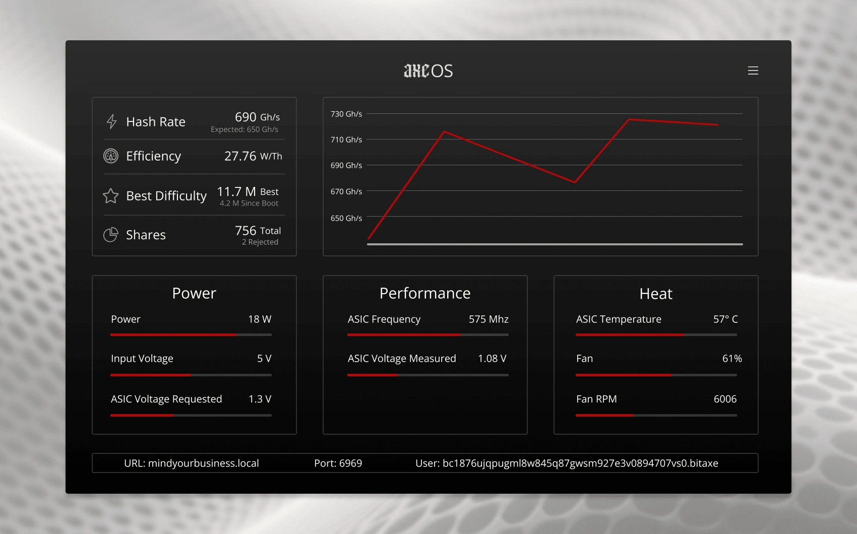
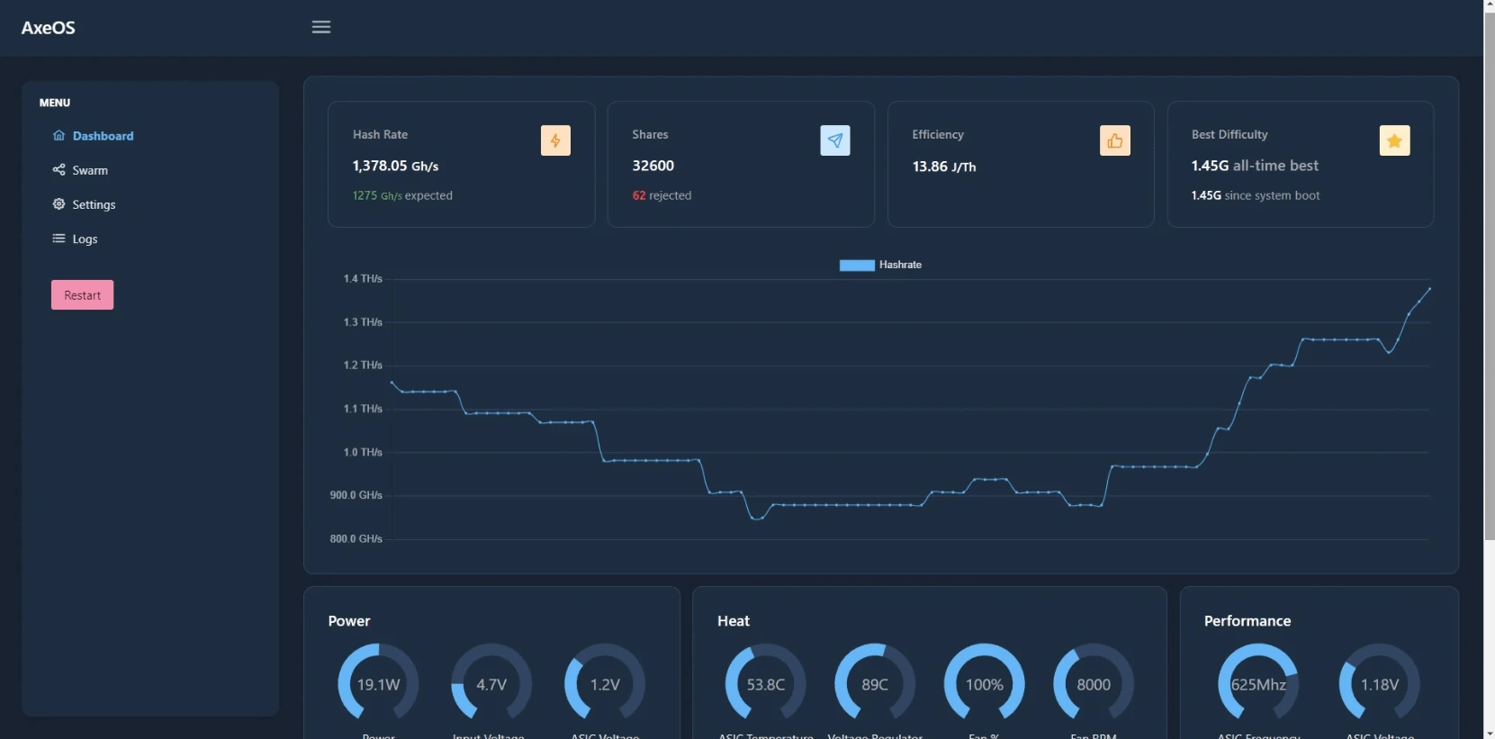
New and improved dashboard UI!
Beyond a simple refresh, this redesign has established a design system that has guided future iterations, ensuring that the dashboard remains user-friendly, efficient, and in sync with the community’s evolving needs. Here are some of the adjustments made since my mockup was released:
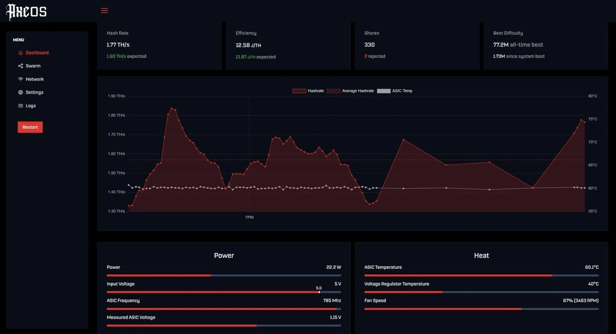
We're getting there!
For social proof and responses, please see my X (fka Twitter) post:
Like this project
Posted Feb 4, 2025
Redesigned AxeOS (open source bitcoin mining) dashboards with a user-centered approach focused heavily on branding, usability, and aesthetics.