Surf Forecast - Mobile Application Redesign
Cody Carter
Redesigning the Surf Forecast Experience for Faster, Friction-less Decisions
Spend more time paddling out. Spend less time forecasting.
Overview
The Surf Forecast app was already a solid tool for surf enthusiasts. Clean, data-focused, and free from unnecessary clutter. However, there were clear opportunities to refine the experience: reducing friction, improving engagement, and making the interface more visually dynamic while staying true to the brand’s identity. My redesign introduced key enhancements to streamline usability and make surf conditions more intuitive at a glance.
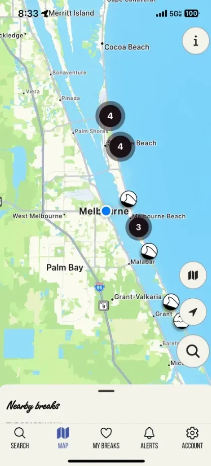
Surf Forecast's former UI.
Approach
My approach combined competitive research, UI refinement, and brand-aligned visual enhancements to create a more seamless and engaging experience:
Competitor Analysis – I studied leading surf apps like Surfline and the former MagicSeaWeed, pinpointing what they did well and identifying features that could be adapted to enhance user experience.
UI Simplification – While I respected the app’s minimalist approach, I focused on further decluttering the interface so that essential data was more immediately accessible, with fewer taps and distractions.
Brand Alignment – I introduced a vibrant yet strategic use of color and updated typography, ensuring the redesign remained visually appealing and in line with the app’s identity.
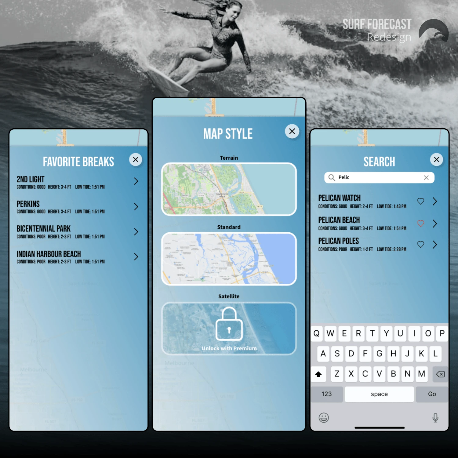
Ideas
To bridge the gap between functionality and engagement, I implemented several key design improvements:
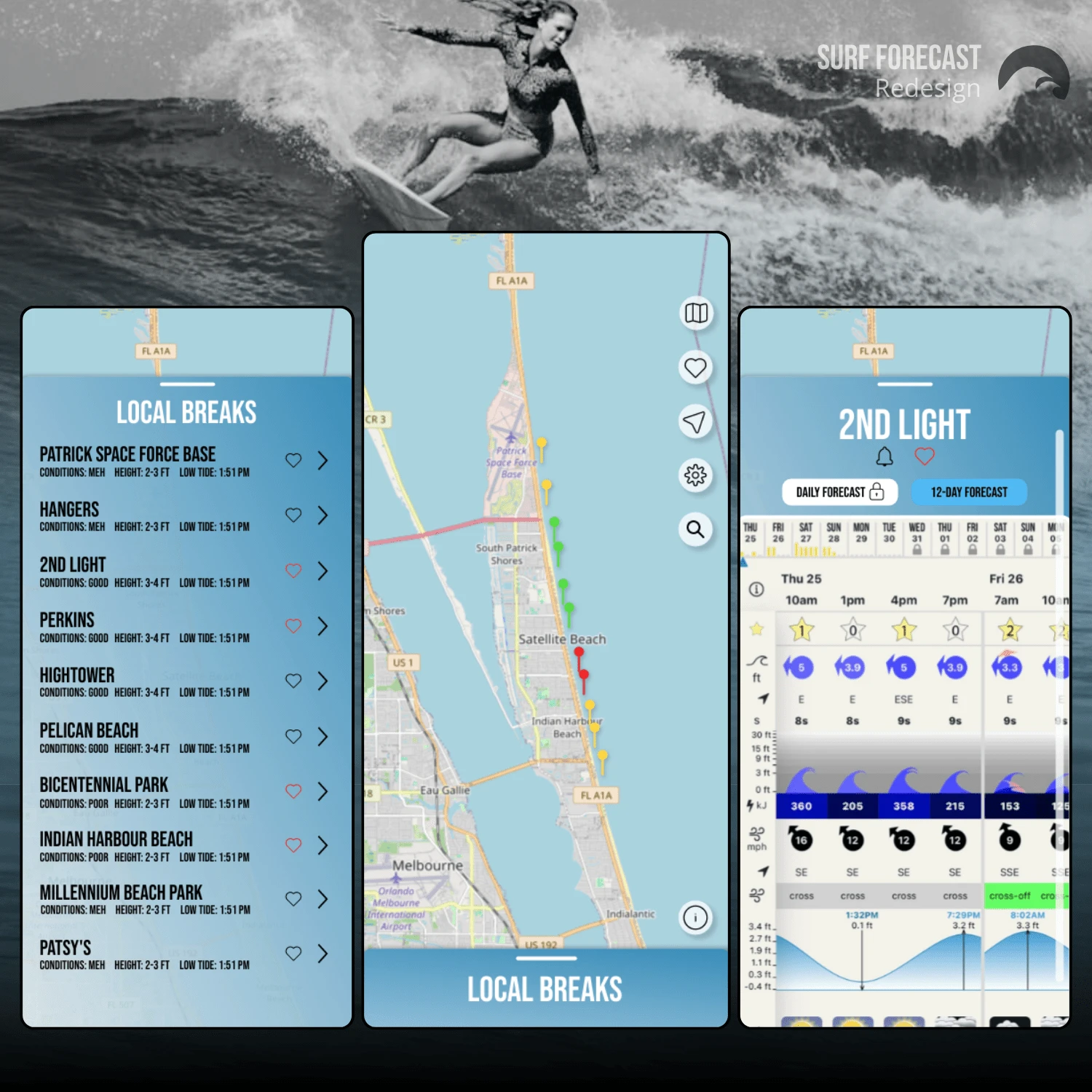
Forecast Preview Pins – A color-coded pin system (green for great conditions, yellow for moderate, red for poor) allowed users to assess surf spots instantly without needing to deep-dive into detailed reports.
Menu Optimization – By restructuring the menu layout and ensuring consistent button sizing, navigation became more intuitive and user-friendly.
Visual Enrichment – Thoughtful use of colors and updated fonts gave the interface a fresh, polished look while maintaining clarity and readability.
Questions
Throughout the redesign process, I challenged assumptions and explored user behaviors to refine my approach:
How do surfers prioritize information when checking conditions?
Users needed an at-a-glance summary first, with detailed reports available when needed.
Where was friction in the existing design?
Menus and navigation could be streamlined, and key data needed better visual hierarchy.
How could branding be elevated without compromising usability?
A balance between minimalism and vibrancy was crucial. Color had to be functional, not just decorative.
Result
I believe the redesign struck the right balance between simplicity and enhanced functionality. By integrating intuitive visual cues and improving navigation, the updated Surf Forecast app now offers:
Faster decision-making – The color-coded forecast pins give users immediate insights into surf conditions.
A more seamless experience – Simplified menus and layout optimizations reduce friction.
An engaging, brand-aligned UI – The refreshed color palette and typography enhance readability while reinforcing the app’s identity.
For social proof and community responses, please view my X post:
Like this project
Posted Feb 4, 2025
Redesigned Surf Forecast UI with user-friendly updates, optimized menus, and enhanced visuals to improve clarity, navigation, and brand alignment.
Likes
1
Views
14