Coaching By Kari
Ron Chio
READY FULL CASE STUDY: https://cleverquokka.com/case-studies/kari
Coaching By Kari
Kari approached me with a clear vision: to create a corporate-facing website that would stand out and reflect her unique coaching style. Her coaching philosophy revolves around providing transformative employee support, combining empathy and accountability to drive organizational success. Our task was to build a website that not only highlighted these qualities but also delivered a seamless and engaging user experience.
Technologies Used:
Figma
Framer
Client Deliverables
Wireframing and Sitemapping
Brand Identity/ Strategy
Logo Design
Mobile Responsiveness/Optimization
Search Engine Optimization (SEO)
Conversion Rate Optimization (CRO)
UX/UI Optimization
Web Design/Development
Lead Generation/Contact Forms
Third-Party Integrations
Content Strategy and Marketing
Branding
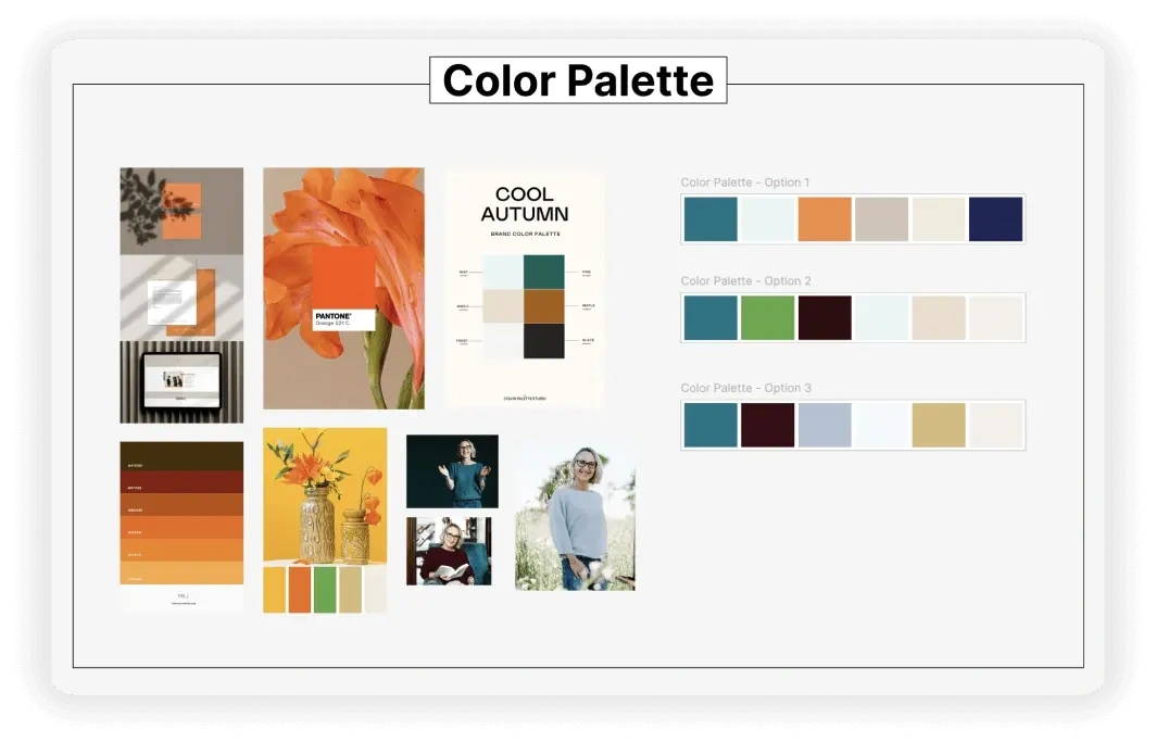
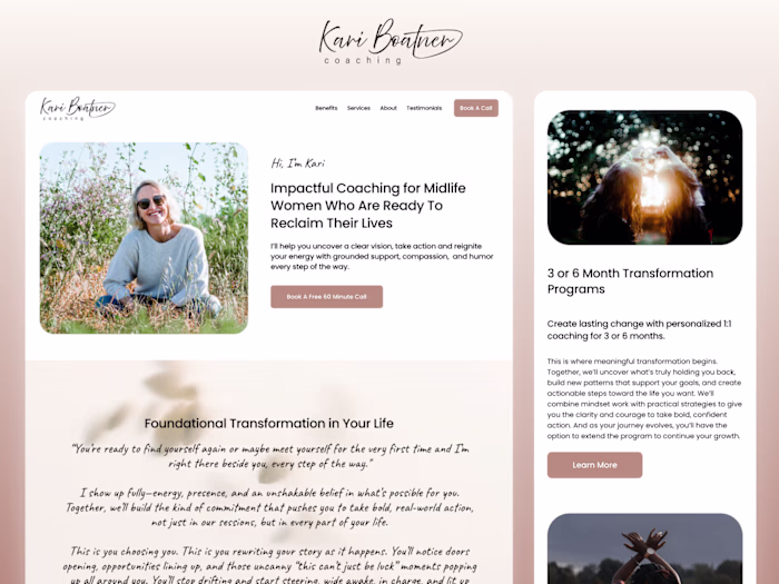
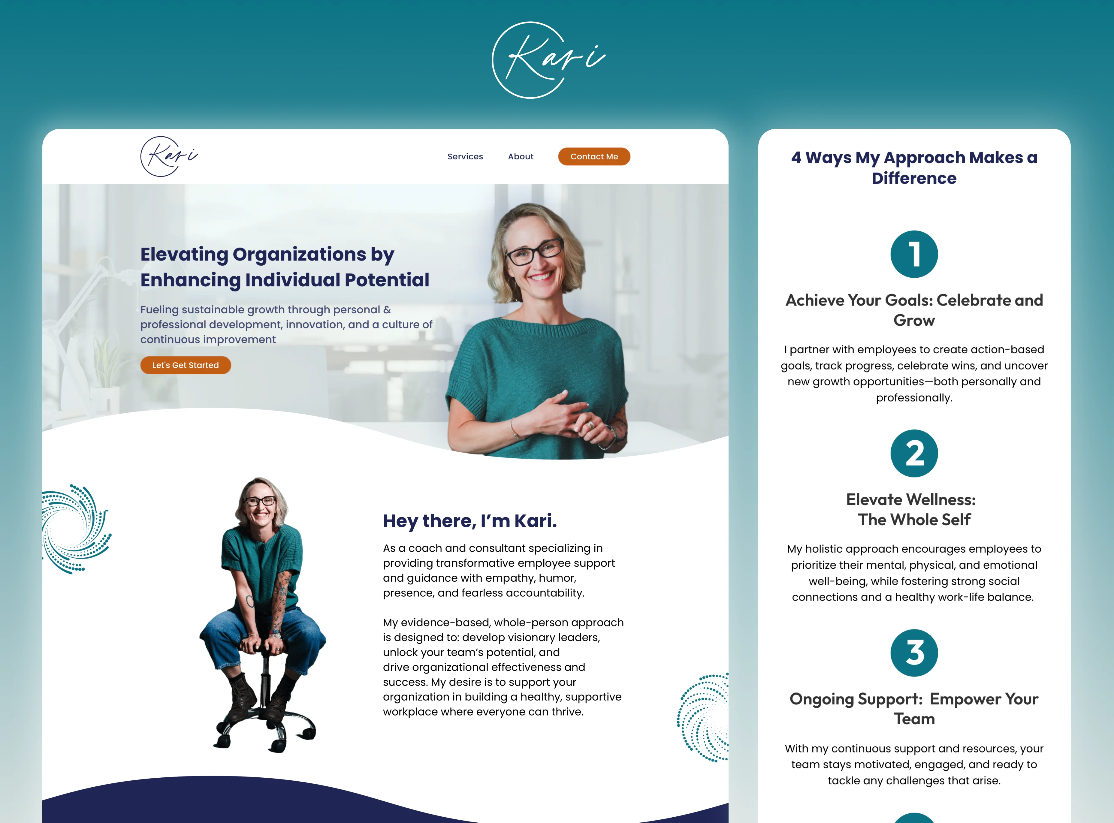
Kari’s vision for the website was to have branding that reflects her vibrant coaching style. We selected a color palette that captures Kari’s energy and optimism while maintaining a professional. The colors were inspired by her portrait images, ensuring that the website feels personal and connected to her identity. This balance of rich but measured tones creates an inviting atmosphere that reflects Kari’s empathetic, yet results-driven approach to coaching and consulting.
Logo
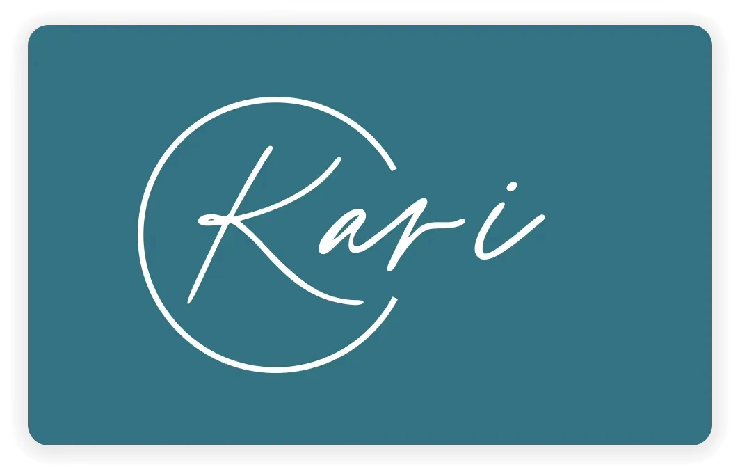
Kari’s logo was designed with simplicity and elegance in mind. Drawing inspiration from one of her personal tattoos, we incorporated a circular motif into the design. The circle not only symbolizes Kari’s love for water, aligning with her coaching philosophy of personal and organizational development. This thoughtful integration of personal meaning into the logo design helped create a strong, unique brand identity for Kari's business.
Web Design
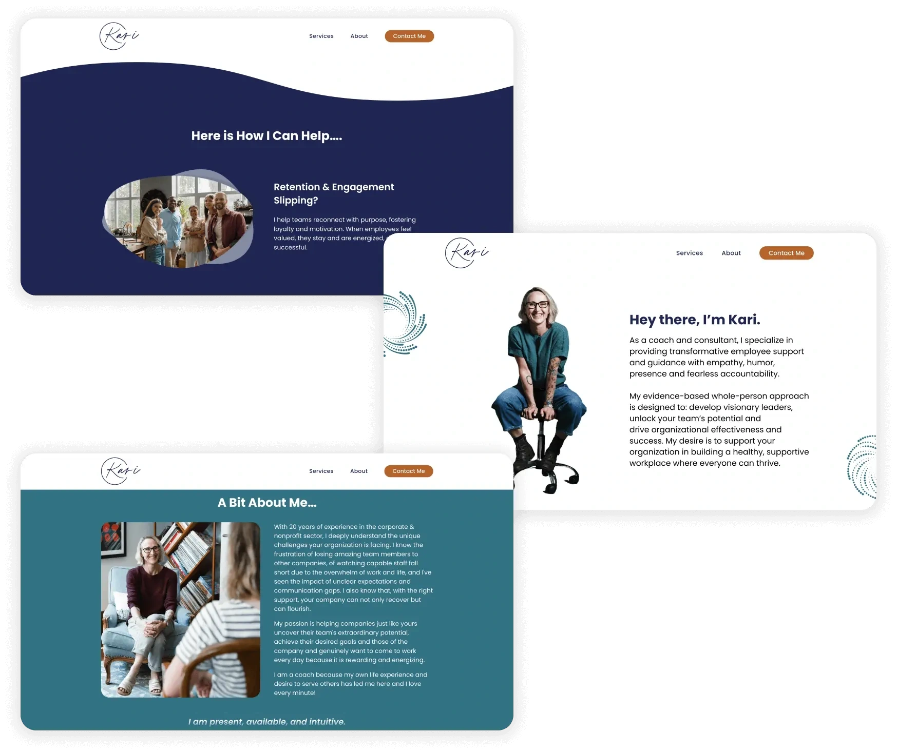
The website’s design was crafted to mirror Kari’s coaching philosophy—clean and professional. We used large, easy-to-read text to ensure that the site is accessible and user-friendly. The layout features wavy borders, water-inspired background imagery, and whirlpool icons to reflect Kari’s deep connection to water, an element she holds dear. This subtle yet consistent water theme adds a unique flair. While the blend of individual and group imagery effectively represents the two core services Kari offers.
Final Thoughts!
By aligning the branding with Kari’s personality and coaching philosophy, we successfully delivered a website that positions her as a trusted leader in employee support and development. This project not only enhanced Kari's digital presence but also provided a strong foundation for continued success in her coaching business.
Thank you Kari for a kind and open-minded person to work with. I love how your website turned out and it truly is a reflection of your personality!
Testimonial from the Client:
I love Ron's creativity. It is underneath everything that he does. My goal was to engage Ron and having a very skilled person that I could say, you do it. Ron was incredibly open to feedback, insanely patient and kind, where I had one idea and then I would change it the next week. I admired his calm, consistency and creativity. Working with him was seamless and so easy.
– Kari Boatner (coachingbykari.com)
Like this project
Posted Dec 29, 2025
Our task was to build a website that not only highlighted these qualities but also delivered a seamless and engaging user experience.