Banking Made Easy
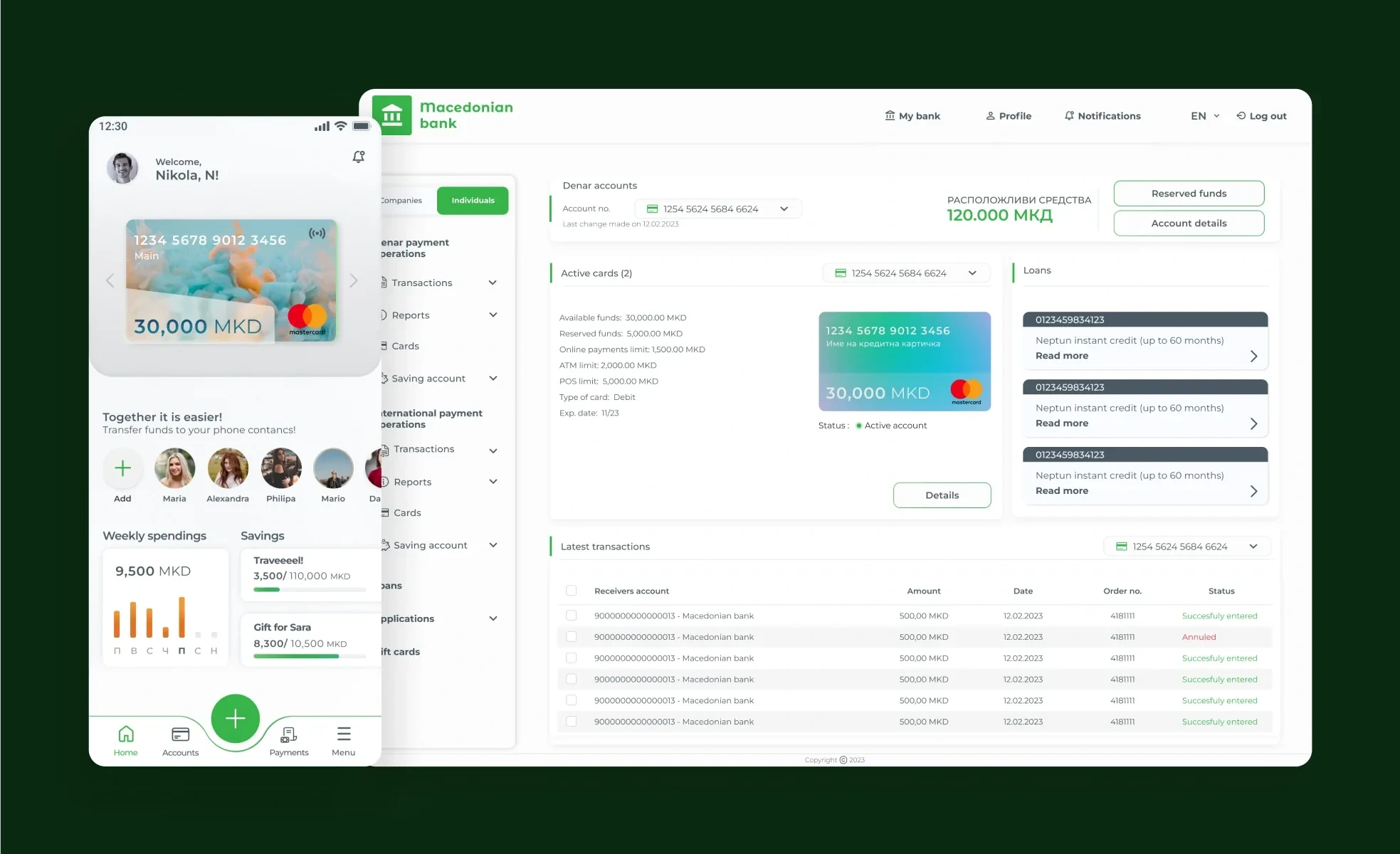
Final design
Redesigning an entire banking experience to simplify everyday financial management
The leading financial institution in the country recognizing the issues with their digital banking experience issued a Request for Proposal (RFP), calling for design firms to pitch a complete redesign of their apps.
Project Type
Pitch to the largest bank in Macedonia (NDA)
Project duration
January 2023 - March 2023Agency
The challenge
Despite its leading position, Macedonian Bank (this is how we’ll refer to it here for reasons of confidentiality) was struggling with providing a satisfying digital experience. Three separate applications served their users digital banking needs: mBank - mobile app for personal banking, mBankCo - mobile app for business banking, and InternetBank - web app for both personal and business users. The challenge was twofold: modernize outdated interfaces and streamline overly complex workflows across all three platforms.
Innovation on a Budget
The RFP called for a proposal focusing on redesigned task flows. However, our team, lacking extensive FinTech experience, saw an opportunity to stand out. We opted to present fully designed prototypes for each app instead, showcasing a comprehensive user experience overhaul. This strategic shift required agility – our junior-led UX department divided into three teams, each tackling a specific application. I redesigned the personal banking mobile app and the web application. This case study outlines my process, design thinking and final deliverables.
Understanding Our Users
To tackle the challenge, I started with an internal user research – a survey of our colleagues who used the bank's apps. This revealed key insights into user demographics, preferences, and pain points. Age groups most likely to use the apps were 18-25 and 26-35. Users primarily accessed personal banking through mobile apps and business banking through the web app, with limited overlap. The most used features were balance checking (96%), bill payments (40%), and fund transfers (36%). However, a staggering 68% reported frustration with overly complex workflows, while 12% lacked clarity on crediting information.
Competitive Landscape
To better understand the context, I analyzed both direct and indirect competitors in the country and the region. This helped identify gaps and opportunities for improvement.
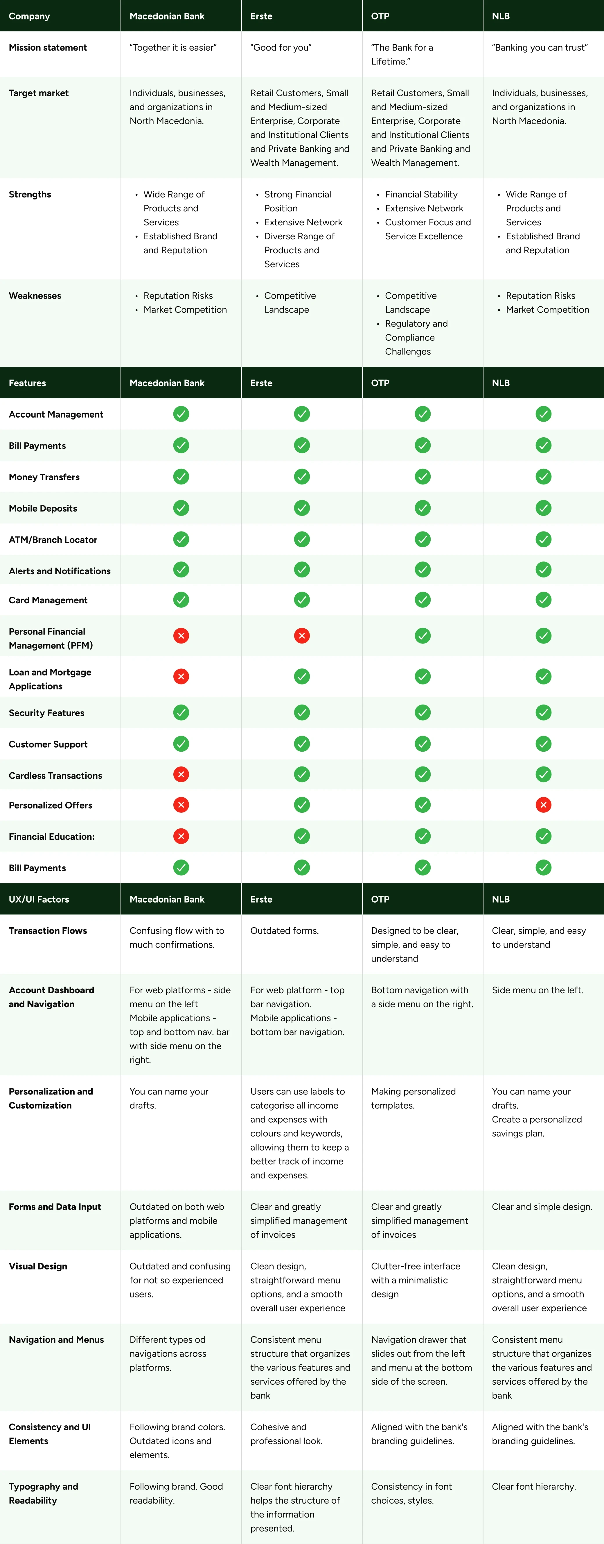
Competitive analyses
User Personas
I identified two primary user segments with different motivations to use the apps: individuals utilizing digital banking for personal finance management and professionals involved in financial management for businesses. With these two distinct user groups in mind I created user personas to guide design decisions and ensure alignment with user needs.
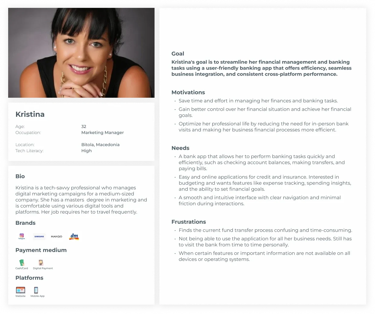
User Persona 1
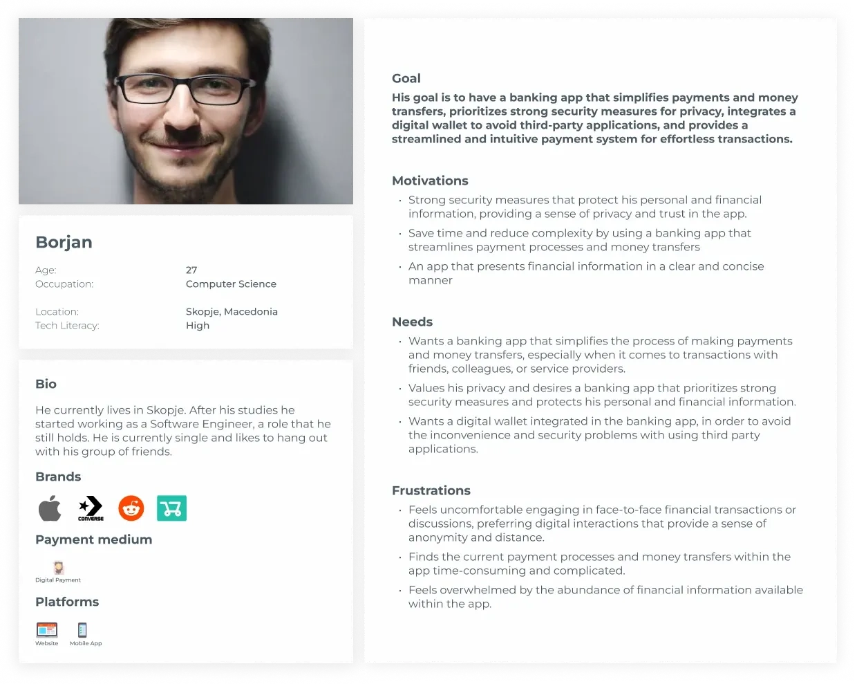
User Persona 2
Simplifying Navigation
All existing apps suffered from convoluted navigation. I developed a user-friendly information architecture for each platform. I focused heavily on the web app (InternetBank) and the personal mobile app (mBank), prioritizing intuitive organization while maintaining a familiar experience for existing users.
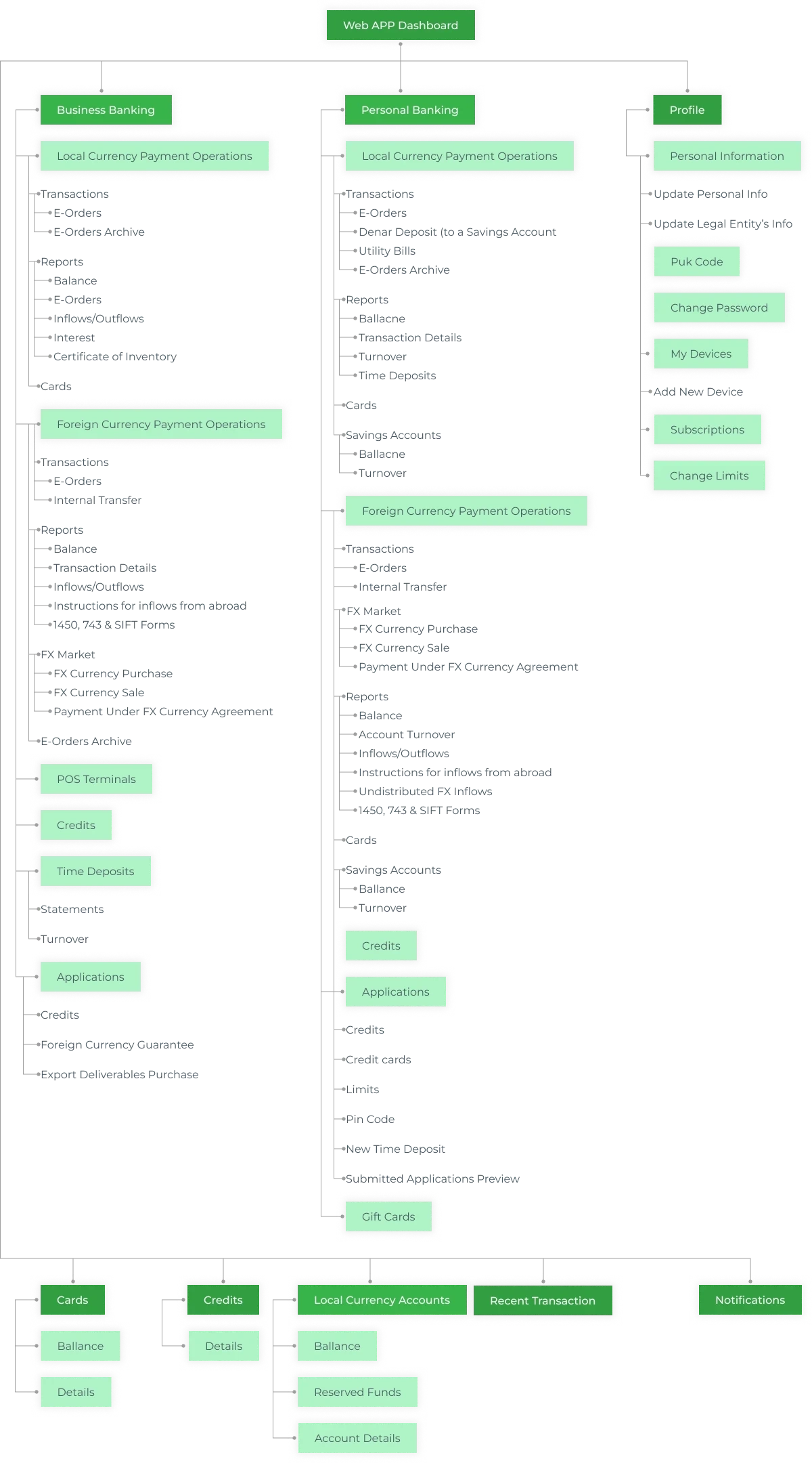
Web app information architecture
My main contributions
The dashboard would be the first screen the user sees after login. It was only natural to display the most prominently used features: bank accounts, active debit and/or credit cards, a list of recent transactions, and, based on our research, a credits and loans section – a functionality users expressed a desire for. I opted for a master-detail layout, where the sidebar (master) provides quick access to features, while the detail component displays actions relevant to the chosen feature.
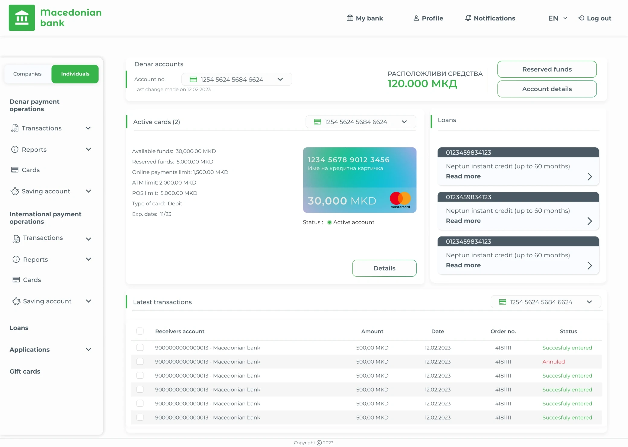
Internet Bank Dashboard Design
Intuitive Navigation
Legal regulations required all users to register and log in as individuals, with business features unlocked after linking a legal entity. The old navigation stacked features, creating an excessively long scroll. My solution divided the sidebar navigation into "Companies" and "Individuals" tabs based on the user's login association, ensuring an easy-to-understand system.
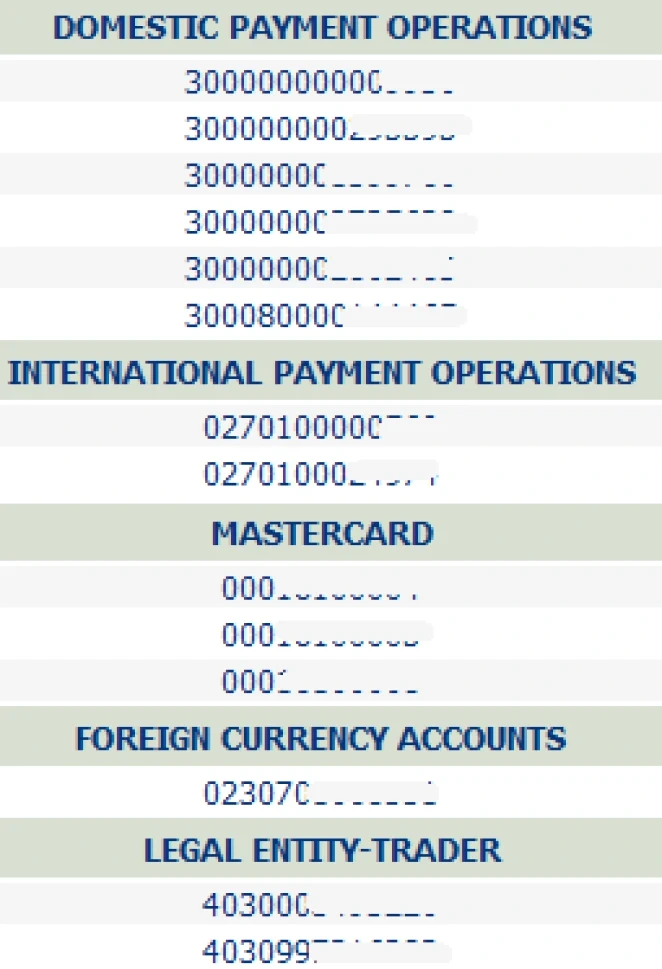
Old navigation
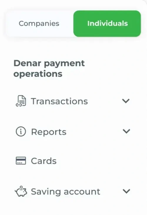
New navigation
Payments
As a core feature, I focused on simplifying and redesigning the web app's payment flow. The previous payment process was a frustrating maze. The Old payment nightmare:
1. Filling the Order: Users began by filling out an electronic order form.
2. Once completed, they had to perform an action called "Insert," which placed the order in a tab labeled "Entry."
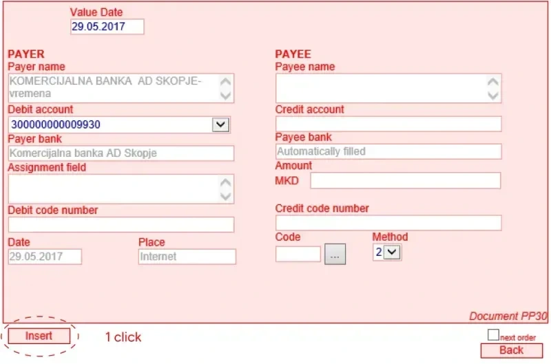
Old payment flow - filling an e-order
3. From "Entry" users had to select the desired order(s) for processing (one for individual payments, or multiple for batch payments), perform an action called “Send for signing”, then navigate to the tab called “Signing”.
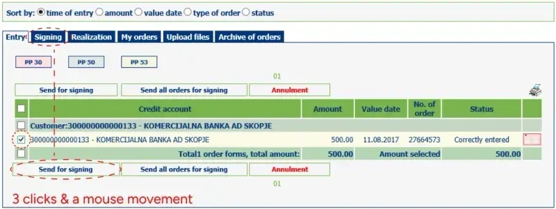
Old payment flow - "Entry" tab
4. You see the pattern: selecting the e - order, they then needed to perform another action, "Sign," which moved the selected order(s) to a new tab called "Realization", where they would now have to navigate.
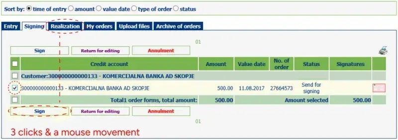
Old payment flow - "Signing" tab
5. Yet another step awaited in the "Realization" tab. Users had to repeat the selection process and then click on “Send for realization”.
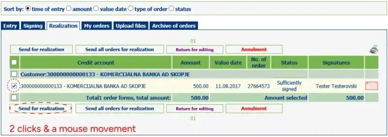
Old payment flow - "Realization" tab
6. Checking for Status: Unfortunately, the agony wasn't over. To obtain a status update on their payment (successful or failed), users were forced to manually refresh their browser.
As you can see, this multi-step process created significant interaction cost - a total of 9 clicks and 3 mouse movements to make a single payment! Furthermore, the outdated interface lacked a clear visual hierarchy for organizing information, the confusing language and UX writing lead to confusion and cognitive overload.
By mapping the entire process with a user flow chart, I visualized a modern, intuitive flow.
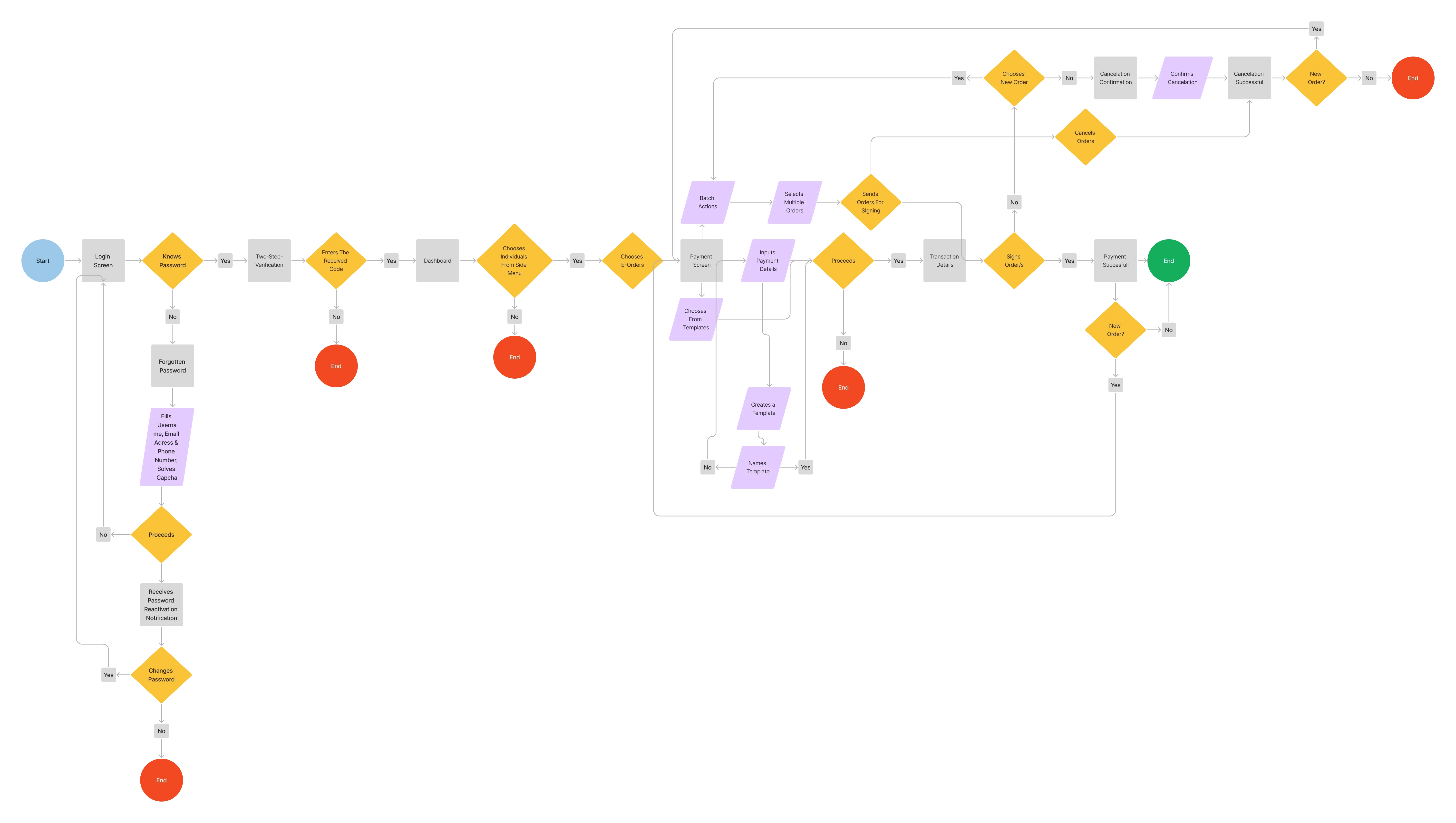
User Flow Chart
I designed a streamlined e-order payment flow with two steps, thus decreasing interaction cost, while preserving the familiar task logic used by existing users. This new flow allows users to create, utilize templates, and perform batch actions all within the same screen.
New payment processing flow
Future Vision
The research & competitive analyses revealed user demand for easy fund transfers. I along with the team proposed a new feature for the mBank mobile app called "Together it is Easier," allowing users to send funds to phone contacts (if they also use the mBank app), aligning with the bank's tagline. This feature was further extended to include sharing bills and receipts within the app.
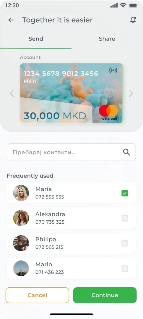
Fund sharing feature
5 year plan
My five-year plan envisioned modern features like QR payments, personalized secondary navigation for quick access to frequently used features, and a biometric authorization option for a quick balance check.
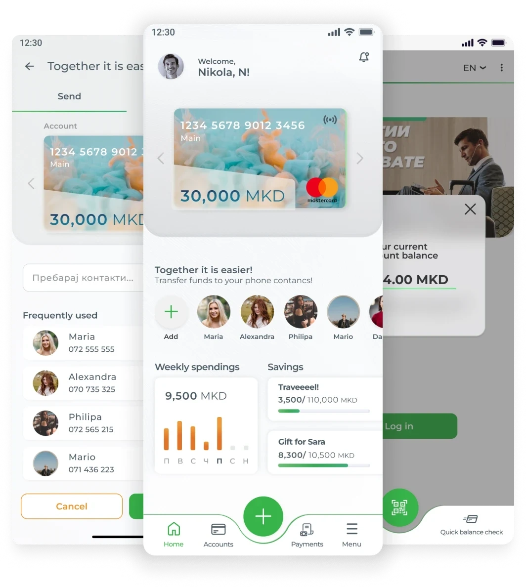
QR authorized payments, personalized navigation, biometric validation
The outcome
While we didn't win the pitch (reportedly due to our lack of FinTech experience), the project proved invaluable for our junior design team. I learned to design three interconnected products within a tight timeframe. If successful, I would have recommended tracking KPIs like task success rate, completion time, user retention, and net promoter score to measure the product's success and identify areas for improvement.
Like this project
Posted Dec 31, 2024
I played a key role in redesigning an entire banking experience to simplify everyday financial management


