Gley.tv: Unlock Growth
Teoman Maksut
Increasing conversion rate through website redesign
Gley, the first Macedonian streaming platform, struggled to attract new subscribers. Their website lacked a clear value proposition and a smooth user journey. The website was designed from scratch to showcase Gley's unique offerings and streamline the signup process, aiming to boost conversion rates.
Client
Gley
Project duration
15th March 2023 - 20th May 2023
The challenge
Gley’s old website struggled to convert website visitors into paying subscribers because their existing online presence faced two key challenges:
Unclear value proposition: The website didn't effectively communicate what Gley offered, leading to confusion among potential customers, especially senior users who might have associated it with cable TV.
Confusing communication of pricing structure: Pricing plans were differentiated solely by the number of devices allowed for simultaneous streaming. This didn't resonate with users accustomed to models like Netflix, where plans offer varying content tiers or account options and had to be communicated extra carefully.
Understanding the Problem
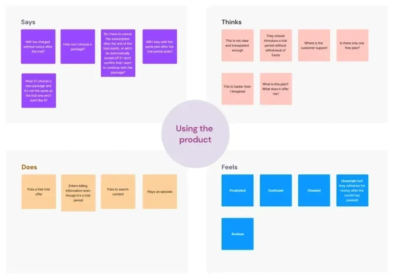
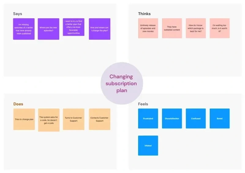
To find the solution, I started with in-depth interviews with stakeholders and a thorough user research process. By analyzing the data, I identified four key areas causing user frustration:
Onboarding process
Product features
Support
Pricing concerns
I created empathy maps to understand these pain points better:
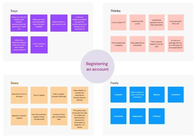
Empathy map - onboarding process
Empathy map - product features
Empathy map - support
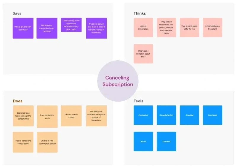
Empathy map - pricing concerns
This systematic approach helped me pinpoint the main gaps between Gley and potential customers:
Clearly communicating Gley's unique value proposition (what makes them special?)
Explaining the benefits & differentiating features of each pricing plan (why would someone choose one over another?)
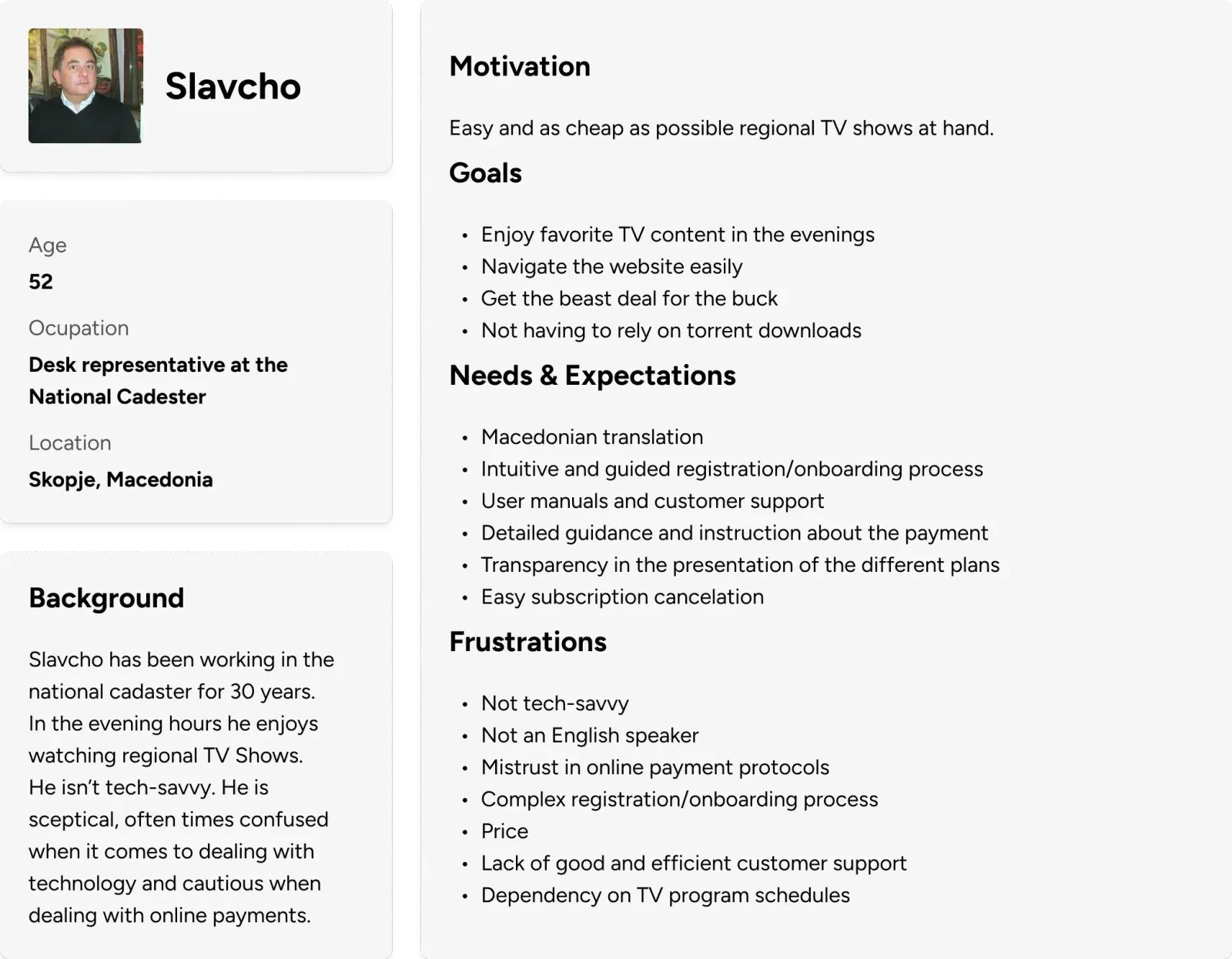
User Personas
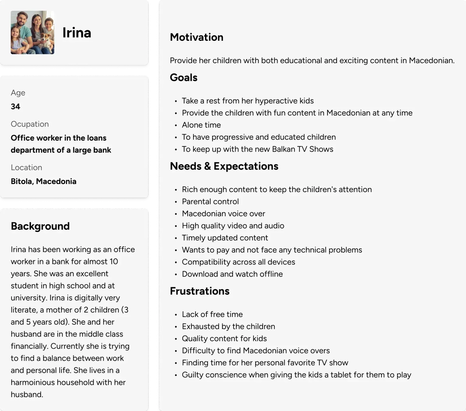
Who are Gley's website visitors? To understand Gley's audience, I created user personas for Gley's three main groups:
Nostalgia Seekers: Fans 45+ who love regional TV shows and movies.
Savvy Parents: Young families seeking safe, native-language kids' content.
Domestic Binge-Watchers: Viewers of all ages who crave domestic TV shows.
These personas helped me tailor the website experience to each group's unique needs.
User persona 1
User persona 2
User Journey
The target audience of nostalgia seekers, embodied by the user persona Slavcho, was the most delicate. I mapped their user journey to understand how they interact with the current website. This helped me identify key touchpoints and potential roadblocks on their path to becoming paying subscribers.
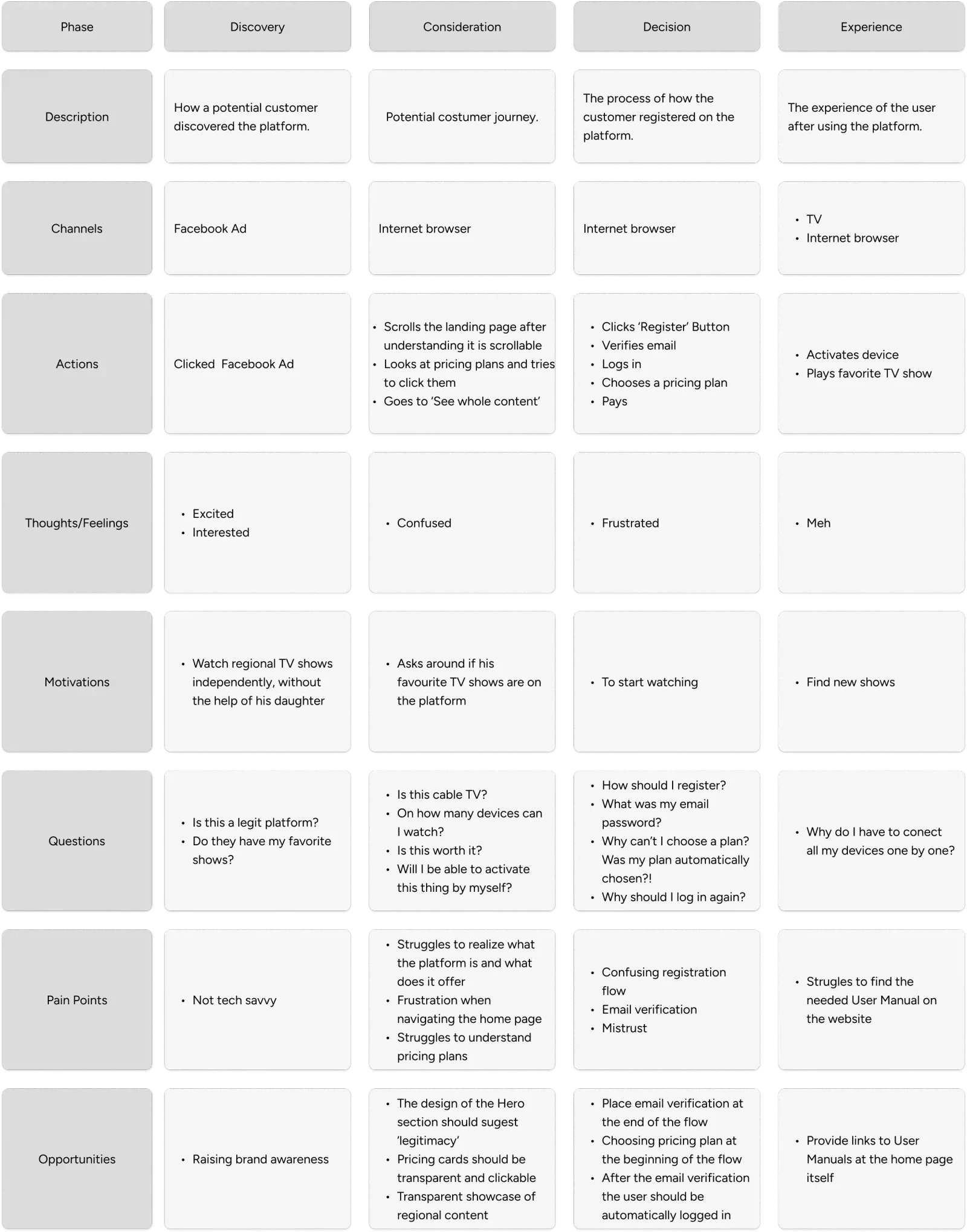
User jourmey
Learning from the Competition
I analyzed top video streaming platforms to see how they showcase their value. Here's what I discovered:
Clear Value Proposition: Landing pages highlight their unique offerings
Compelling Promotions: Eye-catching sections feature popular content
Organized Content: Users can easily browse by category
Engaged Users: Perks and rewards keep subscribers coming back, as well as free trials
Information at Your Fingertips: Movie descriptions summarize key details
Seamless Streaming: User manuals & clear instructions and device compatibility visuals ensure a smooth experience
Localization: The platform caters to different regions with localized content selection
Keeping Users Informed: Release dates and upcoming content sections build anticipation
Building Trust: Partnership logos demonstrate platform reliability
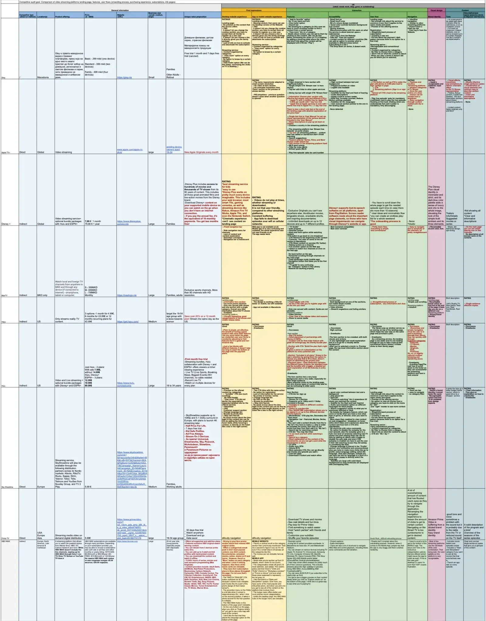
Competitive analyses
Information Architecture
I maped out the website's structure.
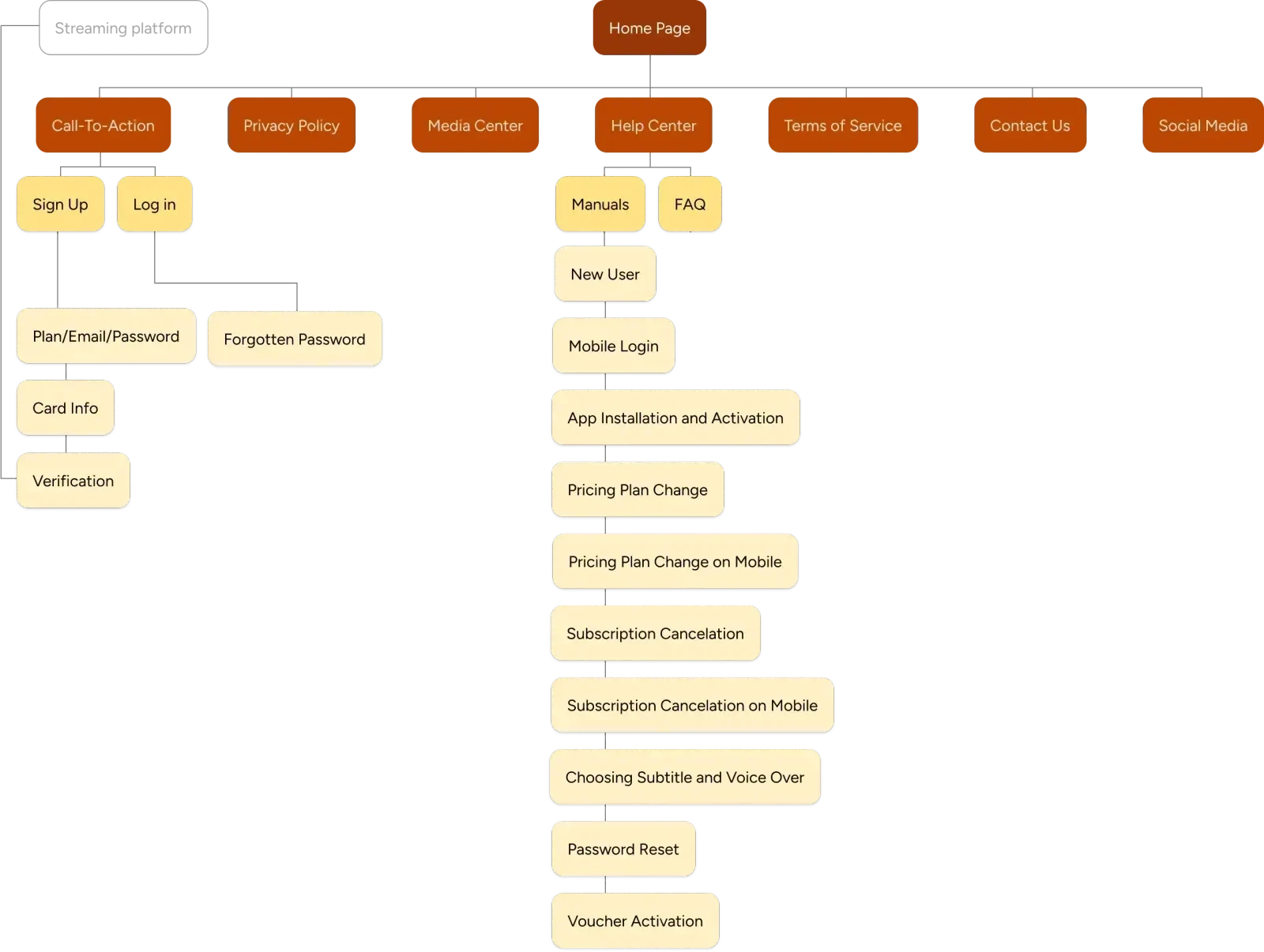
Information architecture
Google Analytics Insight
Analyzing website visitor behavior with Google Analytics revealed a key issue: many visitors didn't scroll past the hero section (32.68%). I made 3 plausible hypothesis around why this could be:
The hero wasn't attractive enough to evoke the interest.
The design felt like "clickbait" (much of the traffic came from social media marketing links).
A combination of both.
The solution? A cinematic hero! Inspired by captivating movie titles, I envisioned the hero section as a mini cinematic experience that mimics the immersive feel of cinema. I created this design with the goal to grab user attention and create a more engaging welcome:
Captivating Video Showreel: Highlights Gley's content at first glance.
Subtle Slogan Fade-in: Introduces the value proposition elegantly (allusion to movie titles).
Delayed Navigation & CTA: Prioritizes content, then guides visitors further.
This approach aims to keep visitors engaged and wanting to learn more.
Cinematic hero
Building Trust with Clarity
To address user confusion around pricing plan differences, I redesigned the cards with clear bullet points, increasing the font weight for the key differentiating factor - the number of devices for simultaneous streaming. I also added a title eyebrow to further communicate the difference and an info icon to explain immediate billing. This transparency builds trust in Gley as a brand.
Before (pricing card)
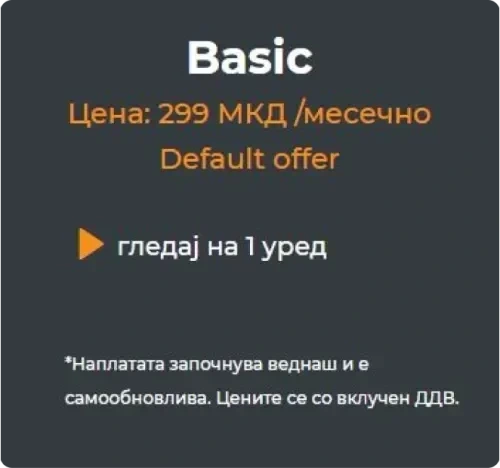
Old pricing card design
After (pricing card)
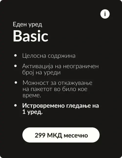
New pricing card design
Fixing the Leaky Funnel
I discovered another major issue: a high bounce rate on desktop (89.9%) and mobile (45.9%) registration screens . I traced this to requiring immediate email confirmation after providing the email, forcing users away from the next steps required for successful signup.
Solution: Streamlined Onboarding
To improve user experience, I redesigned the registration flow:
Email & Password: Capture contact information even if users don't complete registration (allowing retargeting for later conversion).
Choose a Plan: Select a pricing option based on needs.
Payment Details: Securely enter payment information.
Personalization (Optional): Tailor content suggestions for a more customized experience.
Email Confirmation: Verify email at the end to finalize registration.
This streamlined approach prioritizes user tasks, removes distractions, and ensures a smooth registration process.
Onboarding flow
Usability Testing
After building a polished prototype, I designed a usability testing plan. I ran 19 sessions, watching users interact with the design and gathering their feedback. I encouraged them to share their thoughts and feelings, and completed the sessions with a quick questionnaire. This helped me spot and fix minor details, like making text links more accessible and easier to find for some users. By the time the project went to development, I had a user-tested and refined design.
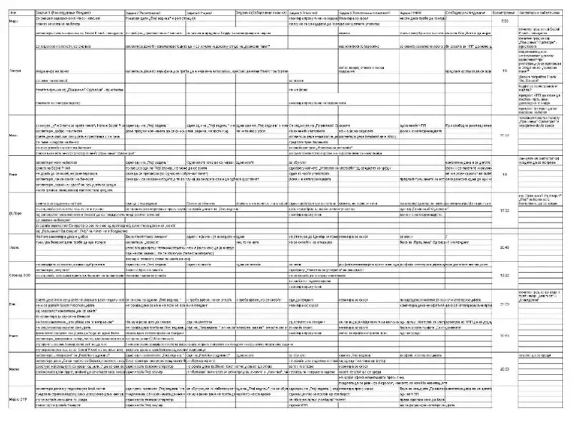
Usability testing notes
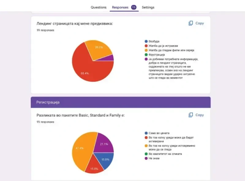
Usability testing report
Lessons Learned
Leading the whole team on this project was a valuable experience. I participated in all the project phases, learning to balance diverse perspectives and make tough decisions that impacted both the business and the users. It wasn't always easy, but I learned to trust my judgment while managing to balance various requirements (by stakeholders, developers, management etc.).
Like this project
Posted Jan 3, 2025
I redesigned the video streaming platform's website to increase conversion rate
Likes
0
Views
12