Beyond UI Refresh
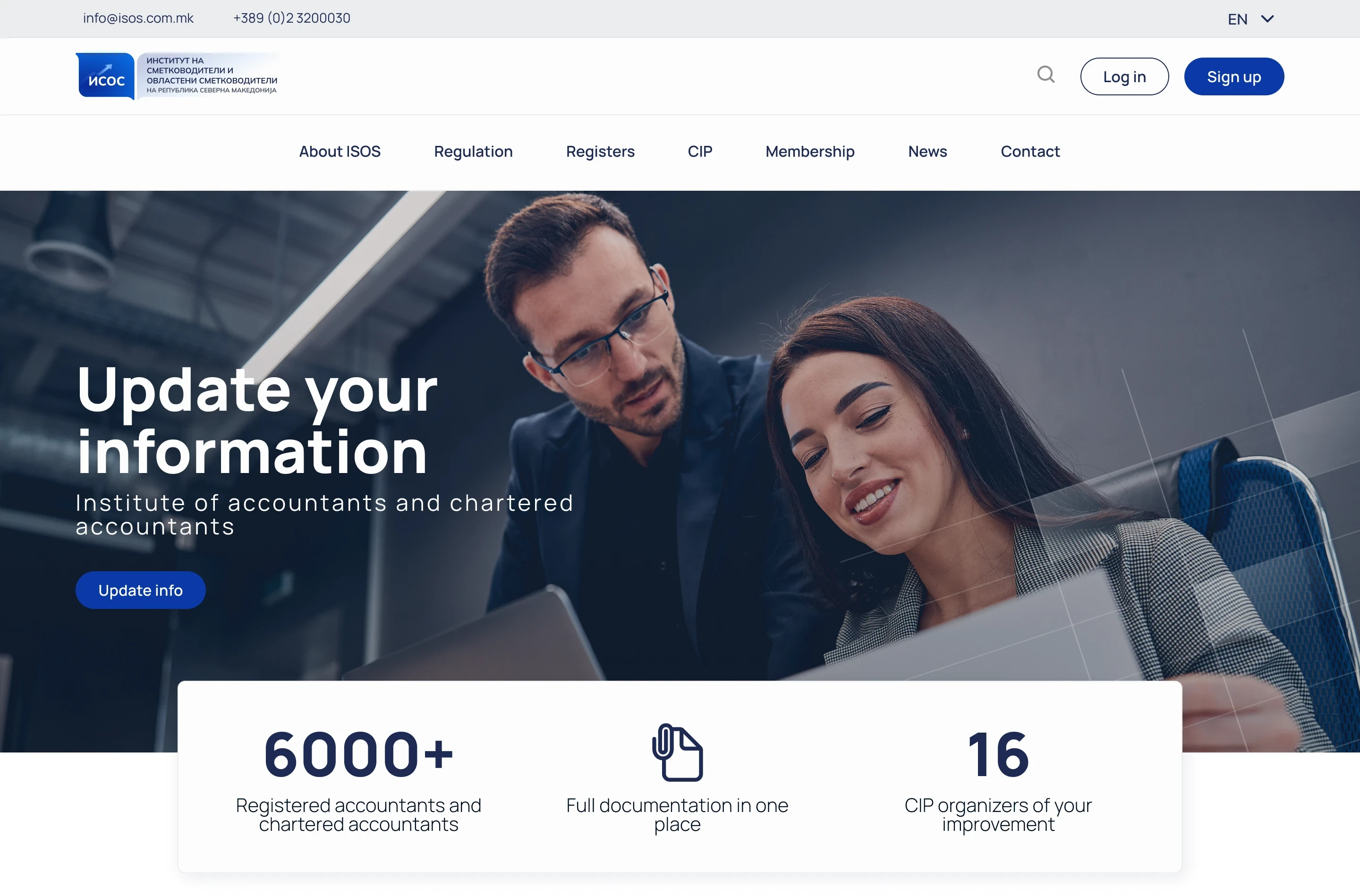
Final design
Beyond aesthetics: How visual design boosted ISOS.mk's user experience
ISOS.mk, the official organization for certified accountants in Macedonia, needed a website refresh. This case study explores how a strategic UI refresh alone can elevate user experience, even with limited resources.
Client
Institute for Accountants and Chartered Accountants (ISOS)
Project duration
December 2023
The challenge
ISOS.mk's existing website, built in a hurry by a developer, relied on a WordPress theme with minimal customization beyond incorporating their brand colors. This resulted in an unprofessional aesthetic that didn't reflect their recently updated branding. While aiming for a complete website redesign, ISOS.mk faced tight deadlines and budget constraints, making a full process redesign cycle unrealistic. Understanding these limitations, they approached us requesting a 'cosmetic facelift' for their website. However, as this case study will show, the project ultimately demonstrated the significant impact that visual design and thoughtful design decisions can have on improving user experience.
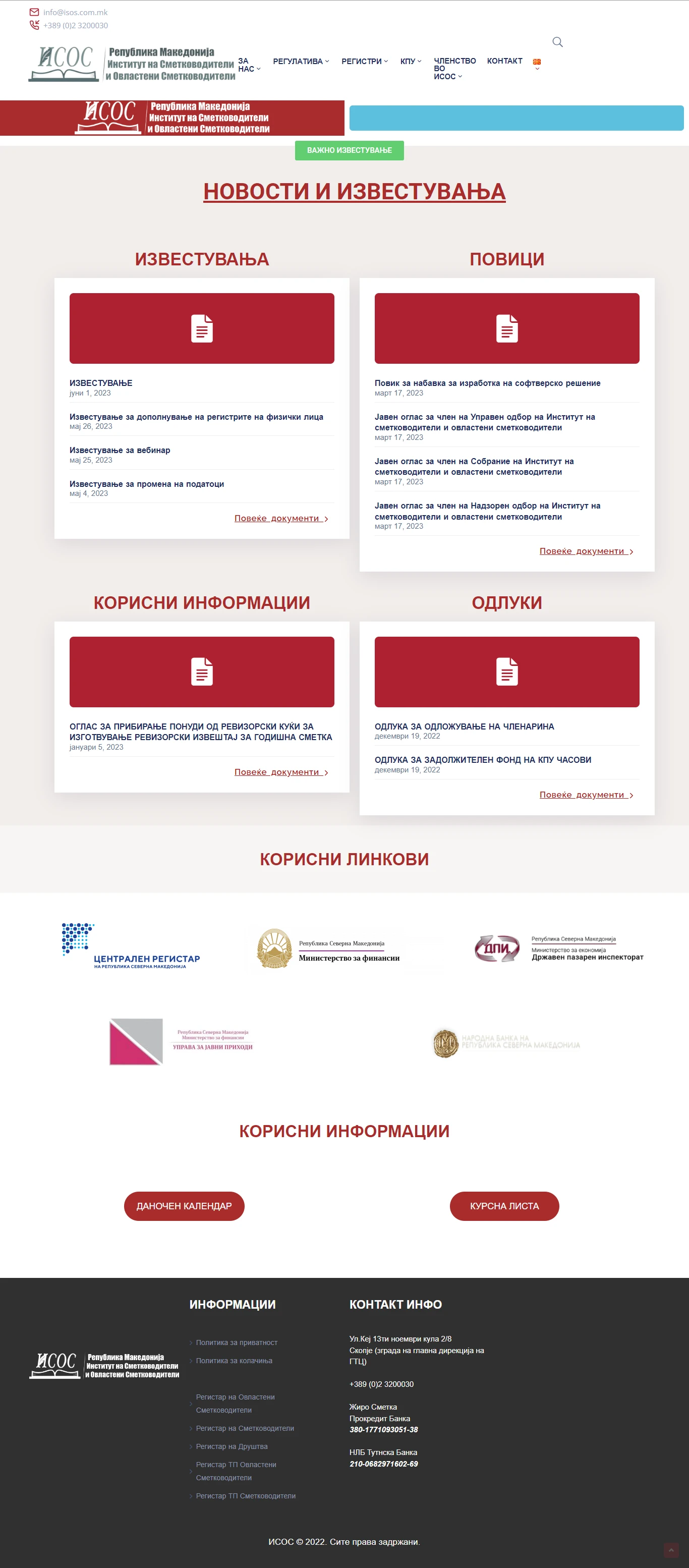
ISOS.mk's old website
Design System
I believe in building simple, accessible design systems that can grow with a project's needs. This approach ensures visual consistency and streamlines design decisions, avoiding unnecessary complexity. For ISOS.mk, created a core design system to guide the refresh. The change in the color palette reflects ISOS’ recent rebrand.
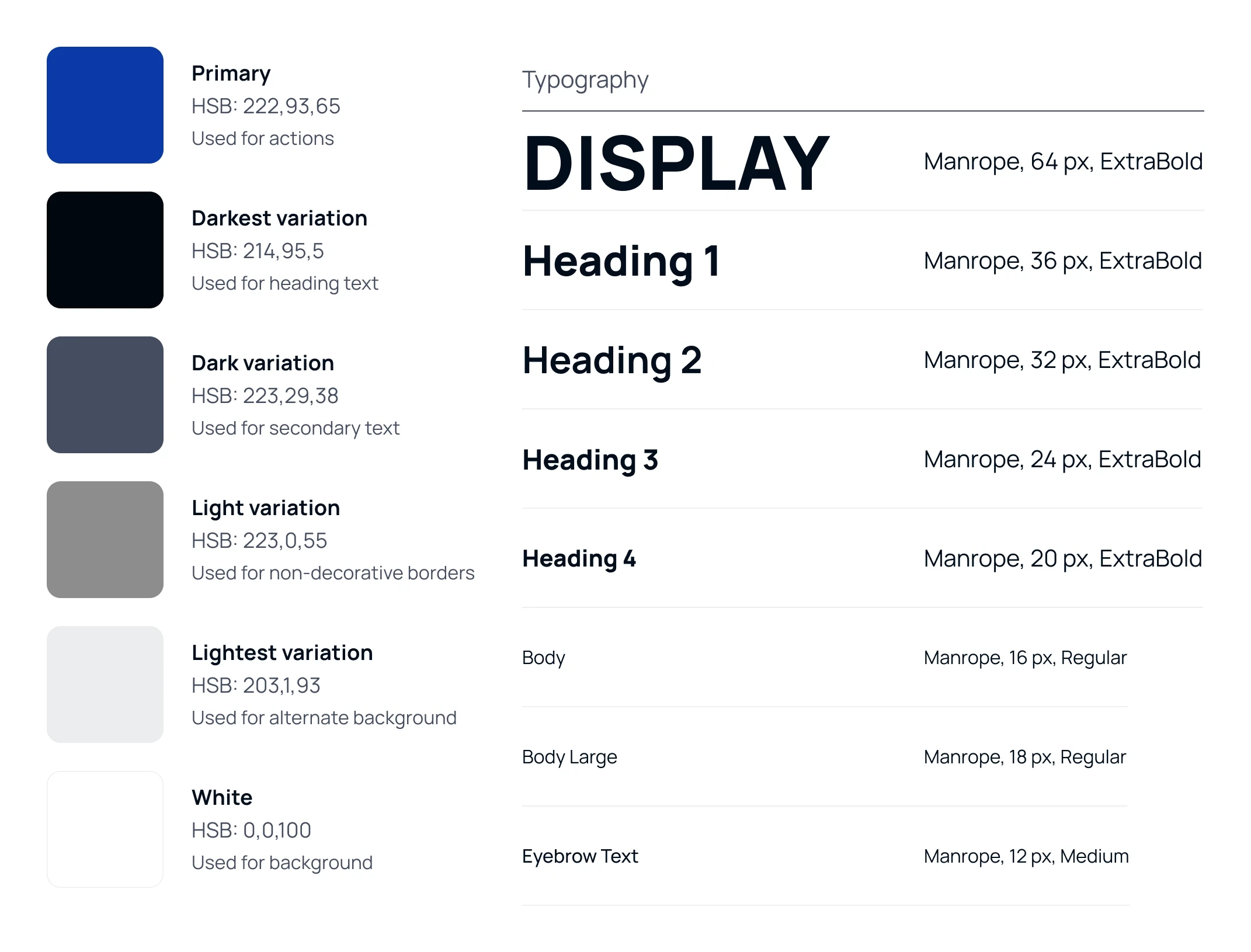
Design system
The Hero Banner
The original website used the hero area for CTAs and announcements - totally understandable! But aesthetically, it was a try at design at best.
The new hero banner displays a full-width photo of colleagues discussing work, creating a professional atmosphere and evoking positive feelings about joining the organization. I also included a clear call to action button to encourage members to update their professional information, a pressing concern for ISOS.mk at the time.
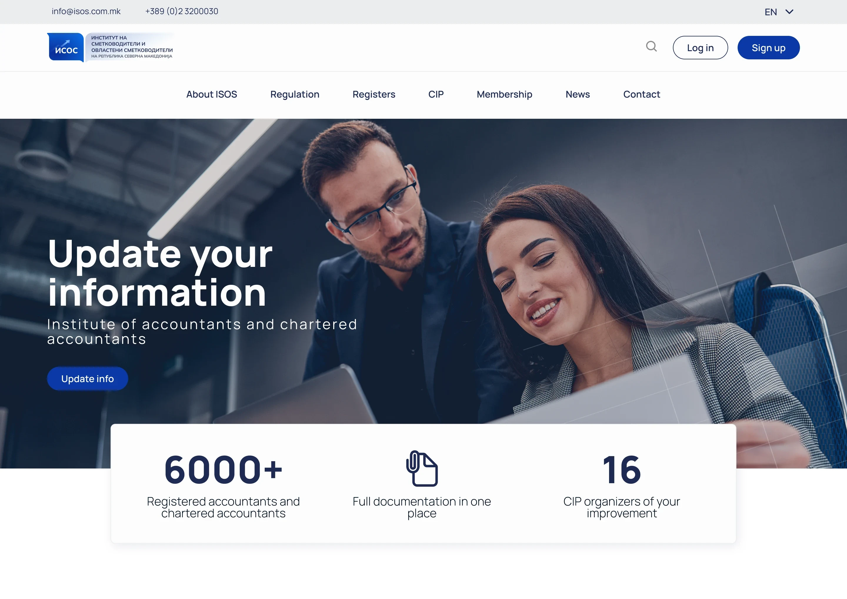
New hero nanner
Modular Approach
Knowing the website needed lots of reusable elements, I took a modular approach. This means designing components that could be easily used throughout the site. I started with the navigation. Since accountants often visit the website to find specific professional documents, I added a search bar in the main navigation. This allowed users who knew exactly what they needed to find it quickly, without browsing through menus.

Navigation bar
Previously the documents were accessible for download via a text link. I designed a simple component allowing users to preview the document before downloading. This minimized frustration by avoiding unnecessary downloads and ensuring users acquired the most relevant files for their needs.
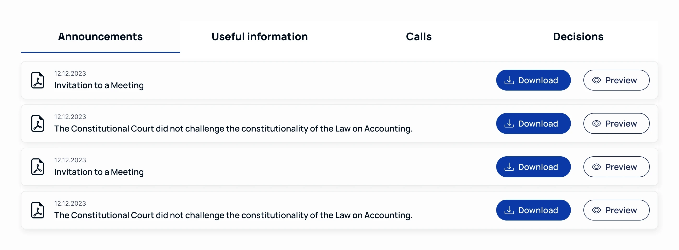
Download and preview documents
The old homepage featured a section for state institutions and relevant links used by Macedonian accountants. However, the implementation presented usability issues. As shown in the image below, institution logos were simply placed in a grid, leading directly to the institution's website upon click.
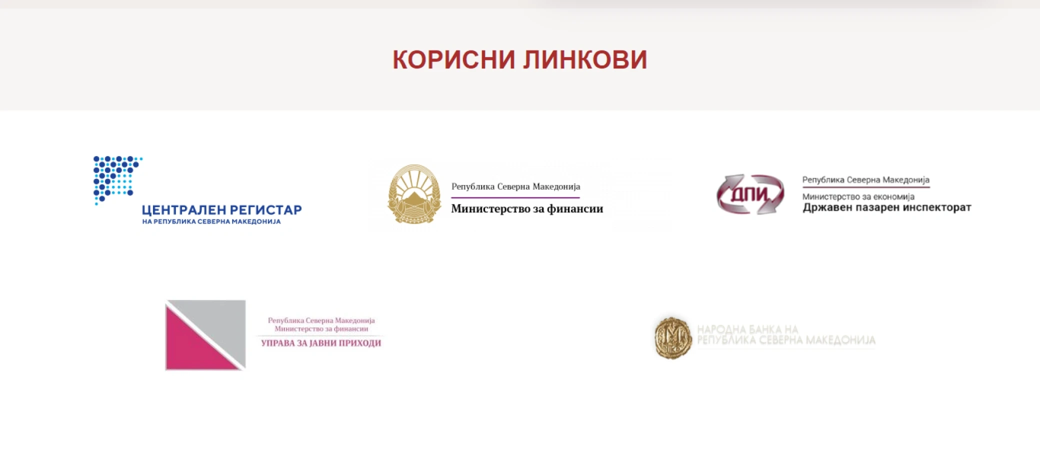
The old 'useful links' section
To improve information architecture and user efficiency, I designed a tab component. This component allows users to select a specific institution, revealing a curated list of their most commonly used resources. This approach streamlines access and reduces unnecessary navigation steps.
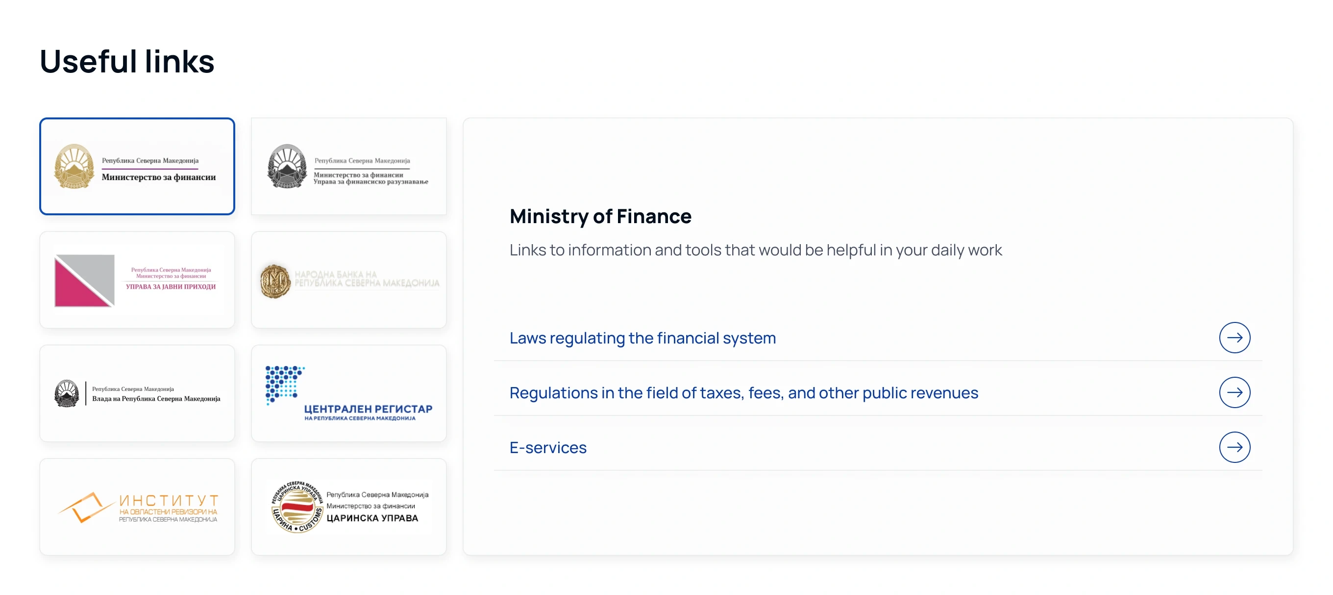
The new useful links section
To reinforce ISOS's recent rebranding I played around with the shape of ISOS’ new logo both for banners and the footer. This approach strengthens brand recognition and creates visual consistency across the user experience.

CTA banner
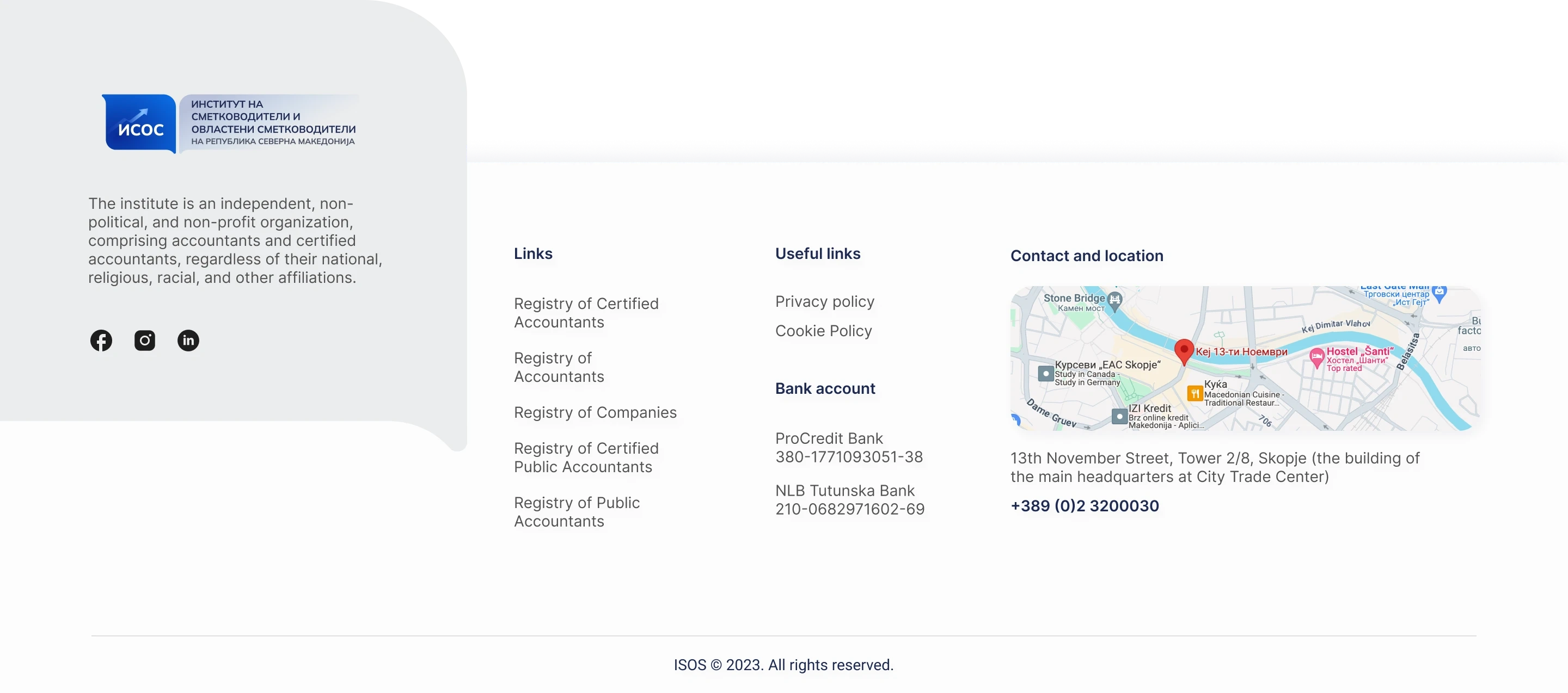
Footer
Responsive tables
A critical feature of ISOS's website is a database of Macedonian accountants and firms, including details like workplace, license information, contact details etc. Previously, users downloaded large PDF files containing tables with this information. This was highly impractical due to enormous data and tables with thousands of entries and a dozen data points per entry. I replaced the PDFs with searchable tables. This drastically improved user experience by enabling quick access to specific information through search and pagination.
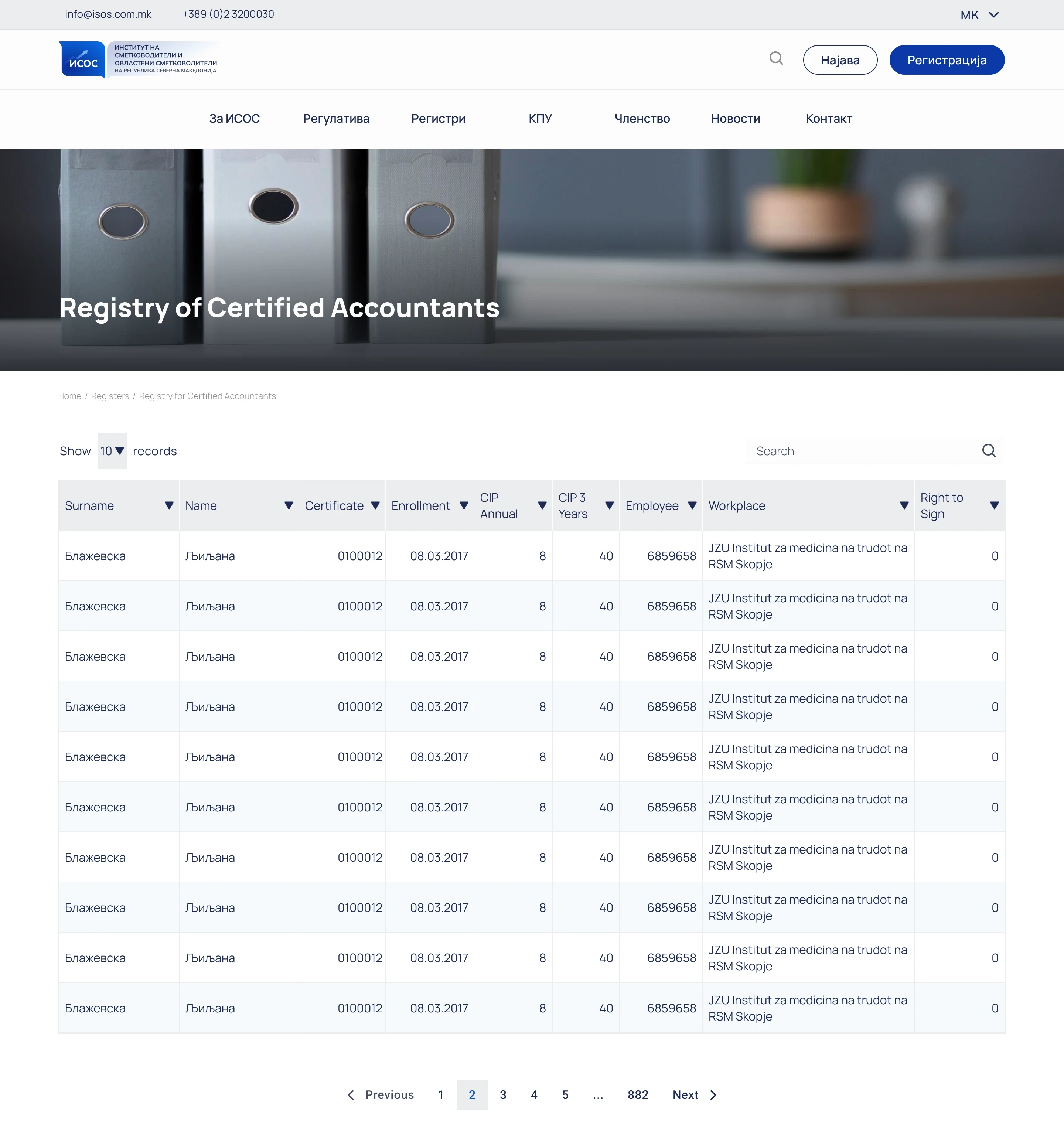
Searchable tables instead of downloadable PDFs
However, maintaining table usability across devices presented a challenge due to the extensive number of columns. I didn’t like the traditional solutions because:
Classic horizontal scroll lets users scroll side-to-side, but they'd lose sight of the legend (the first column).
Sticky legend: I could have locked the legend in place, but this works for short data and our tables were extensive.
I thought of a third way: transform the rows into cards! This wouldn’t affect usability as I had a search bar and pagination in place allowing users to find what they need quickly.
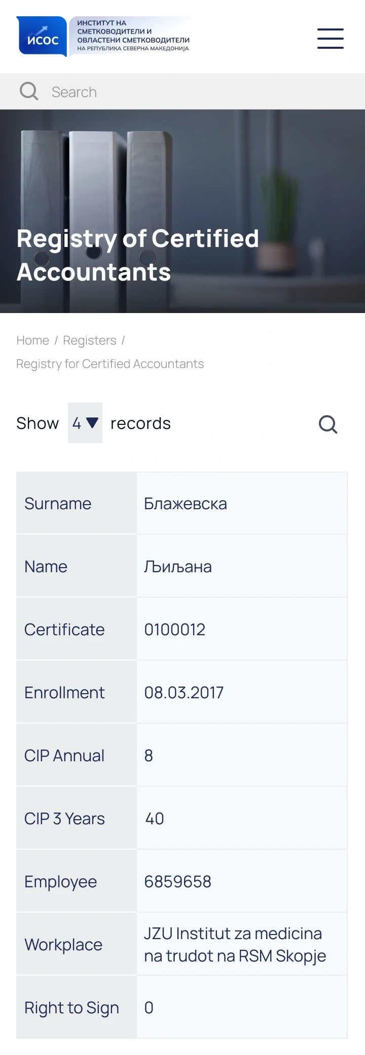
Responsive table
Final design

New home page
Lessons learned
This project was a quick but rewarding sprint. Although time was tight, I had the big responsibility of delivering more than just a visual refresh for the national institute of accountants. This experience truly highlighted the significant impact that user interface design can have on the overall user experience.
Like this project
Posted Jan 3, 2025
This case study explores how a strategic UI refresh alone can elevate user experience, even with limited resources.
Likes
0
Views
3

