Mobility UI — Modular Vehicle Interface
Andrej Mlinarevic
🚗 Building Blocks for Next-gen Mobility Interfaces
Interface on a Wide Screen Physical Device
🌶️ Challenge: Scalable Mobility
Build a Modular System of Mobility UI Components that Scales Across Different Screen Sizes & Orientations
🔥 Solution: Fluid Device Grid + Responsive Components
Different mobility users have different needs. If you are riding an e-bike is not the same to go straight od downhill through the forest. You need different information depending on your context.
To meet the extensive demands of user personalization and customization, I designed a set of dynamic, responsive components that adapt fluidly to size, context, and user preferences. Built on a flexible, percentage-based grid, these components seamlessly adjust to different screen sizes for an optimized, consistent experience.
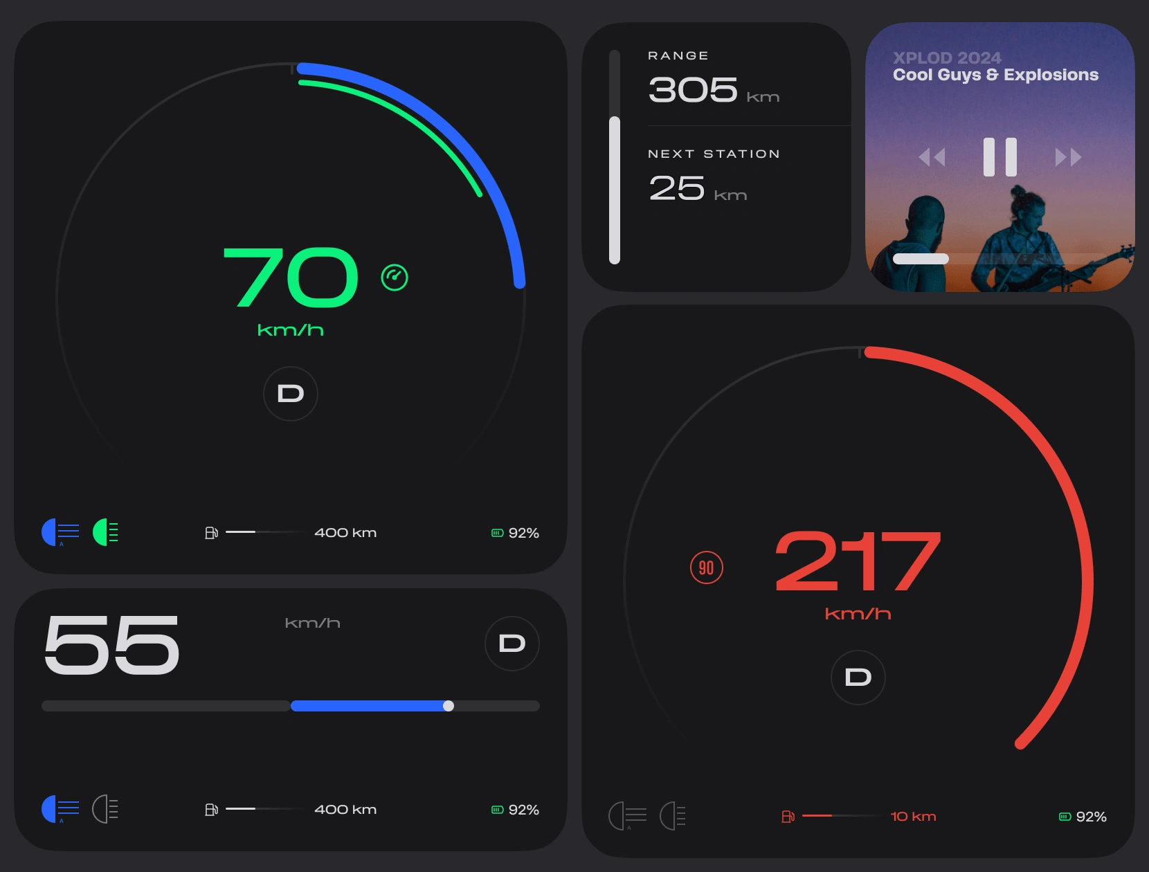
Different Variants & States of Display Modules in Dark Mode
🕶️ Dark or Light, Your Choice
All components are designed with clarity and simplicity in mind and come in dark and light mode with accents.
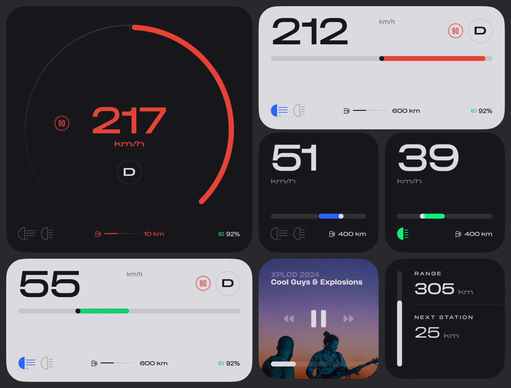
Mixed Light & Dark Modules
3rd Party Integrations
The modular interface supports embedding of all types of apps, both in their tablet or mobile UI mode, for example you can have a map on 1/2 of your screen or as a full-screen experience.
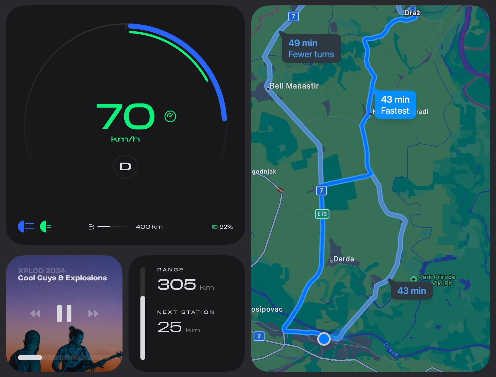
Map view
🏗️ This project is undergoing and available for a live demonstration.
Like this project
Posted Nov 1, 2024
A highly customizable UI based on the drivers' preference. Module based grid combined with dark & light elements.
Likes
0
Views
24