Wired Roots | Brand Design
Tom Haynes
"It has been an absolute pleasure to work with Tom. His unique insights and exceptional knowledge of design and brand identity have provided me with a clear direction for my business. The professional logo he created not only stands out online but has also significantly boosted my brand's presence. I highly recommend Tom for his outstanding design skills and dedication to his clients."
Oscar Knock / Founder
Overview
Wired Roots crafts unique and rare gemstone trees and jewellery, merging artistic beauty with a deep appreciation for the intricate craftsmanship of wire art. With a mission to add beauty to life and home, the brand maintains a standard of high quality and authenticity that resonates with discerning customers who value aesthetic elegance and meaningful artistry. Seeking to elevate this vision, Oscar approached me for an upgrade to his original logo. We established that he needed a more cohesive and versatile identity to distinguish his brand from competitors and support his transition from selling on Etsy to offering his pieces directly through his own website.
Problem
The original logo for Wired Roots presented several challenges that limited its effectiveness. The complex geometric shapes forming the canopy, combined with the thin lines of the branches and trunk, posed legibility issues when scaled down, making the logo cluttered and difficult to use on icons or business cards. The overall asymmetry of the tree added to the visual imbalance, which affected how the design was perceived as a whole. Furthermore, the light and minimal typography created readability challenges, particularly when the logo was scaled down. Compounding these issues, the logo had only one variation, which limited its flexibility across multiple touchpoints.
Solution
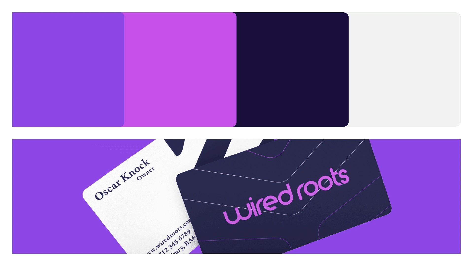
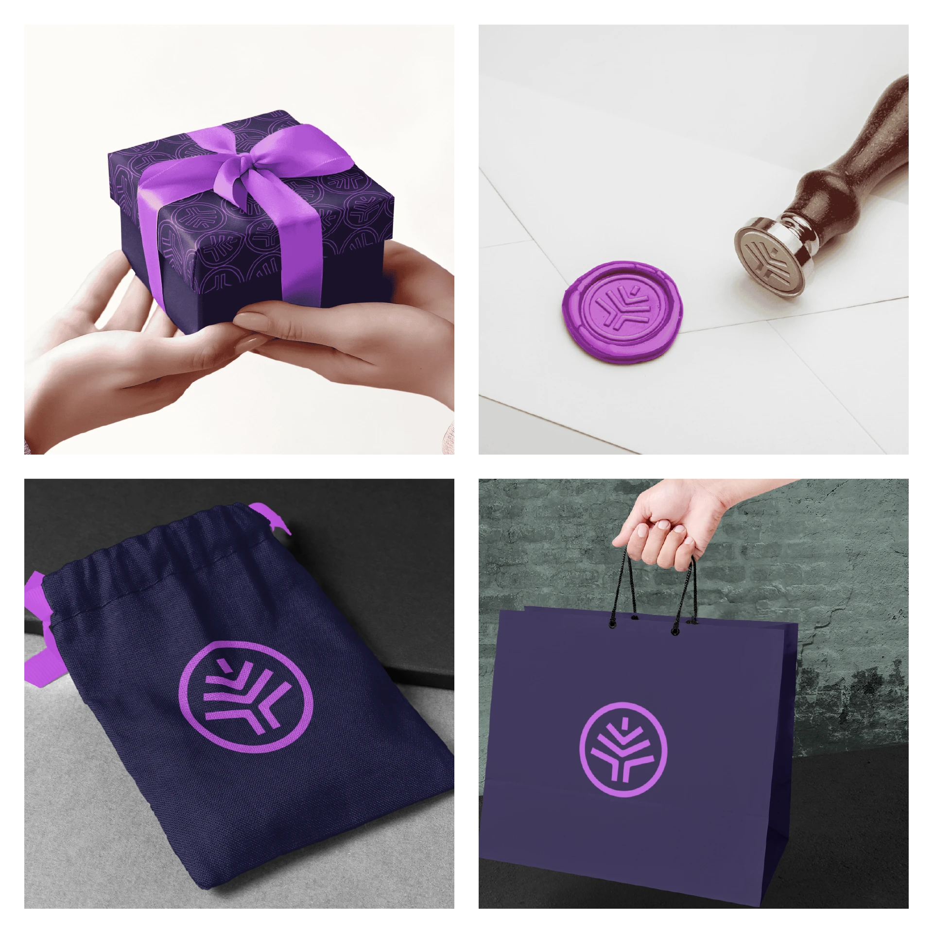
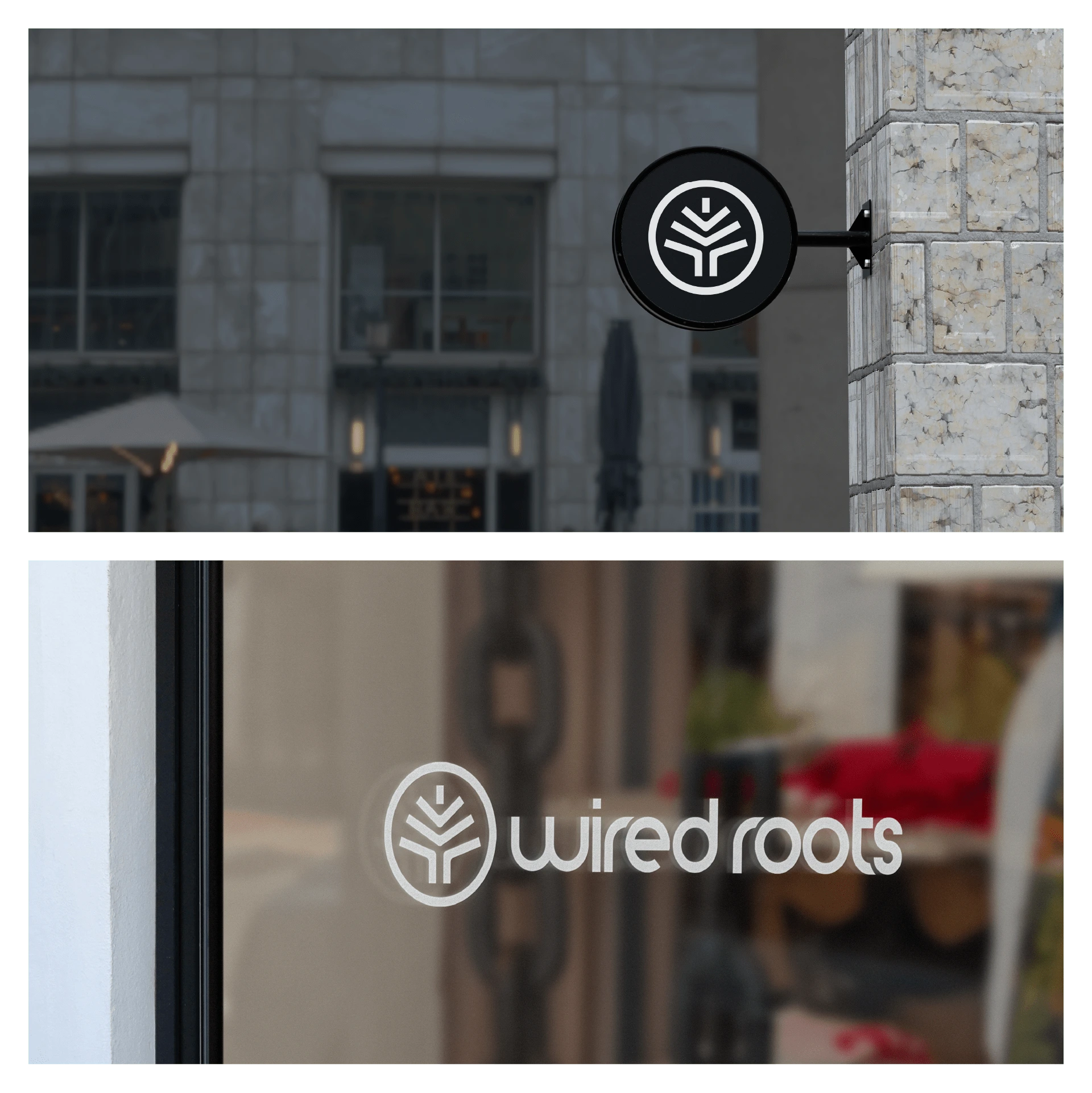
The final logo for Wired Roots features an abstract tree design framed within a circular container, symbolising unity and rootedness. The bespoke typeface is modern and well-rounded, providing a contemporary and approachable feel, with closely connected letters that represent the interconnectedness of roots. The Wired Roots colour palette uses bold contrasts to stand out among neutral competitors, reflecting the brand's uniqueness and premium quality in the gemstone tree and jewellery market. This versatile design ensures that Wired Roots maintains a strong and recognisable presence across various applications.


Like this project
Posted Jan 24, 2025
Wired Roots crafts unique and rare gemstone trees and jewellery, merging artistic beauty with a deep appreciation for the intricate craftsmanship of wire art.