Alpine Construction | Brand Design
Tom Haynes
Overview
Alpine stands at the forefront of Martial Arts training excellence, offering state-of-the-art cages that mirror the strength, resilience and durability of alpine landscapes. They focus on enhancing the practitioner's experience with an unwavering commitment to safety, quality, and innovative design. In the world of Martial Arts, Alpine is synonymous with resilience and innovation, elevating the spaces where the martial spirit thrives and grows.
Brief
To design a simple and striking icon and logotype that conveys a compelling narrative, while ensuring versatility across various mediums such as website, marketing materials (brochures, banners), stadium signage, and product packaging.
Execution
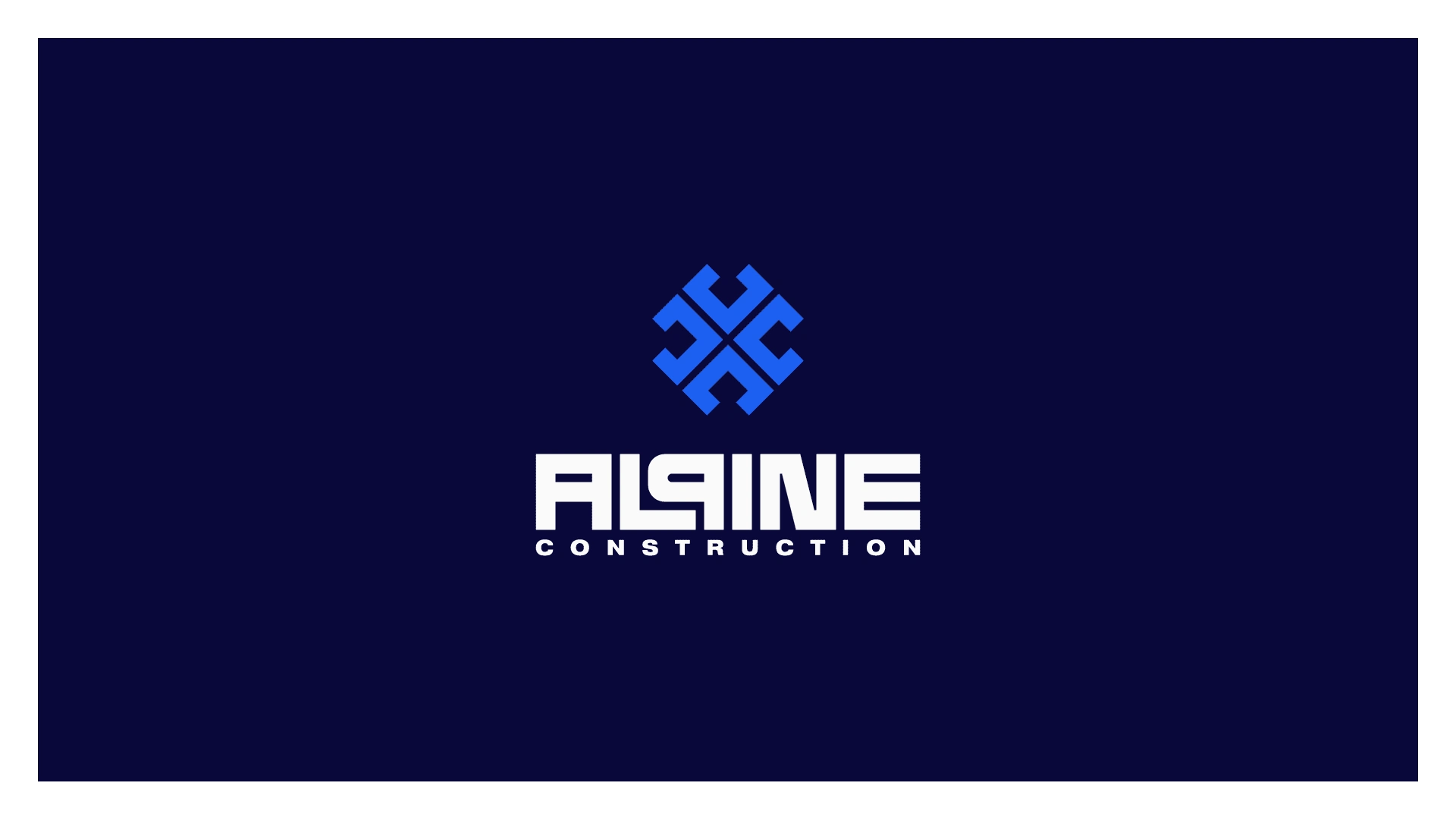
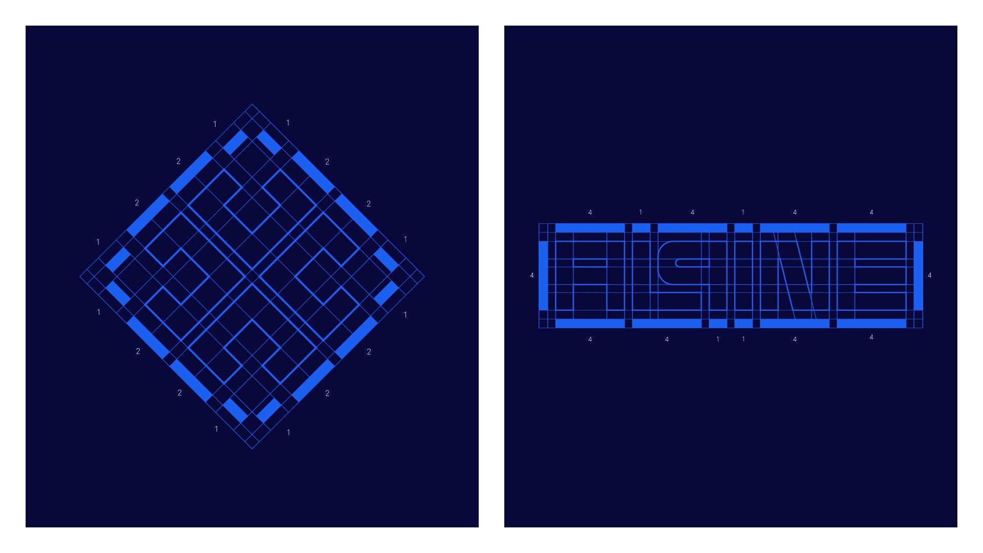
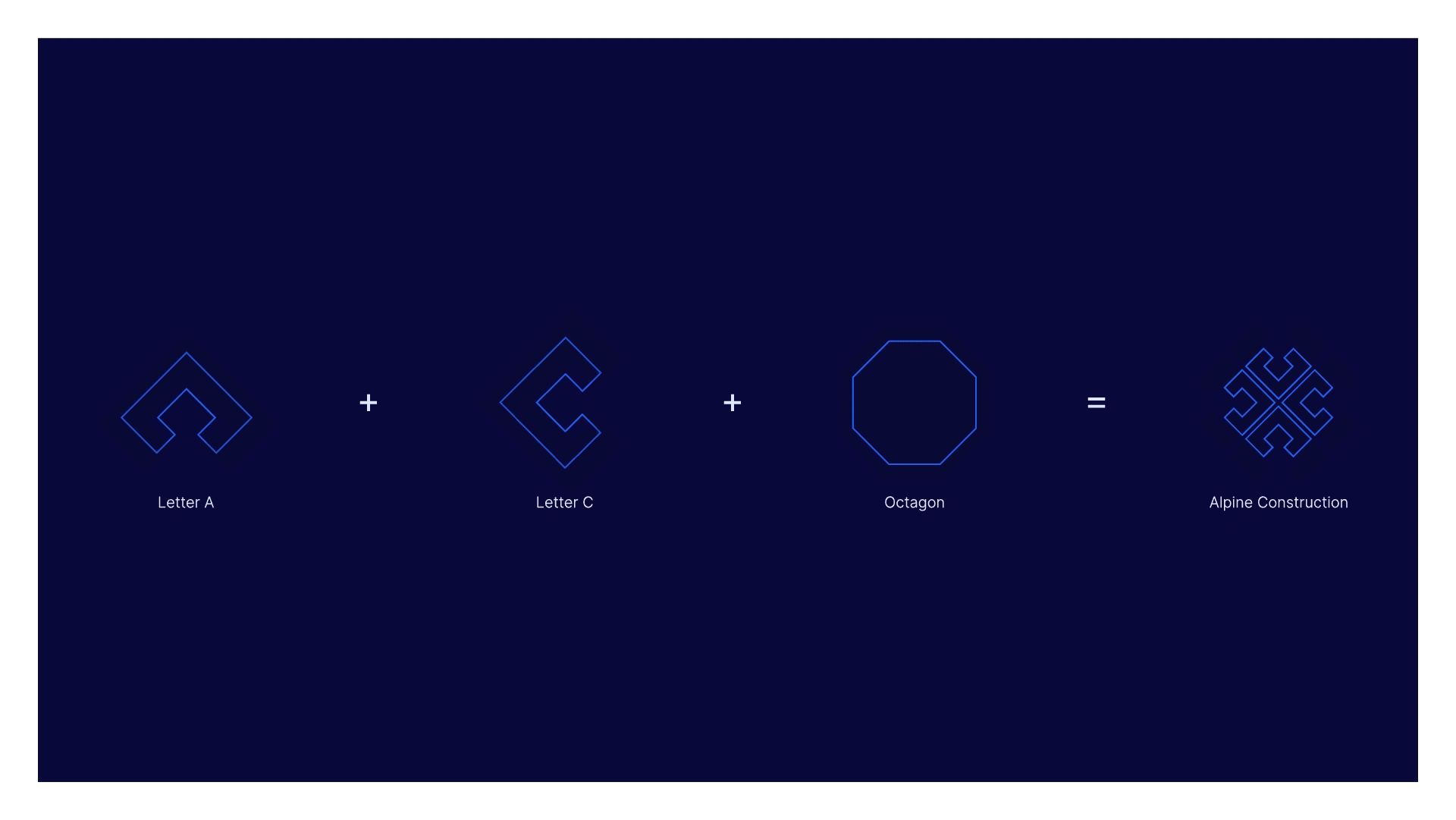
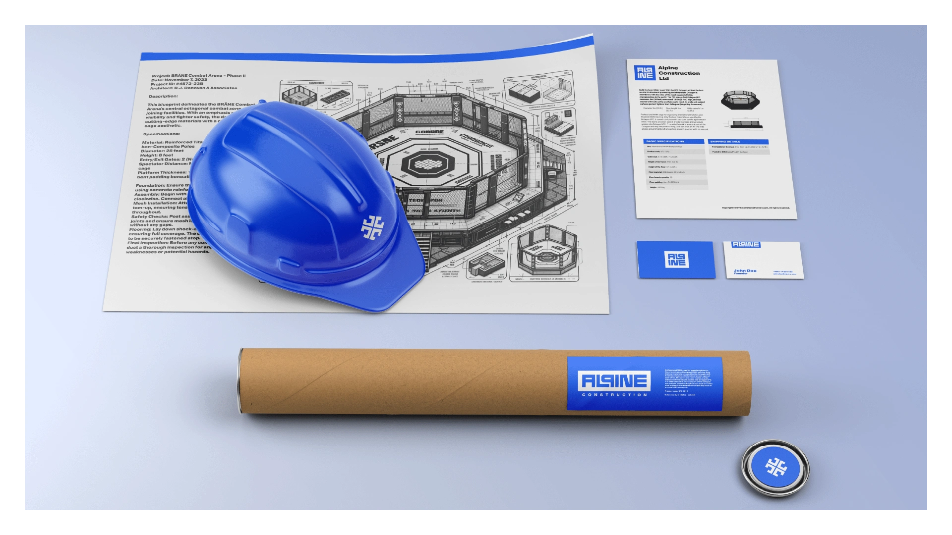
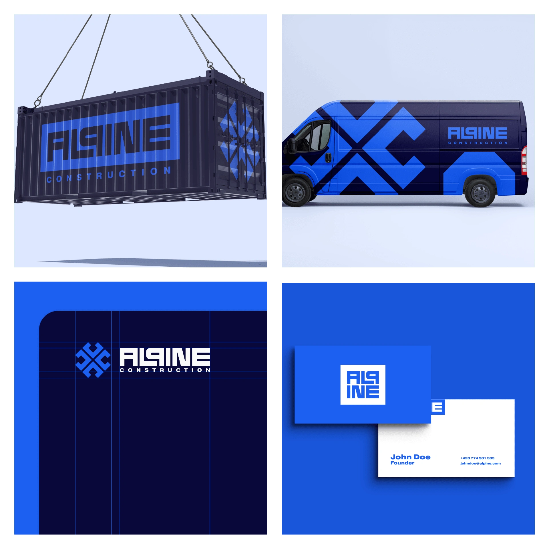
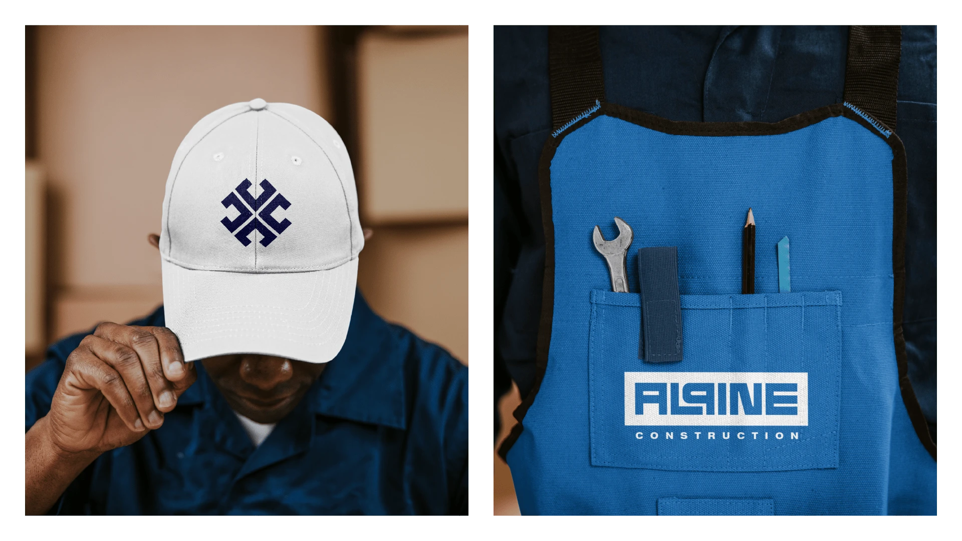
Alpine Construction's logo, featuring the initials "A" and "C" interwoven into a geometric octagon reminiscent of mixed martial arts cages, reflects the brand's essence of strength, resilience, and modernity. This design symbolises stability and interconnectivity, highlighting the company's expertise in constructing specialised sporting structures. The bold typography and precise lines convey durability and meticulousness. Variations in stacked and inline formats ensure flexibility across different media and branding materials, maintaining a consistent and adaptable brand image.
*This is a concept brand
Like this project
Posted Feb 13, 2025
Alpine stands at the forefront of Martial Arts training excellence, offering state-of-the-art cages and equipment.