Ariem AI Logo & Visual Identity Design
Miriany Guzman

Project: Ariem AI Logo & Visual Identity
Client / Brand: Ariem AI
Date: August — October 2025
Role: Lead Designer — concept development, symbol design, color direction, and typography
Overview/Challenge
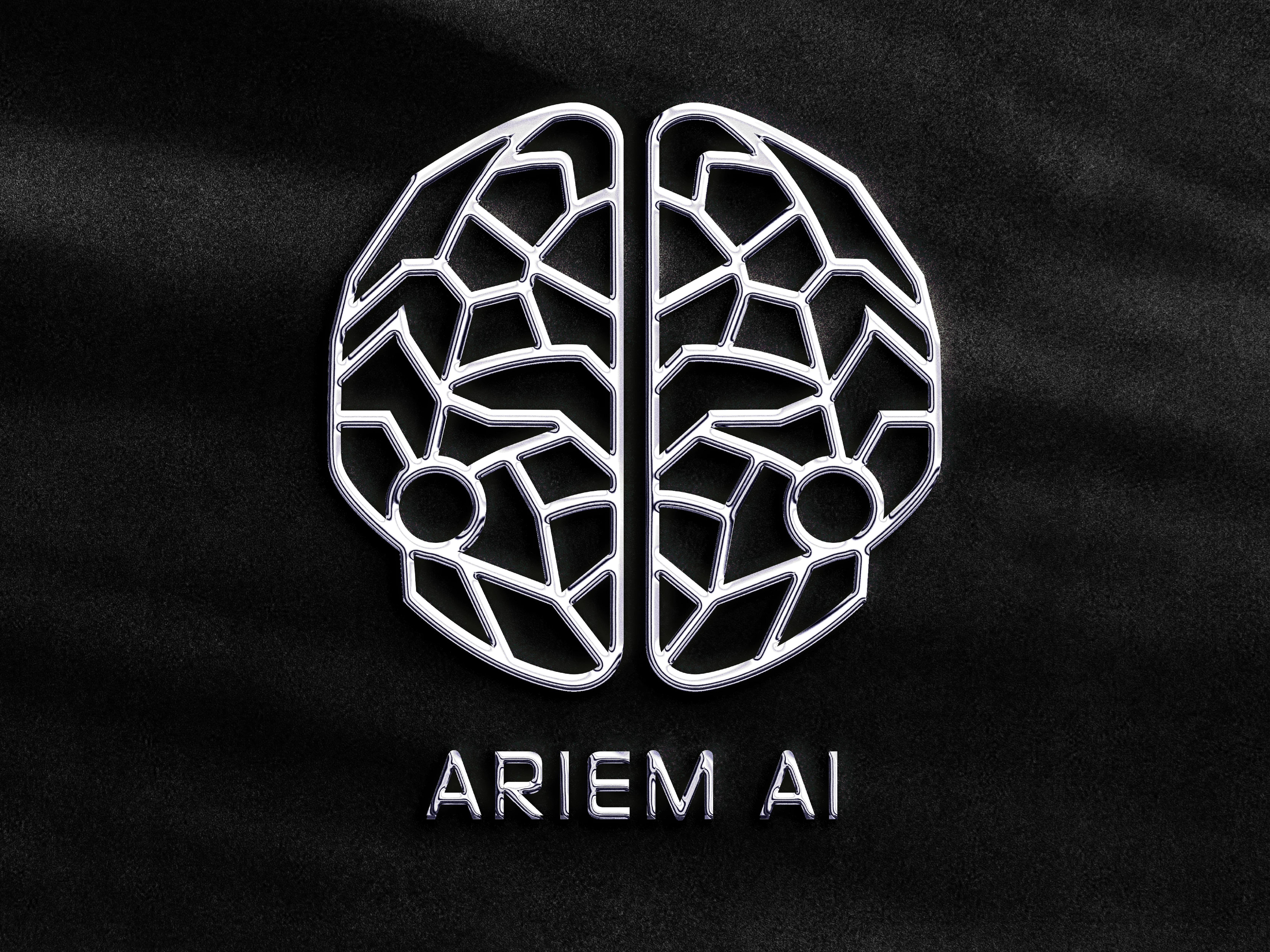
· Ariem AI needed a visual identity that expressed intelligence, structure, and cutting-edge technology. The challenge was to create a mark that felt both futuristic and clean—something visually striking yet professional enough for an AI-driven brand. The goal was to blend neural-inspired elements with modern geometry to convey innovation, precision, and digital sophistication.
My Approach/Solution
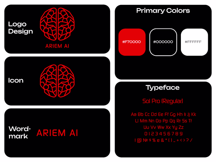
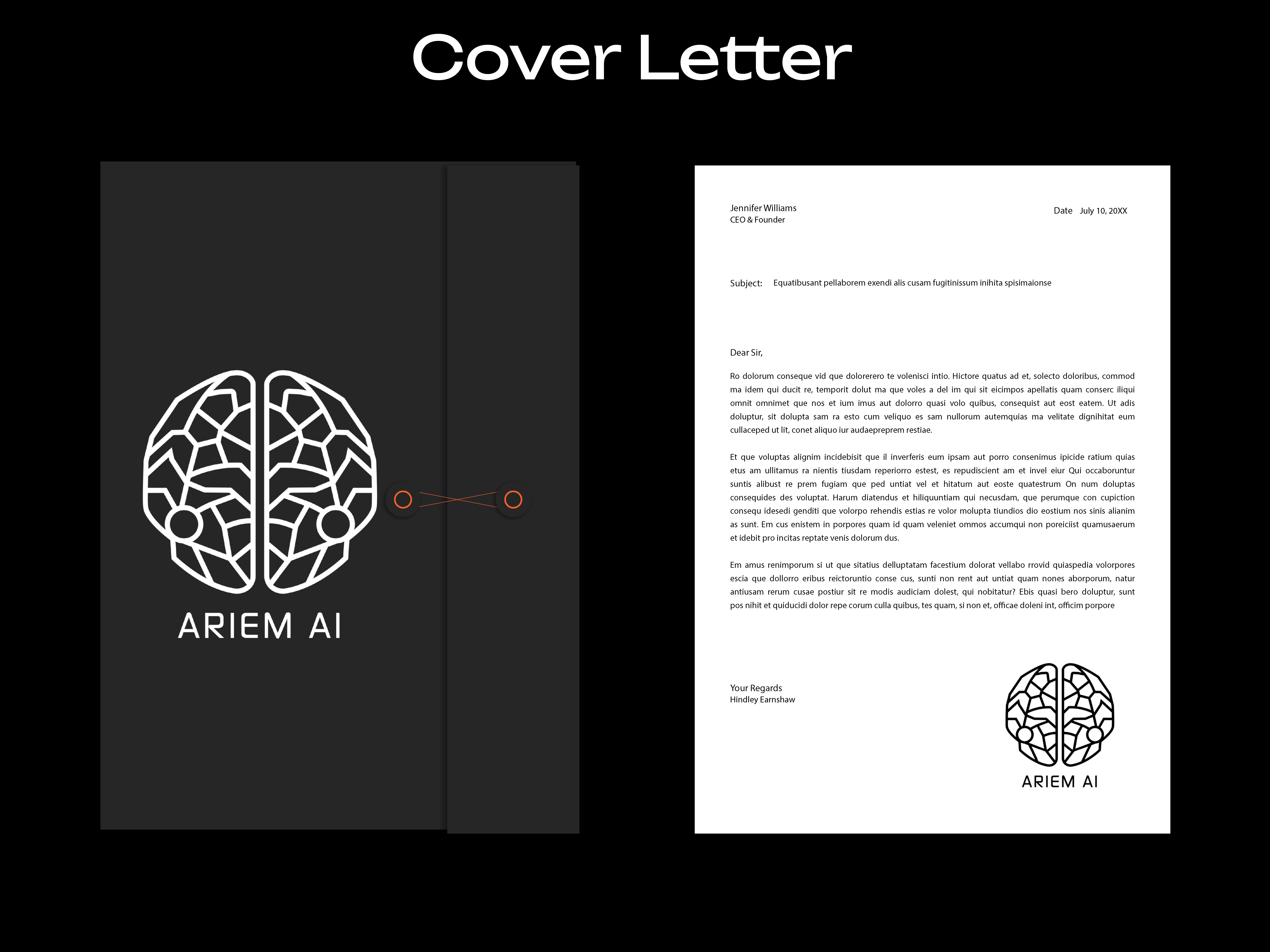
· I started by researching neural networks, digital systems, and geometric patterns found in AI branding. From there, I explored shapes that referenced the human brain, symmetry, and interconnected structures.
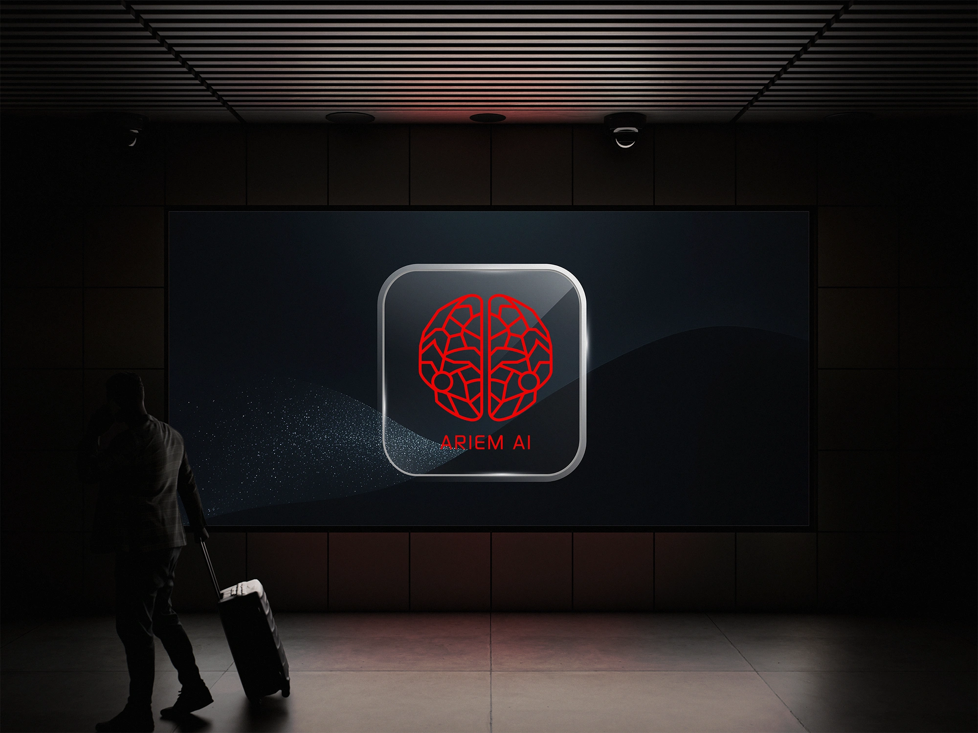
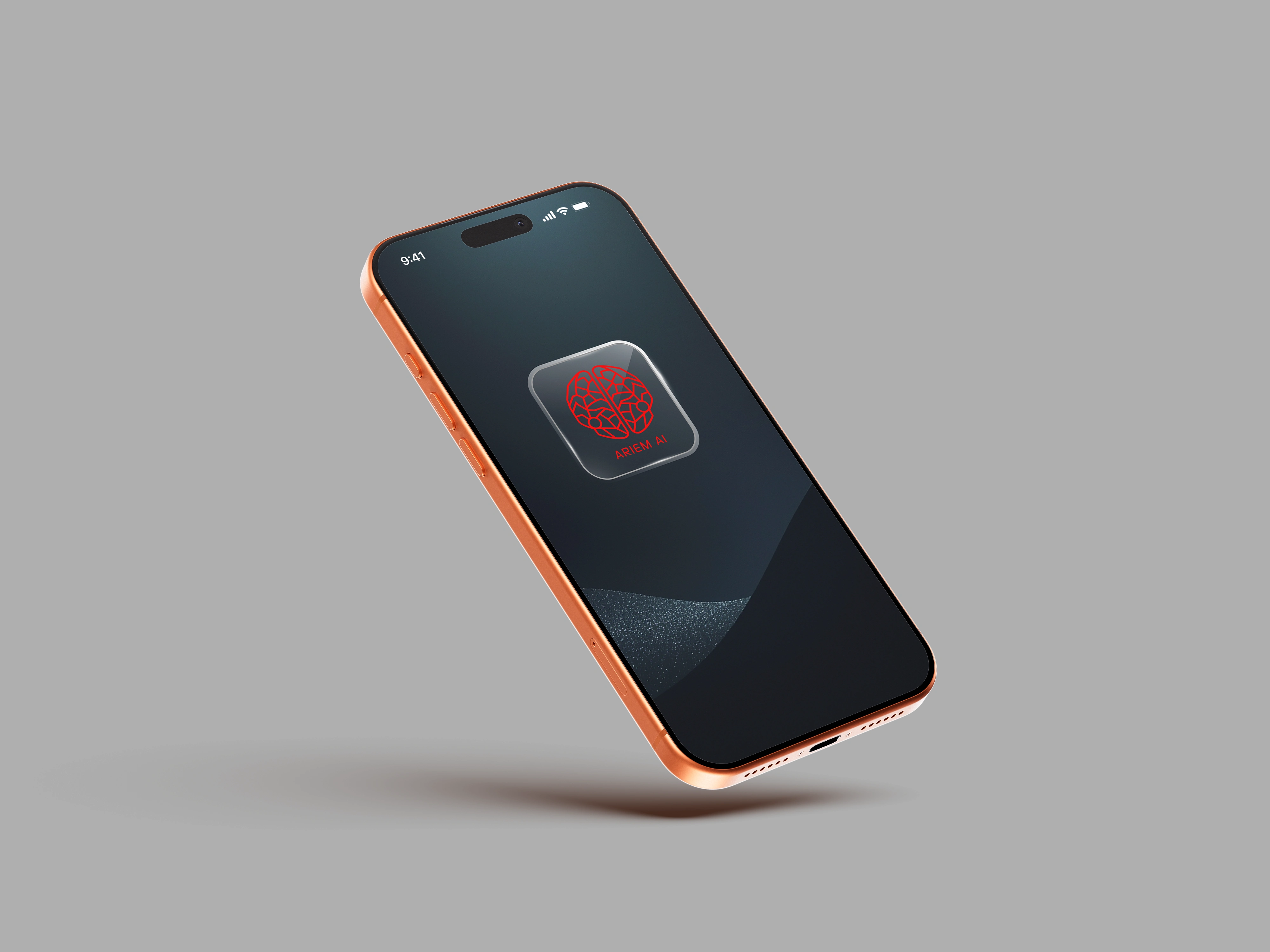
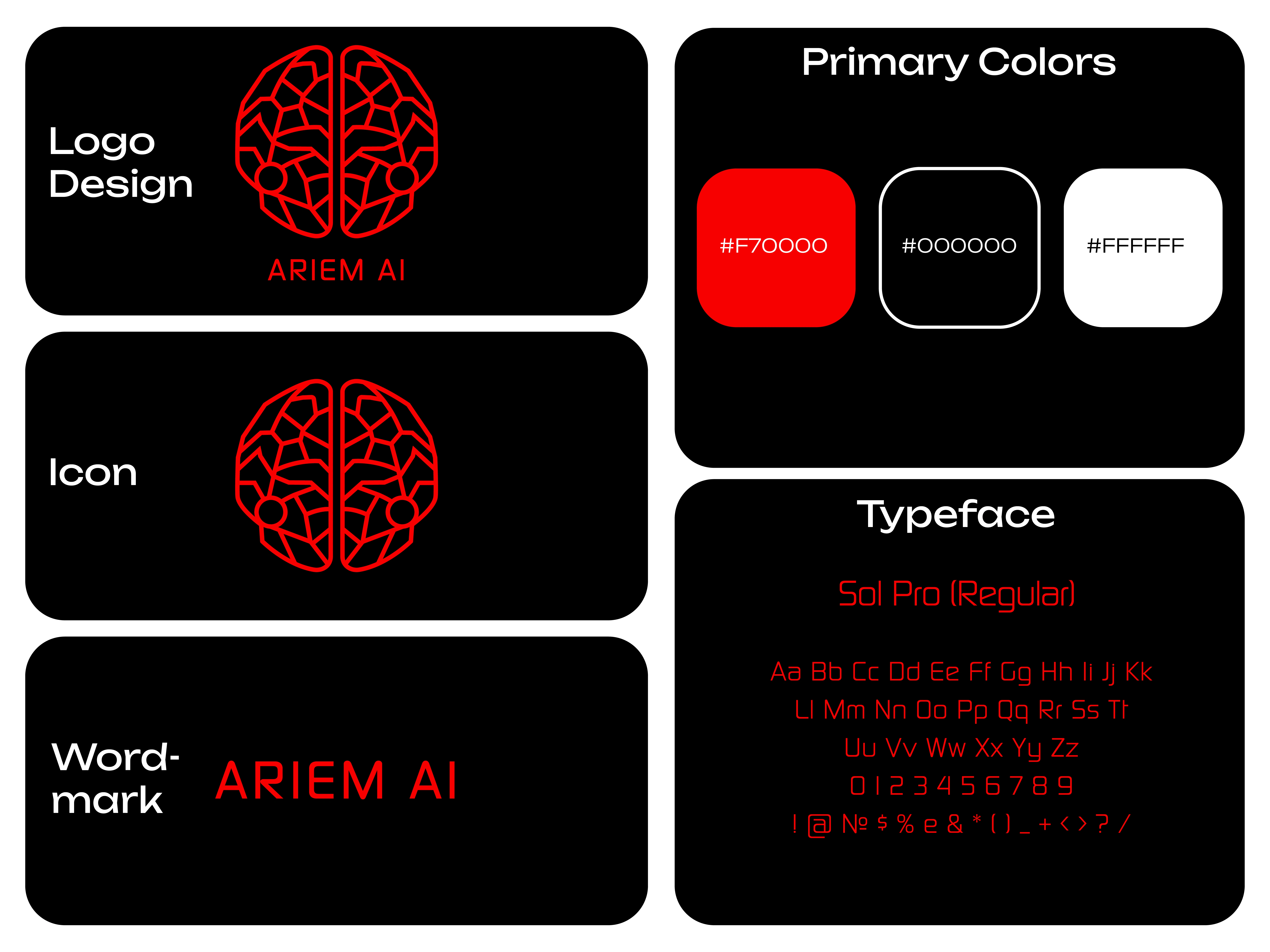
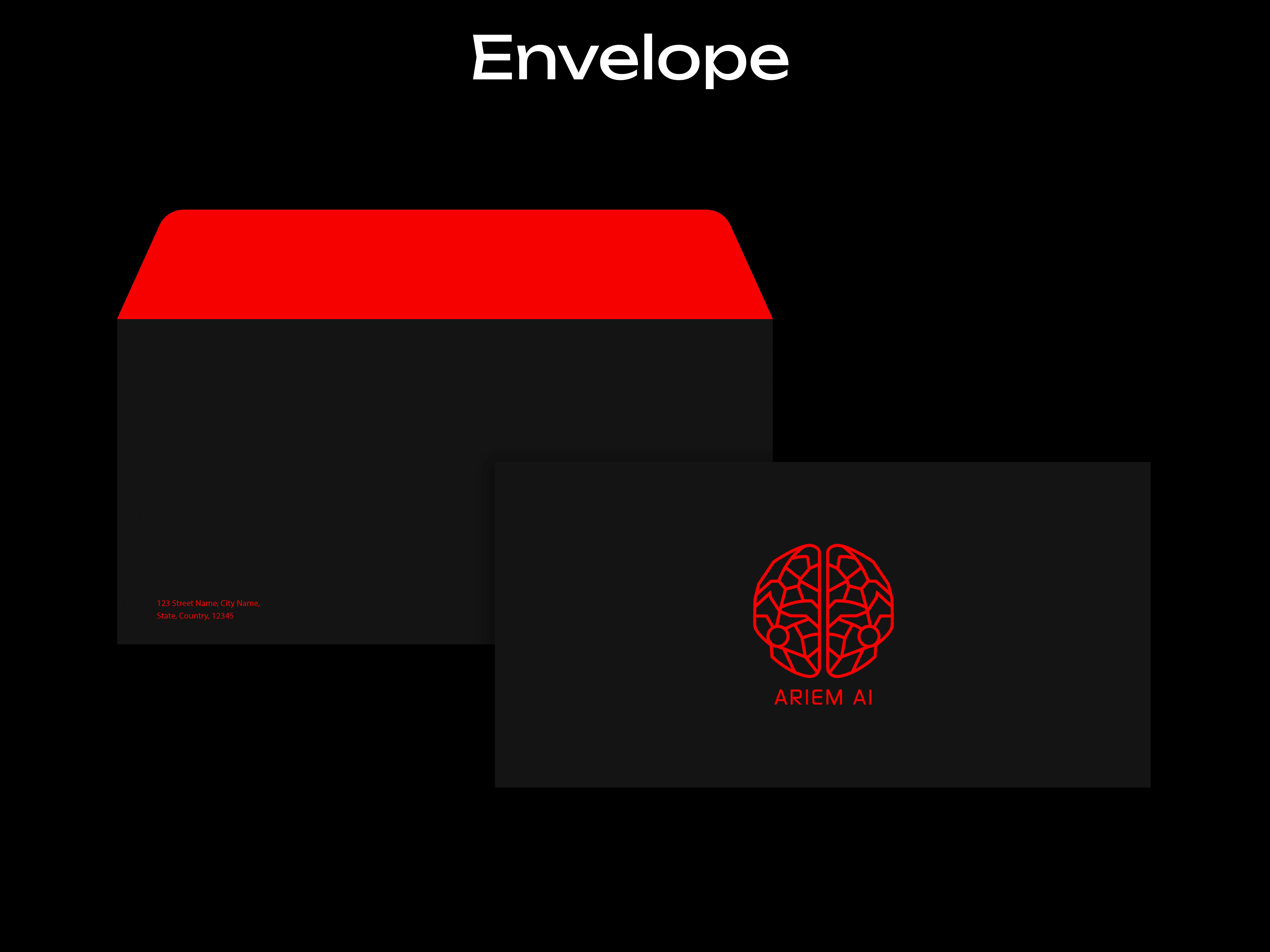
· I developed a stylized brain icon split into two mirrored hemispheres, each filled with a geometric network of angular lines representing data flow, machine learning pathways, and AI processing.
· Circular neural nodes were added to create focal points and balance the sharp geometry.
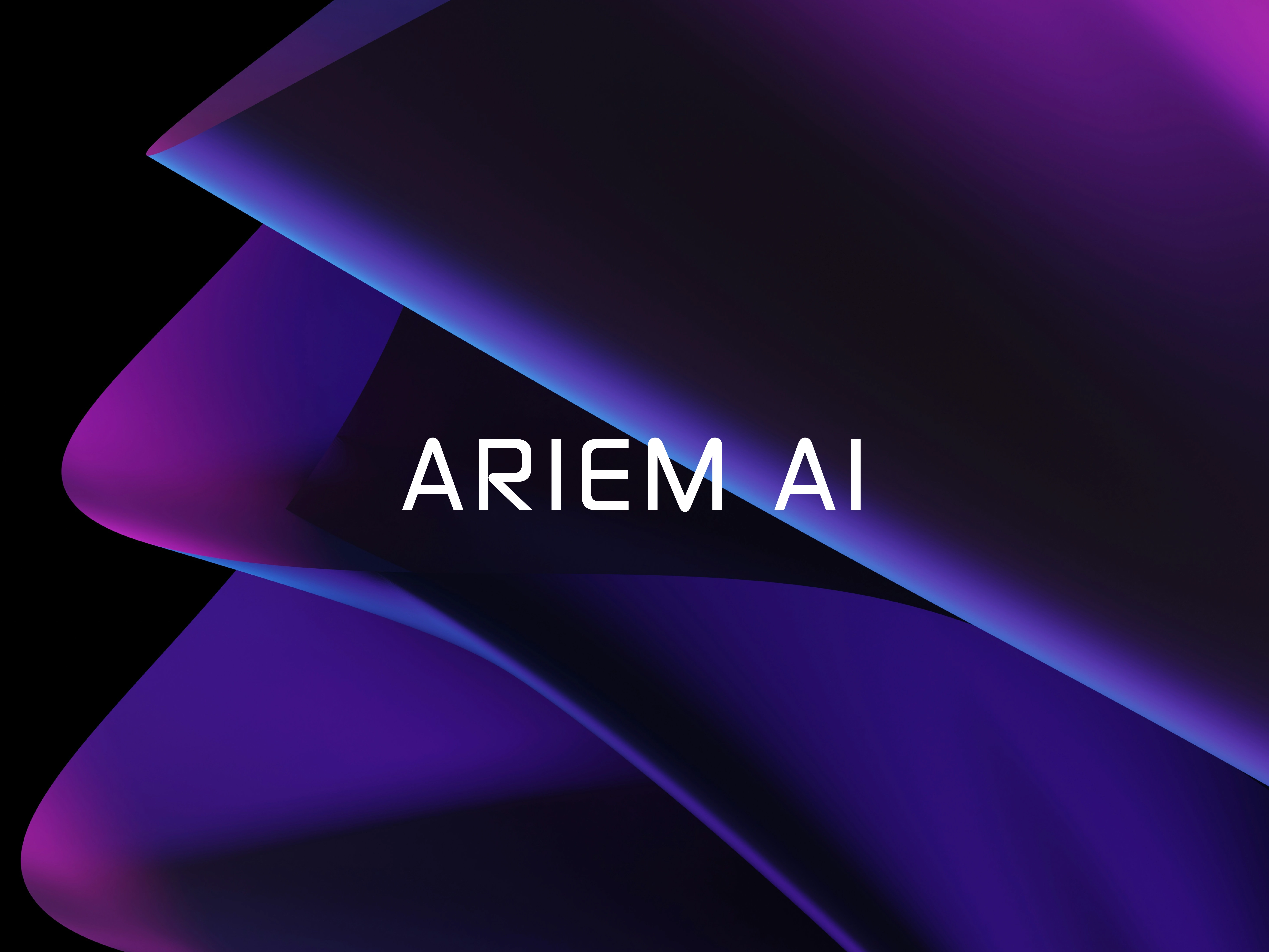
· A bold neon orange color was chosen to communicate power, clarity, and a high-tech identity.
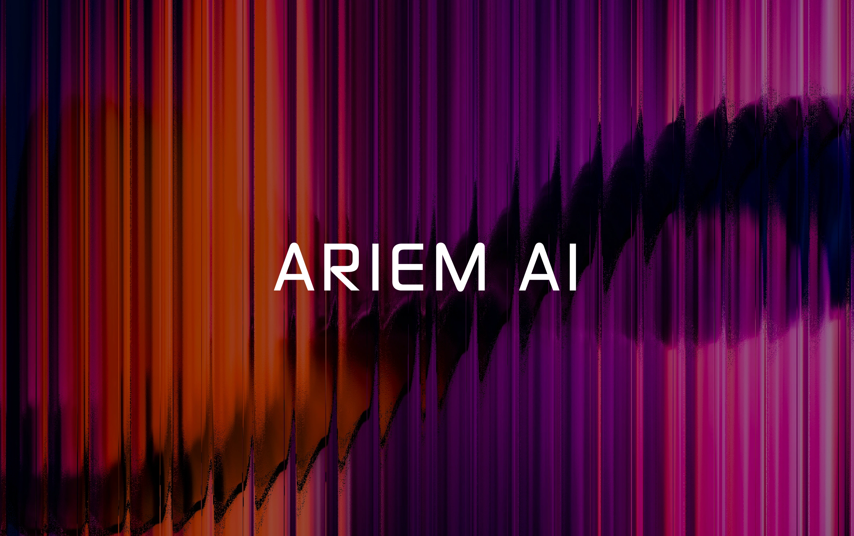
· For typography, I selected a clean, all-caps SOL PRO (Regular) font to maintain a modern, futuristic feel that pairs well with the complexity of the symbol.
Outcome/Result
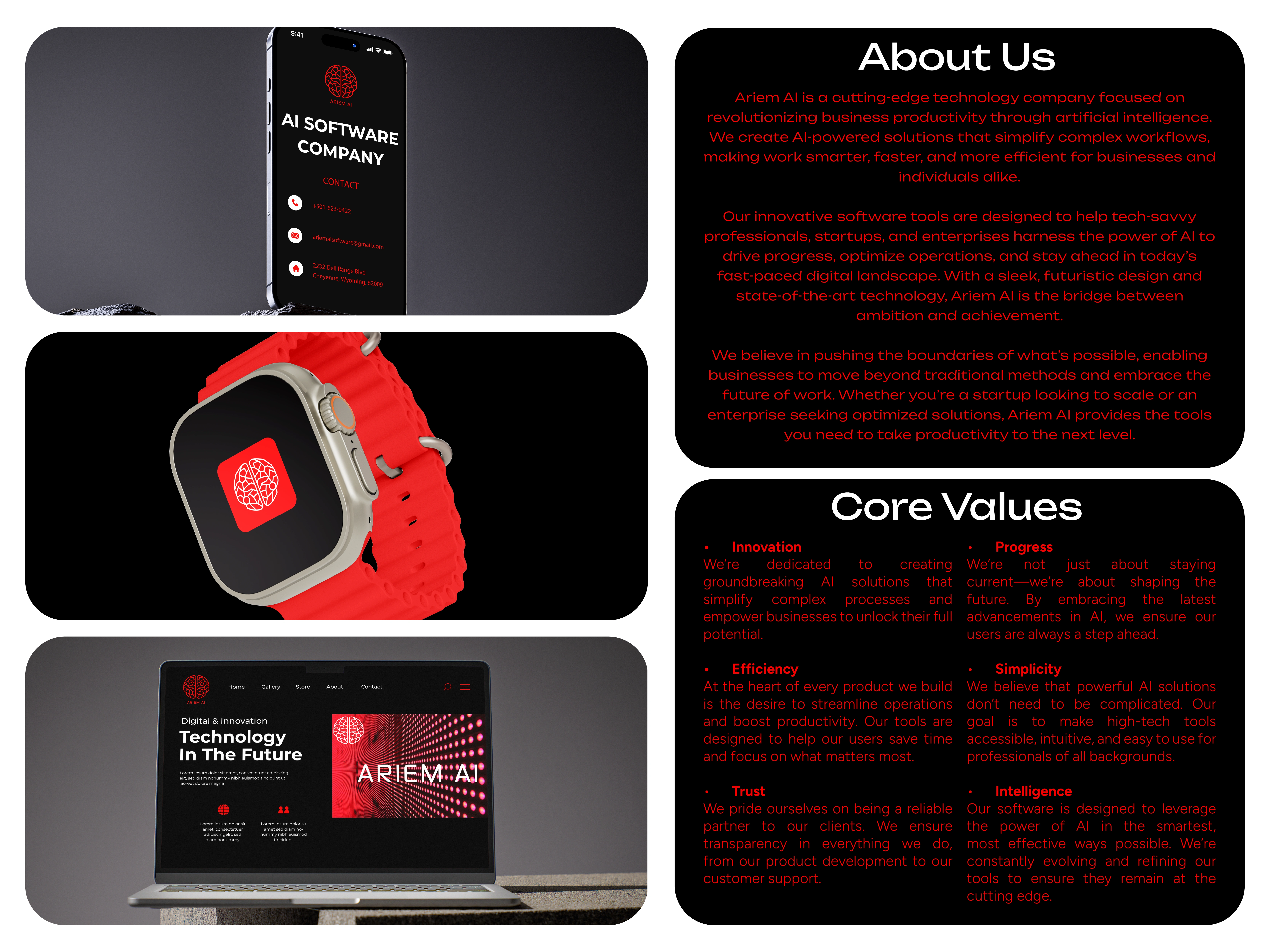
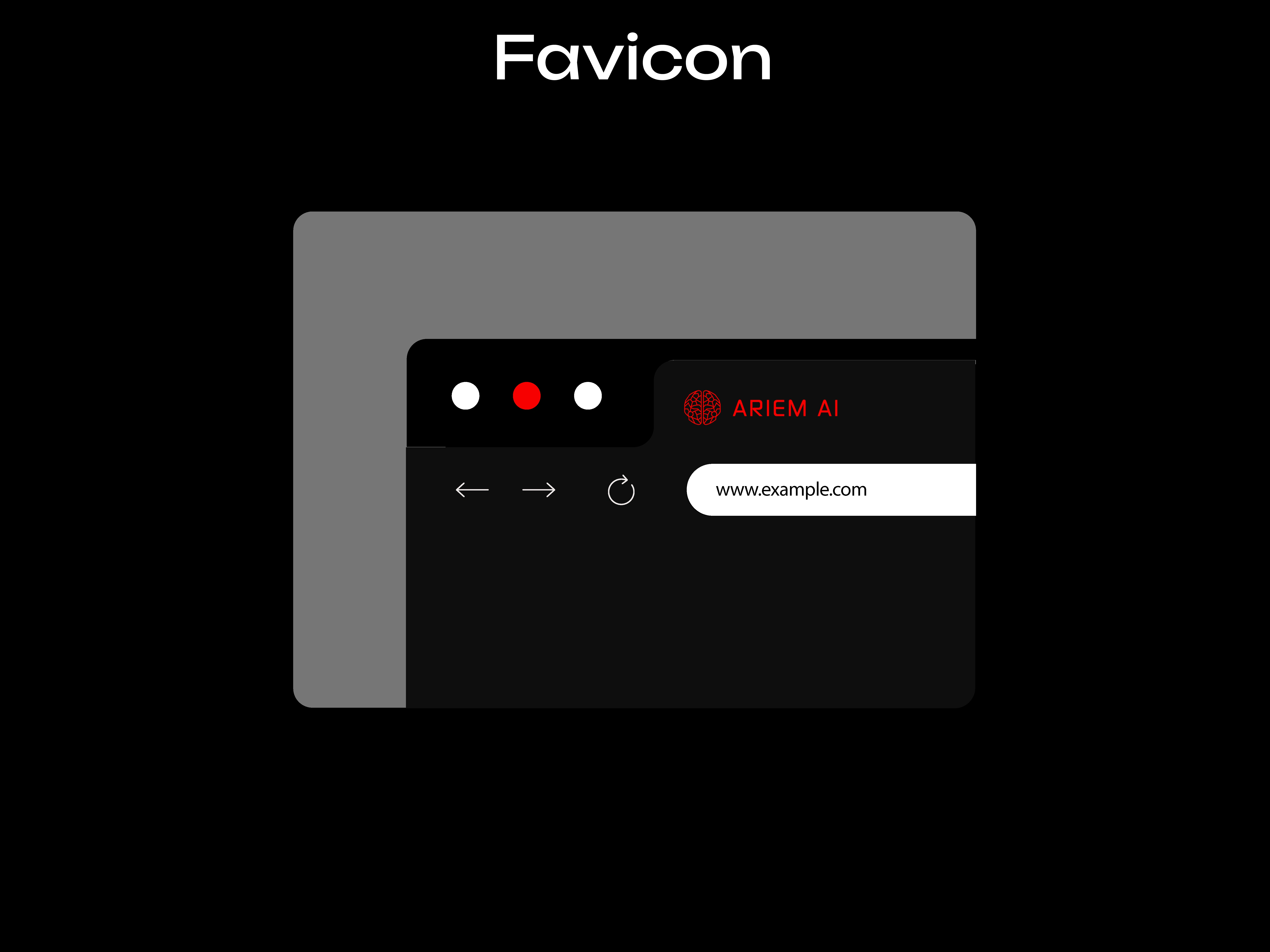
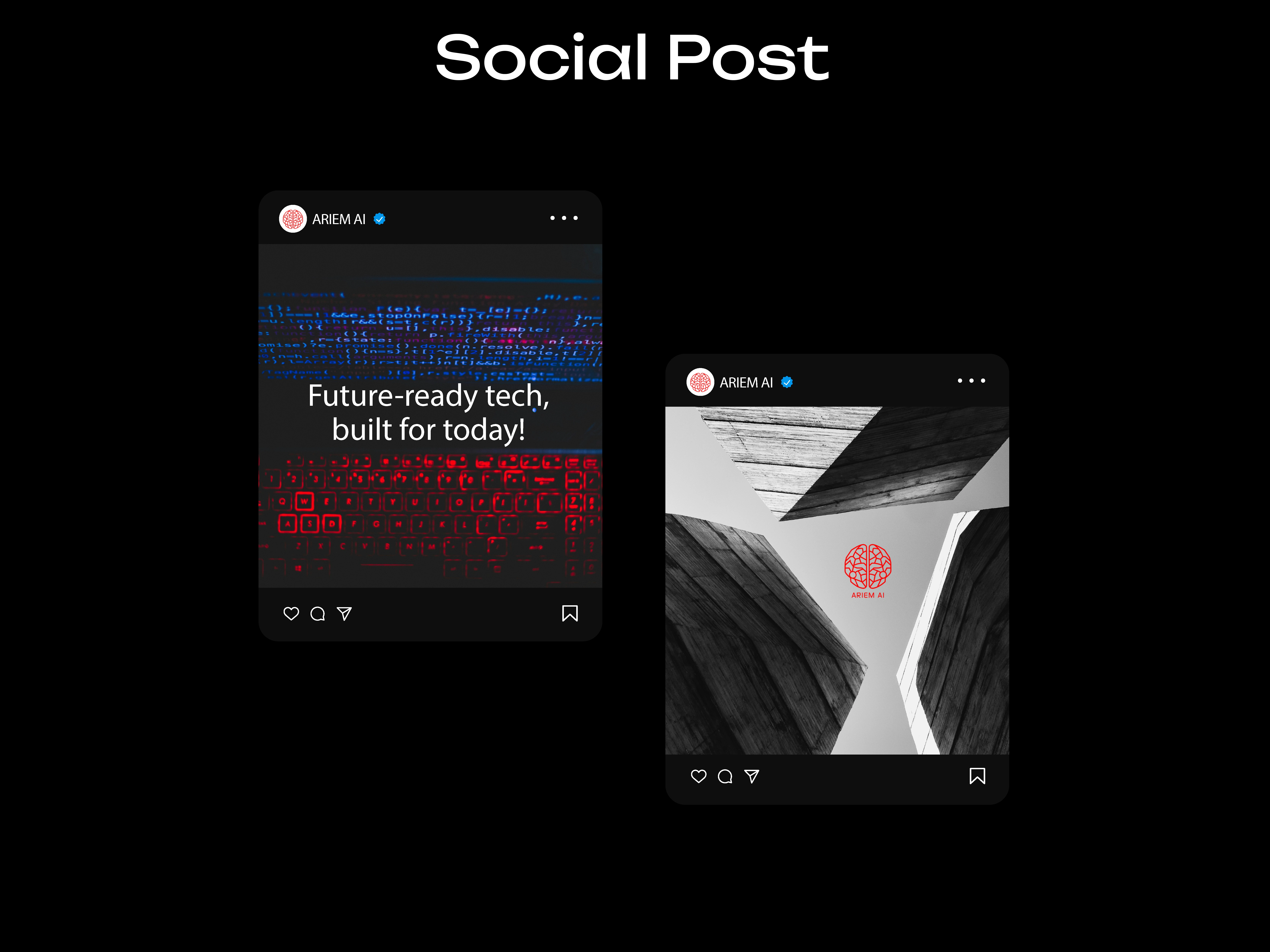
· The final design is bold, memorable, and highly versatile for digital platforms. It visually communicates innovation, intelligence, and structure—positioning Ariem AI as a sophisticated, forward-thinking technology brand.
Reflection/Learnings
· This project emphasized the importance of balancing complexity with clarity. The geometric network pattern works seamlessly with futuristic typography, capturing both the logic and creativity of artificial intelligence.
Like this project
Posted Nov 17, 2025
Designed a modern, tech-driven identity for Ariem AI using neural-network geometry and bold, futuristic visuals.
Likes
0
Views
11
Timeline
Jul 31, 2025 - Oct 30, 2025