L’espresso Aurora Logo & Visual Identity Design
Miriany Guzman

Project: L’espresso Aurora Logo & Visual Identity
Client / Brand: L’espresso Aurora
Date: (March – May 2025)
Role: Lead Designer — conceptualization, logo design, color palette, typography, and identity guidelines
Overview/Challenge
L’espresso Aurora needed a visual identity that reflected the warmth, richness, and artisanal quality of their coffee brand. The goal was to create a modern, minimal logo that felt inviting, sophisticated, and versatile across digital and print applications. The challenge was balancing a sleek, minimalist style with depth, dimension, and a sense of energy inspired by the brand’s name — “Aurora,” meaning dawn.
My Approach/Solution
I began with a brand discovery phase, understanding the brand’s values, coffee style, and the experience they wanted their customers to feel.
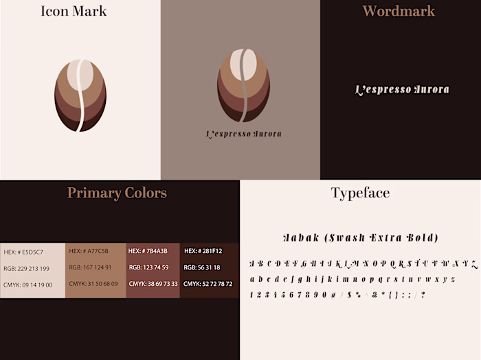
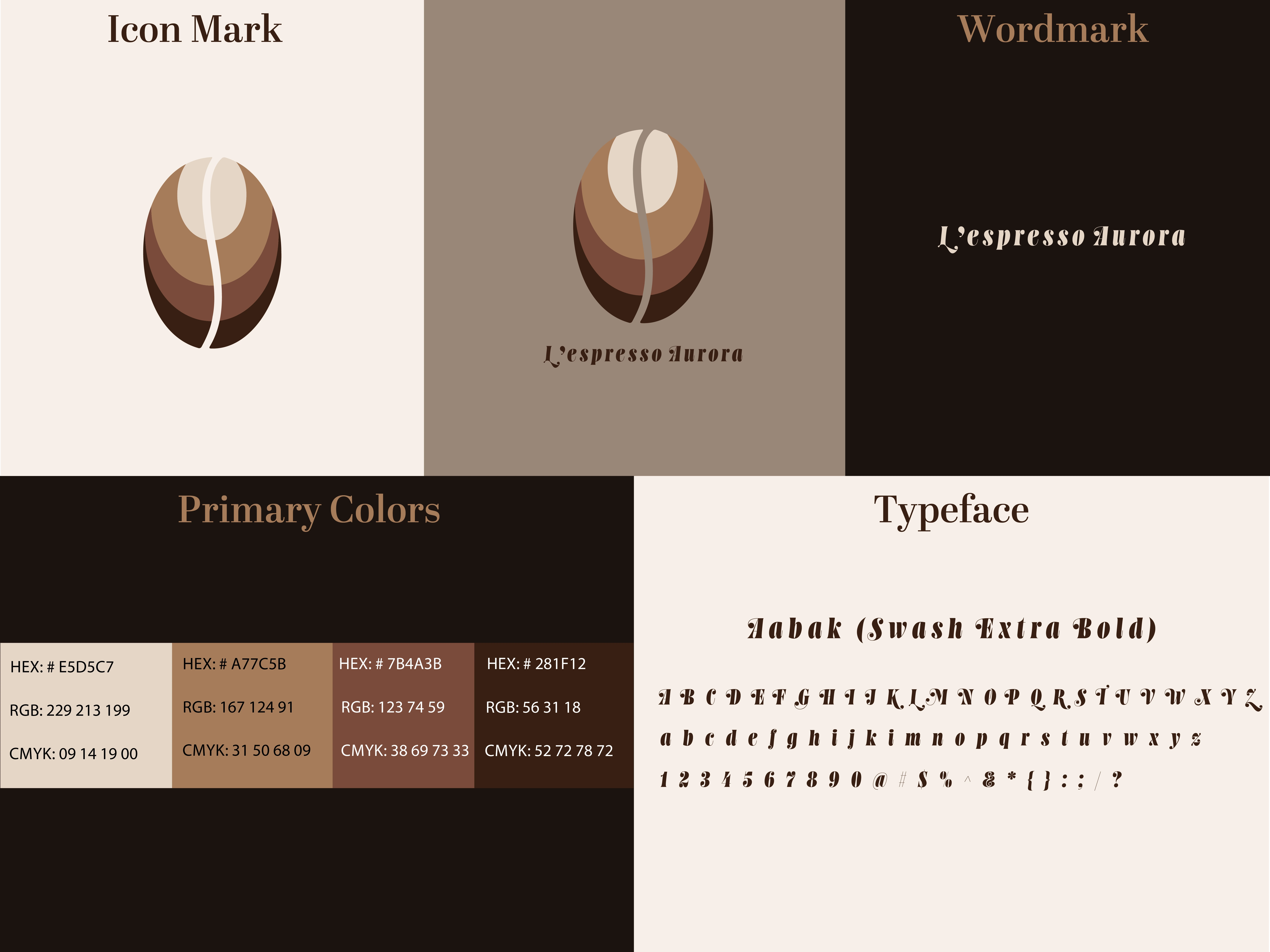
I explored visual metaphors related to coffee and sunrise, developing a stylized coffee bean as the central symbol. A flowing vertical line through the bean represents the natural seam of a coffee bean, the aroma rising from a fresh brew, and a sense of movement and energy.
I layered the bean with curved bands in light cream, warm caramel, and deep brown, creating depth, dimension, and a soft sunrise-like glow. This gradient structure conveys warmth, richness, and the premium nature of the brand while maintaining a clean, minimalist aesthetic.
The color palette uses neutral coffee tones to evoke comfort, sophistication, and natural elegance.
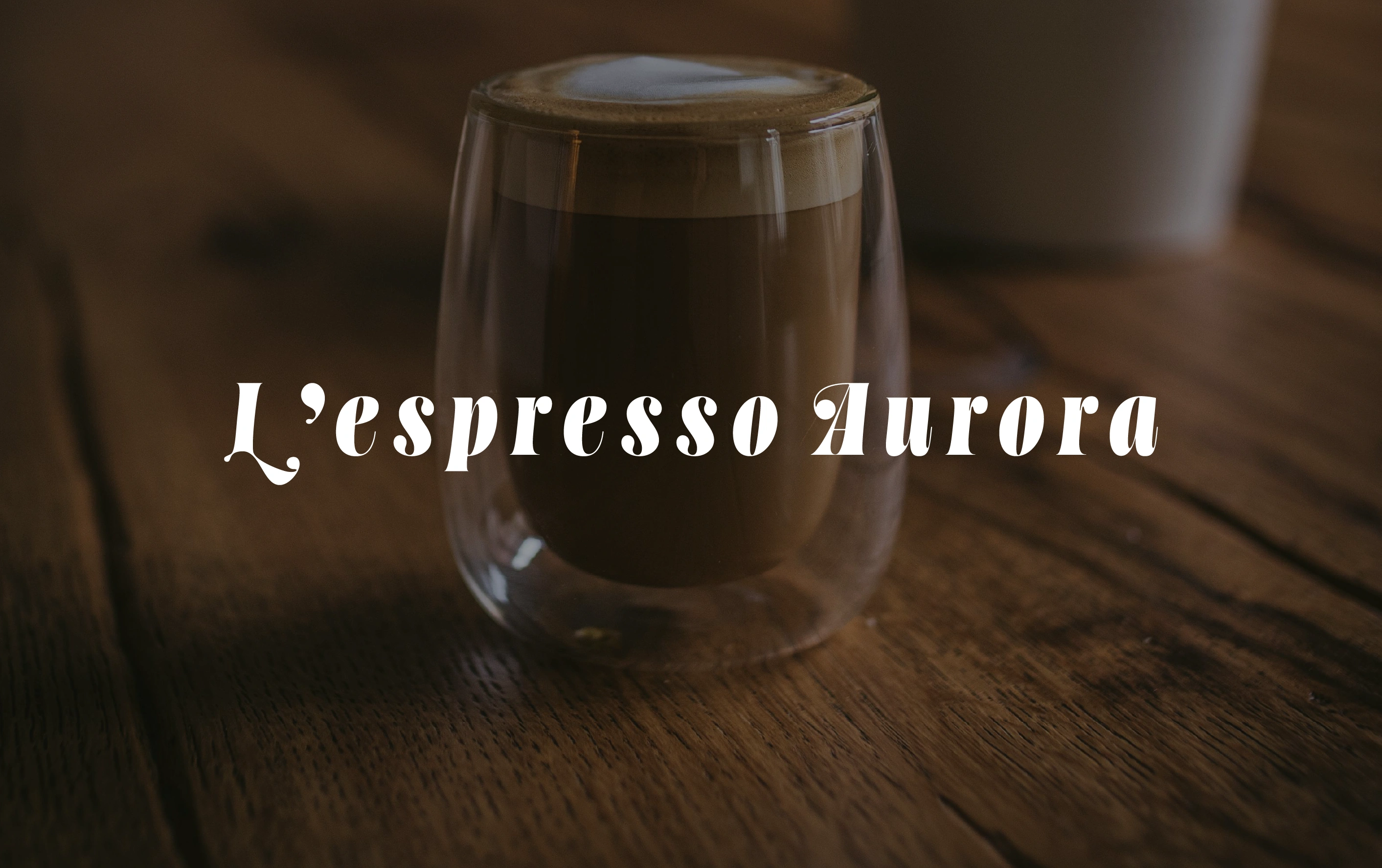
For typography, I chose a bold, stylized font called Aabak (Swash Extra Bold) it displays soft curves, complementing the smooth lines of the logo. The text communicates artisanal quality, European café inspiration, and a handcrafted personality, harmonizing with the icon.
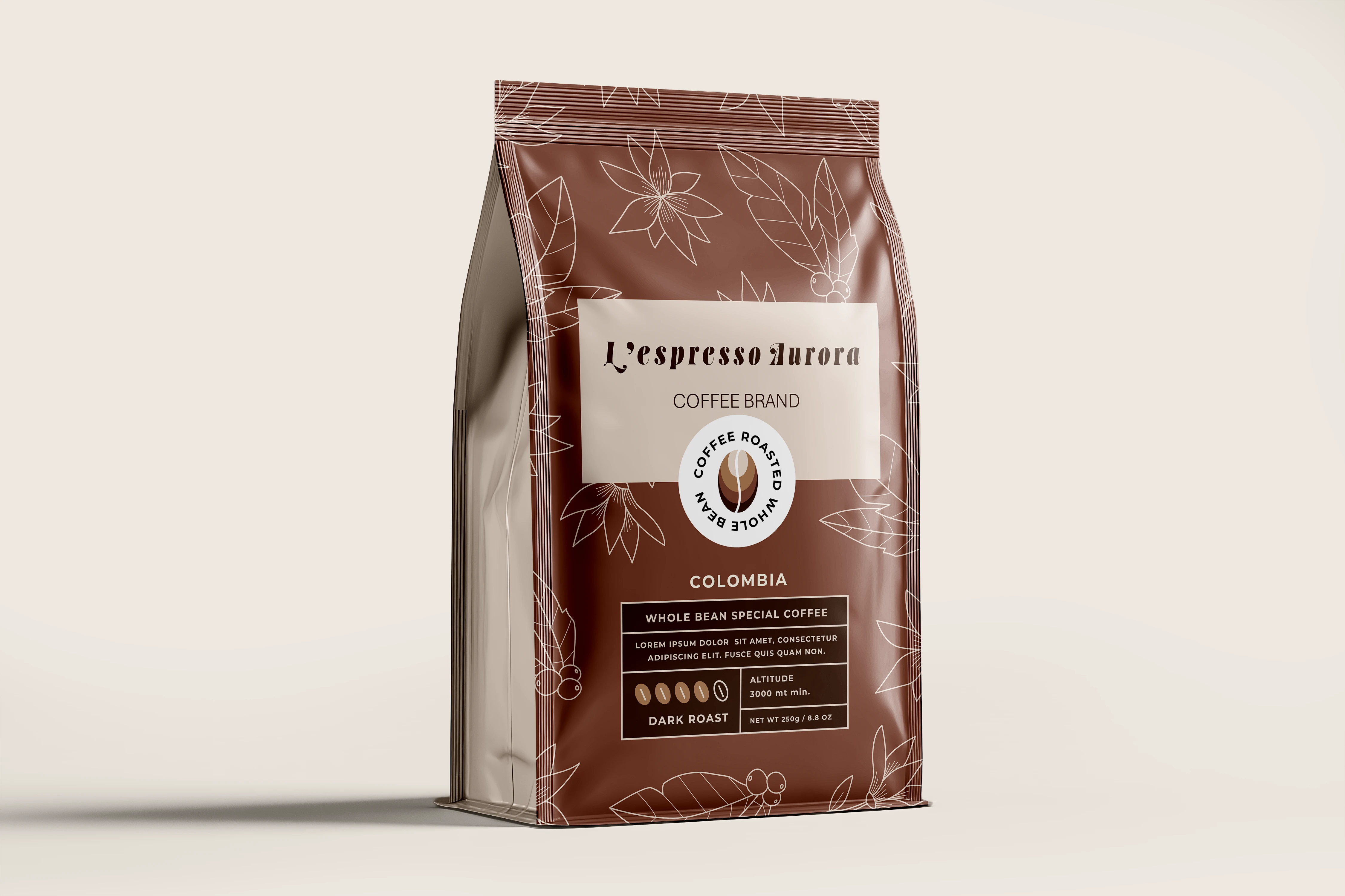
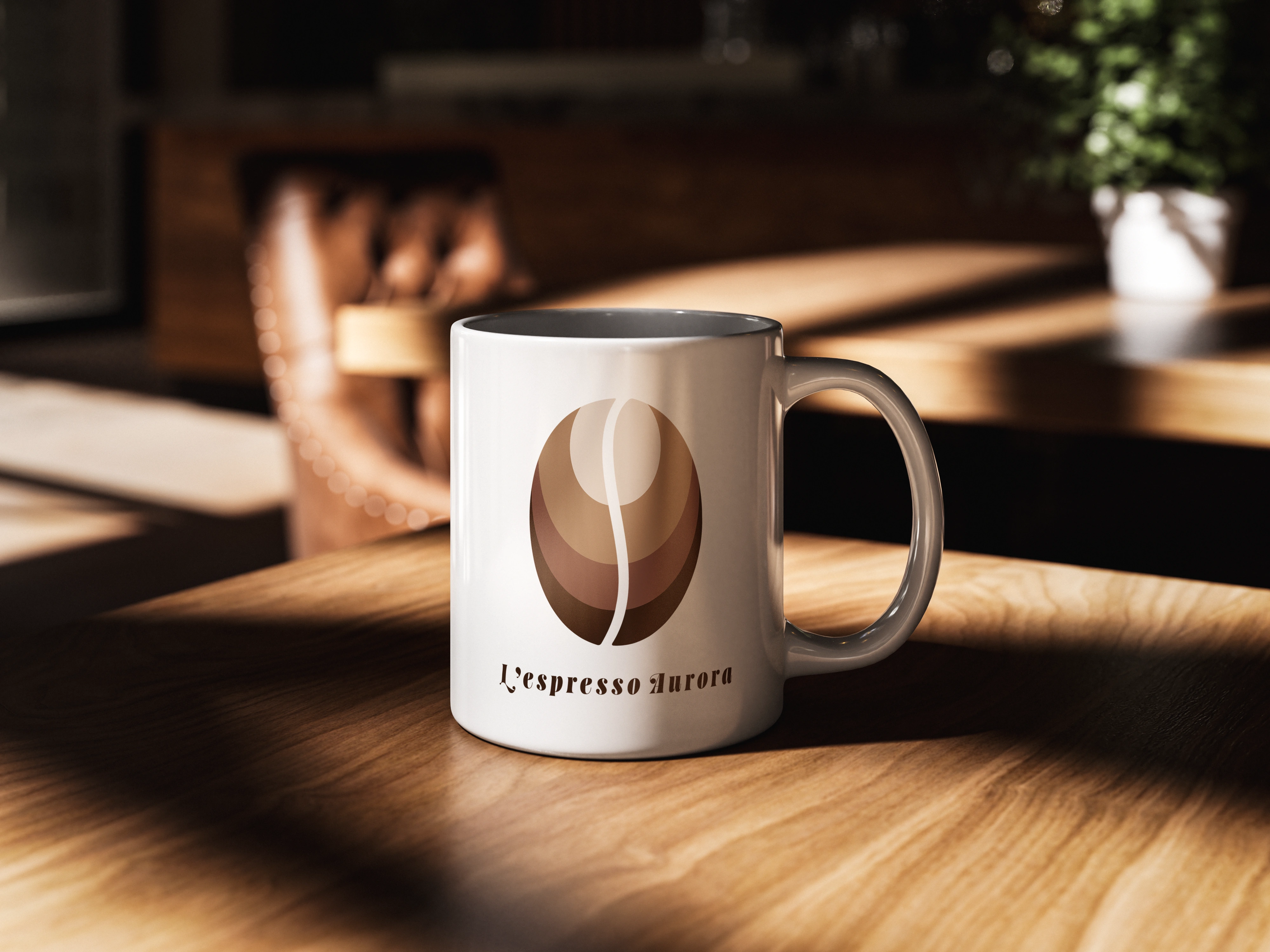
I created a brand guideline, including logo usage, color specifications, typography rules, and placement guidelines, ensuring consistent application across cups, menus, packaging, and signage.
Outcome/Result
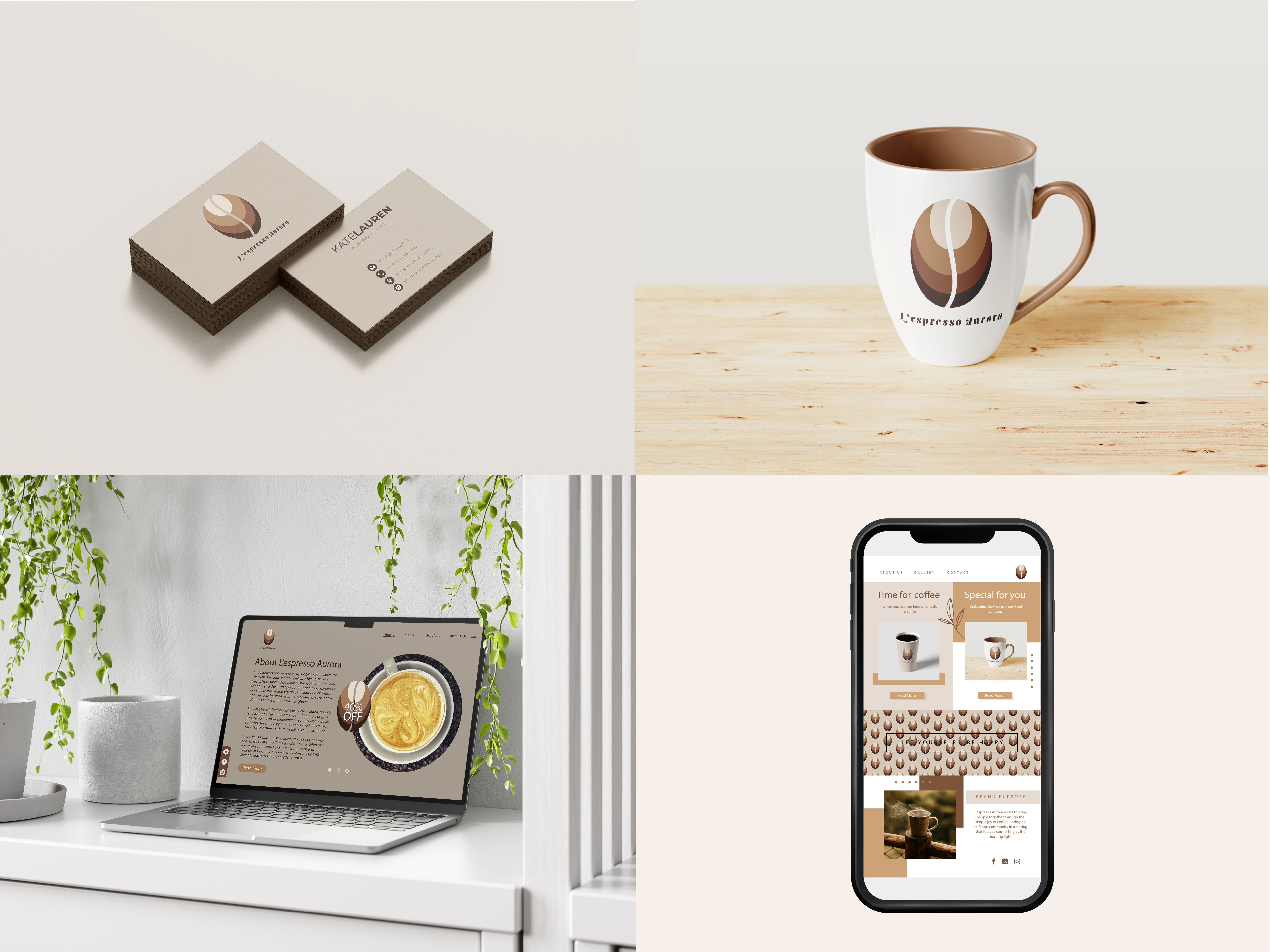
Delivered a versatile, minimal logo system (different shades of brown representing the coffee bean and various colors of coffee) suitable for digital and print.
Provided a brand guide for consistent usage and visual cohesion.
The logo communicates warmth, sophistication, and artisan quality, giving L’espresso Aurora a memorable, premium brand presence.
Reflection/Learnings
Layered gradients and curved geometry can give minimal designs depth and dimension without adding clutter.
Incorporating symbolic details (like the bean seam and sunrise reference) adds subtle storytelling to the logo.
Early development of brand guidelines ensures consistent application across multiple touchpoints, maintaining a cohesive identity from day one.
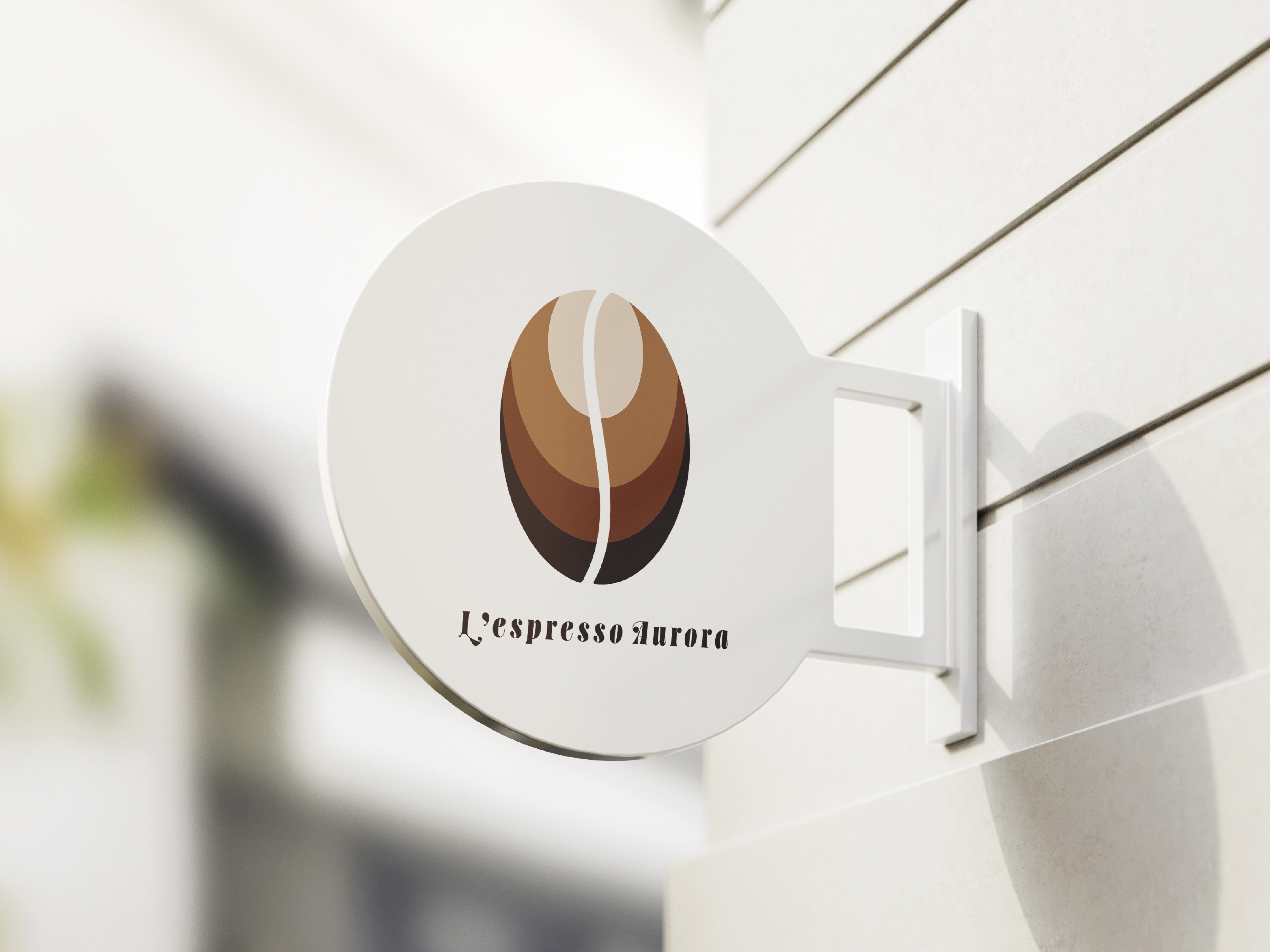
Sign Mockup
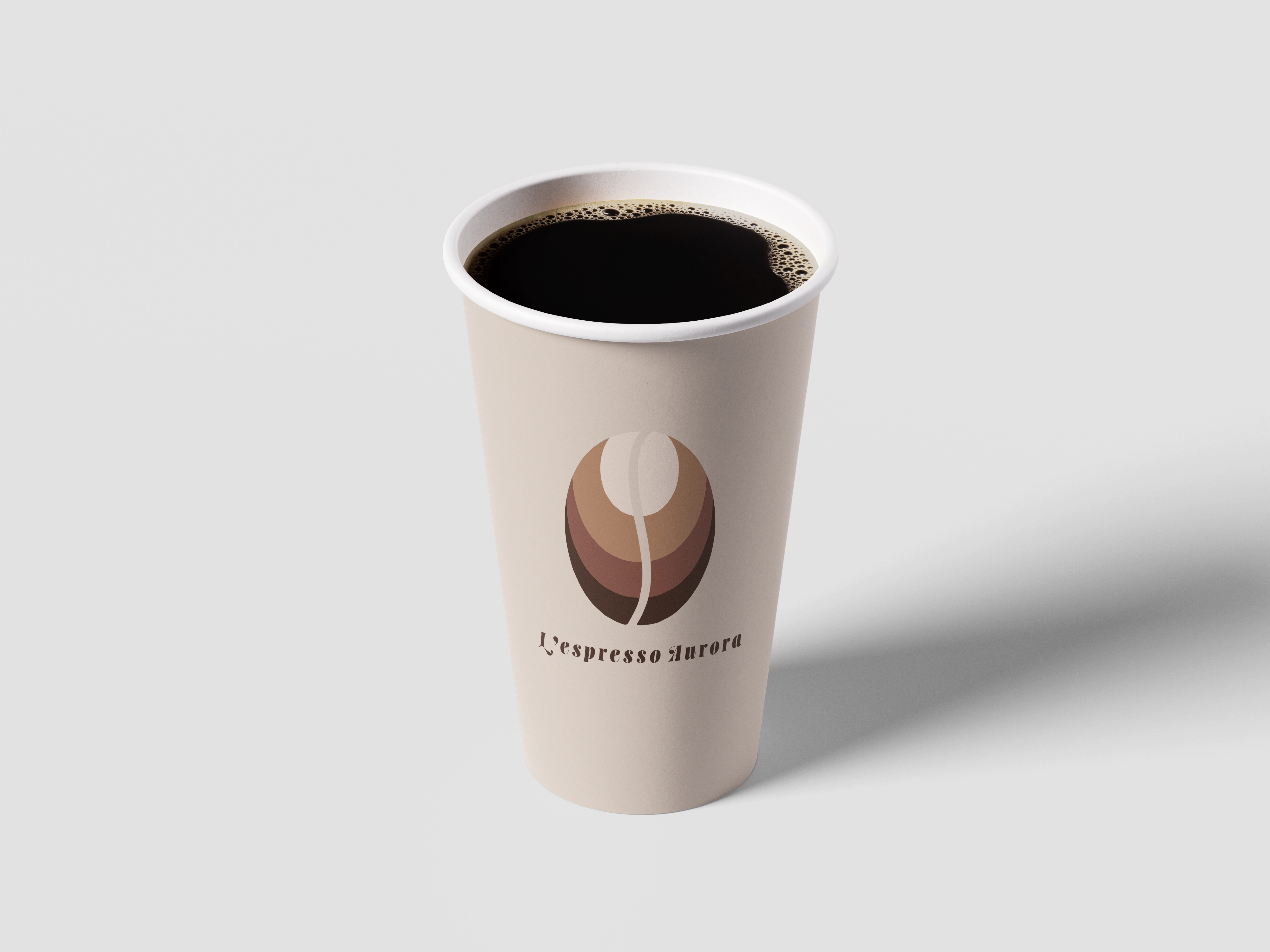
Black Coffee Mockup
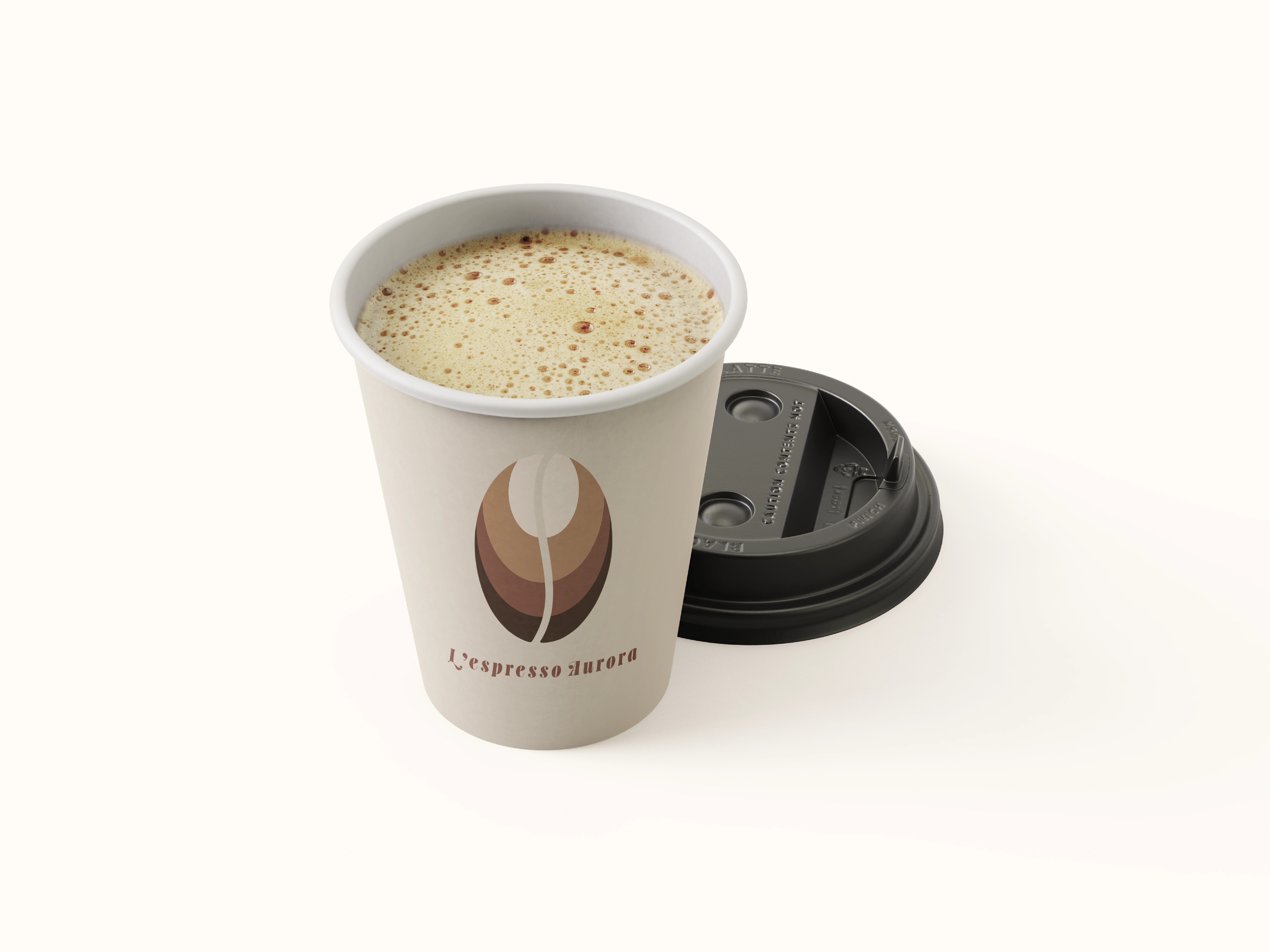
Coffee with Cream Mockup
Like this project
Posted Nov 17, 2025
Designed a modern, minimal visual brand for L’espresso Aurora, featuring a stylized coffee bean, warm tones, and inspiration drawn from artisan coffee culture.
Likes
0
Views
12
Timeline
Feb 28, 2025 - May 30, 2025