Oun AI Real Estate Webflow Website Design

Victor Adebayo


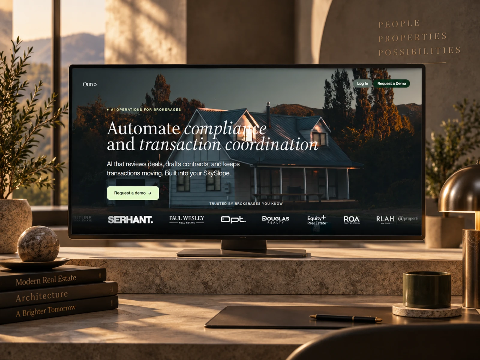
Oun — AI Transaction Coordination Platform
Webflow Design · UX/UI Design · SaaS Website · Responsive Development
Project Type: AI SaaS / PropTech / Real Estate Technology
Primary Objective: Explain a complex AI workflow product clearly, build trust with real estate professionals, and generate qualified demo requests
Platform: Webflow
Role: Web Designer & Webflow Developer
Deliverables: UX/UI Design · Responsive Web Design · Webflow Development · SaaS Landing Page · Product UI Presentation · Lead Generation · Interactions & Animations · SEO & Performance Optimization
1. Project Overview
Oun is an AI-powered real estate operations platform designed for brokerages, teams, and independent agents.
The product helps automate some of the most time-consuming parts of a real estate transaction, including compliance reviews, document drafting, transaction coordination, appointment scheduling, deadline tracking, and follow-ups. It is also designed to work directly with existing transaction-management workflows such as SkySlope.
The goal of the website was to turn that technical functionality into a clear, credible, and conversion-focused SaaS experience.
Instead of explaining AI through technical terminology, I structured the website around what real estate professionals care about most:
moving deals faster, reducing repetitive admin work, managing risk, and getting more time back.
2. The Challenge
Oun solves a complex operational problem.
Real estate transactions involve contracts, signatures, deadlines, compliance checks, inspections, communication, scheduling, and multiple stakeholders. The platform automates many of these workflows, but presenting everything at once could easily overwhelm a first-time visitor.
The main UX challenge was to:
Explain the product quickly
Make AI automation feel practical rather than abstract
Clearly communicate the value to agents and brokerages
Demonstrate how Oun fits into existing workflows
Build confidence around compliance automation
Explain multiple capabilities without creating information overload
Show the product interface in context
Differentiate individual-agent and brokerage use cases
Keep demo conversion visible throughout the page
Maintain clarity across desktop, tablet, and mobile
The website needed to make a sophisticated operations platform feel simple enough to understand within a few minutes.
3. Design Strategy
I structured the experience around four principles:
Value → Proof → Product → Conversion
Lead With the Business Outcome
The hero does not begin with a long technical explanation.
Instead, it immediately communicates the core value proposition around automating compliance and transaction coordination, followed by a direct Request a Demo CTA.
This gives decision-makers an immediate understanding of what Oun does and what they should do next.
Translate Features Into Outcomes
Rather than presenting automation as a long feature checklist, I organized the experience around recognizable benefits:
Execute transactions more efficiently
Reduce repetitive administrative work
Manage deals from anywhere
Reduce errors and rework
Keep deadlines and transactions moving
This makes the product more relatable to agents, transaction coordinators, and brokerage operators.
Show the Product
Because workflow software is easier to understand visually, product interface imagery plays an important role throughout the experience.
Screens demonstrate compliance findings, contract workflows, transaction timelines, and integration behavior.
This turns abstract capabilities into something visitors can immediately picture inside their day-to-day workflow.
Reduce Adoption Friction
One of the strongest messages is that Oun integrates with SkySlope rather than forcing teams to abandon the workflow they already use.
The website explains that deals can sync automatically, findings appear inside the existing workflow, and decisions can sync back.
This addresses a major SaaS adoption concern: “Will my team need to learn an entirely new system?”
4. UX/UI Design
Hero Section
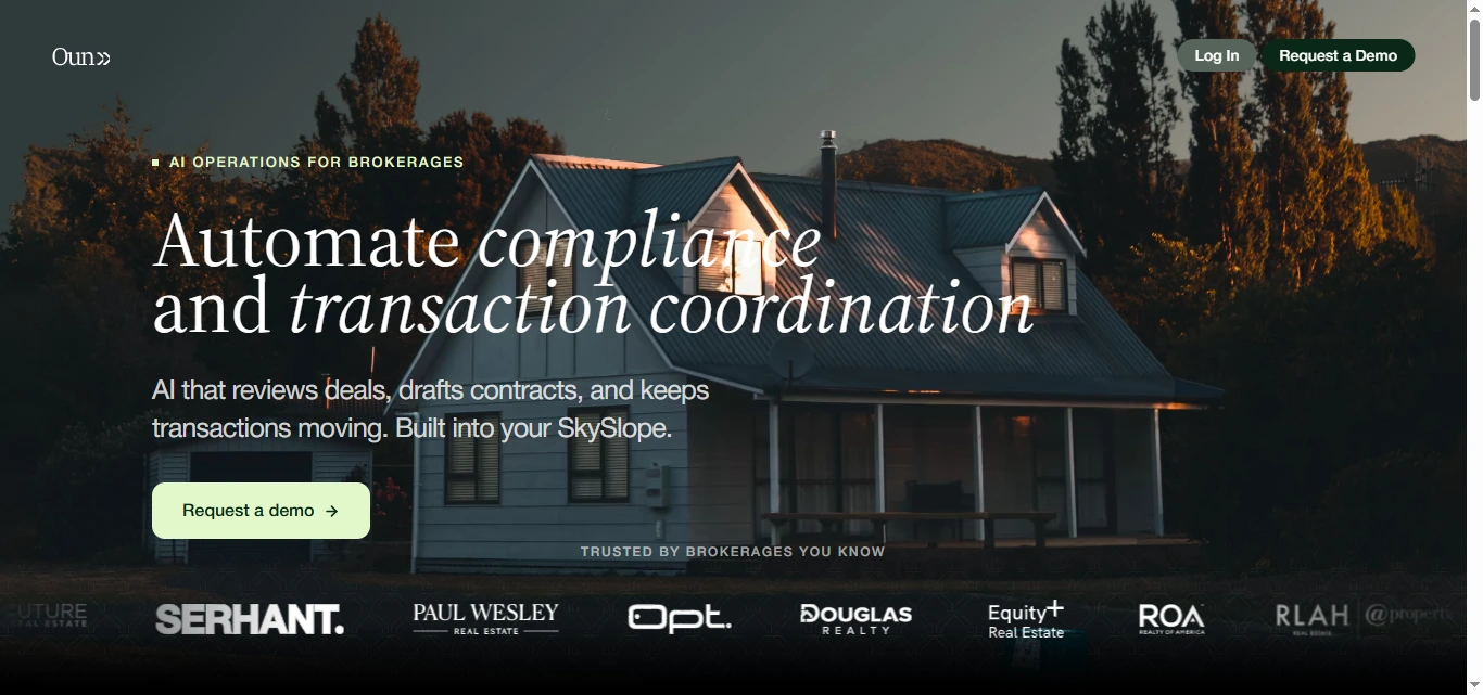
The hero was designed to communicate three things immediately:
What is it?
AI operations for real estate.
What does it automate?
Compliance and transaction coordination.
What should I do next?
Request a demo.
The interface avoids unnecessary messaging and keeps the opening experience focused on the product’s strongest value proposition.
Visual Hierarchy
The landing page follows a deliberate progression:
Value Proposition → Trust → Business Benefits → Core Product → Integration → Capabilities → User Segments → Demo Request
This progression mirrors the questions a prospective buyer is likely to ask:
What is this? → Why should I care? → What does it actually do? → Will it fit my workflow? → Is it for my team? → How do I try it?
Trust Signals
Real estate brokerages need confidence before introducing automation into compliance and transaction workflows.
I used recognizable brokerage logos early in the experience to provide immediate social proof before moving into deeper product explanations.
This helps establish legitimacy without interrupting the product narrative.
Benefit-Driven Sections
Instead of opening with technical capabilities, the page first focuses on outcomes such as:
Faster execution
Time savings
Mobile flexibility
Risk reduction
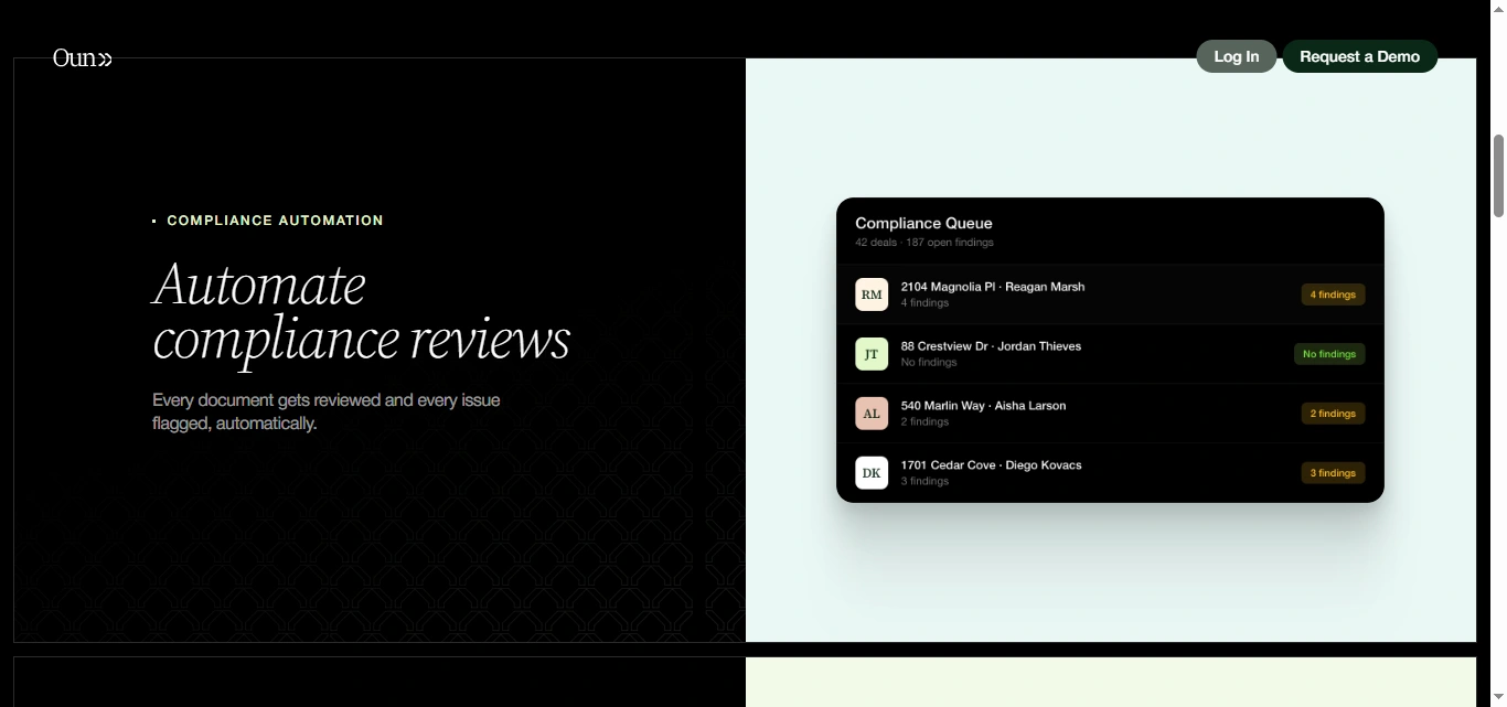
Each benefit is separated into a clear visual block with supporting imagery, making the section easy to scan.
Product Feature Presentation
The core product is broken into three major areas:
Compliance Automation
Documents are reviewed and issues are flagged automatically.
Document Drafting
Users can initiate workflows through email or messaging and receive drafted contracts.
Transaction Coordination
The platform helps manage transactions from contract through closing.
Separating these capabilities creates a clearer mental model of the product.
Integration Section
The SkySlope integration section is one of the most important conversion elements.
Instead of simply showing an integration logo, the experience explains how it works:
Deals sync → Findings appear → Decisions sync back
This turns an integration claim into an understandable workflow.
Capability Grid
Once users understand the core platform, a more detailed capability section introduces features such as:
Email-first workflows
Document preparation and e-signatures
Automatic compliance review
Scheduling and coordination
Milestone and deadline tracking
Severity-based issue prioritization
This information appears later in the journey, where visitors are more prepared for deeper product detail.
Audience Segmentation
The website separates two primary audiences:
Teams & Brokerages
and
Independent Agents
The messaging changes based on their needs.
Brokerages are positioned around scaling transaction and compliance operations, while individual agents are positioned around saving time and operating with the efficiency of a larger team.
This avoids forcing two different customer types into one generic value proposition.
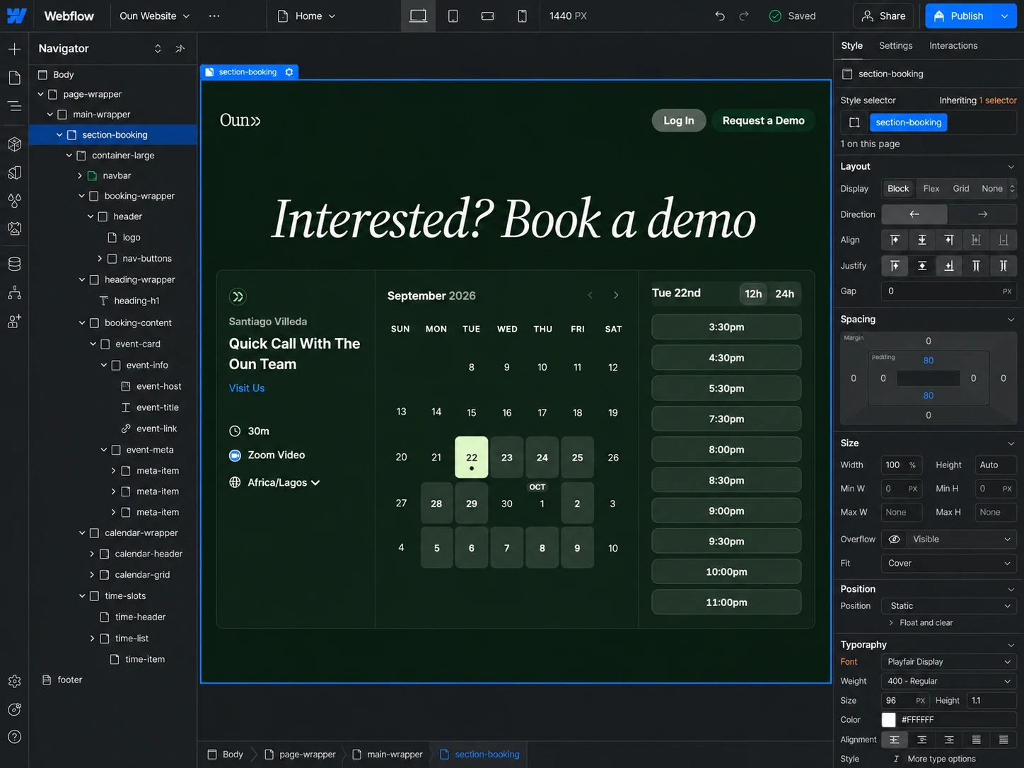
Demo Form UX
The final conversion experience keeps the qualification process simple.
The demo form collects essential information including:
Name
State
Email
Role
Intended use
This provides enough context for the sales conversation while avoiding an unnecessarily long form.
Responsive Design
The interface was designed to preserve clarity across desktop, tablet, and mobile.
Responsive considerations included:
Product screenshots
Feature grids
Typography scaling
Brokerage logos
Benefit sections
Integration diagrams
CTA placement
Demo forms
Navigation
Content spacing
On smaller screens, multi-column sections transition into a clear vertical journey without losing the relationship between product visuals and supporting content.
5. Website Architecture
Oun uses a focused SaaS structure designed around product education and demo conversion.
Homepage
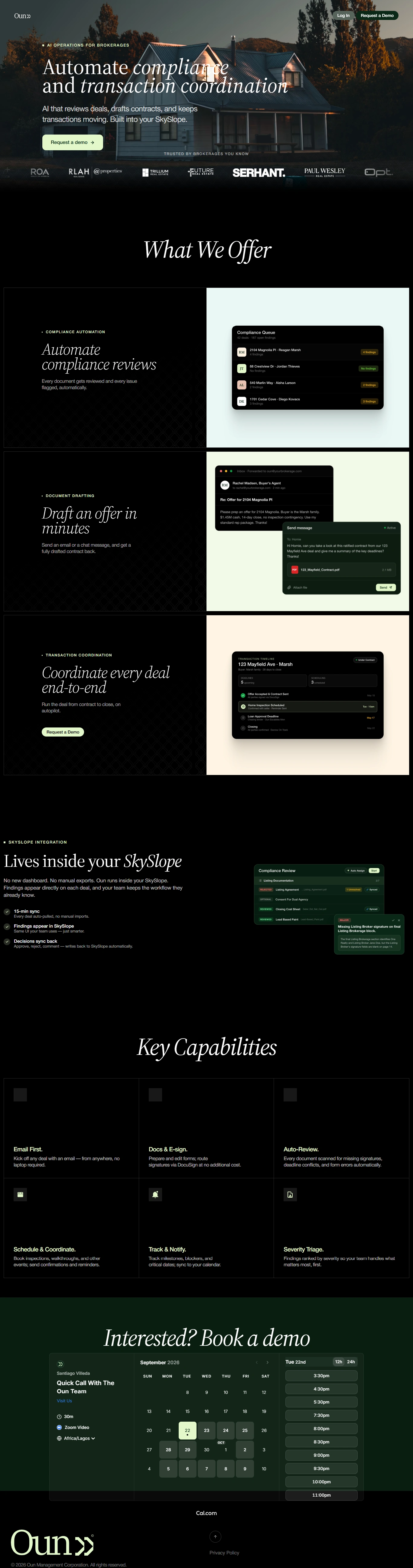
The main landing page handles most of the marketing journey:
Hero → Social Proof → Benefits → Product Capabilities → SkySlope Integration → Detailed Features → Audience Segmentation → Demo Form
Keeping the core story on one page reduces unnecessary navigation and keeps visitors moving toward the primary conversion.
Product Application
Existing users can move directly from the marketing website into the Oun application through the login pathway.
Demo Request
The demo experience acts as the primary lead-generation channel for teams and agents evaluating the product.
Privacy
A dedicated privacy experience explains how Oun handles platform data, connected services, integrations, AI processing, and user information. The policy also describes supported integrations including email, calendars, transaction-management platforms, e-signature services, CRMs, and messaging tools.
For an AI platform operating around real estate transactions, making this information available supports transparency and trust.
6. Webflow Development
Once the UX direction and page hierarchy were established, I translated the experience into a responsive Webflow implementation.
The build focused on creating a polished SaaS interface while maintaining a reusable structure for future product updates.
Development considerations included:
Responsive Webflow development
Reusable content sections
Structured class architecture
Product screenshot components
Integration feature layouts
Logo/social-proof sections
Responsive feature grids
Interactive navigation
Demo form implementation
Form success and error states
CTA interactions
Subtle hover effects
Scroll-based transitions where appropriate
Responsive imagery
Accessibility-conscious structure
SEO-friendly heading hierarchy
Image optimization
Performance optimization
Cross-browser testing
Cross-device testing
Animations were kept restrained so they supported product understanding instead of distracting from technical information.
7. Design & Development Process
Research → UX Structure → Wireframes → UI Design → Design System → Webflow Development → Responsive Optimization → Testing → Launch
Research
I started by understanding the real estate transaction workflow, the platform’s main automation capabilities, primary user groups, integrations, and the operational problems the product solves.
UX Structure
The website was organized around the buyer’s decision process:
What is Oun? → Why does it matter? → What can it automate? → How does it fit my workflow? → Is it right for my organization? → How do I see it in action?
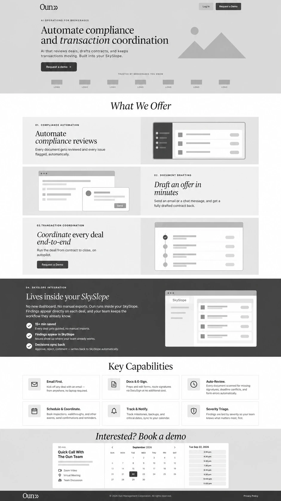
Wireframes
I mapped the hero, trust signals, product benefits, feature demonstrations, integration section, user segmentation, and conversion flow before introducing detailed styling.
UI Design
The wireframes were transformed into a polished PropTech/SaaS interface combining real estate imagery with software UI visuals.
This balance was intentional: the property imagery establishes industry relevance while the interface screenshots communicate the technology.
Design System
Reusable rules were established for:
Typography
Buttons
Section labels
Product cards
Feature blocks
Logos
Forms
Image treatments
Integration components
Spacing
Responsive behavior
Webflow Development
The approved system was translated into modular Webflow components to maintain consistency and make future updates easier.
Responsive Optimization
Each major section was refined independently across desktop, tablet, and mobile.
Special attention was given to product screenshots and workflow sections so important UI details remained understandable on smaller screens.
Testing
Before launch, I reviewed:
Navigation
Demo CTAs
Form submissions
Product screenshots
Integration sections
Responsive layouts
Form states
Browser compatibility
Application links
Launch
Final refinements focused on usability, accessibility, responsiveness, SEO structure, asset optimization, and consistent presentation across the full experience.
8. Key Features
AI SaaS landing page
Real estate technology positioning
Conversion-focused hero
Brokerage social proof
Benefit-driven product storytelling
Compliance automation presentation
AI contract drafting workflow
Transaction coordination experience
SkySlope integration showcase
Product interface previews
Email-first workflow messaging
E-signature capability presentation
Deadline and milestone tracking
Risk and severity prioritization
Brokerage and team segmentation
Independent-agent pathway
Demo request form
Reusable Webflow components
Responsive SaaS design system
Custom interactions
SEO-conscious architecture
Performance optimization
Mobile-responsive implementation
9. Final Result
The final Oun website transforms a technically complex AI operations product into a focused, easy-to-understand SaaS experience.
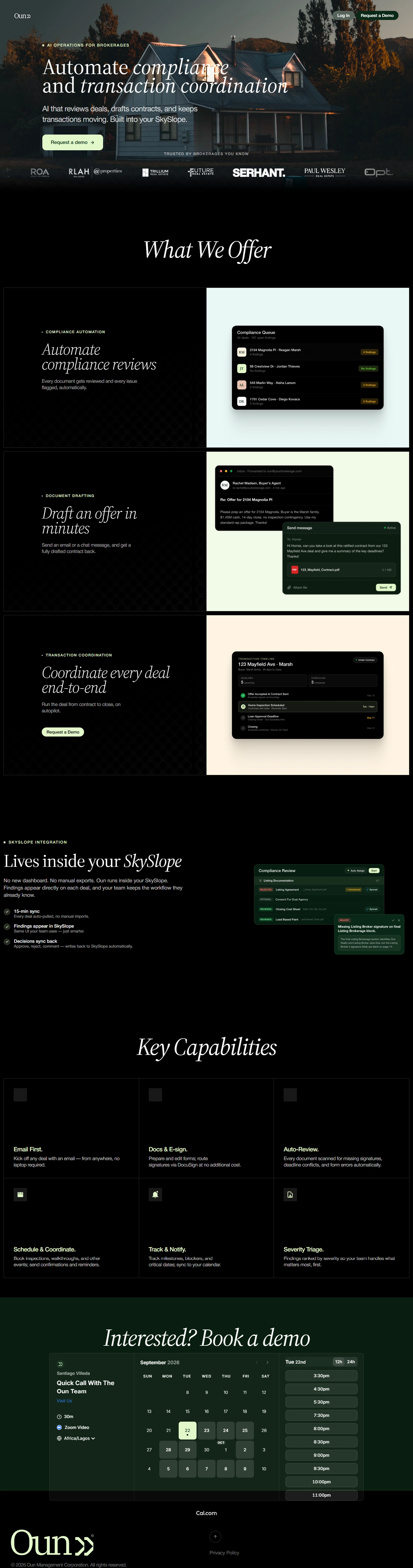
Instead of asking visitors to understand AI infrastructure, the website focuses on recognizable real estate problems: reviewing documents, preparing contracts, tracking deadlines, coordinating appointments, managing compliance, and keeping transactions moving.
Product screenshots make the automation tangible, while the SkySlope integration section shows how the platform can fit into existing brokerage workflows rather than forcing teams into an entirely separate operating system.
The separation between brokerages and independent agents also gives each audience a clearer reason to consider the product.
The result is a modern, conversion-focused PropTech website that combines real estate credibility, product-led storytelling, strong UX hierarchy, and Webflow development into one cohesive experience, guiding visitors naturally from understanding the platform to requesting a demo.
Like this project
Posted Sep 22, 2026
Designed a SaaS website on Webflow for an AI real estate platform, enhancing UX and demo conversions.
Likes
5
Views
4