FUEGO DE CASA | Mexican Hot Sauce Packaging Design
Victor Abayomi
FUEGO DE CASA
Mexican Hot Sauce Brand
Role: Packaging Designer
Tools: Adobe Illustrator · Adobe Photoshop · Kittl · Figma
Deliverables: three-SKU packaging, brand guidelines
Overview
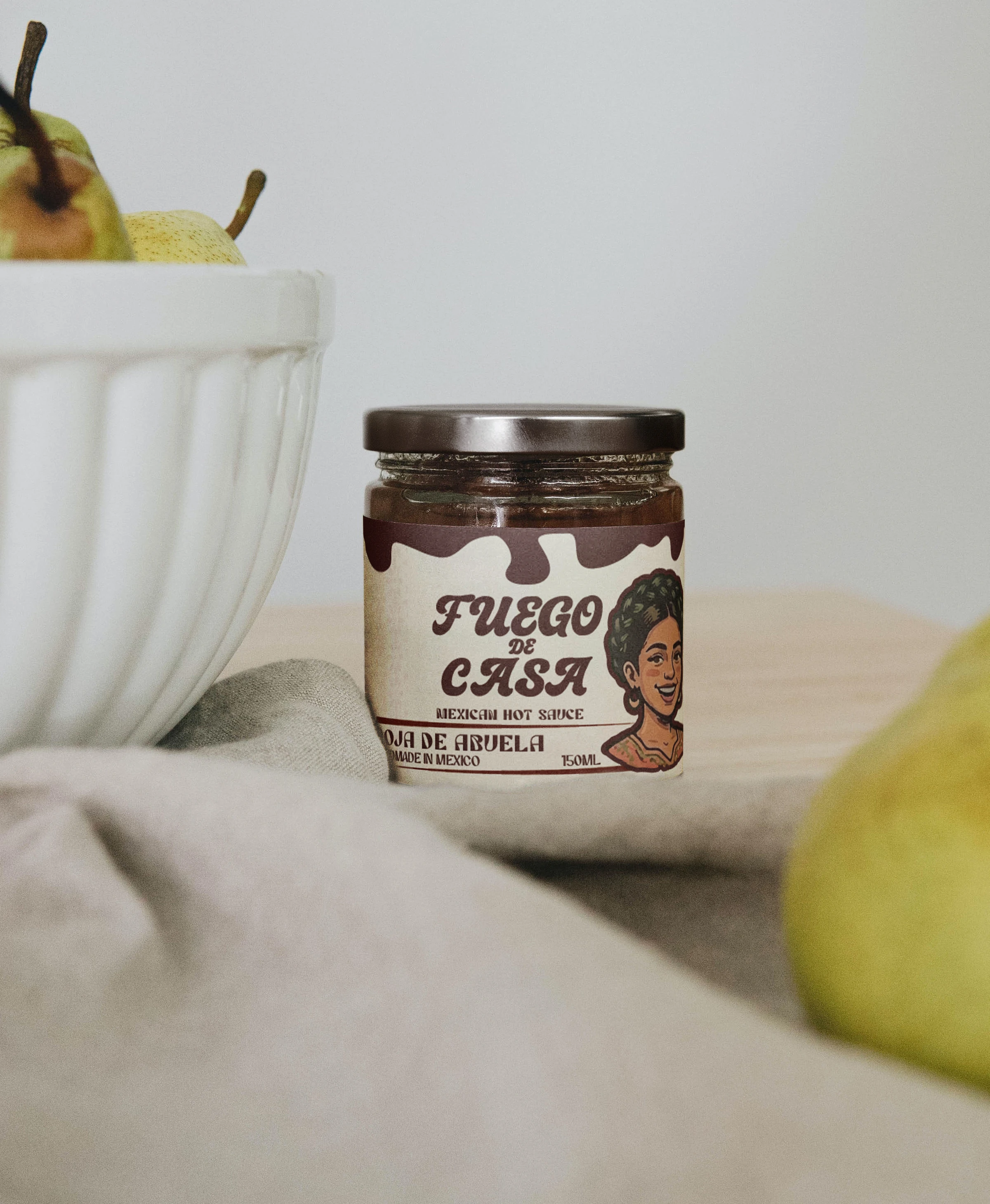
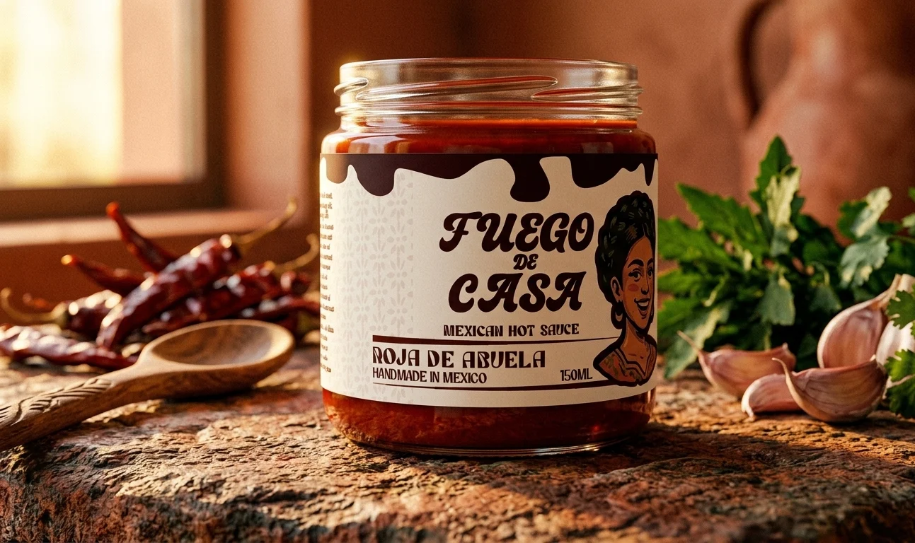
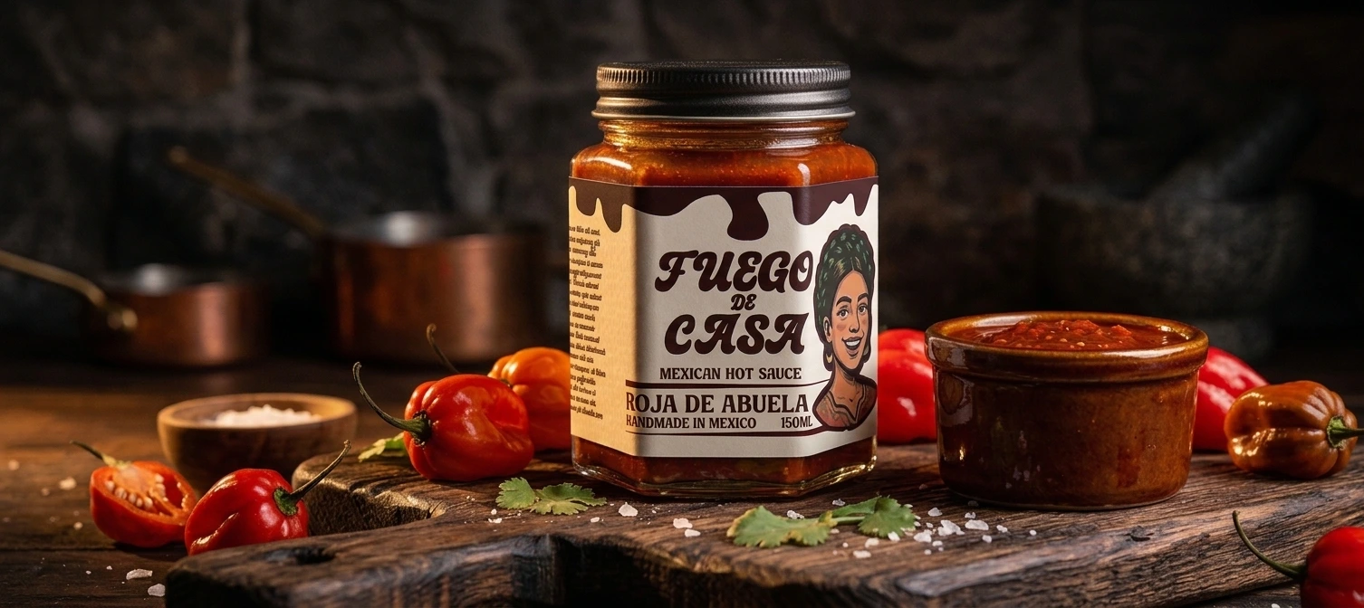
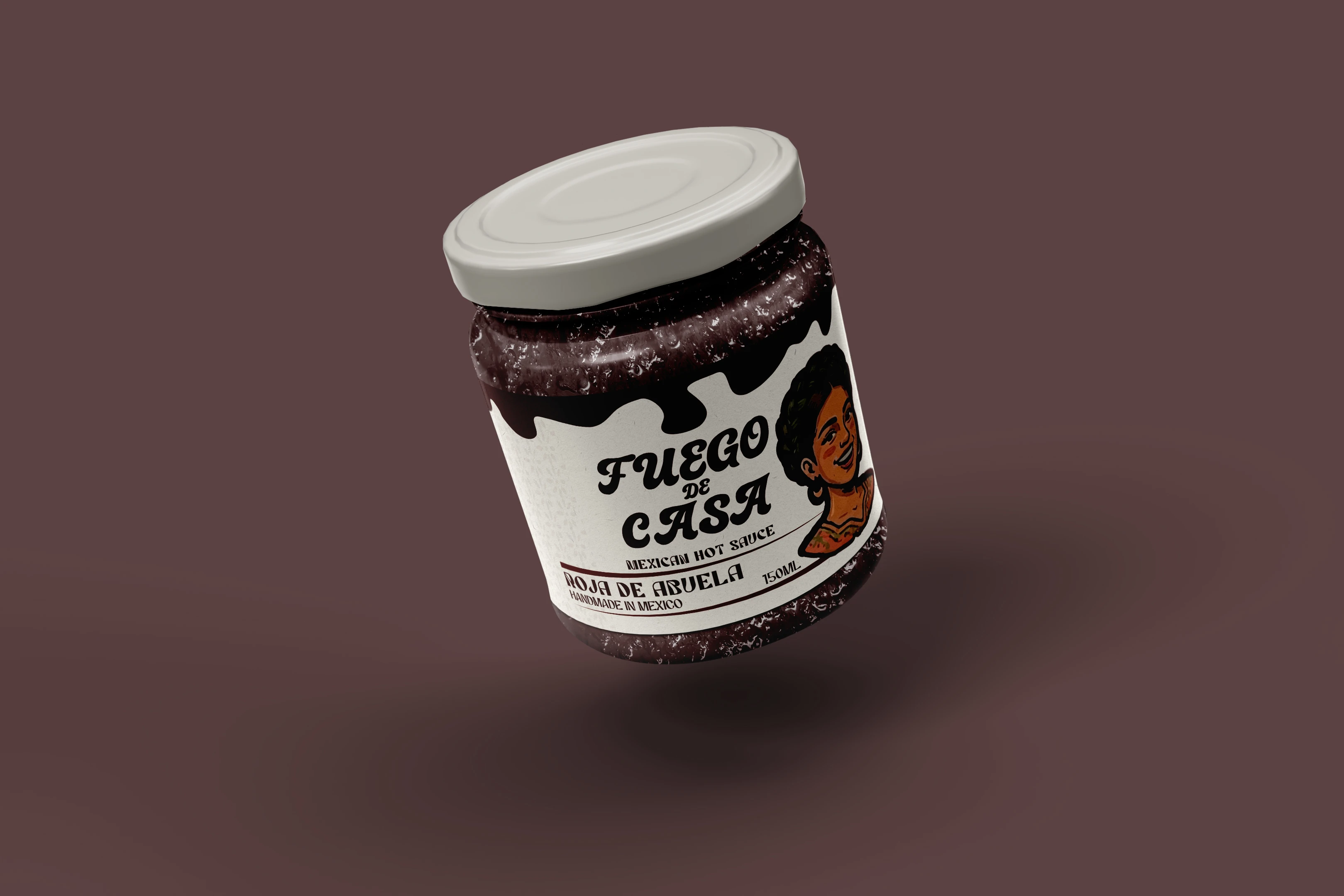
The hot sauce shelf is loud. Every brand is competing on heat claims, mascot aggression, and novelty typography that shouts before it communicates. FUEGO DE CASA was built on the opposite instinct — that the most confident brand in the category doesn't need to raise its voice. It just needs to be unmistakably itself. Hand-drawn type as the hero. Character as personality, not decoration. A color-coded three-SKU system that holds together as a family and apart as individuals.
The Brief
Develop a complete brand identity and packaging system for a three-SKU Mexican hot sauce line. The brand needed to feel rooted — in craft, in culture, in the kind of kitchen where this sauce actually lives — without defaulting to the visual clichés that flatten Mexican food brands into costume. No sombreros. No cartoon flames. No aggressive red-on-black heat signaling. Something with real character and real restraint.
The Challenge
Mexican food branding exists in a category where authenticity is the most overused word and the least practiced principle. Most brands perform Mexican heritage through visual shorthand — terracotta, chili pepper icons, distressed textures — without building anything that feels genuinely considered. FUEGO DE CASA needed to feel like it came from somewhere real: a family kitchen, a specific voice, a point of view. That kind of authenticity doesn't come from aesthetics borrowed from the category. It has to be built from scratch.
The Approach
The design system was built around hand-drawn type as the primary visual element — not as an accent or a textural detail, but as the hero of the entire identity. The letterforms were developed to feel crafted and specific: the kind of type that looks like someone made it, not like someone chose it from a font menu. That decision set the tone for everything else.
Character illustrations were introduced as accents — present enough to give the brand personality, restrained enough to never compete with the typographic system. Each of the three SKUs was color-coded as a distinct expression of the same brand family: the color does the work of differentiating heat level and variant, while the typographic system holds all three together as a cohesive line.
The result is a packaging system that reads as a family on shelf and as individual products in hand — which is the fundamental tension of any multi-SKU line, and the thing most brands get wrong.
The Outcome
Complete brand identity and three-SKU packaging system: primary logotype in hand-drawn type, character illustration system, color-coded variant palette, typography hierarchy, full packaging design for all three SKUs, and brand guidelines.
"The most confident brand in the category doesn't need to raise its voice. It just needs to be unmistakably itself."
Like this project
Posted Jun 1, 2026
Three-SKU hot sauce packaging system. Hand-drawn type as the hero, character illustrations. Built for shelf impact and cultural authenticity.