Runway Fragrance Packaging Design for PCA Group
Victor Abayomi
Verified
RUNWAY FRAGRANCE
Packaging Design for PCA Group
Role Brand & Packaging Designer Adobe Illustrator · Adobe Photoshop · Kittl OVERVIEW
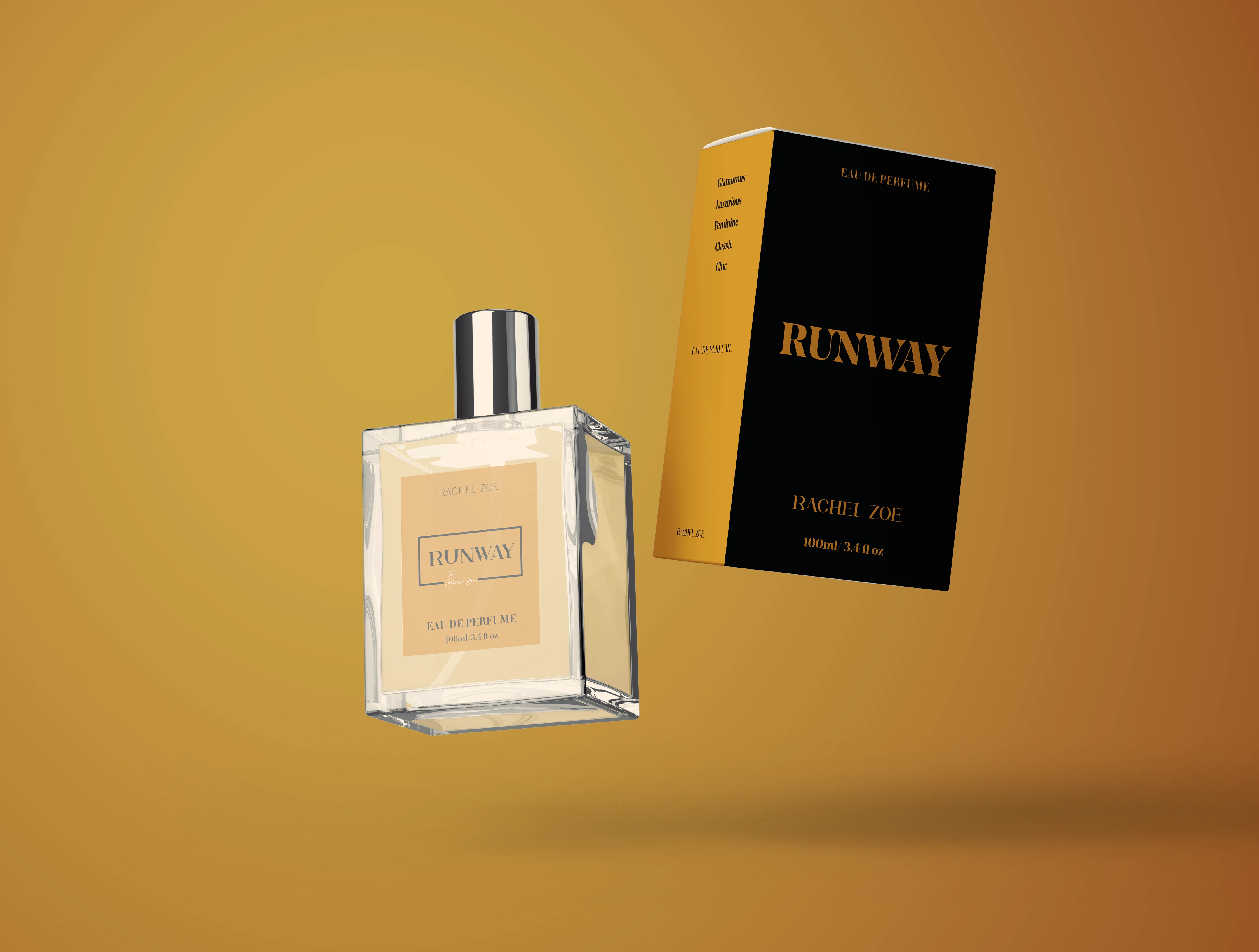
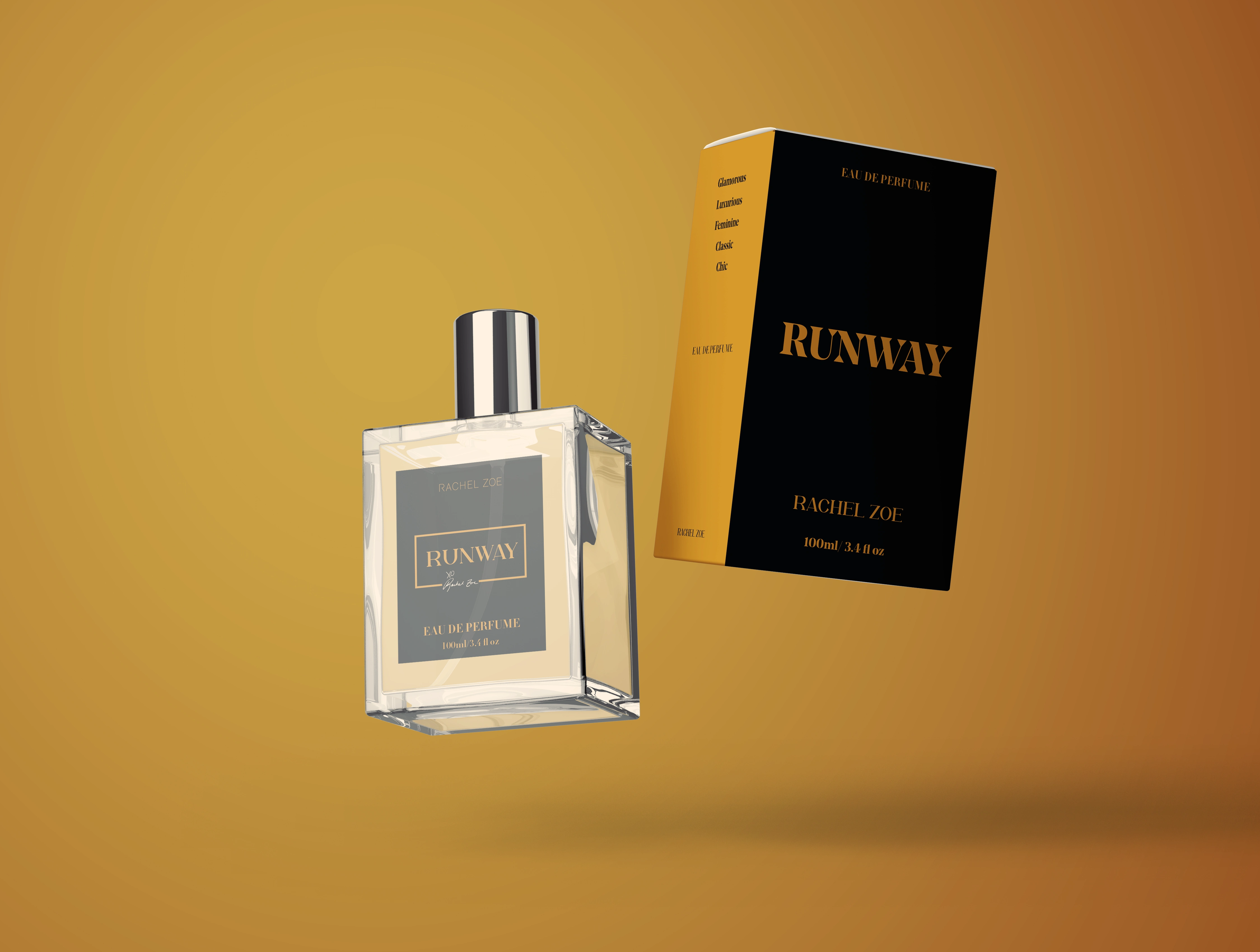
Deliverables Full packaging suite, dielines, mockups Luxury fragrance packaging has one job above everything else: make the customer feel the product before they open the box. PCA Group brought me in to design the packaging identity for Runway — a premium scent developed as part of Rachel Zoe's luxury product line — and that feeling was the brief: runway confidence, bottled. The challenge wasn't visual complexity. It was restraint. High-fashion packaging earns attention by knowing what to leave out.
THE BRIEF
PCA Group needed a complete packaging suite — primary and secondary box design — that could do three things simultaneously: express the confidence and glamour of Rachel Zoe's aesthetic without overdesigning; translate that fashion energy into a fragrance format where the bottle, box, and label all carry the same weight; and survive manufacturing — print-ready, commercially viable, ready for a global rollout.
THE CHALLENGE
True luxury packaging wins on typography, negative space, and material texture. The risk with black-and-gold is that it reads as generic opulence. The solution was strict: the gold stays in the logotype only. Nothing else competes with it. Every other surface earns its existence by what it doesn't do
THE APPROACH
I started with a competitive audit of the brands this fragrance would sit near on shelf: Dior, YSL, Tom Ford. The research confirmed what the brief implied — true luxury packaging wins on typography, negative space, and material texture. Color: black and gold — the gold reserved for the logotype only, nothing else competing. Typography: refined sans-serif, weighted for authority, wide and unhurried. Material direction: soft-touch matte box with gold foil emboss on the logotype — the matte surface provides tactile richness, the foil does one thing and does it permanently. Throughout, I worked closely with Holly, PCA's brand lead, refining layout hierarchy with precision through each round.
THE OUTCOME
The final suite included a full packaging system — primary box, secondary packaging, production-ready dielines, print specifications, and high-fidelity mockups for marketing presentation.
"Luxury fragrance packaging has one job: make the customer feel the product before they open the box."
Like this project
Posted Oct 30, 2025
Designed a sophisticated, print-ready black and gold suite that successfully met the brand’s high-fashion goals and commercial viability requirements.
Likes
2
Views
23
Timeline
Oct 22, 2025 - Oct 29, 2025
Clients
The PCA Group