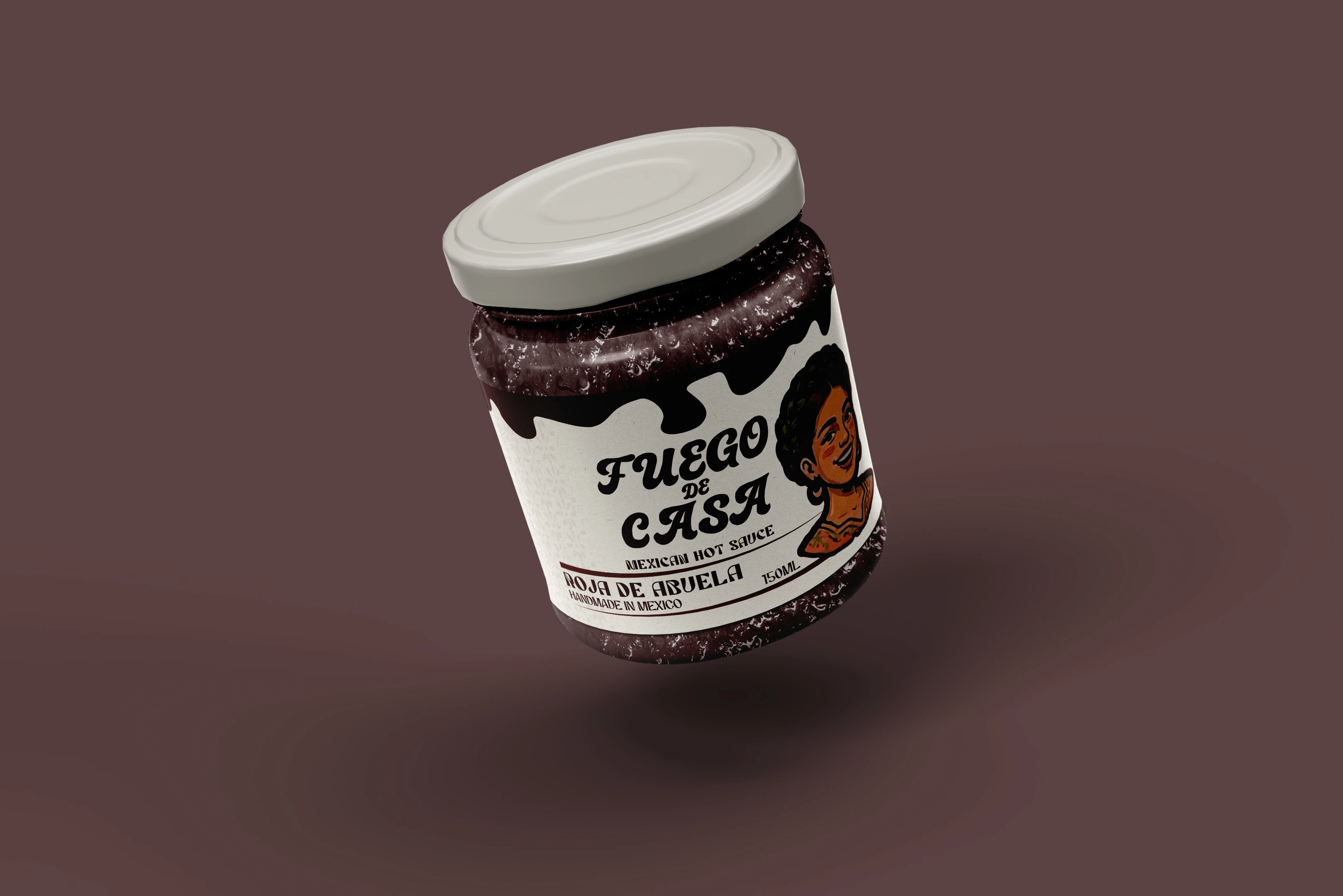
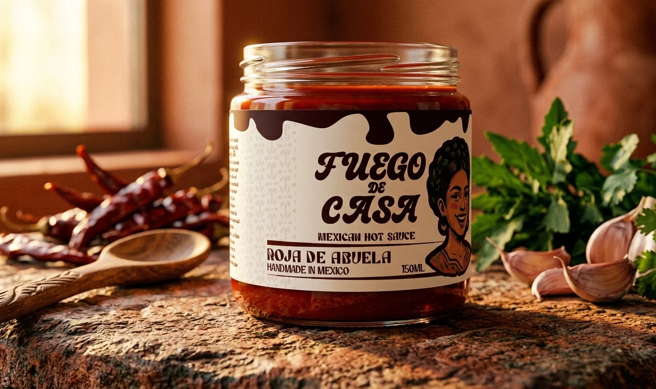
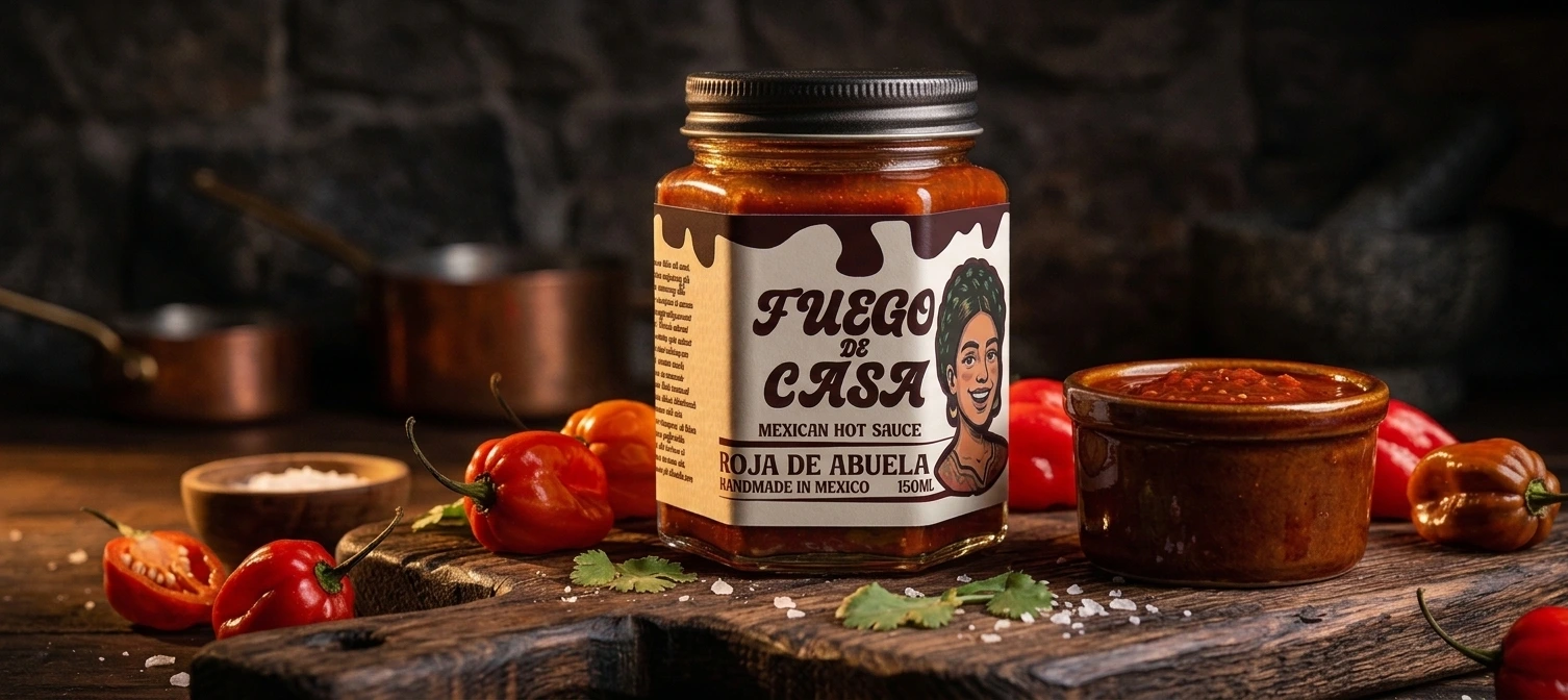
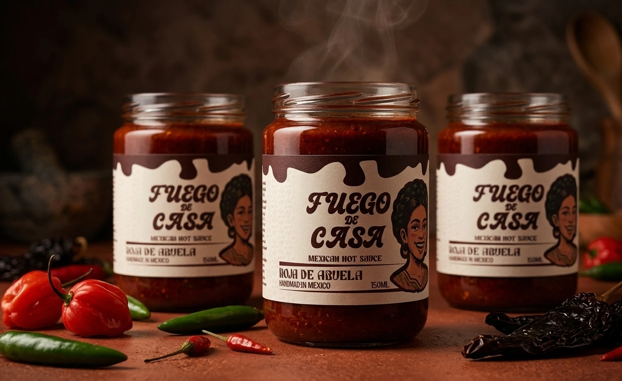
FUEGO DE CASA — Mexican Hot Sauce Packaging System
Victor Abayomi✦
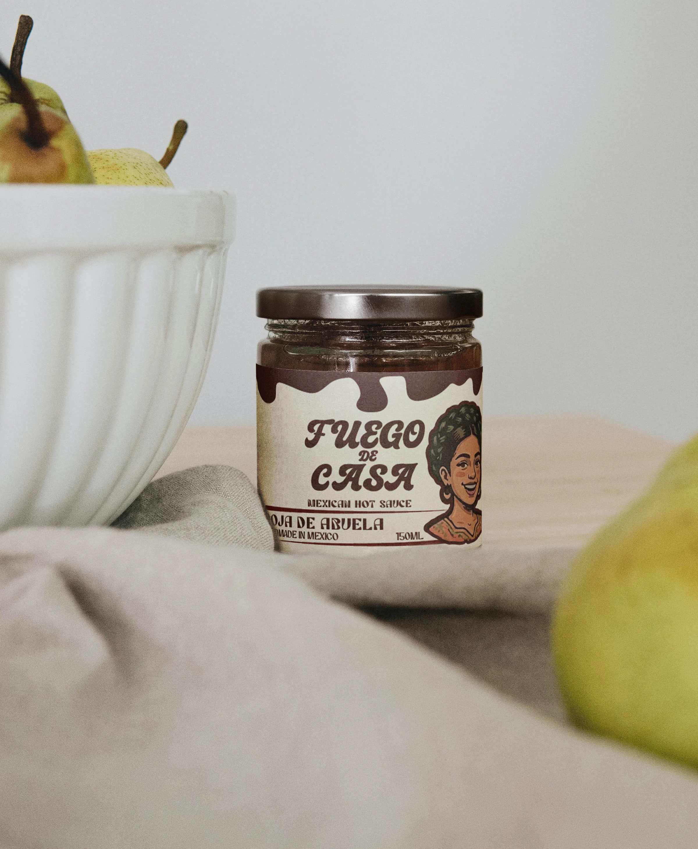
FUEGO DE CASA — Artisanal Mexican Hot Sauce Packaging System
A typography-first packaging system for a premium handmade hot sauce line celebrating family recipes and Mexican heritage. The challenge: create three distinct SKUs that feel like a cohesive brand while honoring the personality of each family member who created them.
The Brief:
FUEGO DE CASA is a fictional CPG brand — artisanal hot sauces handmade in small batches, positioned in the premium condiment space. Three variants, each with its own story:
The brand needed packaging that felt authentic and handcrafted, not sterile or corporate. Every bottle needed to tell a story.
Design Approach:
Rather than lead with illustration, I built a typography-first system where the hand-drawn brand mark becomes the hero. Each label uses:
Bold italic serif typography (primary brand name)
A scalloped decorative edge (sauce drip reference, color-coded per SKU)
A small character portrait (corner accent, not the focal point)
A consistent cream background with SKU-specific color blocking
Supporting typography hierarchy: variant name, origin line, heat level.
Design Process:
Researched artisanal hot sauce brands (De Galera Tao, Calenton, etc.) to understand market positioning
Sketched typography variations — hand-drawn vs. refined serif
Tested color combinations for each SKU variant
Created character illustrations to represent family storytelling
Built the full label system at 250mm × 100mm with print specifications
The key insight: premium positioning isn't about maximalism — it's about intentional constraint. A cream background, bold type, and simple accent colors communicate quality more effectively than a packed, colorful label.
Like this project
Posted Jun 1, 2026
Typography-focused packaging system for a premium artisanal hot sauce brand.