iScrim E-Sports Platform
iScrim E-Sports Platform
What is iScrim ?
iScrim was an e-sports platform service where independent users or organisers could host and manage tournaments.

How were the problems discovered ?
Initial research.
Discussing with the team about the older version metrics.
Interviewing current (at the time) users.
What were the problems ?
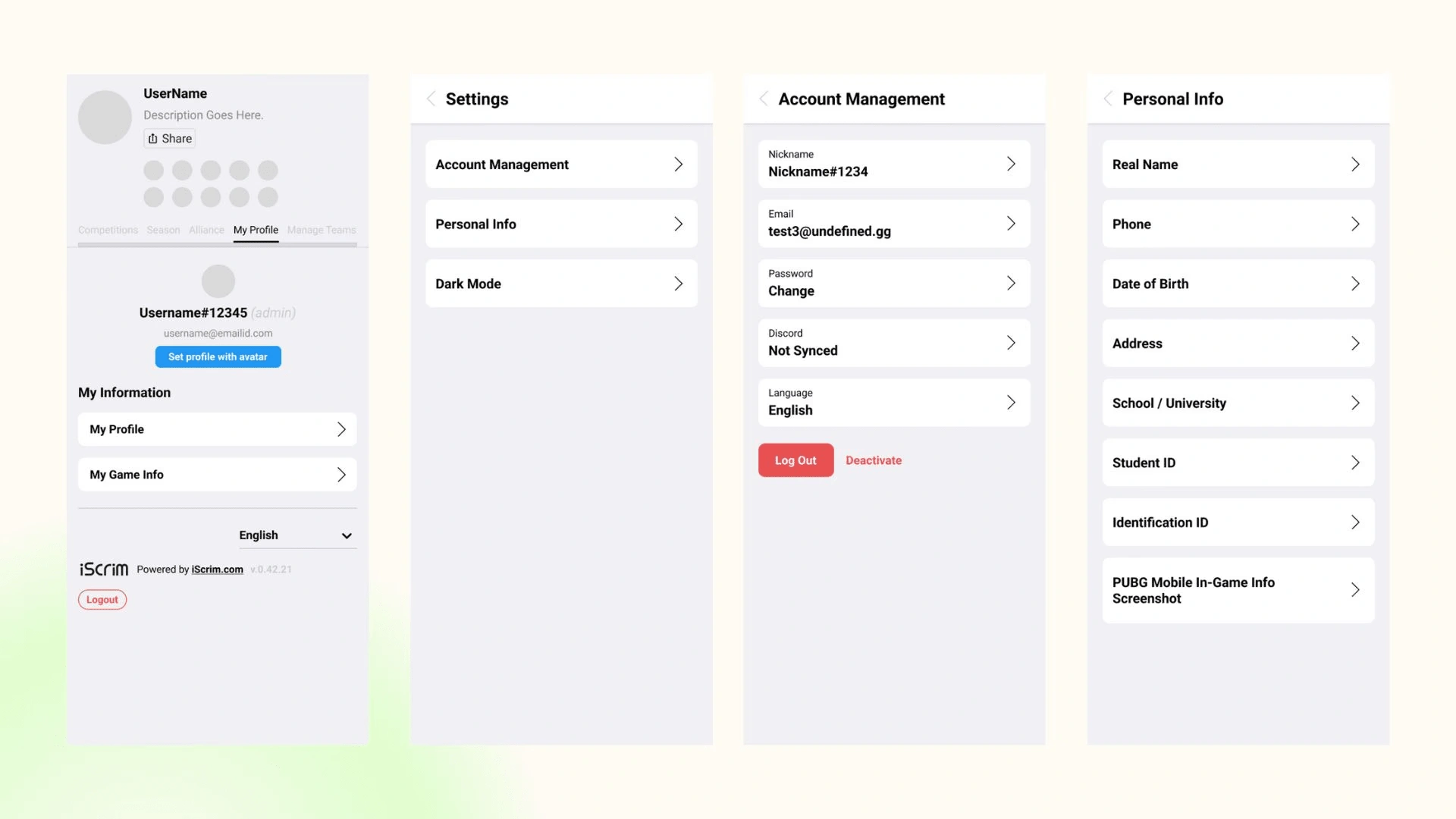
There was no dedicated profile page for the users to view their information.
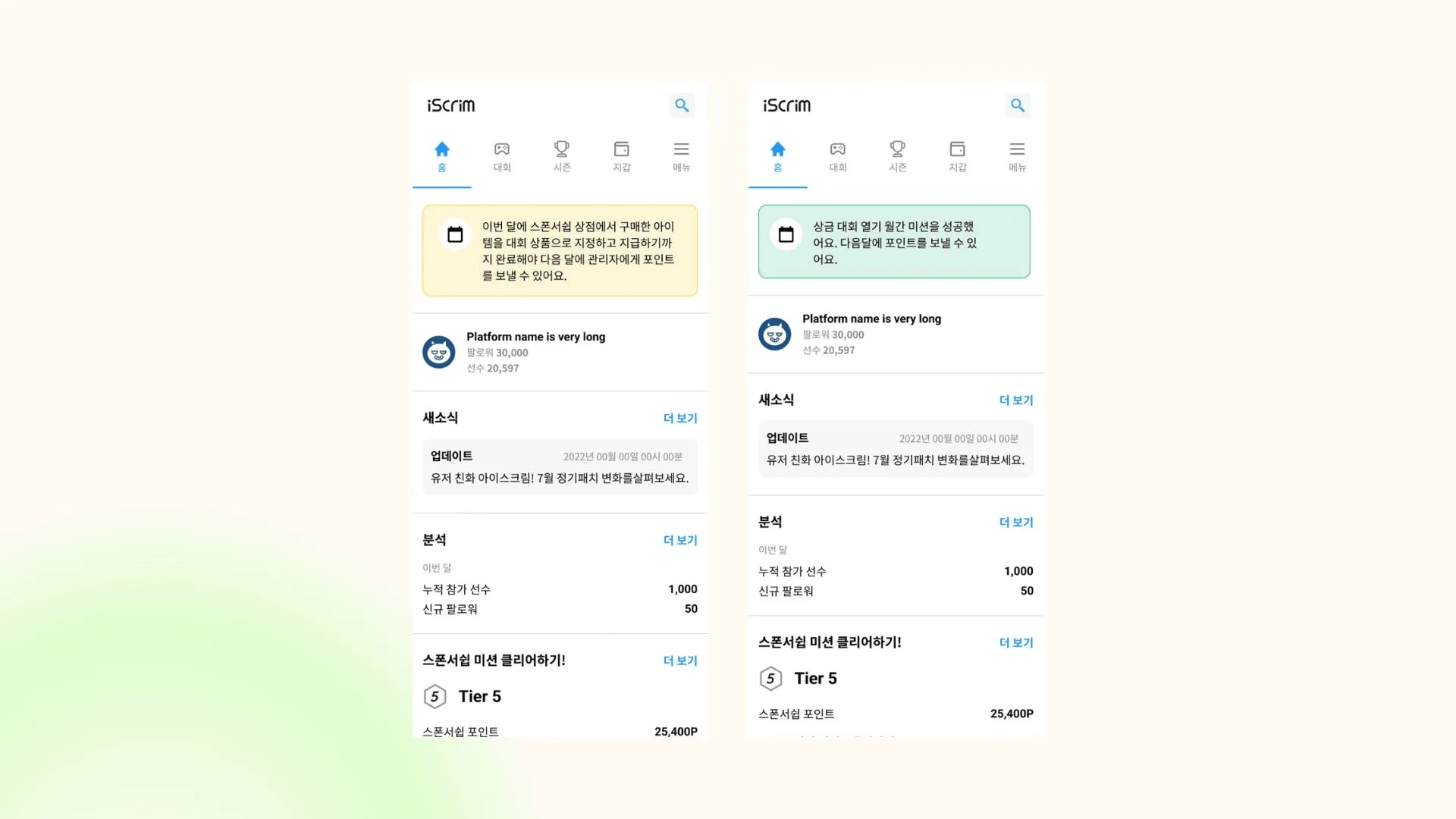
Lack of delivering news to the users regarding platform and tournaments.
UX flow wasn’t same across the similar actions.
Solutions
Creating a dedicated profile page for the users so that they can check all the info.
Creating a news section on the homepage for all the important news.
Researching and improving UX across the website.
My Role and Goals
Working on adding new features.
Working on improving the overall UX.
Doing QoL changes.
Upgrading website from 2.0 to 3.0 version.
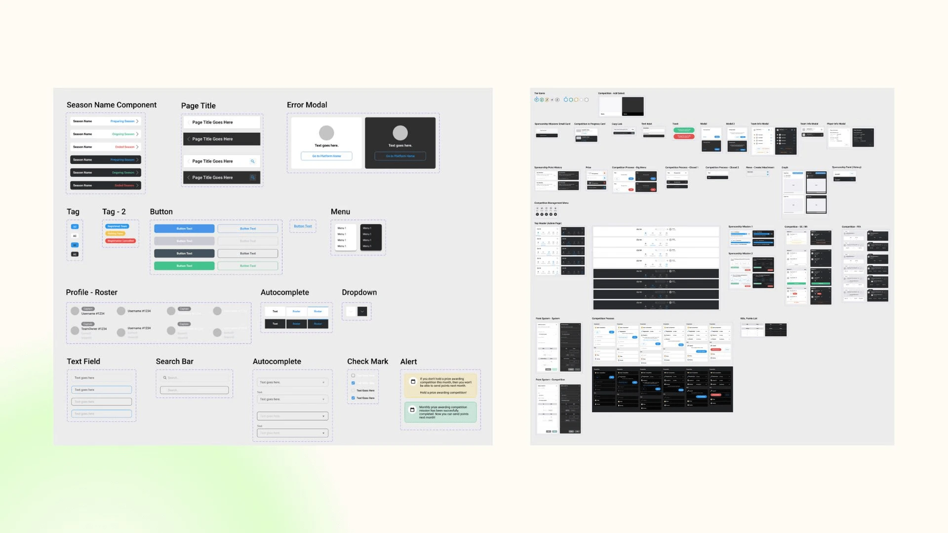
Creating a design system library.
Working closely with devs and PM.
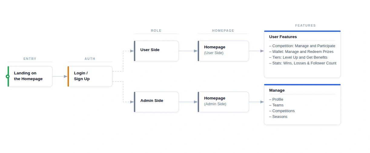
UX Flow (Simplified)
Why Certain Decisions were made ?
A news section was among the highest priority alongside profile section because news is very important for users in the tournament as they would not want to miss any match news and organizers as well if there is any news from the company so this was another change I pushed for.
A profile section is necessary for any user to view their information in one place so they can change details such as username, password, link or unlink game accounts, etc. This I push forwarded with this change.
Design
My Profile Section
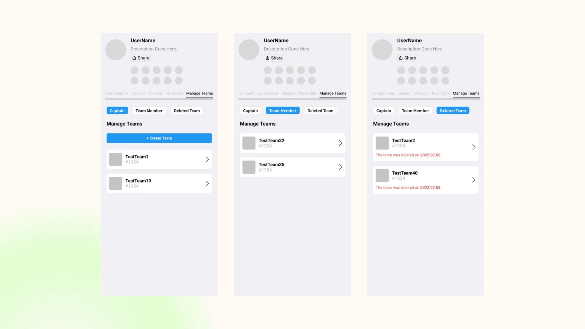
Teams Section
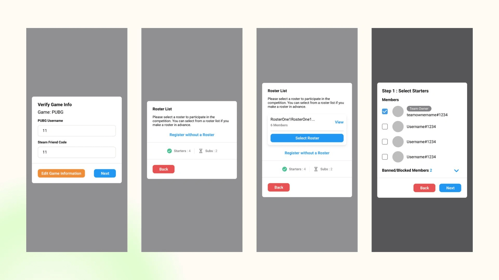
Roster Selection
News Section
Design System (Example)
Like this project
Posted Nov 12, 2024
iScrim was an e-sports platform service where independent users or organisers could host and manage tournaments.
Likes
1
Views
6

