Crushed Tonic — Cross-Platform Brand & Marketing Design
Crushed Tonic — Brand, Digital, and Marketing Design System
About
Crushed Tonic is a collagen peptide and supplement company offering powdered collagen products alongside capsule-based supplements, including sleep support and hair growth formulas. The brand operates across e-commerce, Amazon, social media, paid advertising, and printed marketing.
I partnered with the brand to establish a cohesive visual system that could support rapid content production while maintaining a premium, modern presence.
Goals
The goal was to strengthen brand cohesion and elevate marketing effectiveness across platforms, while positioning the products as part of an everyday beauty and self-care routine rather than traditional supplement marketing.
Additional goals included improving product education, supporting paid media performance, and creating reusable design systems that could scale.
Research & Strategy
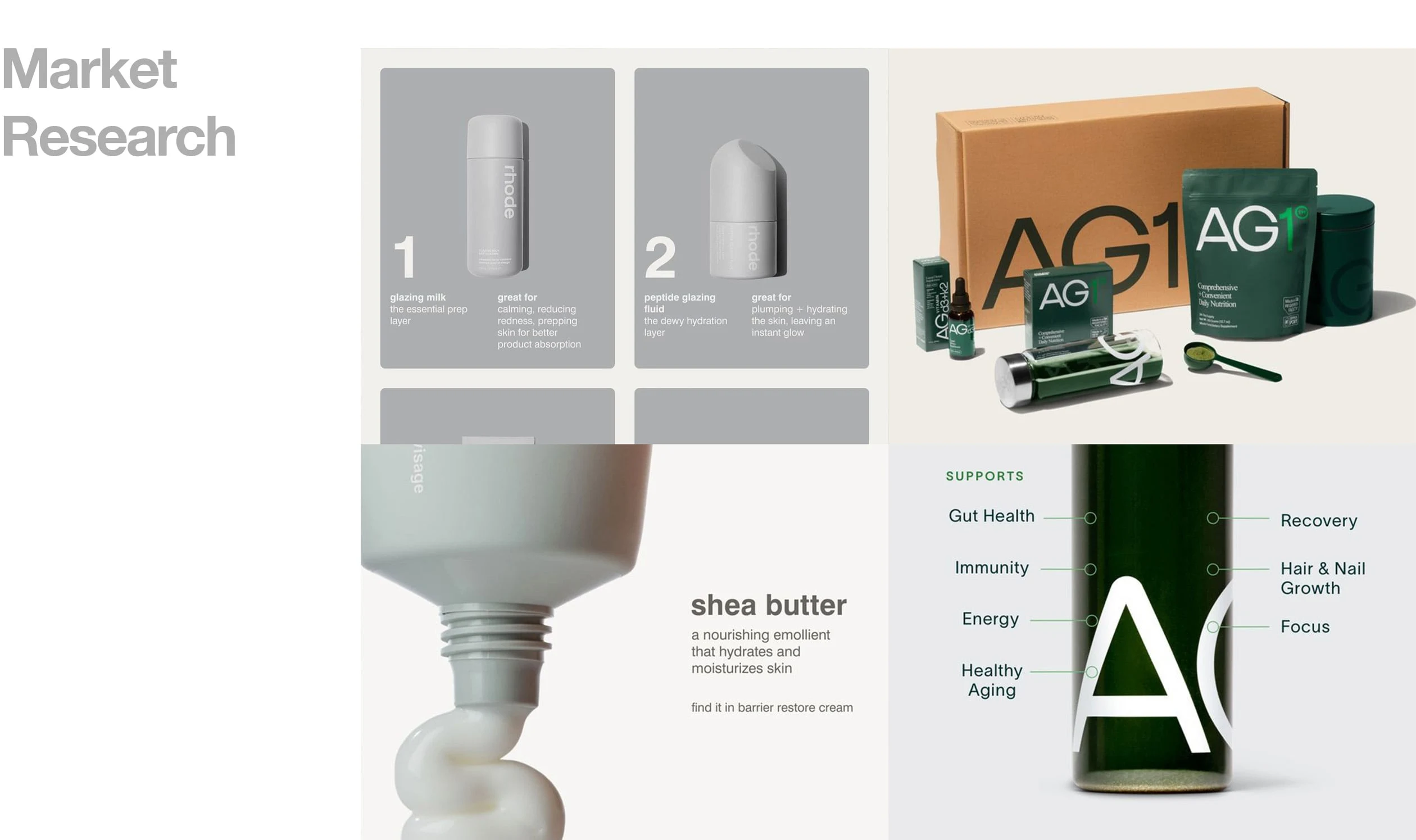
Research extended beyond the collagen and supplement category to include beauty-forward and lifestyle brands with strong cultural and marketing impact. We analyzed brands such as Lemme and Graza for marketing effectiveness and community-driven positioning, and Rhode for premium beauty branding and visual restraint.
This broader research informed a strategy that positioned Crushed Tonic alongside modern beauty routines, emphasizing clarity, credibility, and premium appeal without relying on overly clinical or trend-driven visuals.
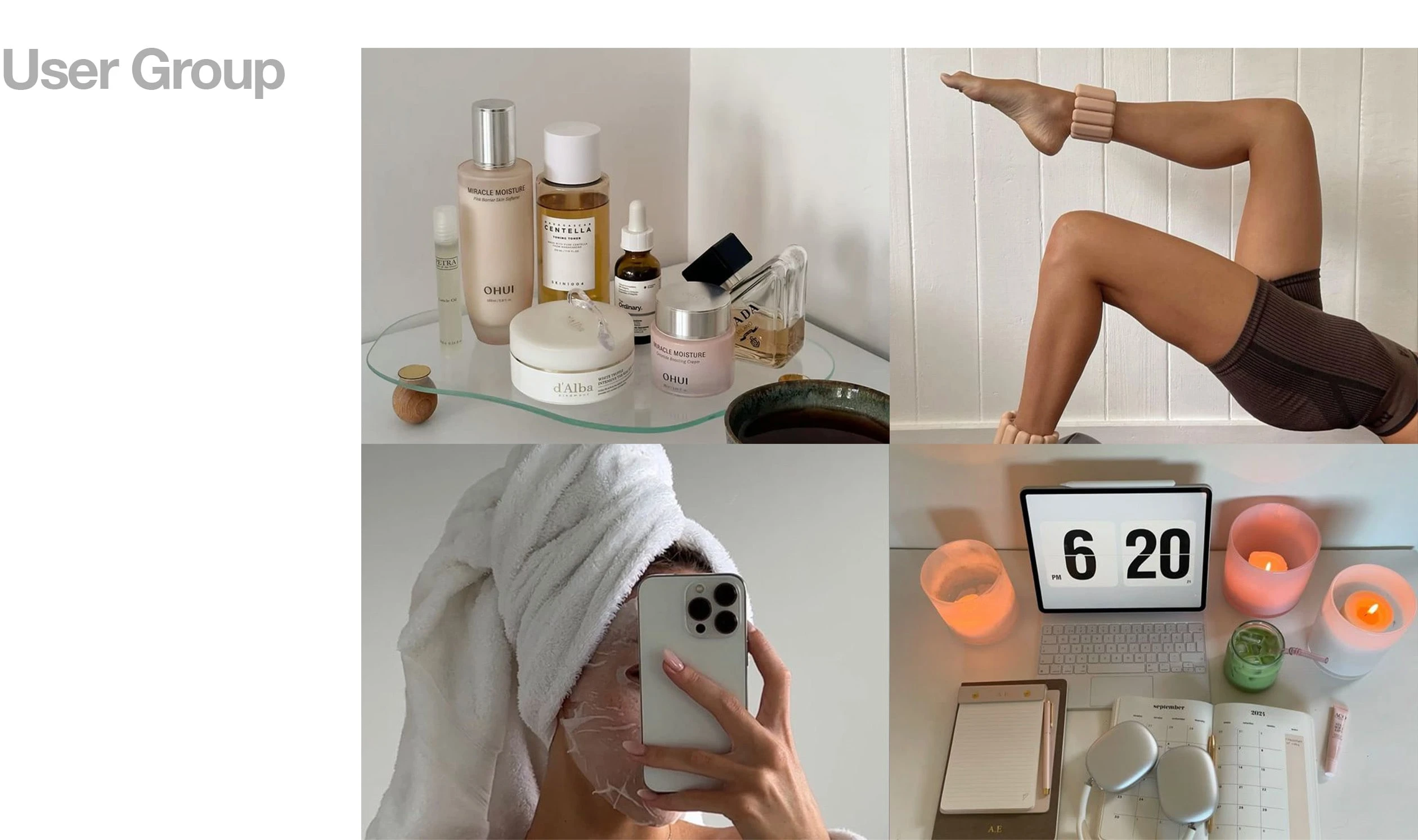
Early moodboarding explored:
restrained color palettes
editorial-inspired layouts
modular systems adaptable across formats
Design Execution
I designed a flexible visual system that could be reused and resized across social, paid ads, Amazon, web, and print. Assets were built with hierarchy and scalability in mind so that single concepts could translate seamlessly across platforms.
Rough drafts focused on layout logic and structure before refinement into final assets.
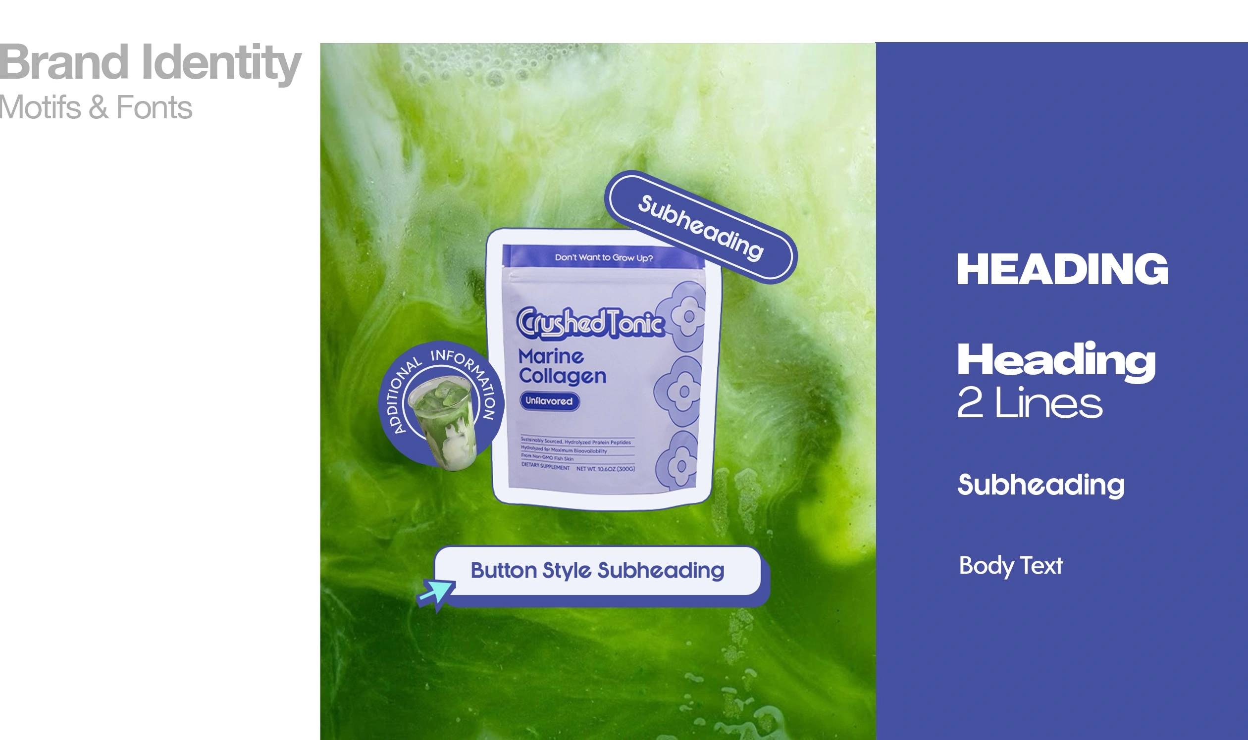
Brand Identity & Typography
To create cohesion across social, paid media, e-commerce, Amazon, and print, I established a consistent typographic and visual foundation that could scale across formats without losing clarity or brand recognition.
Typefaces were chosen to strike a balance between modernity and trust, ensuring product education remained clear while elevating the overall brand presence. Consistent typographic hierarchy and spacing rules were applied across social content, paid ads, Amazon graphics, website layouts, and printed materials.
Key identity elements included:
a primary typeface for headlines and emphasis
a complementary secondary typeface for body copy and informational content
Final Deliverables
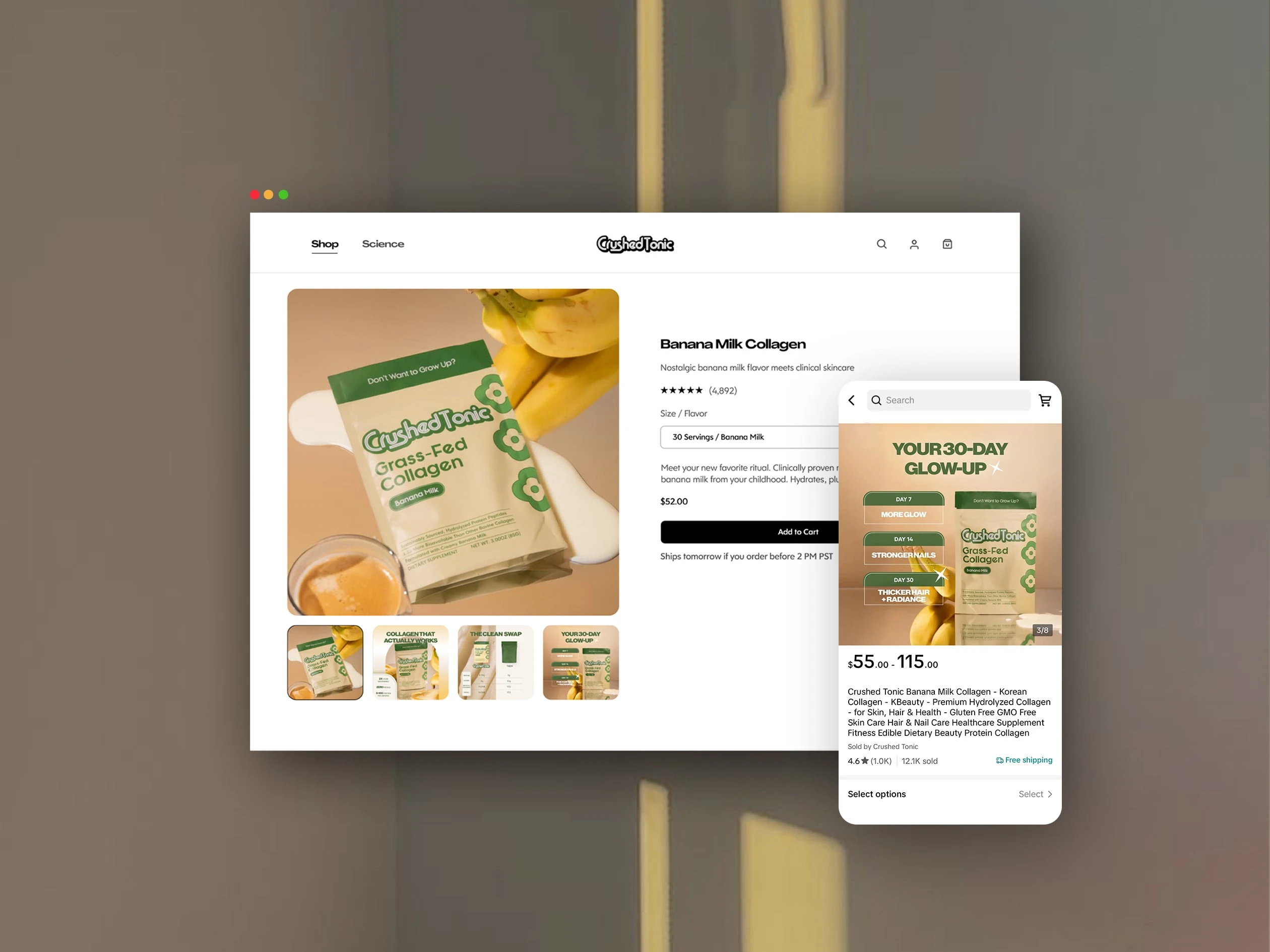
Website & TikTok Shop
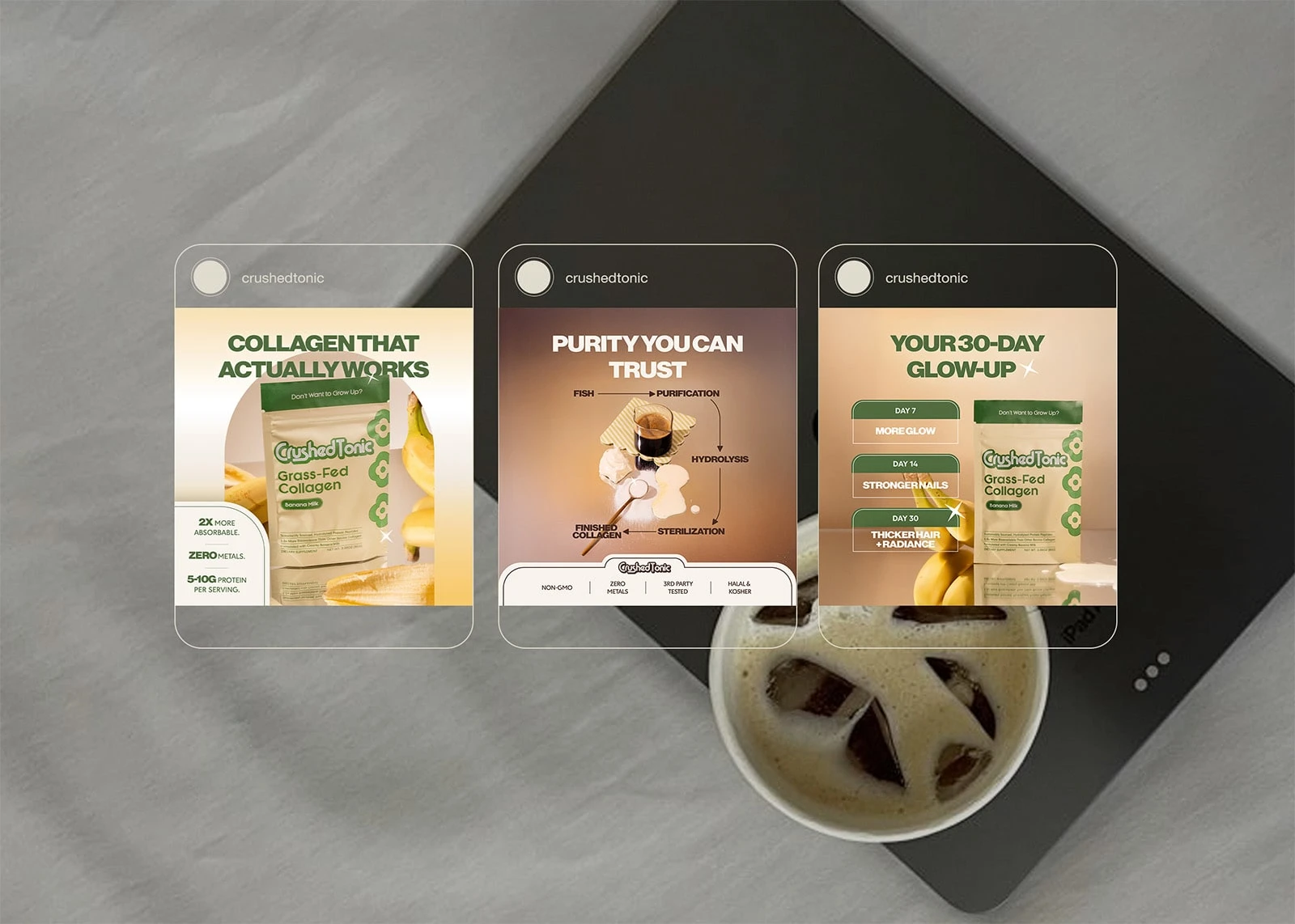
Web Infographics Used in Product Listings

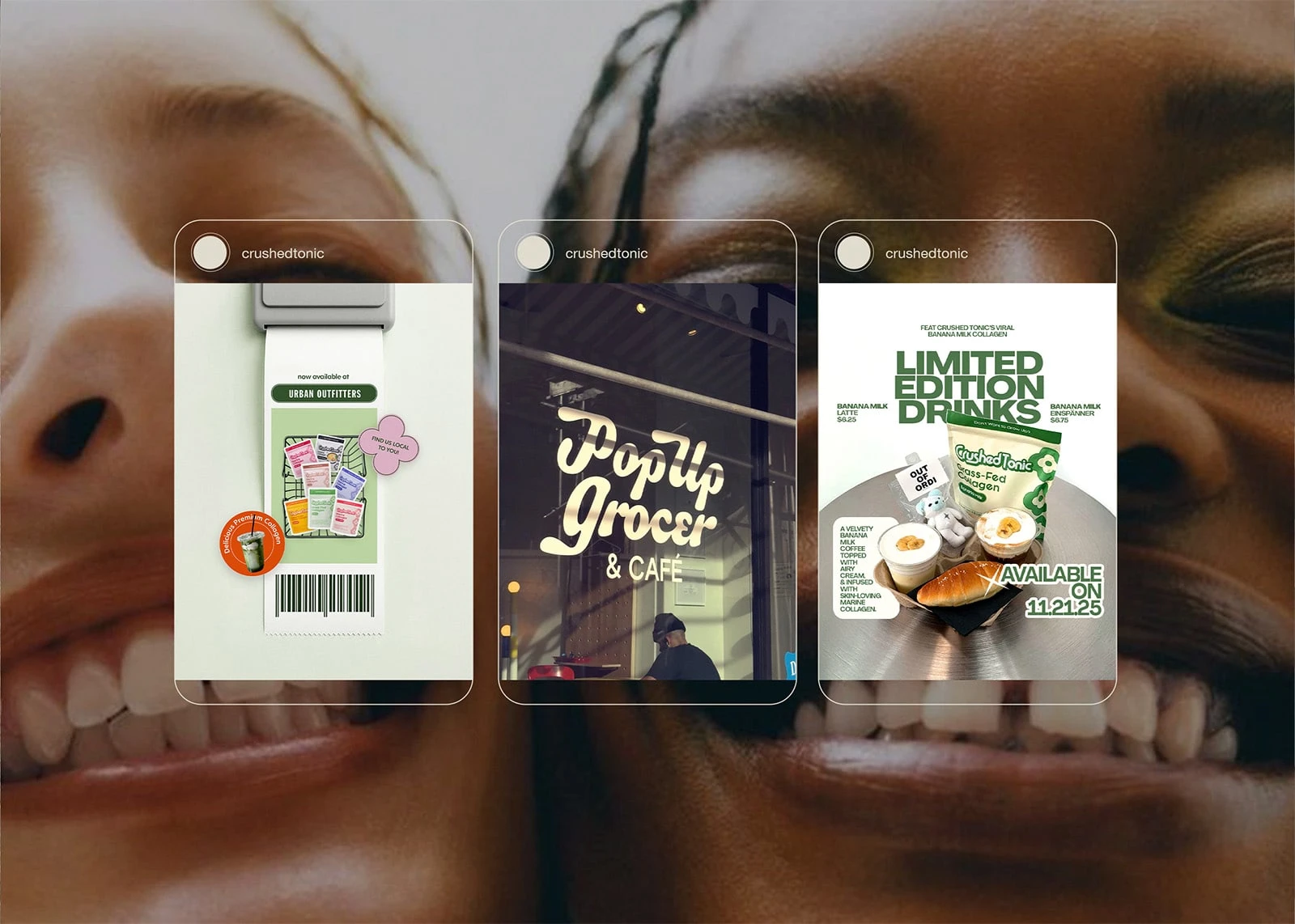
Social Media Graphics Promoting Events & Retail Locations
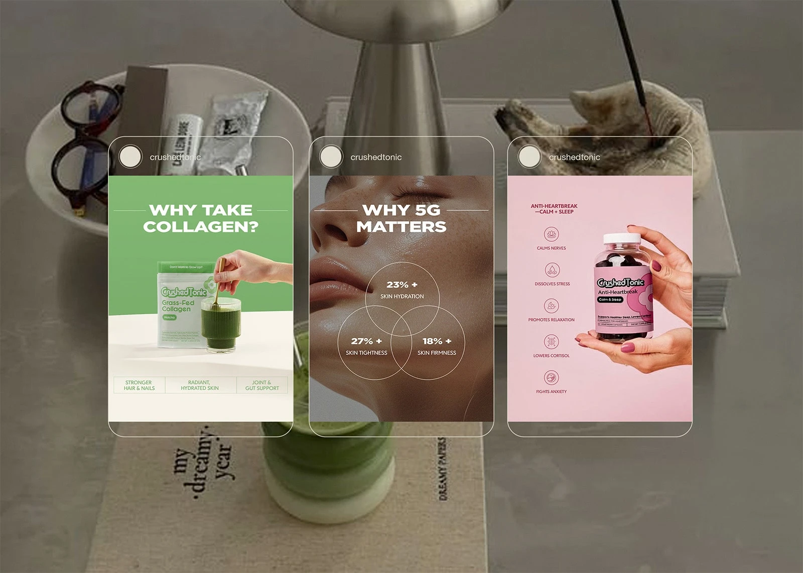
Infographic-Inspired Social Media Ads
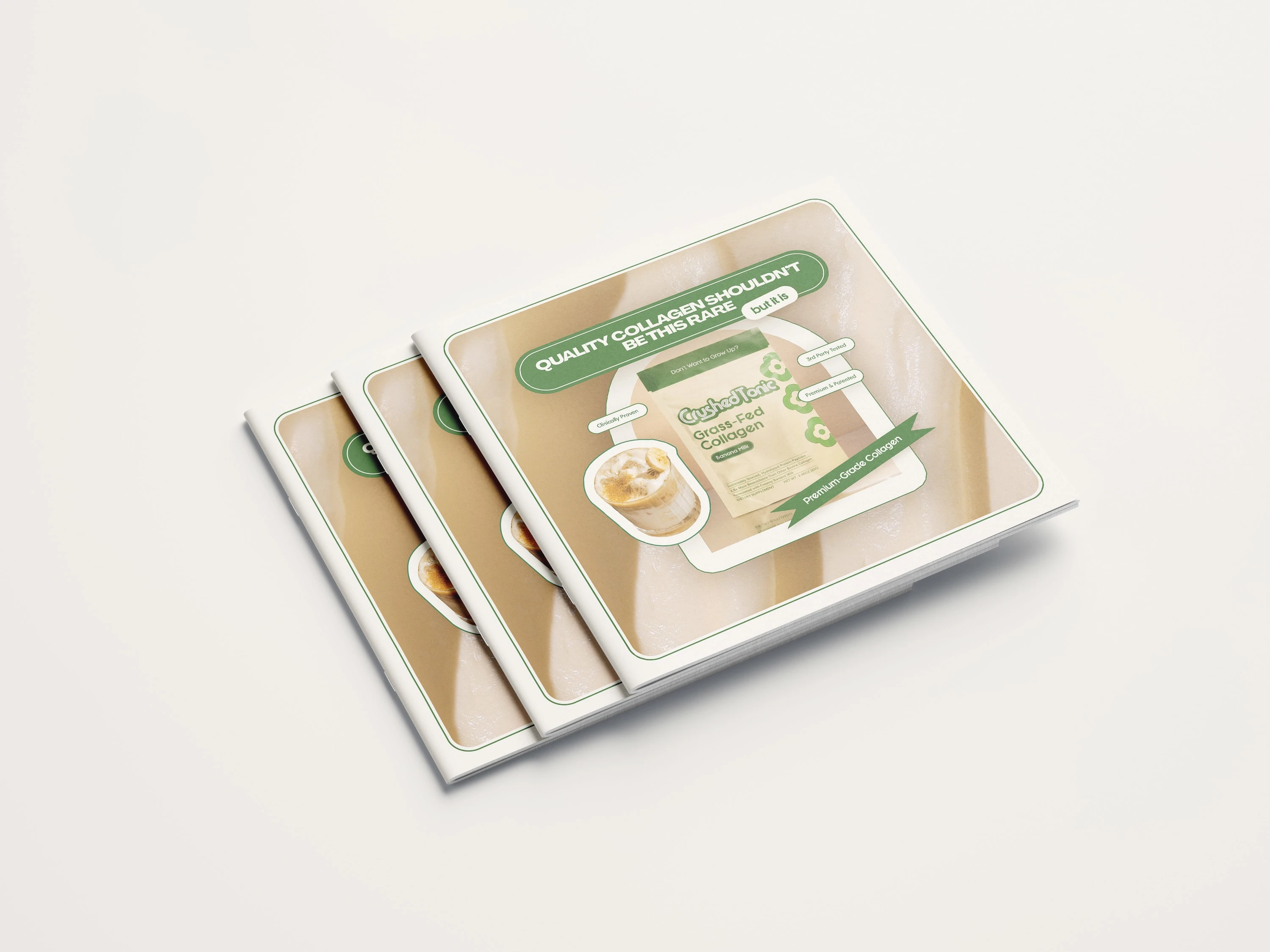
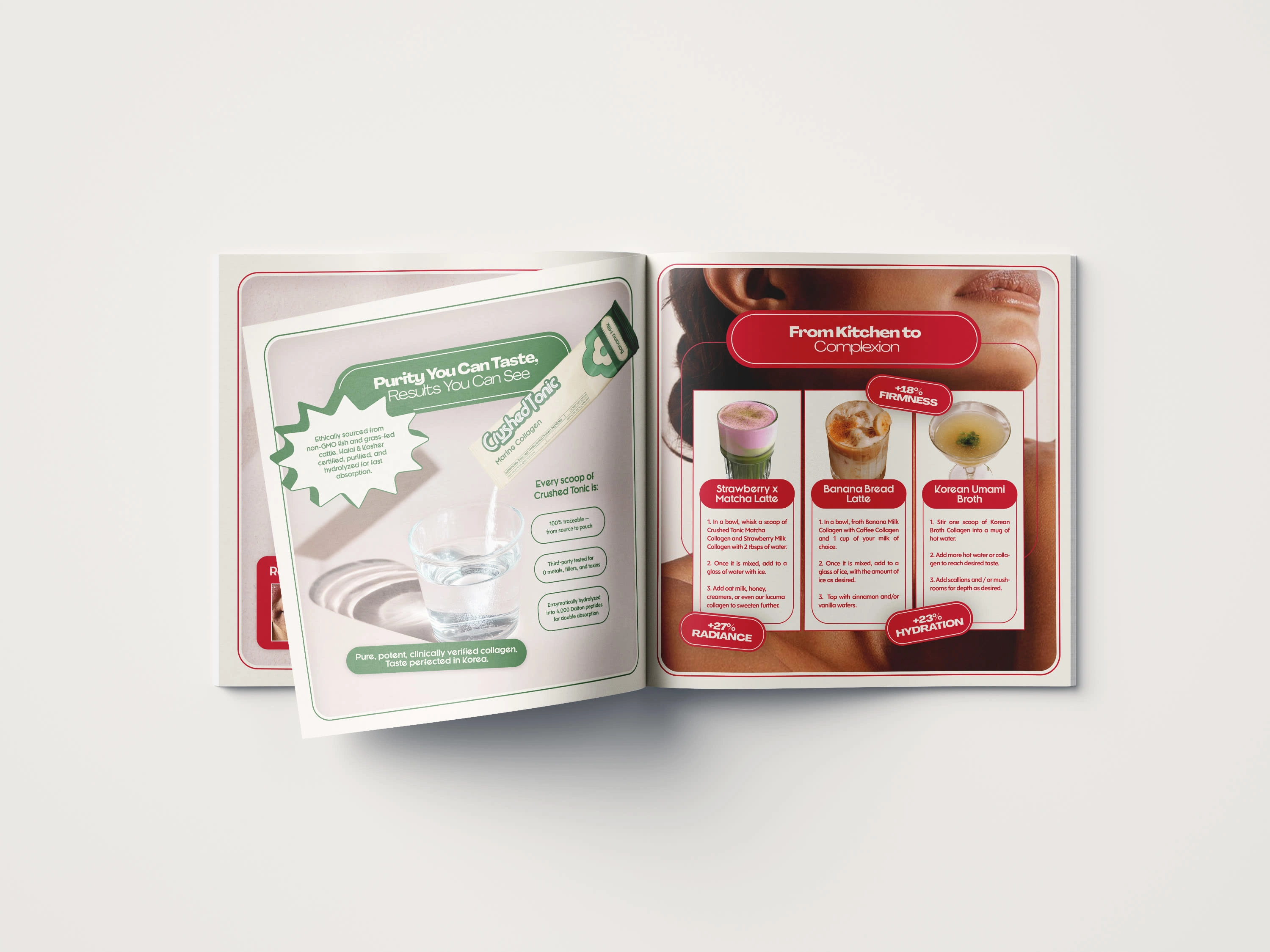
Promotional Brochure Included in Product Packaging
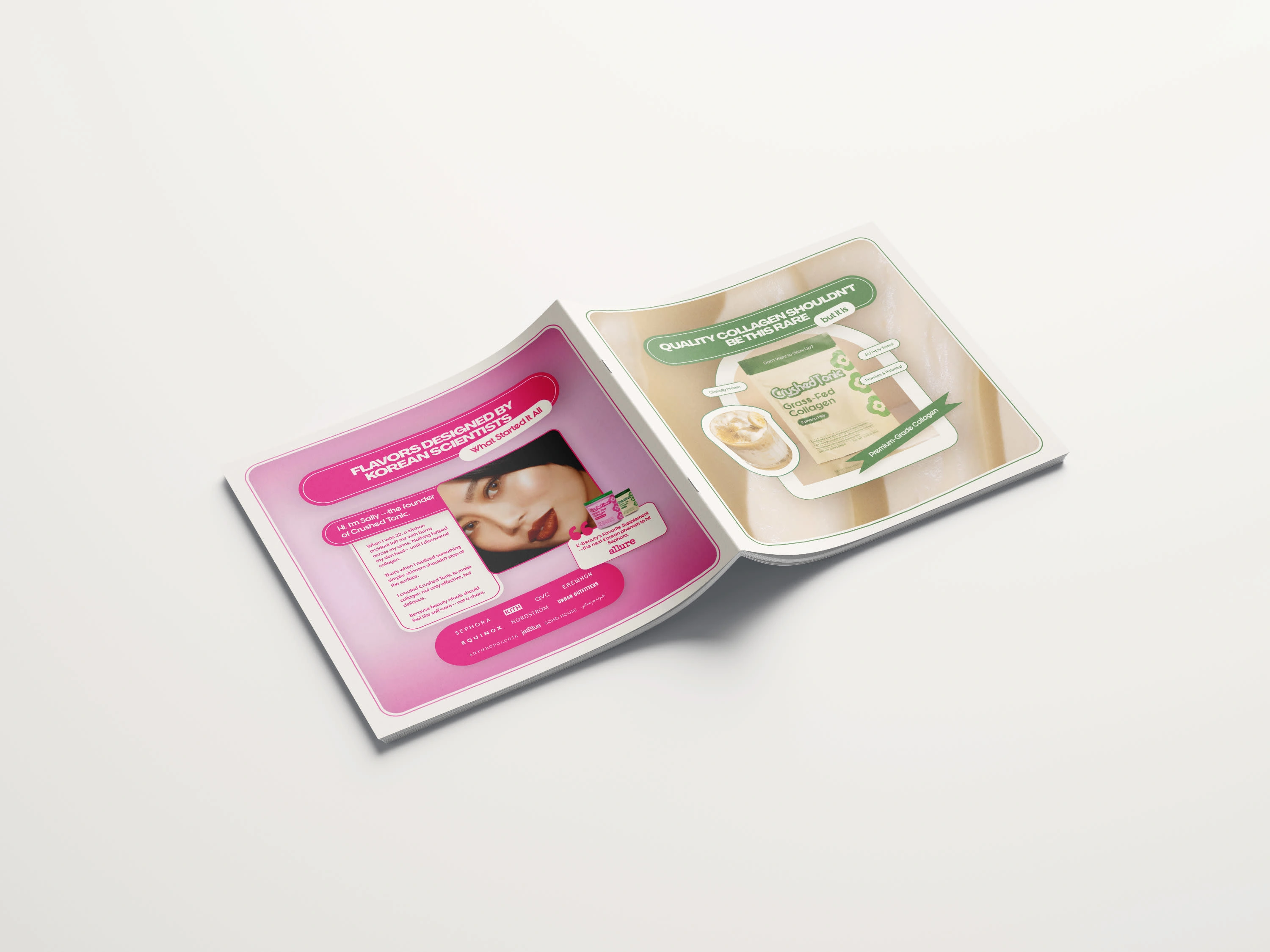
Promotional Brochure Included in Product Packaging
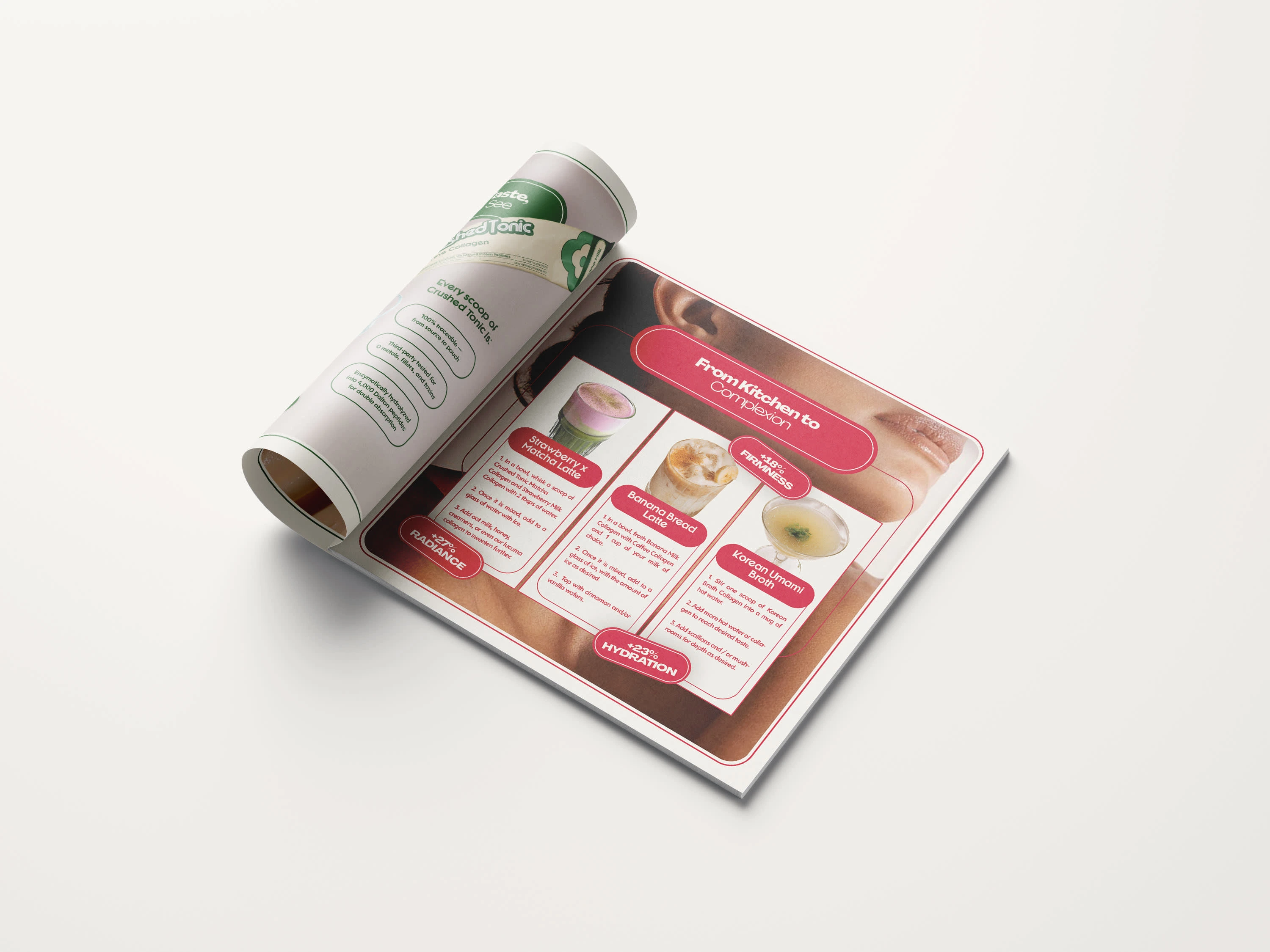
Promotional Brochure Included in Product Packaging
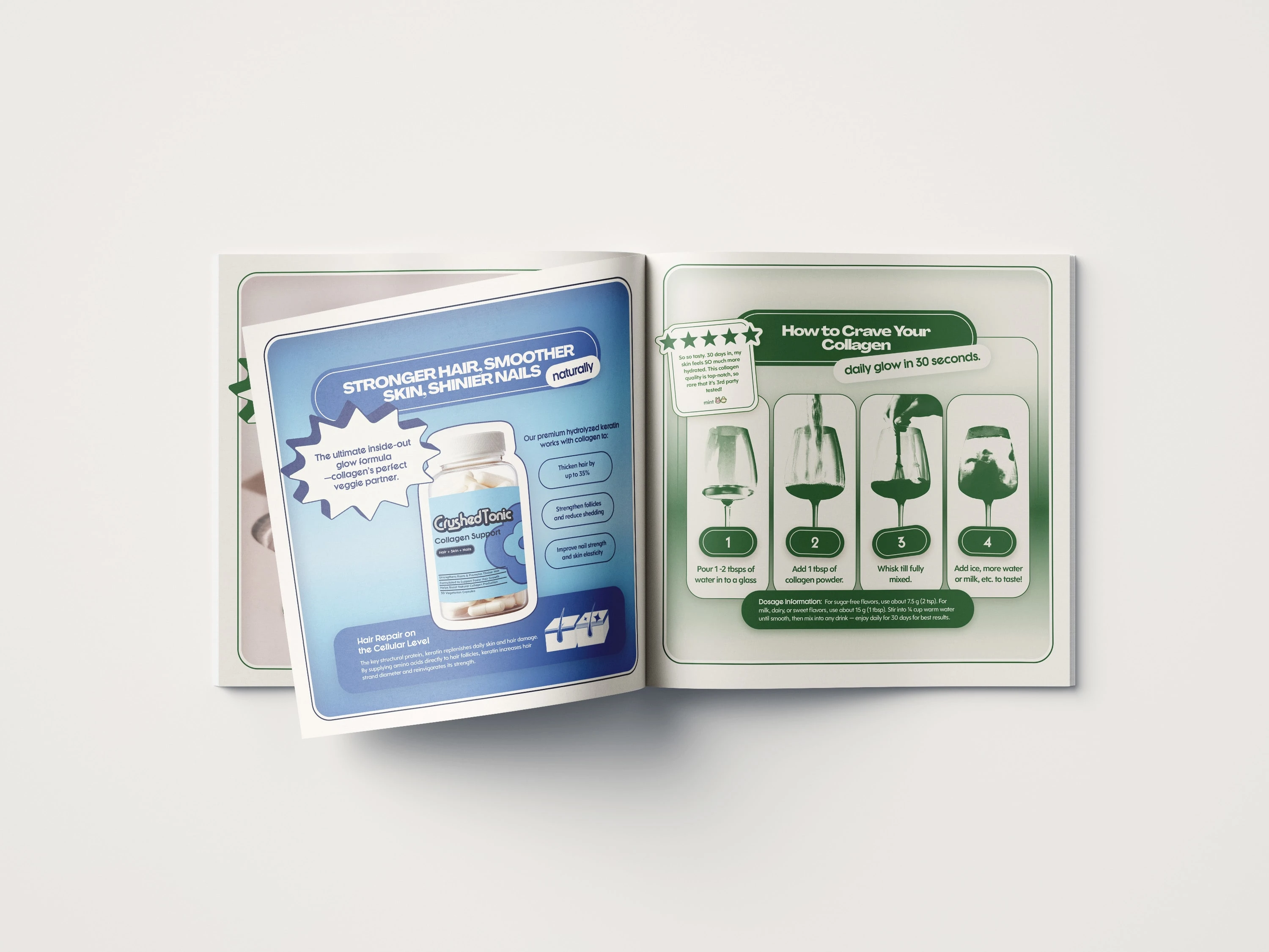
Promotional Brochure Included in Product Packaging
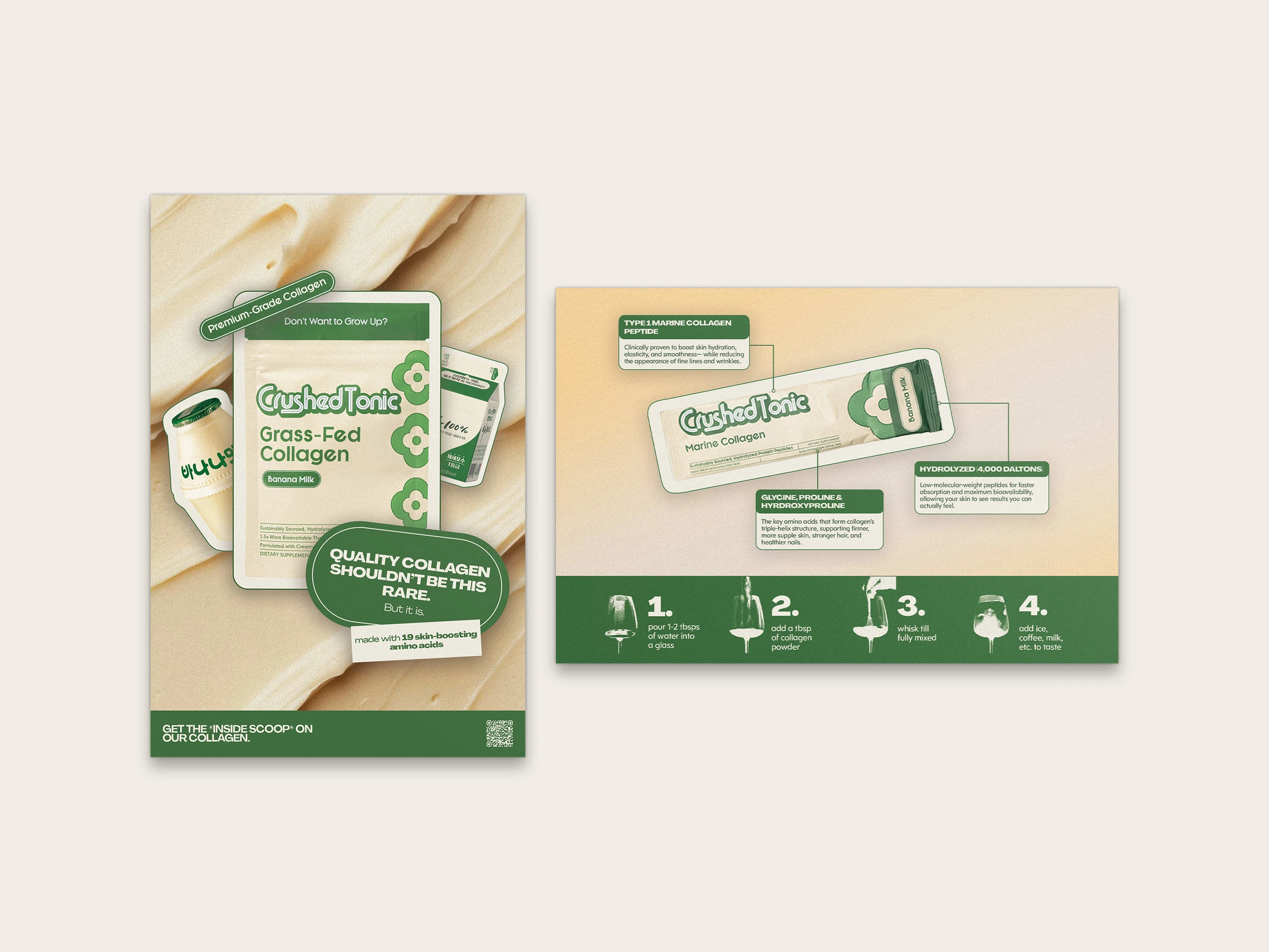
Promotional Postcard Used in Product Packaging and For Event Posters
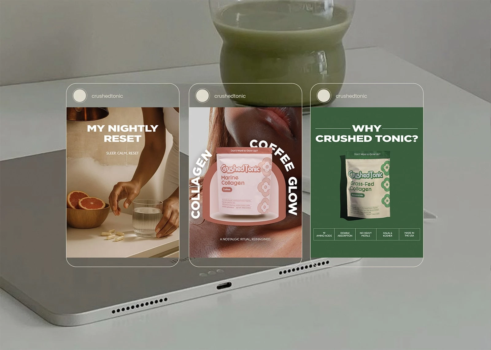
Infographic-Inspired Social Media Ads
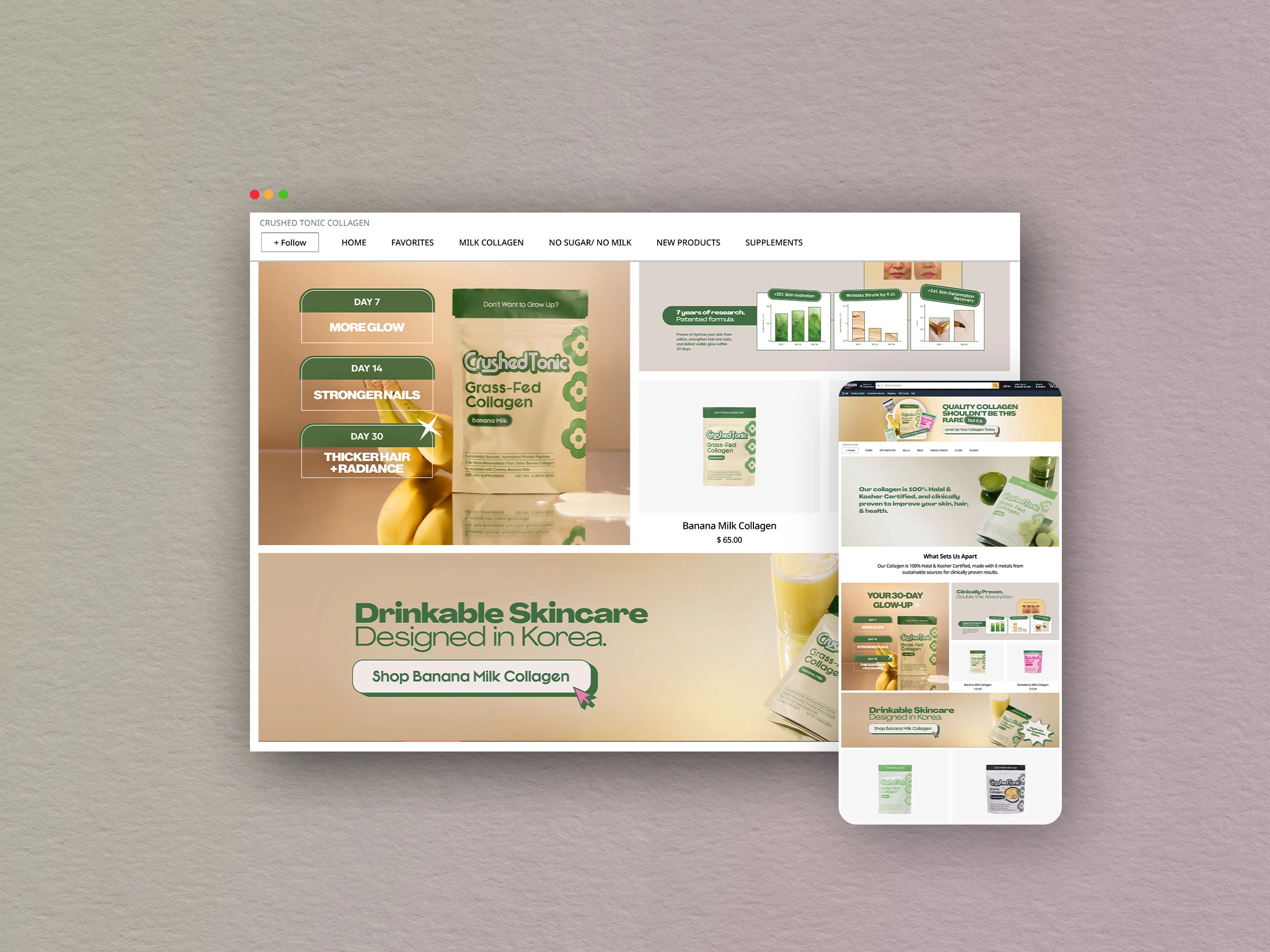
Amazon Storefront for Desktop & Mobile
Impact
The project resulted in a cohesive, scalable design system that improved consistency across brand touchpoints and supported clearer product storytelling. The brand gained a visual foundation that could evolve alongside future campaigns and product launches.
Like this project
Posted Jan 28, 2026
I built a scalable brand & marketing system for a collagen & supplement company spanning digital, Amazon, e-commerce, and print with beauty-forward positioning.
Likes
2
Views
11
Timeline
Sep 15, 2025 - Dec 3, 2027
Clients
Crushed Tonic

