Rebrand & Social Media Marketing for Online Health Community
Daisy Bell
About the Brand
With about 22 million Americans suffering from inflammatory bowel disease (IBD) and healthcare profiting $8.5 billion in 2018 just on this disease according to data from the CDC, patients need a space to feel like they are in control (1,2). As the cost of care suggests, the lifelong disease is expensive. The CDC estimates that 71% of healthcare costs contribute to prescription medicine costs, mainly due to the “effective but highly-priced biologic medication” (2). Two inferences can be made from this reality. The first is that companies make extreme profits from the sick. The second is that patients should mitigate all variables that would result in their disease worsening, thereby being medically forced to take “highly-priced” biologic medication. We all know about the gut-brain axis —how the brain influences how our gut feels and vice versa.
we need to increase a sense of community amongst autoimmune patients
That would mean that prioritizing mental health, which is largely benefited by control over one’s body in the case of chronic illness, would greatly benefit the gut and prevent IBD symptoms from worsening. Therefore, we need to increase a sense of community amongst autoimmune patients and increase the flow of information between doctor and patient. That is what this company is all about —empowering the patient and helping them live well despite their disease. And, with 2 in 3 Americans living with one or more chronic illnesses, the company would benefit more than just IBD patients.
1 Fairweather, D., & Rose, N. R. (2004). Women and Autoimmune Diseases. Emerging Infectious Diseases
2 Center of Disease Control (2024), “IBD Facts and Stats”
Brand Priorities
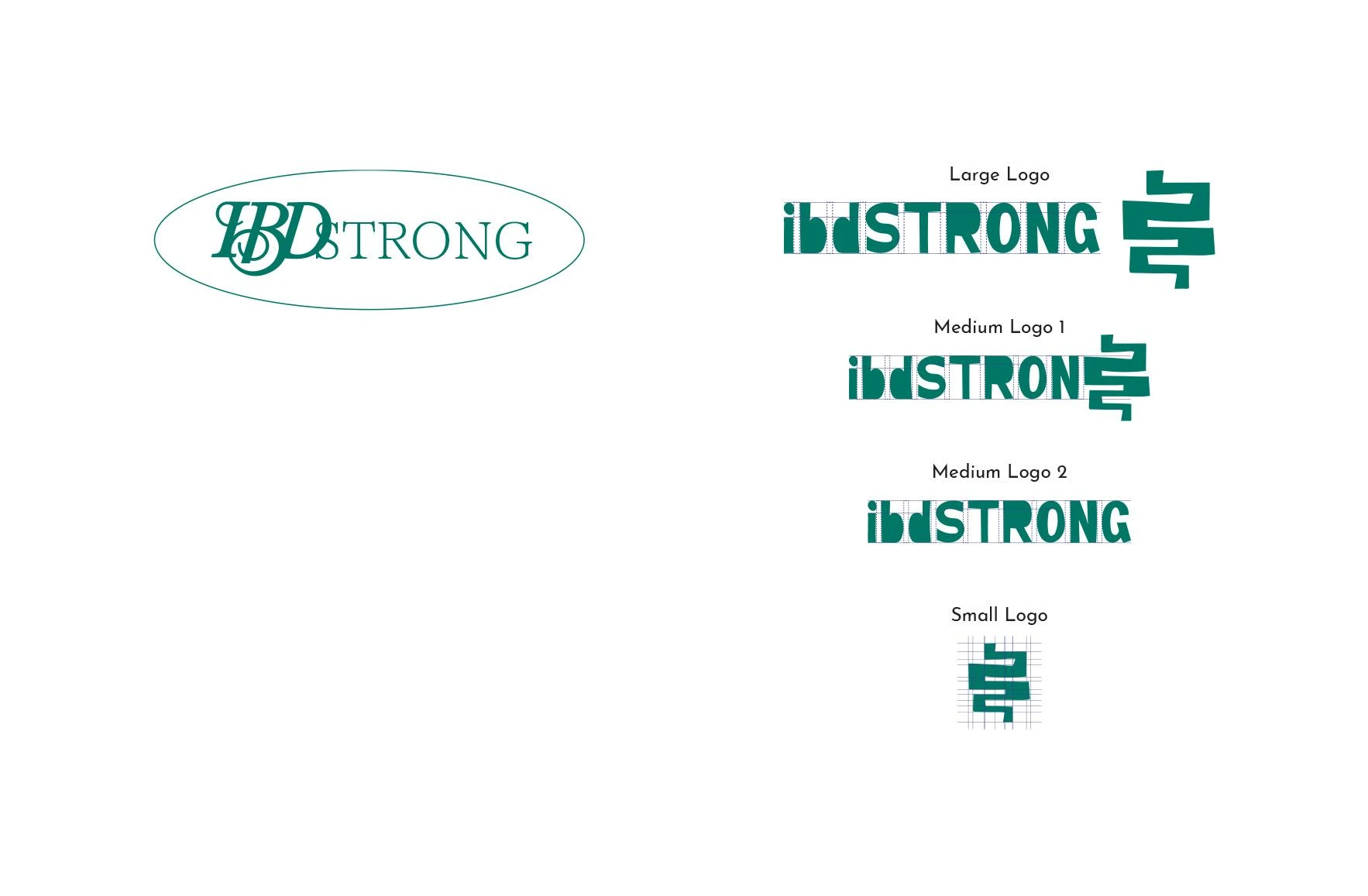
Since IBD is a relatively common disease, with about 5-8% of the population having been diagnosed, the disease already has semiotics associated with its community. For instance, the color purple and a breast-cancer-like ribbon are all used widely in the IBD community. That meant that these colors would be important to use in this company’s branding. However, it didn’t have to stop at purple and a ribbon. I felt like the color green, representing growth and new life, would be a powerful color to add to this company’s branding by representing the new growth that can happen for patients while they build their inner tenacity and face some of life’s toughest lessons. I also felt like the ribbon was an icon that put patients into a sickness-identifying mental state. I wanted the brand to be an uplifting and inspiring place for patients to commune, meaning that the branding should feel like it has a soul and is imperfect and ever-growing. I tapped into a more hand-drawn kid-like logo to once again tap into new-growth and to give the entire brand a personality. On top of the logo, the client wanted to touch on 5 content subjects that would help patients find which complementary medical practices would help them mitigate their disease worsening —workouts, food, research, treatments, and quotes. You can find more about the brand transformation below.
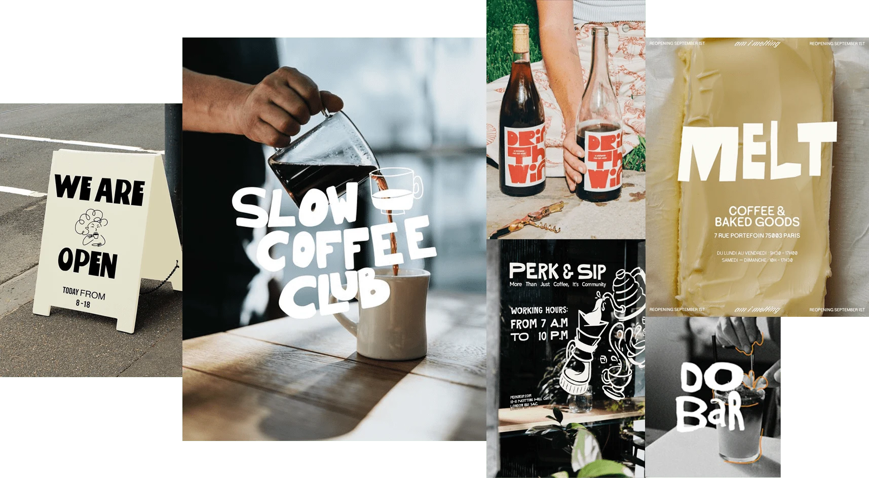
Logo Moodboard
Logo Transformation
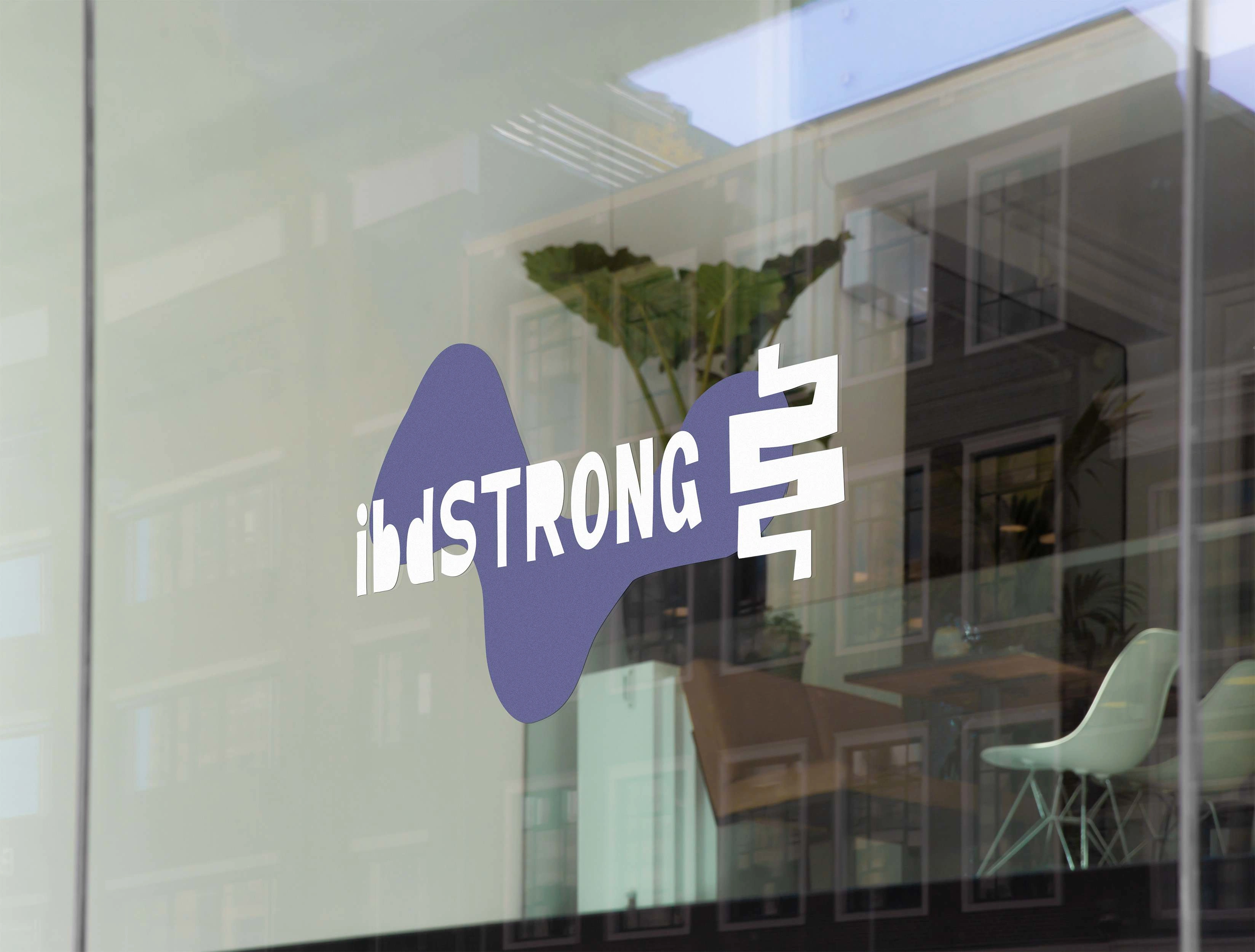
The Brand's New Look
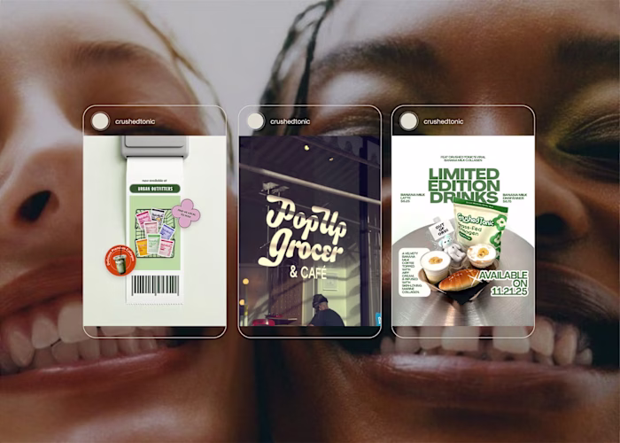
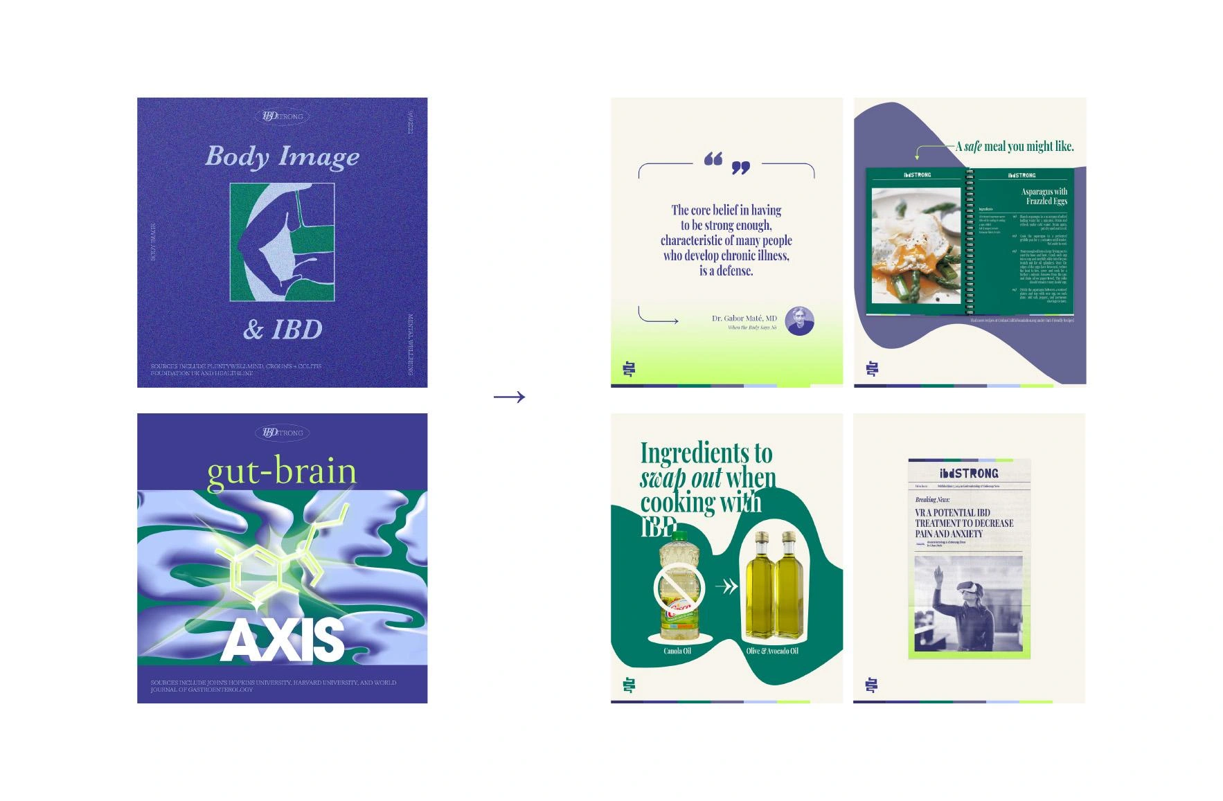
Post & Story Topics
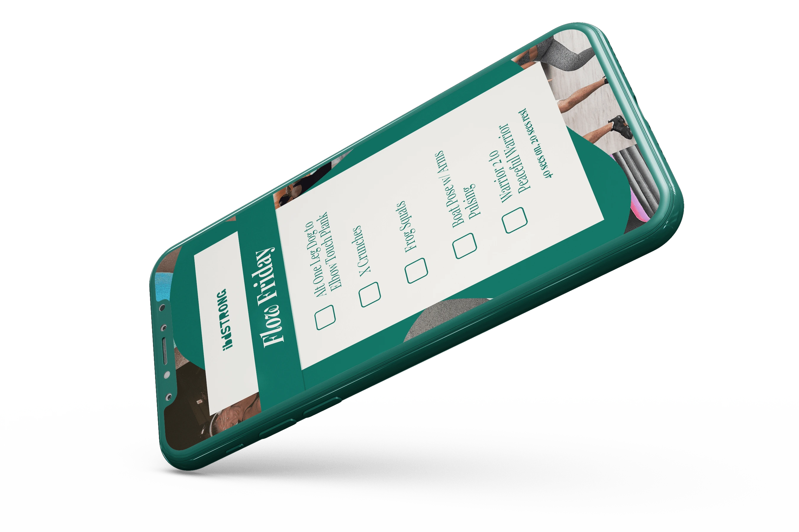
Workouts
Food
Research
Treatment
Quotes
These will be divided up amongst posts & stories, with cooking tips and workouts mainly comprising stories. The entire point of these topics & whether they are posts or stories is that they help patients & those close to patients be educated on fun ways to be healthy while living with IBD.
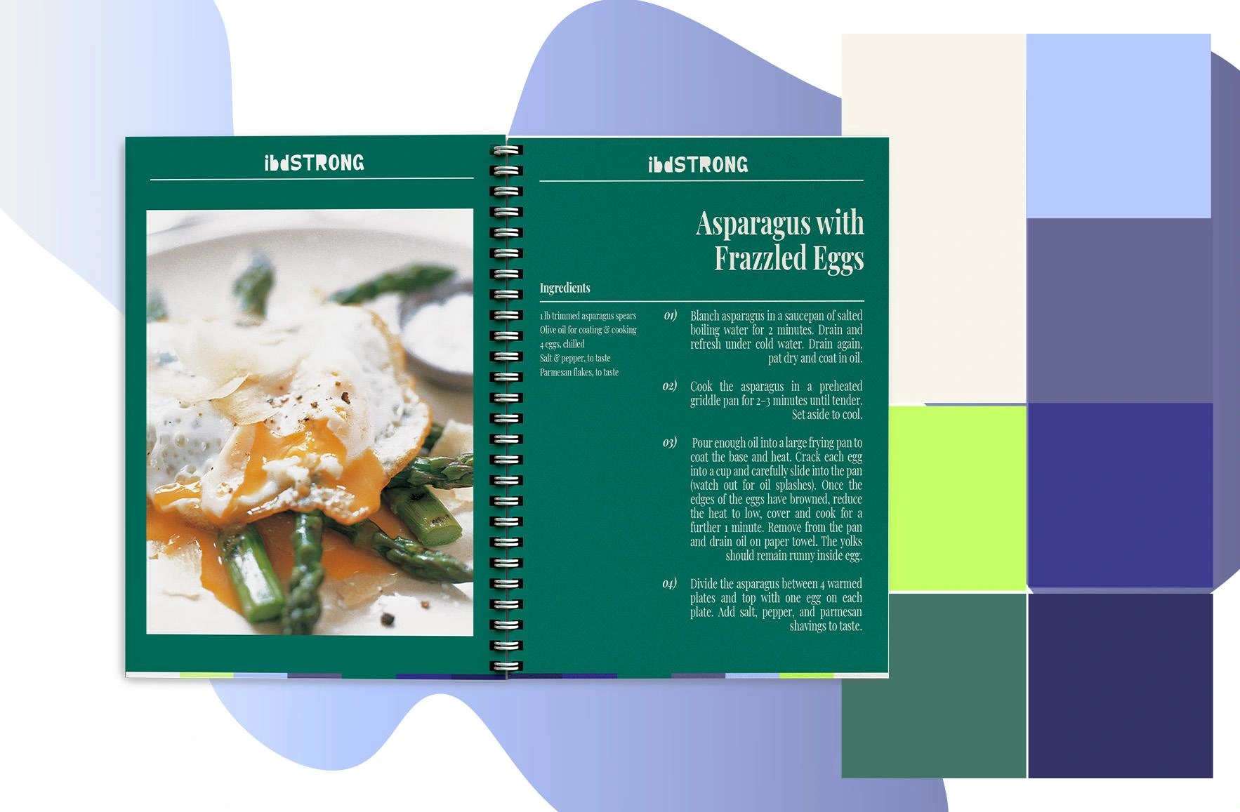
How the Files Look
Mockups for Efficiency
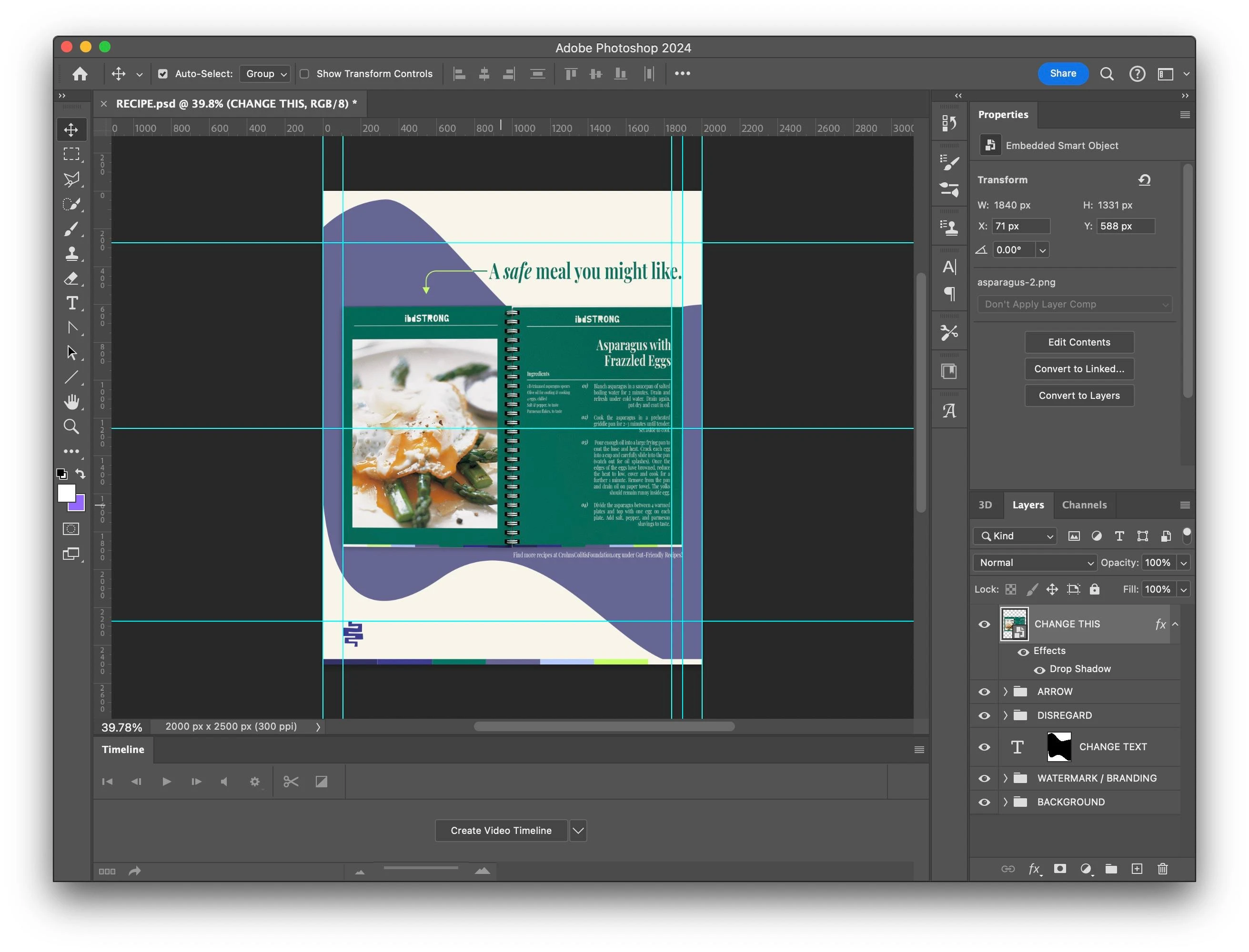
This is the beauty of Photoshop Smart Objects. Look at the layer that says "CHANGE THIS". The client can double-click the image and replace the recipe, helping the client easily update their post.
Then & Now
The evolution of the brand
Final Assets
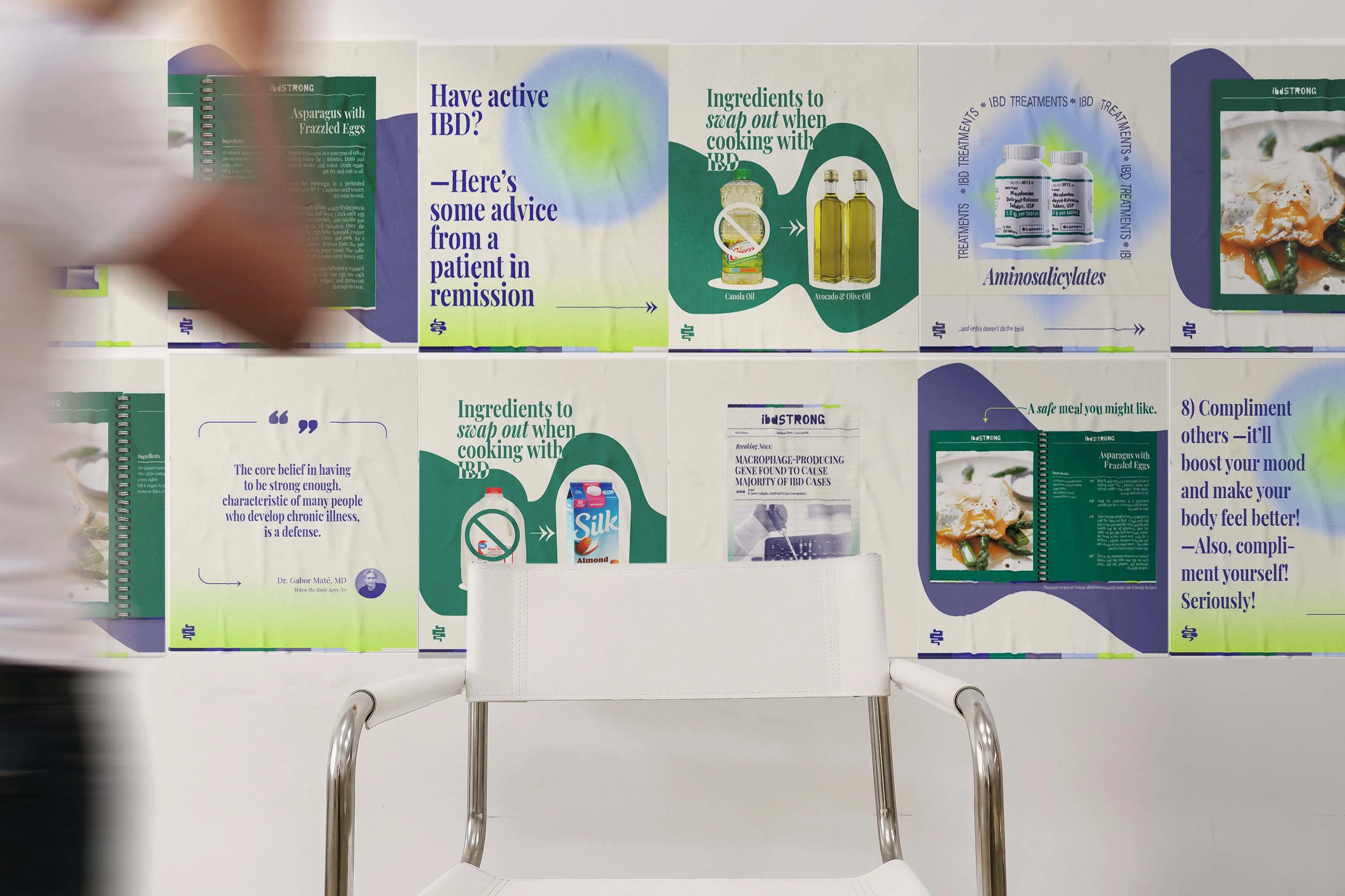
Posts, side by side.
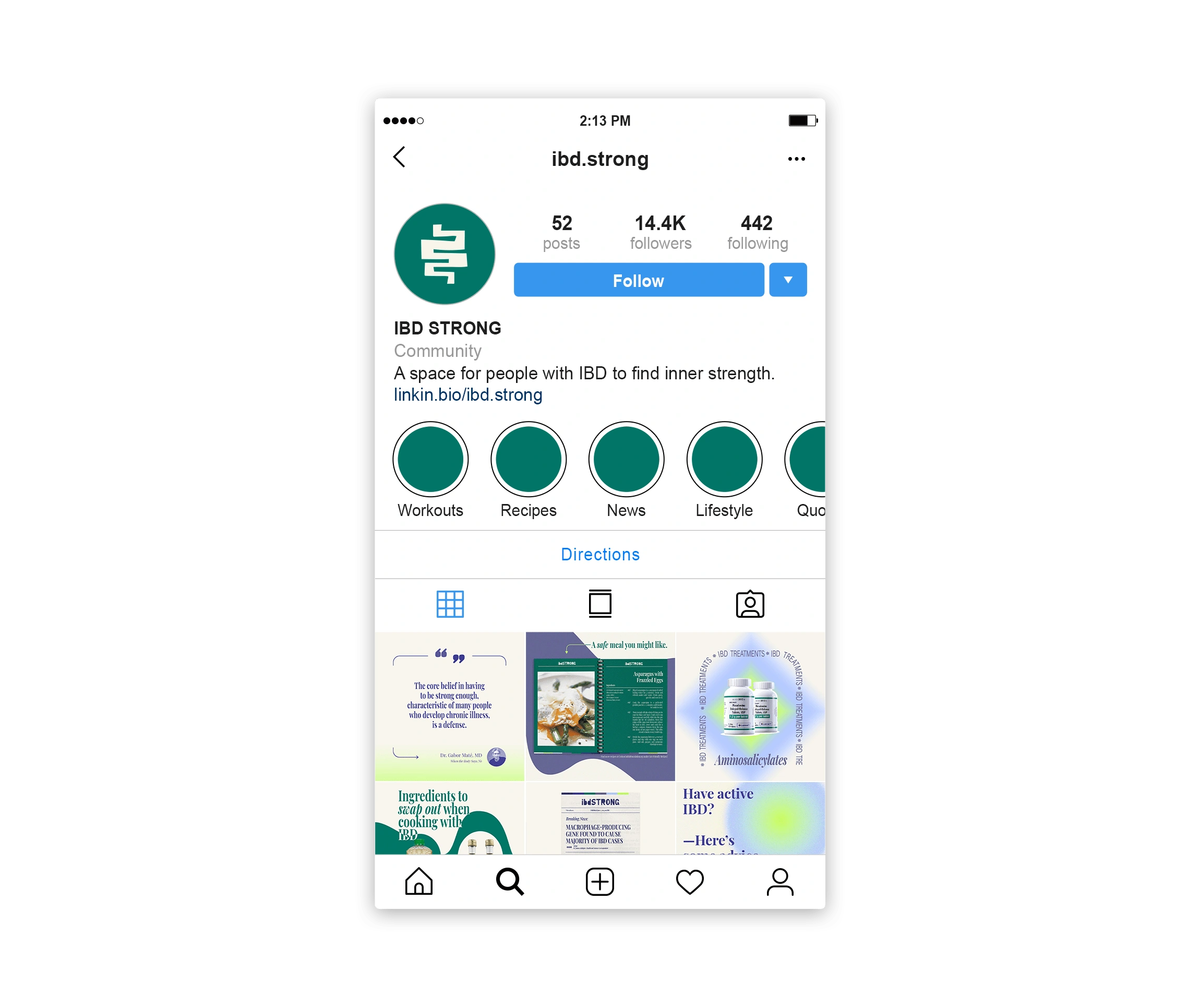
Profile
Workout story.
Like this project
Posted Sep 23, 2024
A brand redesign, involving an attractive and fresh brand personality, connecting the company's audience with growth-oriented stories & hope.