Social Media Campaign for Digital Music Magazine
Daisy Bell
About the brand
We Don’t Care. Music (WDC) is a brand that highlights up and coming artists. Imagine a Rollingstone online magazine for new musical talent. That’s what WDC is all about. With interviews of musicians and new songs release all the time, the brand needs to connect with its audience quickly & while engaging the audience with the personality and brand of many different artists. It’s all about entertainment.
Onboarding
Since this was a client-designer relationship, the biggest priority for me was to understand how I could help my client both with my visual skills and software expertise. Everyone talks about their onboarding process, but I think it’s critical to understand how I can help out a brand as a designer. If a designer can’t satisfy the needs of a brand, what’s the point of it all? Anyway, I take this part of the process very seriously. I want my designs to be useful and convenient for my clients.
During the development of this brand’s rebrand, I wanted to resolve any potential obstacles that could arise after my partnership with the organization. In this particular case, I needed to create social media assets that were easily editable and looked good next to each other. To achieve these objectives, I created labeled, editable Photoshop documents using the software’s Smart Object feature. Labeling layers whether they should be edited or not made it easier for the brand to use Photoshop as a tool without all its features overcomplicating the asset creation process for the brand after I was out of the picture. Also, it satisfied one of the brand’s priorities —that being a quick turnaround period between posts.
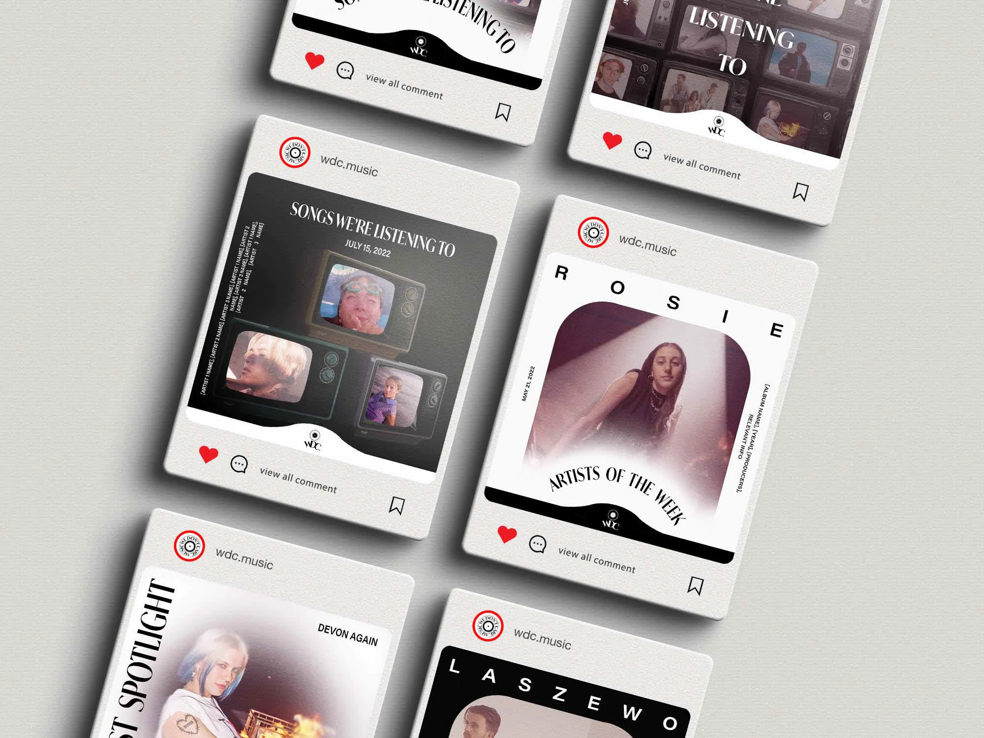
Marketing Campaign Moodboard
Brand Priorities
In this project, I was hired to refresh the company’s branding as well as its social media marketing. To achieve this task, I needed to know their target audience and how they planned to reach it. In other words, I needed to fully understand their branding priorities.
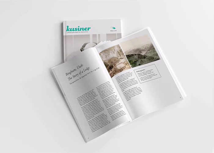
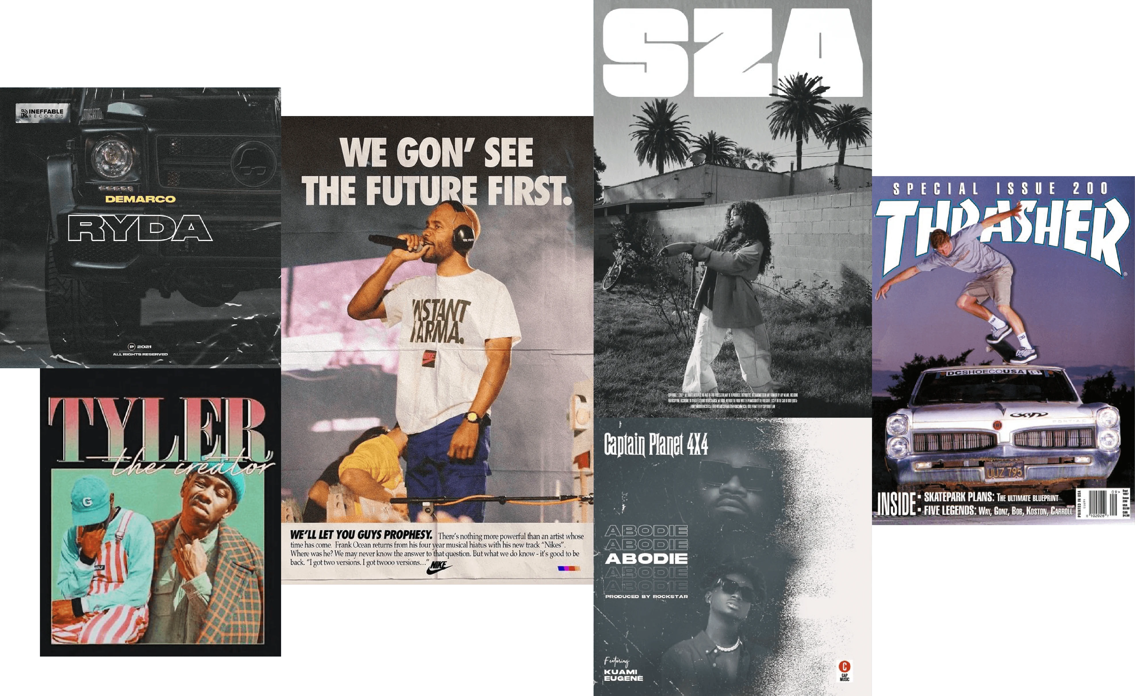
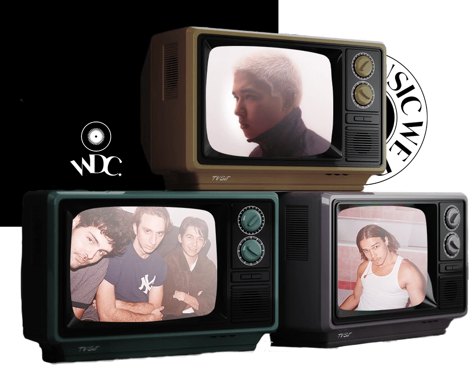
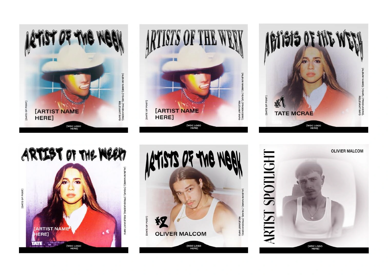
Since this brand showcases new musical talent, in which the musical talent has its own marketing aesthetic, I needed to develop a brand that wouldn’t visually clash with lots of other aesthetics. This can be a tough can of worms, relatively speaking, because the success of a brand lies in how aesthetic and recognizable it is. There should be an overall vibe or personality behind the brand that’s reflected in the brand’s visual content. Since this is a music-related brand too, which means it functions in an oversaturated marketplace, the brand needs to have a certain swagger and coolness factor applied to the way that it looks. To achieve swagger and character without clashing against each artist’s visual content, I created black-and-white brand materials. I also applied texture that made each asset seem retro and media-related. I wanted to give the brand a 1960s space race feel. You can get the feel of the brand with some assets to the right.
What the files look like
Using Smart Objects to Create Editable Assets
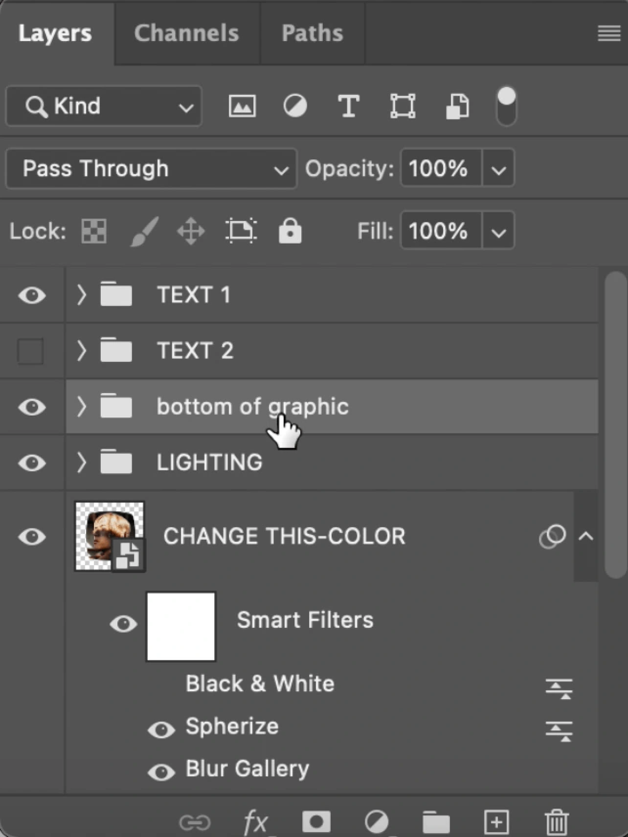
This is what the Photoshop labeling looks like, to the lower right. The image on the top is the final asset. The editable component of the document is the layer labeled “CHANGE THIS - COLOR”. The layer below is a version in black and white to give greater control of the social media asset. I find that the greater the communication, the easier the design contract is for the client. In this case, greater communication also allows me to give greater versions of each asset for the client to create a consistent brand across visually different assets.
Rough Drafts of Campaign's Look
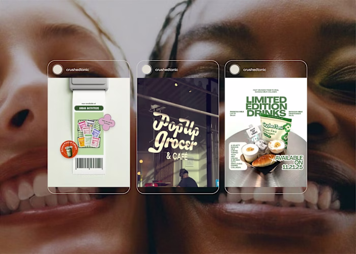
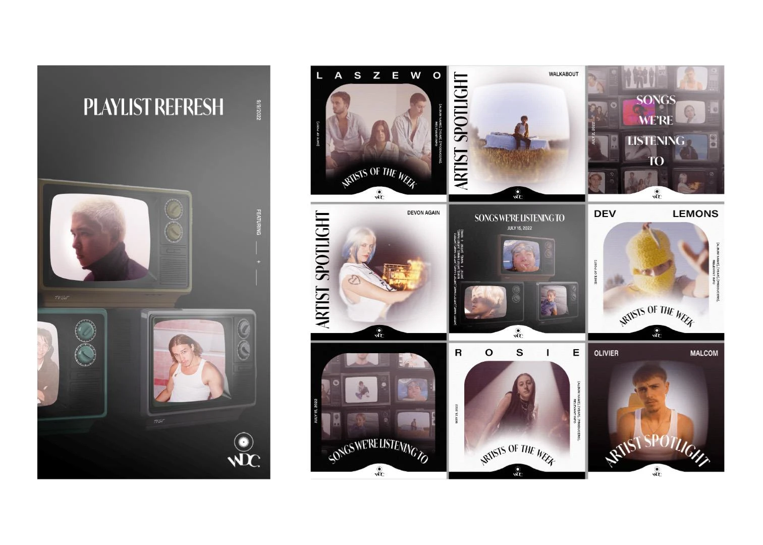
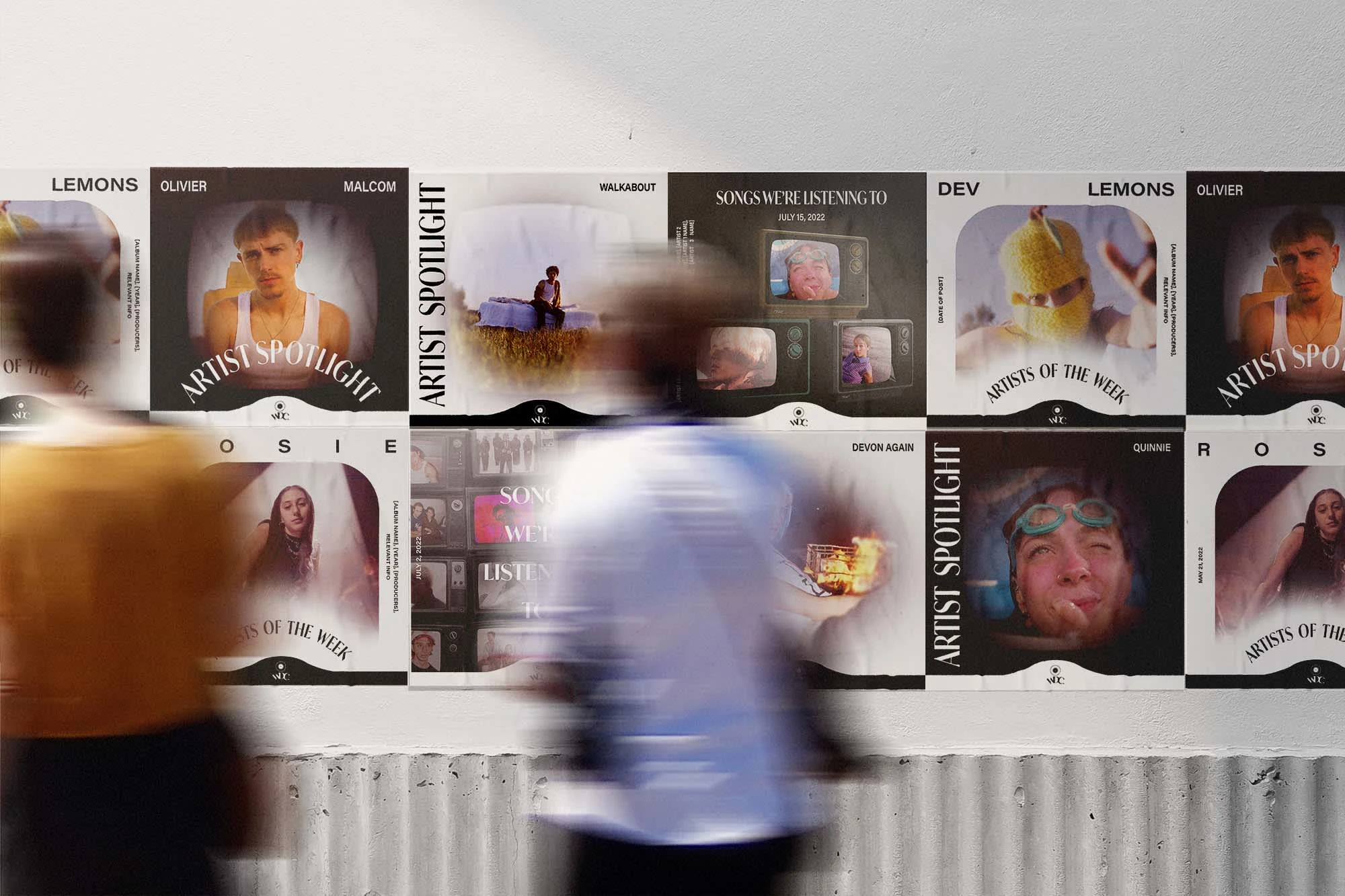
Final Campaign Assets
Like this project
Posted Sep 23, 2024
I crafted social media marketing materials, including posts, reels, and stories. The campaign successfully increased follower count and engagement rates.