Magazine + Brochure for Historical Society
Daisy Bell
Commissioned by the Swedish Finn Historical Society, I transformed undigitized records, letters, and photos into a tactile, emotionally resonant magazine and brochure. The goal? To breathe life into the past, bridging history with modern design—and drawing younger people into stories they didn’t know they needed.
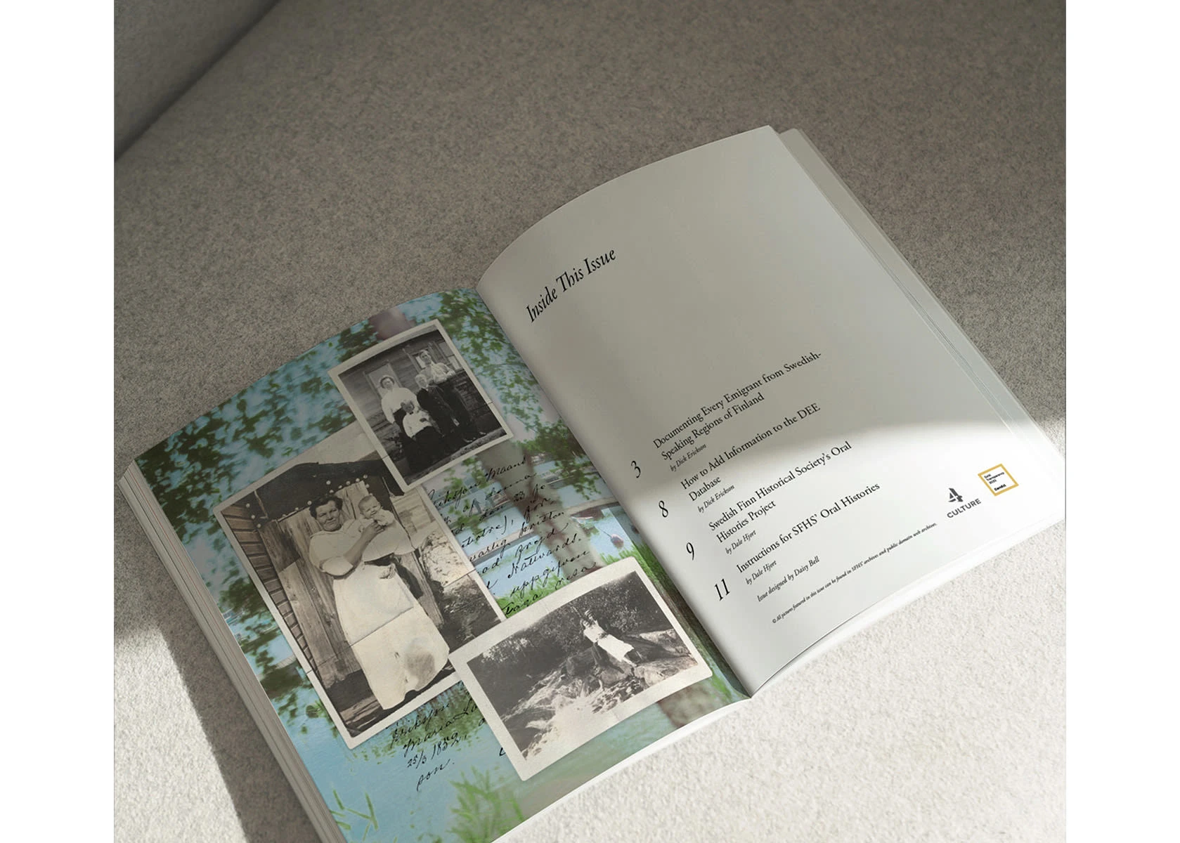
Table of Contents
Project Overview
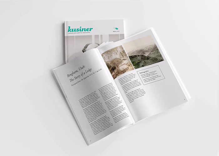
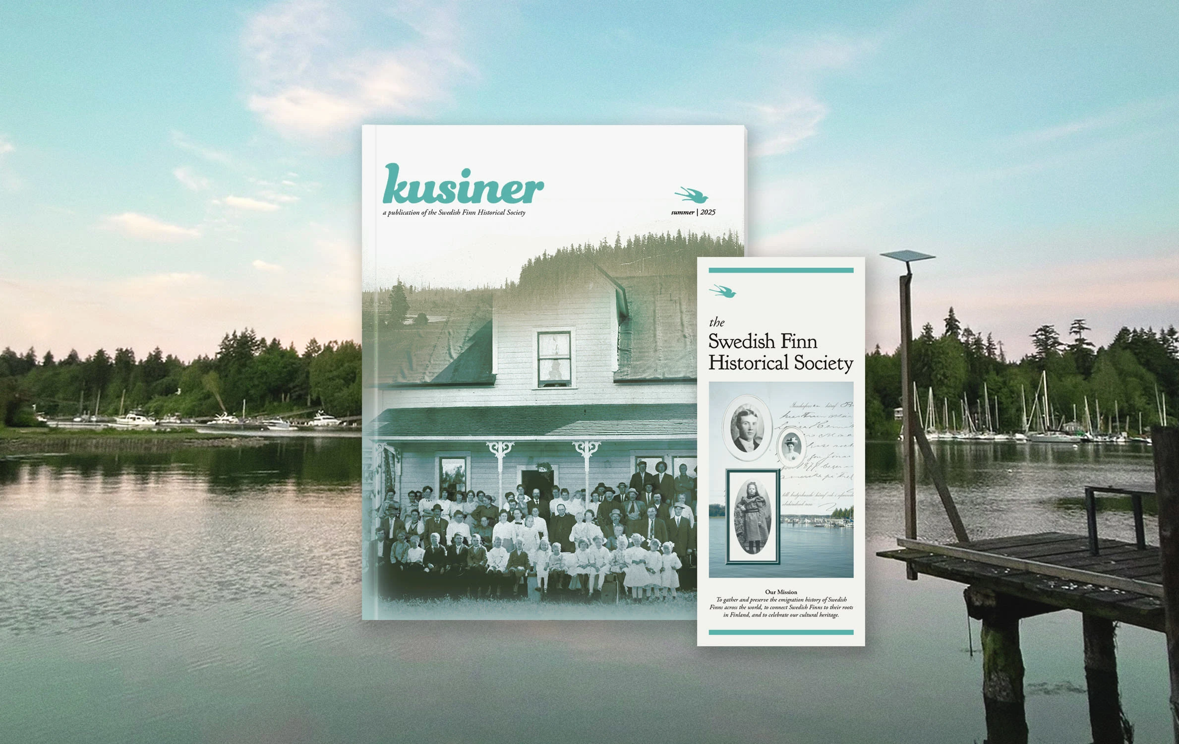
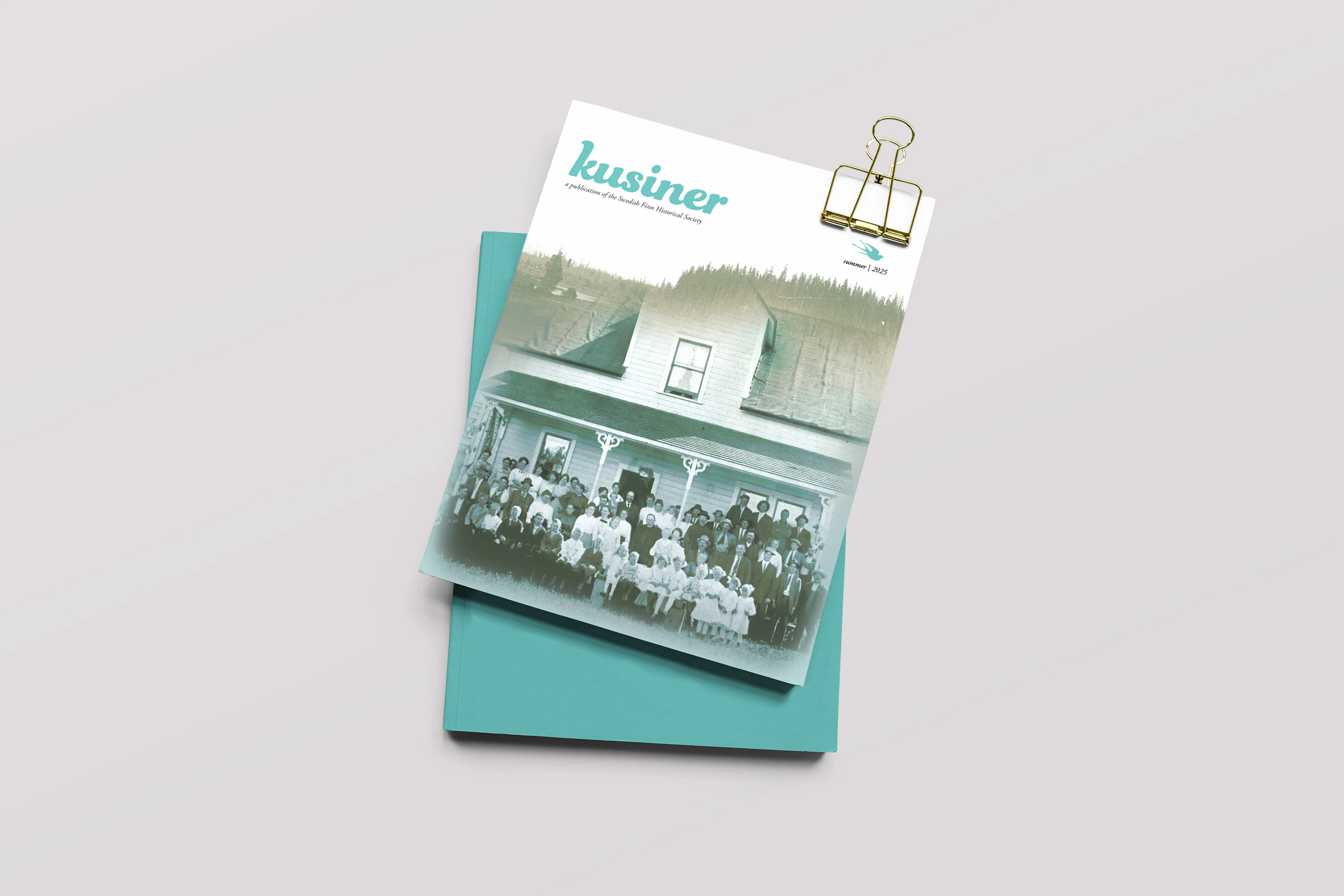
Kusiner is a print design project for the Swedish Finn Historical Society, a nonprofit preserving stories of Swedish-speaking emigrants from Finland. Faced with thousands of undigitized letters, photos, and documents, the Society needed a way to both preserve and enliven their archive—especially for younger audiences.
My Role & Vision
As a freelance graphic designer, I:
Collaborated with community members in both the U.S. and Finland
Led layout, visual storytelling, typographic systems, and image curation
Marched the line between archival reverence and contemporary appeal
Design Goals & Process
Design Goals
Create a magazine that felt timeless yet fresh
Reflect the Society’s brand and digital presence in print
Turn dense historical narratives into visually digestible spreads
Honor budget limitations with elegant, efficient design
Mirror the magazine’s aesthetic in the companion brochure
Design Process
Research & Inspiration: Community interviews, Pinterest moodboarding, pondering how “time” looks and feels
Typography & Layout: Chose Garamond for its classic readability; wove in the Society’s rustic serif logo; structured spreads with textbook clarity and visual flow
Magazine Highlights
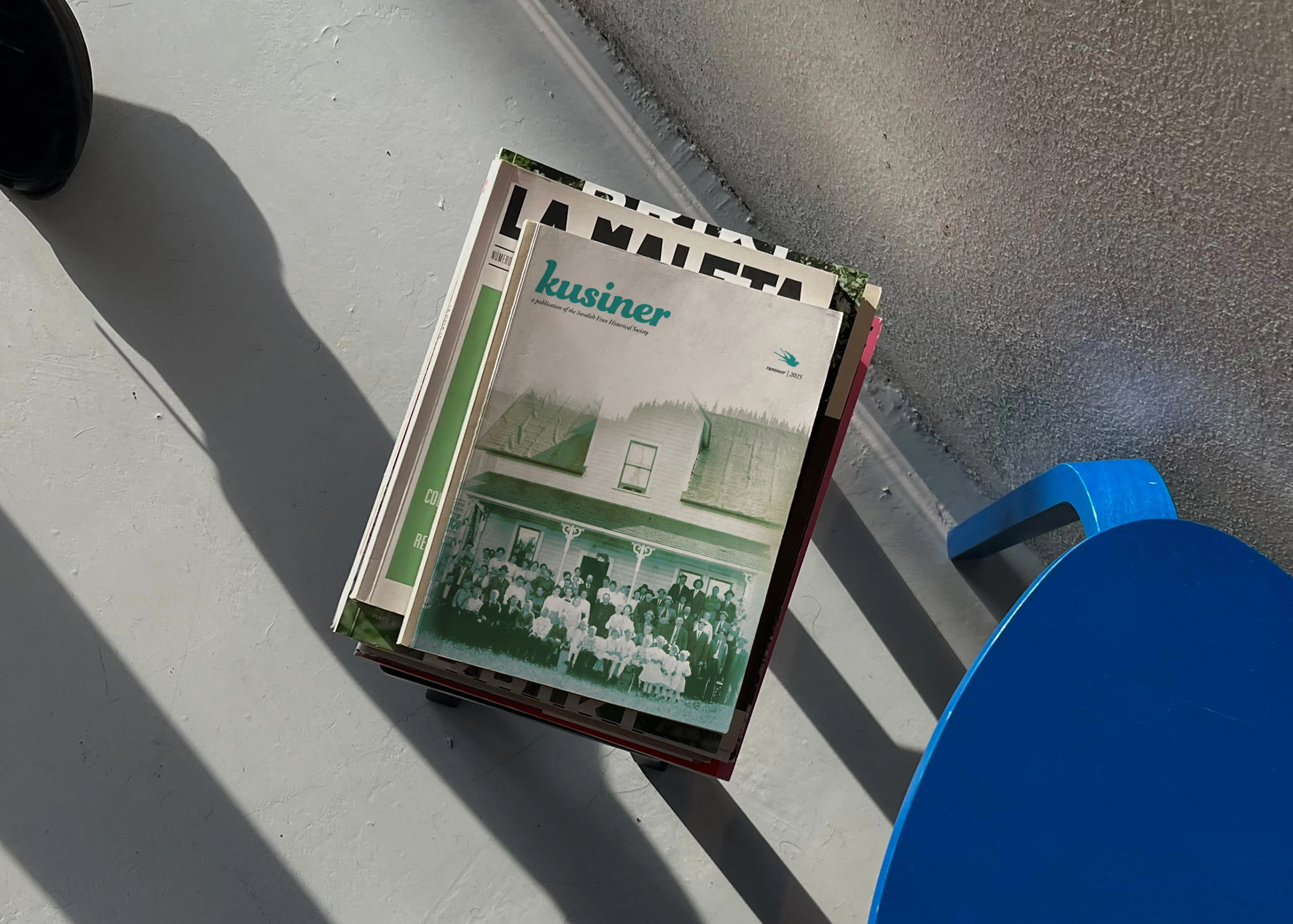
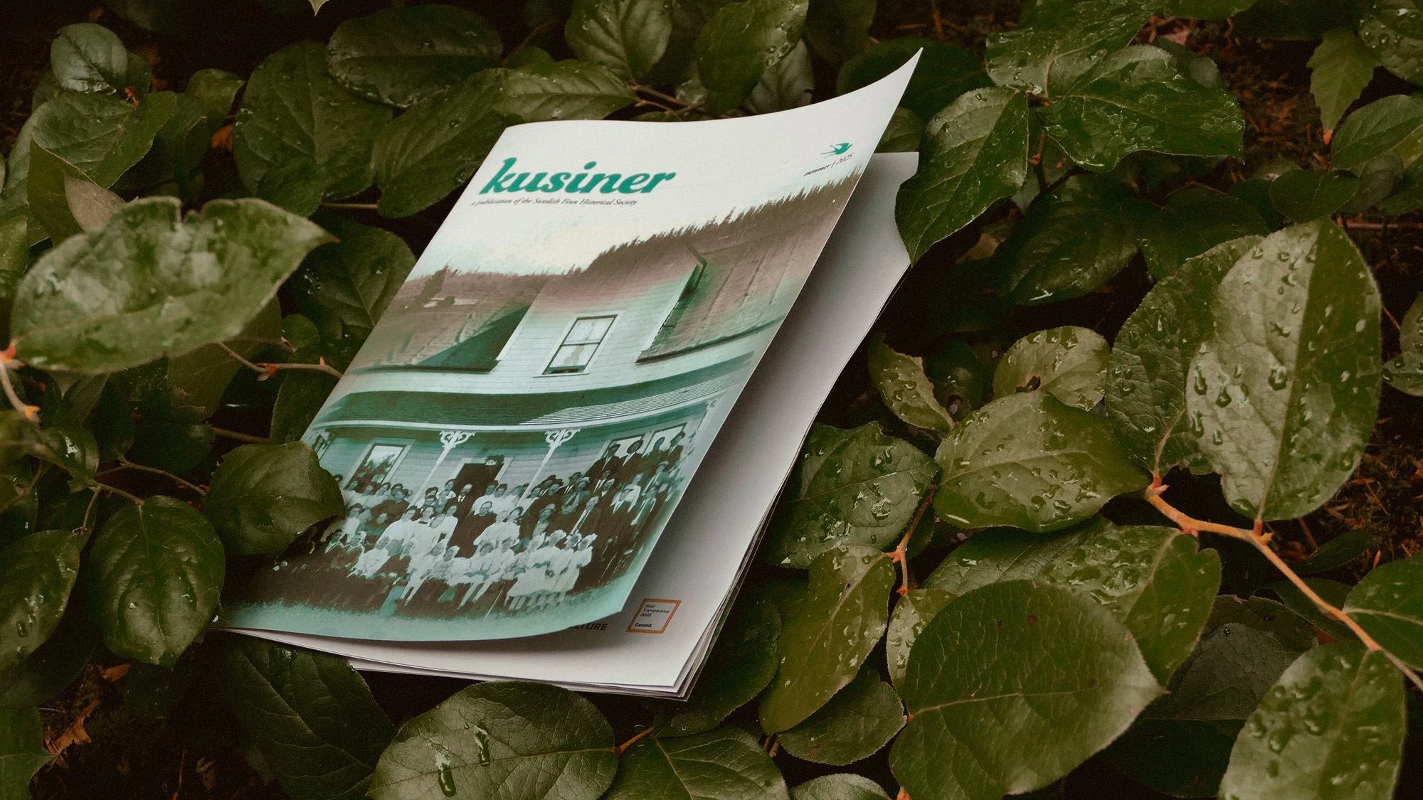
Cover – Timefolds: A double-exposure image: identity echoing across generations
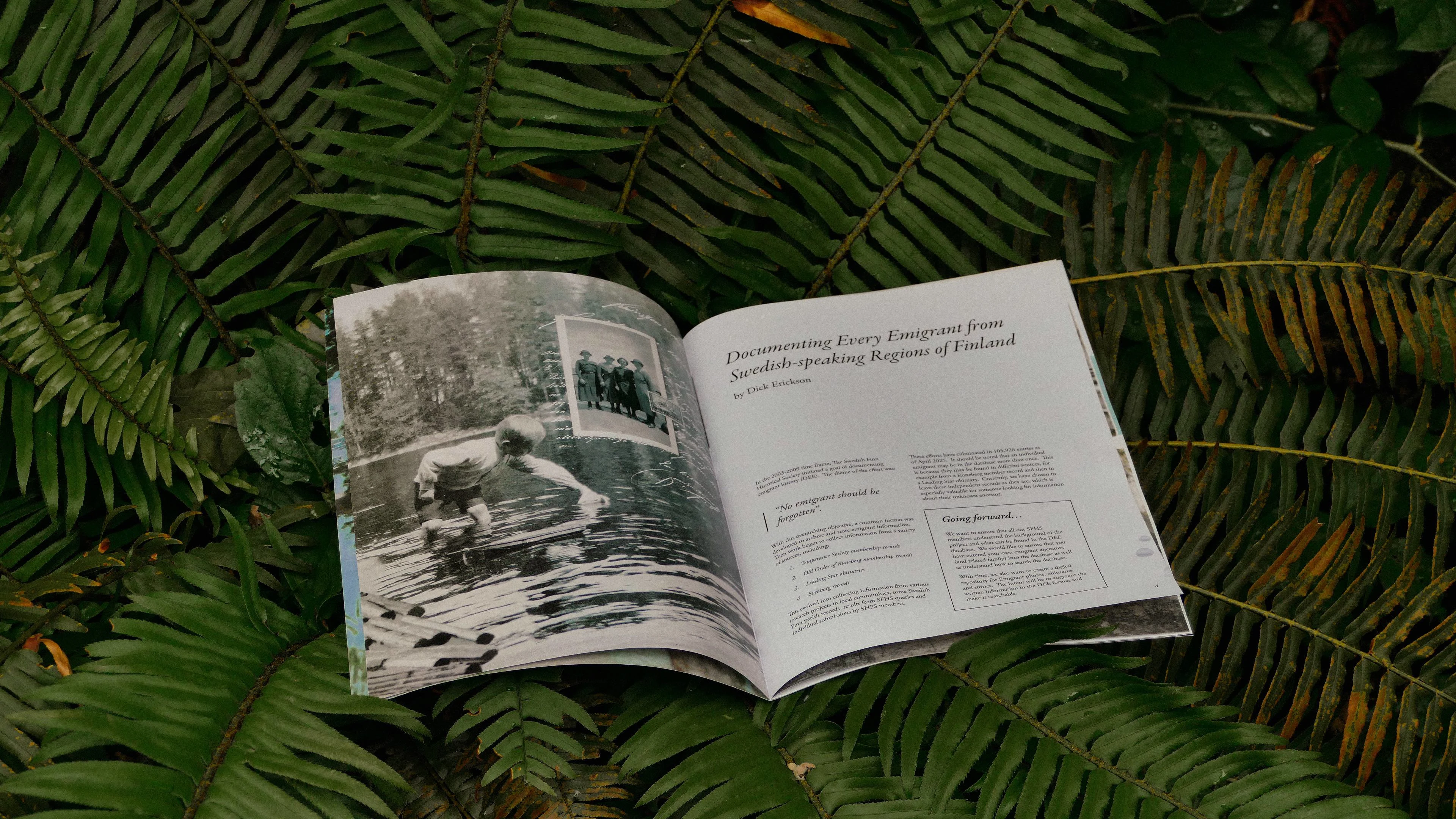
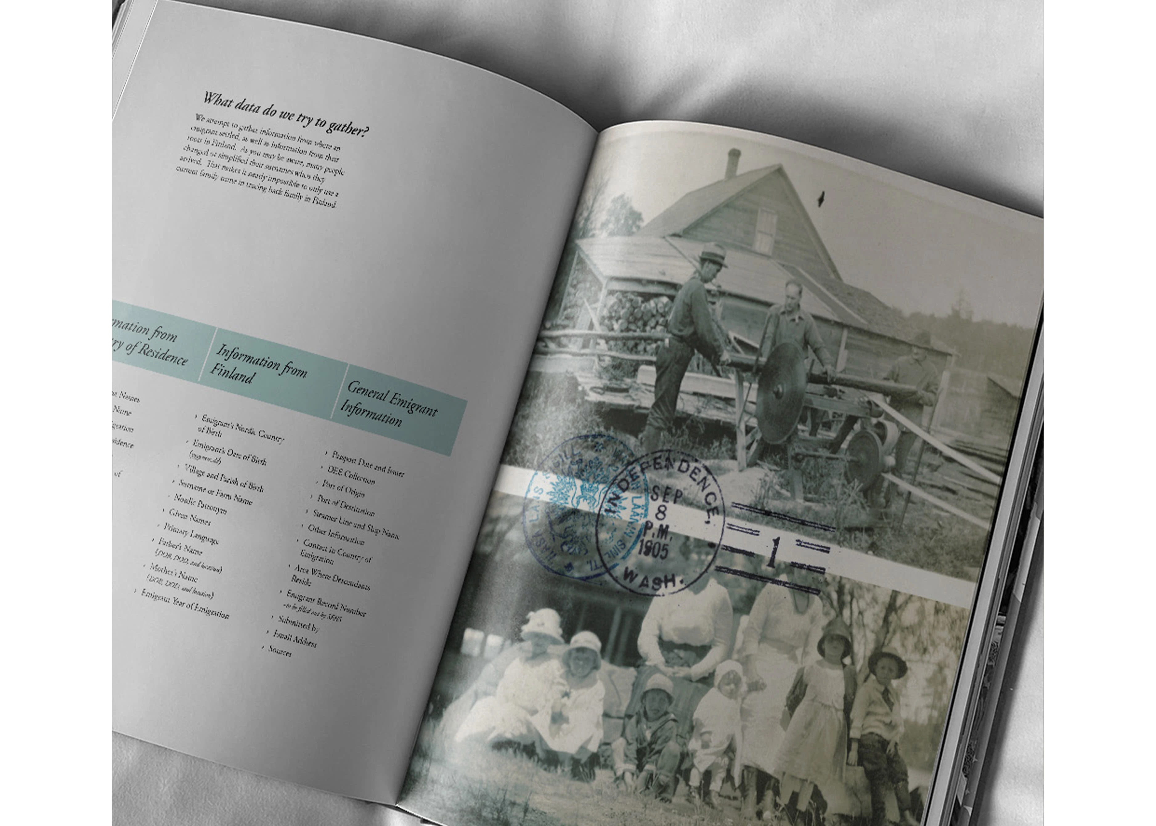
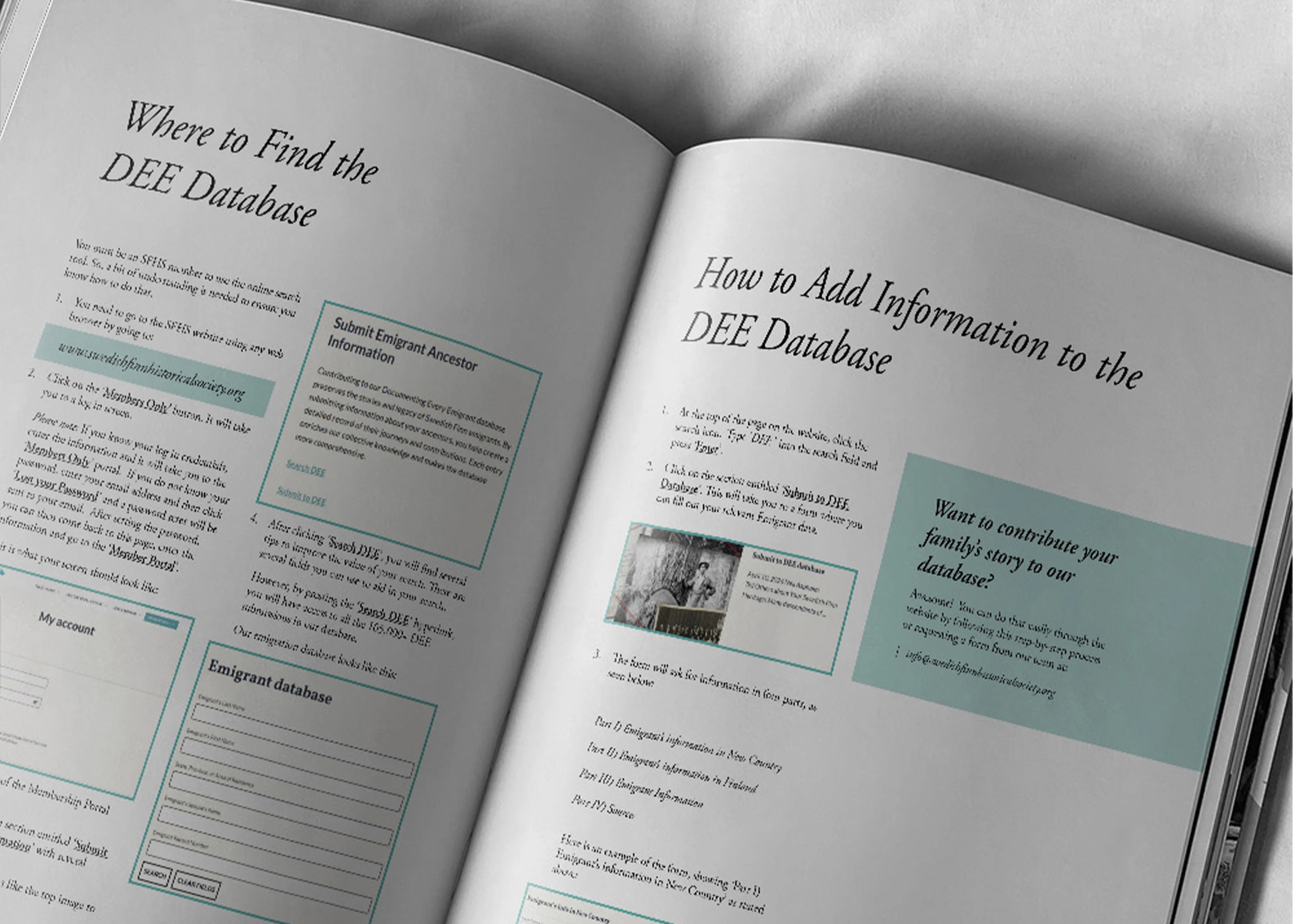
DEE – Documenting Every Emigrant: A feature section styled like an archive classroom, with visual cues of letter stamps and maps
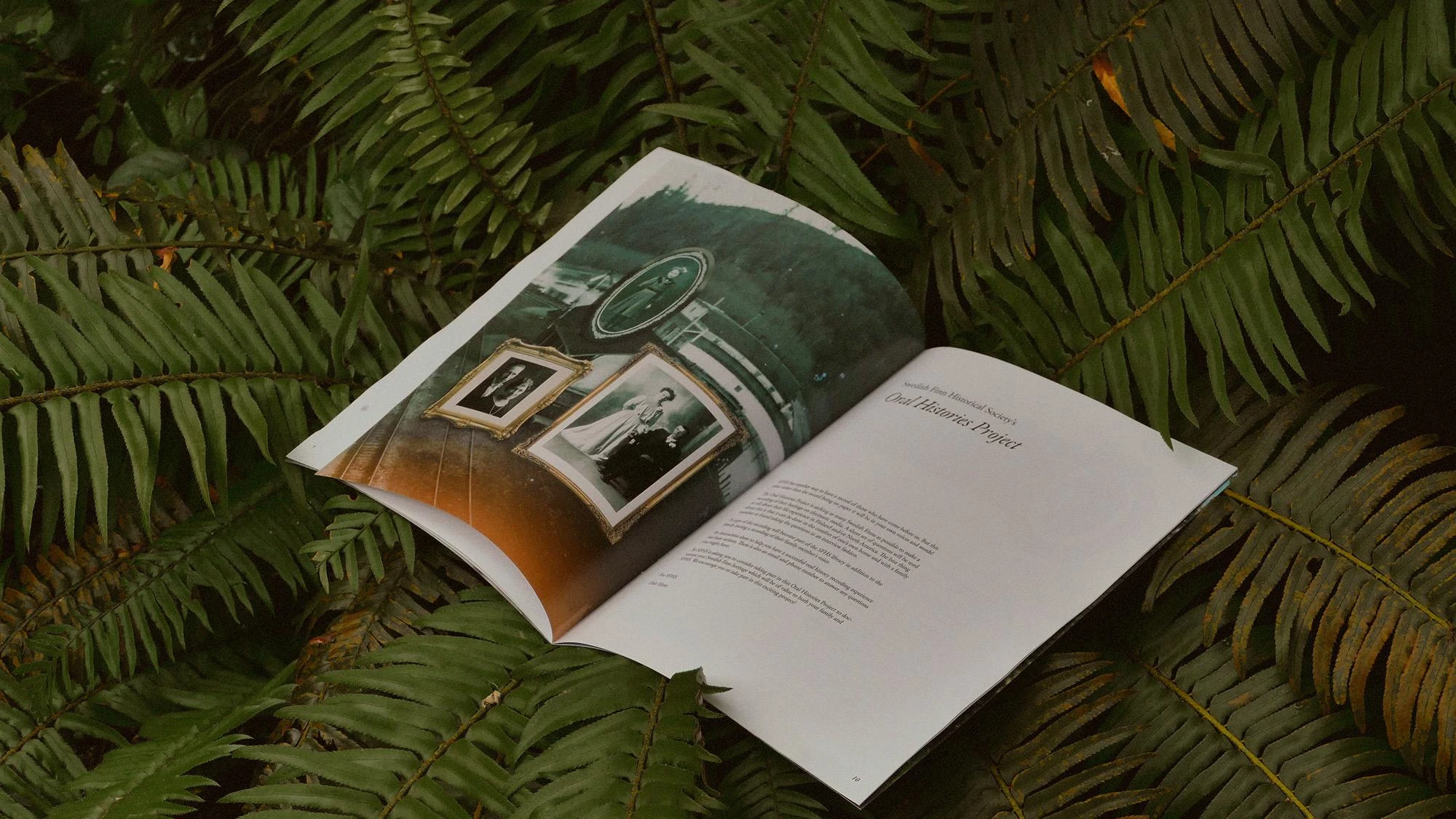
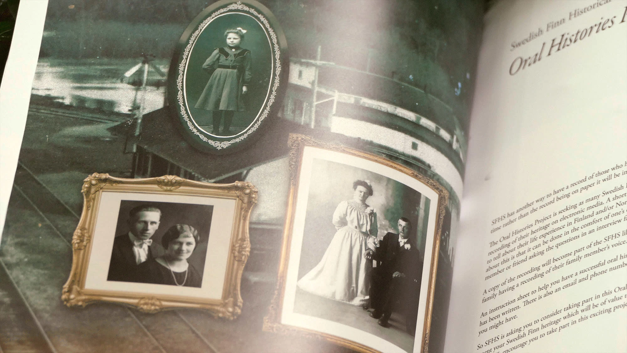
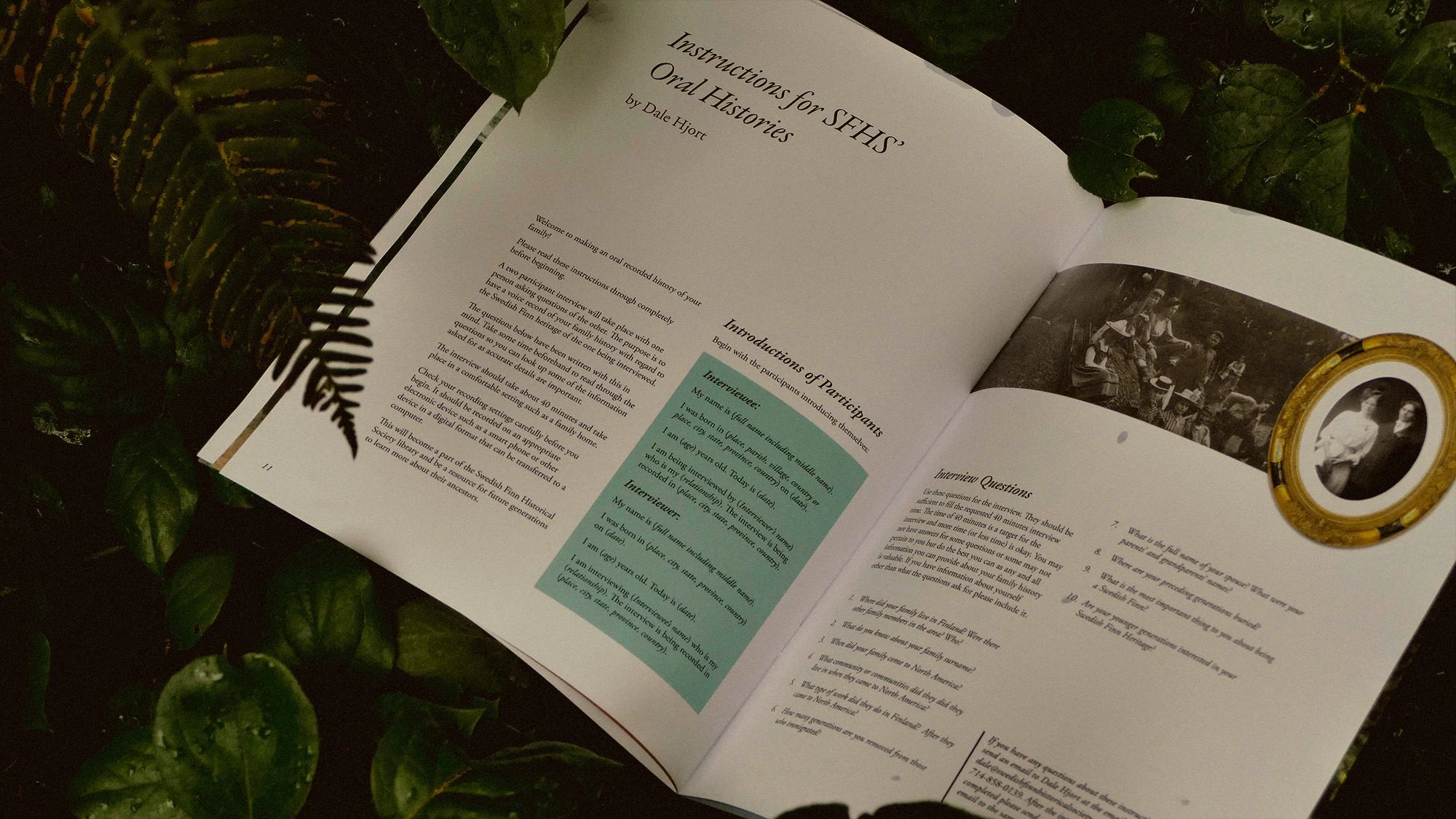
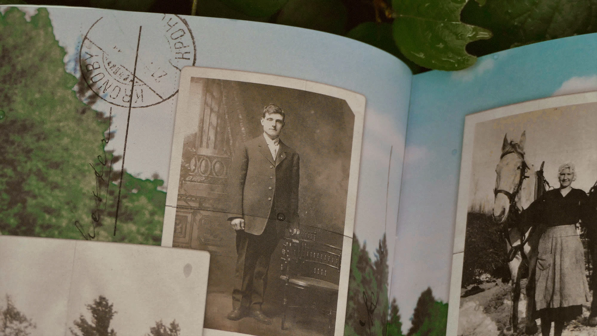
Oral Histories: The emotional core—layout inspired by portraits brought to life, grounded in imagery from Rochester, WA
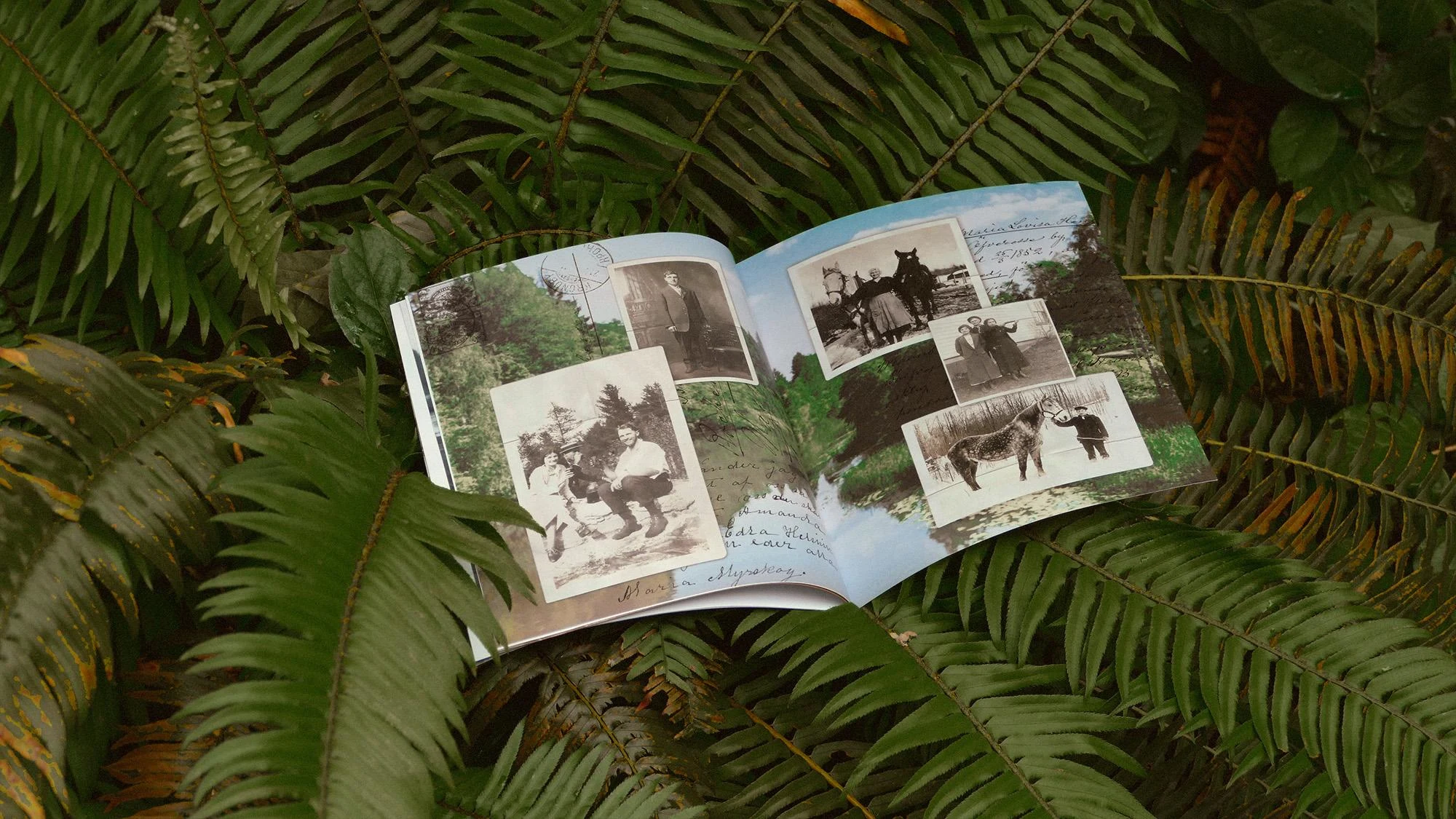
Inside Collage: A tactile montage of artifacts that makes the archive feel intimate and real
Reflection
Kusiner became more than a gig—it became meditation. Design became a way to make history feel personal and alive, especially for those whose connection to their past comes in fragments. It reframed immigrants not as distant figures in sepia but as powerful ancestors shaping present identities.
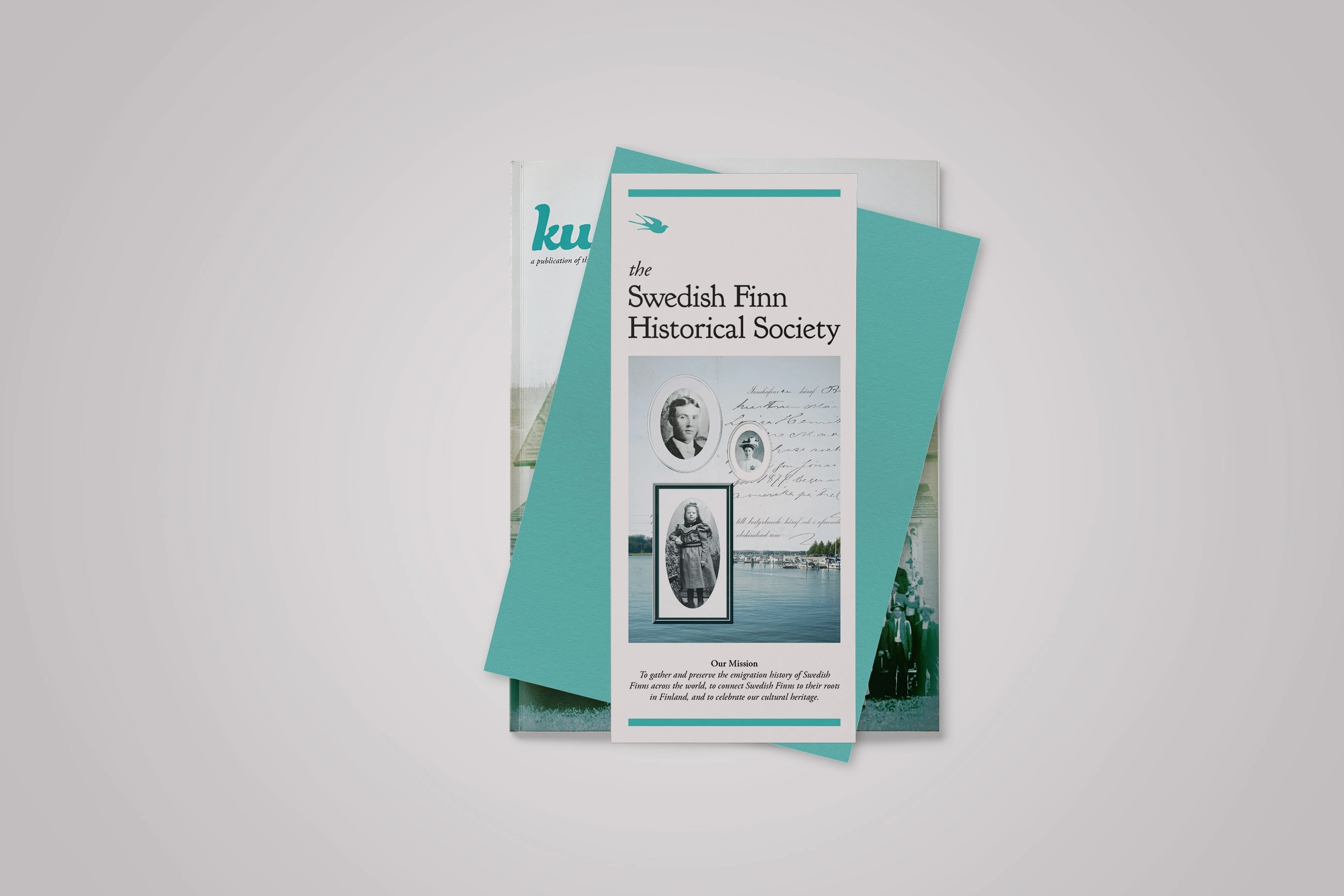
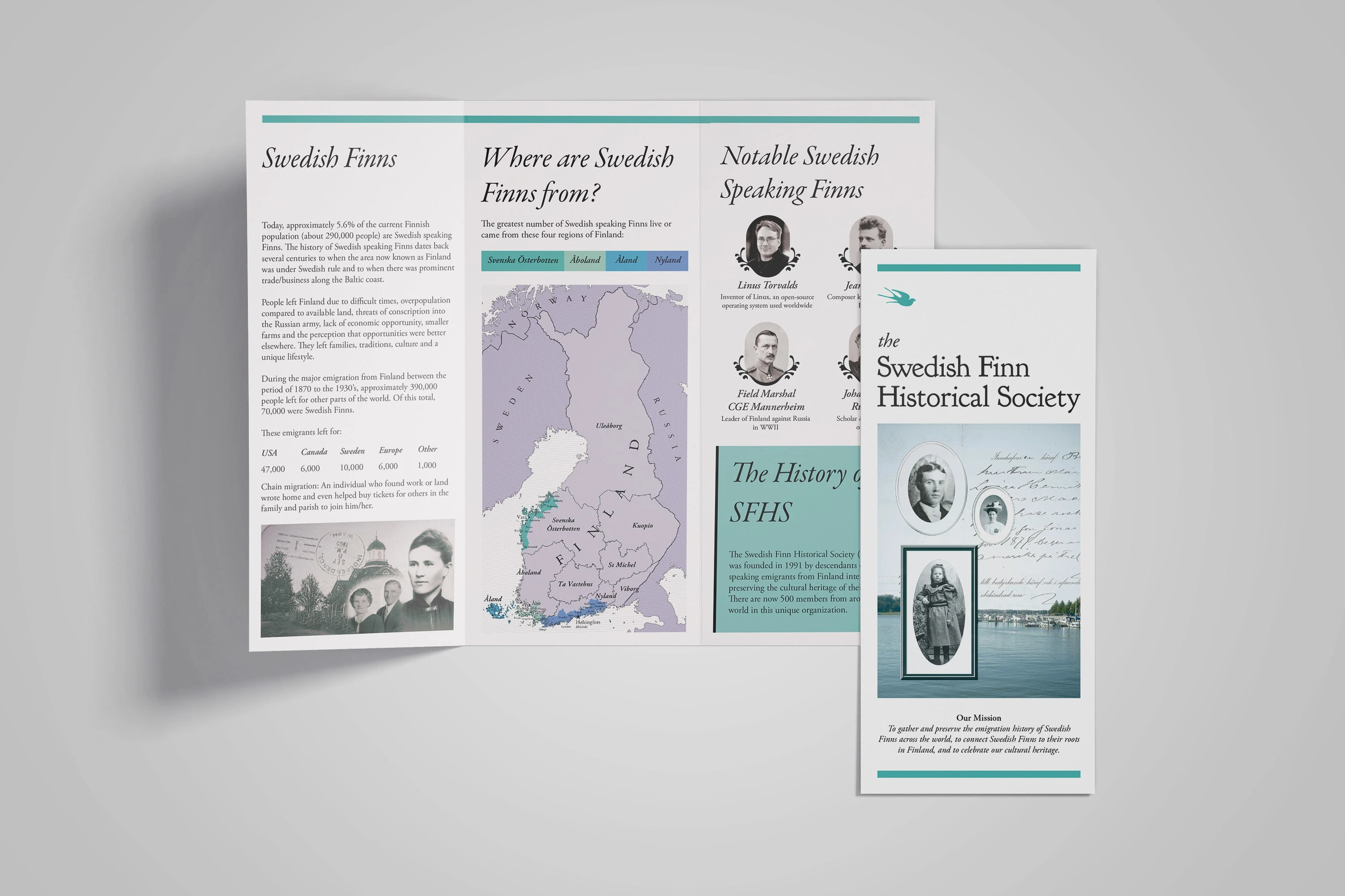
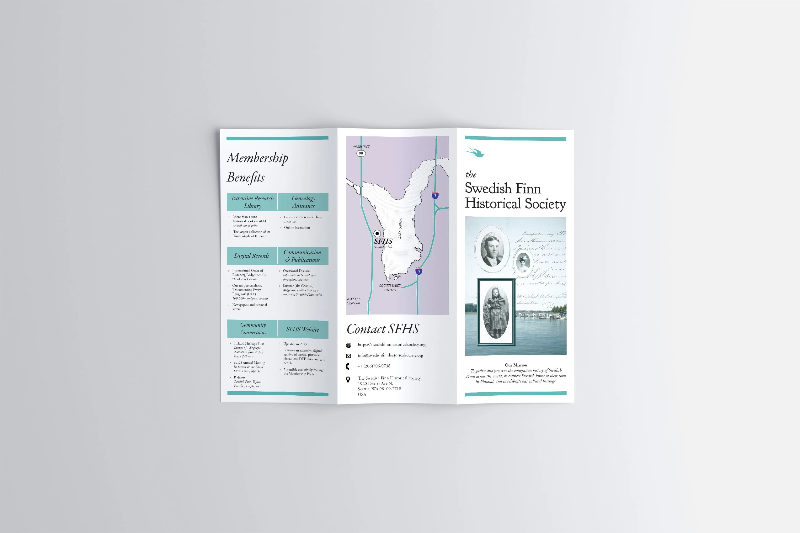
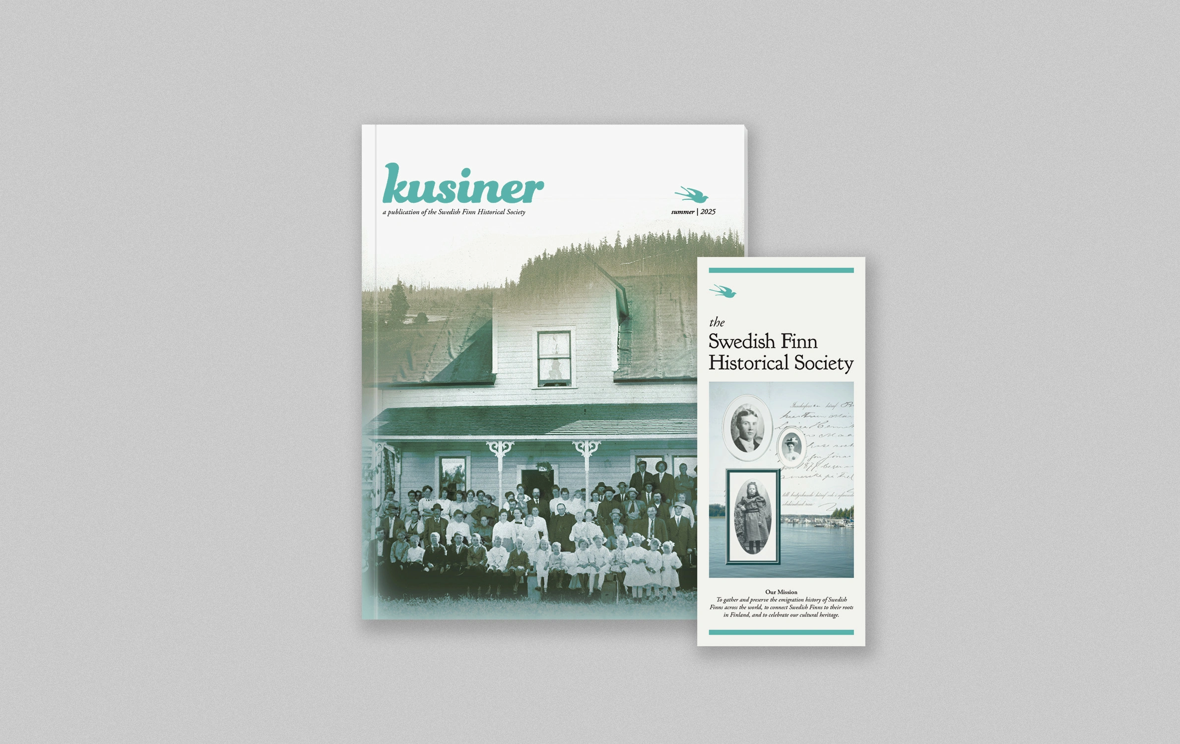
The Brochure —A Companion Story
If the magazine was about depth, the brochure was about invitation.
The Swedish Finn Historical Society needed a piece that could be handed out at events, mailed to members, and shared in classrooms—something that distilled the richness of Kusiner into a quick, approachable format.
My Approach
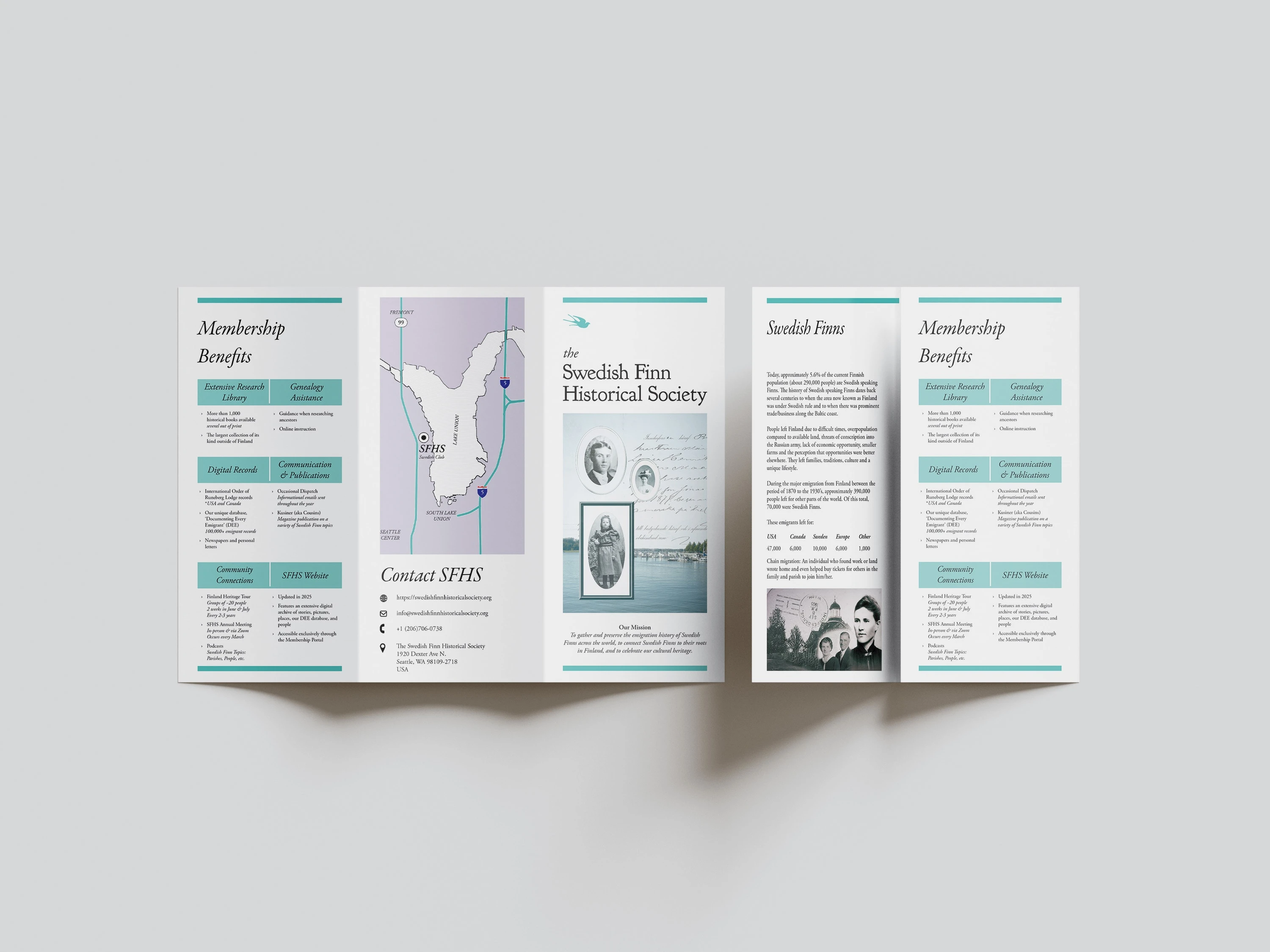
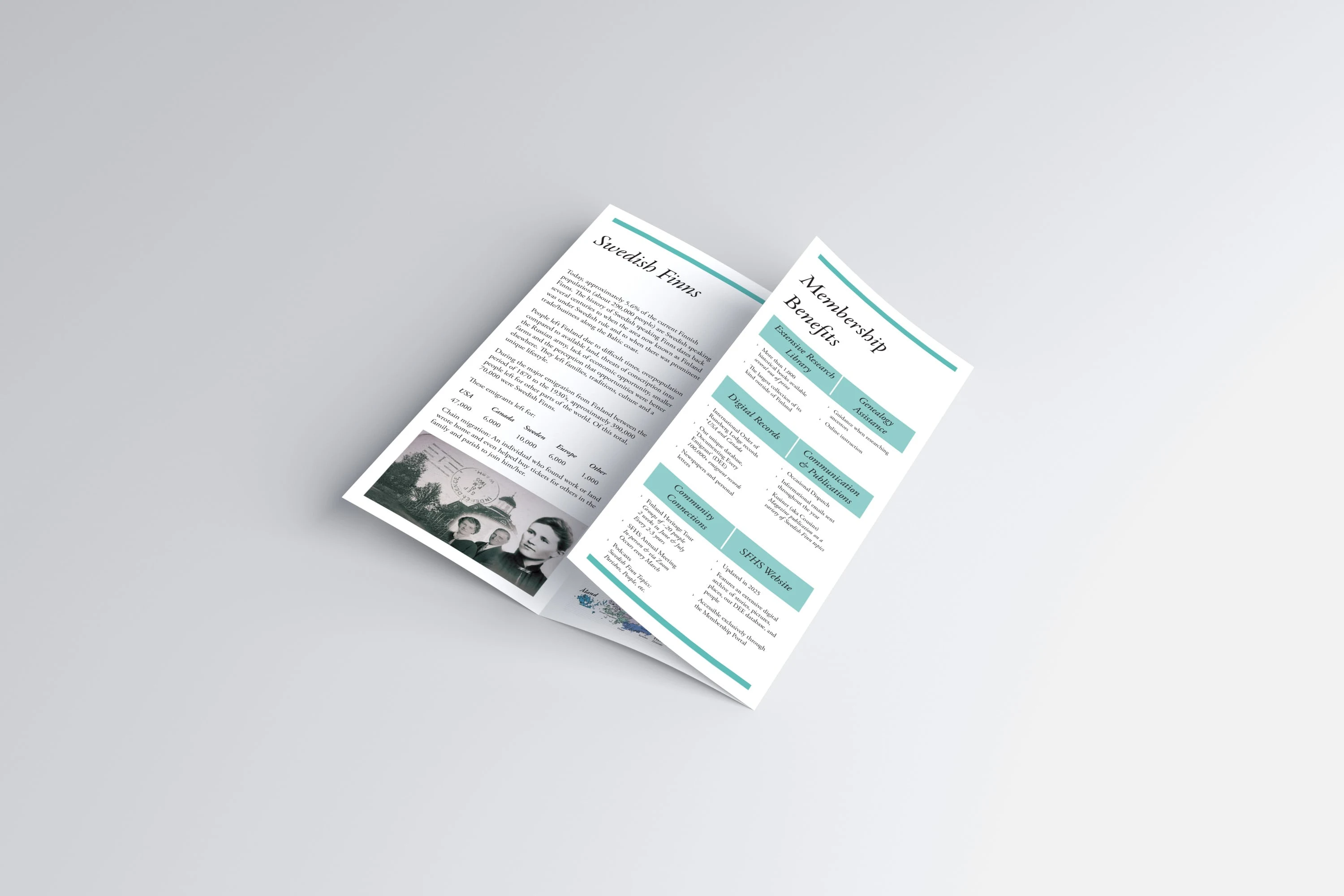
Translated the magazine’s layered design language into a simplified, travel-friendly format
Focused on bold typography, clean margins, and crisp hierarchy to make information easy to scan
Chose visuals with high emotional impact—portraits and collages that instantly connected readers to the Society’s mission
Design Highlights
A fold-out structure that mirrors the rhythm of flipping through a magazine, but in miniature
Consistent brand alignment with fonts and color palette so the brochure felt like a sibling to Kusiner rather than a detached asset
A call-to-action section written and designed to inspire new membership and community engagement
Outcome
The brochure acted as a gateway to the magazine, sparking curiosity and drawing new audiences into the Society’s larger archive. Together, the two pieces formed a cohesive storytelling ecosystem: one for lingering, one for sharing.
Like this project
Posted Sep 9, 2025
Designed a magazine + brochure for the Swedish Finn Historical Society, blending archival heritage with modern design to engage new audiences.
Likes
3
Views
29
Timeline
May 1, 2025 - May 23, 2025
Clients
Swedish Finn Historical Society