Seaya Holidays: Rebuilt around what stopped people

Will Derman


Thirty-five people, four bookings, one page
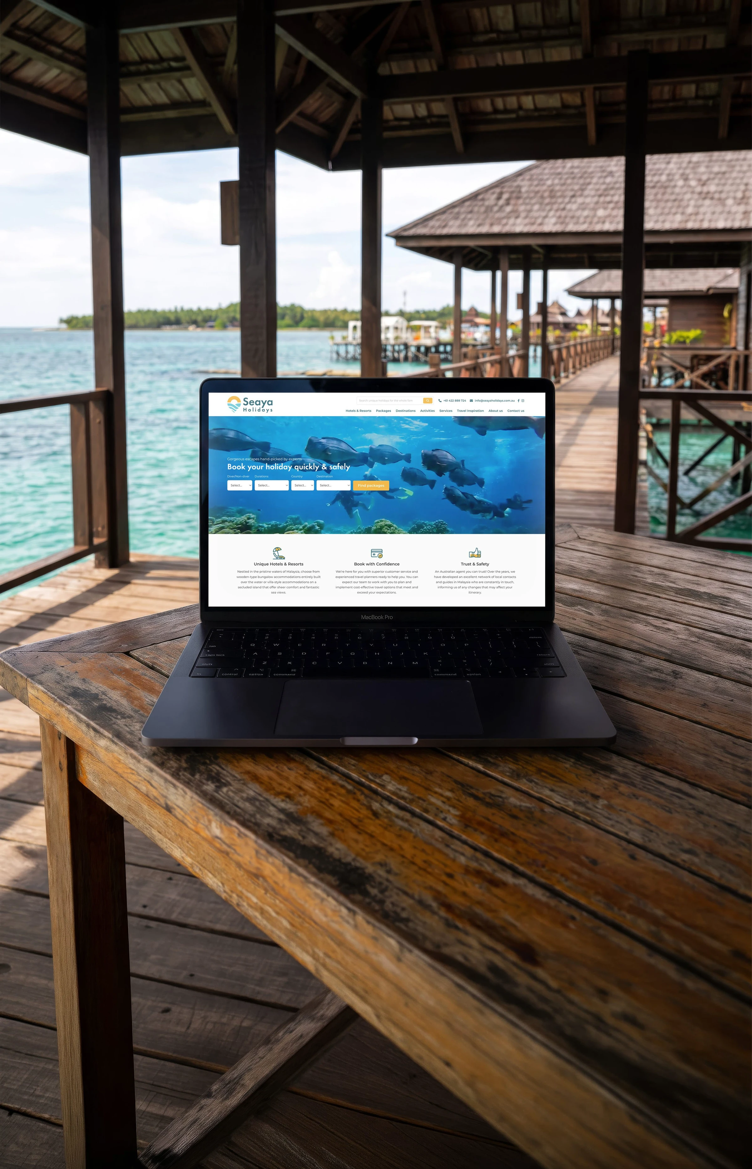
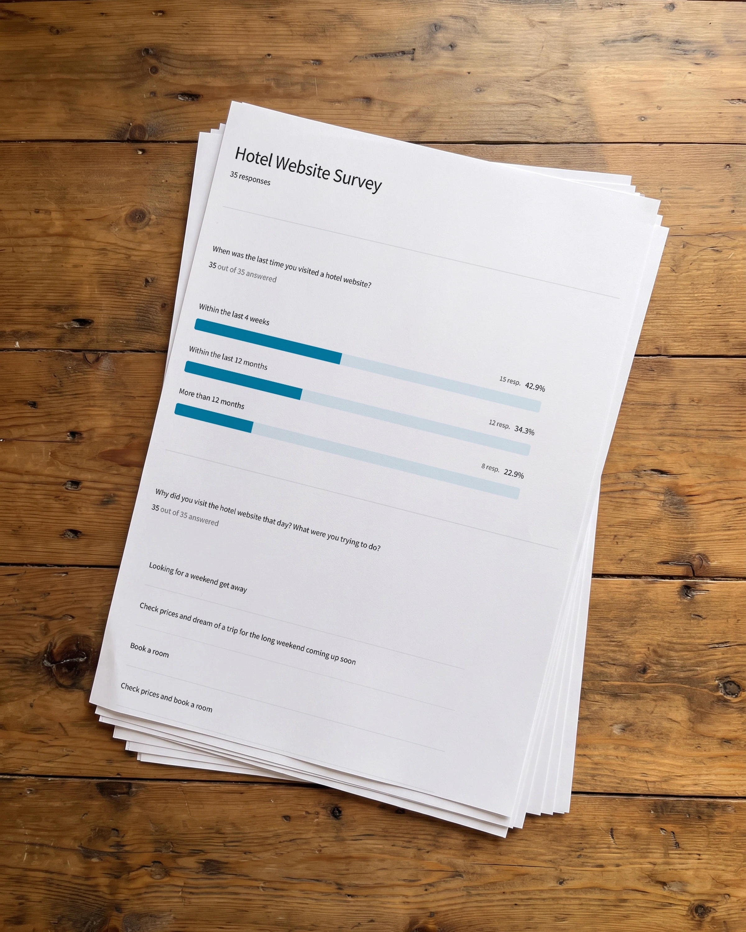
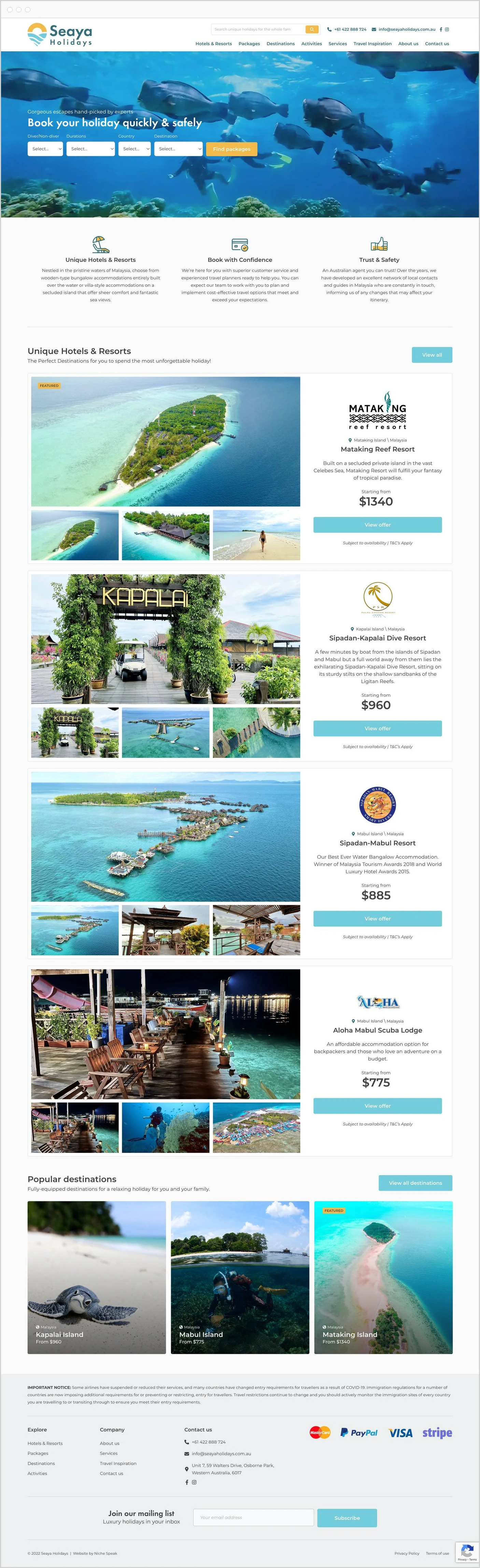
A booking site shaped by what actually stops people booking. Seaya sells week-long diving holidays on Malaysian islands to Australians who pay in full before they see the place. I surveyed thirty-five people, watched four bookings, designed the booking journey and the logo, and built the site.
Colour and type
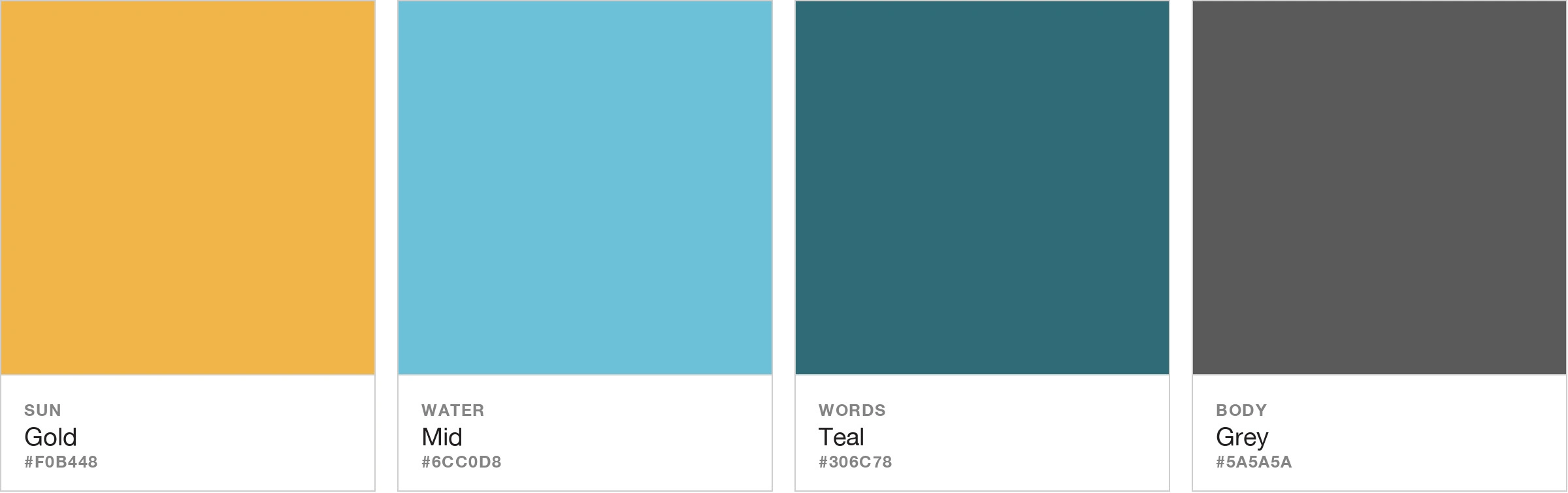
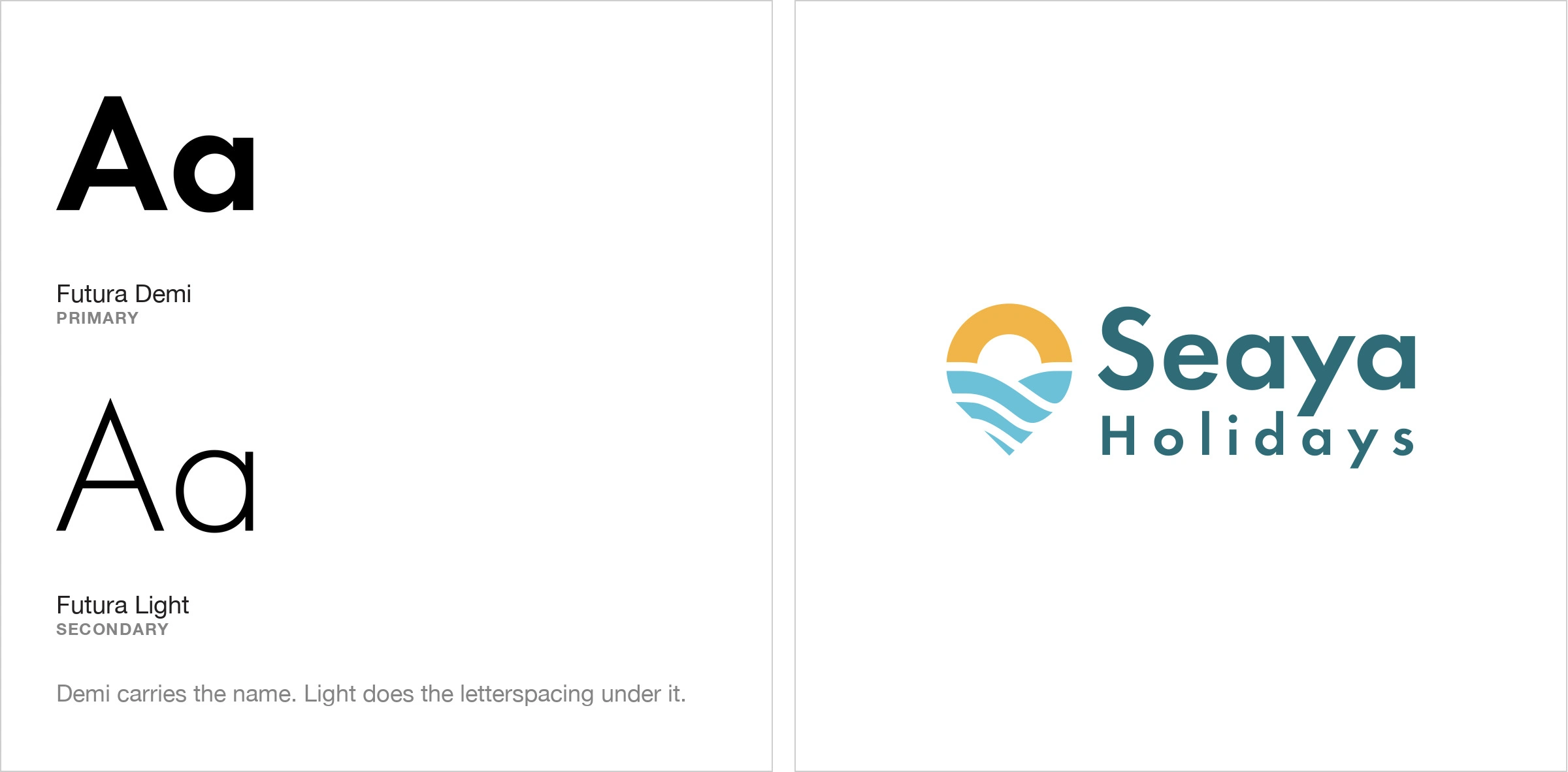
Nobody sends money to a stranger for an island they have never seen
Packages run from $775 to $1,340 a person, paid before anyone boards a plane, to a small agency found online, for somewhere known only from pictures. There is no office to walk into and no second attempt.
The site is the only place a doubt can be settled. Fail, and you hear nothing: the tab simply closes.
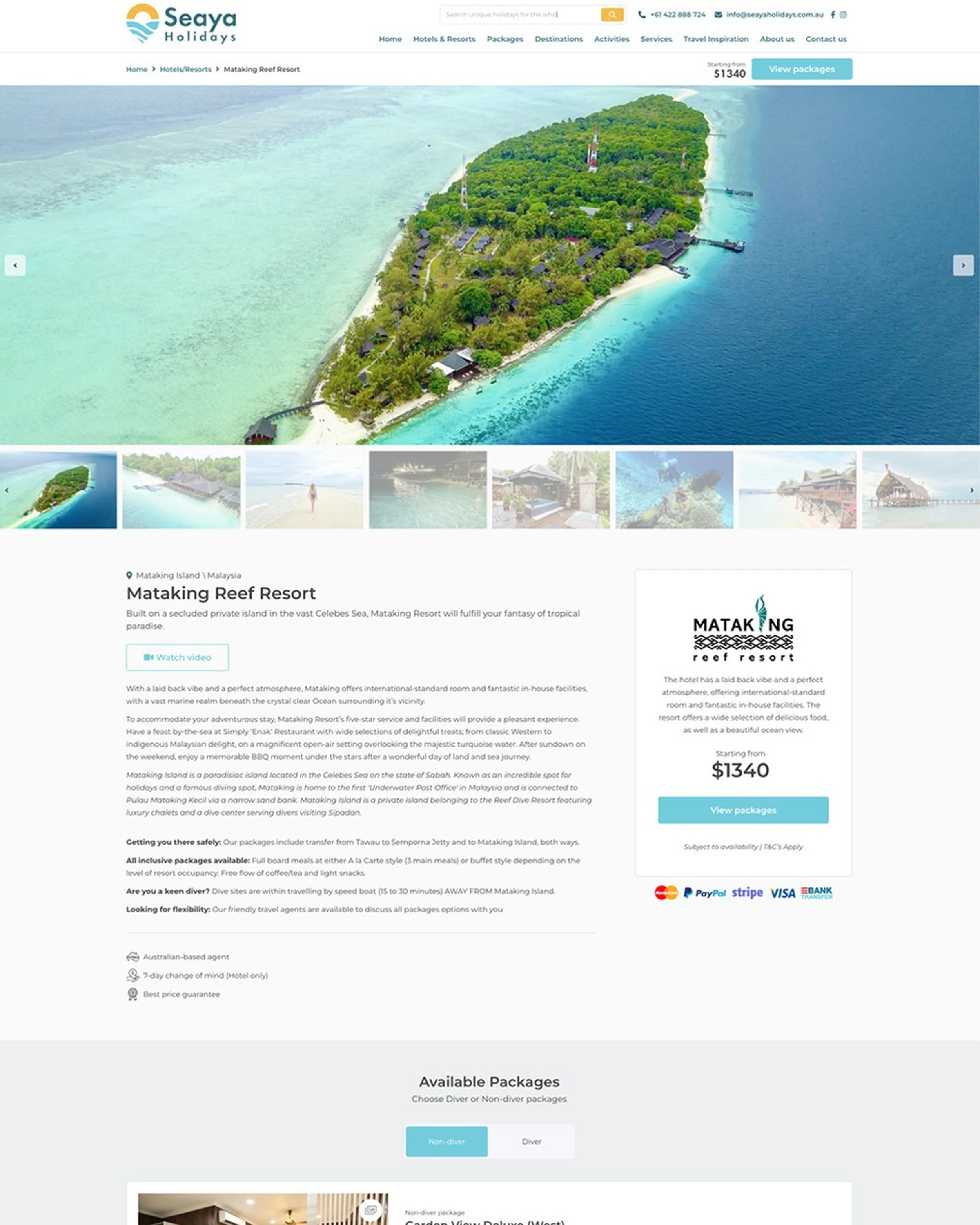
Seven survey answers asked for more photographs, and three gave the same reason: the pictures were too generic to tell one room from another. One participant put it more bluntly, that a thin gallery looks like something is being hidden. Here, pictures are how people compare, and how they judge honesty.
A company nobody has heard of has to look like somewhere you would actually go
The mark was mine too, and it carried the site's problem in miniature.
So it shows a place rather than initials: a map pin, a low sun, banded water beneath it. The name already says sea and see. The mark finishes the picture. Gold, one turquoise and a deep teal sit in every header, recognisable before a word is read.

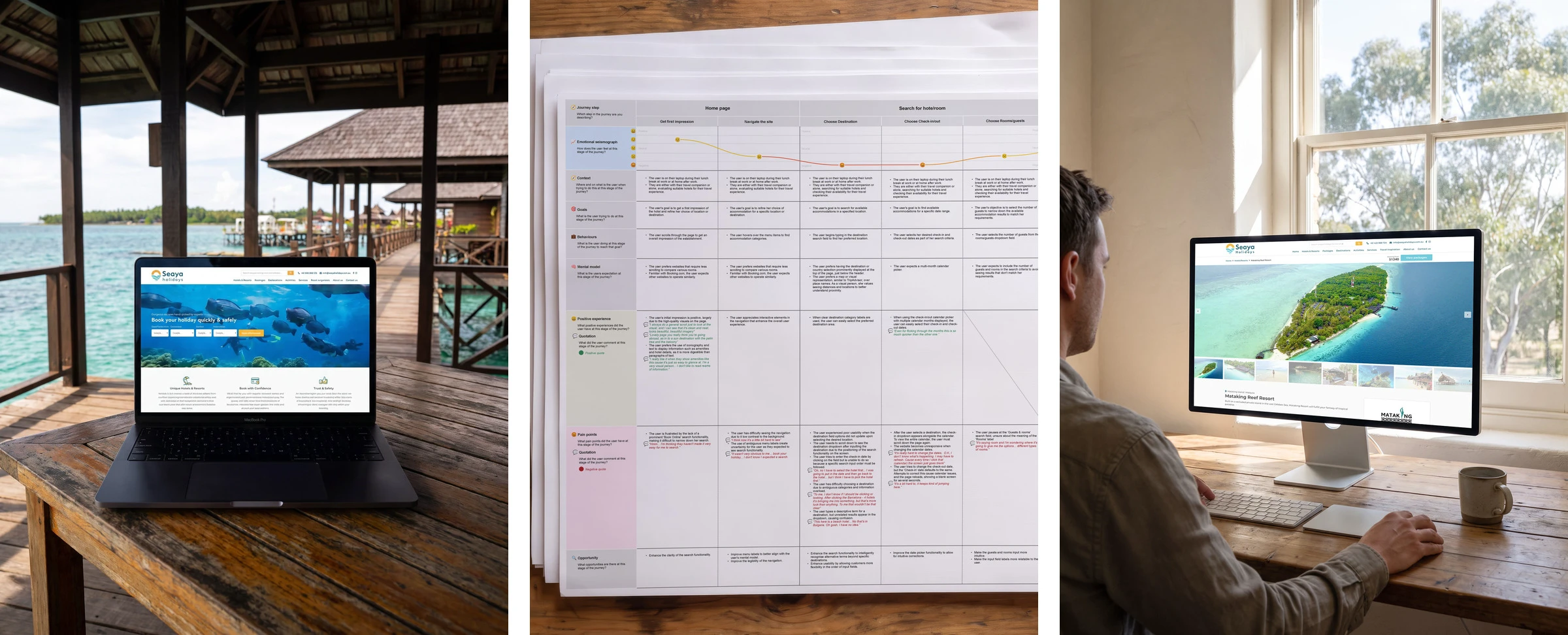
So I stopped guessing, and watched people try to book
Thirty-five people were asked about their last accommodation booking, and six had failed at it.
Two then booked on rival sites, four sessions in all, since there was nothing of Seaya's to test yet. The form never stopped anyone. Uncertainty did. One participant tapped through a calendar six times to find her month, sat 51 seconds waiting on a page, could not decode an add-on, and still did not know whether cancelling was free.
So everything a decision needs moved ahead of the form.
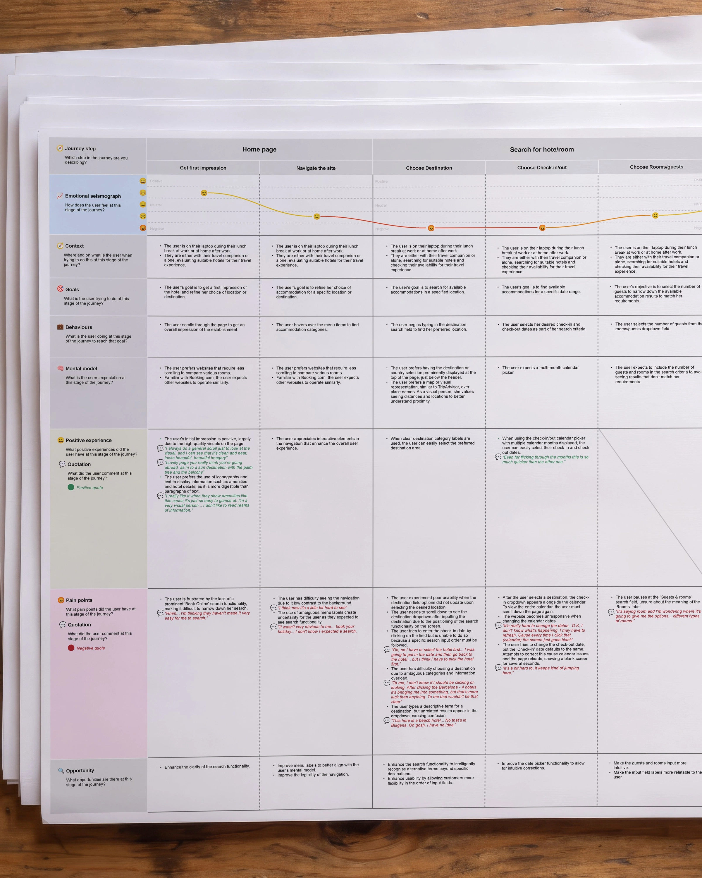
Doing the research is the easy half
Arguing for what it shows is the hard half, particularly when that is less elegant than the option everyone favours.
The elegant option here was a wizard, which this category reaches for by reflex. The evidence pointed to a page you read across, because participants were holding back a decision, not losing their way. Holding that position is what gets a thing built.
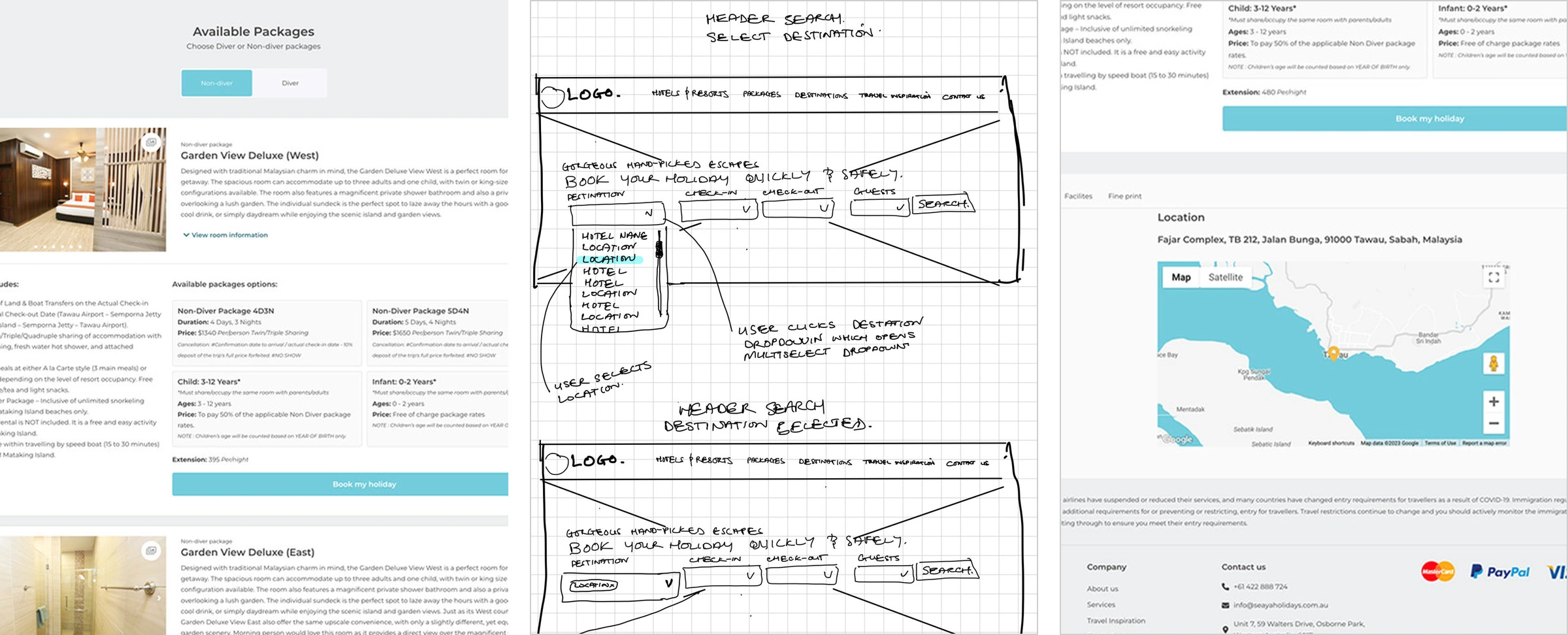
It cuts both ways. Specific photography, because respondents asked for it. Rooms side by side, because telling them apart was the most common complaint. Cancellation terms beside the price, because somebody abandoned payment over exactly that.
Four resorts, every package in one view
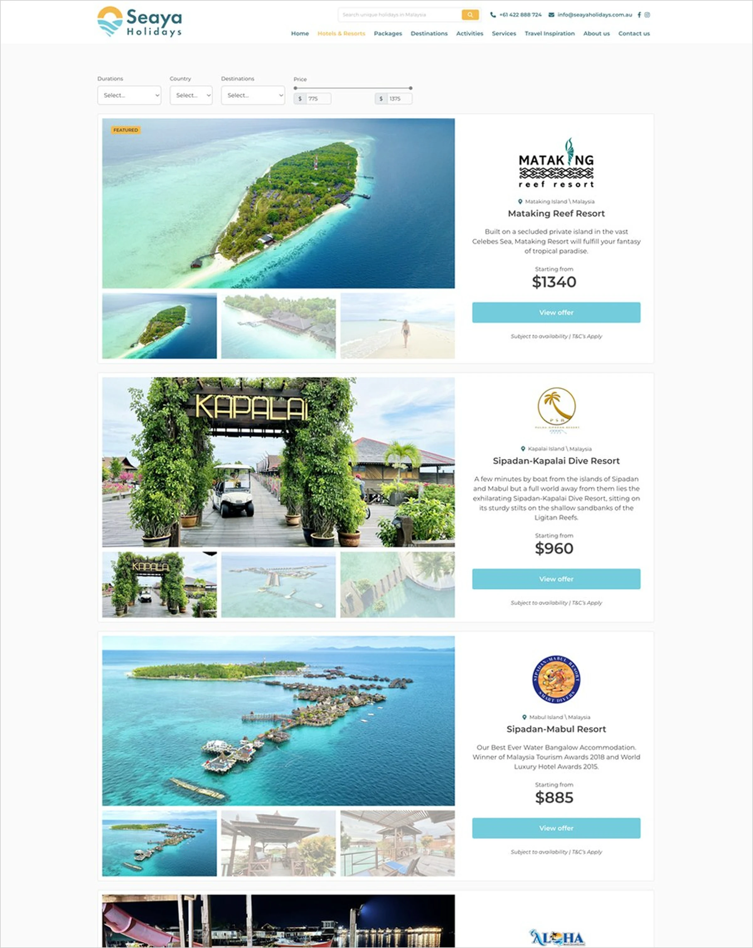
Each resort page shows every room, package length, price and inclusion together, and each room can be booked where it sits. A diver or non-diver switch took the place of rate names people could not tell apart.
Handover came at launch, with no analytics account behind it, so there is no conversion figure. The numbers alongside come from the research, and they are what I can vouch for. The study used competitors' sites and hotel booking, not diving. That one transfer was trusted rather than tested, and testing the finished page is the next step.
The work
The website
The numbers
People surveyed: 35
Did not finish: 6 in 35
Bookings watched: 4
Longest wait: 51 seconds
Like this project
Posted Sep 13, 2026
A booking site built on research into what stops people booking: 35 surveyed, four bookings watched. Journey, logo and build for Seaya Holidays.