Oto (YC W22) - Rebrand and UI Redesign
How might we redesign Oto's UI to appeal to our senior users?
Background
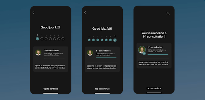
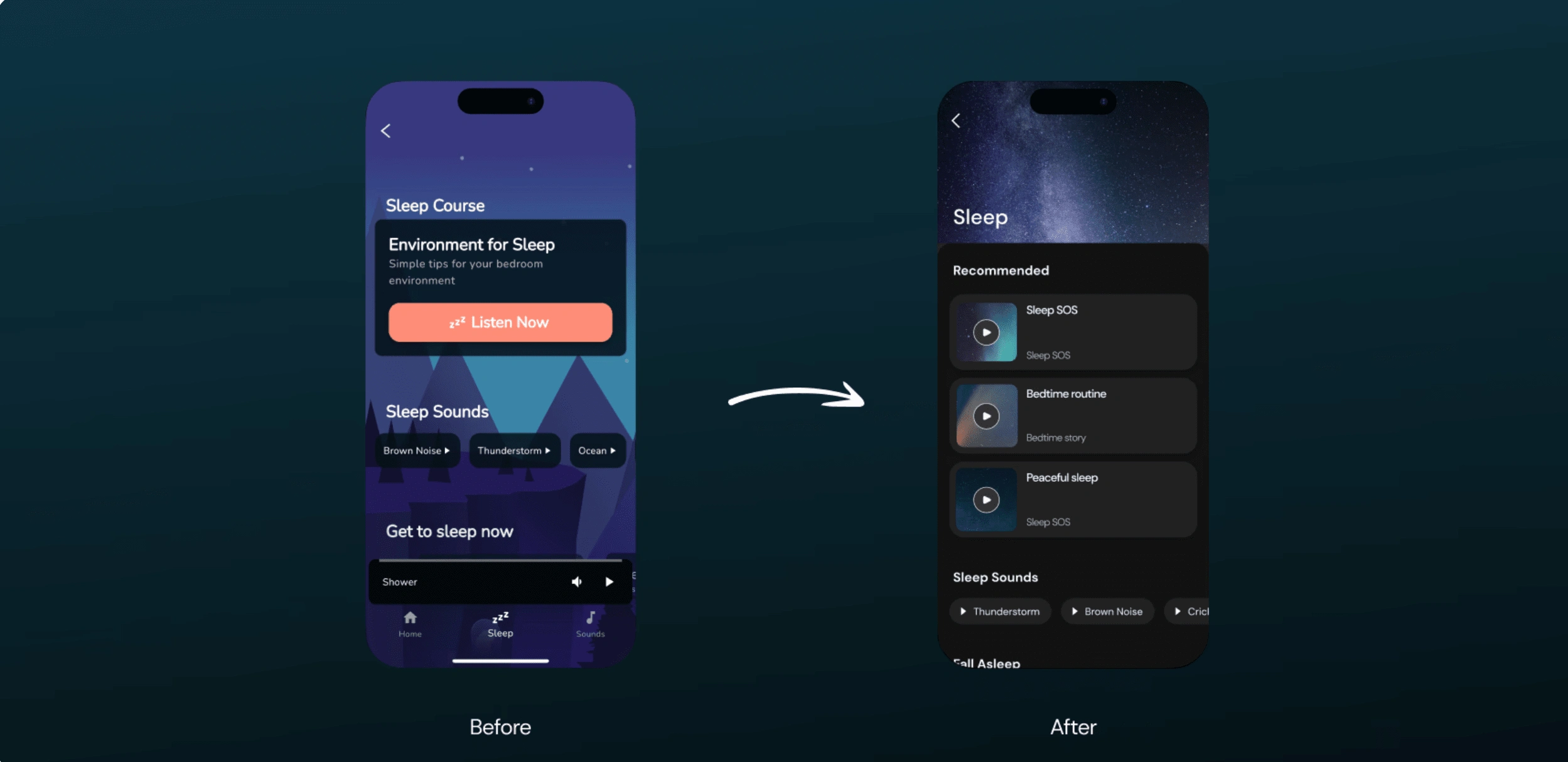
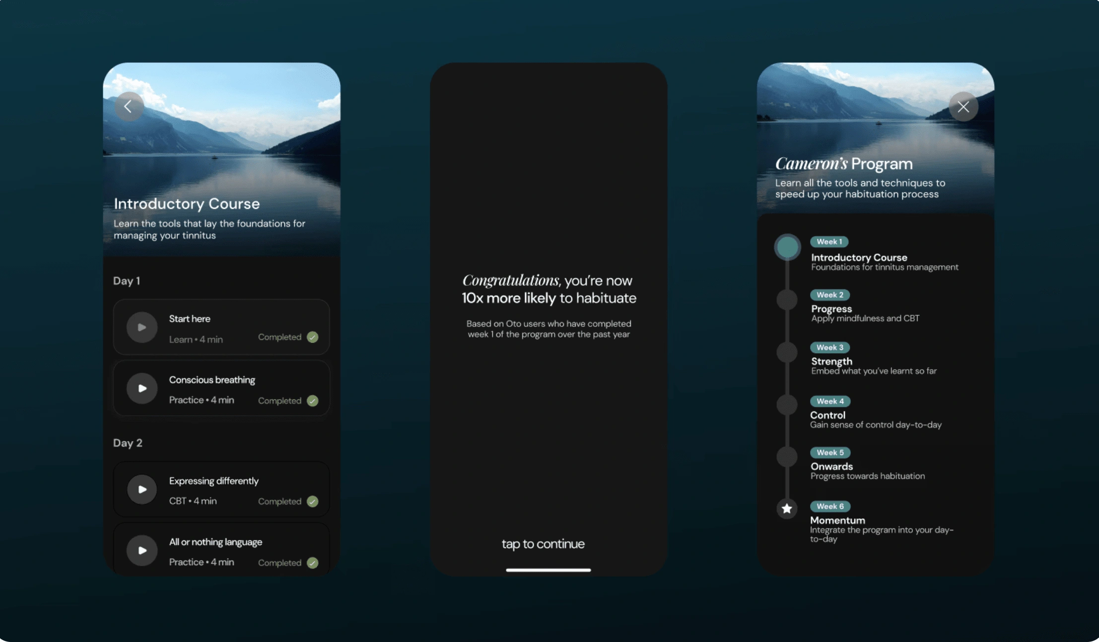
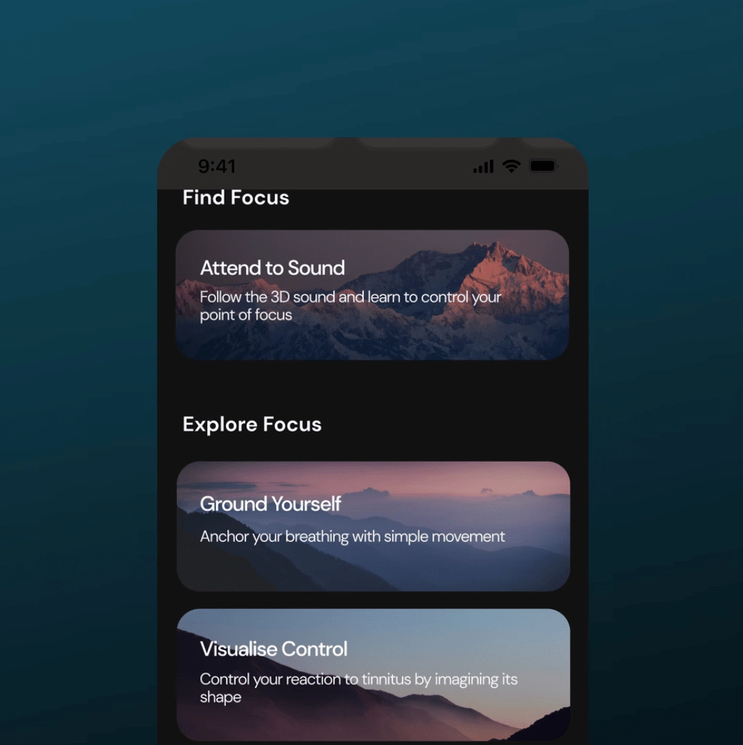
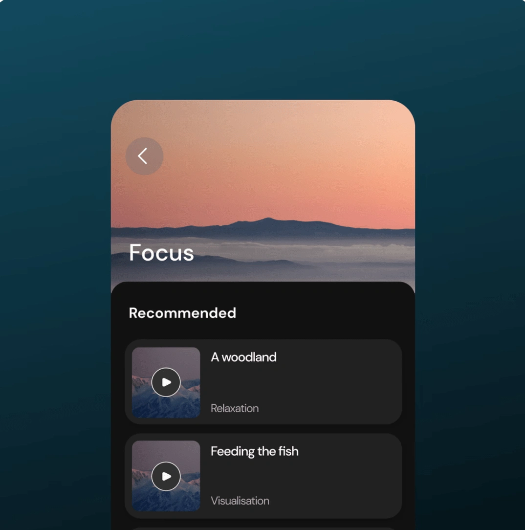
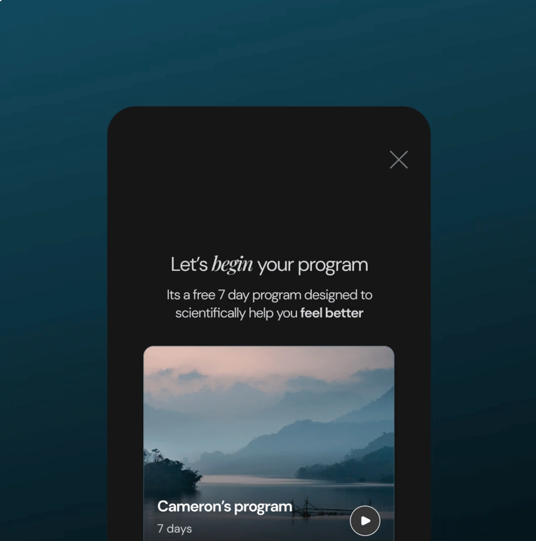
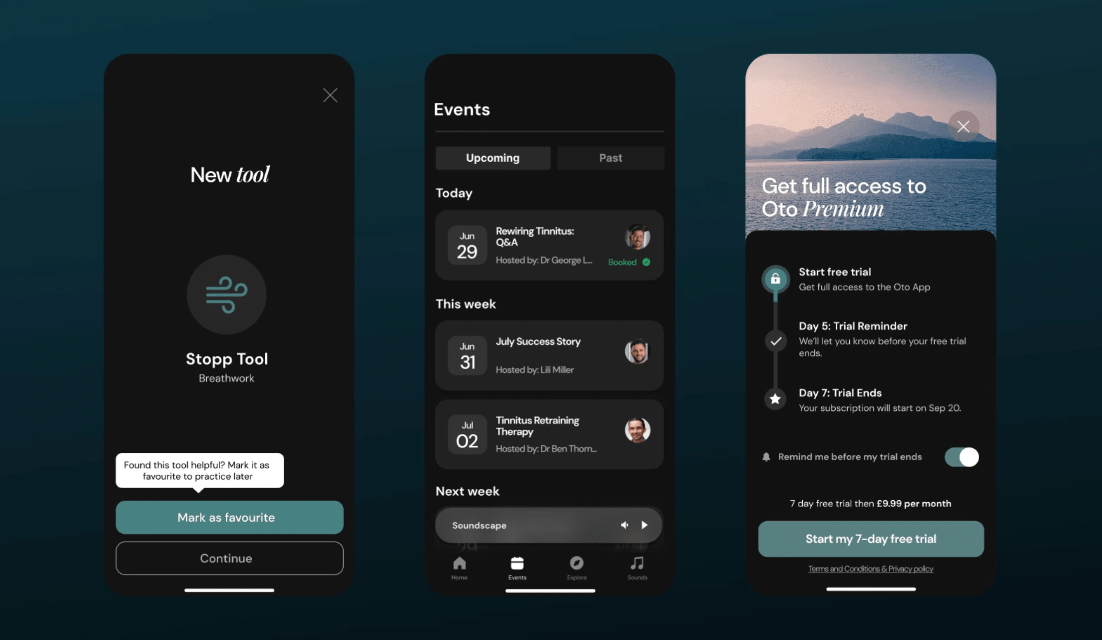
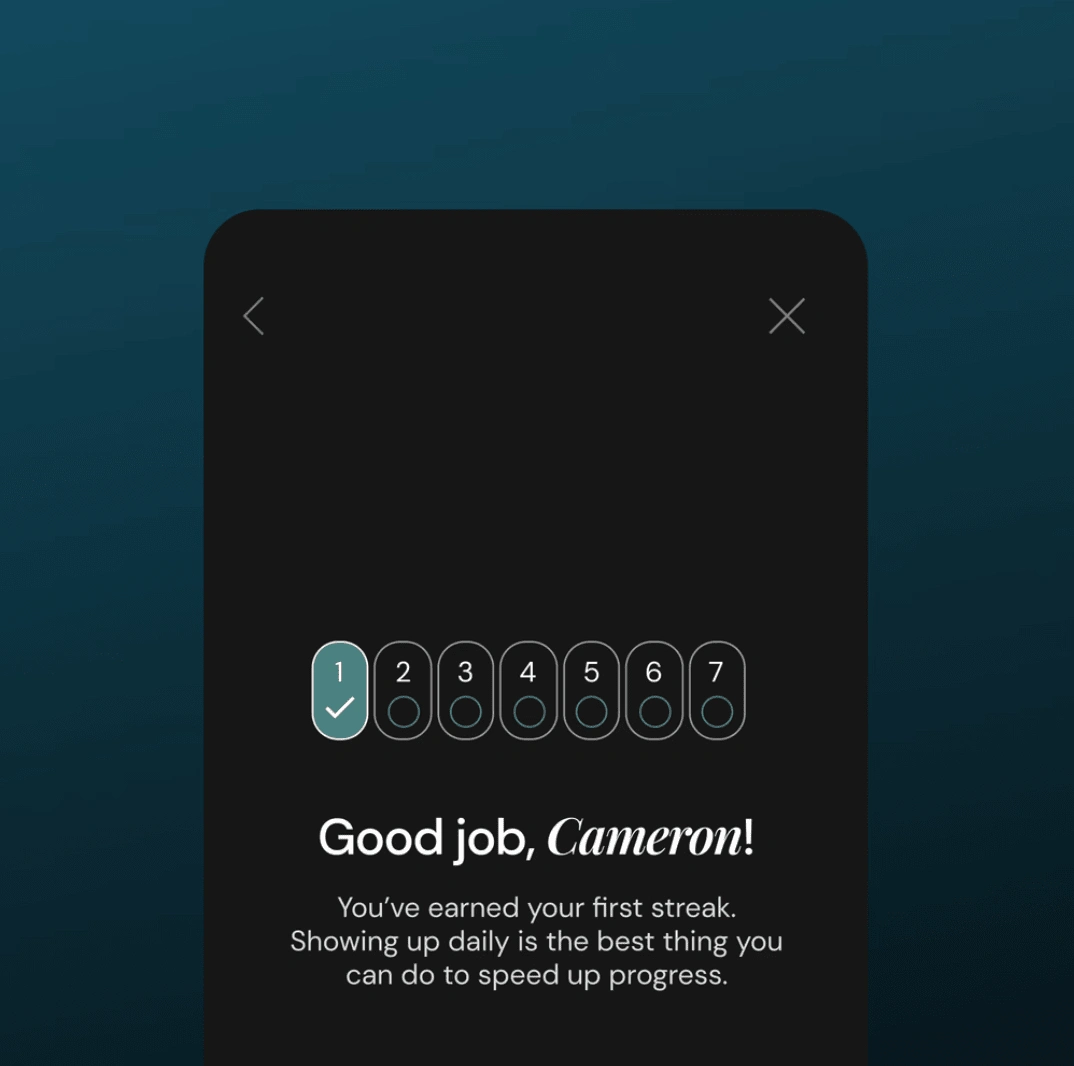
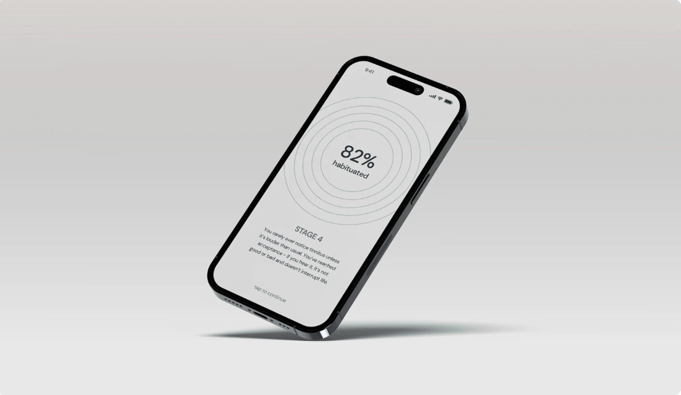
Oto, the leading tinnitus management app, serves a primarily 60+ audience who use the app at night. To align with our new premium positioning and the introduction of coaching, I led a full UI and UX redesign. We created a sleek, dark mode interface with real-life imagery that resonated with our users. The redesign was met with enthusiastic feedback, with users praising the app's refreshed and delightful look.
Highlight
For the app: No metrics here, just love from the users
For the website redesign: 150% Landing page CTR increase + 3-5% bounce rate reduction
Challenges
In tackling the redesign, we first conducted market research to pinpoint the visual identity that best resonated with our 60+ target demographic. Drawing from the Oto rebrand, we began crafting the initial screens, focusing on simplicity and clarity. With a small team and myself as the sole designer, we consciously avoided time-consuming illustrations, which also proved less impactful with our audience. Instead, we streamlined the UI to reduce clutter, enhancing the overall user experience while aligning with our premium positioning.

Outcome
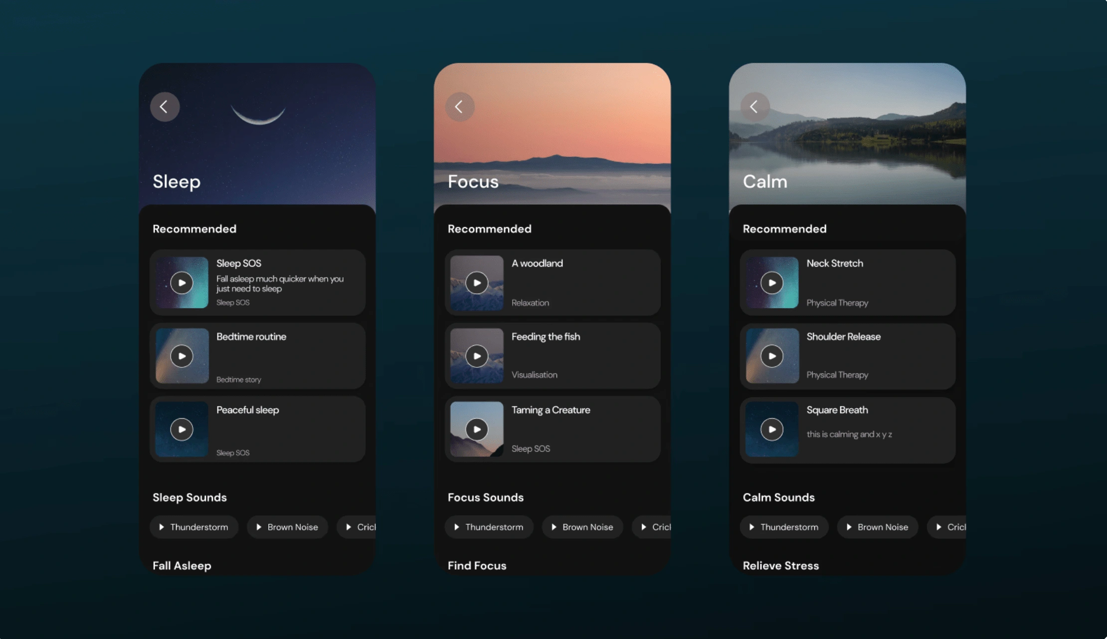
The redesign had a significant impact, particularly in addressing the emotional journey of tinnitus sufferers. By incorporating calming visuals, we received a very positive response from users who felt more understood and supported. The adjusted dark mode UI provided a more comfortable experience during the app's peak usage times of 8pm onwards. Additionally, this refined UI seamlessly supported the launch of our premium offering in the following quarter, further solidifying Oto's position as the leading tinnitus management solution.
Rebranding Oto
How might we position Oto as the go-to clinical solution for tinnitus sufferers?
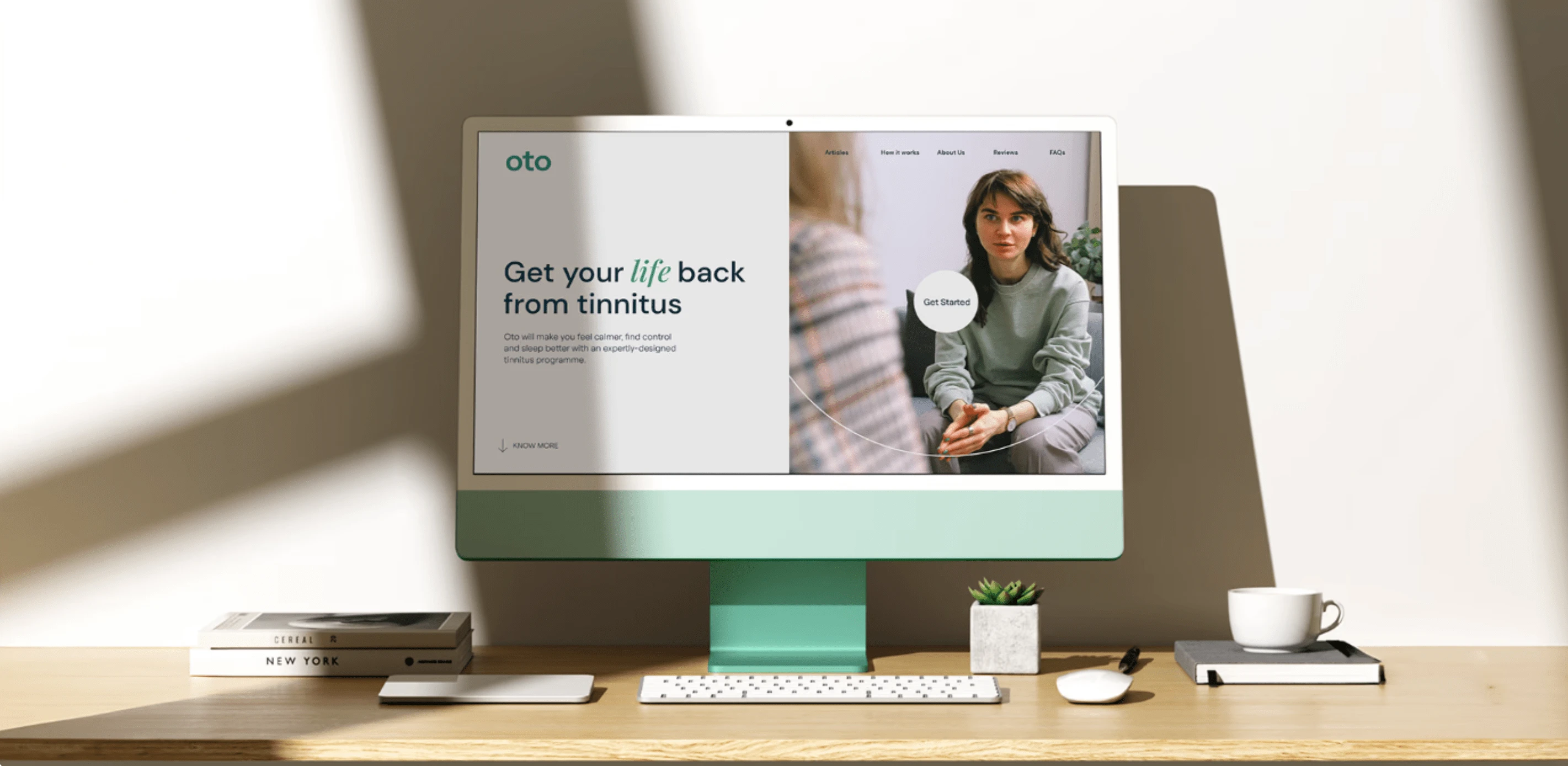
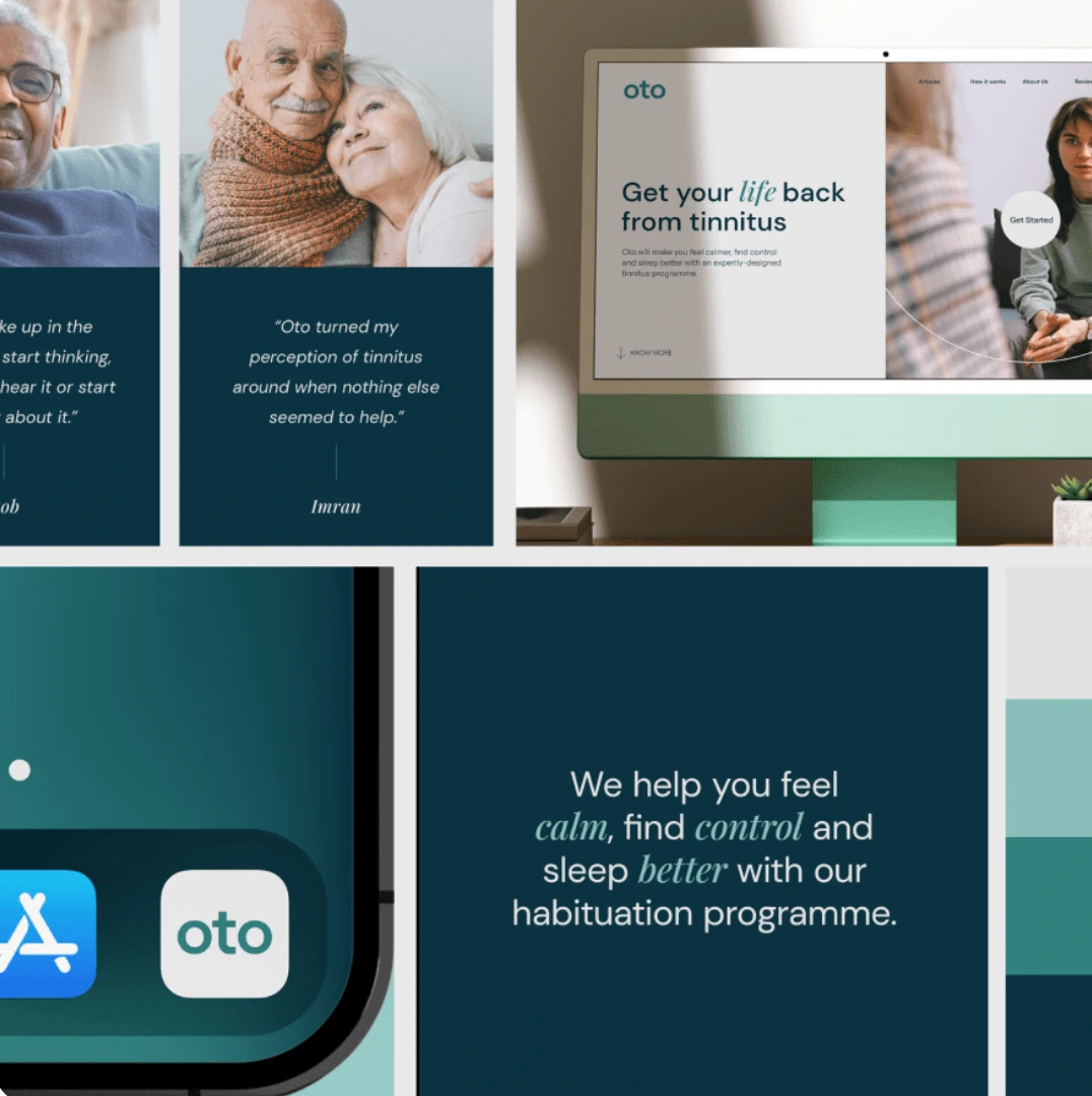
During my time with Oto, I strategically repositioned the brand to resonate more deeply with our target demographic—tinnitus sufferers. I led the brand's application across the entire website, transforming it into an effective lead generation tool that successfully guided patients toward our premium 1-1 coaching service.


Challenges
We faced key challenges in repositioning Oto’s brand. The growth team struggled with low conversion rates on the landing page, and our existing brand, suited for app sales, didn’t align with the premium 1-1 tinnitus coaching product. Without a clear value proposition or brand direction, our communication was fragmented, failing to resonate with our target audience, especially those aged 40-50.
Outcome
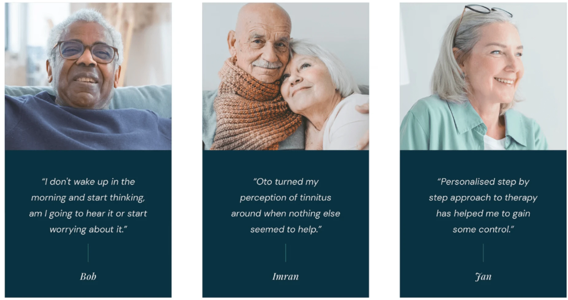
I led a persona workshop to define our core audience, Angela, a 40-50-year-old tinnitus sufferer seeking a comprehensive solution. We then conducted a brand strategy workshop to establish clear language, values, and identity. With new brand guidelines in place, we executed a full website redesign, which not only boosted our organic lead capture but also increased landing page CTR by 150% and reduced bounce rates on key pages by 5-8%.
Like this project
Posted Sep 4, 2024
At Oto, I repositioned the brand to connect with tinnitus sufferers, transforming the website into a lead generation tool that drove patients to our premium 1-1
Likes
0
Views
16

