Vo Han - Vietnamese Coffee | Brand Identity
1. Introduction
Brand Overview
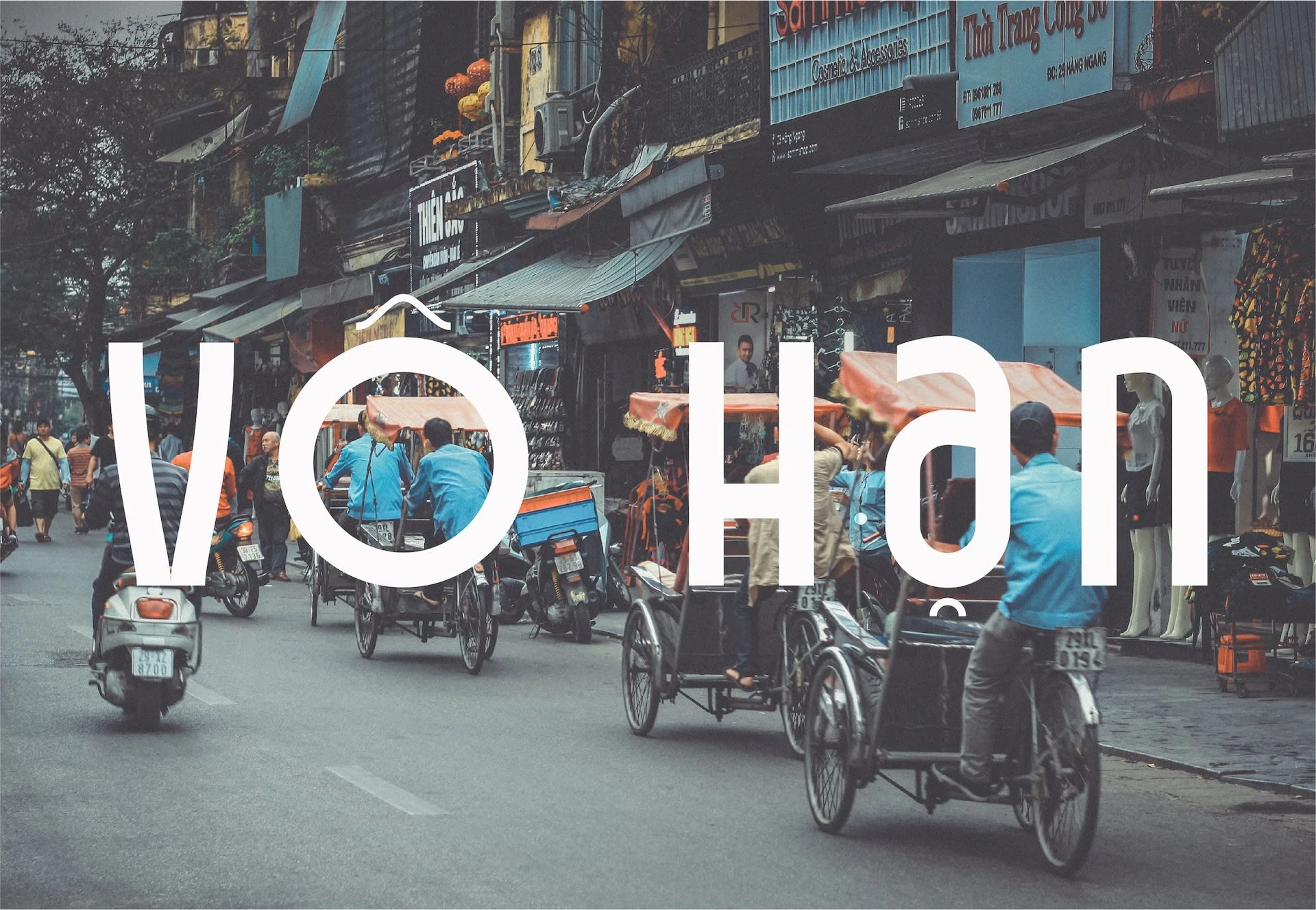
Vô Han is not just a coffee brand; it's an experience that encapsulates the rich history and culture of Vietnam. By taking consumers on a journey from the streets of Vietnam to the fall of the Berlin Wall, Vô Han offers a unique blend of history, flavour, and cultural appreciation.
Origin and Meaning
"Vô Han" translates to "borderless" or "limitless" in Vietnamese. The brand name is inspired by Vietnam's significant role during the Cold War and its indirect influence on Germany becoming borderless in 1989.
2. Brand Strategy
Target Audience
Our primary audience is the discerning coffee lover seeking a blend of taste and history. Those who appreciate authentic, global flavors and value the stories behind the products they consume will resonate with Vô Han.
Market Positioning
Vô Han positions itself at the intersection of history, culture, and exquisite taste. It's more than just coffee; it's a narrative.
Brand Promise & Mission
To offer a unique coffee experience that goes beyond taste, blending history and culture in every sip, while promoting sustainable and ethical practices.
Unique Selling Proposition
Every bottle of Vô Han is a sip into the past, an authentic Vietnamese coffee experience with an innovative twist of history and sustainability.
3. Visual Identity
Logo Design & Variations
The minimalist logo emphasises Vietnamese culture through its diacritical marks, providing a western representation of a traditional product.
Colour Palette & Typography
The chosen colors hint at the brand's cultural background and the delectable product. Our typography, Ken, designed by Dat Do, stands out for its unique diacritical marks.
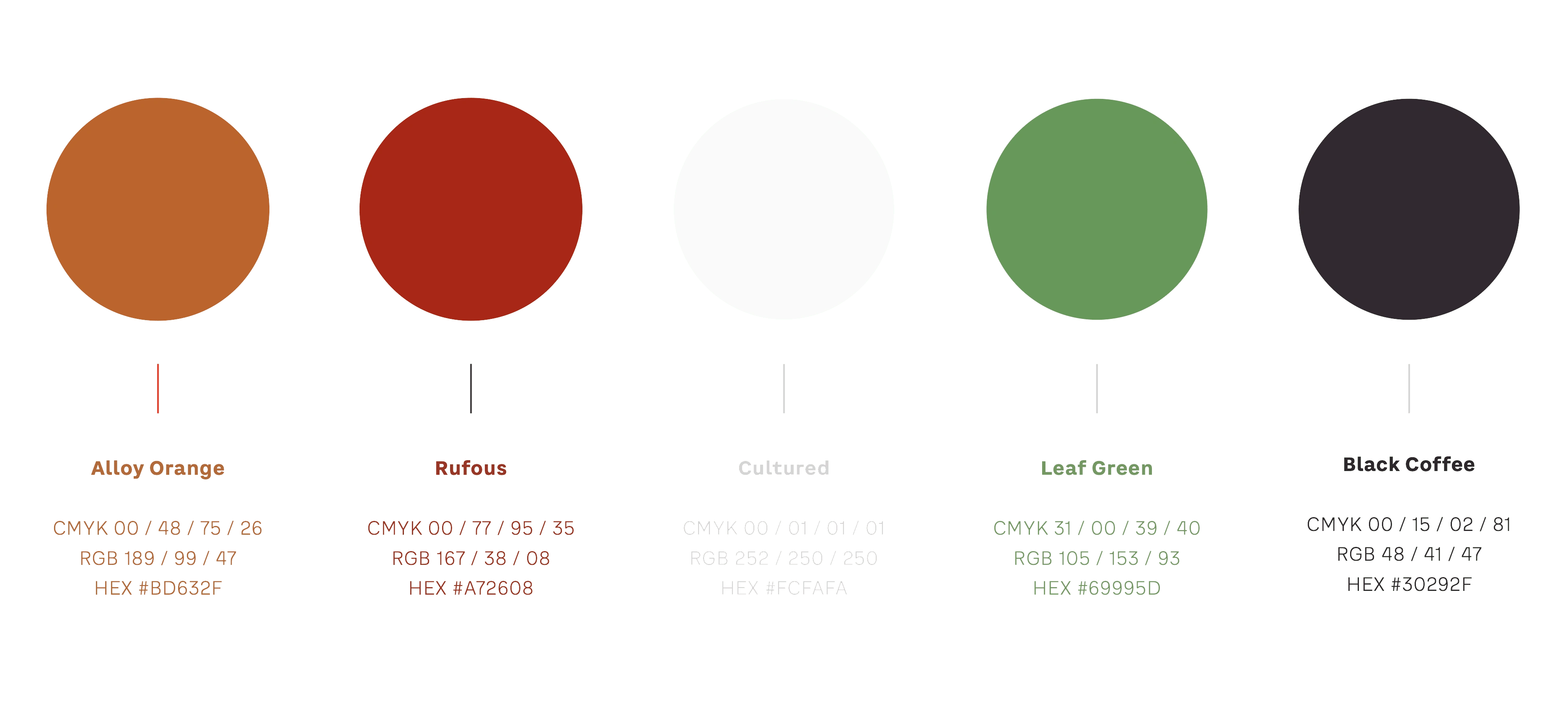
Colour Palette
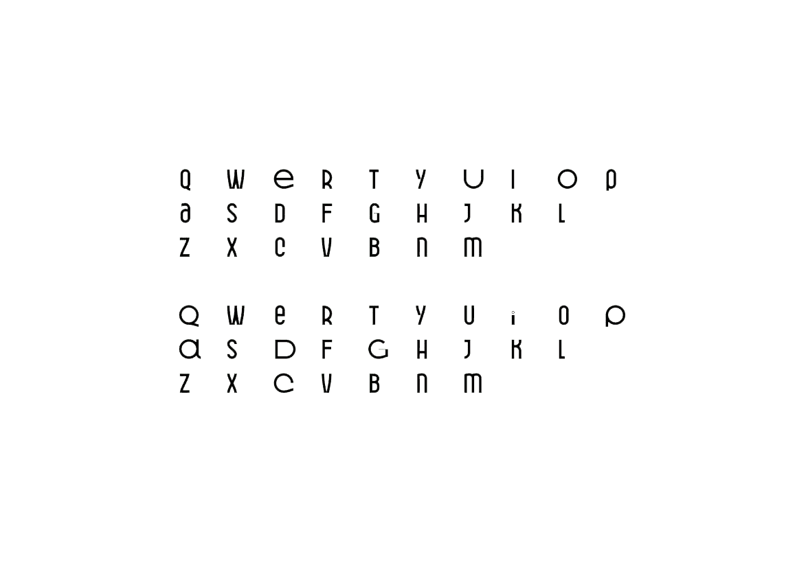
Ken Typeface
Imagery
Emphasising authenticity, our visuals capture unadulterated moments of Vietnamese culture, prioritising emotion over picture-perfect shots.
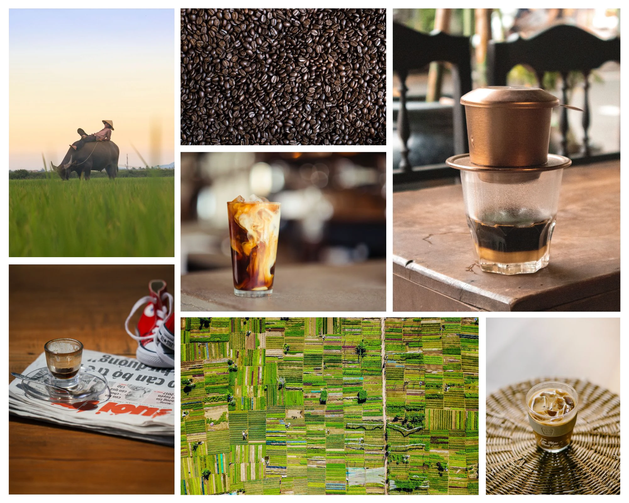
Visual Language
4. Packaging & Design
Design Inspiration & Concept
The unique packaging design draws inspiration from the traditional Vietnamese coffee filter, introducing an interactive component for the consumer.
Materials & Sustainability Considerations
Using glass over plastic emphasizes quality and reflects our commitment to sustainability, reducing environmental impact.
Packaging
The primary variant is a 330ml bottle, with the logo and other details printed directly onto the bottle, allowing an unobstructed view of the coffee and milk union.
Packaging with Cap
5. Other Visuals
Refrigerator
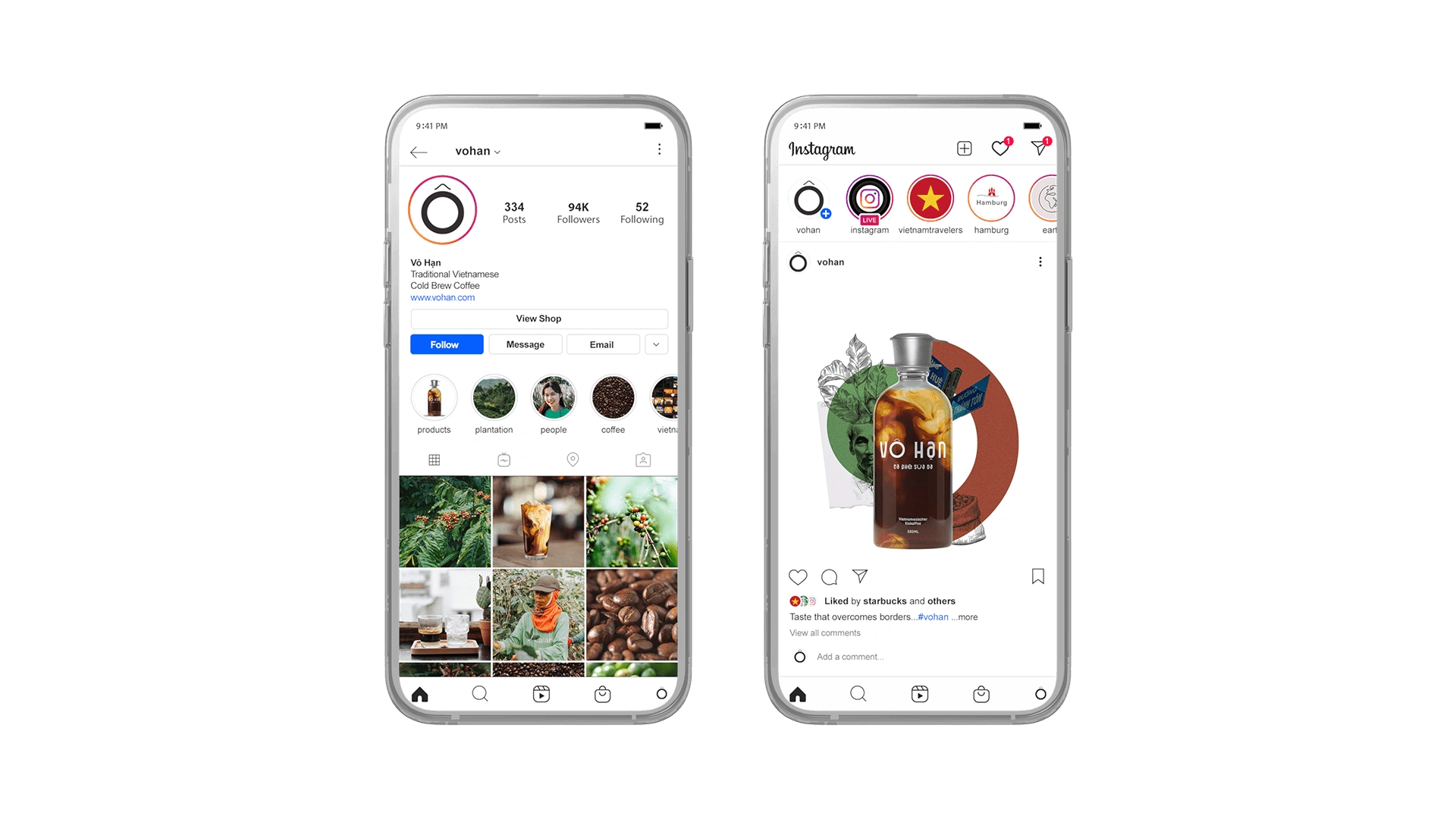
Instagram
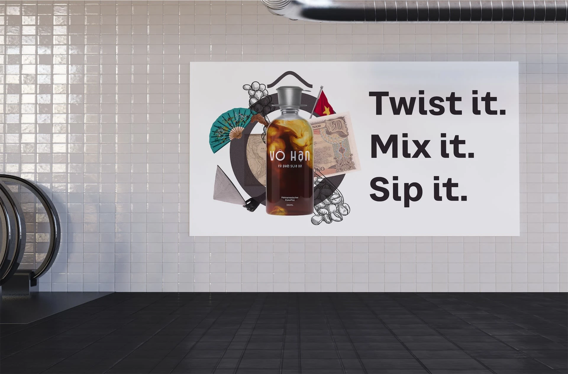
Billboard Advertisement
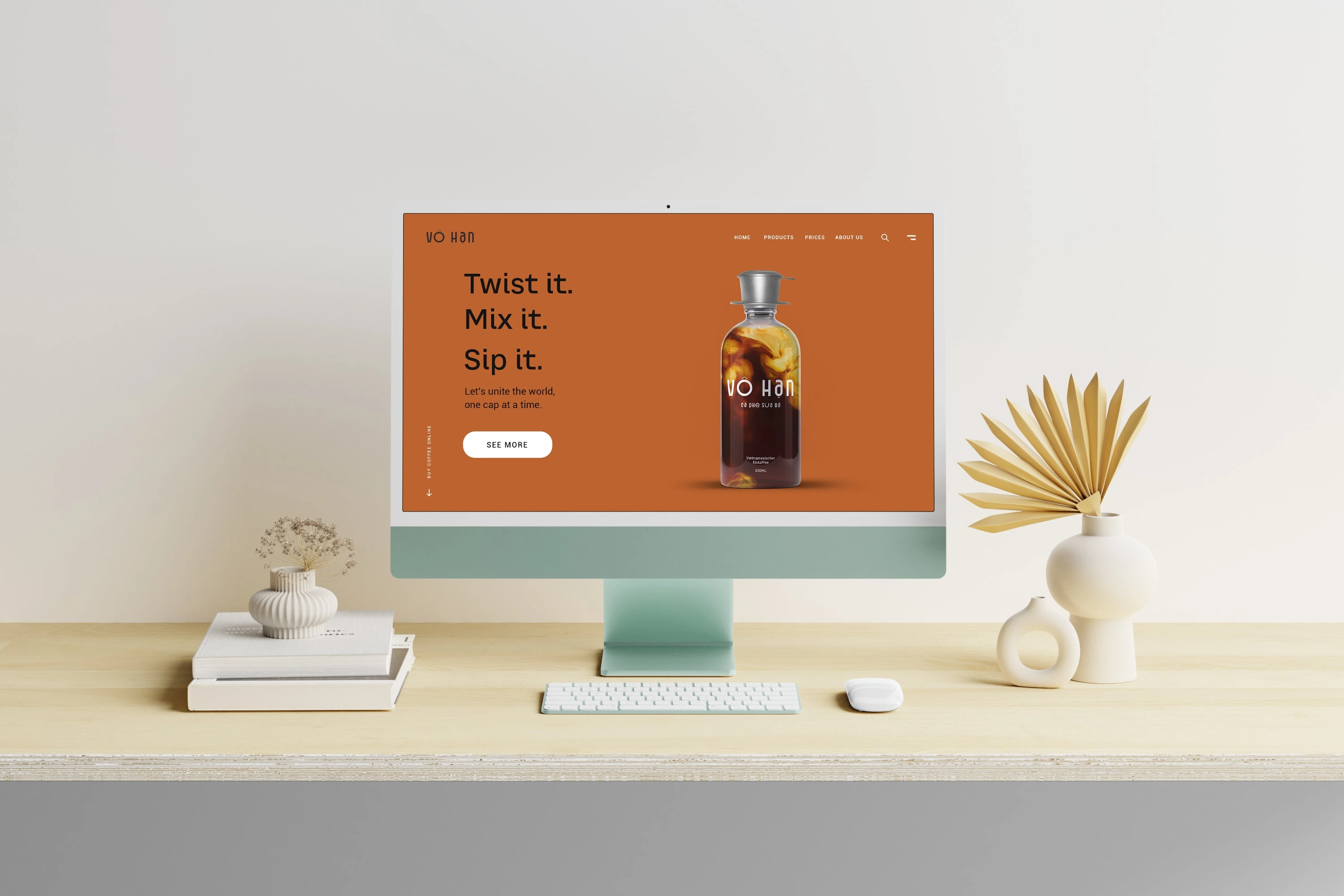
Website
Like this project
Posted Sep 11, 2023
Vô Han: Beyond coffee. Dive into Vietnam's rich history with each sip, from the streets of Saigon to the fall of the Berlin Wall. Taste meets tale!

