Brand identity for Makers of Barcelona
Hayley Cantor
Makers of Barcelona 360º Brand refresh
MOB (Makers of Barcelona) is the first coworking community space in the city, launching in 2011. When we started working together in 2020, they had 3 locations, were on the verge of selling one, a dated visual identity, and a brand that didn't reflect the energy of the community inside.
We designed a flexible, chameleon-like identity system that could evolve with the space: adapting across signage, digital, events, and member communications without losing coherence.
Results after 6 years of continuous use:
✔️ Web traffic increased by 26%
✔️ Social media following grew from ~1,800 to 6,072
✔️ 3rd coworking space opened in 2024 using the same brand system
✔️ Featured locally by a brand strategist as a standout identity
The brand has outlasted trends, survived 3 CEO changes and supported expansion, operating successfully based on the original brand strategy.
Despite its deep roots in the city’s creative ecosystem, the brand identity had grown static. Communication felt disconnected, visuals outdated, and the community lacked a strong sense of cohesion and clarity about what MOB now stood for.
Teaming up with a communications expert, I helped realign MOB’s message from the ground up. We revamped the comms strategy, then built a refreshed visual identity that honoured its colourful legacy while speaking directly to the vibrant creative minds it serves.
Using the existing logo and palette as a springboard, I created a flexible visual system: a new website, social media templates, print and digital assets, and art direction for a fresh photoshoot, ensuring everything felt purposeful, strategically aligned, and still unmistakably MOB.
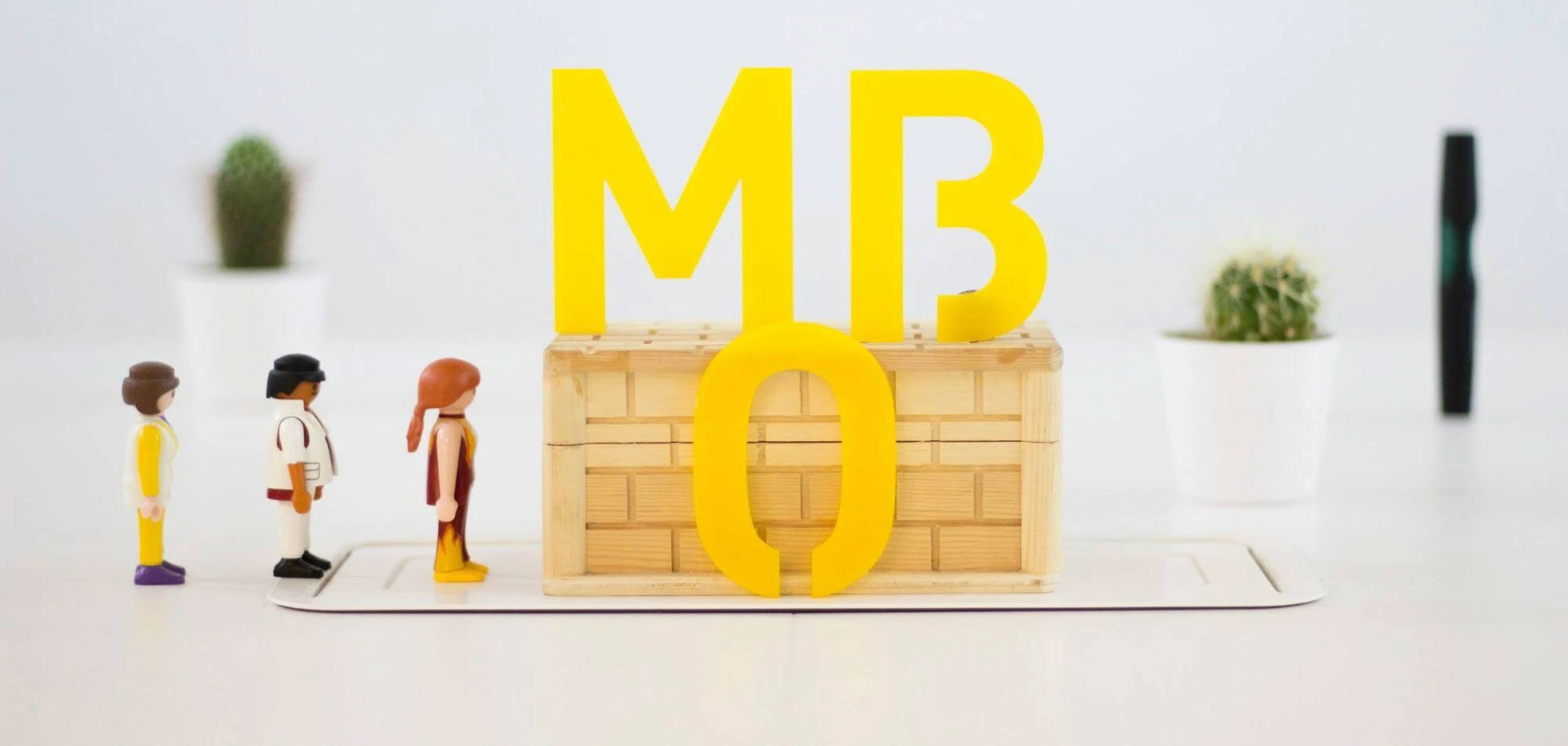
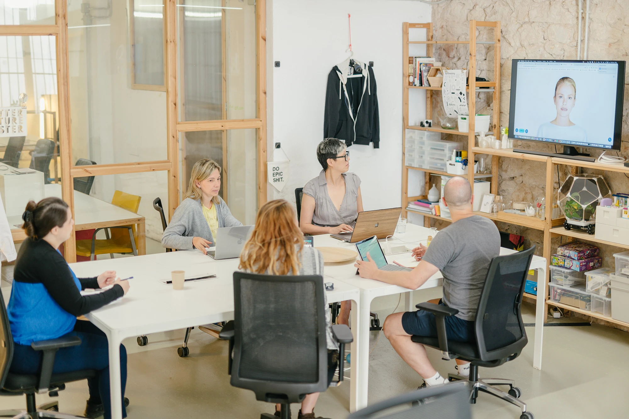
An original inspirational image from the original essence of MOB: playful, focused on makers and creatives.
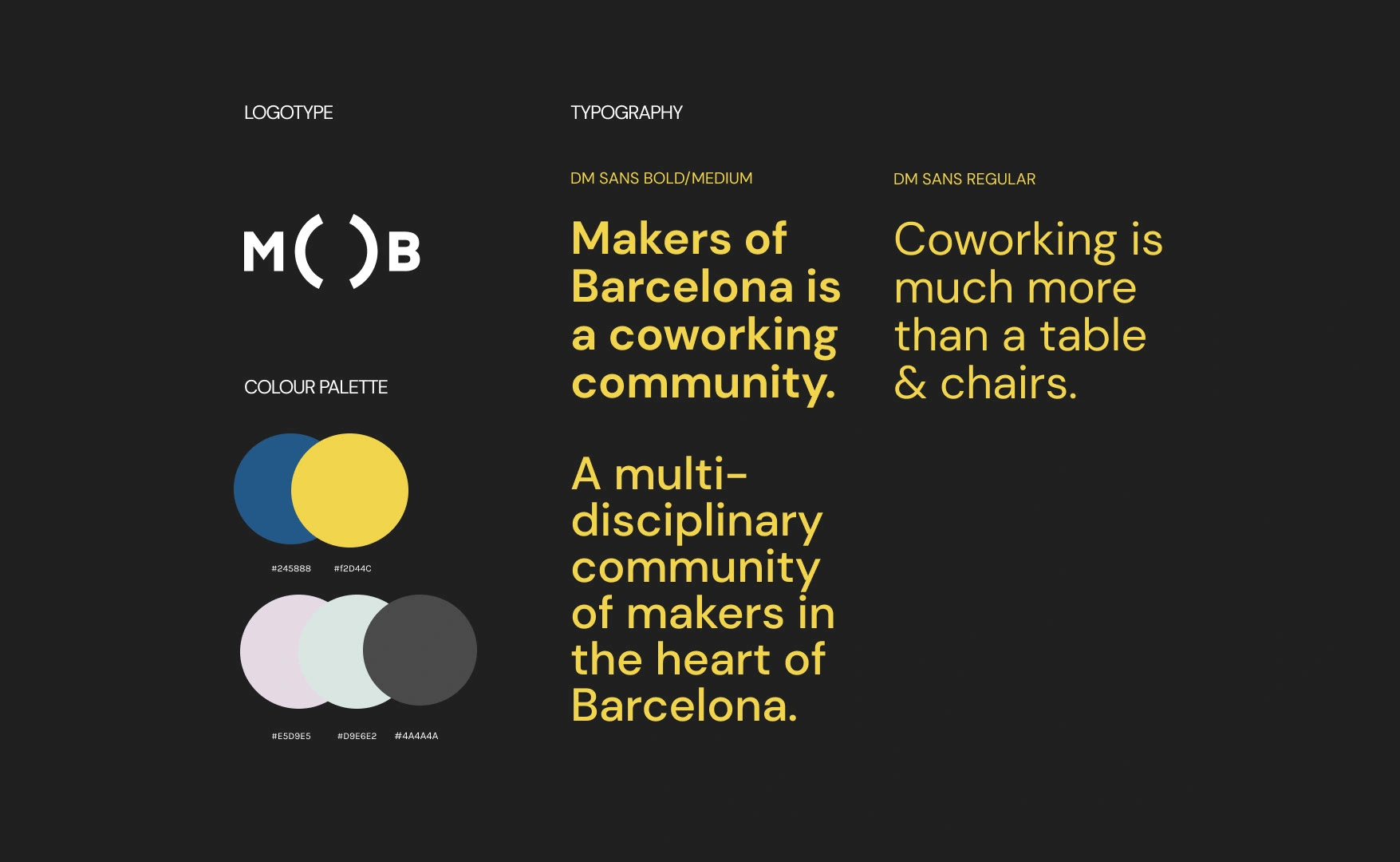
New brand basics for MOB
Complete overhaul of social media design
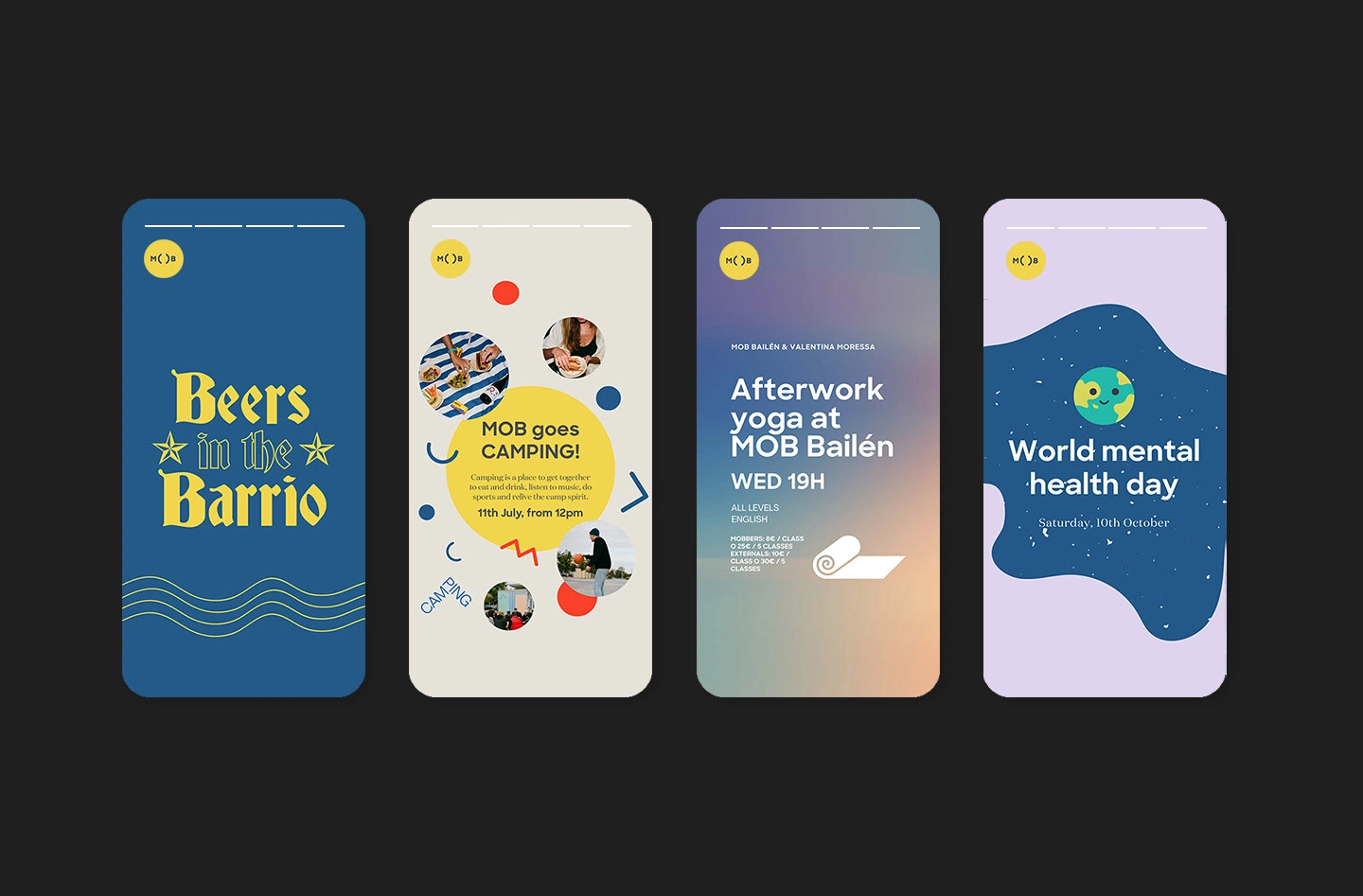
With a small team, and A LOT of activities, MOB needed a realistically scalable solution to allow them to have a drastically improved social media presence. I created a series of colour-coded and thematic templates that were easy to adapt to all types of different event types, announcements and purposes on social media.
This included matching designs for:
→ stories (Instagram & Facebook)
→ printable posters for inside the multiple coworking spaces
→ posts for linkedin, eventbrite and other social media platforms.
We also designed series that would better transmit MOB's brand values, specifically 'community' by spotlighting members or, Mobbers.
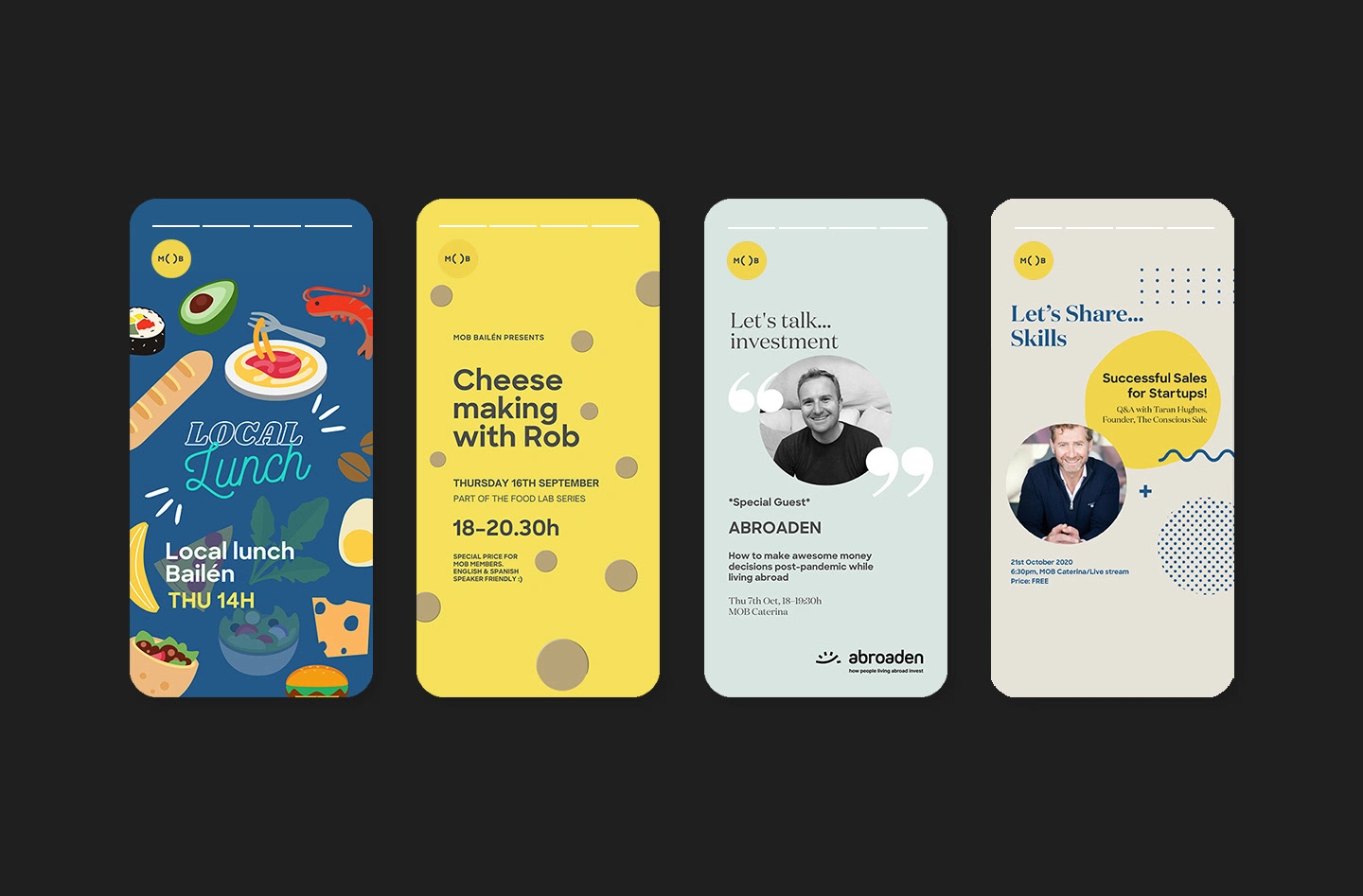
Fresh social media design system of templates, allowing MOB to communicate anything and still feel on brand.
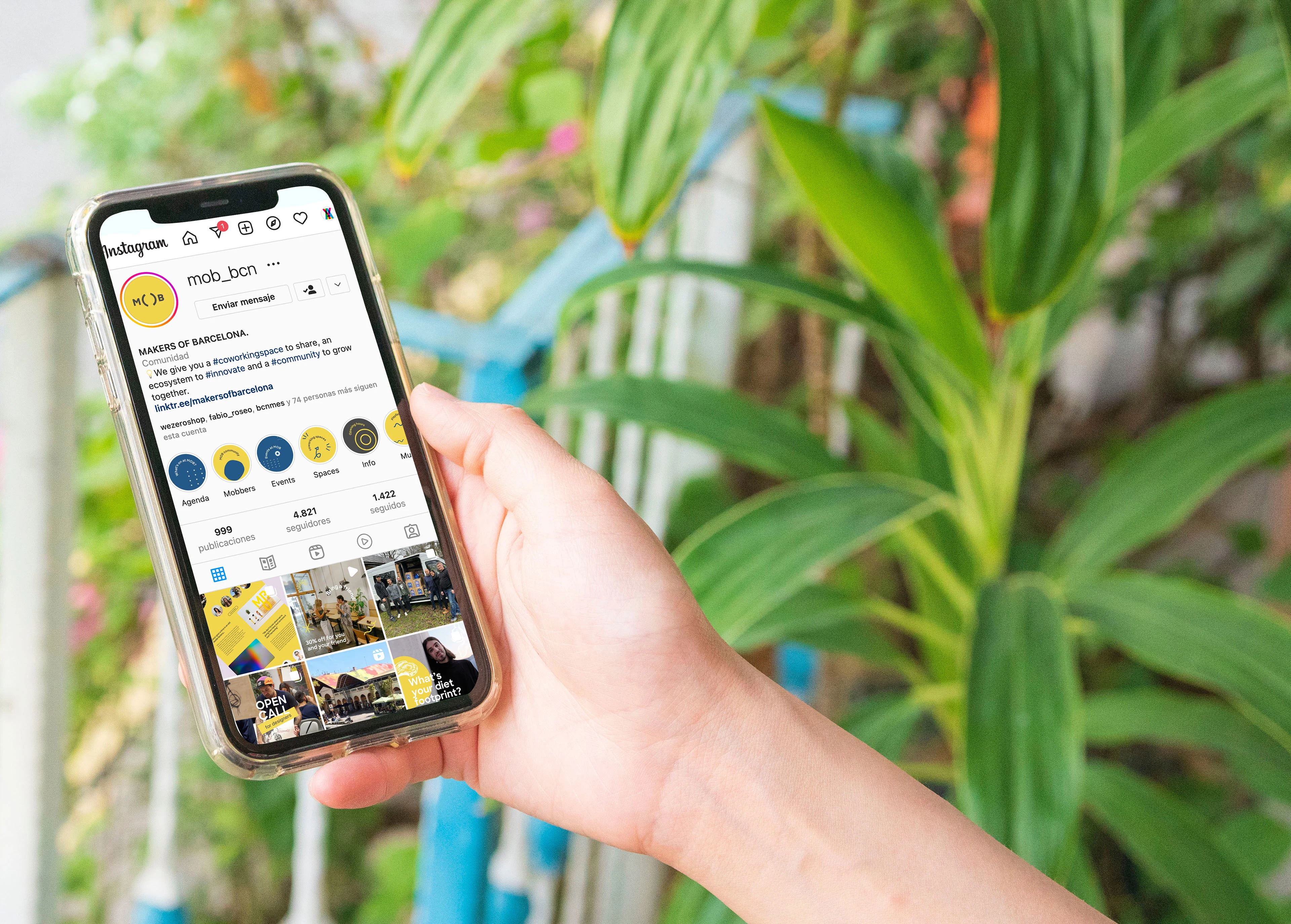
An Instagram feed that breathed the brand to connect all touch-points visually
Examples of stories designed for the brand refresh
Meet the Mobber series design, for highlighting creativity and developing a deeper sense of community
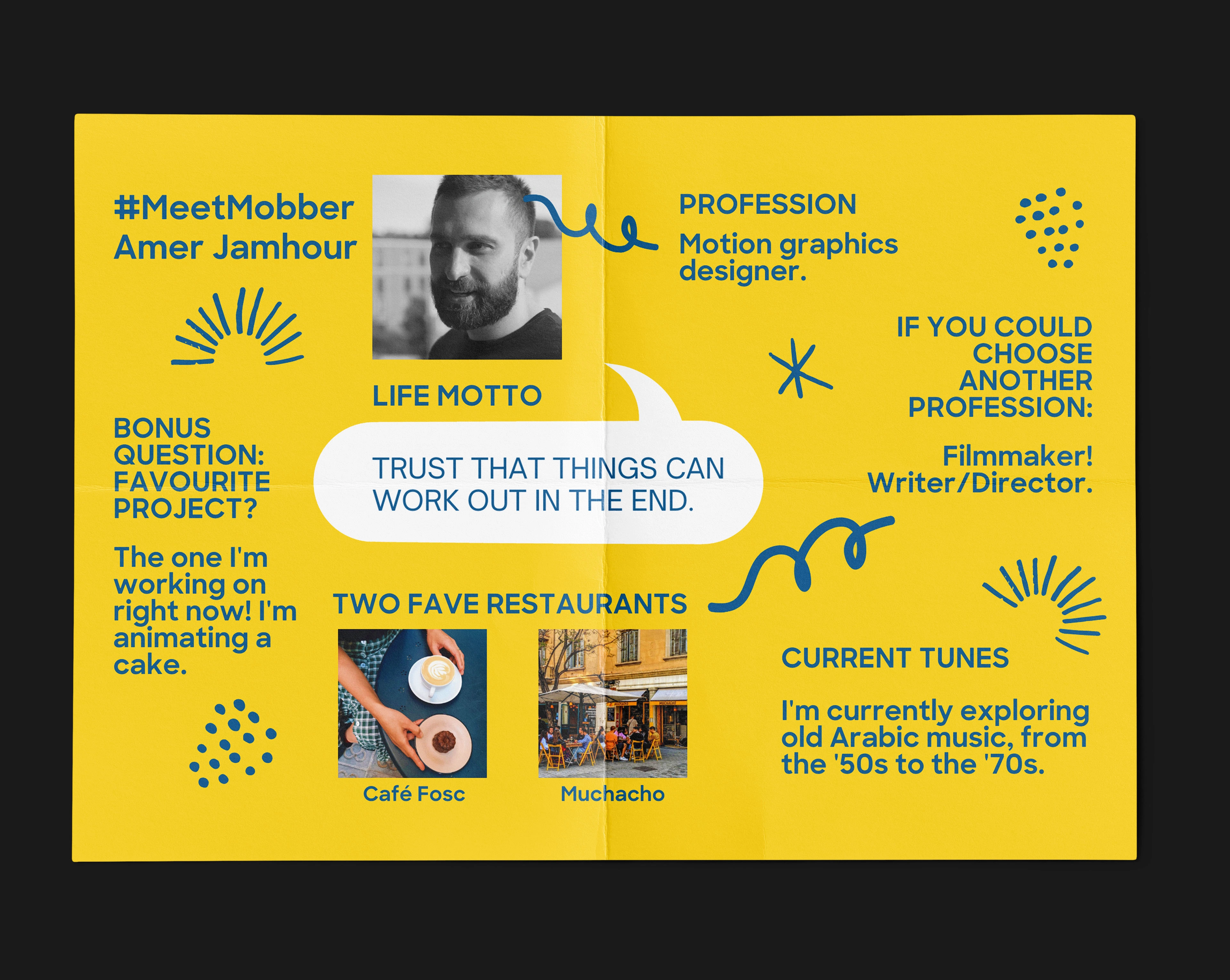
Meet the Mobber graphics adapted for website blog article
Social media template series, easy for internal staff to adapt on Canva
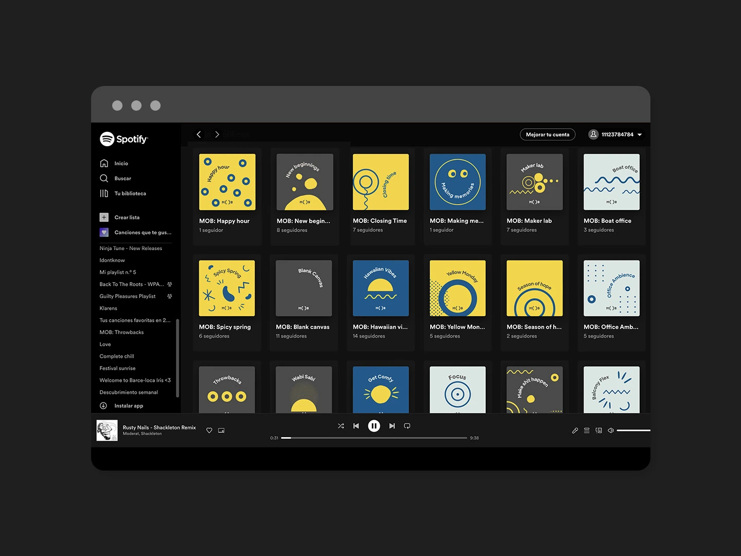
Spotify covers: tracks curated for every occasion with collaborative comm/unity playlists.
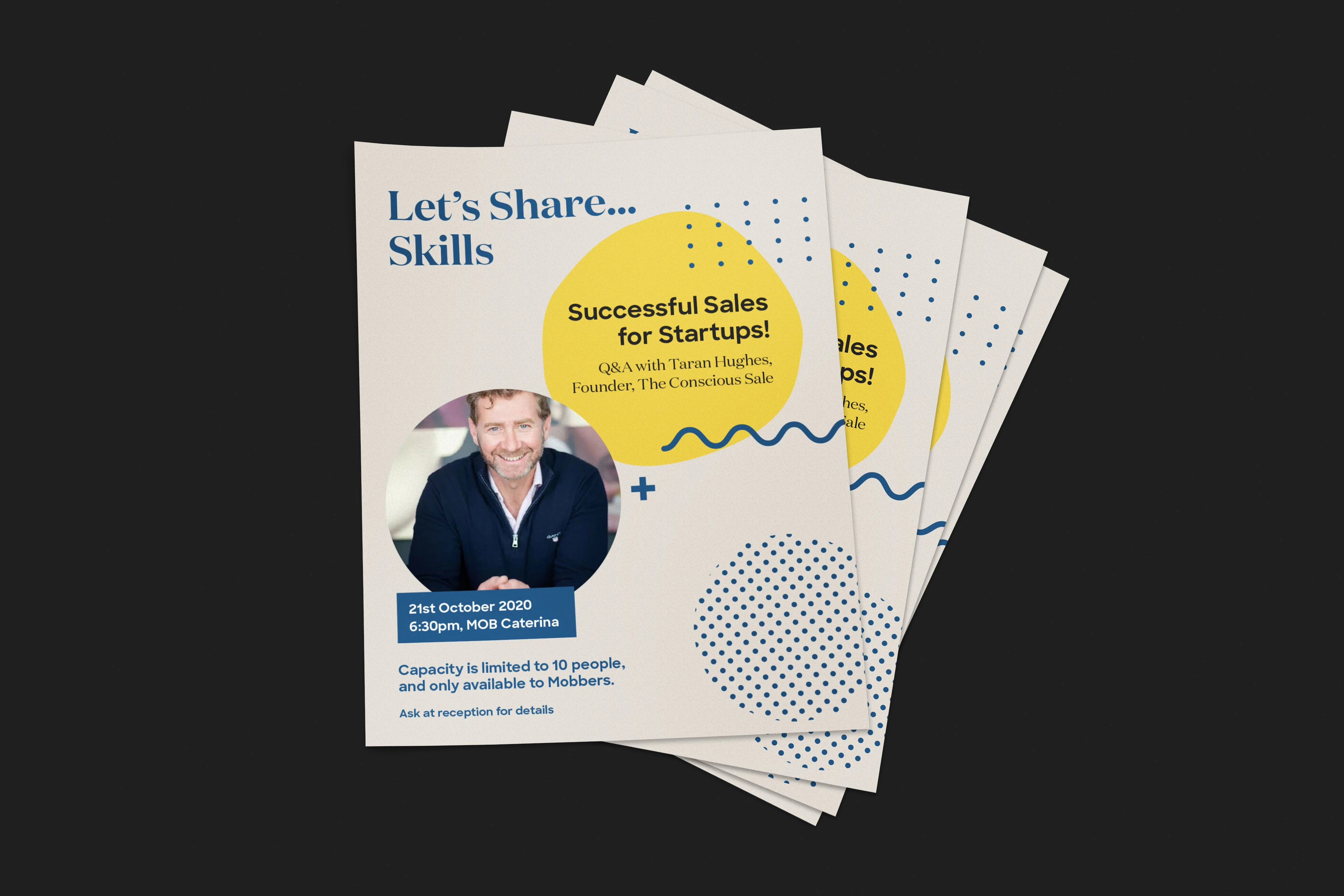
Series of posters designed for a professional training event
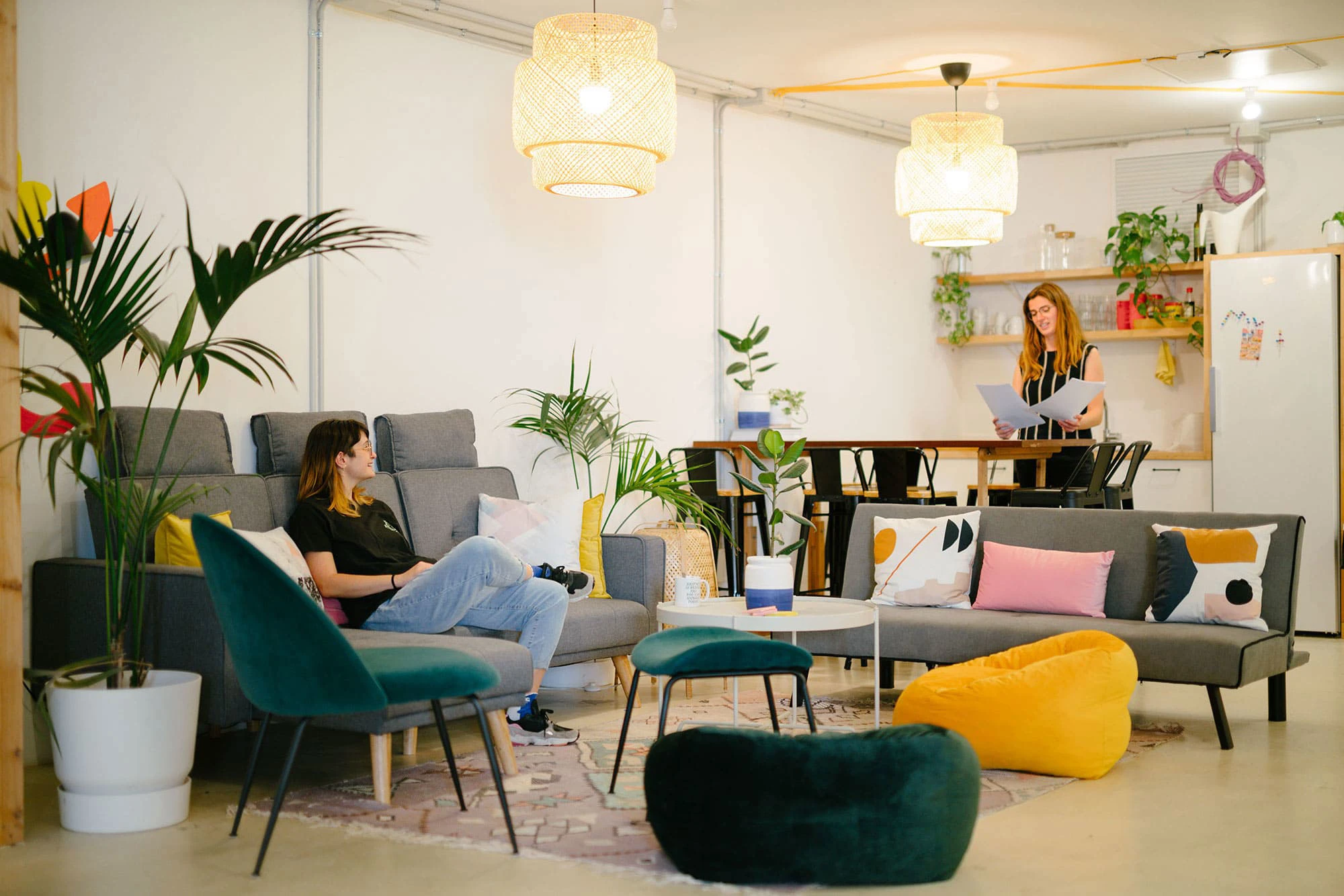
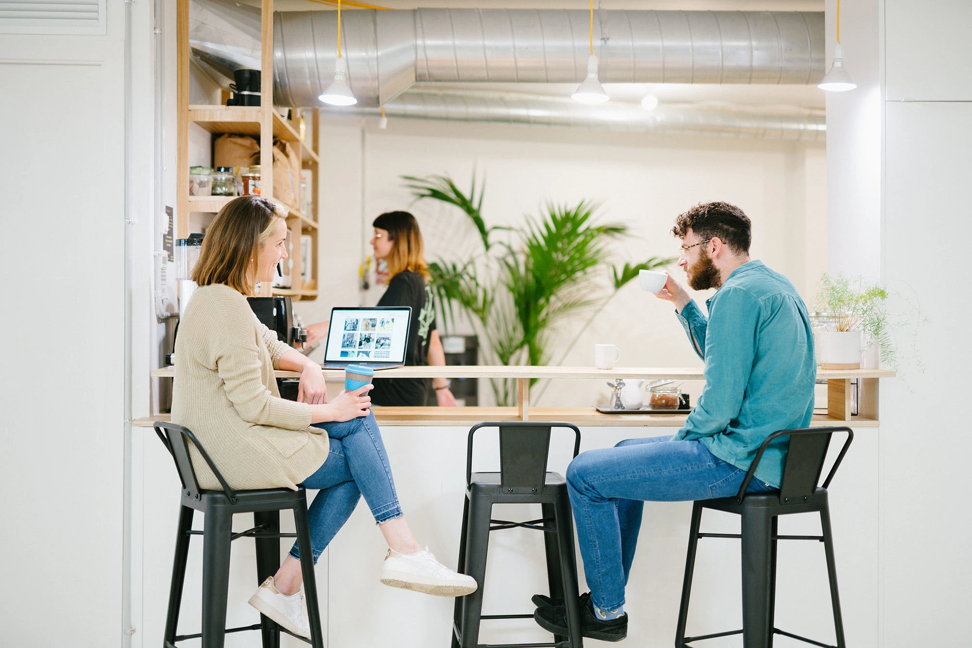
Art direction: a new photoshoot to present the spaces as 'a place to call home'
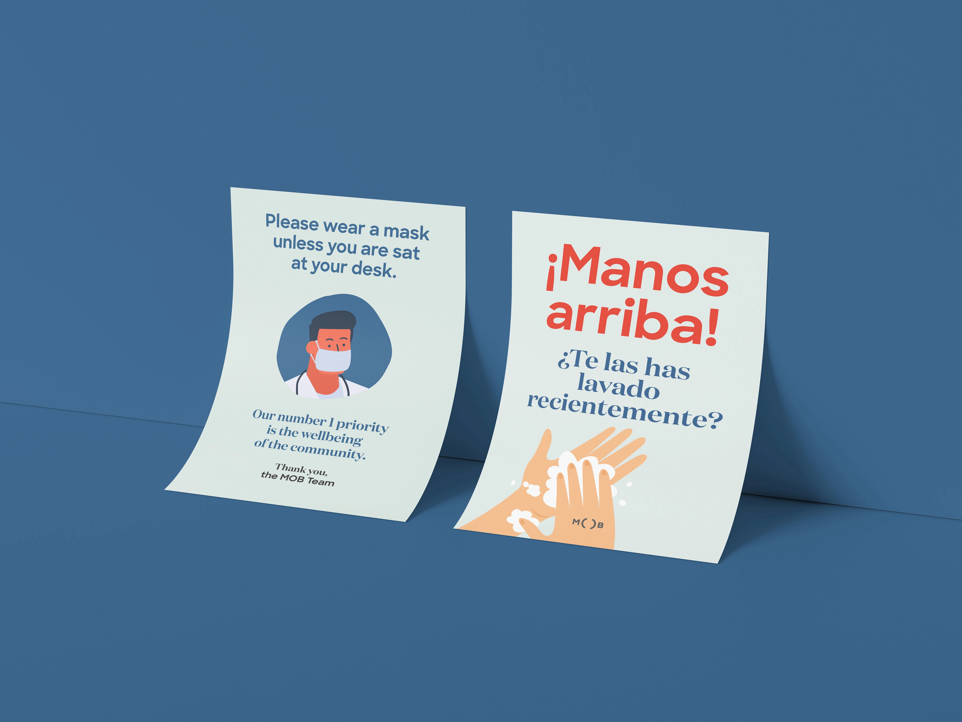
Examples of poster designs for COVID pandemic: designed to be informative but friendly.
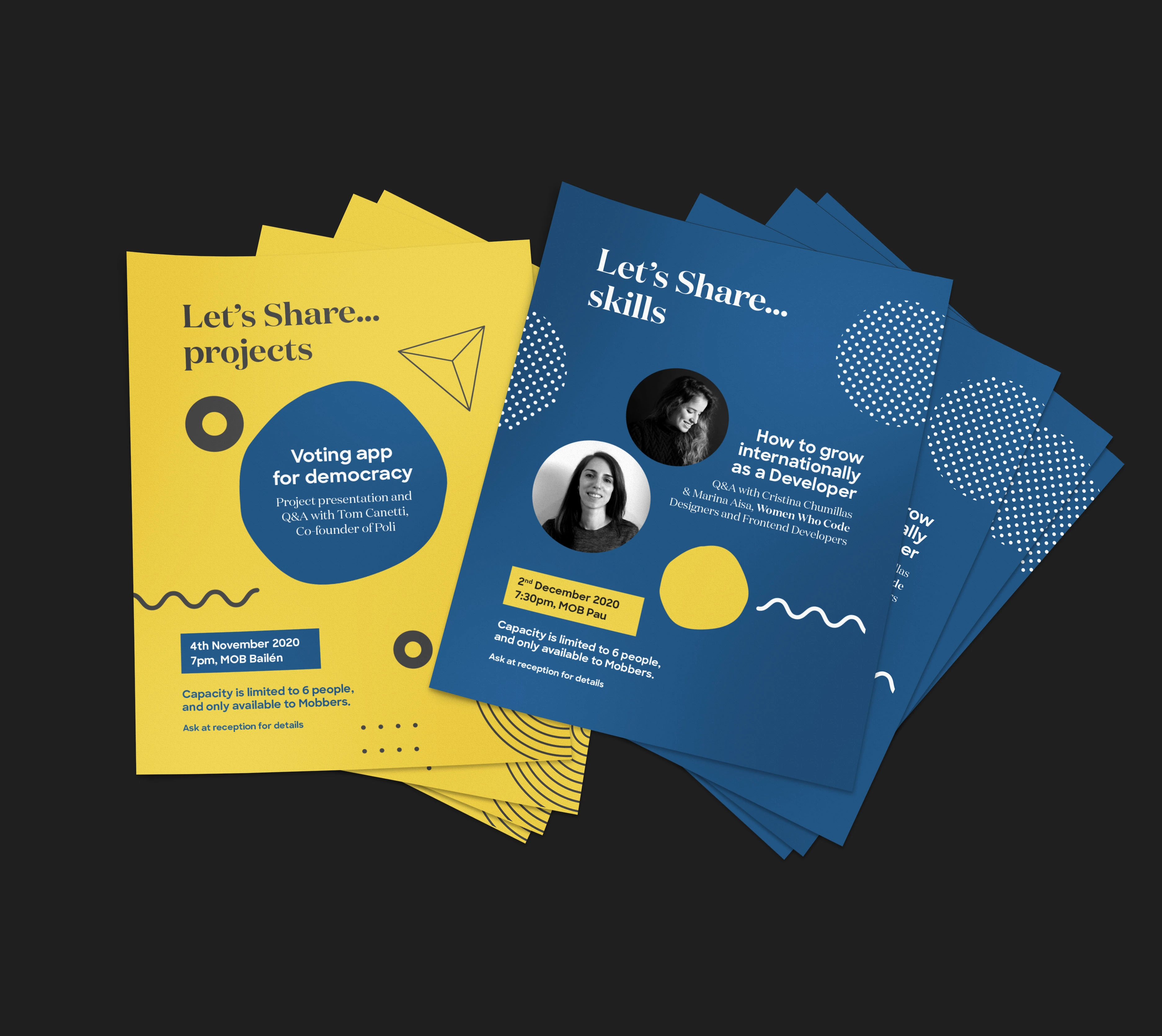
Series of posters for professional training events at the coworking space
Sub-branding
We wanted to find proof-points to show how MOB is part of a bigger ecosystem that connects to the wider community, not just an isolated space for people to work from. To do this, I designed a mini branded event called 'Beers in the Barrio' (Barrio = neighbourhood in Spanish). The concept was to use multiple languages that could be universally understood to show neighbours that they were also invited to the coworking space afterwork sessions on Fridays.
With a huge poster outside the space, gradually, over a few months, we began to see more and more locals join us for drinks to discover more about what was happening at MOB.
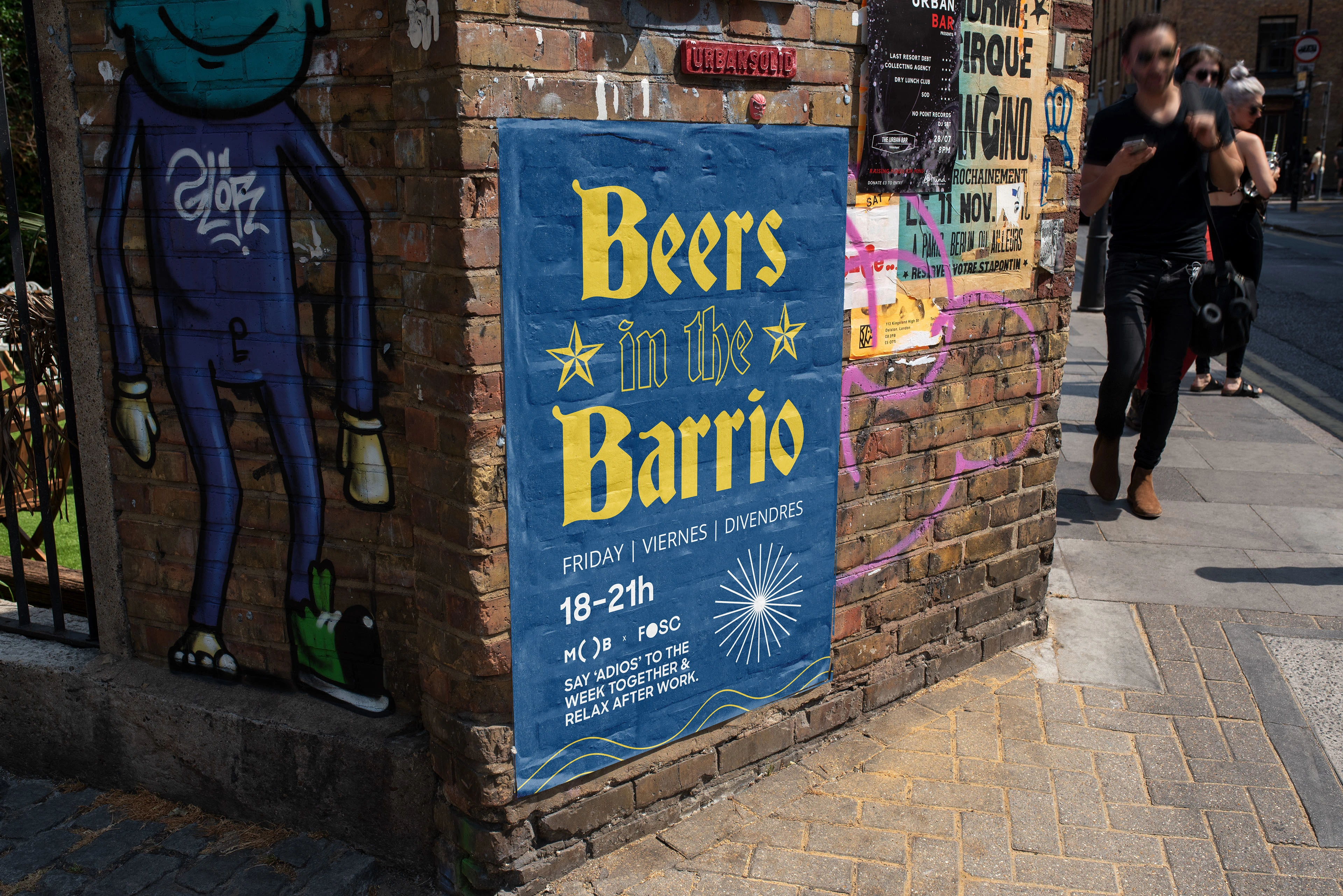
Beers in the Barrio: a sub-branded event designed to connect the coworking space afterworks with the local community in the neighbourhood (or 'barrio' in Spanish)
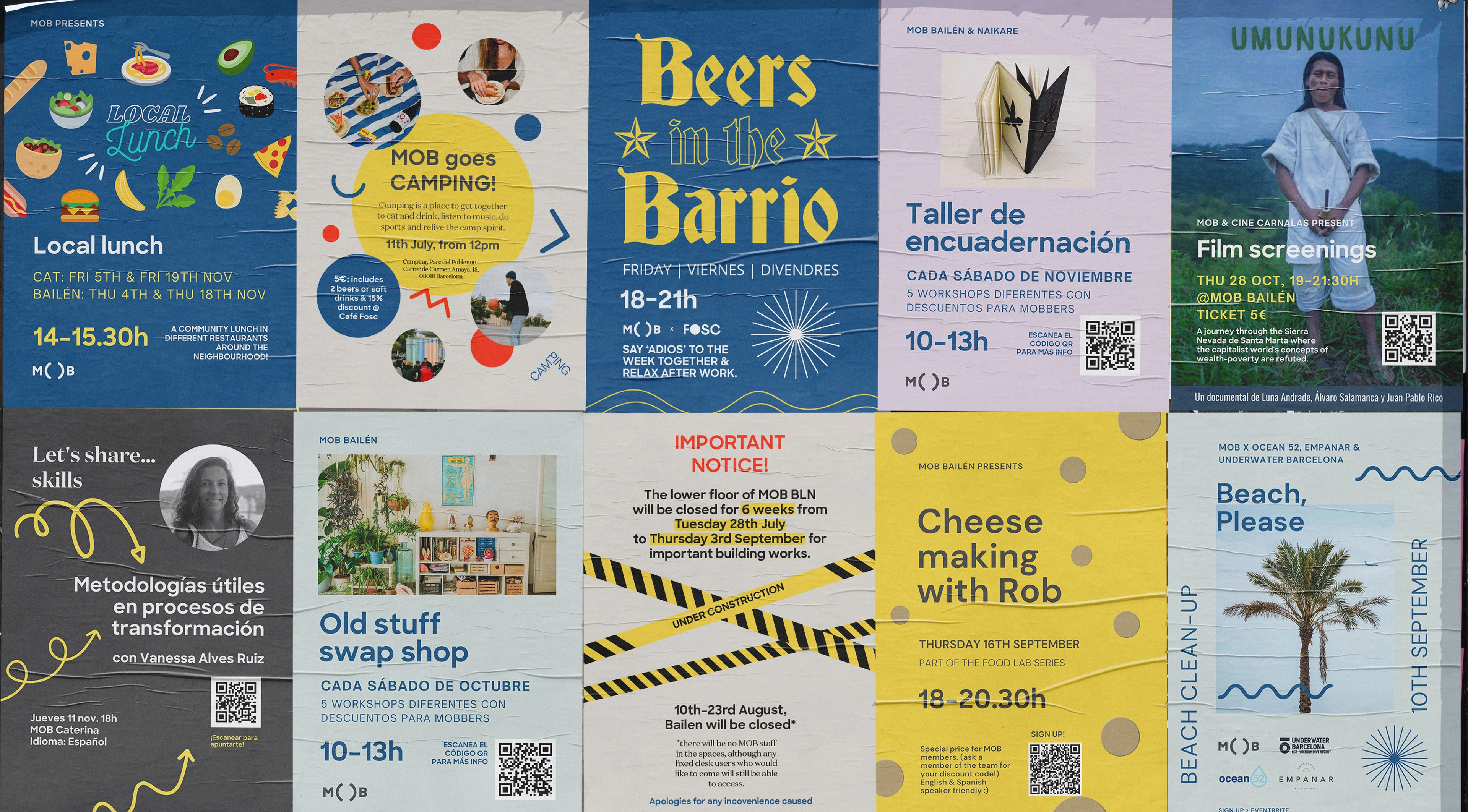
Collection of poster designs used to communicate events offline for the whole community.
New improved web design & refreshed collateral
With MOB's intention to expand it's activities, and become more remote friendly, we needed to rethink the website.
It wasn't possible to pay for your coworking membership directly on the site, nor was the site built in an SEO friendly way and the design also wasn't scalable. This was creating a lot of additional work for staff at a time when they were already significantly overwhelmed with tasks.
We designed a completely new user-oriented concept, dividing the page by coworker types, then their respect memberships, cutting the clicks to sale significantly from 6 to 2. Now we were also able to update this key touchpoint to reflect the rest of the brand presentation, to create a cohesive, holistic experience for the user.
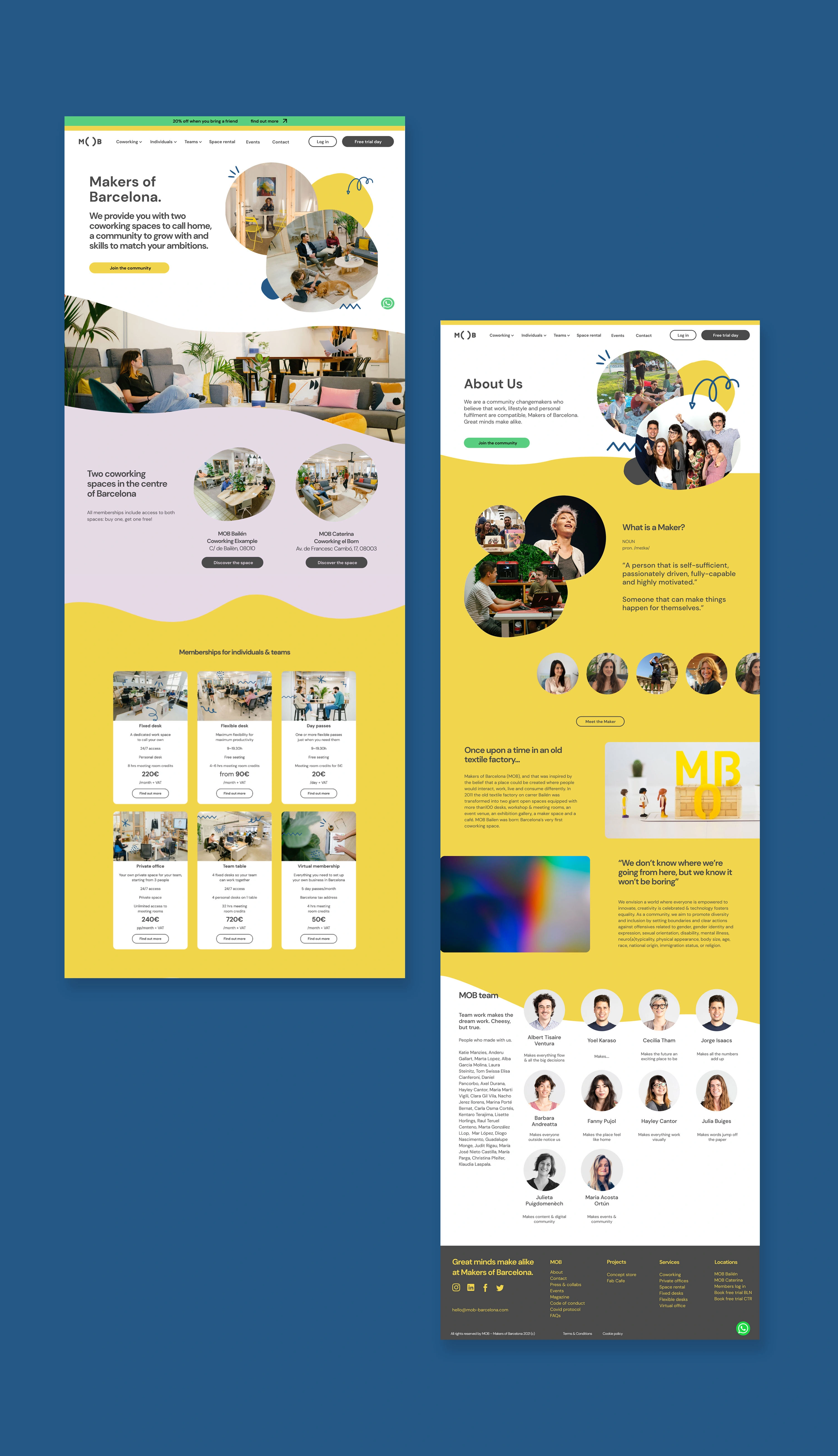
Complete website redesign, including improved UX, and ability to book and pay for memberships online.
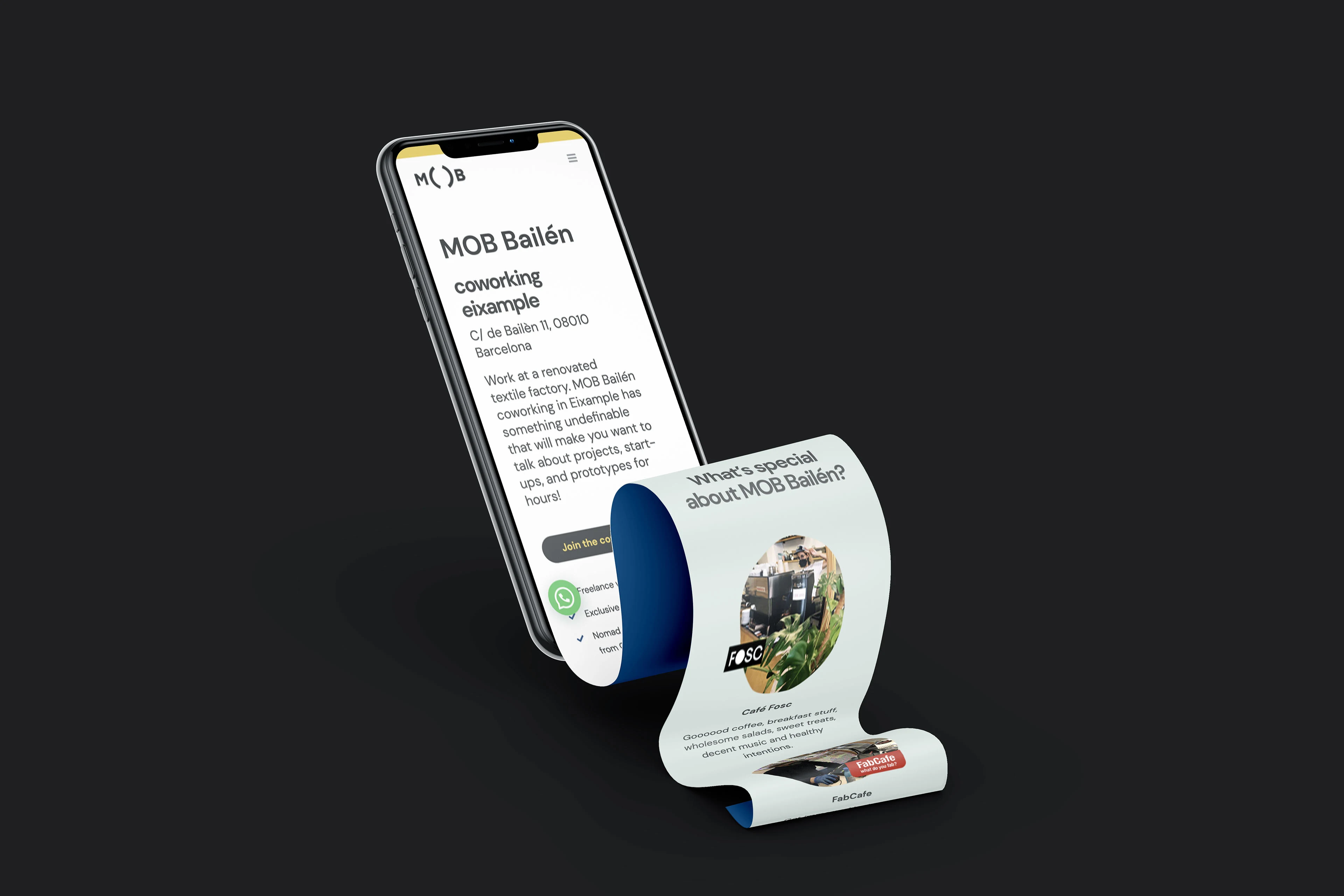
UX/UI design for new MOB website on mobile
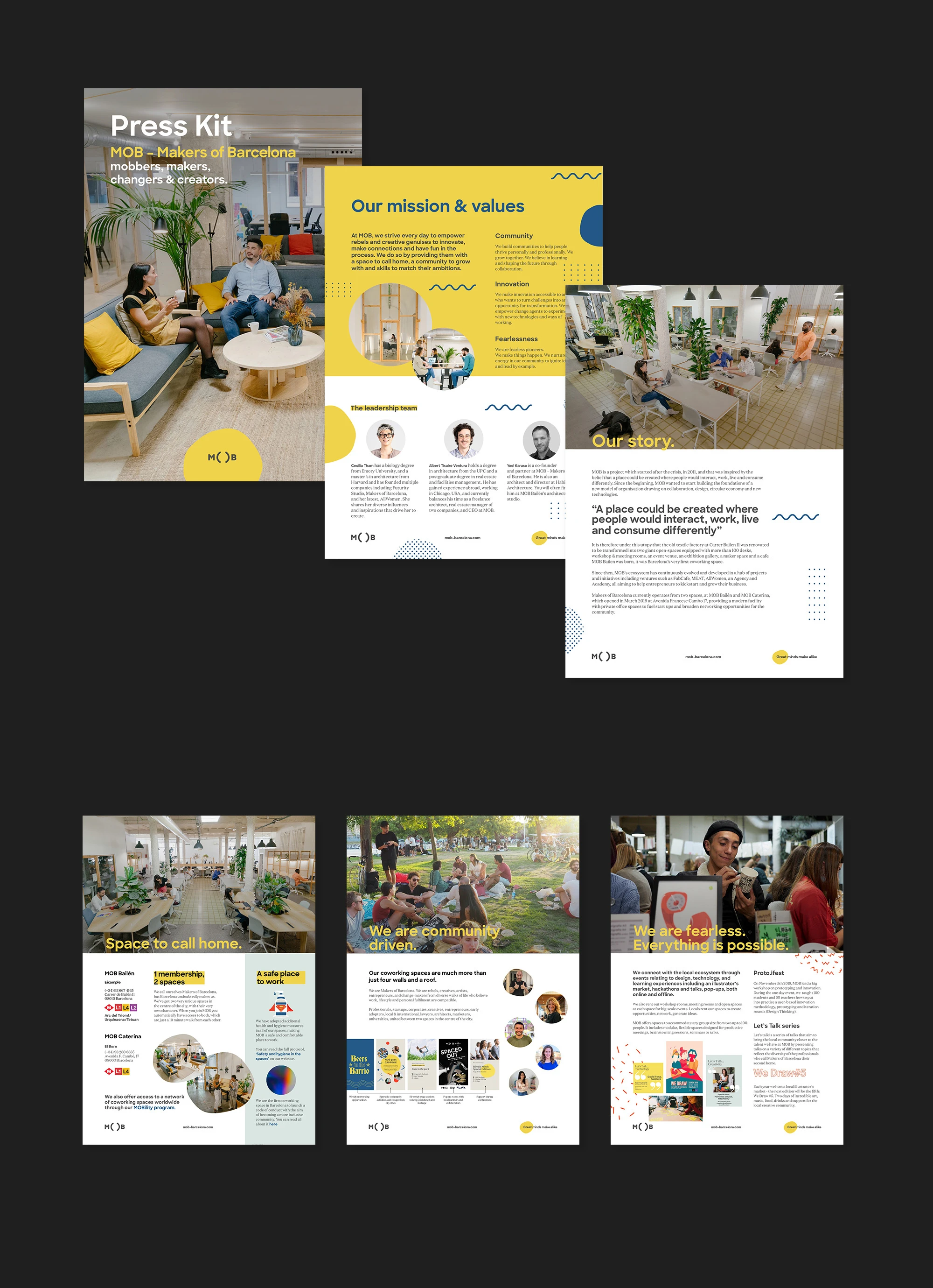
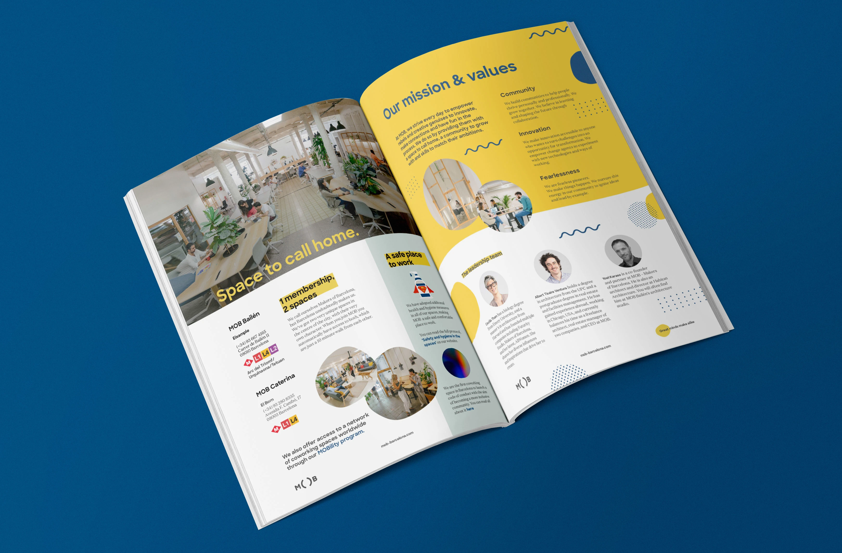
Updated presskit, with the brand's new realigned brand & communication strategy
Application of the updated branding to photography: playful elements communicating MOB's creative side.
New mission & values for Makers of Barcelona
Example photo from the new art direction
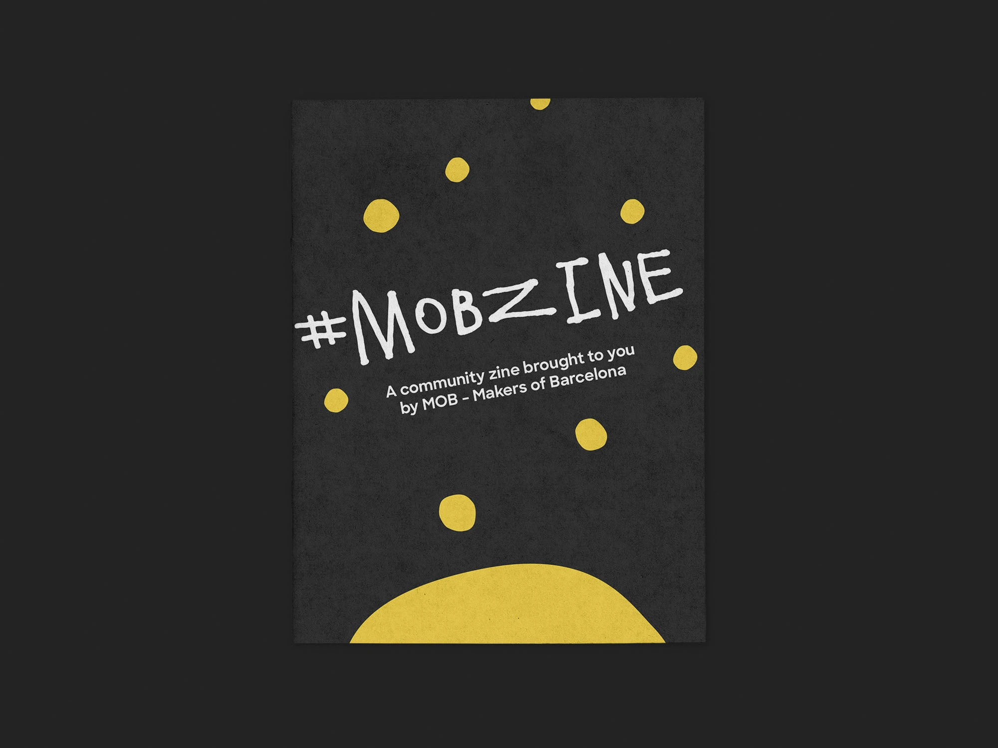
Community zine project representing MOB's tight-knit community, create during the Spanish lockdown, remotely.
Examples of the page layout from the community fanzine
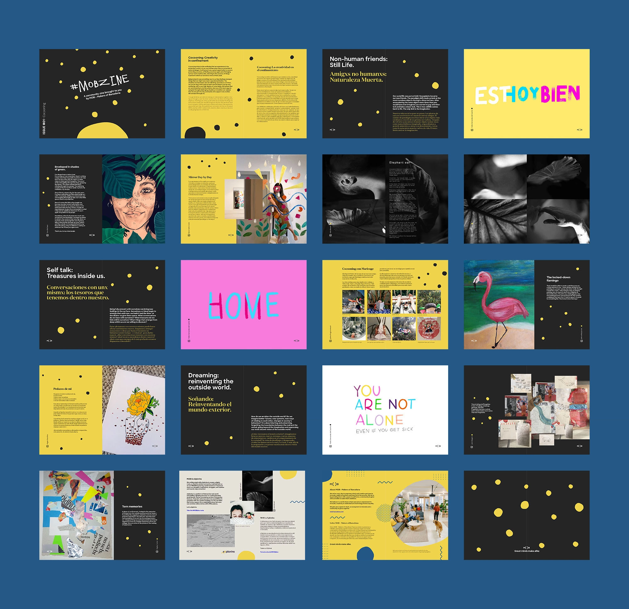
Flat plan of the MOB community fanzine created collaboratively
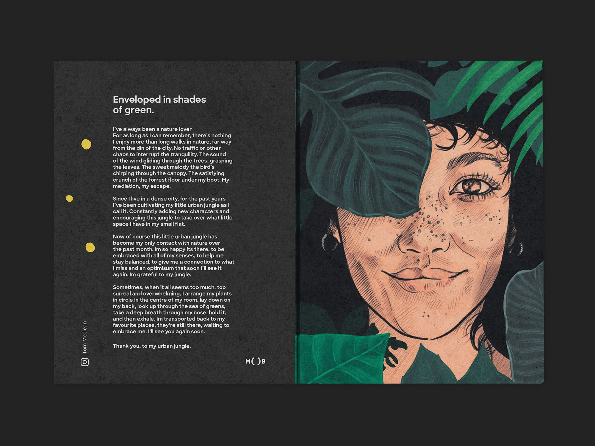
Page spread from the community zine.
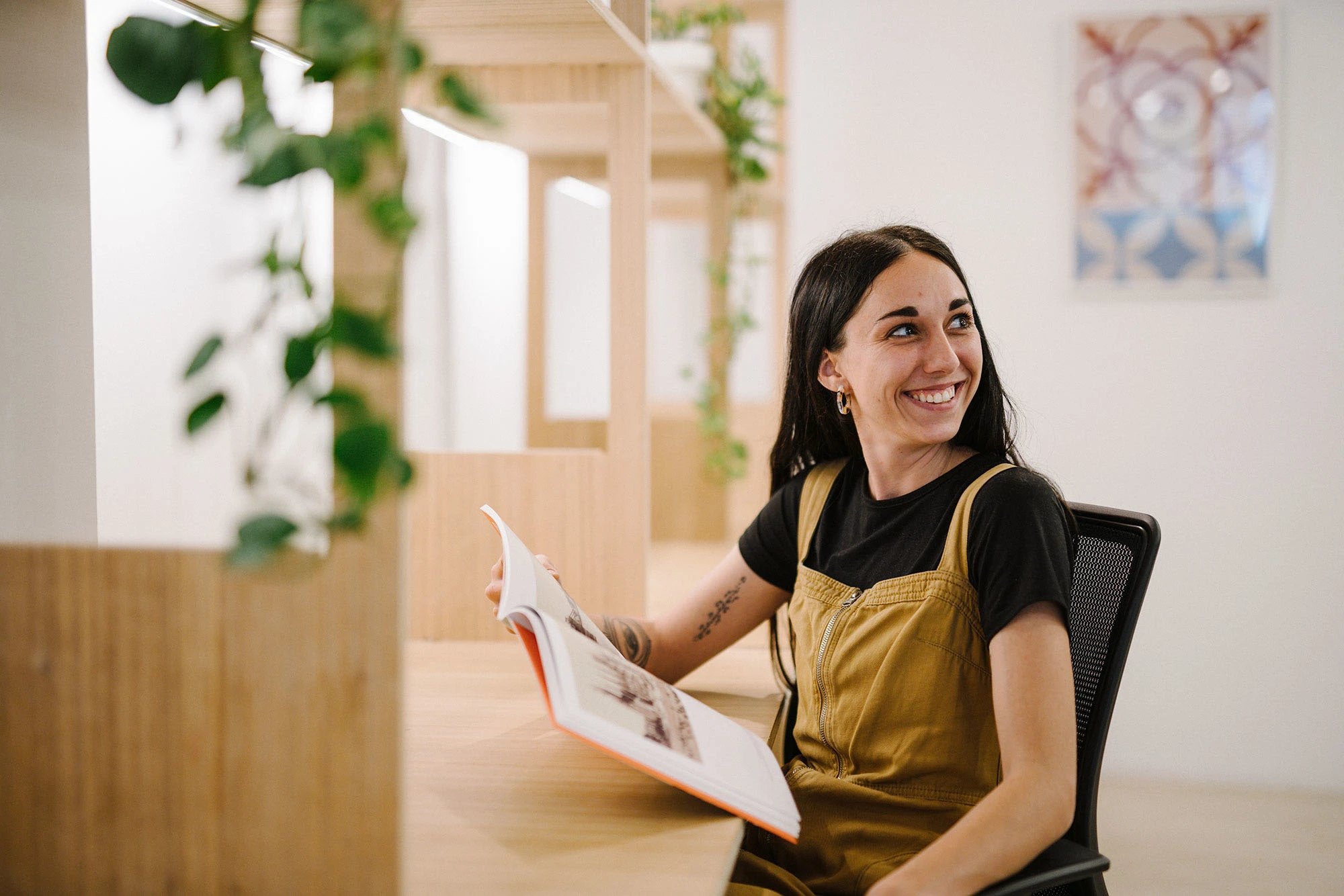
Photo showing Mobber in a relaxed, homey atmosphere: a coworking space to call home.
3 spaces to call home!
Since we did the brand refresh, business at MOB has been thriving. They have been able to scale up, opening a 3rd coworking space, serving another area of the city. They've expanded partnerships with local businesses and achieved recognition for the strength of the community and brand.
Like this project
Posted Mar 3, 2025
26% increase in web traffic and social grown 1,800 to 6,000+. Brand identity for Barcelona's leading coworking community, opened 3rd space following rebrand.
Likes
2
Views
37
Timeline
Sep 28, 2020 - Jan 28, 2021