Redesign dashboard feature
Car zone, is a feature under Socar’s dashboard where the Fleet Team can manage the parking zone of every fleet cars for our B2C service. It contains the information of the parking such as address, coordinates, operating hours and even payment detail of the parking rental.
However, the users (Fleet Team) has a poor experience with the current user interface and it has doubled their time to complete their task.
Talking to the users
After receiving the word where I need to do a redesign for them, I scheduled a meeting with the business and fleet team in order to understand why is the redesign requested by them. By asking them to show me how do they use the feature (end to end process), I capture how they were using the feature and what value they actually uses on it. I learned that the major pain point for them was that the screen was limiting the list of zone area to only 3 items per page and that the map was taking up half of the screen. Users have to scroll down to view the list which is unfriendly to their task.
The card design of the list is also causing some pain in completing their task as it is difficult to skim through.
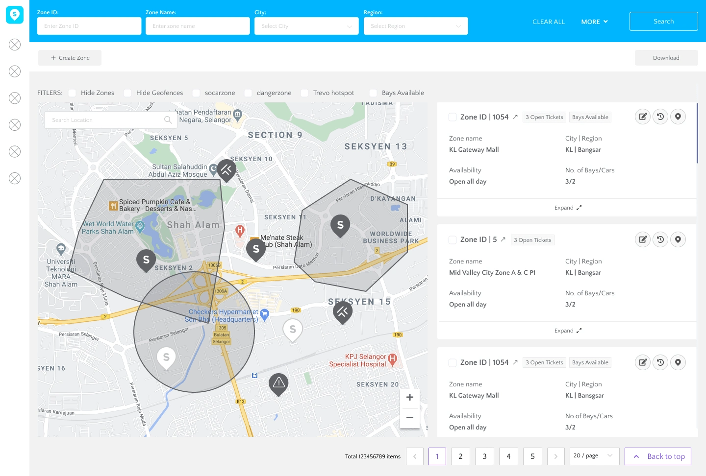
(Current design) List of zone on the right hand side of the screen
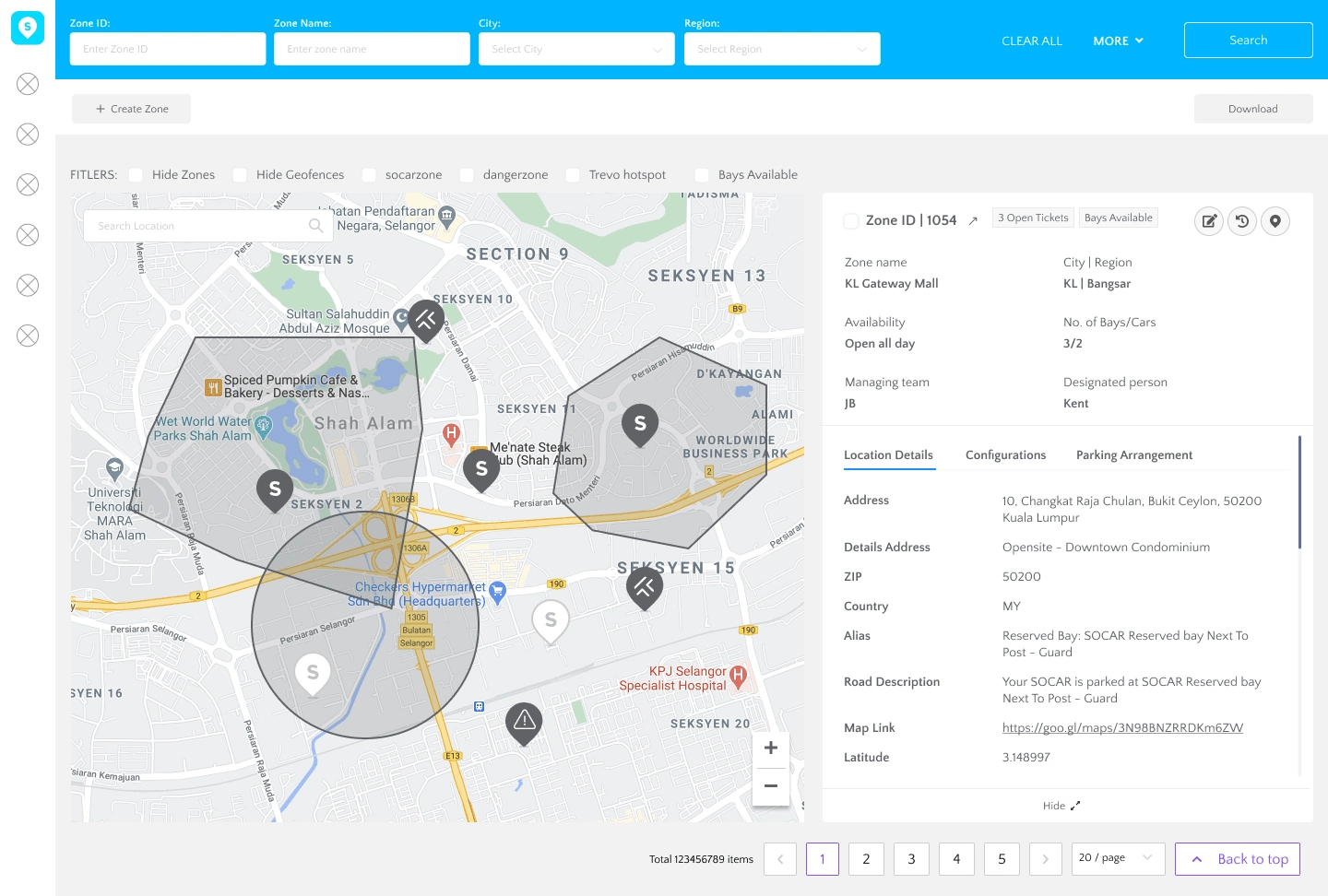
Expanded card takes up the whole right side screen
The visuals did not indicate which information was more important than the other. Additionally, there is no other way for the user to search for particular zone area they want to find.
Talking to the users have also help me in identifying the problem in creating and editing a new zone (a feature within the screen). The first step in creating a zone in the current design is redundant for them as it is just an extra step that is not needed by them.
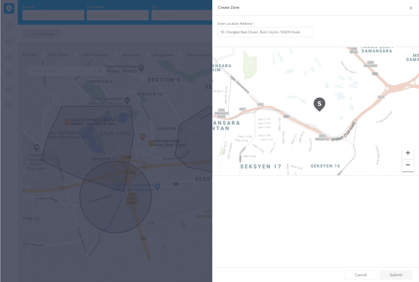
First step in creating a new zone
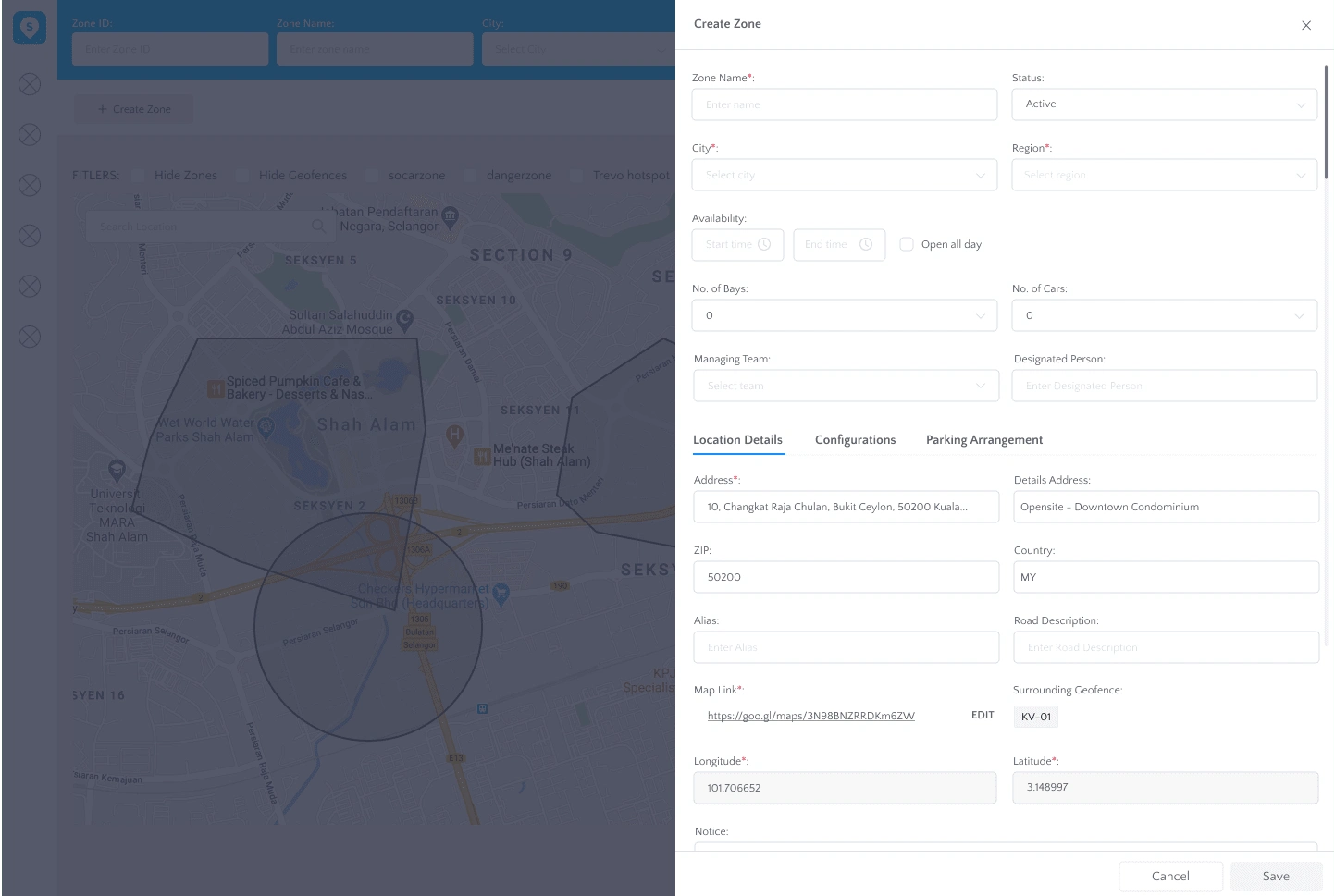
The tabs in side drawer has given users some pain points as they need to click on different tabs to edit any changes but only have one save button for all changes made. There is no overview of the things they have changed.
Main objective
This section or feature of the dashboard is crucial to be improve to relieve the pain points the users encounter, especially in locating a specific car in specific zone area.
I determined that the main objective is to reorganised the hierarchy of informations to ease the users daily task visually and adding some functionality for user to search through the long list of cars they have. The map exist as a secondary priority for an overview look of the zone.
Redesign process
Wireframing
I designed a simple overview of the screen with adding a search bar and a table list view for easy skimming of the zones available.
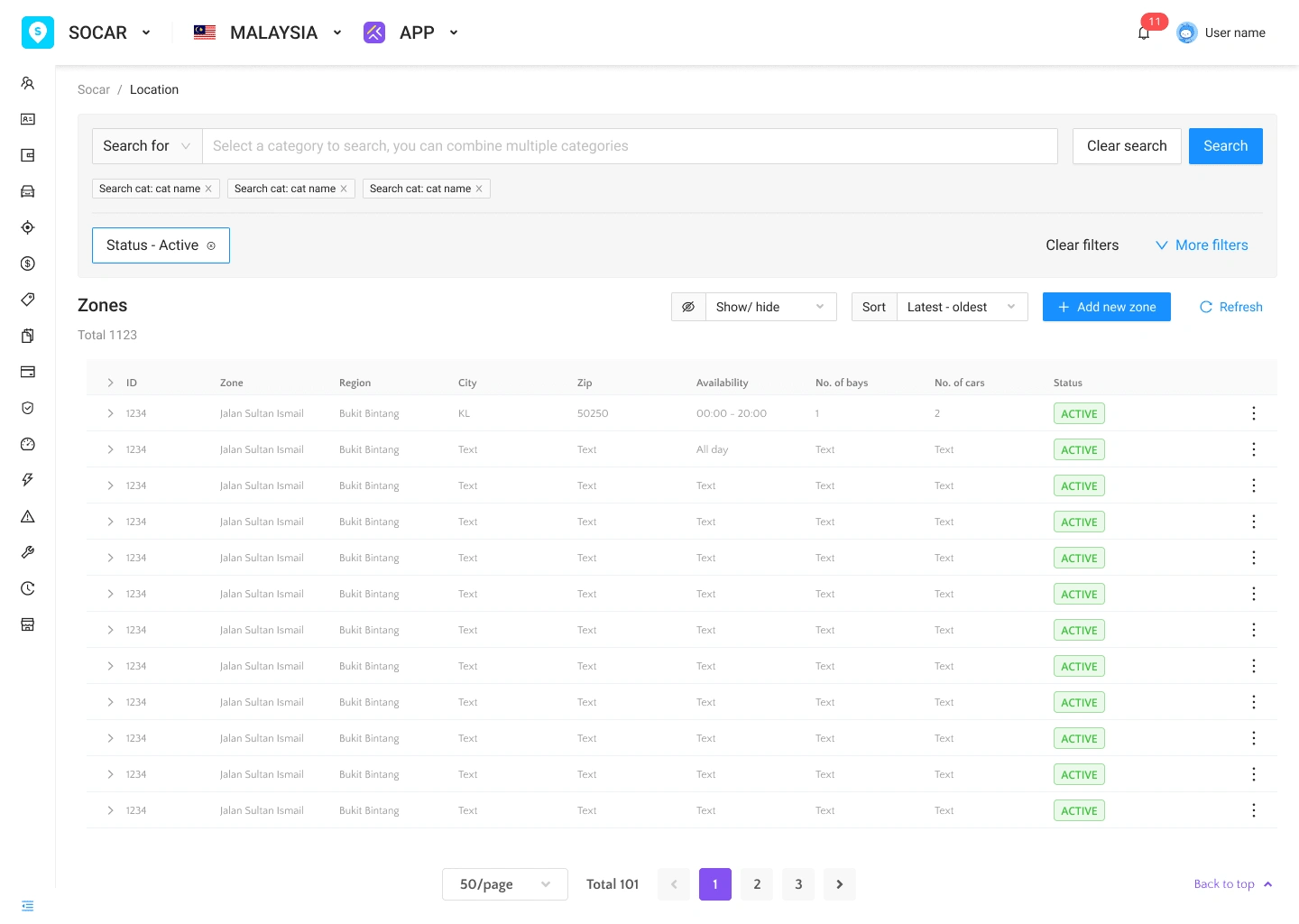
Redesign look
I also rearranged the information under the create/edit a zone into different tabs as to minimized the amount of informations in one screen.
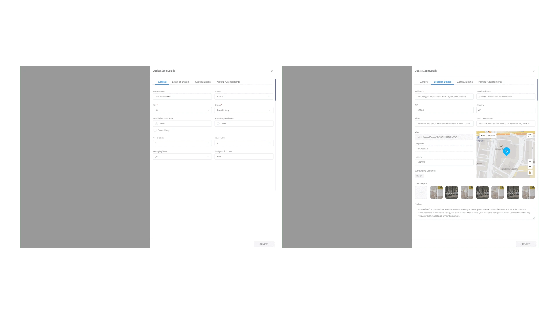
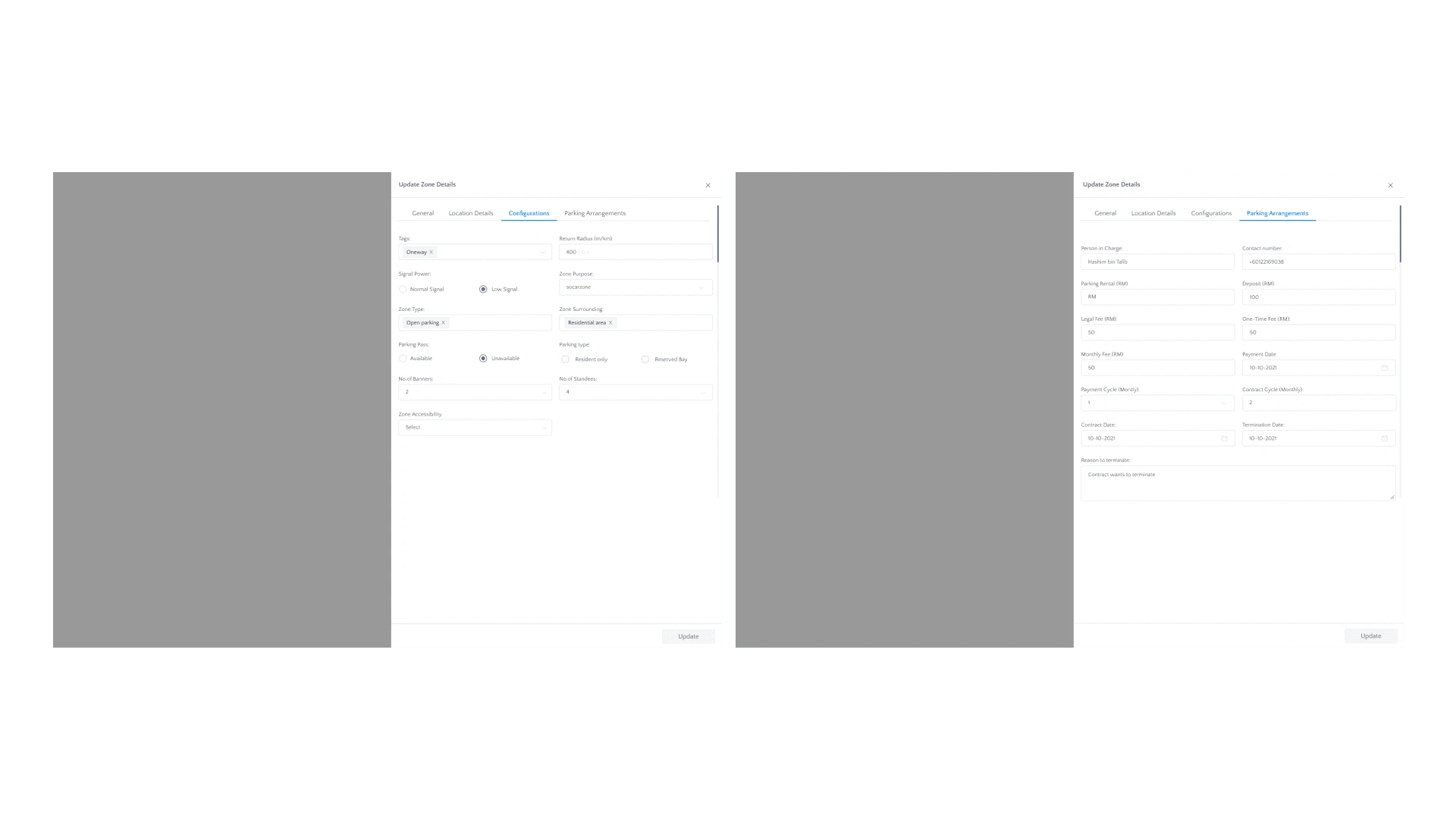
After presenting to the users, they expressed the usefulness of the addition and rearrangements.
Iterations
Based on the feedbacks from the wireframe presentation, I narrowed down the focus into 3 areas for more potential improvement of this feature:
Improve the visual hierarchy
Improve the actionability
Improve navigation
Improve the visual hierarchy
I learned that the users spend more time in editing and creating a new zone instead of the main screen. The side drawer limits their visual and can increase tiredness of focusing only on the right side of the screen with little space and a lot of informations. I wanted to display the data in a more appealing and easy way to be digested.
Improve the actionability
What can the users do or see once they made any changes to the zone? What happens when they want to view tons of information under one zone? I thought of a few ways to improve the experience by prompting a modal status after any action made.
Improve navigation
I discard the side drawer and change it to a full screen modal. I have also separate the modal of creating a new zone and edit a zone into two different screens but still keep the relevant informations.
If a user were to expand a zone from the list, only relevant informations can be seen for a quick view. More information can be viewed in a different screen.
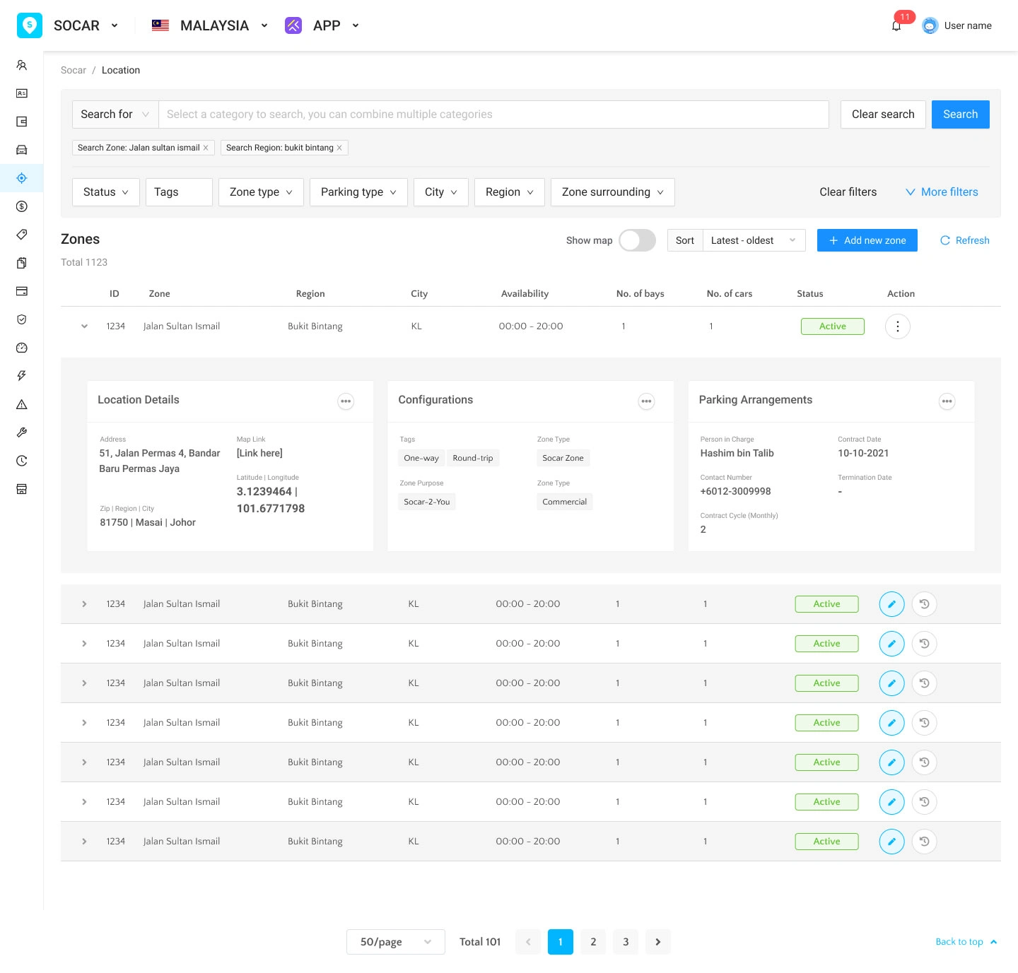
Expanded version in main screen
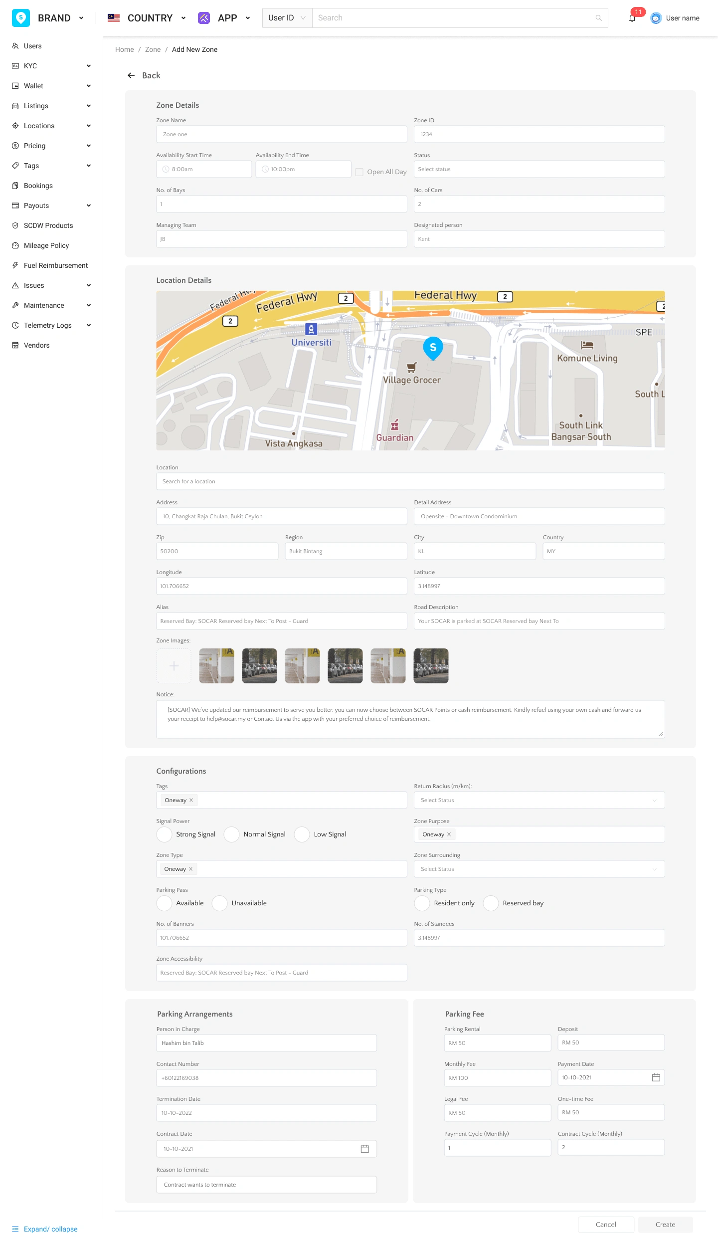
Create zone in one full view but segregate the fields based on category
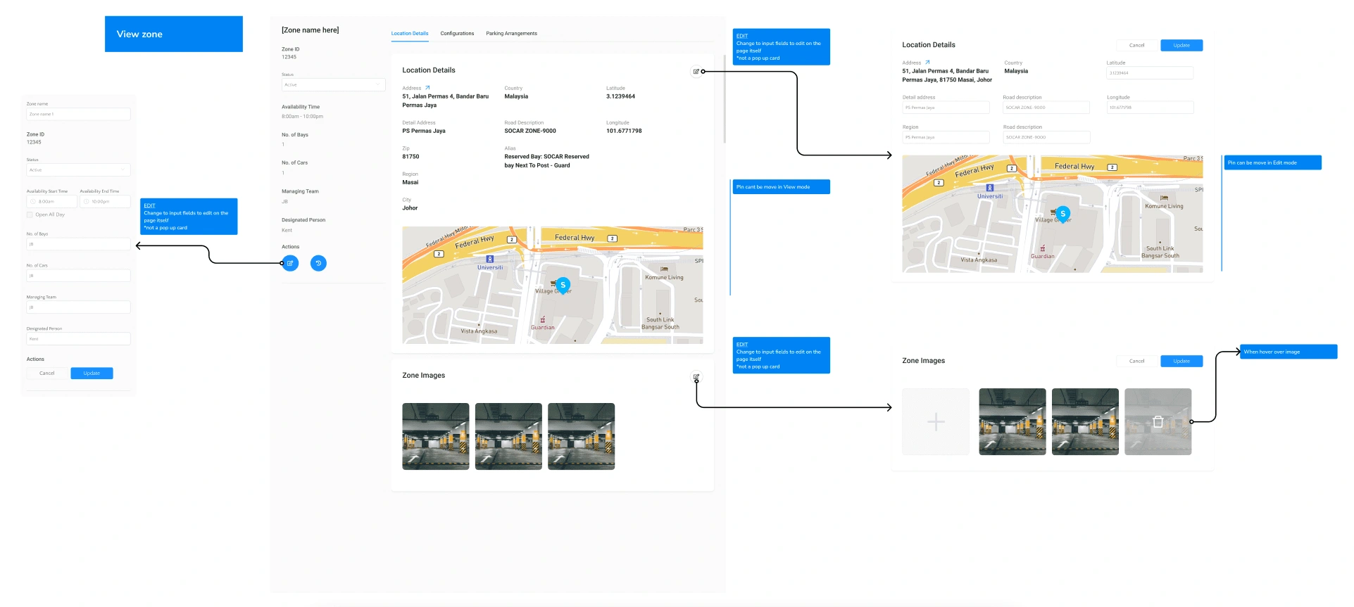
View and edit in the same full modal screen
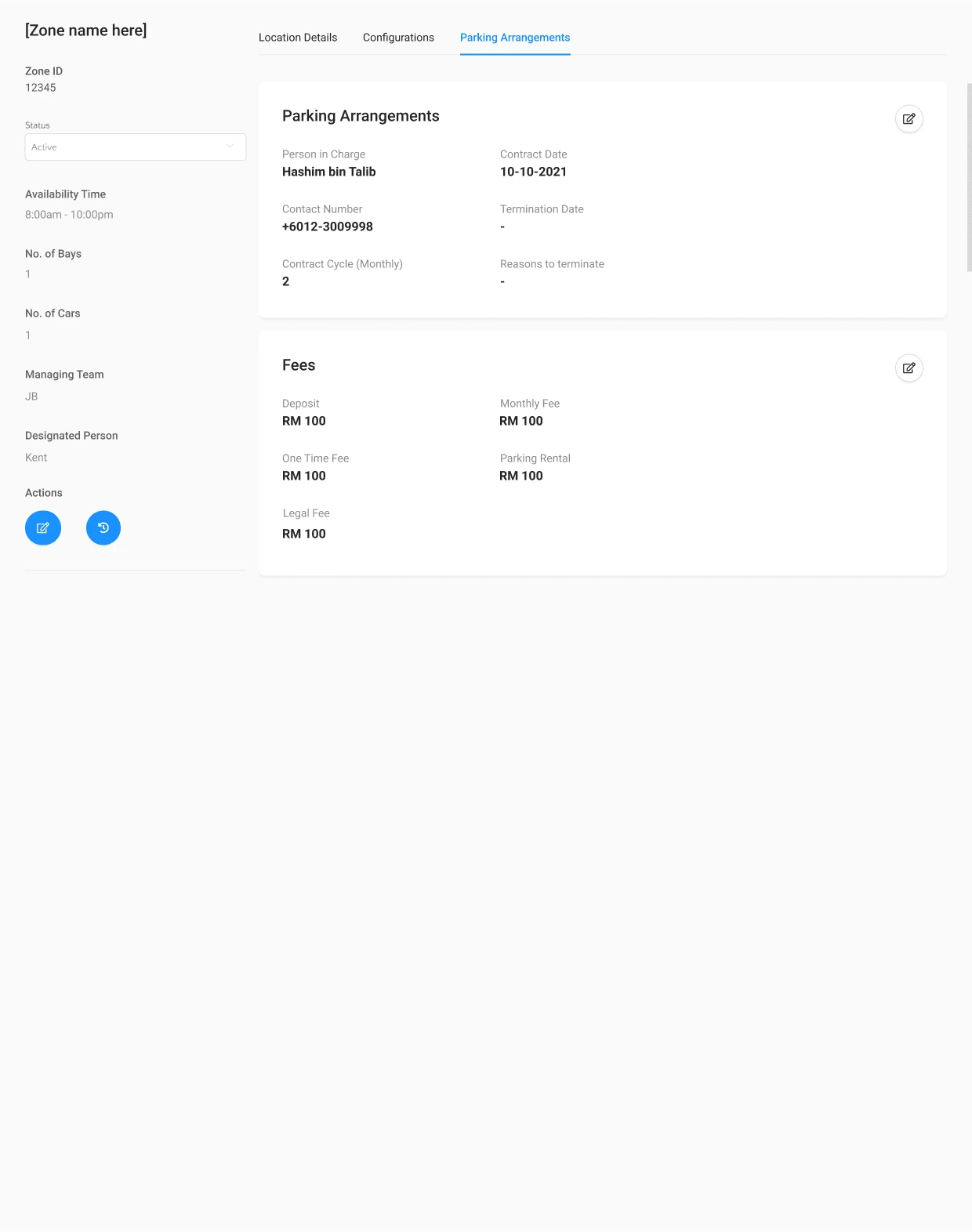
Image: View mode of a zone

Add a toggle for map view
Challenges and compromises
As like most startups, the main challenges is the lack of resources and time. With this challenge, I have to reiterate the design to be most achievable within the time constraints with lack of resources in research even though it is based on internal users but still providing value to them.
Conclusions
The released feature has been well received but there will always be improvements that can and should be made as there will be technical update from different part of the dashboard.
Like this project
Posted May 8, 2023
A new tool that blends your everyday work apps into one. It’s the all-in-one workspace for you and your team
Likes
0
Views
10

