Stack’d Pizza Brand Identity Design
Anas Khan
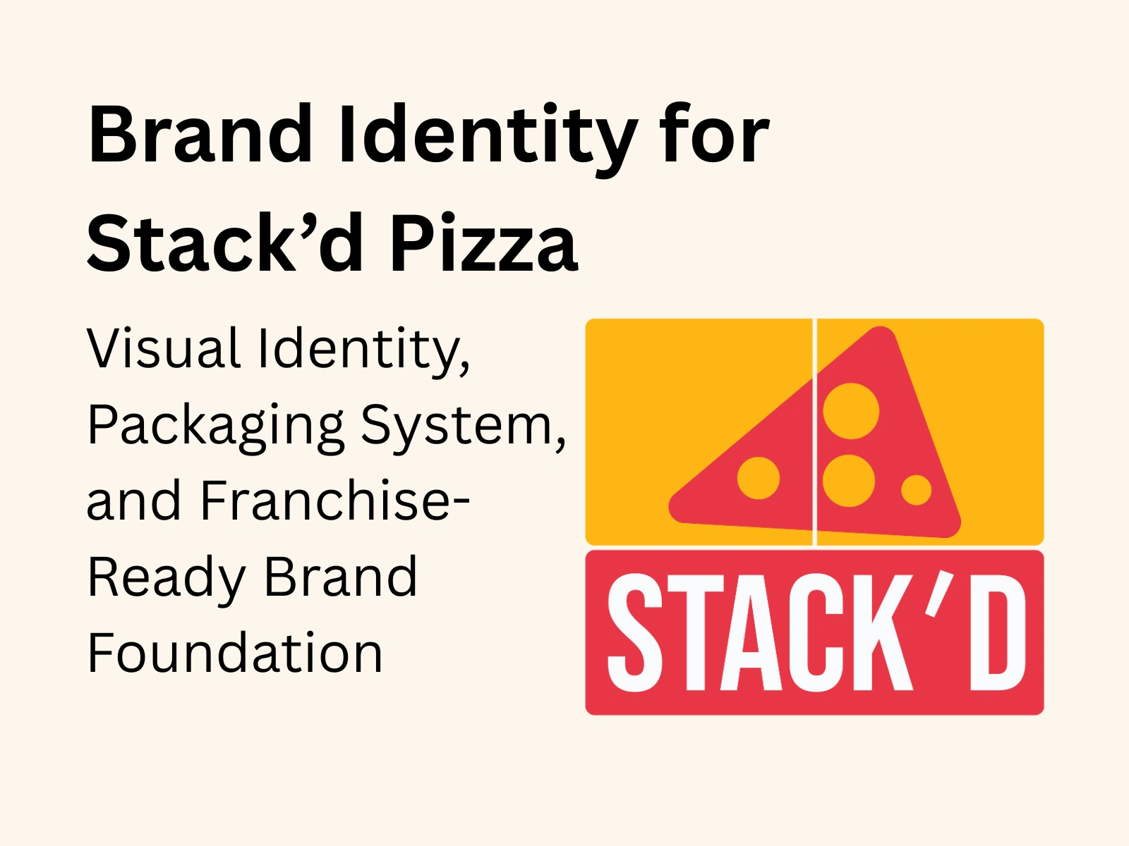
Brand Identity for Stack’d Pizza
Visual Identity, Packaging System, and Franchise-Ready Brand Foundation
Overview
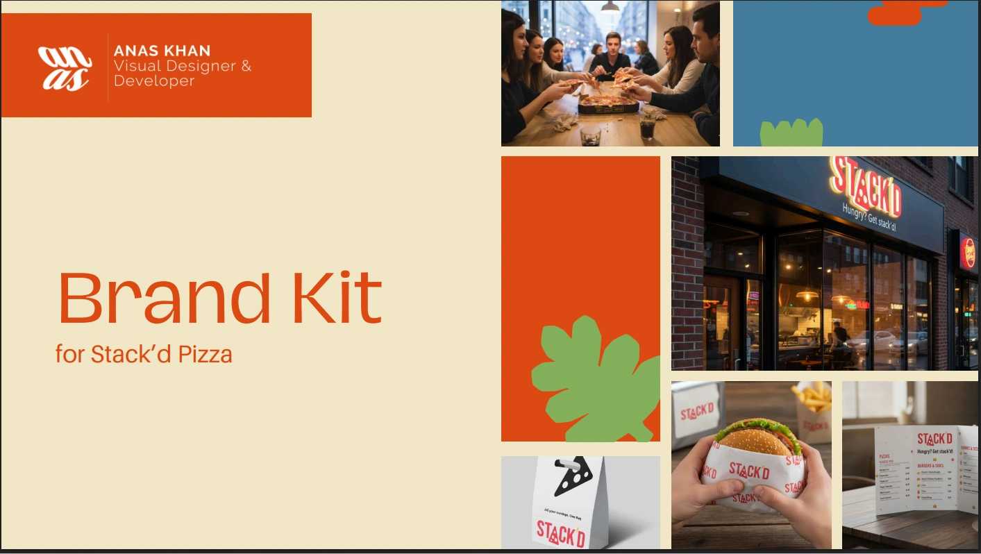
Stack’d Pizza approached me with a bold ambition. They wanted to enter the Canadian QSR space not as another pizza shop, but as a young, franchise-ready brand that felt energetic, modern, and instantly memorable. Their vision was clear. They needed a visual identity that could scale from storefronts to menus to takeaway boxes, while carrying a warm, community-driven personality.
My goal was to design a brand system that felt playful enough for Gen-Z, dependable enough for families, and iconic enough for future franchise growth.
The Challenge
Stack’d needed a brand identity that could bring together
• a diverse menu
• fast-casual energy
• high visual recall
• packaging that photographed beautifully
• signage and brand assets that could be handed off to any future outlet without losing consistency
In other words, the brand had to feel simple, but contain enough flavor to tell its own story.
The Solution
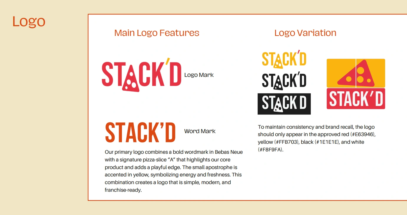
1. A Bold, Iconic Logo System
The primary logo combines Bebas Neue’s strong structure with a custom pizza-slice “A,” creating an instant visual signature. The accented yellow apostrophe gives the wordmark a spark of personality, capturing the brand’s upbeat tone.
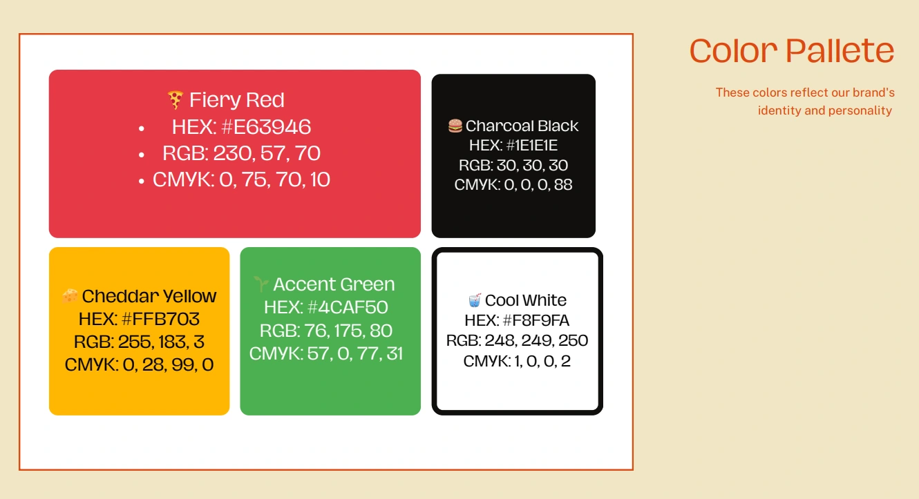
2. A Color Palette Built for Appetite and Energy
Inspired by the warmth of food and the freshness of quick service dining, I crafted a five-color palette:
• Fiery Red (#E63946)
• Cheddar Yellow (#FFB703)
• Accent Green (#4CAF50)
• Charcoal Black (#1E1E1E)
• Cool White (#F8F9FA)
These colors appear throughout the packaging, menus, signage, and digital assets, providing strong cohesion and visual recognition.
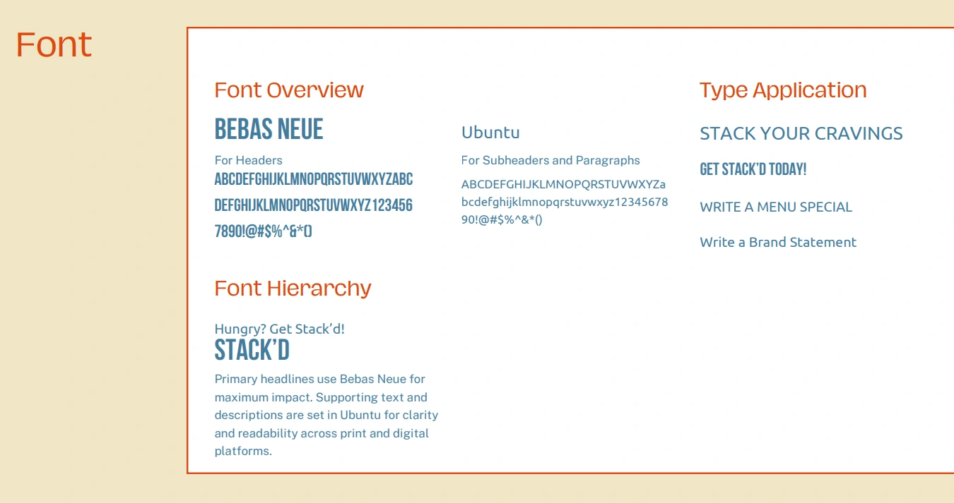
3. Typography That Speaks in a Confident Voice
Headlines use Bebas Neue to deliver impact.
Body and supporting text use Ubuntu for clarity and accessible reading on both print and digital surfaces.
4. Packaging System and Mockups
I developed a complete packaging ecosystem that could elevate brand visibility from dine-in to delivery:
• Branded pizza boxes with a fun pattern background
• Takeaway bags in multiple color themes
• Burger wraps
• Beverage cups
• In-store branding elements like napkin holders and menu tents
Each mockup was designed to feel clean, modern, and instantly shareable in photos or social media.


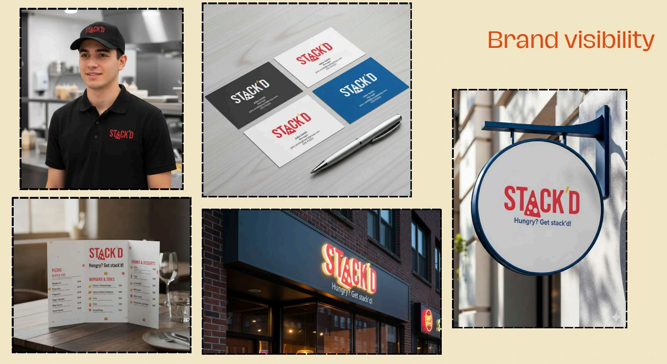
5. Real-World Brand Visibility
To help Stack’d visualize how the brand lives in the real world, I created mockups for:
• Staff uniforms
• Business cards
• Storefront signage
• Menus and table setups
• Outdoor round signage
These assets help the brand align franchise partners and maintain high-quality consistency across locations.
The Impact
The new identity transformed Stack’d Pizza into a visually cohesive, energetic, franchise-ready brand. The playful slice-integrated logo and vibrant color palette communicate variety and abundance, while the clean typography and packaging system make the brand look mature, dependable, and ready for scale.
Stack’d now has a strong foundation for marketing campaigns, store launches, signage production, digital storefronts, and future franchise expansion.
Services Delivered
• Logo and identity design
• Brand color palette and typography system
• Packaging design (pizza boxes, wraps, bags, cups)
• Storefront and signage mockups
• Menu and stationery mockups
• Complete brand guideline PDF
Like this project
Posted Dec 9, 2025
Designed a brand identity for Stack’d Pizza, creating a cohesive and scalable visual system.