19 Domburg: Culinary Identity & Hospitality Experience
19 Domburg: Culinary Identity & Hospitality Experience
Project Snapshot
Client: 19 Domburg
Industry: Hospitality / Fine Dining
My Role: Art Director & Brand Designer
Services: Brand Identity, Menu Engineering, Print Design, Social Assets
Tools: Adobe InDesign, Illustrator, Photoshop
1. The Challenge: Matching the Plate to the Paper
(The "Problem") 19 Domburg offered an exceptional culinary experience, but their visual identity didn't reflect the quality of the kitchen. The existing menus were functional but lacked character, failing to prime guests for the premium pricing of the dishes.
The challenge was to create a visual identity that felt as curated as the ingredients—building anticipation from the moment a guest sat down and held the menu.
2. The Strategy & Solution
(The "Process") I approached this project through the lens of Sensory Branding.
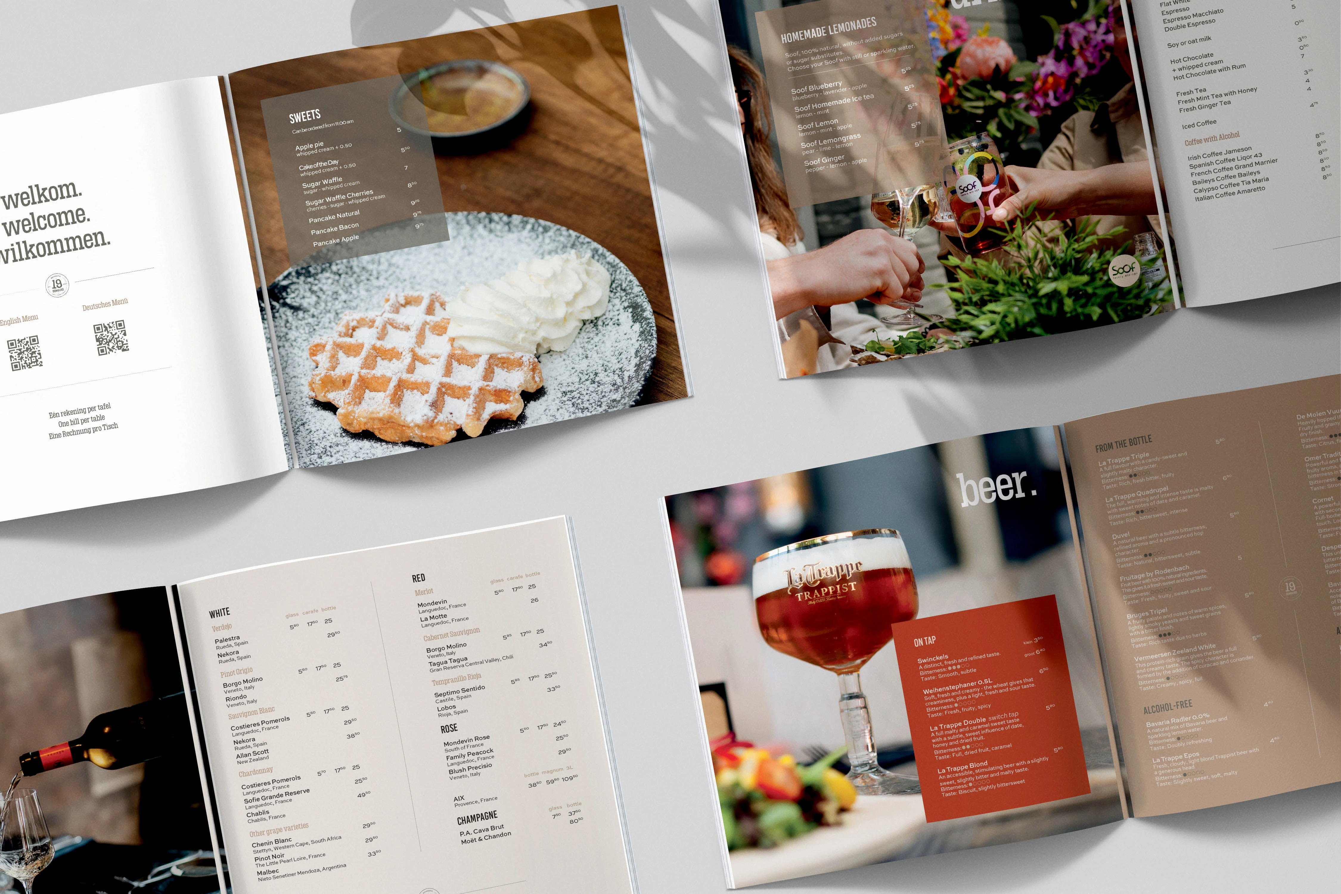
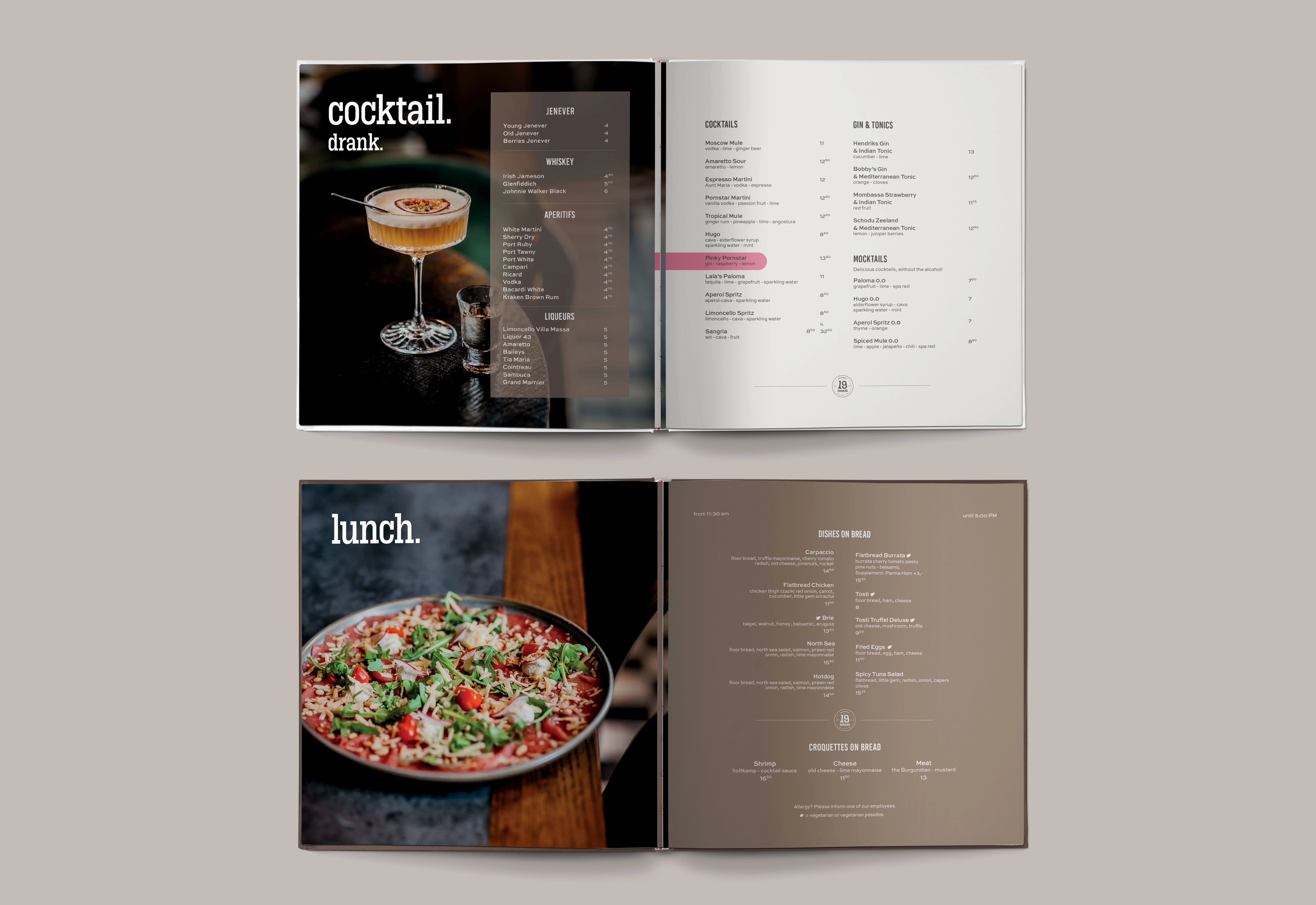
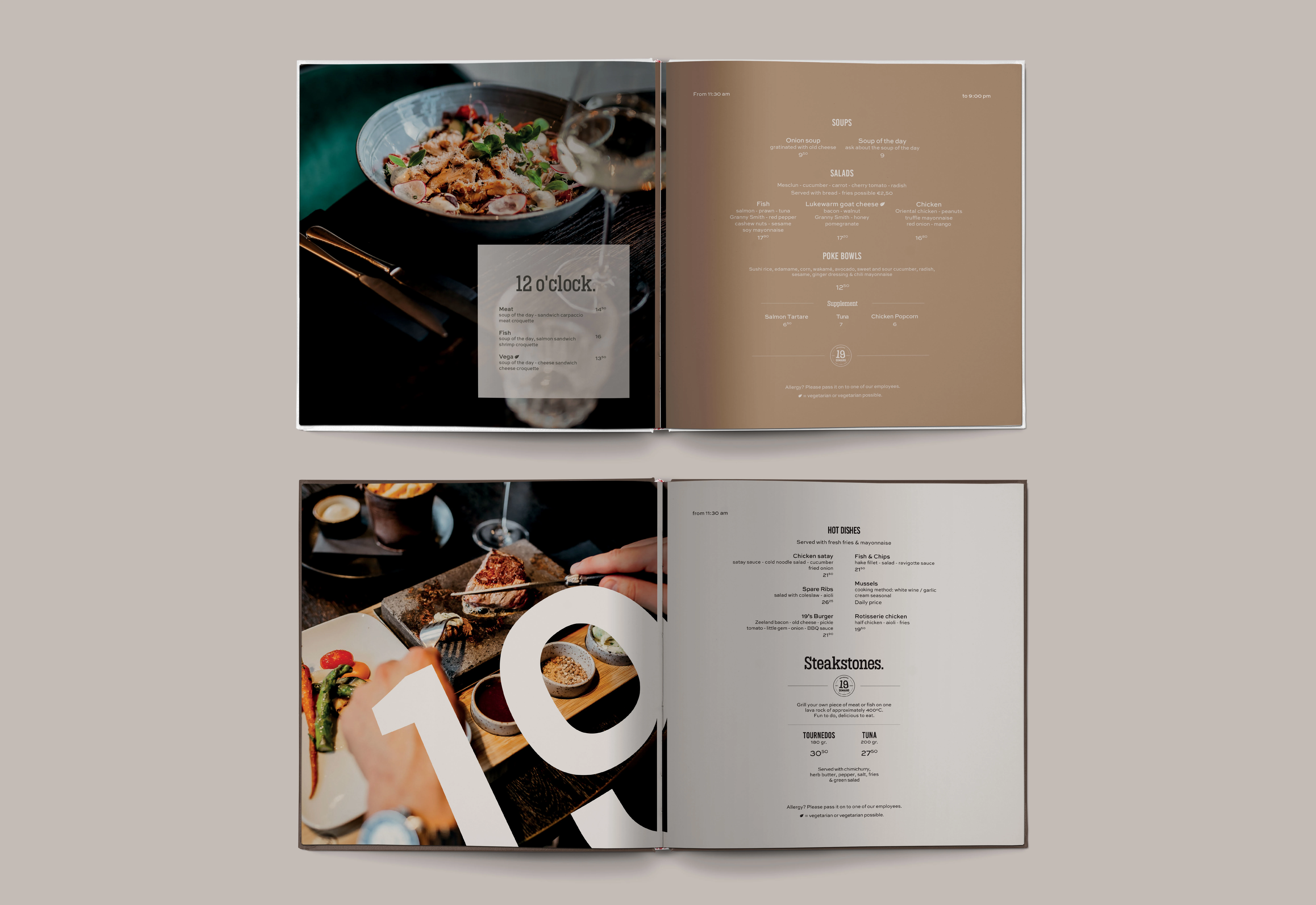
Menu Engineering: This wasn't just about layout; it was about sales psychology. I used strategic negative space and typography hierarchy to subtly guide the diner's eye toward high-margin signature dishes.
Typography & Texture: We selected a typeface that blended modern elegance with classic readability (crucial for dimly lit dining rooms). We chose textured paper stocks to add a tactile element to the brand experience.
Visual Consistency: I extended the new aesthetic across all touchpoints—from the physical menu to the digital reservation confirmation—ensuring a cohesive guest journey.
3. The Outcome
(The "Results") The rebranding successfully elevated the restaurant's perceived value.
Elevated Atmosphere: The new collateral seamlessly integrated with the interior design, completing the dining atmosphere.
Sales Focus: The new menu layout improved readability and highlighted key dishes, contributing to a better ordering experience.
Brand Recognition: The consistent visual language made the brand instantly recognizable on social media, driving engagement.
Like this project
Posted Mar 18, 2025
Elevating the dining experience for 19 Domburg with a premium identity system and strategic menu design that drives sales.


