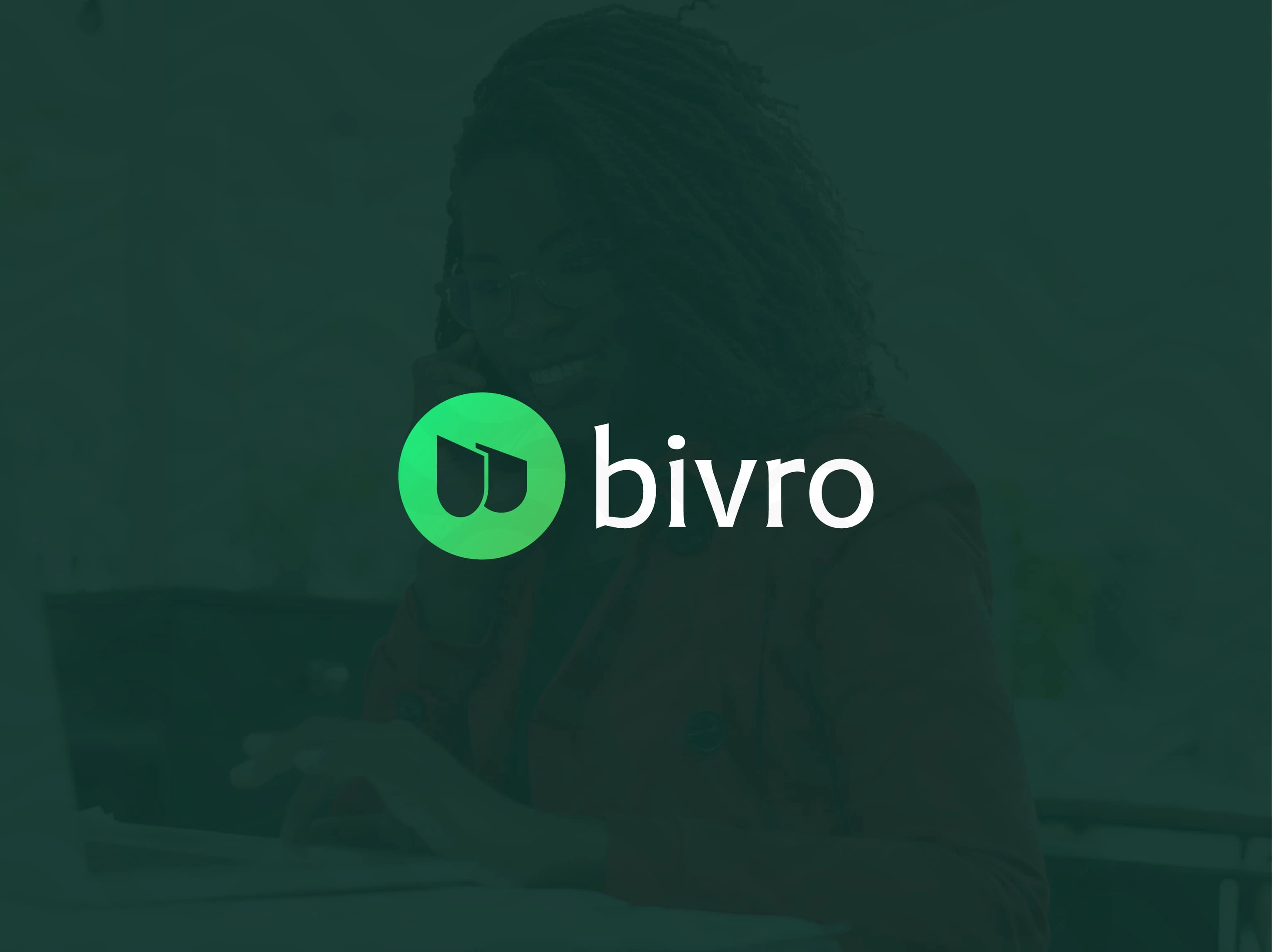
New Brand Identity Design For Bivro
Ahmad Muhammad
The Challenge
To develop a compelling brand identity for Bivro, a fintech startup offering seamless cross-border payments across Africa. The goal was to design an identity that felt fresh, digital, and empowering, appealing to growth-focused entrepreneurs while communicating trust in a highly regulated and competitive industry.
Bivro needed to stand out in a sea of fintech platforms that often look too technical or too sterile. The identity had to capture Bivro’s speed and clarity, without losing its human touch.
The Solution
I built a brand system centered on seamless flow, both conceptually and visually.
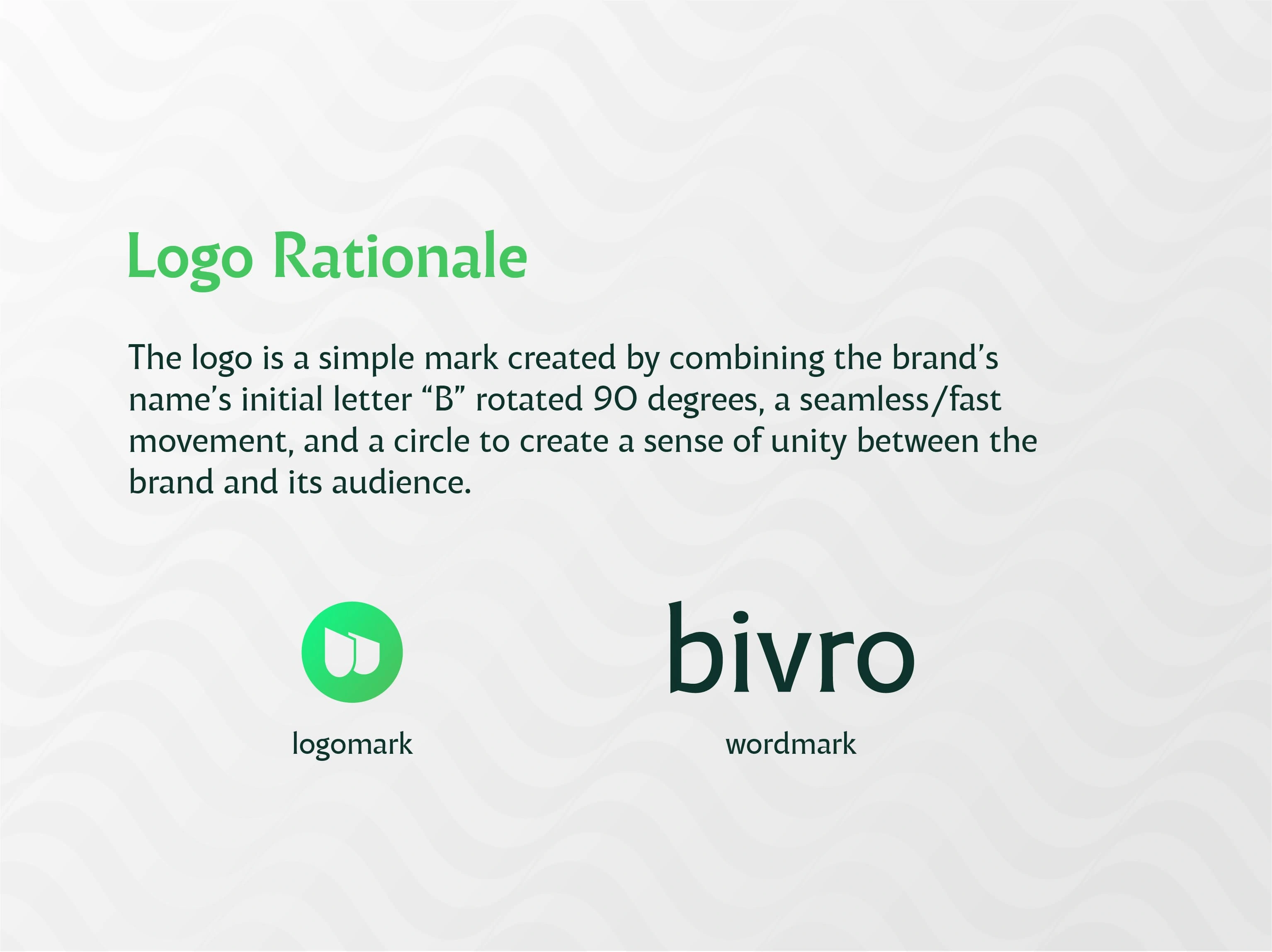
The logomark combines a rotated “B” with directional flow and a circle, creating a dynamic symbol that represents speed, connection, and unity. The mark visualizes the concept of seamless movement, tying directly into Bivro’s core promise of smooth financial operations.
I designed a minimalist wordmark that complements the energy of the logomark, ensuring clarity, legibility, and strength across digital platforms, mobile screens, and financial statements. The combined system is flexible and instantly recognizable.
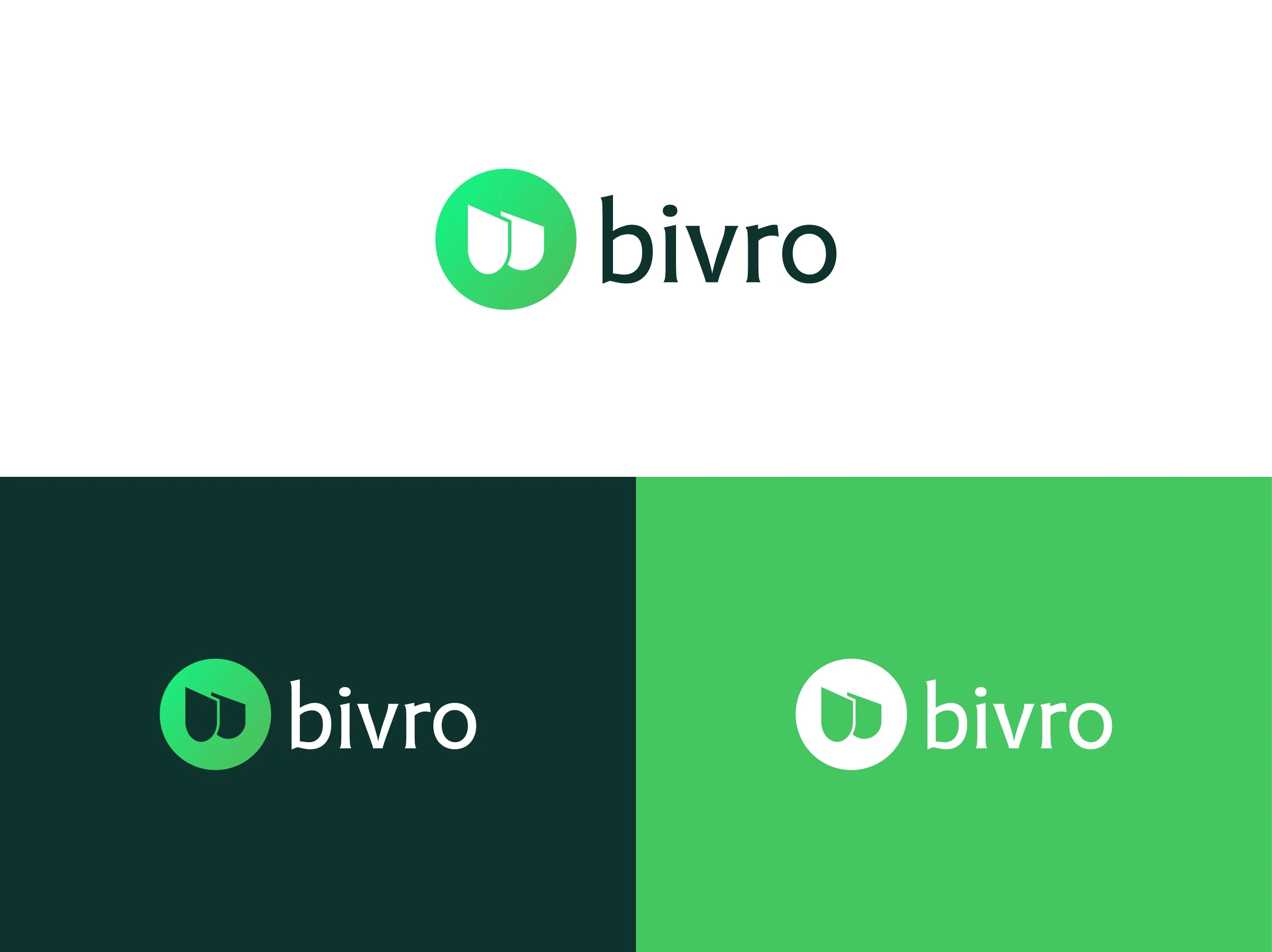
Logo Colour Variation
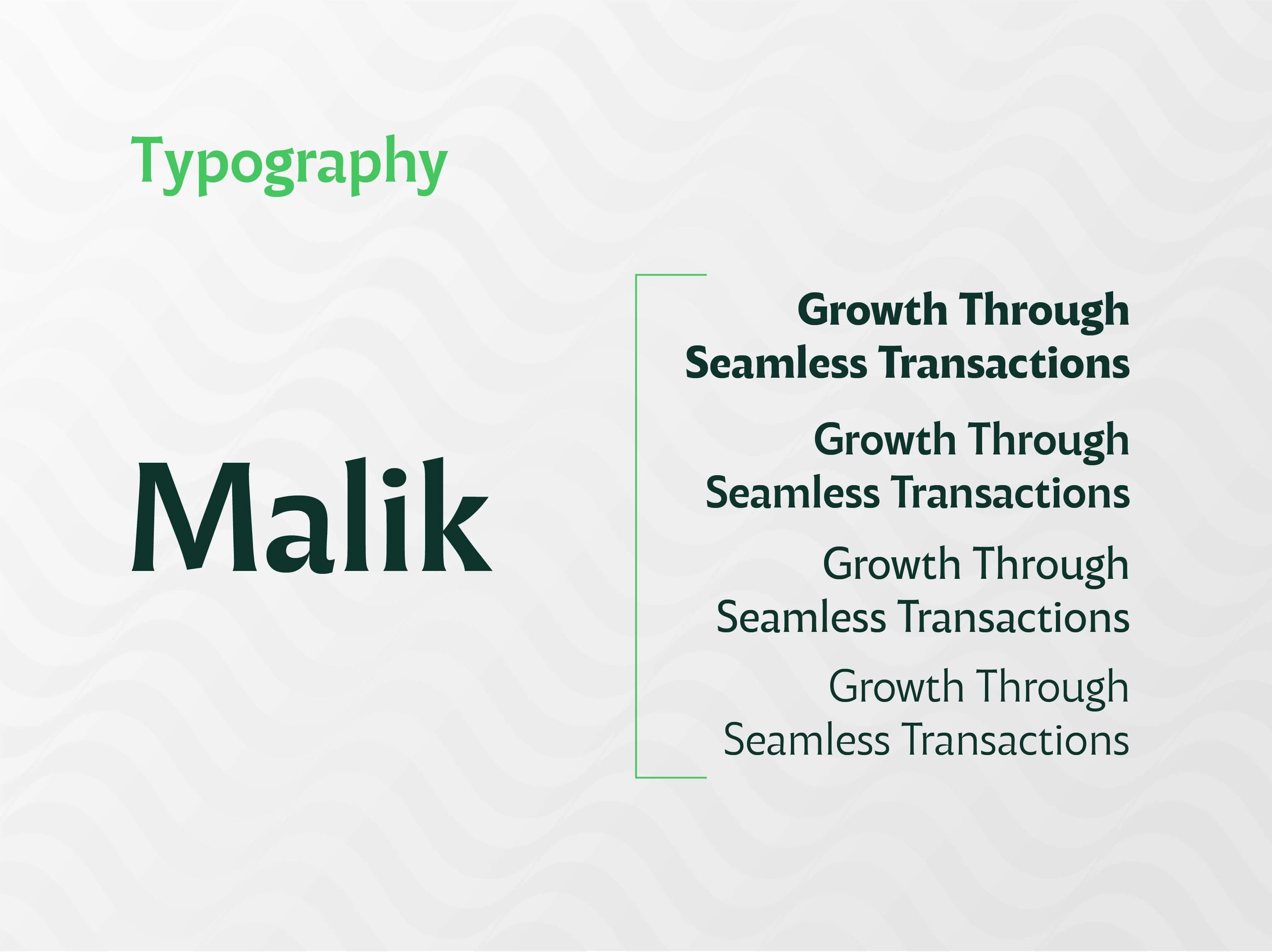
I selected Malik for its geometric, modern structure, giving Bivro a bold, clean visual voice. The typography system balances technical precision with approachability, perfect for a fintech brand serving both startup founders and everyday entrepreneurs.
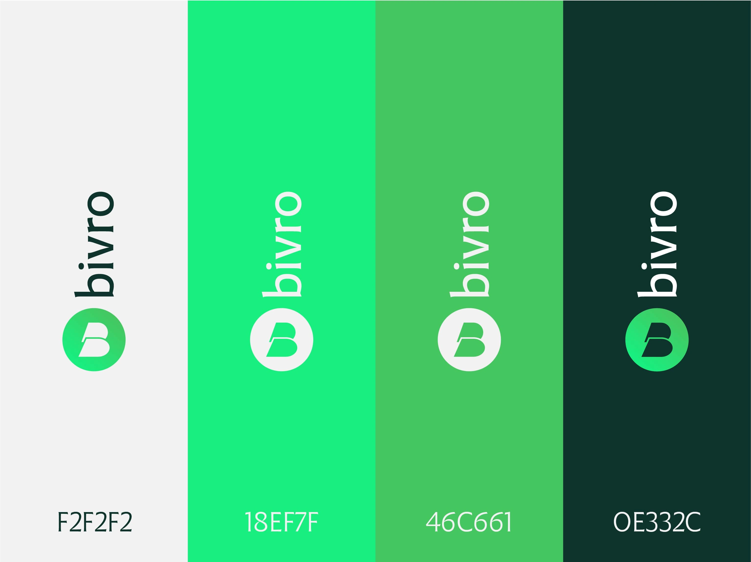
The Bivro palette was built to reflect trust, momentum, and a fresh financial outlook:
Soft Gray (#F2F2F2): clean, digital-friendly background
Neon Green (#18EF7F): innovation, speed, growth
Deep Green (#0E332C): credibility, security, finance
Mid Green (#46C661): vitality, optimism
Together, these colors create a vibrant yet trustworthy visual system that resonates across web, app, and marketing.
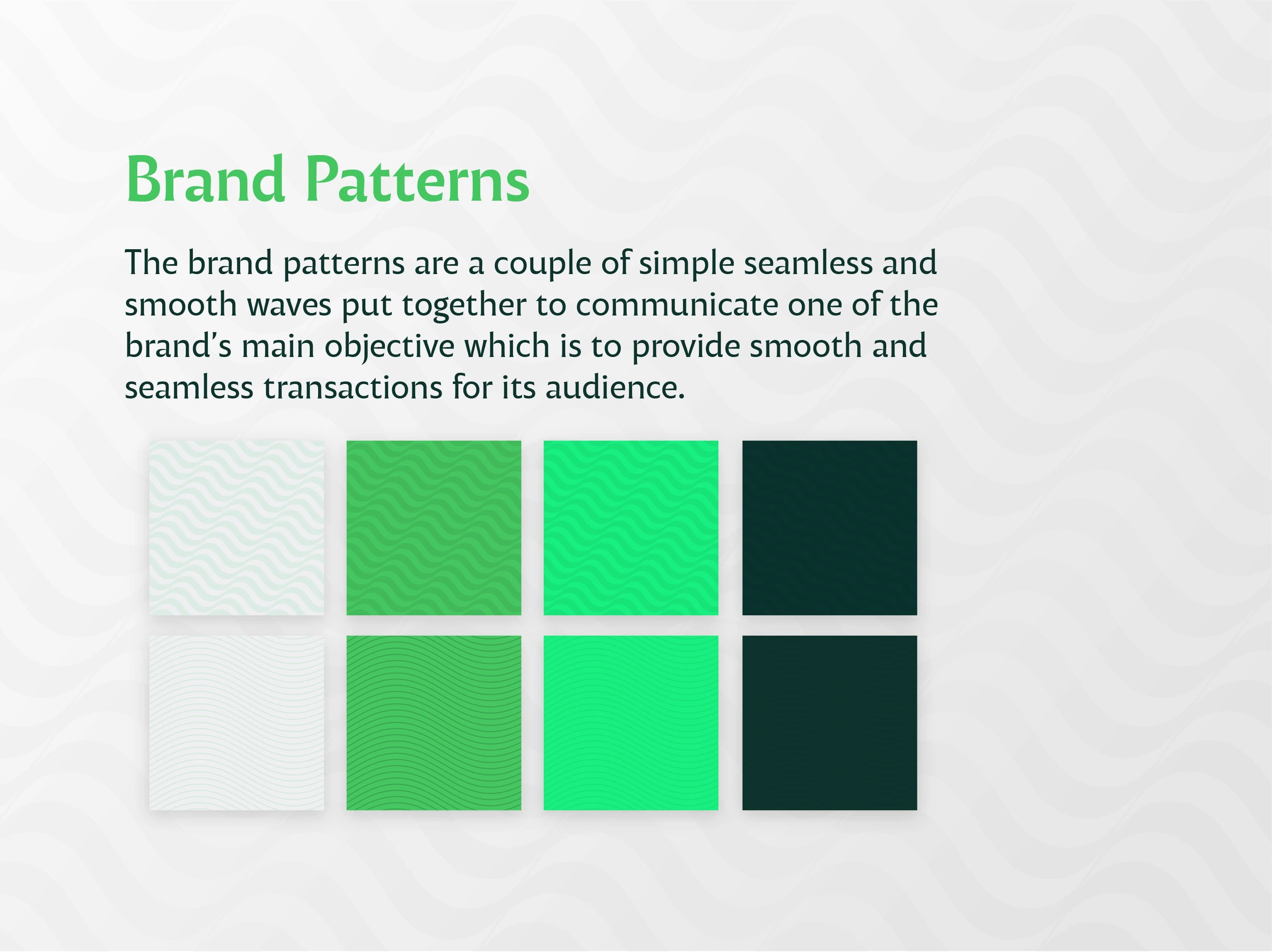
The visual pattern system uses seamless, flowing waves to represent uninterrupted, borderless transactions. These forms help build recognition while reinforcing the core brand promise of ease, speed, and reliability.
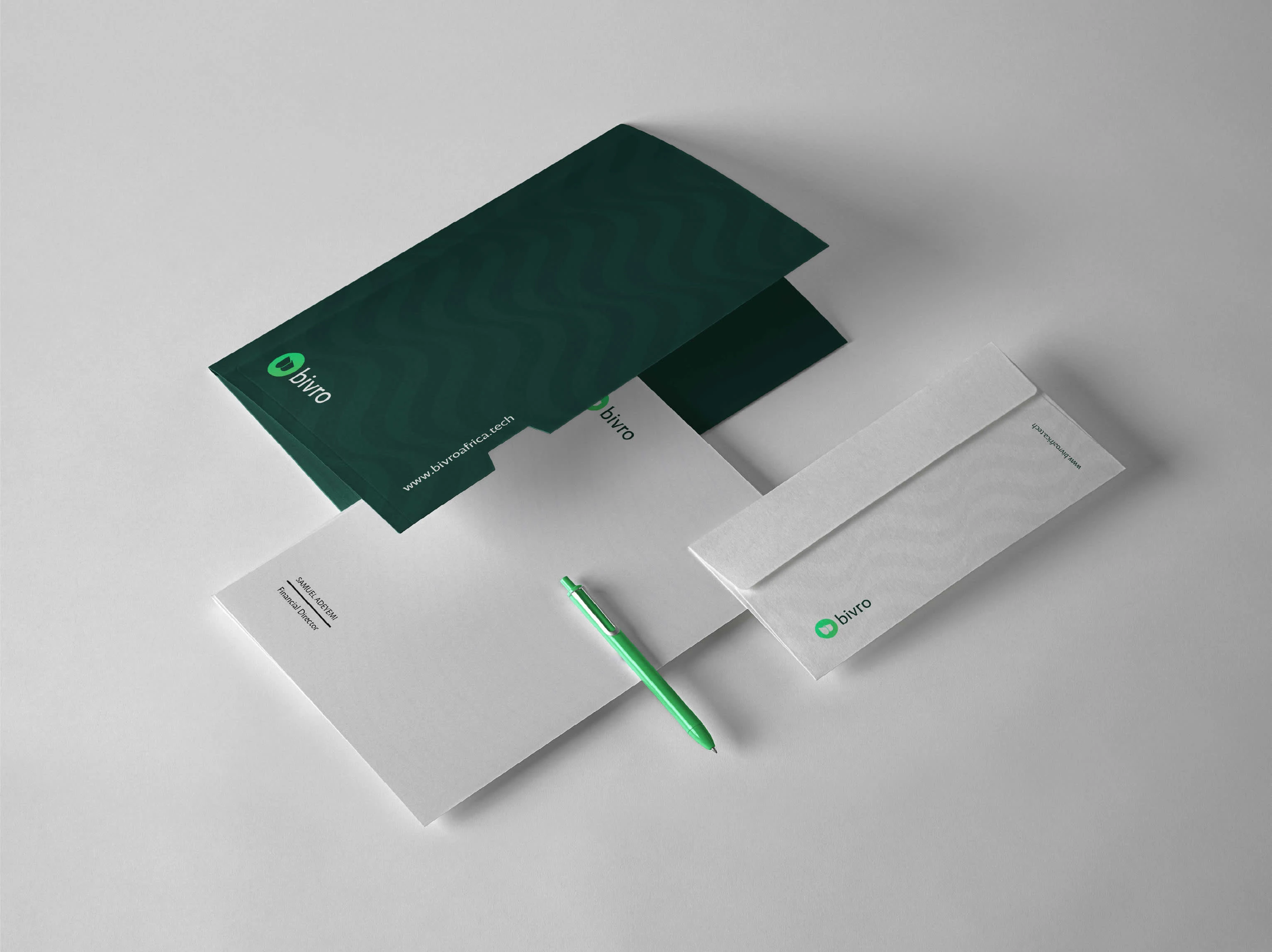
Brand Stationery Design
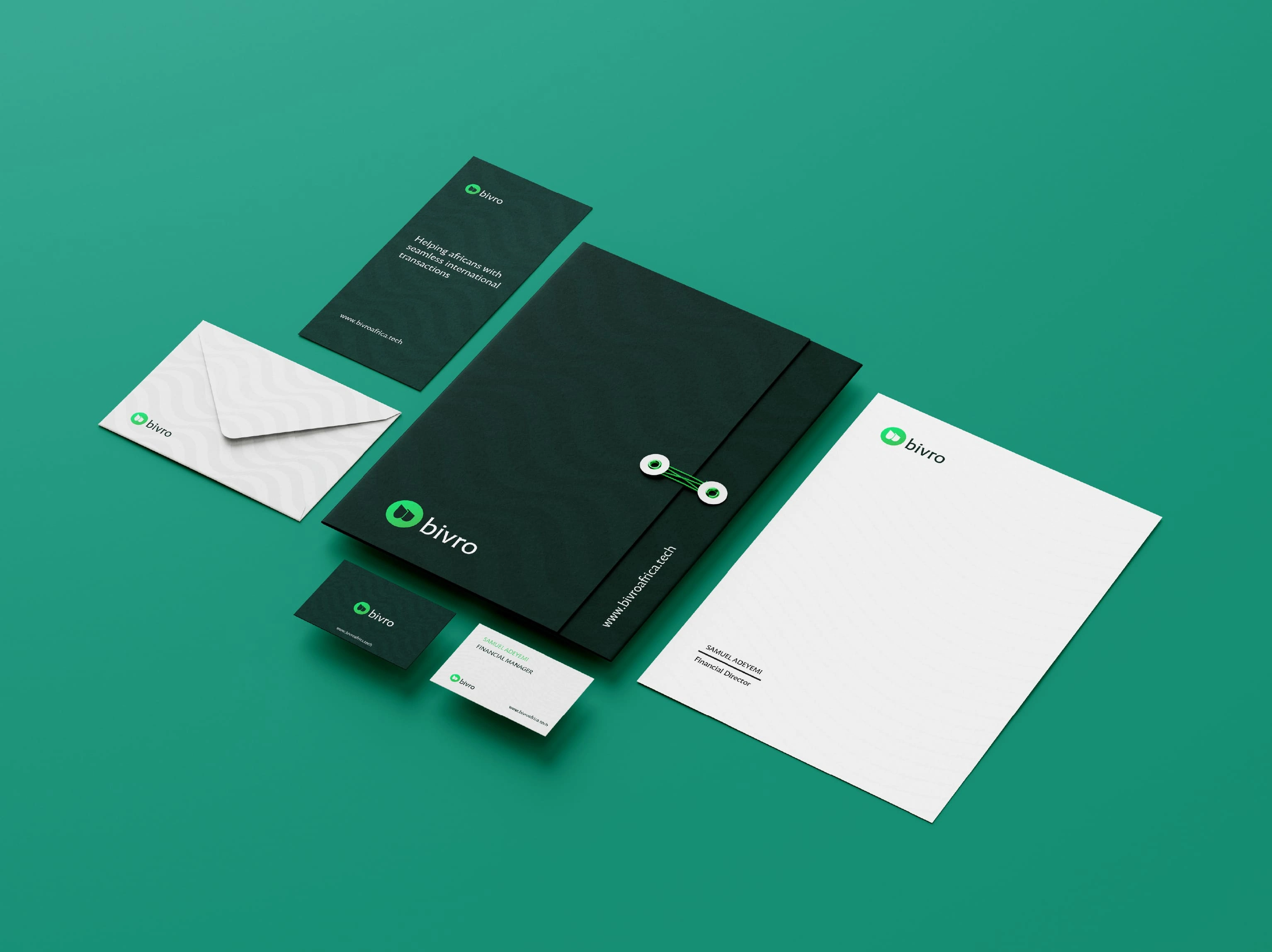
More on the stationery designs.
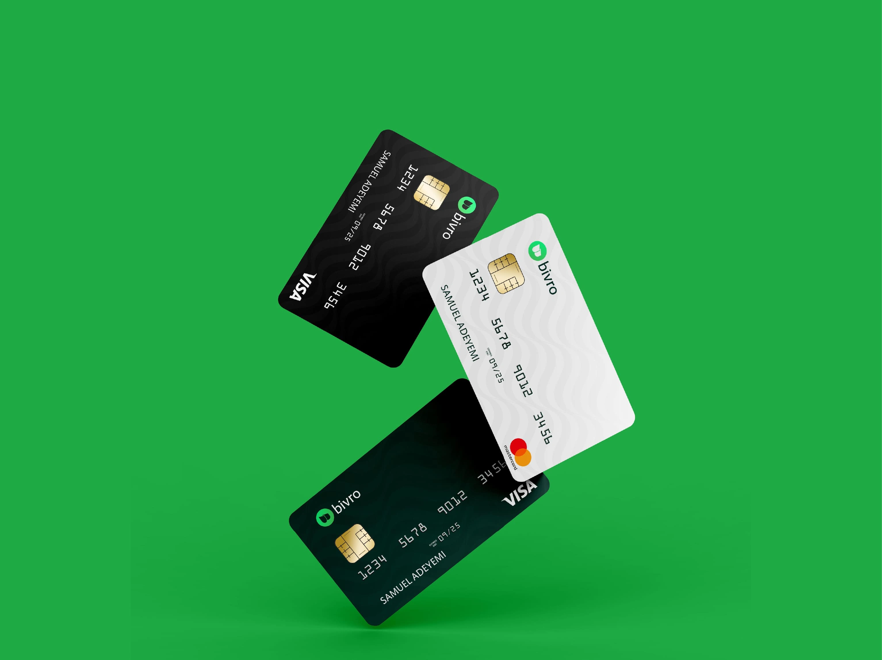
Branded Credit Card.
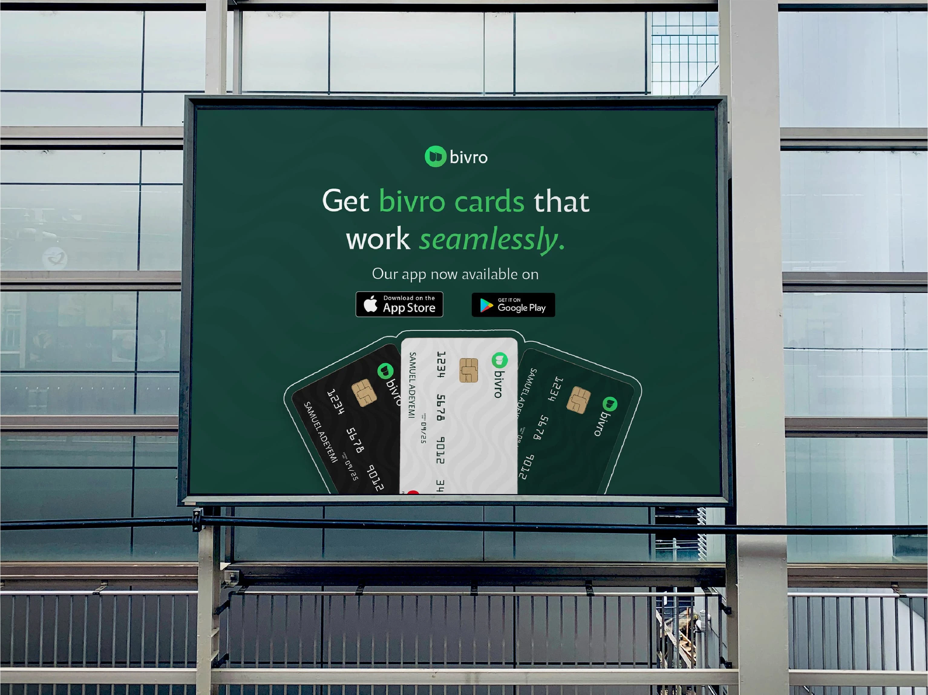
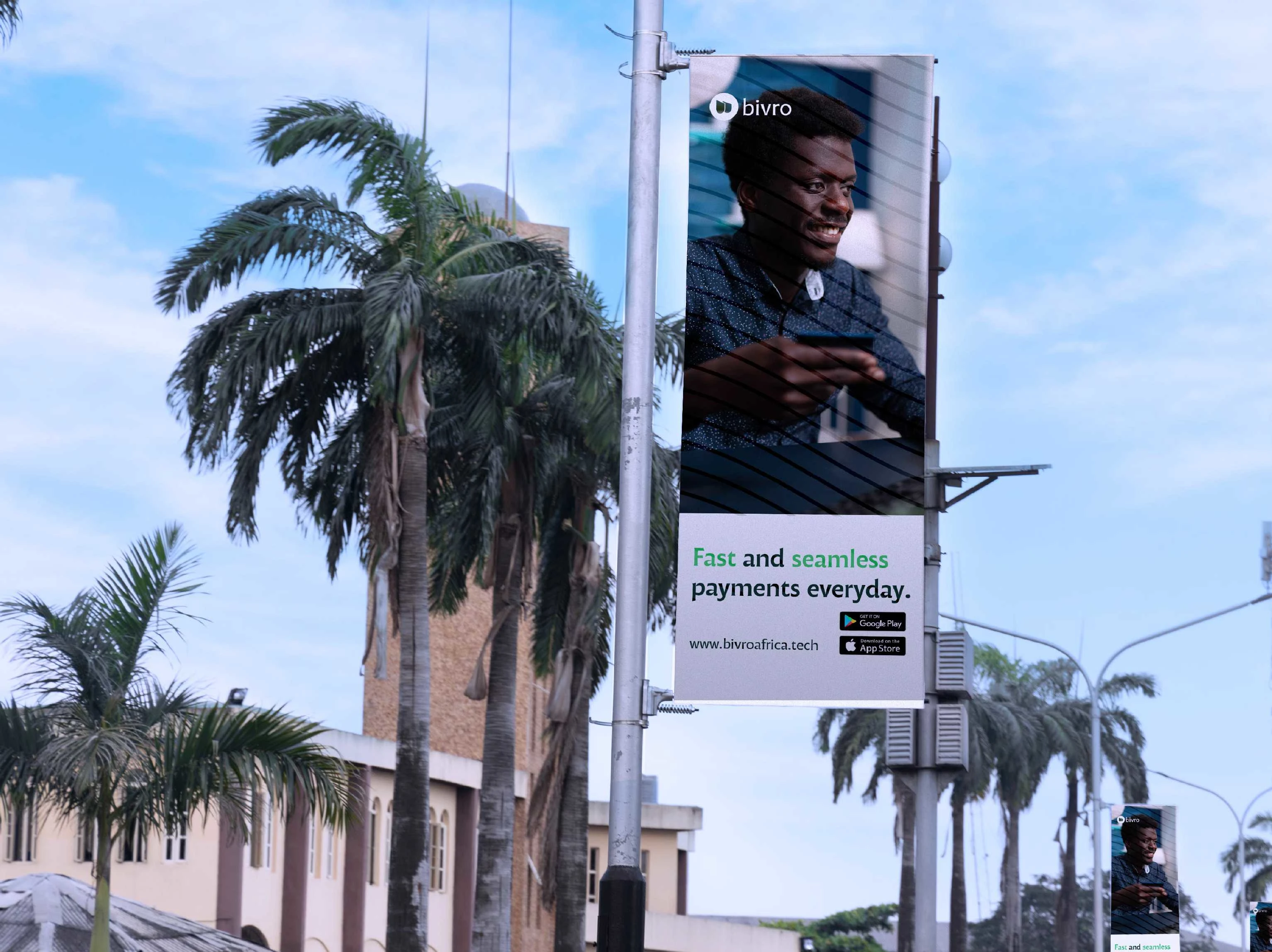
Oudoor Billboard Design
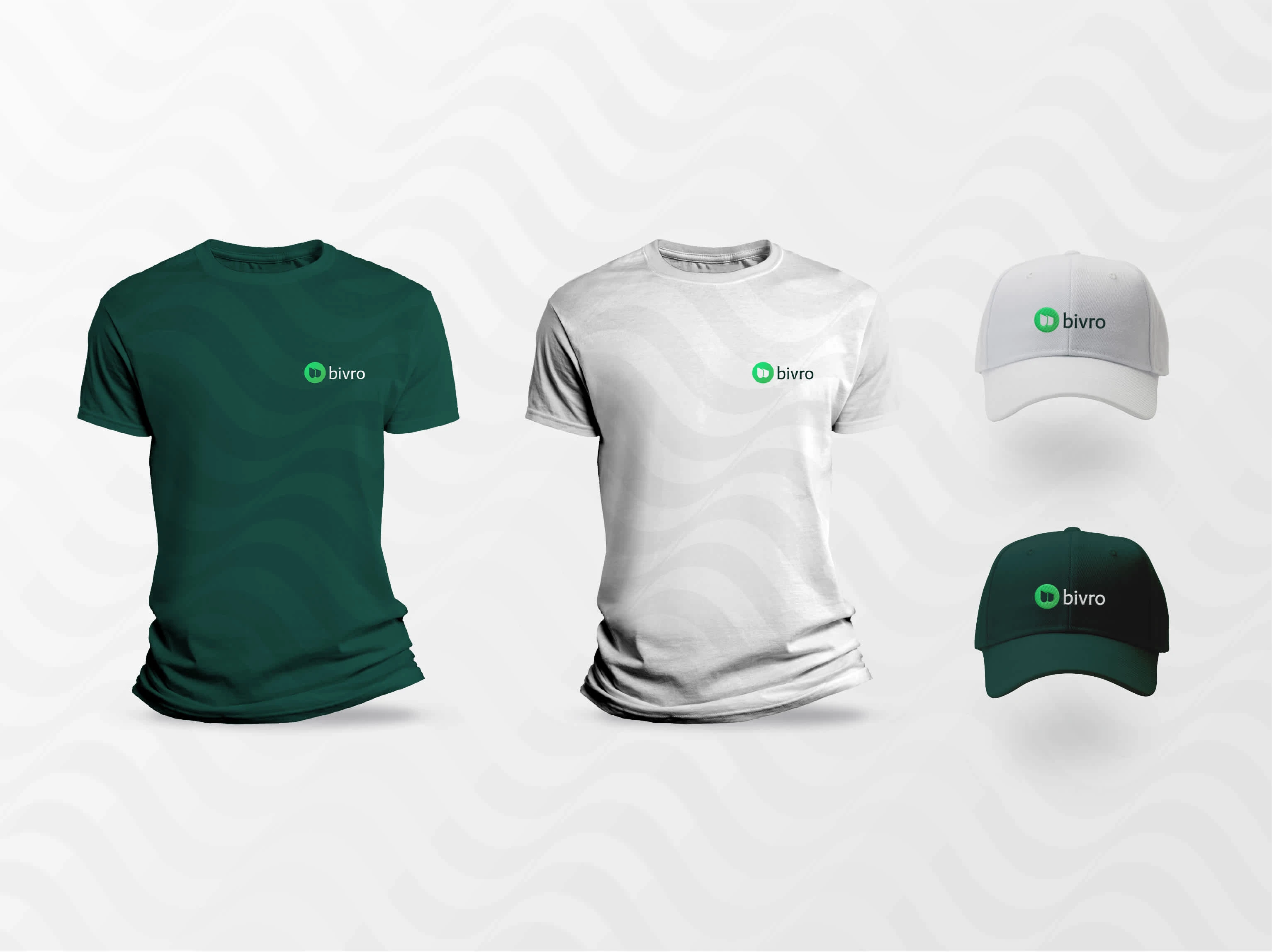
Branded Apparels
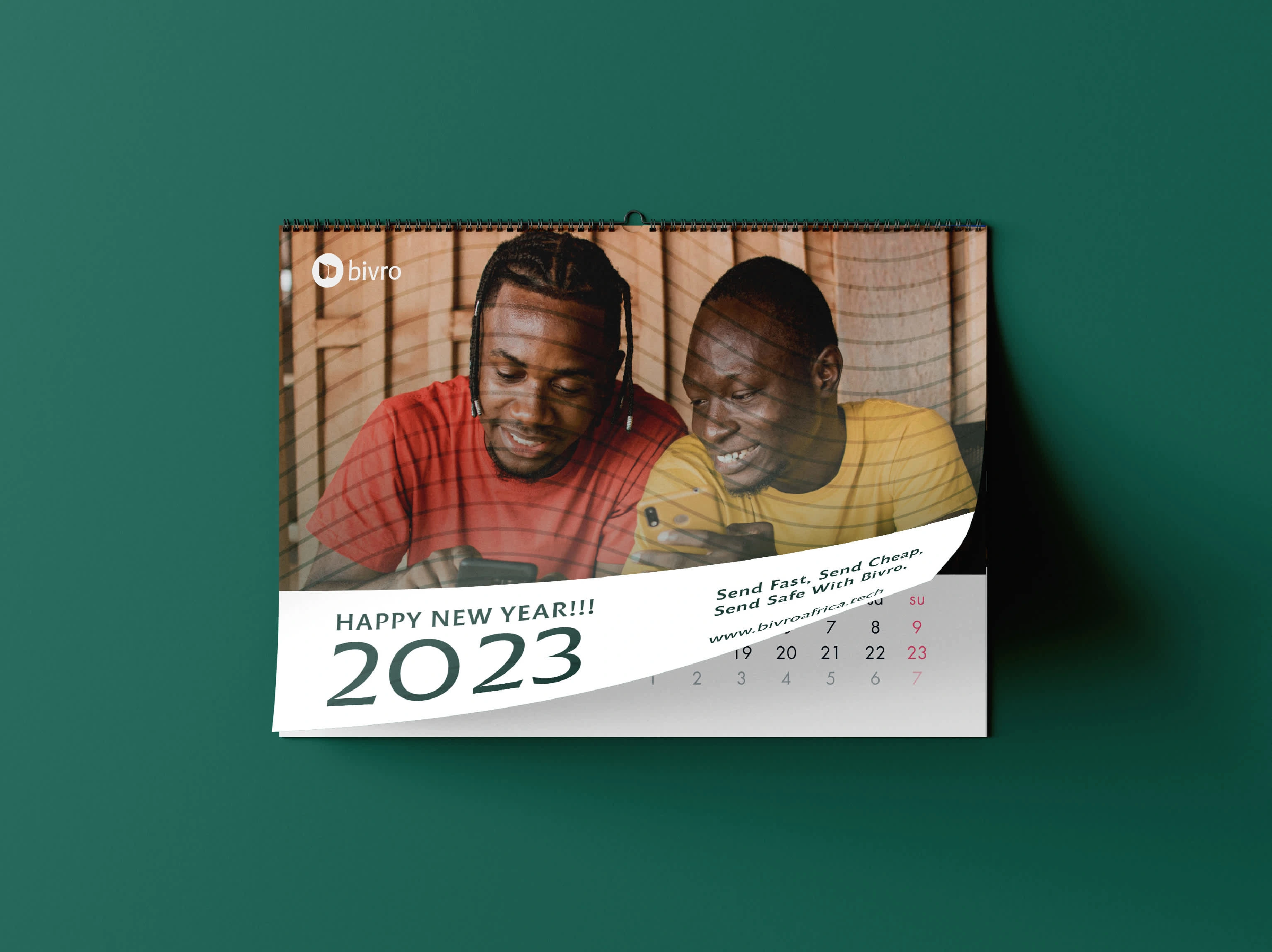
Branded Calendar
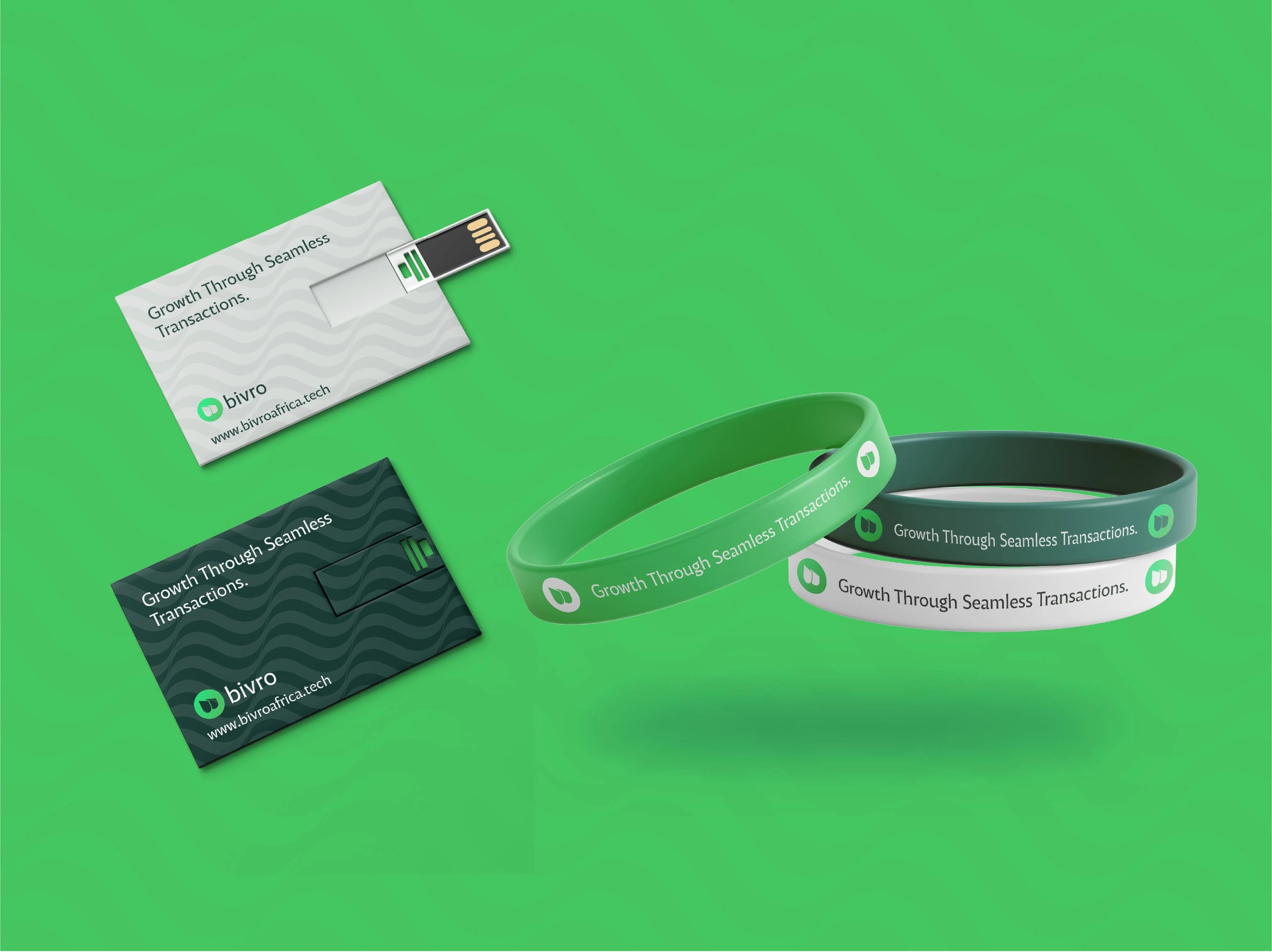
Branded Wrist Bands & USB Cards
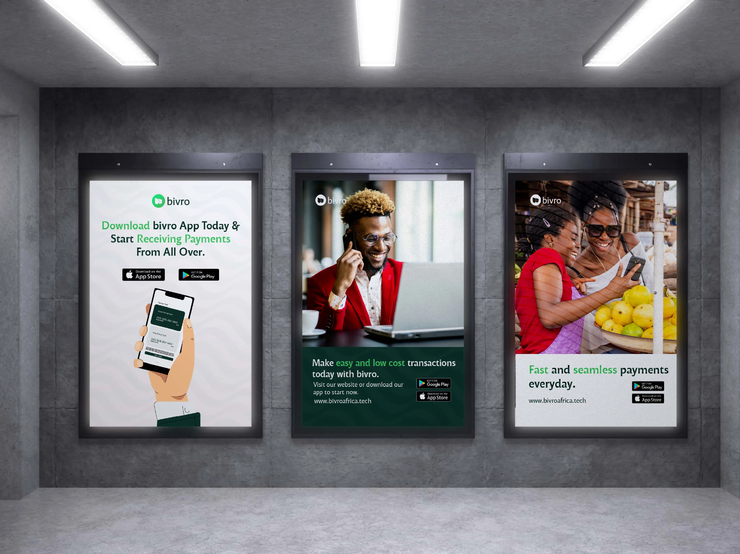
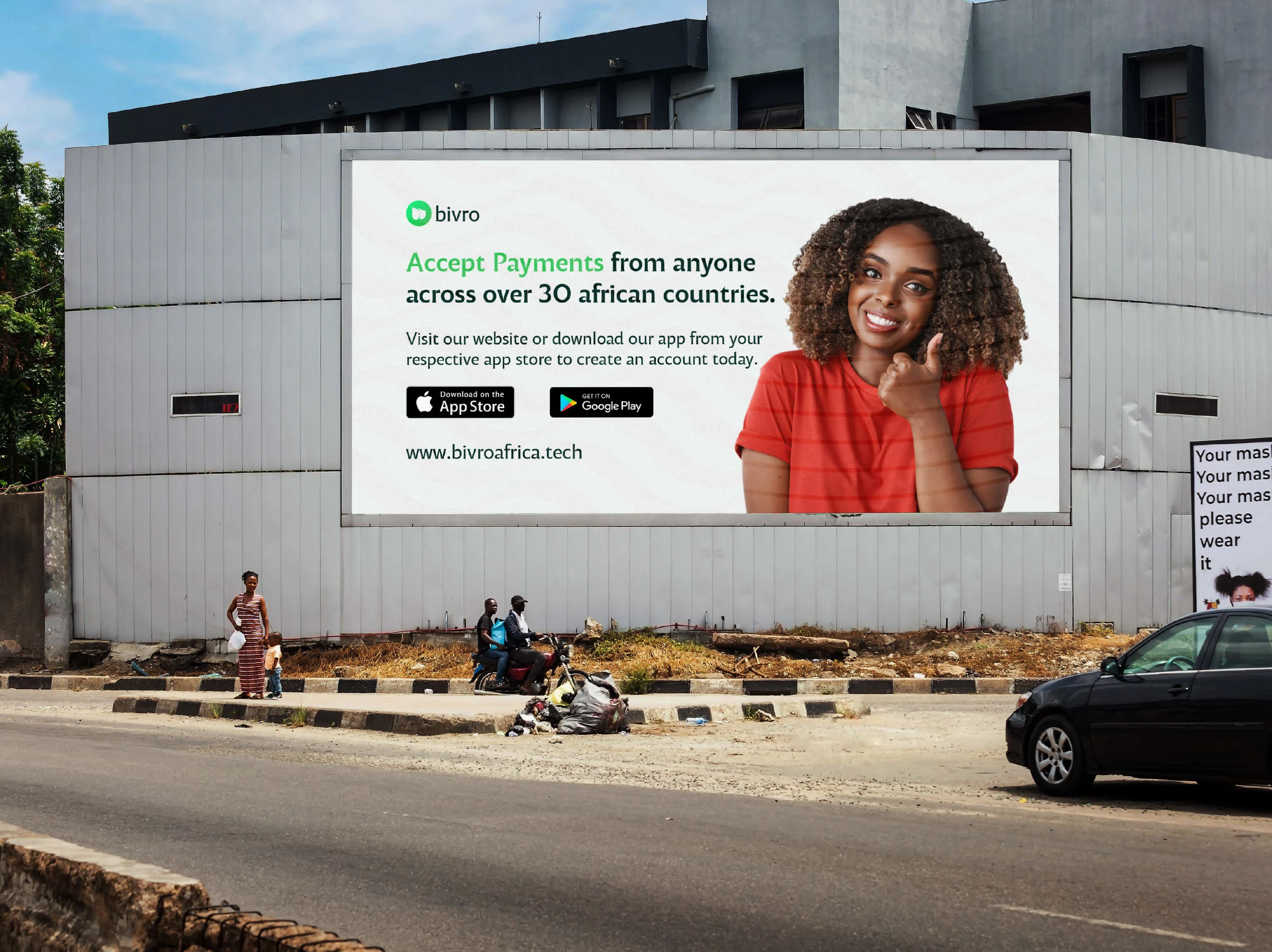
Ourdoor Awarenes Advert
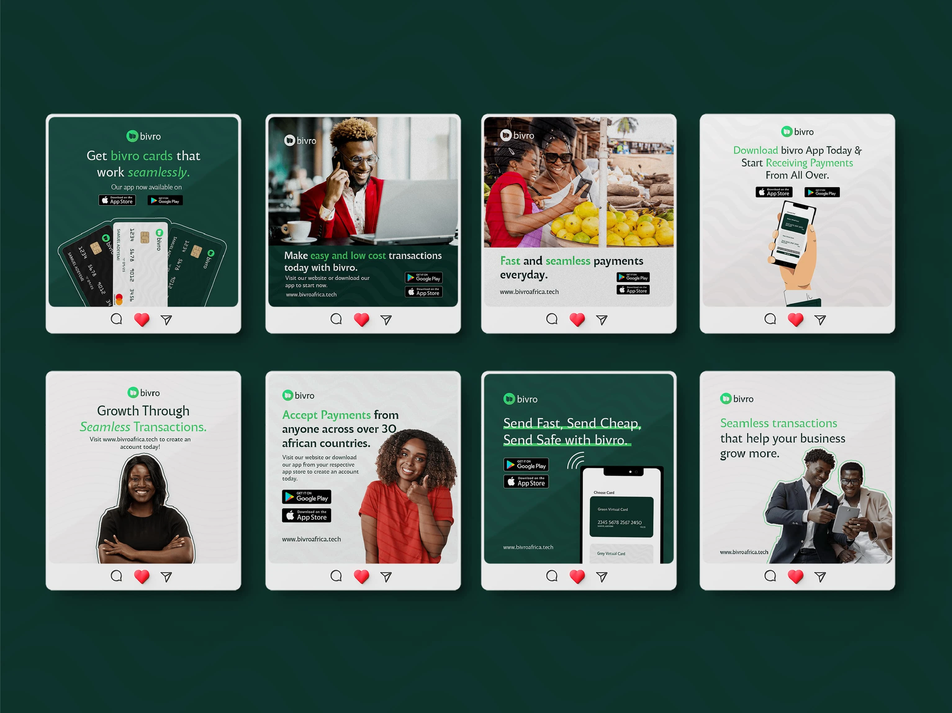
Social Media Design
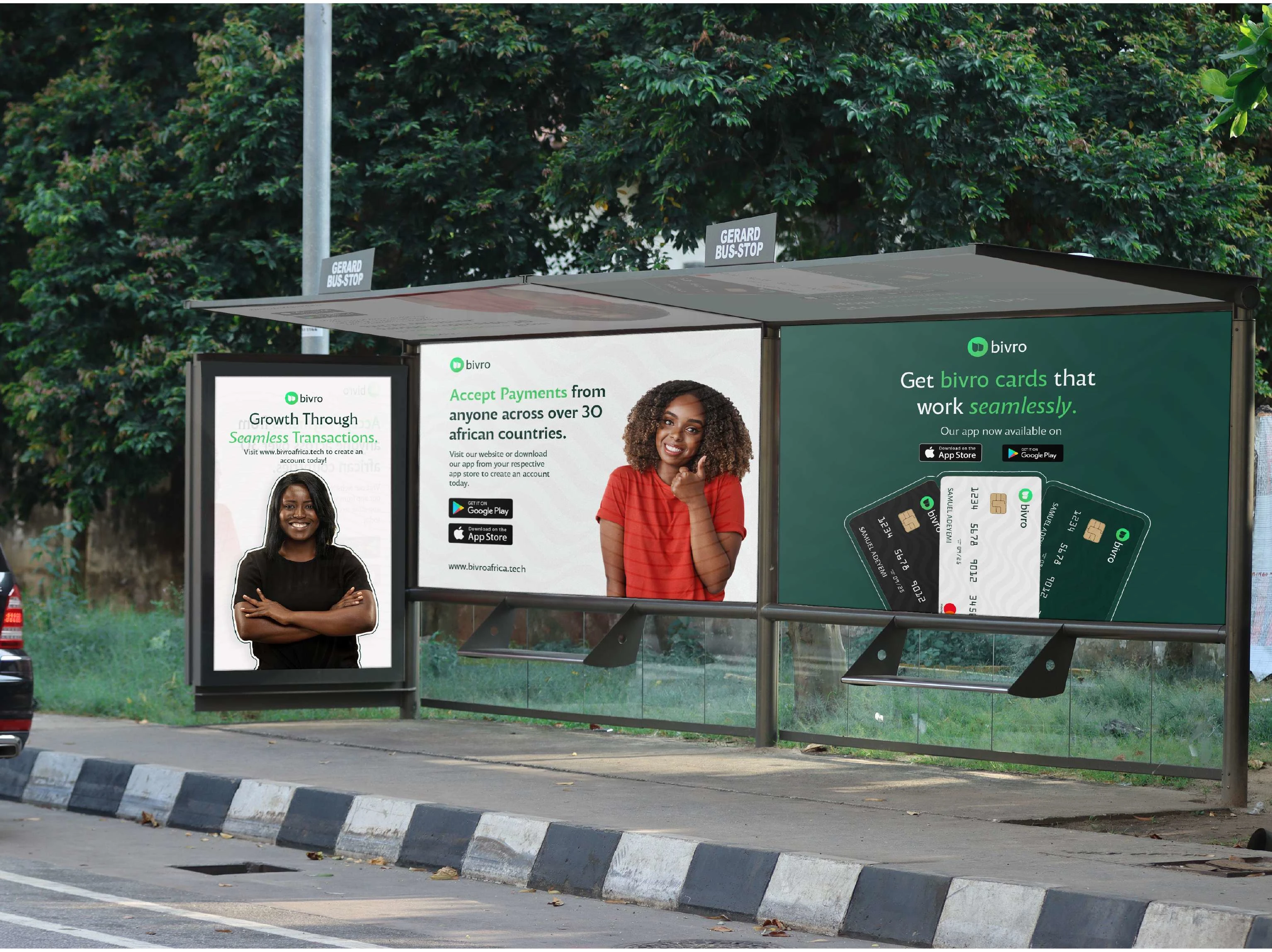
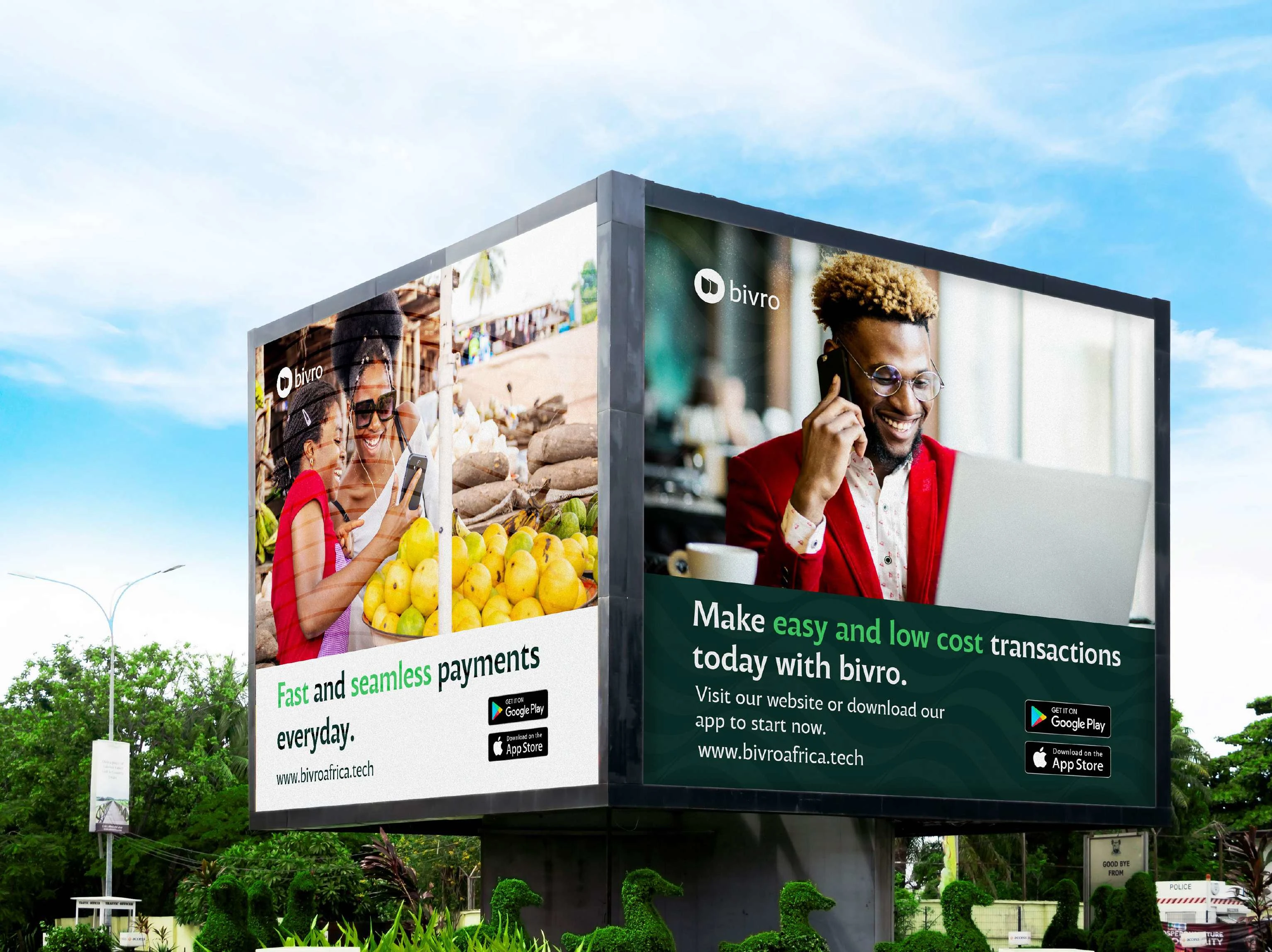
Brand Outdoor Campaigns
Street Billboard Adverts
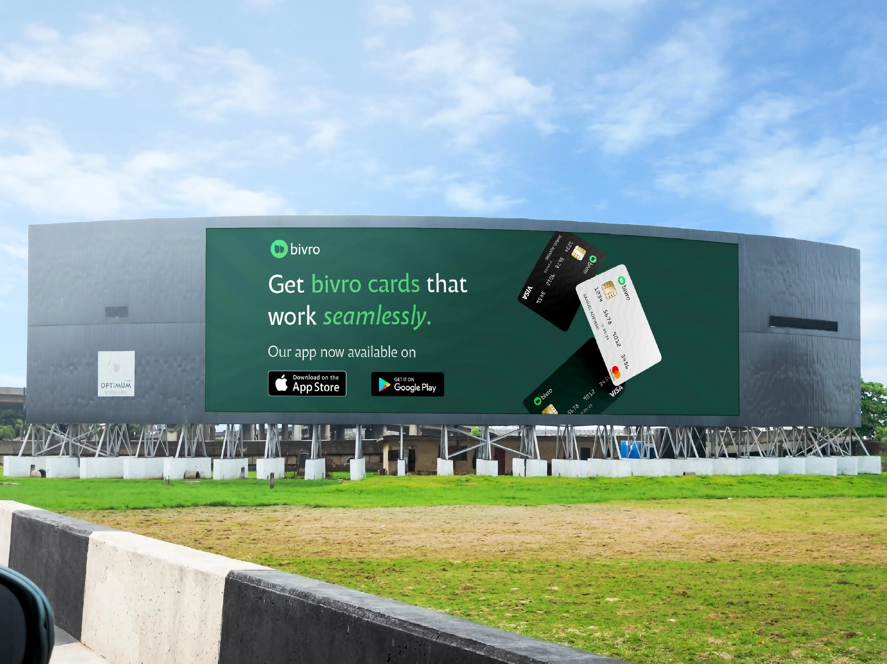
Outdoor Digital Billboard Design
Billboard Awareness Campaign
Digital Billboard Advert
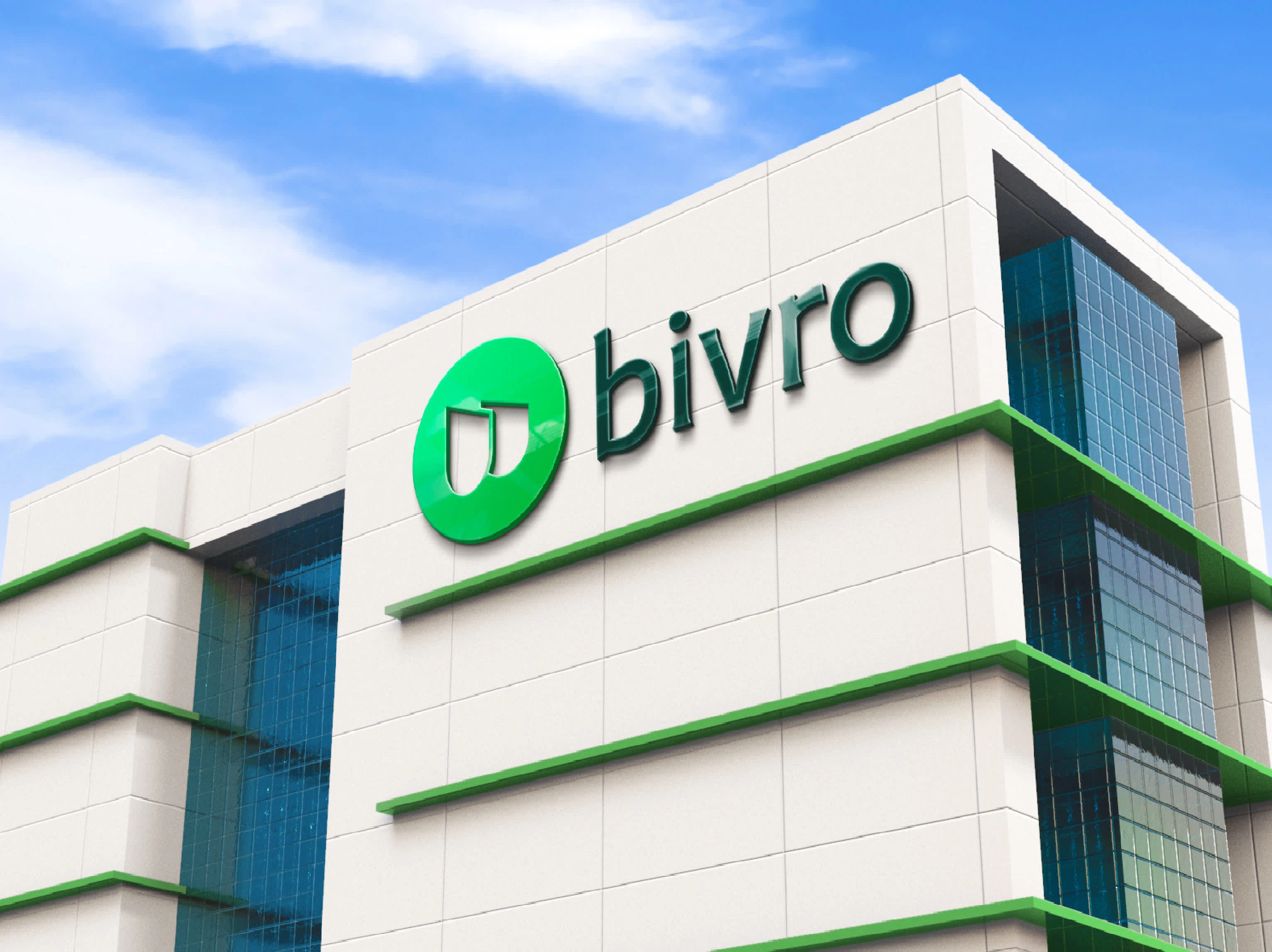
Outdoor Building
Thank You For Viewing
Like this project
Posted Jun 9, 2025
This is a cohesive visual identity that helps position Bivro as a trustworthy and innovative player to their audience and in the fintech industry.