Brand Identity Development for Strukt

Introduction
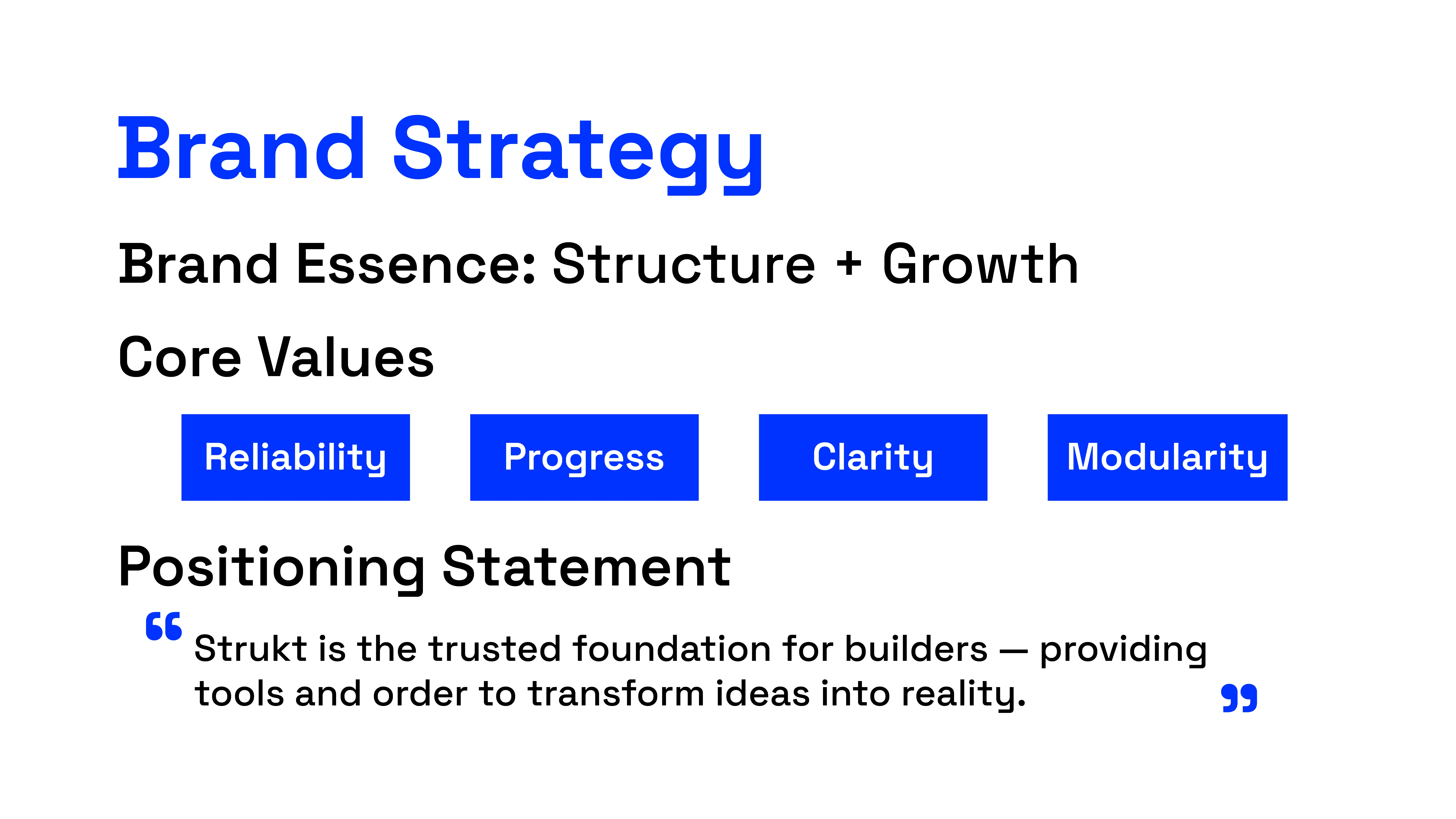
Strukt is a startup platform and toolkit designed for builders, founders, and entrepreneurs. Its purpose is to provide the structure, clarity, and support needed to grow ideas into scalable ventures.
This project aimed to craft a brand identity that reflects strength, order, and adaptability.
The Challenge
How do we create a visual identity that feels solid and trustworthy, while staying modern and flexible enough to appeal to today’s builders and early-stage startups?”
Needed to stand out in a competitive startup ecosystem.
Must balance strength (structure) with energy (momentum).
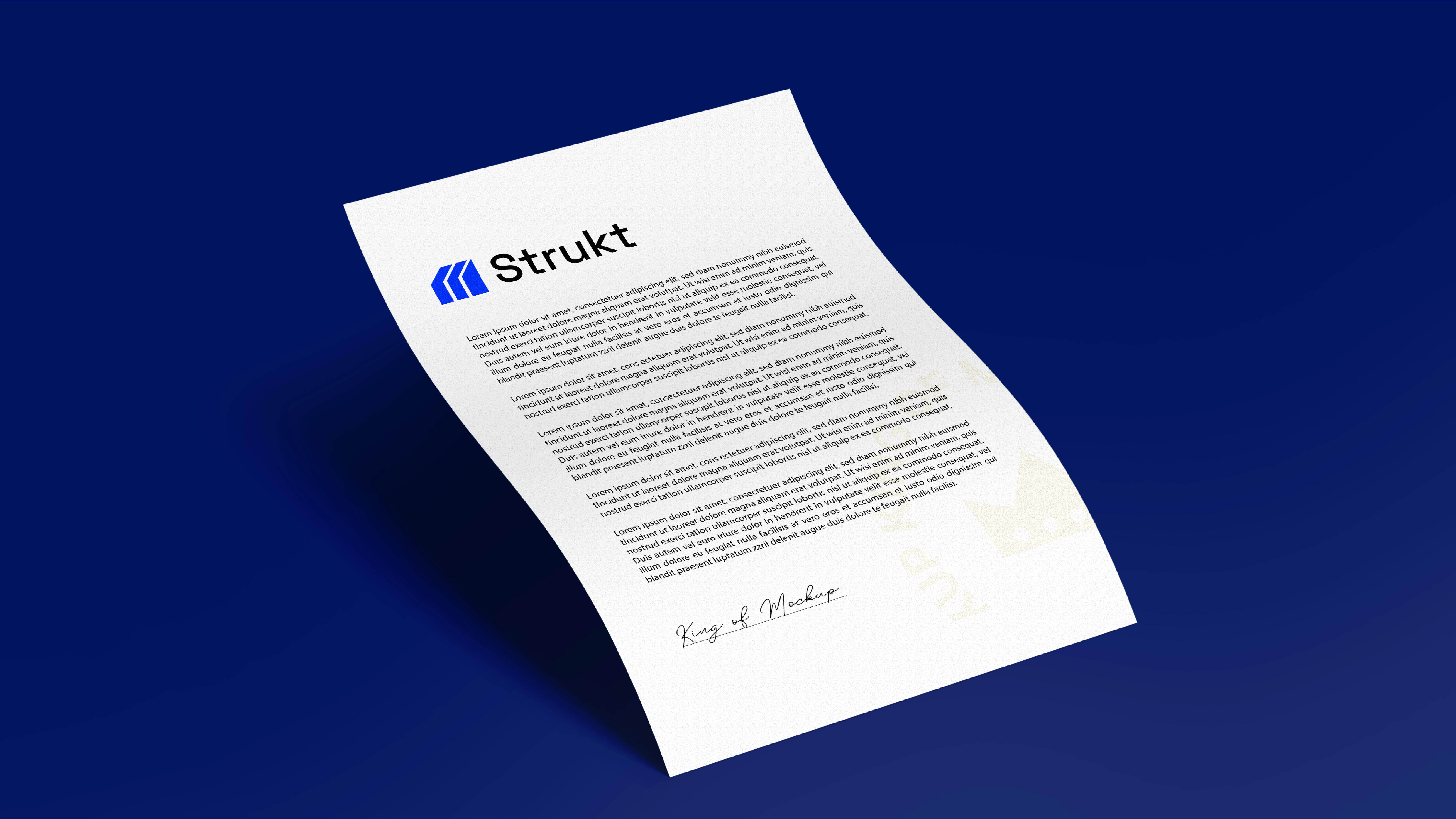
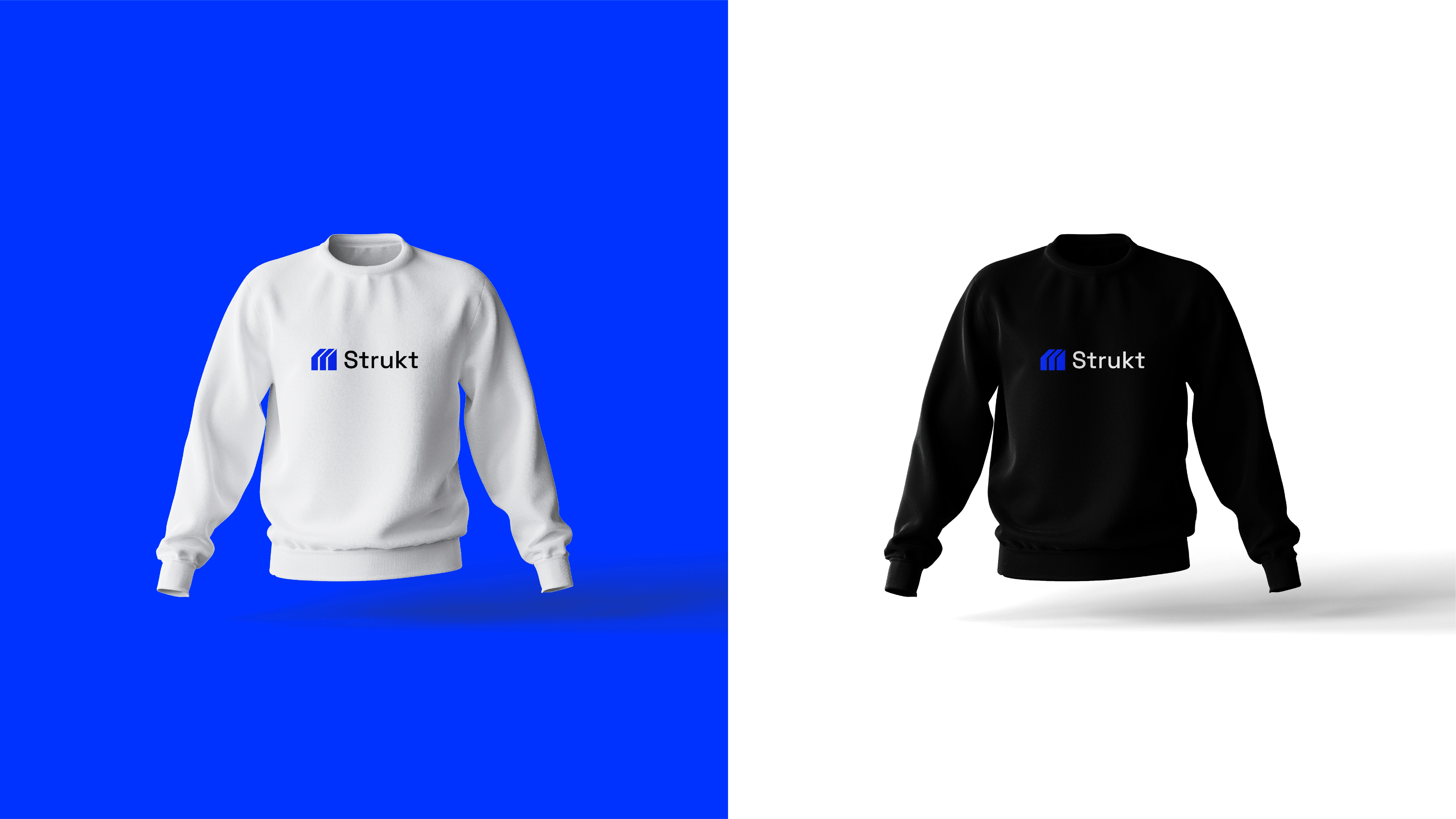
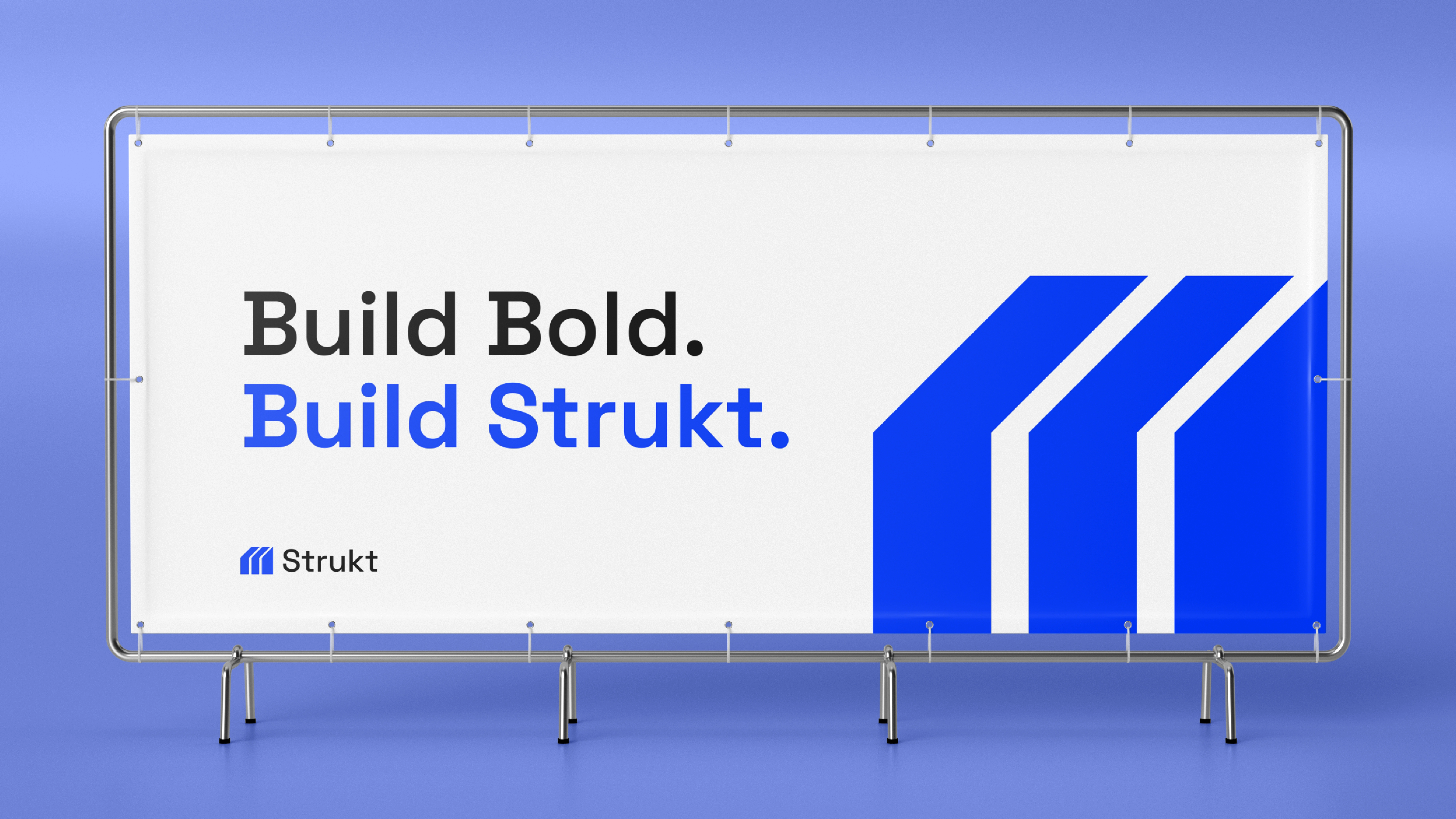
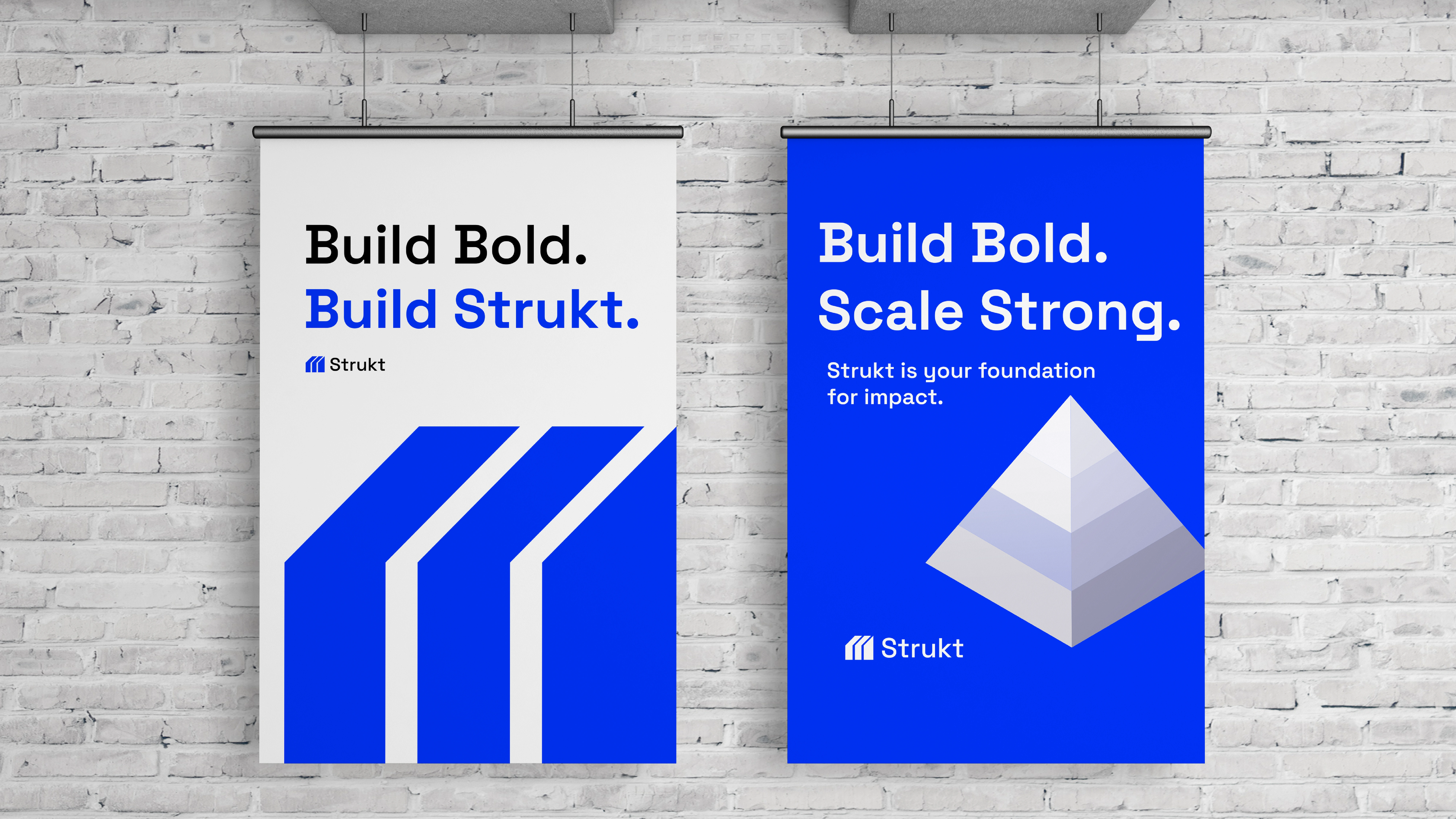
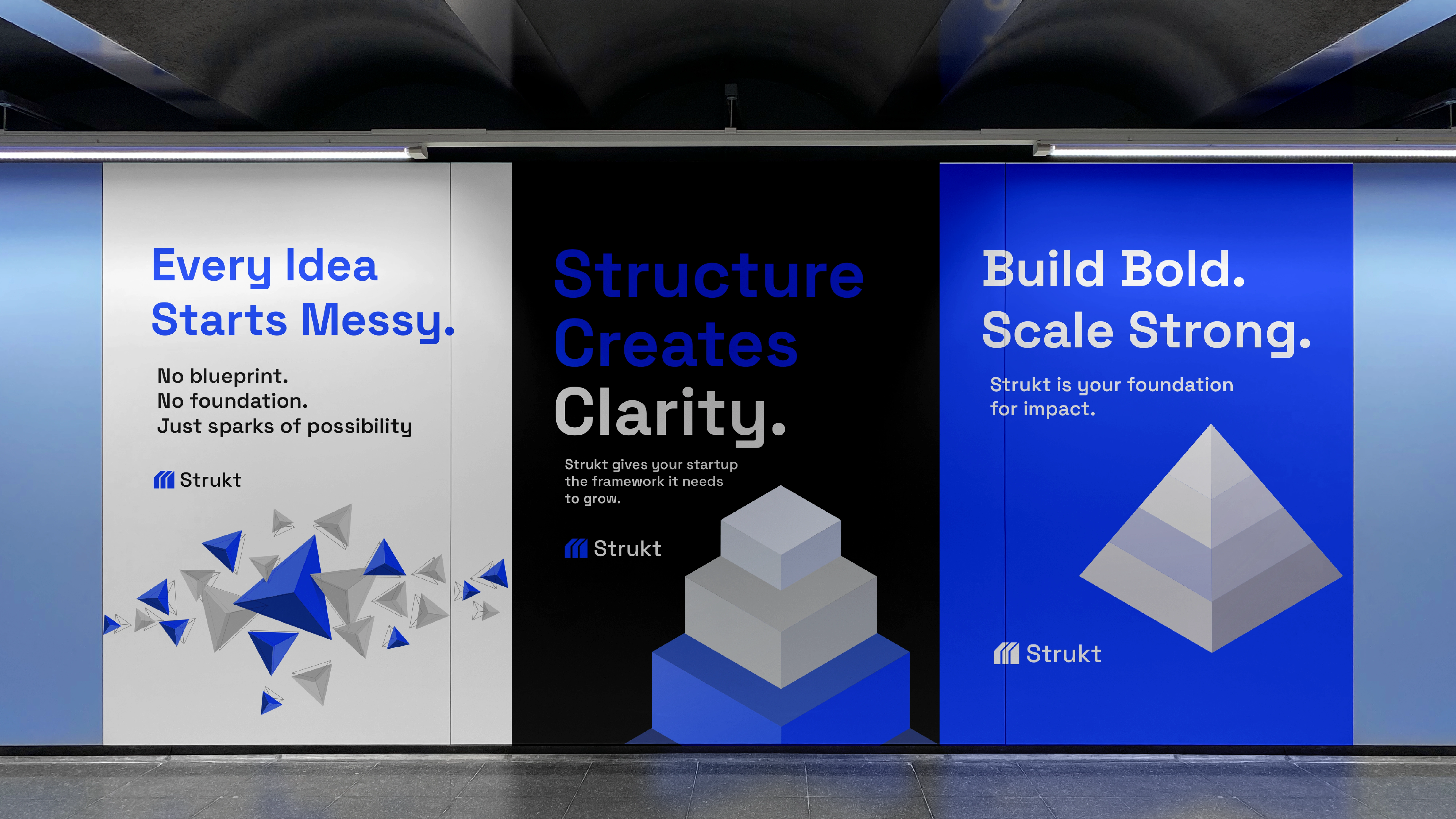
Should scale across digital and physical platforms.
Research Insights
We studied the visual identities of startup tool brands and SaaS ecosystems.
Key Findings:
Many use generic geometric marks or corporate tech symbols.
Few connect directly to construction or structure metaphors.
There’s a gap for a bold, architectural identity that resonates with builders.
Logo Exploration
Several logo directions were explored; the final direction balanced clarity, structure, and upward energy.
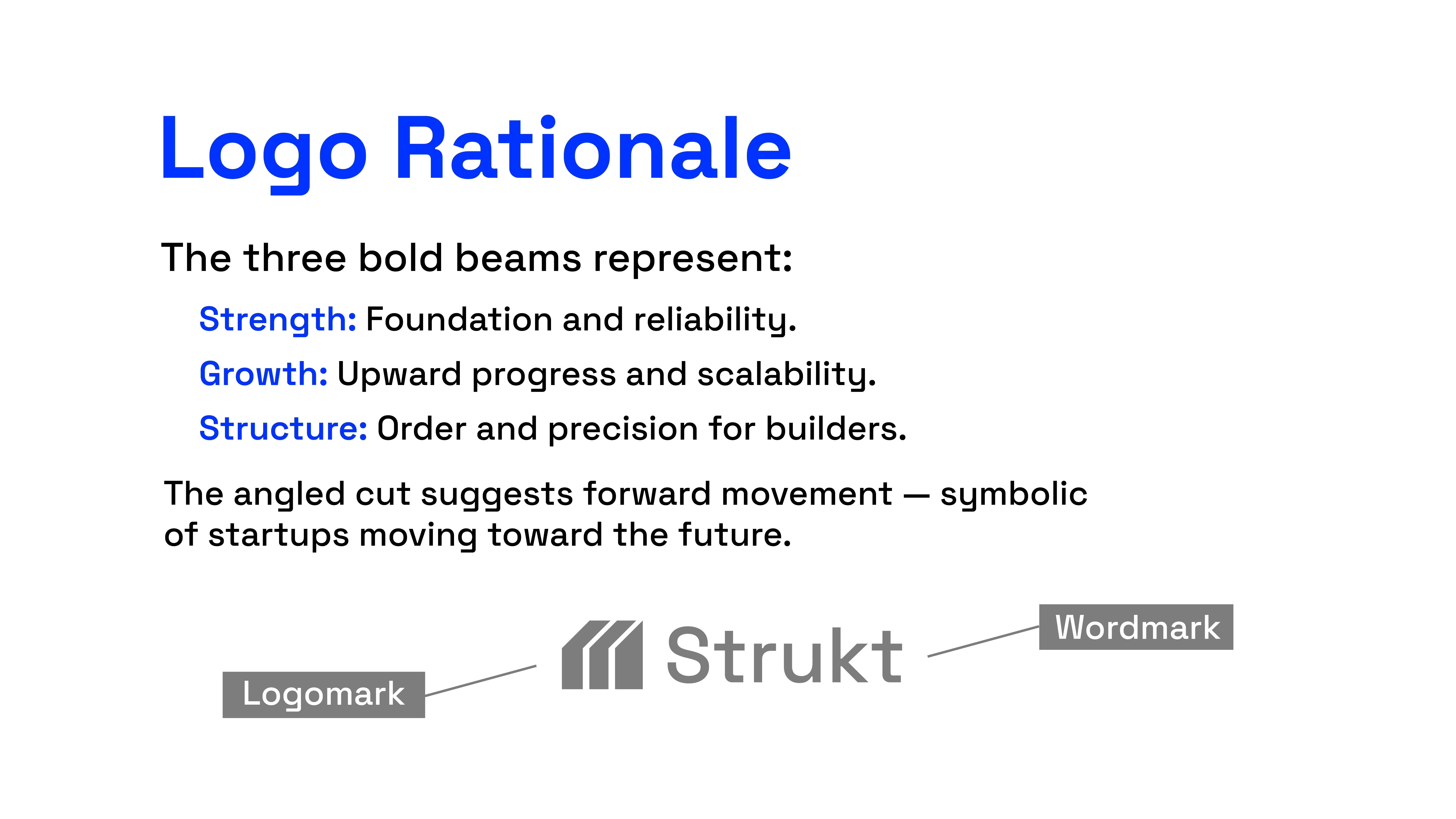
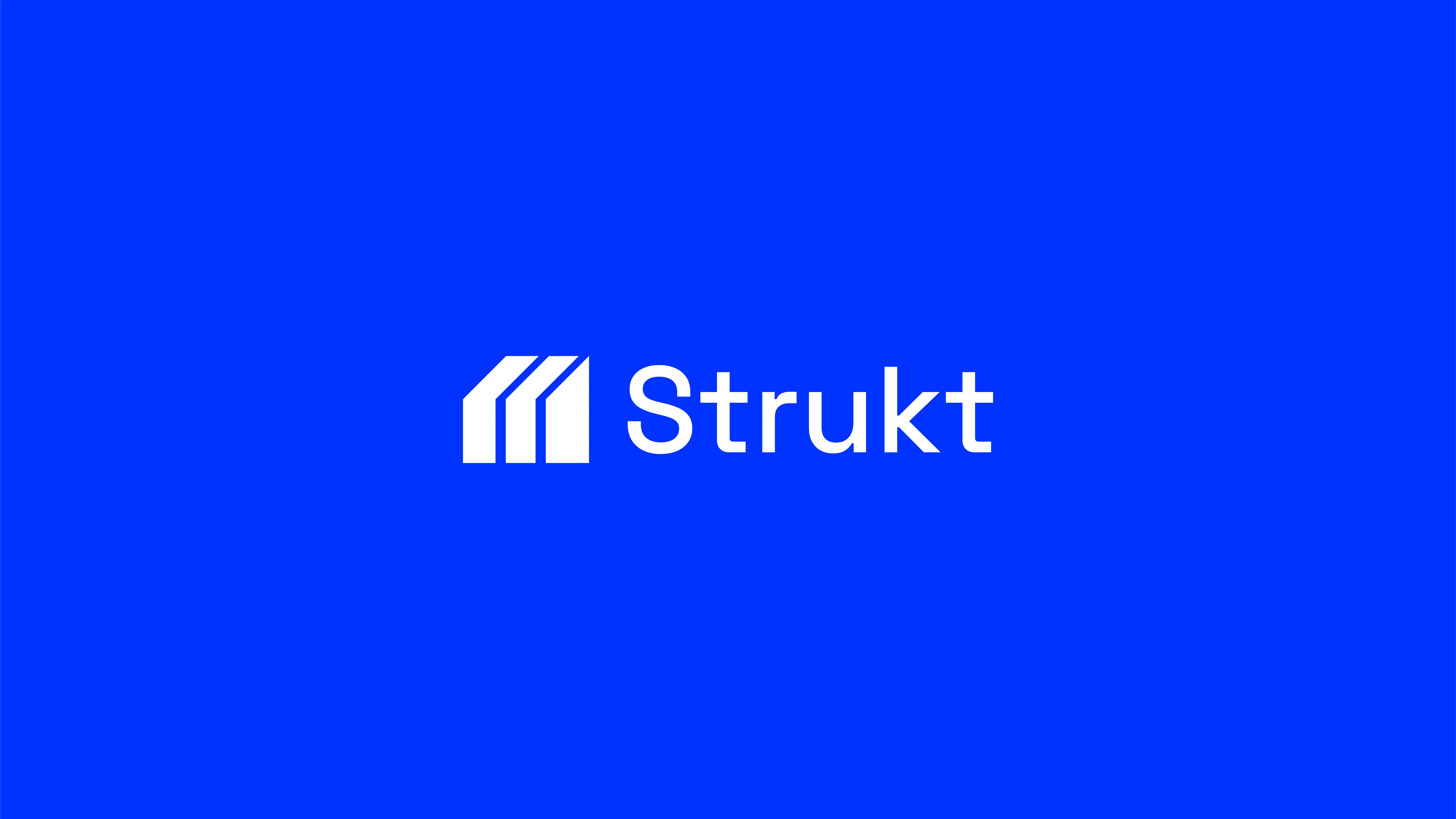
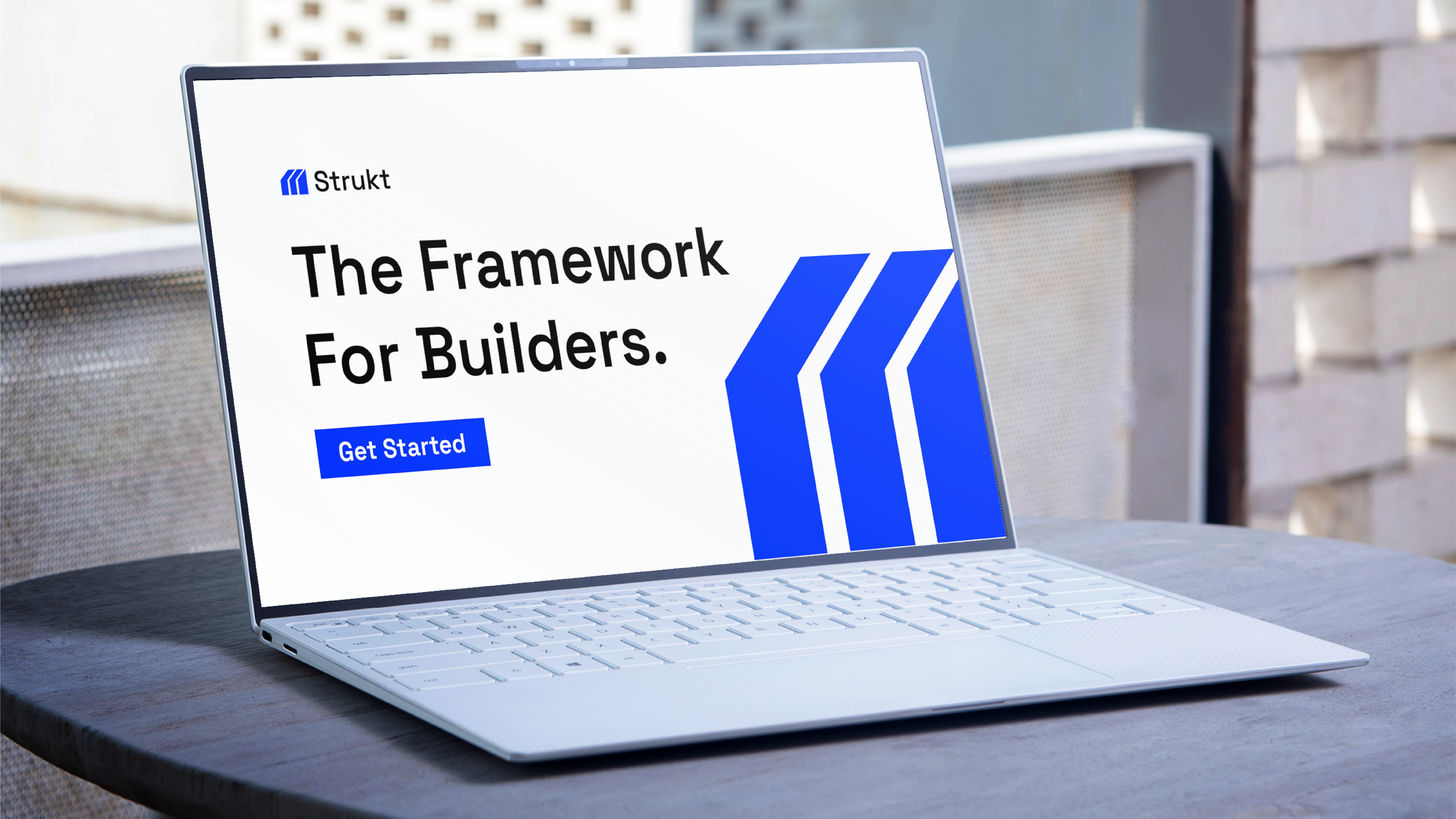
Strukt final logo is a bold wordmark supported by a modular symbol.
Scales well in digital and print.
Recognizable and simple.
Combines structure (solid blocks) with motion (angled cuts).

Typography
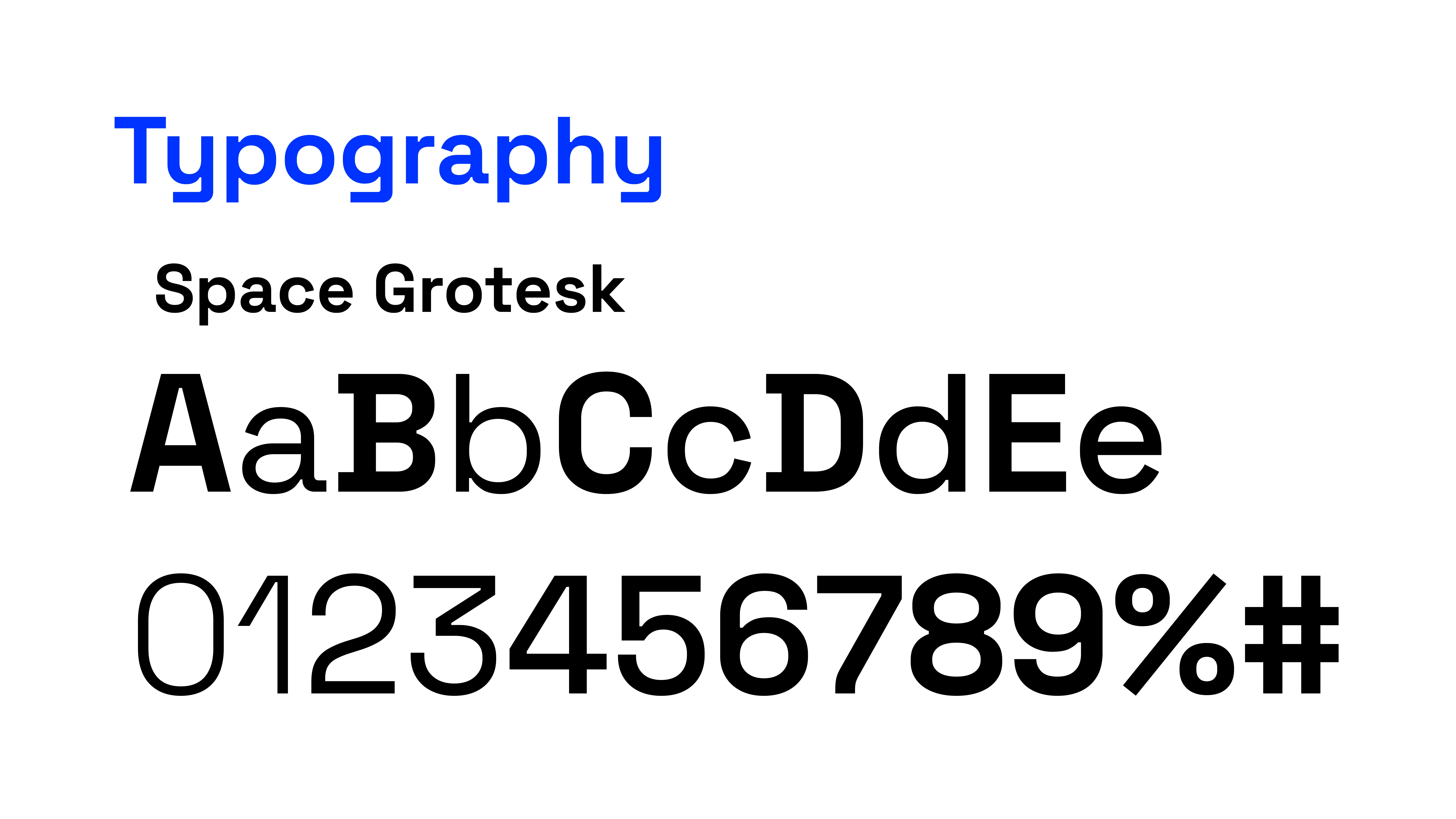
Space Grotesk is a modern sans-serif
Clean, geometric shapes for legibility.
Friendly yet professional tone.
Works well across print, web, and app interfaces.
Typography ensures the brand remains accessible and trustworthy.
Brand Color Palette
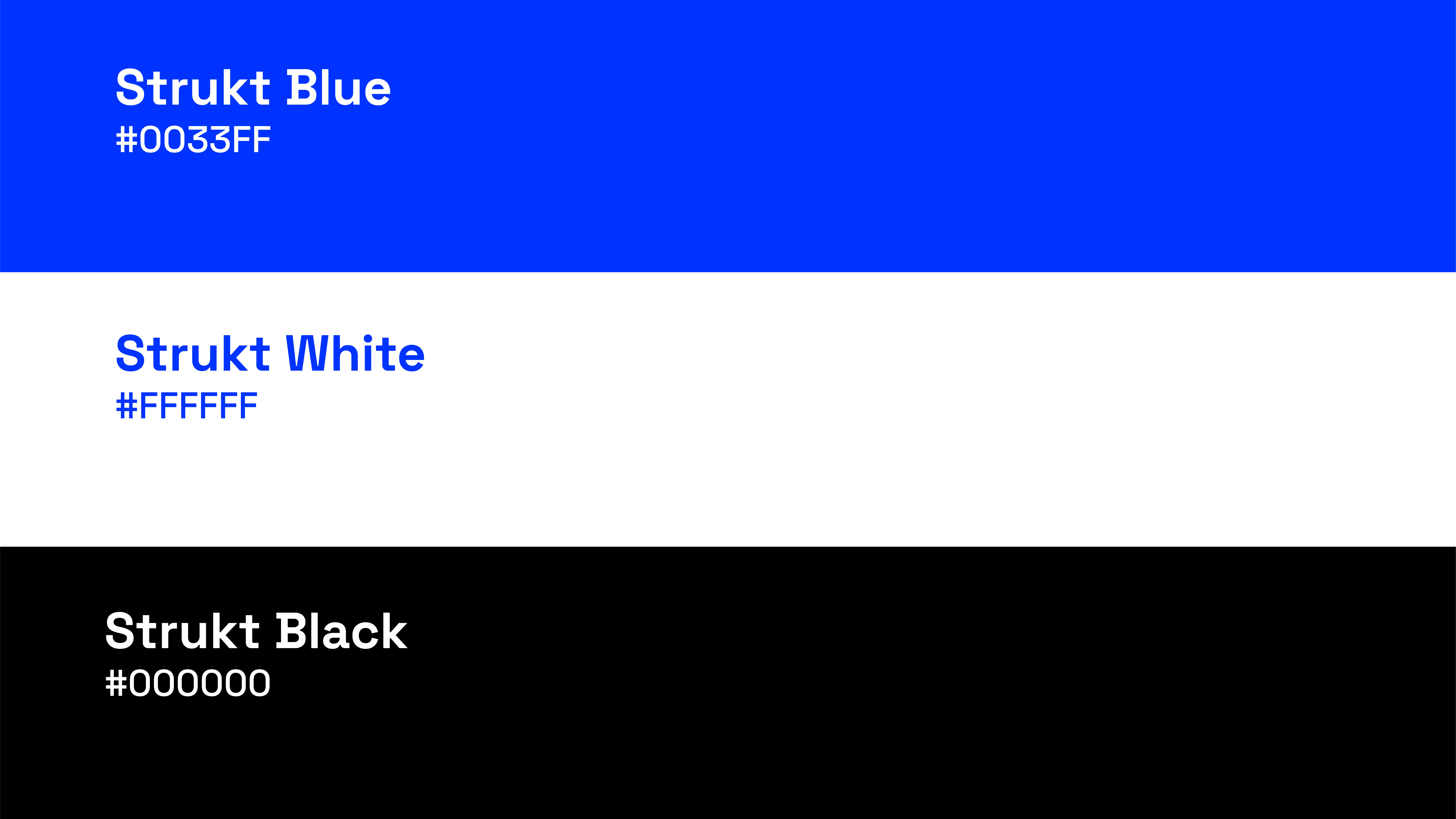
Strukt Blue (#0057FF): Bold, innovative, energetic.
Black (#000000): Strength, clarity, foundation.
White (#FFFFFF): Simplicity, space, balance.
The palette balances bold energy with neutral professionalism.





Thank You For Viewing!
Like this project
Posted Aug 27, 2025
Developed a strong, adaptable brand identity for Strukt, a startup platform and toolkit designed for builders, founders, and entrepreneurs.
Likes
0
Views
1
Clients

Strukt

