CareerLogica – Bilingual SaaS Career Platform (UX/UI)

Riyaz Malek


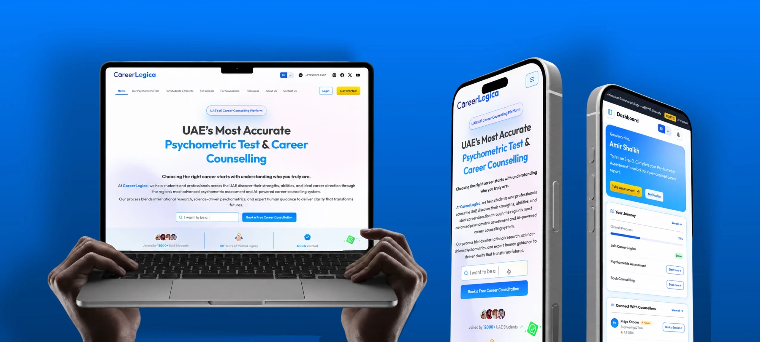
CareerLogica — project cover
Context
I designed a psychometric-first career guidance platform for the UAE and South Asian markets — a full marketing website and four role-based dashboards.
CareerLogica is CareerNaksha rebuilt for a new market, and that matters more than it sounds. I wasn't guessing at what students needed. I was looking at a product already in use, with years of evidence about which parts worked and which parts people quietly walked away from.
So where a screen here differs from the one it replaced, the difference isn't taste. It's the argument.
Deliverables
Marketing website3 login flowsRTL/LTR design systemFigma prototypeStudent dashboardCounsellor dashboardSchool dashboardAdmin dashboardComponent library
Note — This isn't polished to impress you. It's an honest account of a real problem, real decisions under real pressure, and work I'm genuinely proud of — written while the product is still being built. Where I have proof, I've shown it. Where I made a call without data, I've said so.
Research, Strategy, Design, Prototyping
UX/UI design, Product strategy, Dashboard design
Figma, FigJam, Figma Make, Claude AI, Antigravity
Web — desktop + mobile, Responsive, Bilingual RTL/LTR
01 — The problem worth solving
When I got this brief, one question kept me up that night: why does this need to exist at all?
The founder had a vision and a long document. What he didn't have was a reason I could feel — and if I can't feel it, I can't design it.
I found it in the same place every time. Every year, thousands of UAE students choose their stream under pressure from parents, peers and assumption. Not from data. Not from science. Not from any real understanding of who they are.
Three groups were being failed at once, in three different ways.
No credible tool to decide with
No personalised way to connect interests to actual careers — before making a decision they'll live with for years.
Five tools doing one job
Managing an entire practice across WhatsApp, email, Google Drive, a calendar and a spreadsheet.
No tracking, no reporting, no oversight of what happens between a counsellor and their students. All of it manual.
The challenge wasn't designing three separate tools. It was designing one coherent system that served four completely different mental models at the same time.
Scope and approach
I was the only designer on it. Research, information architecture, wireframes, UI, the design system, handoff. No junior support, nobody to hand the tedious parts to. Every decision in this document traces back to me — a comfortable thing to say about the ones that worked, and a less comfortable one about the rest.
02 — What I learned before I designed anything
I'd never designed for the UAE. I didn't know how the school system worked, how families make this decision, or what actually keeps a Grade 11 student in Dubai up at night.
So let me be straight about what I did and didn't do. I did not run user interviews — the timeline didn't allow it, and I'm not going to dress that up as something it wasn't. What I ran instead was a deep competitive audit and a lot of secondary research, leaning hard on what CareerNaksha had already taught me about how these platforms behave once real people are inside them.
What the competitive audit told me
ISMOJO
Psychometric testing buried behind a confusing flow.
Study-abroad focused — not a direct competitor, but it set the bar for what students already expect from a guidance tool.
Surface-level marketing pages. No real product depth underneath.
Three findings that changed the design
The paywall was in the wrong place
Almost every competitor let users sign up, complete onboarding, then hit a payment wall at the final step before the dashboard. Users invested effort, then got blocked. That's not a monetisation strategy — it's a trust problem disguised as one.
Onboarding was exhausting people before they started
Long forms, dozens of small fields crammed onto a single page. Users were mentally spent before completing the first section. High cognitive load at exactly the moment you're asking someone to be honest about their future.
The UAE psychometric market was effectively undefined
No platform combined a credible psychometric assessment with a product experience anyone would enjoy using. The category standard was undefined — which meant whoever cleared the bar first would set it, and clearing it needed a different order of product quality altogether.
Persona, structure, then layout
Personas — four, not one, because the decision isn't made by one person. Two student profiles, the counsellor advising them, and the parent who is almost always in the room.
Sitemap — the marketing website only. The role dashboards were mapped separately; this tree is what a visitor moves through before they ever sign up.
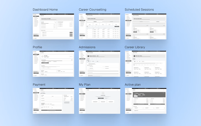
Wireframes — the first version of how the marketing site and every dashboard would look and function: what each screen does, and where every component goes. Answering that in grey, before any high-fidelity UI, is also what let me walk the founder through early concepts and decisions without either of us getting distracted by colour.
1 / 4
Dashboard wireframes
03 — The decision that shaped the product
The biggest decision on this project happened before I opened Figma.
One question had to be answered before I drew a single frame: how do we get someone to trust us before they pay?
Every competitor had already answered it — they didn't. Pay first, find out after. I argued for the opposite, and I wasn't guessing. I'd shipped a freemium model at CareerNaksha and watched what happened: the users who experienced the assessment before paying converted better and complained less than the ones asked to gamble upfront.
Free until the value is proven, not gated behind a paywall
Payment at the last step destroys trust. Finish a 15-minute assessment, hit a paywall, and the read isn't 'this is valuable' — it's 'I've been tricked.' Move the ask past the first real result and you're asking someone to buy more of something good, not gamble on something unknown. A locked dashboard is a promise; a partial result is proof.
Revenue arrives later, and the free tier has to be generous enough to convince — a harder design problem than a paywall at step one. It also carries the institutional sale: schools won't buy a platform their students haven't used, so free student access is the acquisition channel for the paid tiers.
Here's what that buys you. By the time a student has built their profile, explored careers and seen exactly what their report looks like, paying stops being a purchase decision. It feels like unlocking something they already own.
Three separate signup flows, not one with branches
A student, a counsellor and a school are not the same person filling in different fields.
Student
Academic details, interests, and what they're actually looking for. Conversational, low-pressure.
Experience, expertise, credentials. A professional register — this person is applying, not signing up.
Institutional details and the structure of who they oversee.
Three signup flows branching from a single entry screen — student, counsellor and school
4-step onboarding, named after what it builds
The audit had shown me exactly what not to do: everything on one page, dozens of fields, no sense of progress. People were mentally spent before they finished the first section — at precisely the moment you're asking someone to be honest about their future.
So I split it into four, and named the steps after what the student is becoming rather than what they're filling in.
01Personal details — who you are.
02
Scholar
Educational details — where you are academically.
03Career preferences — what you're drawn to.
04Final goal and purpose — what you're actually trying to reach.
UX principle — Chunking (Miller's law)
One long form asks the brain to hold too much at once. Four named steps break the same task into pieces the brain can process one at a time — each with its own small sense of completion.
Identity → Scholar → Explorer → Achiever, with the journey bar starting at 1/4.
04 — The marketing website
A 9–10 page marketing website — the first piece approved, and the visual language everything else inherited.
The client wrote the copy. My job was a visual system that said three things at once: scientifically credible, premium, and not intimidating if you're fifteen.
The tension was real — students need warmth, parents and schools need authority, and they can't look like two different products. So the system splits the job:
a corporate-clean foundation carries the authority
youthful photography and conversational headings carry the warmth
warm accents do the energy
Every page follows it, down to the 404: "Dead end. But not for you."
Homepage, About, For Students and the partner page, full scroll — the approved direction the rest of the product inherited.
05 — One system, four products
A student, a counsellor, a school administrator and a platform admin want opposite things from the same product. The student wants clarity and encouragement. The counsellor wants throughput. The school wants oversight. The admin wants control.
The student dashboard — the hardest screen in the product
When I started this screen I genuinely did not know where to begin. Too many decisions, too many kinds of user, too many things competing for the same space. It took three full rounds before it settled, and each one taught me something the last had missed.
Where it landed: every element has exactly one job.
Greeting and step tag — momentum, before anything is read
Journey tracker — answers what am I supposed to do here
Counsellor widget — seeds the next paid action
Pricing, in the open — a product asking a teenager's parents for money should never look like it's hiding the number
CareerNaksha
CareerLogica — UAE
The rebuilt CareerLogica student dashboard home screen
The screen says who you are and where you are
The old home never told a student their name, their stage, or their plan. The rebuild opens with all three — answered before the eye moves.
Every incomplete step carries its next action
Three bars stuck at 0% say only that you're behind. "Your Journey" names each step and puts a button on every unfinished one. Same data, opposite emotional read.
The highest-value surface is never empty
"Connect With Counsellors" was a heading with nothing under it, on the best conversion moment on the page. It now carries three counsellors with specialty, rating and a booking CTA. An empty state invites nothing.
One icon set, one meaning per icon
Filled icons, outline icons, and one icon used for two destinations. Not a polish problem — a duplicated icon makes two places look like one.
UX principle — Endowed progress effect
People are more likely to finish something when they can see they have already made headway on it. "Your Journey" shows 1 of 3 done rather than an empty tracker — the step the student has already taken is counted and named, so what is left reads as the rest of something started rather than the whole of something not.
Nine screens run on one component library. Every one of them is the same set of parts at a different density.
My plan
1 / 9
Active plan
Same system, three more brains
The other three roles run on the same library. What changes between them is density and tone, not the parts.
Same system, different brain
Counsellors think in workflows, not journeys. The home screen leads with status and action, and Student Connect replaces the WhatsApp-email-spreadsheet stack from section 01 outright.
Institutional scale, simplified
Schools need overview, not depth — and deliberately no individual student detail. Give an administrator everything and you create noise; give them the right summary and you create clarity.
Seven modules, one principle: density without confusion. Two explicit actions per row, so no row ever ends in a question.
1 / 12
Admin — payments
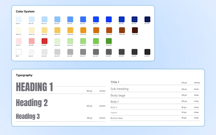
Same components at different densities, not four design languages
Why
Four mental models could have justified four tailored interfaces, and with more designers it might have. One library meant a fix landed everywhere at once, and kept the product legible across roles — a counsellor opening a student's view mid-call isn't learning a second interface. Density carried the difference instead: the same card, spaced generously for a fifteen-year-old, packed tight for someone processing forty students a week.
No role gets a layout perfectly tuned to it. The student dashboard carries more structure than a teenager needs; the admin tables are looser than someone living in them would build. A system that fits four roles well fits none perfectly — and I'd make the same call again at this team size.
06 — Building it in both directions
I'd never designed a bilingual product. I assumed Arabic meant swapping the text and mirroring the layout. That lasted about a day.
Reading right to left changes almost everything:
where the nav sits, and which way every icon points
section order, and where the eye lands first
how a photo reads when its subject now faces the wrong way
Fatima — a persona I built from the research, not someone I met — switches to Arabic within seconds of landing. If the layout breaks there, she's gone before she ever picks Environment, Science and Education.
So RTL was never a feature here. It's a condition of being usable at all, and it belongs in the design system from component one or you build everything twice.
It sharpened the English too: Arabic gave me no instincts to lean on, so every call had to be reasoned instead of repeated.
English — LTR
Arabic — RTL
Arabic right-to-left homepage layout, fully mirrored
07 — What shipped
The product isn't live yet, so I'm not going to pretend I have conversion numbers or retention data. Here's what's actually real.
140+ screens across five platform roles. Solo — a scope that typically needs a team of two to three.
A complete bilingual EN/AR design system covering both reading directions.
The client approved the final direction after the first major presentation, with no structural revisions. For a 0-to-1 product this complex, that's a real signal.
Three months, solo. Not faster work — fewer wrong turns. Owning the problem end to end meant fewer reversals later.
What I'd do differently
Test with real students
Every call was validated with the founder, not the people who'd use it. He knew the market and was usually right, but agreement isn't validation. Next time: five student sessions before locking onboarding.
Build RTL into the system on day one
I designed English-first and adapted Arabic after. That cost rework on components that should have been direction-agnostic from the start.
Push back harder on scope in month one
The extra month wasn't slow work — it was scope growing without renegotiation. I should have flagged it in week three instead of absorbing it.
What it taught me
Domain expertise compounds
CareerNaksha had already taught me how these platforms behave, so here I made better calls faster. That head start was worth months of research — and it's underrated in how people talk about junior versus senior work.
Strategy before pixels
The freemium call shaped everything downstream. Making a business decision before opening Figma made every design decision after it easier to defend and harder to second-guess.
One designer can own a product
Five roles and 140+ screens didn't need a team so much as one person holding the whole problem. Every decision stayed attached to the reason behind it — which is the thing that usually goes missing in a handoff.
Like this project
Posted Sep 5, 2026
UX/UI design for 140+ screen bilingual (EN/AR) SaaS career platform. RTL support, role-based dashboards, design system. EdTech, UAE market.
Likes
0
Views
0
Timeline
Mar 7, 2026 - Jun 25, 2026