Atrc

Riyaz Malek


View
Context
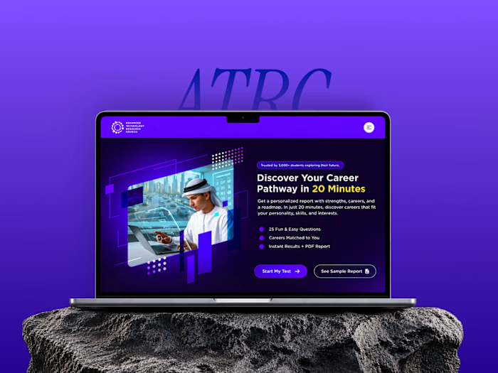
For the Advanced Technology Research Council, UAE, I designed a STEM career assessment for school students — solo, from working prototype to the product now live at careertest.atrc.ae.
ATRC is Abu Dhabi's research and development body, and it runs youth STEM initiatives alongside the deep-tech work. The long-term supply of Emirati engineers starts with a fifteen-year-old deciding what to study, and this test is the front door of that decision.
The test stays long, because the psychometrics need it to. My job was to carry a student all the way through it.
Deliverables
Lovable prototypeSketch wireframesFinal UIUX strategyDesktop-mobile responsivenessDev handoff
Note — This case study shows three stages of the same product: the throwaway prototypes, the flow, and the shipped screens — including decisions from the prototypes that I deliberately reversed. The gaps between the stages are the point.
Role
Research, Strategy, UI design, Prototyping
Delivered
Assessment flow design, UX decisions, Figma prototype, Component library
Tools
Figma, FigJam, Lovable, Claude AI, Perplexity
Platform
Web — desktop + mobile, Responsive
Industry
EdTech · STEM
Timeline
1 month
The problem
Serious STEM assessments run 60–70 questions, and there's no way around it — a five-question quiz can't map a student to a career pathway.
But the test-taker is fifteen. Attention drifts, a notification lands, the tab closes, and twenty minutes of honest answers disappear. So the brief was a contradiction: a test long enough to be credible, experienced as something a student wants to finish.
Stage 01 — Prototype first
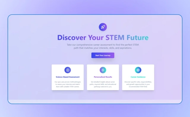
I started by building, not sketching: two working prototypes in Lovable, with 8 placeholder questions — enough to make the flow real without writing a full question bank. The point was never the question count. It was that a test flow can't be judged from static screens; I needed to take it to feel where it breaks.
I built it twice deliberately — one consumer-toned, one institutional — to force a comparison instead of a default.
Consumer-toned
Institutional-toned
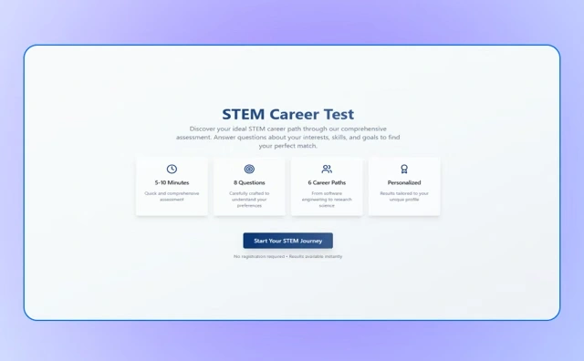
Built twice on purpose. Comparing two real builds surfaces decisions that comparing two static mockups never would.
Three findings came out of clicking through them
01
State the cost before asking for the effort
The version that told students the time, the question count, and "no registration required" before the start button made starting feel safe. The version that only promised benefits didn't. This became the landing page principle.
02
A selected answer should still look like an answer
One prototype flooded the chosen option solid and dropped its letter badge — the item you picked stopped resembling the list around it. The fix, keeping the badge and marking selection with fill and border, carried into the final system.
03
A verdict closes doors; a ranking opens them
One prototype ended with a single career. The other ranked every path with a percentage. For a teenager who'll be a different person next year, ranked is more honest — this finding became the three-pathway report.
Stage 02 — Mapping the flow
Three findings tell you what's wrong with a screen. They don't tell you what happens when a student does something the happy path didn't plan for — and across twenty minutes, off-path is the normal case.
So before sketching a single screen, I drew the product as one diagram: three phases, every decision point, every branch, and every way back in.
01
Entry and onboarding
Almost a straight line, with one branch — a student who isn't ready to commit can read a sample report instead of starting.
02
The 25-question loop
One question node fanning into the four formats, every path returning to the same place.
03
Results and report
Ends in four actions rather than one, with the retake path looping back into Phase 2.
Three things only became visible once it was a diagram.
The sample-report branch is the flow-level version of finding 01 — state the cost before asking for the effort. On the map it stopped being a landing-page detail.
Every question format returns to the same node, so adding a fifth type later is a branch, not a redesign.
The retake loop runs back to the start of Phase 2, which is what makes "hit rewind" a real route rather than a line of copy.
Underneath all of it: the pause and inactivity returns. Drawing them made the obvious thing impossible to ignore — a student can leave from almost anywhere, so every exit needed a matching way back.
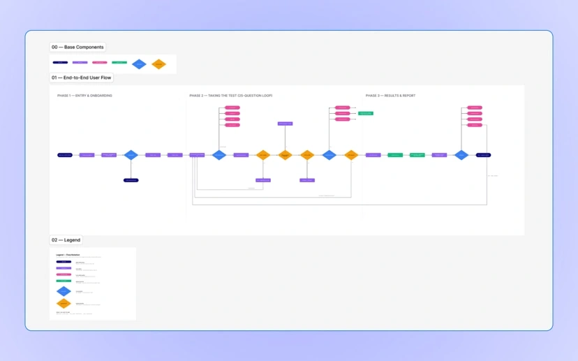
Three phases, every branch, and the loop-backs underneath — the exits a long test has to plan for.
Stage 03 — Wireframes: designing the full system
With the flow mapped, I sketched every screen and state on paper — and this is where the product became much bigger than the prototypes. The wireframes added everything the prototypes never had:
Two-step onboarding — an intro video with three highlights about the test, so a student knows what they're walking into.
A per-question layout with timer, progress bar showing how many questions remain, and a question-related image beside every question.
Four question formats — five-option choice, picture selection, drag-to-arrange, and connect/match — sketched as separate templates.
Pause as a first-class flow — "Pause this test" on every screen, with a reminder scheduler drawn right into the wireframe.
Inactivity recovery — a "Still there?" state triggered after minutes of no activity, progress already saved.
Loading and analysing states — the moment between finishing and results, treated as its own screen.
The report skeleton — avatar, About, Skills, Subjects, Careers, Quick Tip, download and retake.
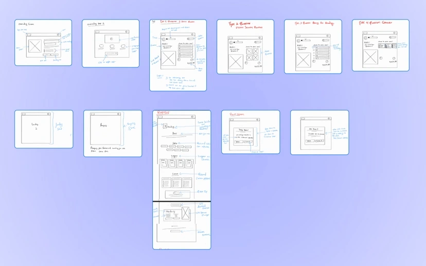
Every screen and state on one sheet — the four question templates, the report, and the two screens for not taking the test.
Stage 04 — Iteration 3
The interface took three passes. This is the third, and the one that went to development.
What makes it the third is that it stopped being a set of screens. Tutorial through report, reviewed as one continuous run — because the question a long test has to survive isn't does this screen work, it's does screen nineteen still feel like screen one. Reviewing it that way settled three things that only show up in sequence:
one dark violet carrying the whole run, so nothing reads as a different product
the guide character holding its position from question to question
the milestone celebration landing as a break in a rhythm the student has already learned, not as a surprise
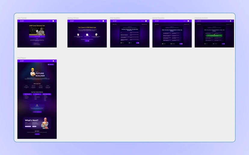
Iteration three, reviewed as a journey — tutorial through report — instead of screen by screen.
Stage 05 — The final design
Keeping engagement high across 25 questions
The shipped test runs 25 questions — and the count can grow, because the design doesn't depend on it staying small. Length is handled by design, not denial.
Gamified progress. A progress bar tracks questions remaining, next to a per-question timer — answering "how much is left?" before it's asked. At milestones the test celebrates: 25% lands with a confetti moment and an encouraging message, and again at 50% and beyond. Long tests die in the middle; the milestones put small finish lines inside the big one.
UX principle — Goal gradient effect
Motivation rises the closer someone gets to a goal — not steadily, but sharply near the end. Splitting one long test into milestone finish lines means the student feels that acceleration four times instead of once.
A guide, not an invigilator. An illustrated Emirati character stands beside every question — a doctor for the health-science ones, a builder in a VR headset for the technology ones. Students see a test made for them, and a companion turns exam pressure into conversation. The character set was AI-generated to my direction, doing the work of an illustration budget a solo freelance project doesn't have.
Friendly failure. Skip without answering and the error matches the product's voice — "Ohh no… something missing" — no red scolding on a test that promised there are no wrong answers.
The shipped product end to end. The milestones are the finish lines inside the finish line.
Four question types in rotation
The variety serves the psychometrics — different formats surface different signals — and it breaks the rhythm, so question 19 doesn't feel like question 4 again.
Standard choice
Five options with letter badges. The baseline format, and the one the selection-state finding came from.
Picture choice
Image options instead of text, for preferences a sentence describes badly.
Drag to rank
Ordering rather than picking — surfaces relative preference, not just presence.
Build a sentence
Assembling blocks into a statement, for questions about how a student frames a problem.
The safety nets
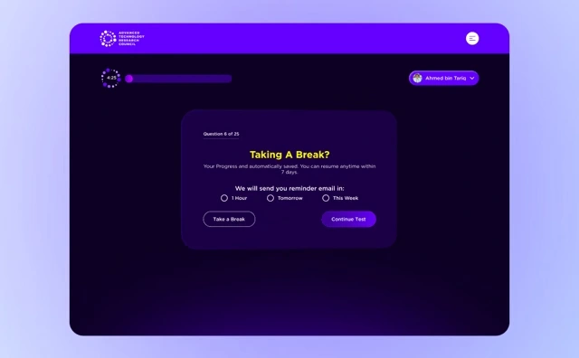
Pause, with a promise. Pausing saves progress for 7 days and offers a reminder email — in 1 hour, tomorrow, or this week. The student picks when they'll return; the product gently holds them to it.
Inactivity recovery. Ten minutes idle triggers "Still there?" — one tap to break or continue, nothing lost to a closed tab.
Pause, with a reminder
Inactivity recovery
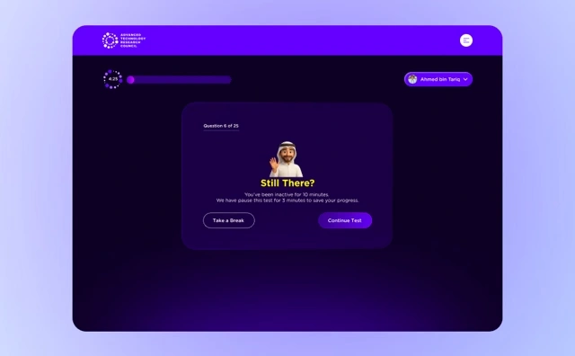
The most valuable screens in the product are the ones for not taking the test.
The report — three pathways, not one answer
Every student gets a Primary, Secondary and Tertiary pathway, each a full identity rather than a job title.
The Maker
Future Builder
Skills to build, subjects to focus on, and career clusters to explore — plus one concrete activity for this month, like building a prototype in CAD or LEGO.
The Decoder
Future Analyst
The same four lists, tuned to a student who reads patterns — with a Try This such as modelling predictions in Excel.
The Guide
Future Leader
For the student who organises people rather than systems, ending in a Try This like running a school initiative.
A result you can only read is a label; a result you can act on this week is guidance. And at the bottom: "Not sure? Hit rewind and see where your curiosity takes you." Retake framed as exploration, never as failure.
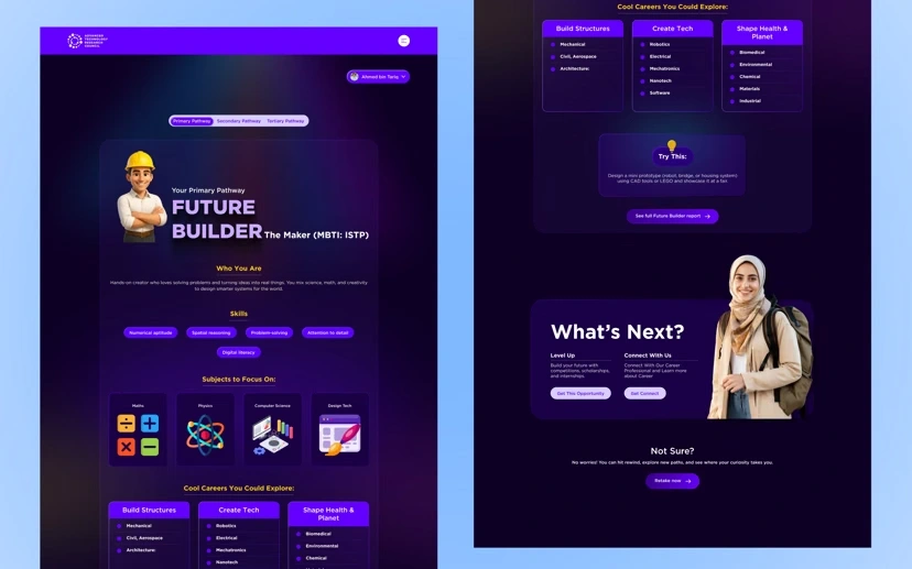
The Future Builder report, full scroll.
Outcome
Shipped
Landing, video onboarding, a 25-question test in four formats, gamified progress with milestone celebrations, pause and resume with reminders, inactivity recovery, an analysing state, a 3-pathway report, and retake.
Status
Live at careertest.atrc.ae.
Role
Solo freelance product designer, September 2025.
Approach
Prototype first, then the flow, then wireframes, then UI — with decisions from the prototypes deliberately reversed along the way.
What I'd do differently
Watch five students take it
Every finding came from testing my own prototypes — better than nothing, but I was a designer simulating a fifteen-year-old.
Prototype the final interactions too
Drag-to-rank and build-a-sentence went to development from Figma. They deserved the same working-prototype test the early flow got.
What it taught me
Prototype-first is a research method
The findings that shaped this product are invisible in static screens. A rough working build cost two days and bought the strategy.
Length is a design material
The most valuable screens are the ones for not taking the test — pausing, returning, recovering. I designed the gaps, and the gaps are why students finish.
(001)
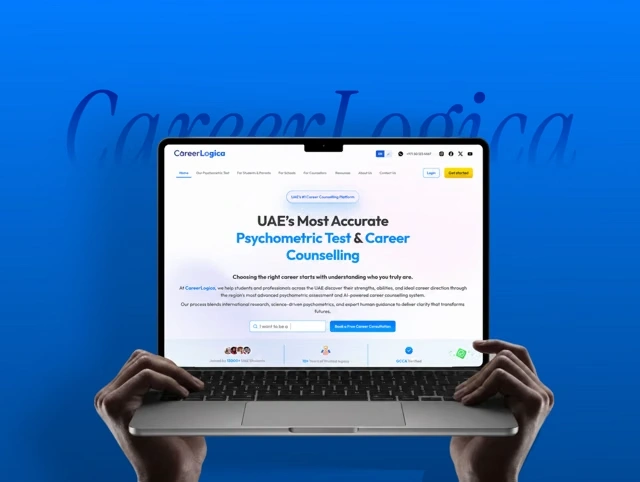
CareerLogica
Psychometric-first career guidance platform
Like this project
Posted Sep 6, 2026
Designed and shipped a 25‑question gamified STEM career assessment with onboarding, pause/resume, inactivity recovery and a three‑pathway report; live at careertest.atrc.ae.