Pecuc

Riyaz Malek


View
Context
PECUC has protected children's rights in Odisha since 1990 — with UNICEF and the European Union among its partners, and three decades of photographs to prove the work. Their website was built in 2001 and treated all of it as furniture. I redesigned the full 15-page site around the one thing they had that no design trend can fake: evidence.
People's Cultural Centre is a non-profit development organisation working for the rights of children, women, older people, indigenous communities and the rural and urban poor. It began with a children's festival attended by 5,000 children, and has since run more than 178 projects across 30 districts of Odisha and 4 districts of Delhi. It holds UN ECOSOC Special Consultative Status, is FCRA compliant and ISO certified, and the Government of Odisha has adopted some of its community models into state policy.
Deliverables
User flowUX auditUX strategyResearchFinal UIDev handoff
Note — I didn't document this project while I built it, so this isn't a reconstructed process diary. It's an account of what I found and what I decided. Everything I describe about the old site is verifiable at pecuc.org today.
Role
UX design, UI design, Website redesign, Responsive UI
Delivered
Figma designs, Component library, Mobile responsive UI
Tools
Figma, FigJam, Perplexity
Platform
Web — desktop + mobile, Responsive
Industry
Non-profit organisation
Timeline
2 months
The problem
An organisation with UNICEF's logo, 178 projects and thirty-five years of photographs was presenting itself online in a way that made a first-time visitor doubt all of it.
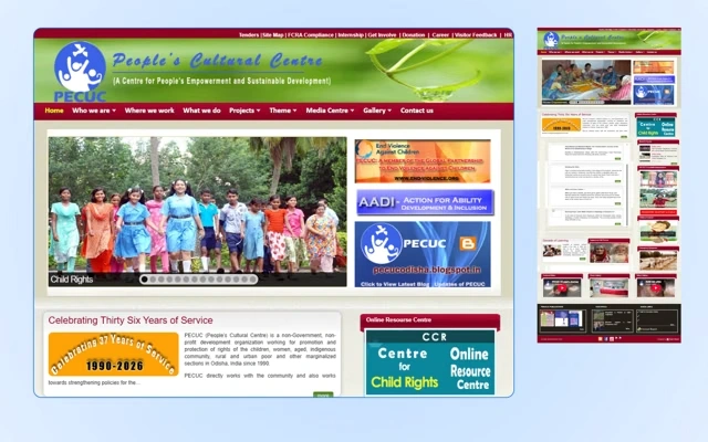
The old site opened with a slider running eleven messages. Seventeen links sat above the fold before a single sentence explaining what PECUC does. Photographs of the children this organisation changed were shrunk to thumbnails beside links labelled homedetails.aspx?id=H1.
And the two links that matter most were broken. Donation pointed to an empty anchor. Volunteering downloaded a PDF to print and fill by hand. For a non-profit, those two links are the product — an organisation this credible, presenting itself this badly, loses donations it will never know it lost.
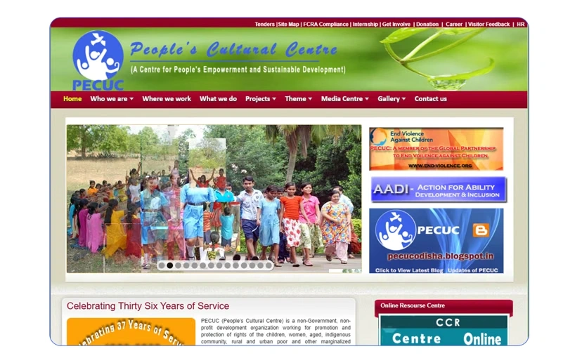
The site as it stood: an eleven-message slider, seventeen links above the fold, and photographs reduced to thumbnails.
Stage 01 — The audit
I didn't run user research on this project. I didn't need to. I needed to open the site and count.
37
Navigation destinations
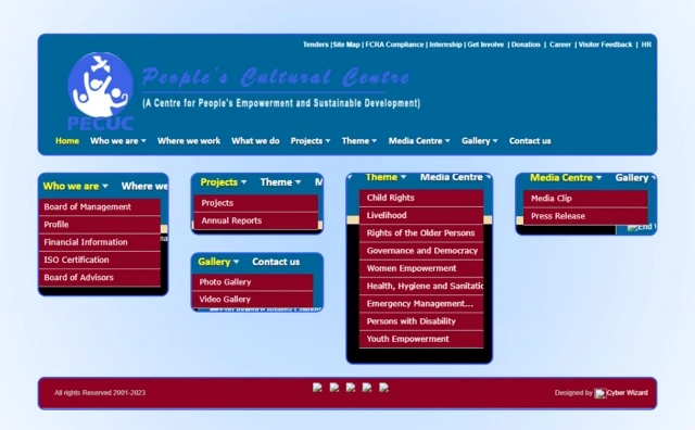
Nine main items, eight utility links above them, and twenty more inside the dropdowns — "Who we are" held 5, "Theme" held 9. Everything equally important, so nothing was.
09
Disconnected properties
A separate Blogspot blog. An online resource centre. A photo gallery and a video gallery on different templates. Press and publications. Annual reports. Board documents served as raw Word files. Each a different visual language, each a dead end.
03
Accounts of what year it was
The footer read "All rights Reserved 2001-2023". The news section had entries from March 2025. The homepage said thirty-six years of service. All on one page.
The content was never the problem. PECUC's writing is better than most NGO copy I've read — Gauri, who joined a self-help group and changed her family's circumstances; Mamata, who returned to school after losing her mother to COVID-19; a clean water project for 132 households in Baidabaja. Specific, human, unsentimental. It was buried behind links labelled id=H1.
From the audit notes
None of this was neglect. PECUC were still publishing to this site in 2025. It was a site structurally unable to hold what the organisation had become.
Sitemap and IA
Twelve content pages and three utility ones, drawn as a tree before a single screen existed. Everything that used to be its own scattered property now hangs off one Resources parent.
Mapping every label to a URL and a page type is unglamorous work that catches naming mistakes here instead of in a build. It caught two:
the footer links "Annual Report" at a path the tree calls Impact Reports
Career is a dropdown with nothing designed behind it yet
Both are flagged rather than quietly fixed. A structure with a known gap is more useful to the next person than one pretending to be finished.
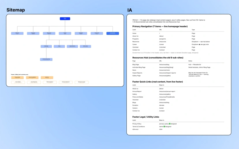
Seven primary destinations and one Resources parent, with every label mapped to a URL — including the two gaps the mapping exposed.
Stage 02 — Restructuring
Before any visual work, I rebuilt the map. A visitor arrives doing one of four things: understanding the work, verifying the organisation, giving money, or offering time. The old navigation served none of those — it served the org chart.
Thirty-seven destinations became seven, and the nine scattered properties were consolidated into a single filterable Resources hub with one visual language and a path from any piece of content to any other.
37 → 7Navigation destinations
4 → 2Clicks to content
9 → 1Separate properties
37 destinations
7 destinations
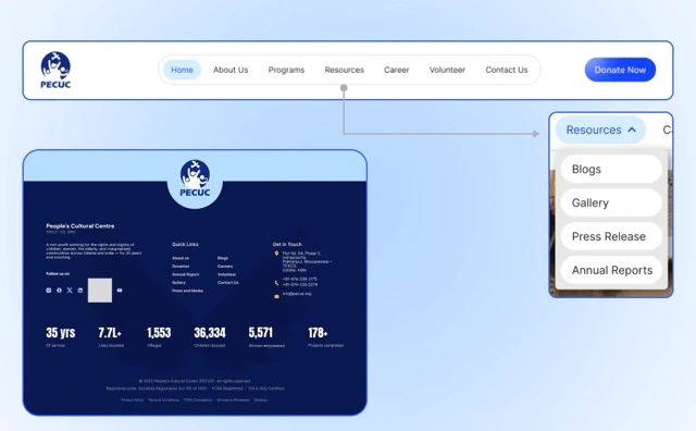
The same content, reorganised around what a visitor came to do instead of how the organisation is structured.
Stage 03 — Building the visual language
Photography first
PECUC's team gave me their programme archive — children in classrooms, women from the self-help groups, community gatherings. Around 90% of the site's imagery is theirs, from the field. Faces lead every section.
Colour from their own history
Blue from their logo as primary, carrying the structural weight. Yellow added as an accent, used sparingly.
Type that makes long headings land
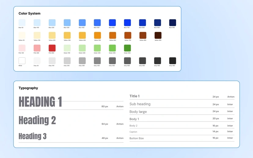
Anton for display, Inter for everything else. NGO headings run long, and condensed display type holds a full sentence together as one unit.
A system that survives non-designers
One reusable card pattern carrying every content type — programme, news item, story, report, gallery album — plus PECUC's first documented design guide.
UX principle — Picture superiority effect
People remember and trust images far more reliably than text alone. Leading every section with a real photograph instead of a paragraph isn't a style preference here — it's the fastest way to make "this is real" land before a single word is read.
The design guide — the organisation's first.
Stage 04 — Iteration
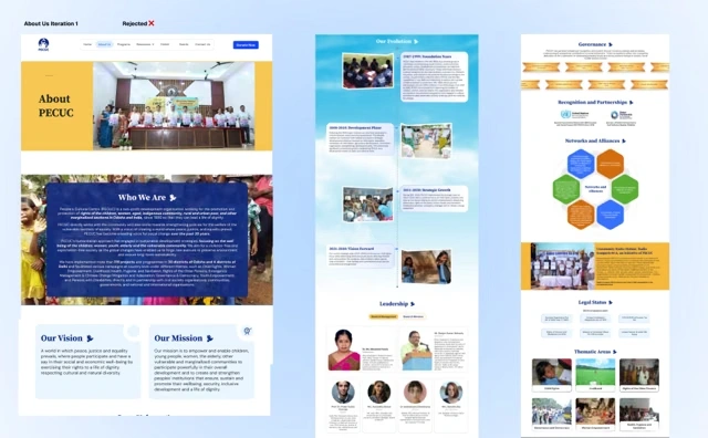
My first layout didn't survive client review, and it's still in the file because it earned its place in this story.
The client liked the type. Liked the colour. Didn't like the layout. So the visual language I'd built was right and the arrangement wasn't — a far better failure than the reverse, because a system that survives its first layout being thrown out is a system, not a lucky composition.
I redesigned the structure, kept the identity, and version two was approved. A round of small fixes followed, and the file went to development.
Version 1 — rejected
Version 2 — approved
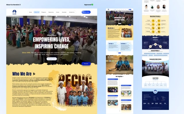
Same type, same palette, different arrangement. A system that survives its first layout being thrown out is a system.
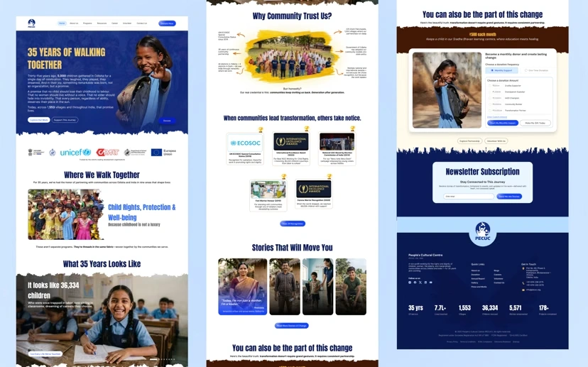
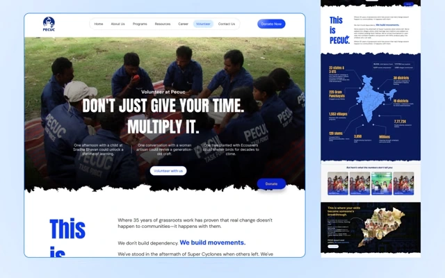
Homepage
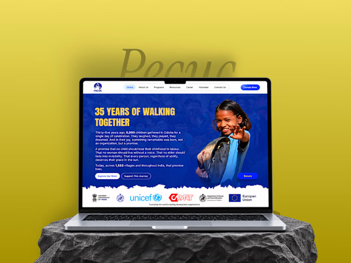
The approved layout carried through to the built homepage — photography-first, one heading, one clear next step, and the hierarchy the old slider never had.
Stage 05 — Designing the two broken journeys
There was no funnel to improve here. Donation and volunteering both had to be designed from a blank page.
Donation became a tiered calculator — frequency first, then named tiers tied to real programmes: Sradha Supporter, Grandparent Guardian, AADI Champion, Community Builder, Transformation Partner. Trust signals — FCRA, ISO, financial transparency — sit at the moment of commitment.
UX principle — Hick's law
The more choices someone faces — or the less bounded a choice is — the longer it takes to decide, and the more likely they abandon it. An open amount field is technically one field but an infinite decision. Five named tiers turn that into a fast pick.
Volunteering became a staged signup, replacing a printable PDF.
01
Who you are
Name, contact, location — everything a volunteer can answer without thinking.
02
What you're drawn to
Which programmes and causes they want to work on.
03
Availability
When and how often, so the match is real before anyone follows up.
Donation
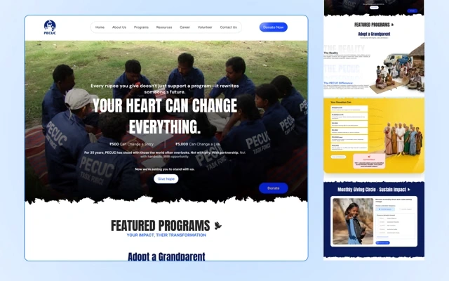
Volunteering
The two journeys that had no funnel to improve. Donation asks which part of the work to belong to rather than for a number; volunteering asks three questions instead of shipping a PDF to print.
The decision log
Every significant call, what drove it, and what it cost.
Make their photo archive the design, not the decoration
Why
Stock photography signals an organisation describing work rather than showing it, and PECUC had 35 years of receipts. Their own field photography now leads every section at full bleed.
Tradeoff
The design is dependent on image quality — a weak photo breaks a whole section, where the old boxed layout hid everything equally. Roughly 10% is AI-generated where the archive couldn't supply an image, and none of that stands in for programme evidence.
Keep their blue, add yellow
Why
After 35 years, that blue is the organisation — replacing it would have thrown away recognition I didn't create. Yellow signals youth and warmth for an organisation working with children, and prosperity, which is the outcome every programme reaches for. Institutional trust plus hope, in the first screen.
Tradeoff
The inherited blue constrained the palette. A free choice might have given a fresher result — it would also have made the site look like someone else's.
Cut 37 navigation destinations to 7
Why
Preserving everything preserves nothing. A visitor has one question, not thirty-seven. The top level was rebuilt around visitor intent rather than organisational structure.
Tradeoff
Compliance content — FCRA, tenders, ISO, board documents — left the top level for About. A serious donor still finds it in one click, but it no longer greets every first-time visitor. That was a real cost I accepted deliberately.
Consolidate nine properties into one Resources hub
Why
The old site's real failure wasn't that content was hard to find — it was that finding one thing led nowhere. One system means a path from any piece of content to any other.
Tradeoff
PECUC lose the ability to run each property independently. Everything now depends on one publishing model being maintained.
Replace the volunteer PDF with a staged signup
Why
Every step between intent and action loses people, and the old flow had six — download, print, fill by hand, find an address, email, wait. Staging looks like it adds steps but removes them, because the visitor never faces a wall of fields.
Tradeoff
Multi-step forms can raise abandonment if the stages feel arbitrary. Ordering them by what a volunteer can answer immediately is what makes it work.
Before and after
Old-site capture on the left, new design on the right.
The hero — before
The hero — after
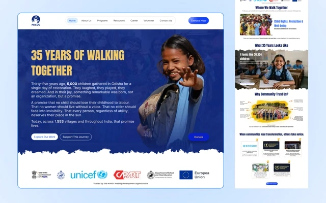
A slider is what you build when you can't decide what matters most.
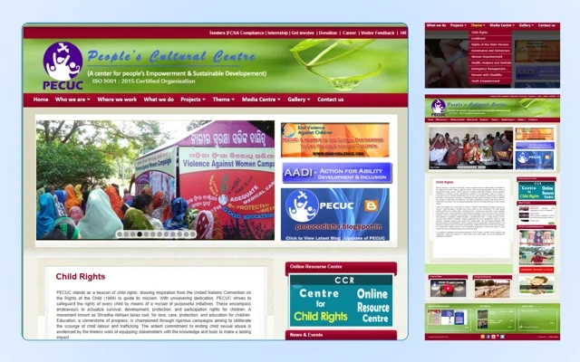
Programmes. Nine themes sat inside a dropdown, which meant the work itself was something you had to go looking for. The rebuild puts them on the page as a section you scroll past rather than a menu you open.
Programmes — before
Programmes — after
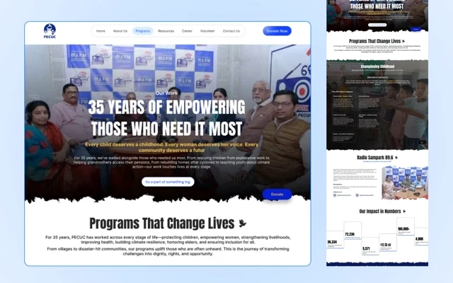
Anything that constitutes proof belongs on the page, not in a menu.
Two more pages were doing real organisational work behind a presentation that undid it.
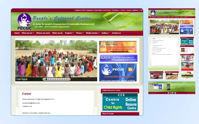
Careers. The old page read like a noticeboard — roles as undifferentiated links, nothing about what it's like to work there. The rebuild leads with the work and the people, then the openings.
Careers — before
Careers — after
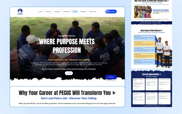
A careers page is a recruitment argument, not a list of vacancies.
Press and media. Thirty-five years of regional coverage — the most credible proof an NGO has — was sitting in an undated list of raw links.
Press — before
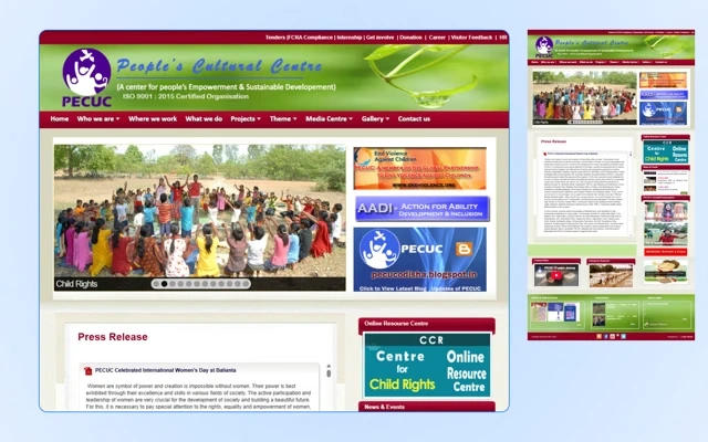
Press — after
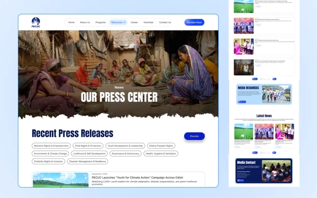
Coverage someone else wrote about you is worth more than anything you write about yourself — if a visitor can tell what it is and when it ran.
Outcome
Scope
15 pages — homepage through 404, privacy and terms.
Identity
A visual design guide: Anton/Inter type system, a blue-yellow palette drawn from their logo, and photography-first layout rules.
Structure
Navigation 37 → 7, clicks to content 4 → 2, nine sub-sites consolidated into one filterable hub.
Journeys
A tiered donation calculator and a staged volunteer signup, both designed from scratch.
System
A card-based component library built to survive non-designers adding content.
Status
Approved, handed off, in development.
Client's words
Riyaz has a remarkable ability to balance aesthetic appeal with seamless user functionality. Thanks to his expertise, we now have a powerful, visually compelling web presence that resonates with our community.
Ranjan Kumar Mohanty — Secretary-cum-CEO, PECUC
What I'd do differently
Document as I go
I reconstructed this reasoning afterwards. The reasoning held; the record didn't.
Test the tiers with a real donor
I set the amounts and programme mappings without talking to anyone who had given to PECUC before.
Design for the content editor
The card system works when filled correctly. I didn't fully solve for a staff member pasting a headline twice as long as the template expects — which is exactly how the old site decayed.
What it taught me
Visual design is an argument, not a coat of paint
Every choice here exists to make one claim: this organisation is real, and the work is real. Once I knew that was the argument, every decision got easier.
The best material is usually already there
I didn't create PECUC's credibility — 35 years of photographs and UNICEF's logo did. My job was to stop the design from hiding it.
(003)
ATRC STEM Career Test
STEM career assessment for UAE school students
Like this project
Posted Sep 6, 2026
Redesigned PECUC's 15‑page site: consolidated IA, photography‑first visual language, component library, tiered donation calculator and staged volunteer signup.