Alchemy Brews - Beer Brewery Brand Identity Design
Brand identity and packaging design for a beer brewery
As the name suggests, the founders of Alchemy Brews have a love for the medieval and the beer they produce takes inspiration from its ancient chemical origins. With such a strong visual theme to play with, this project could either be a walk in the park for a designer or an overdone and cheapened, novelty drink that its mature target audience may turn their nose up at. The care and attention in a project of this type, therefore, are essential for remaining focused on the audience whilst dealing with potentially playful and eccentric imagery. The main challenge is to design a visual identity that is relevant to the client's somewhat out-there vision whilst still being sophisticated and desirable to the intended drinkers.
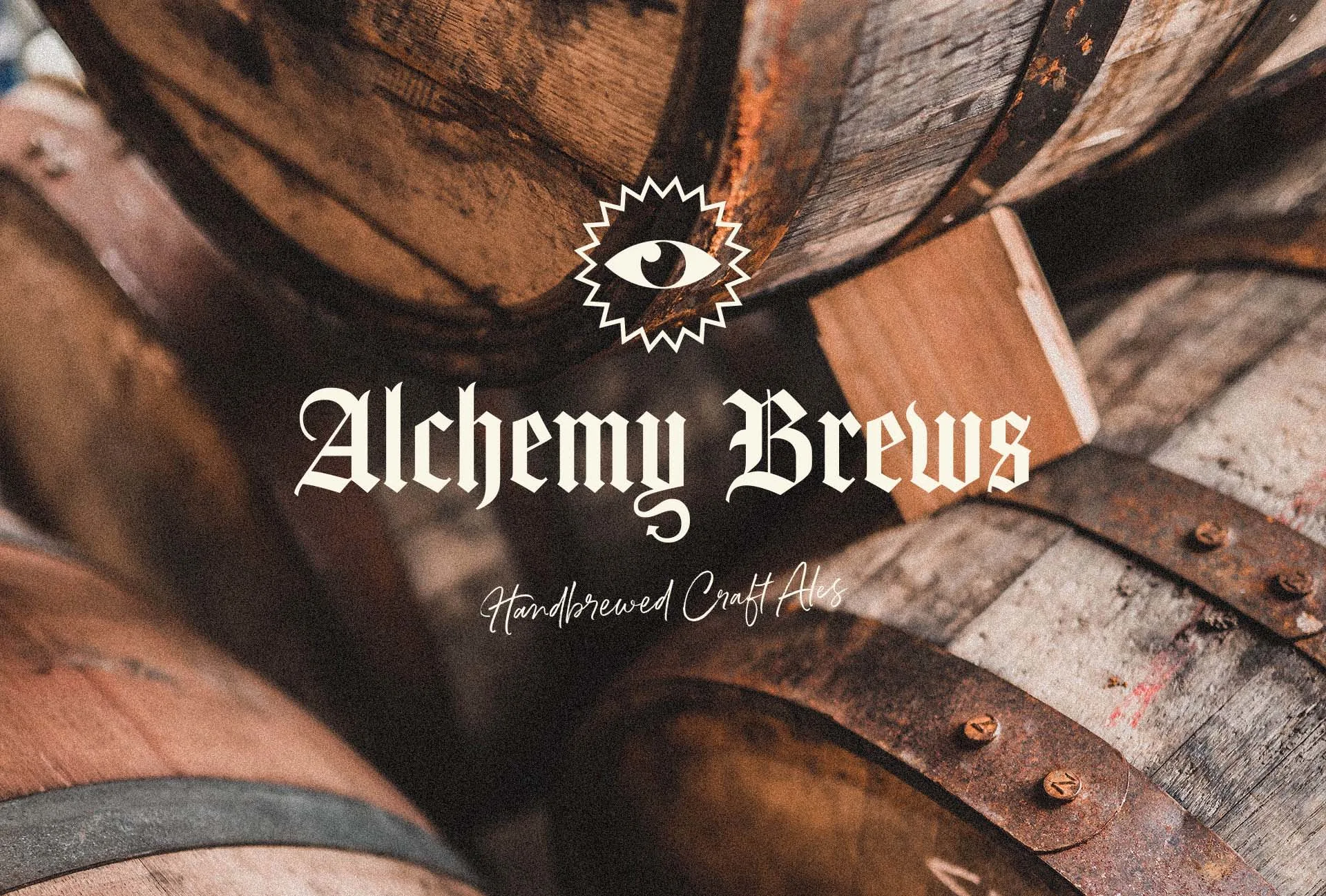
As more and more breweries are popping the cap on the market the visual techniques being used to represent their businesses can be far and wide, with all parties attempting to grab your attention any way they can, using bright colours, detailed illustrations and eccentric logos. The risk here is that beer isn’t the only canned or bottled beverage and you want your business to be instantly recognisable as what it is when it hits the shelves. This can be achieved by using some (but not too many) of the common tropes of the industry whilst still keeping yourself looking fresh and different from the competition.
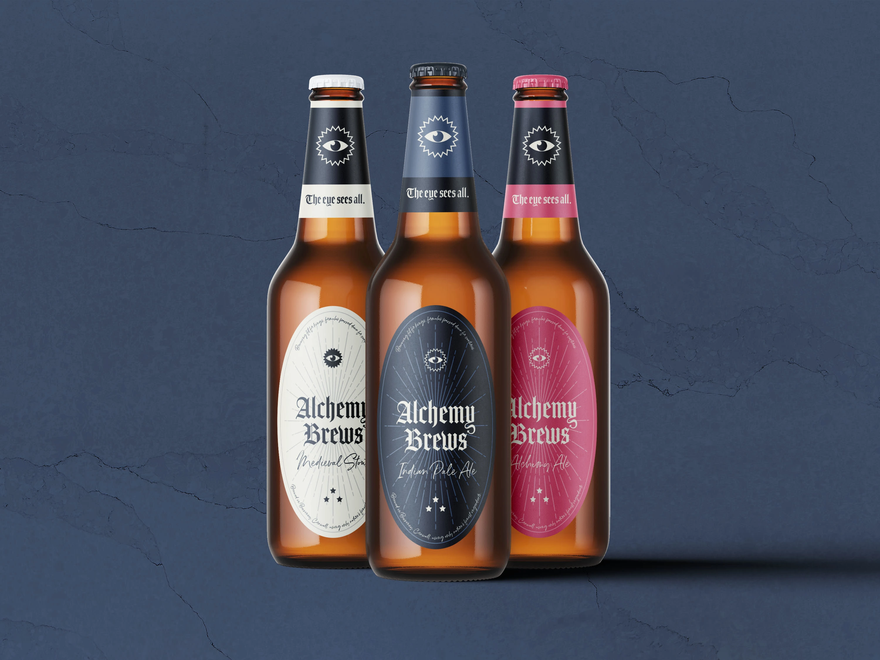
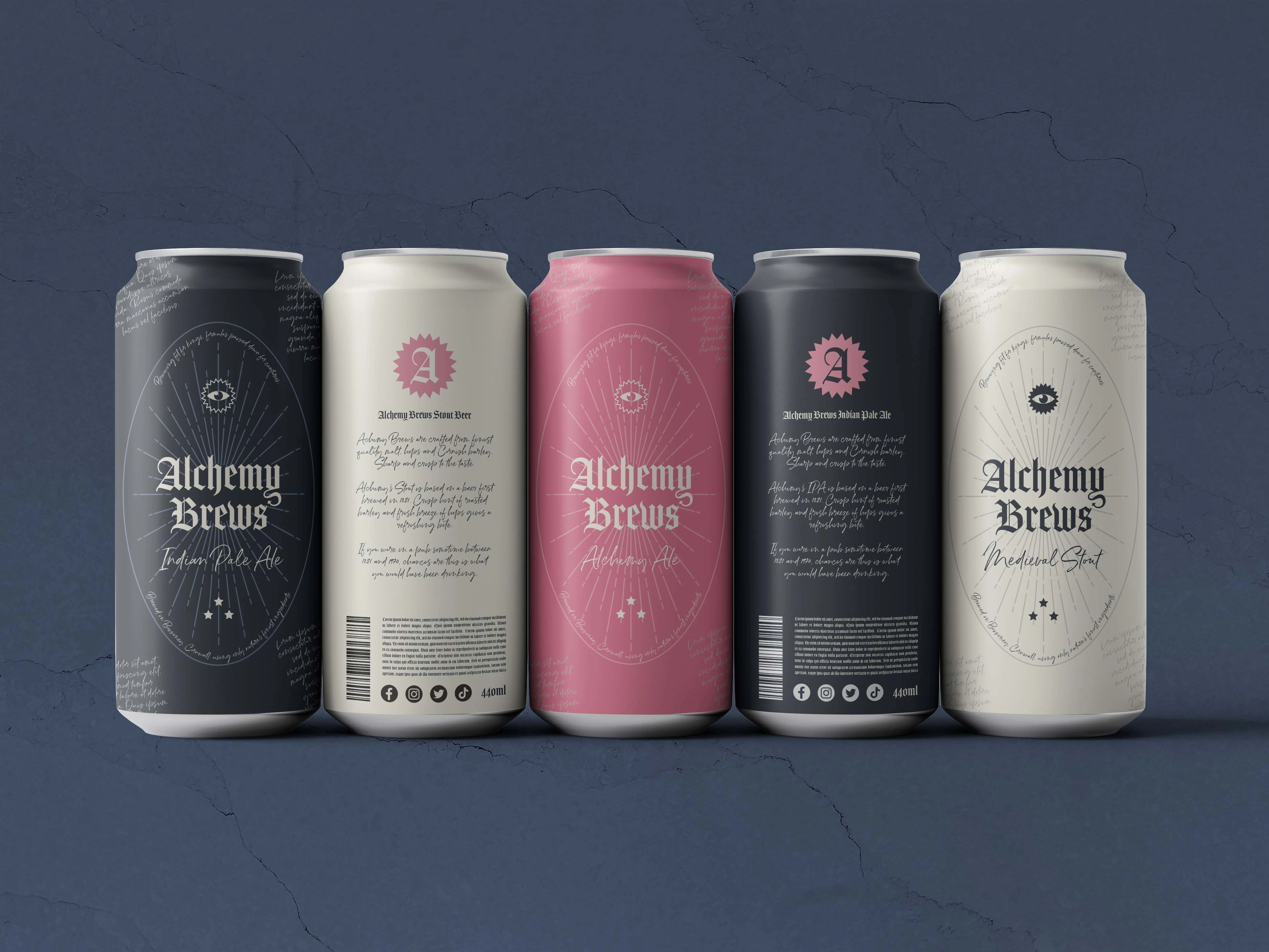
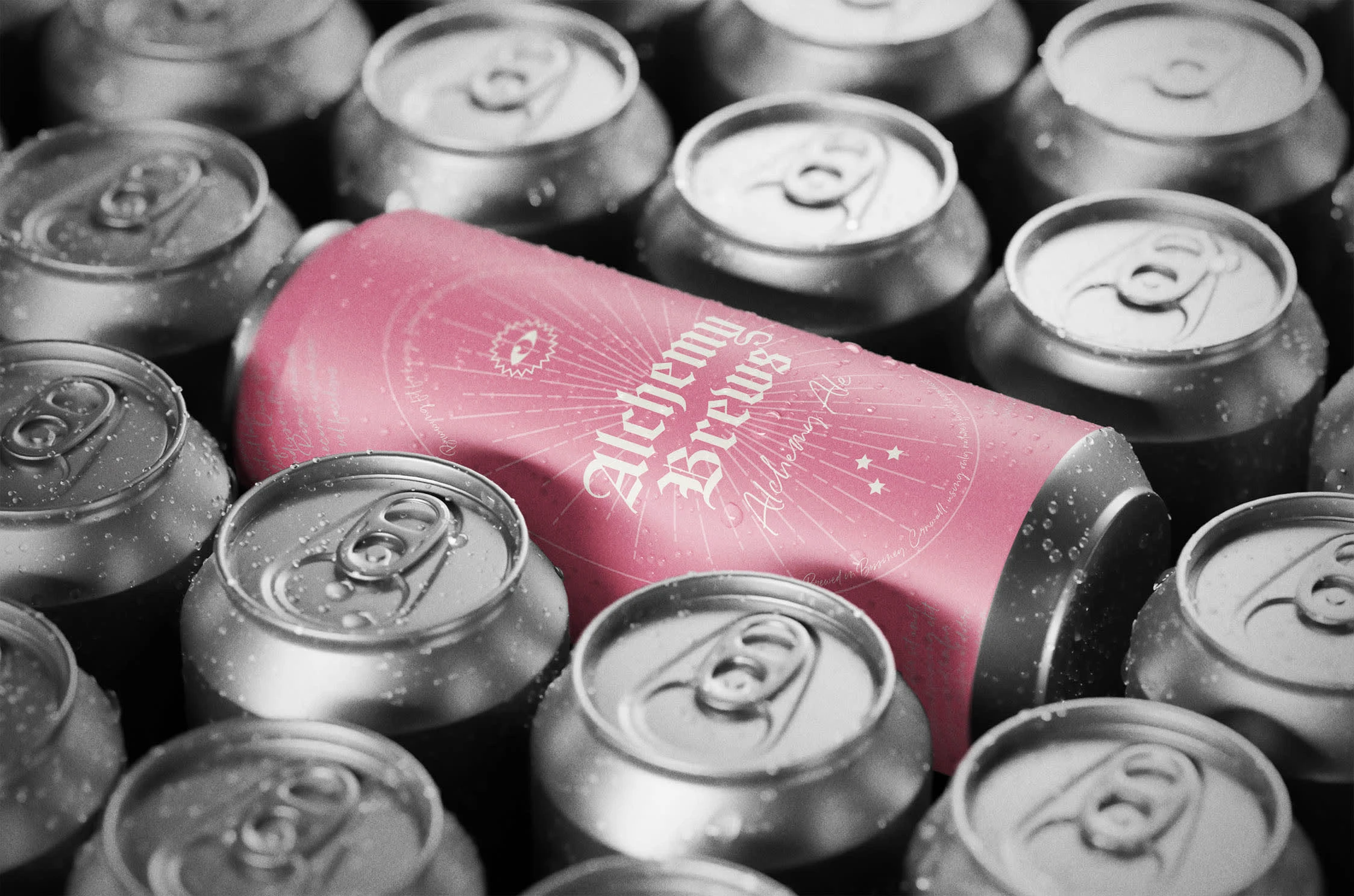
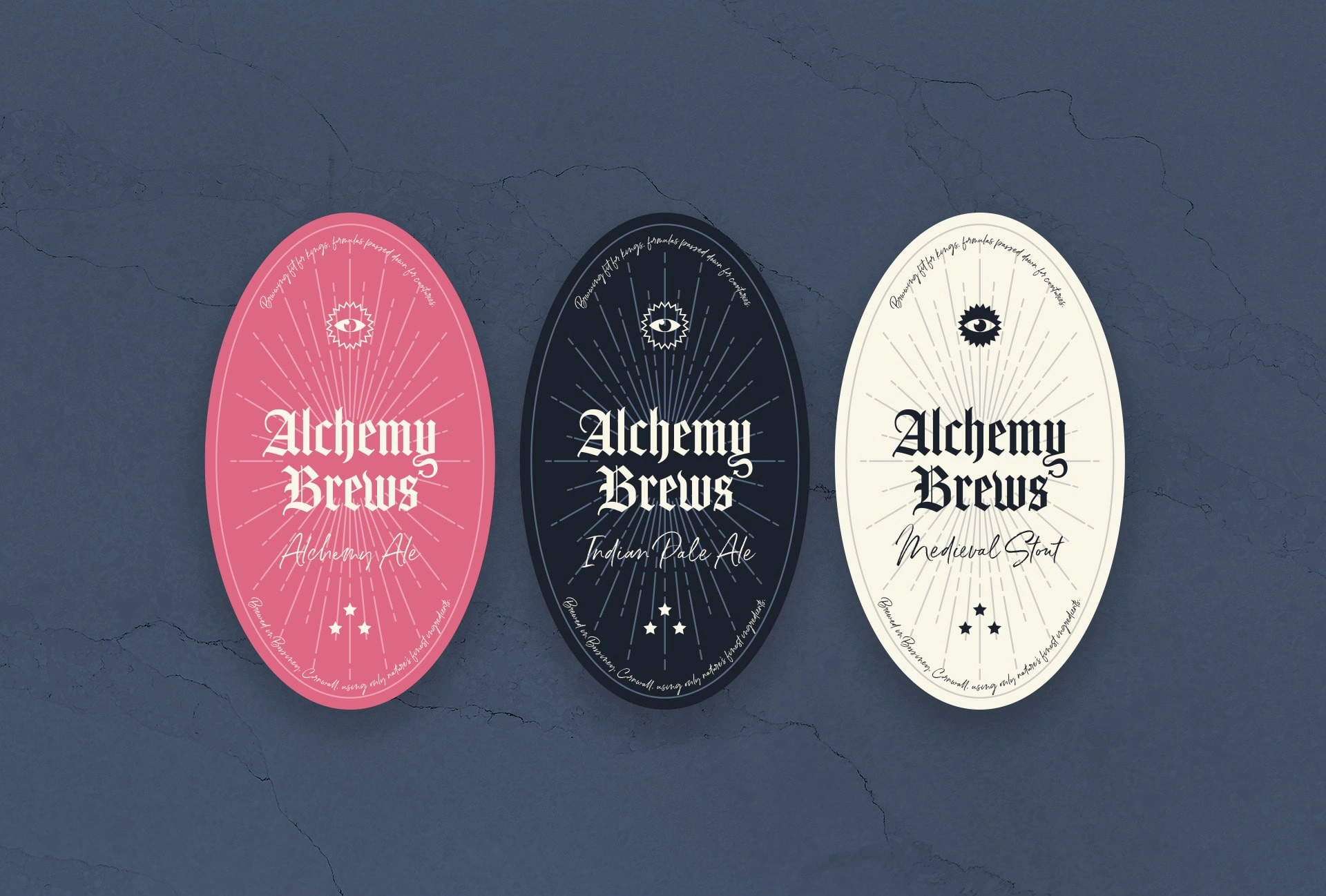
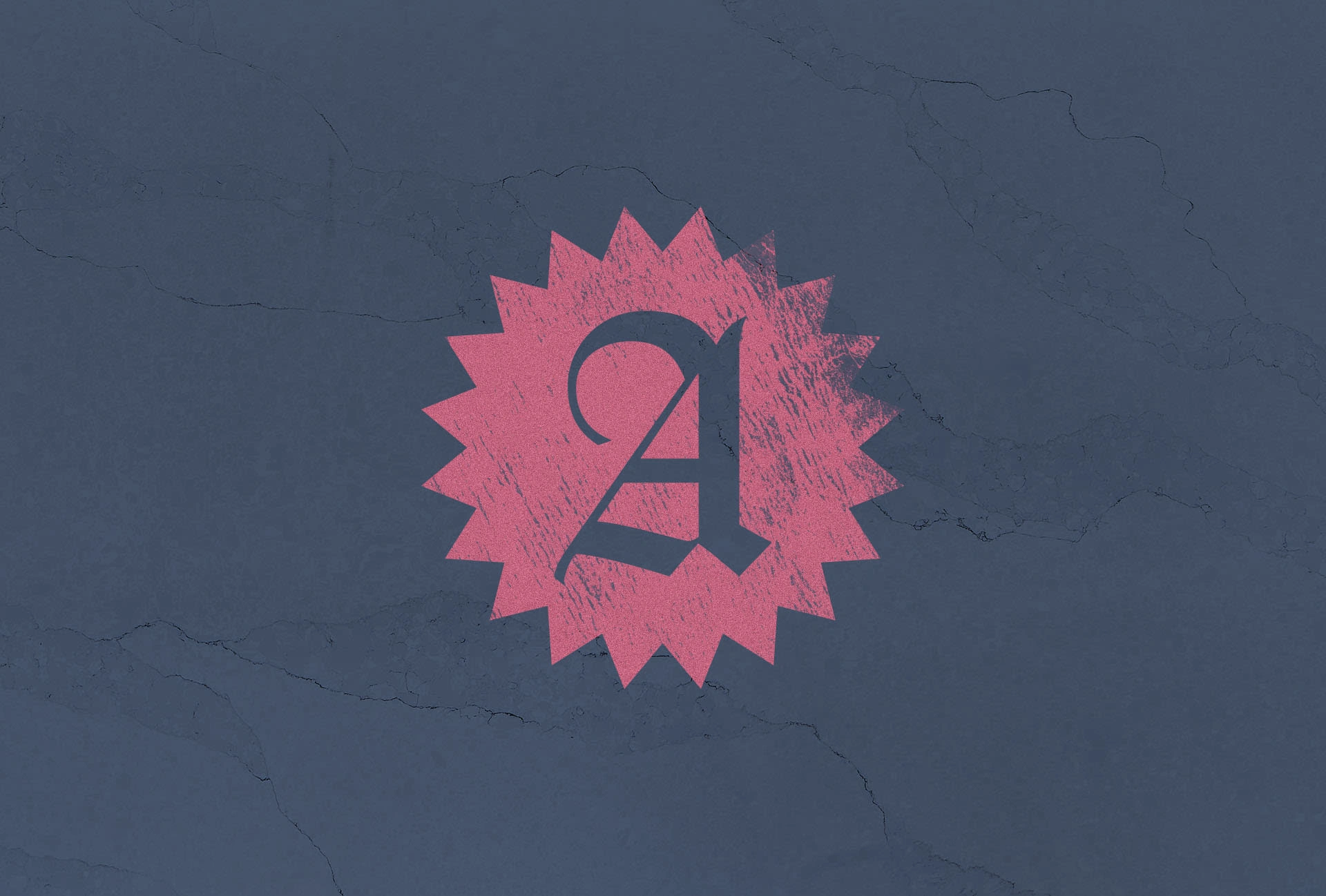
One trope that was particularly relevant here was the use of blackletter and gothic typefaces in beer logos and packaging which immediately captures a medieval character for our logo and packaging designs whilst also indicating that this can most likely contains beer. For colours I chose a stoney off-black and an off-white parchment, these converge with what you’d expect from a beer brand and double as representations of foamy dark stout beers as well as the recipe writing of alchemy and time period of the underlying theme. With these elements anchoring the products in the right market, I then added the garish, potion-esque pink shade to give it a bit of life and disrupt the usual conventions of beer packaging and branding.
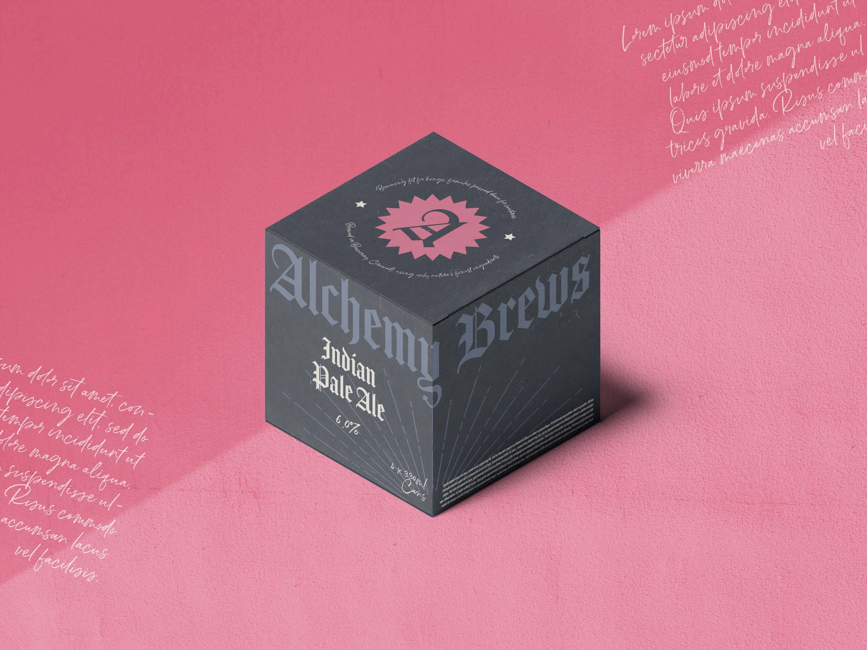
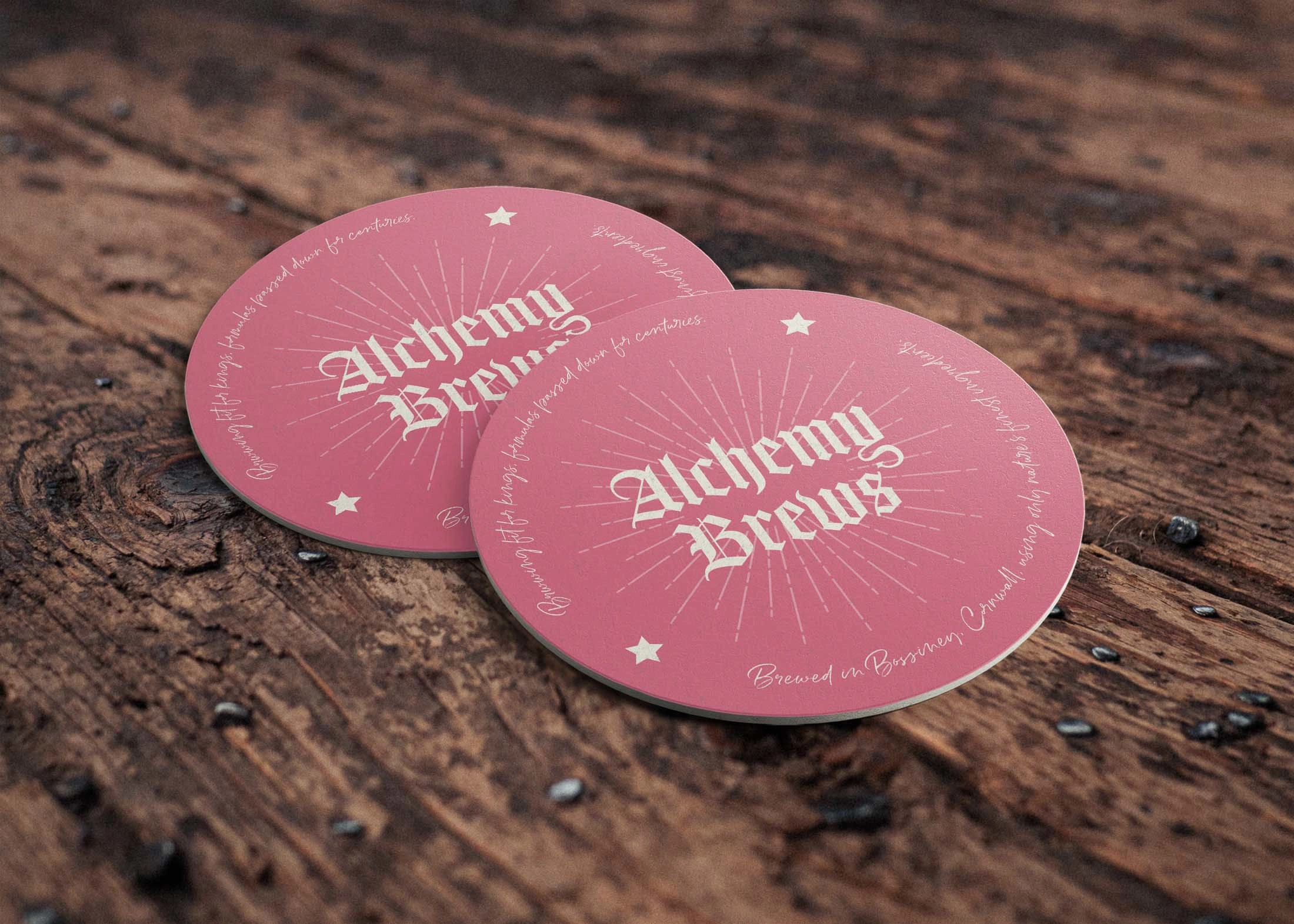
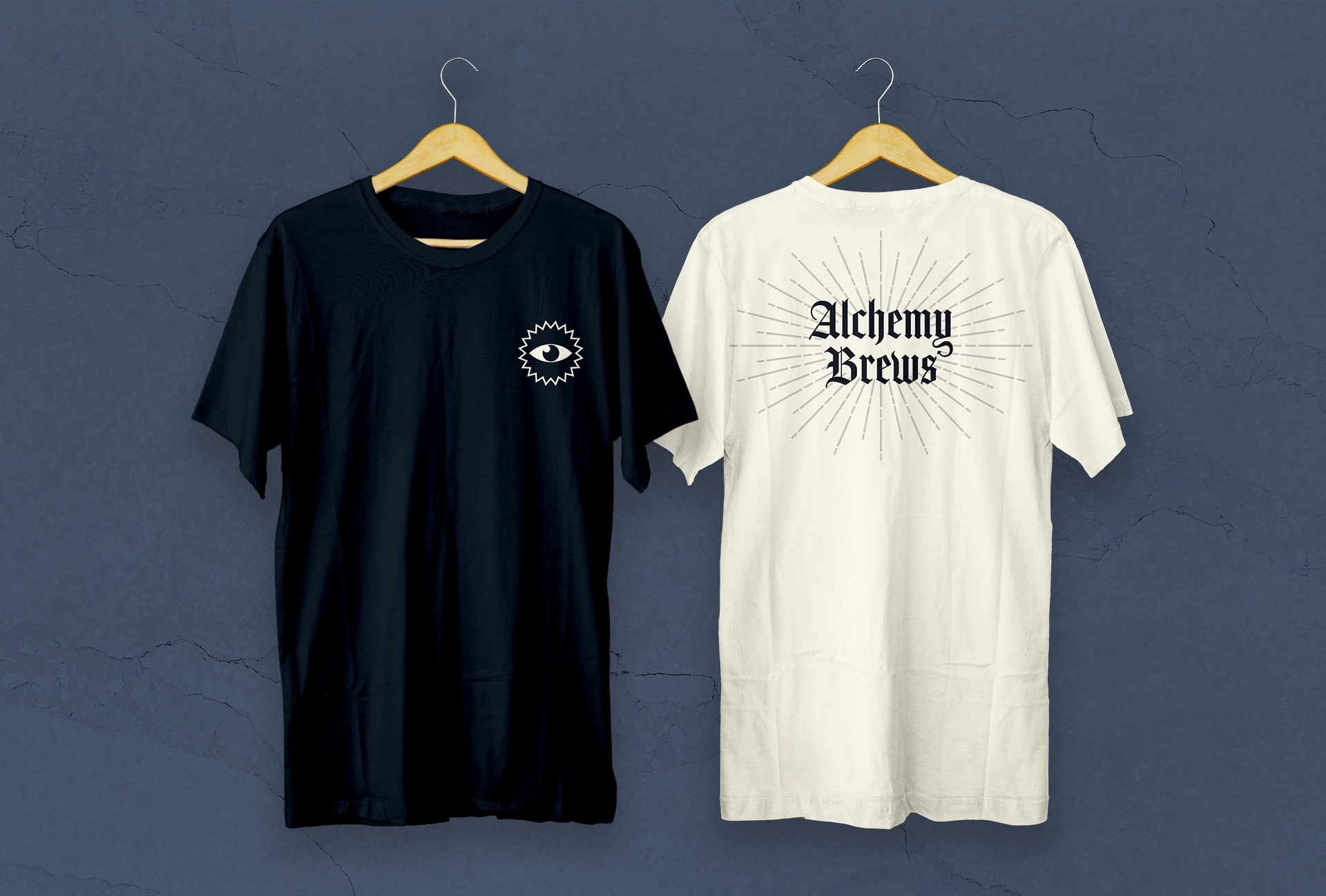
As a simple accompanying icon, I designed an all-seeing eye, resonant with ancient alchemy imagery. This is used as a central figure for the artwork or a supplementary badge or stamp depending on the application. The Y letterform also gave the opportunity to illustrate a tail and add a bit more medieval mischief to the composition whether this is a dragon, devil or goblin’s tail is up to the imagination and adds a bit of intended mystery to the brand. The ingredients and brand story adorns the can designs in a vintage script font as if handwritten by scholars and scientists of old. Behind the typography and detailing lies a simple patterned illustration of a shining light source, suggesting a magical higher power or divinity to the product. These visual elements culminate into a vivid visual identity of wizardry, magic and history.
Like this project
Posted Aug 21, 2023
Brand identity design for a beer brewery with a medieval message. Deliverables include logos, product packaging, and merchandise designs.

