Oooh Pho - Vietnamese Restaurant Brand Identity Design
Brand Identity Design for a Vietnamese Restaurant
Oooh Pho is a traditional Vietnamese restaurant titled after one of the country’s star dishes. With the cuisines growing popularity with modern western audiences they needed a brand identity that would appeal to a modern audience whilst remaining true to its roots. The challenge here presented itself in the awkward title, 2 words being 4 letters and then 3 letters respectively and a whole lot of them being Os.
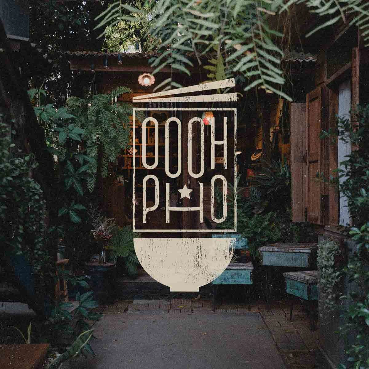

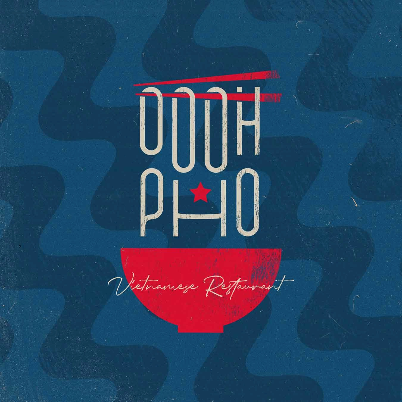
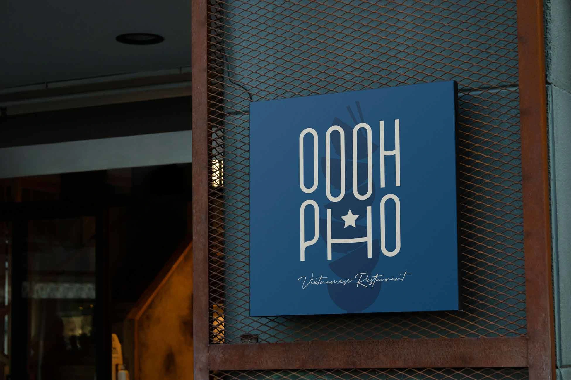
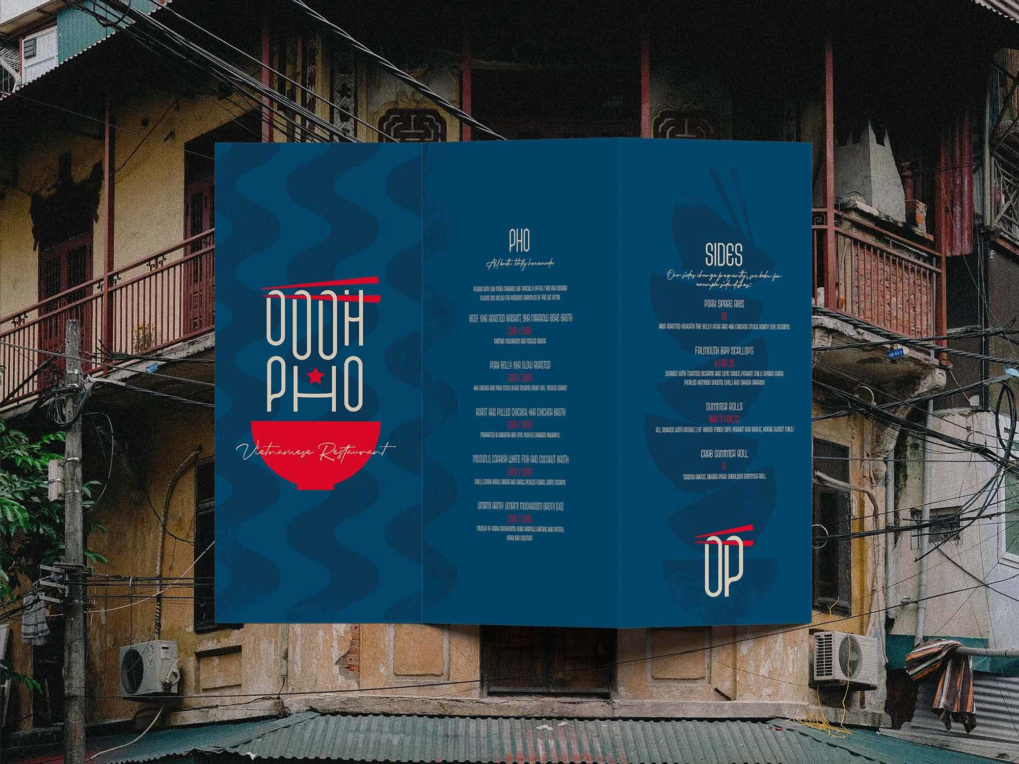
The amount of Os, used with an appropriate condensed font however presented the opportunity to resemble ramen noodles, a feature of the traditional Pho bowl. This also created more of a resemblance to a glyph for the logo rather than conventional English letterforms, giving us an oriental aesthetic to our English word marks without having to use a tacky, over-stylised font. Adding in the traditional Pho bowl and chopsticks gave balance and a bit of dynamism to the typography elements. The brand pattern made itself, using the iconic waves of ramen noodles as the basis for a simple striped patterning.
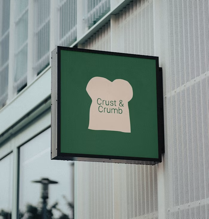
The brand artwork is finished with disturbed ink textures and subtle two-tone backgrounds, opting for rusticity, character and history over luxury and mainstream polish. The logo design and unique brand patterning equipped the restaurant to pack a punch with their printed assets and signage, standing out from the competition of high street restaurants with a refreshing, laidback and rustic approach.
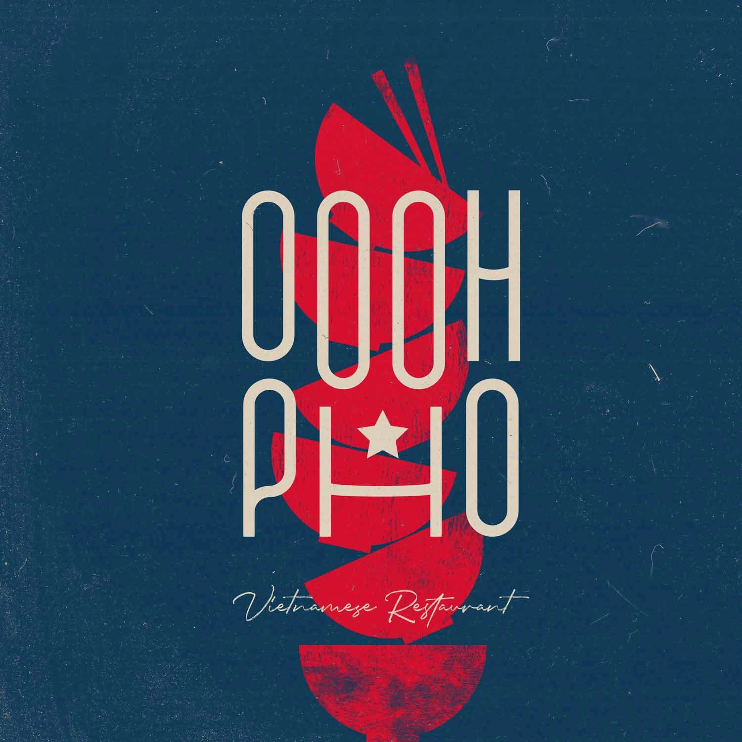
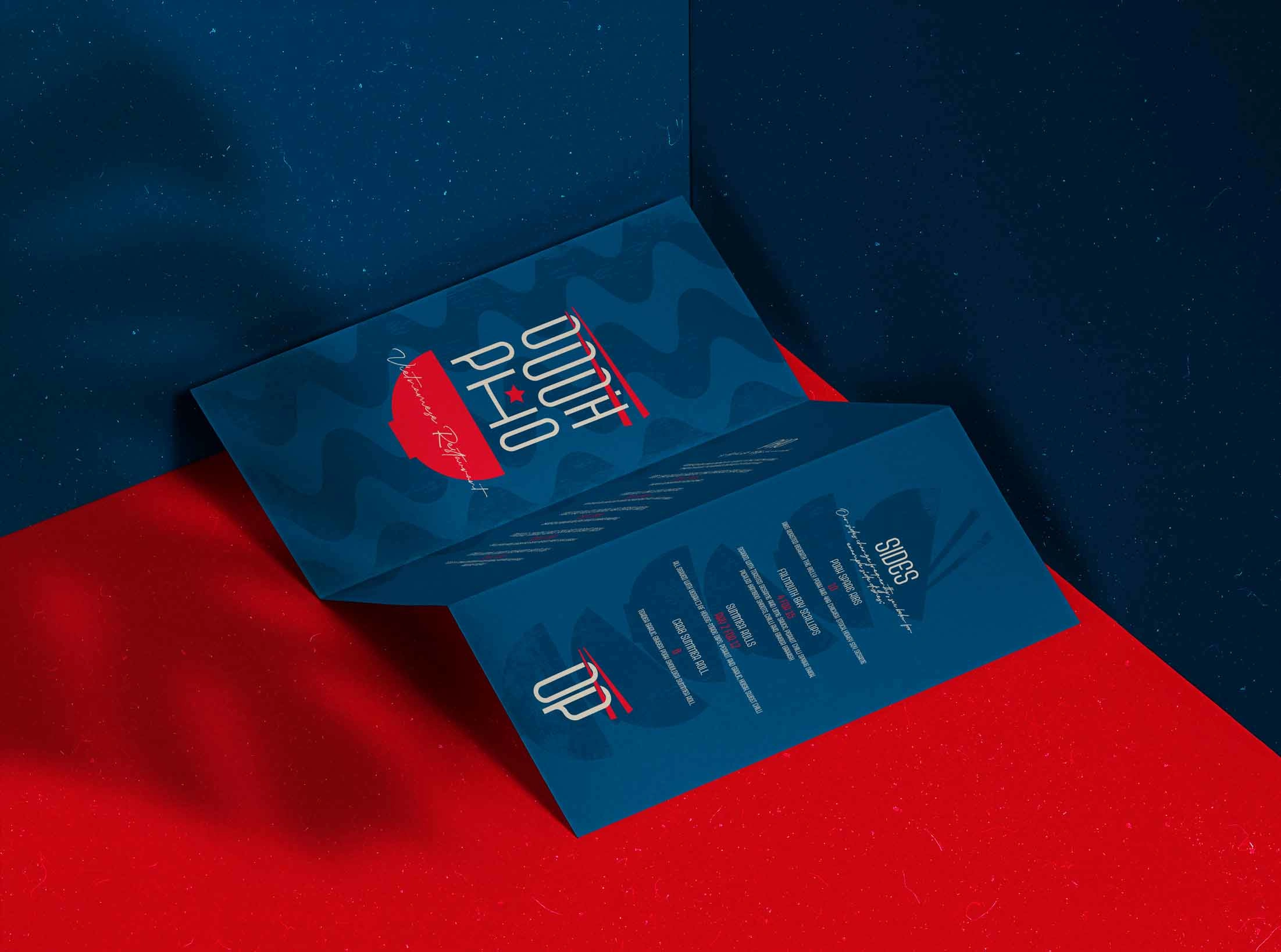
The brand artwork is finished with disturbed ink textures and subtle two-tone backgrounds, opting for rusticity, character and history over luxury and mainstream polish. The logo design and unique brand patterning equipped the restaurant to pack a punch with their printed assets and signage, standing out from the competition of high street restaurants with a refreshing, laidback and rustic approach.

Like this project
Posted Aug 21, 2023
Vietnamese restaurant brand design by Charlie Stopford Design. Includes full logo suite design, print asset designs and signage.

