Crust & Crumb - Sandwich Shop Brand Identity Design
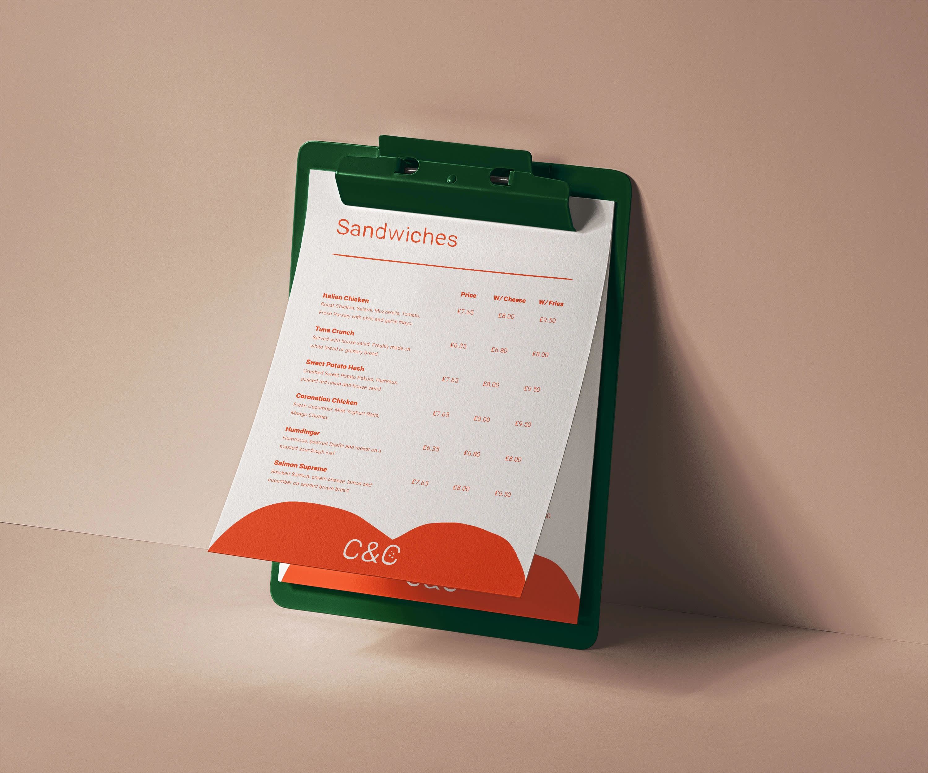
Crust & Crumb are local sandwich specialists. Providing the usual cafe essentials but with the addition of speciality sandwiches and toasties. The name gives a minimalist and classical energy to the business and the client desired a visual identity to match. Although new cafe businesses are in abundance in modern-day life, there is always the opportunity for a quaint and charismatic offering to capture the attention and loyalty of its locale with a touch of sophistication, style and charm. The business’ name refers to the humble slice of bread and this proved an interesting idea to work with. The simplicity and comfort of bread and toast and all that accompanies them is an iconic idea that most people can relate to and one that I hoped to communicate in designing a simple, charming and homely brand identity for this humble, independent little spot.
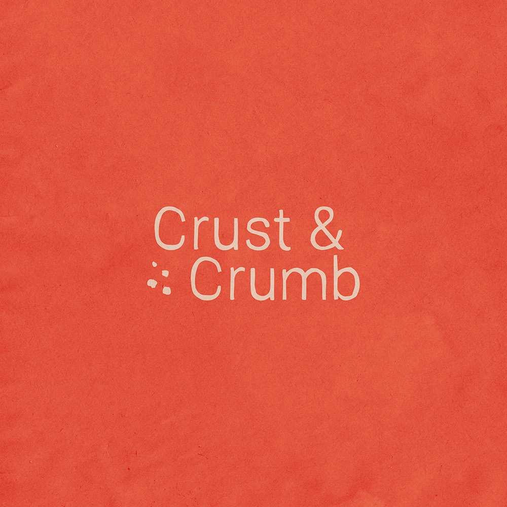
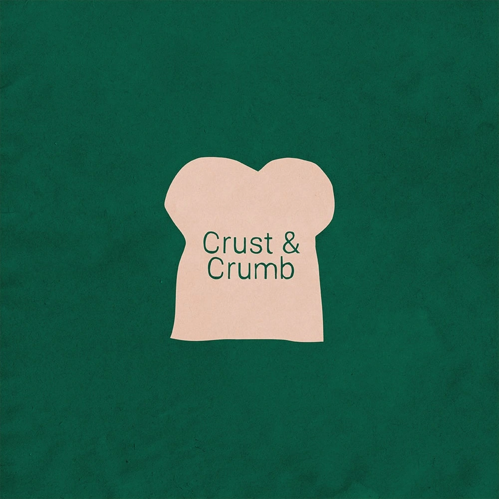
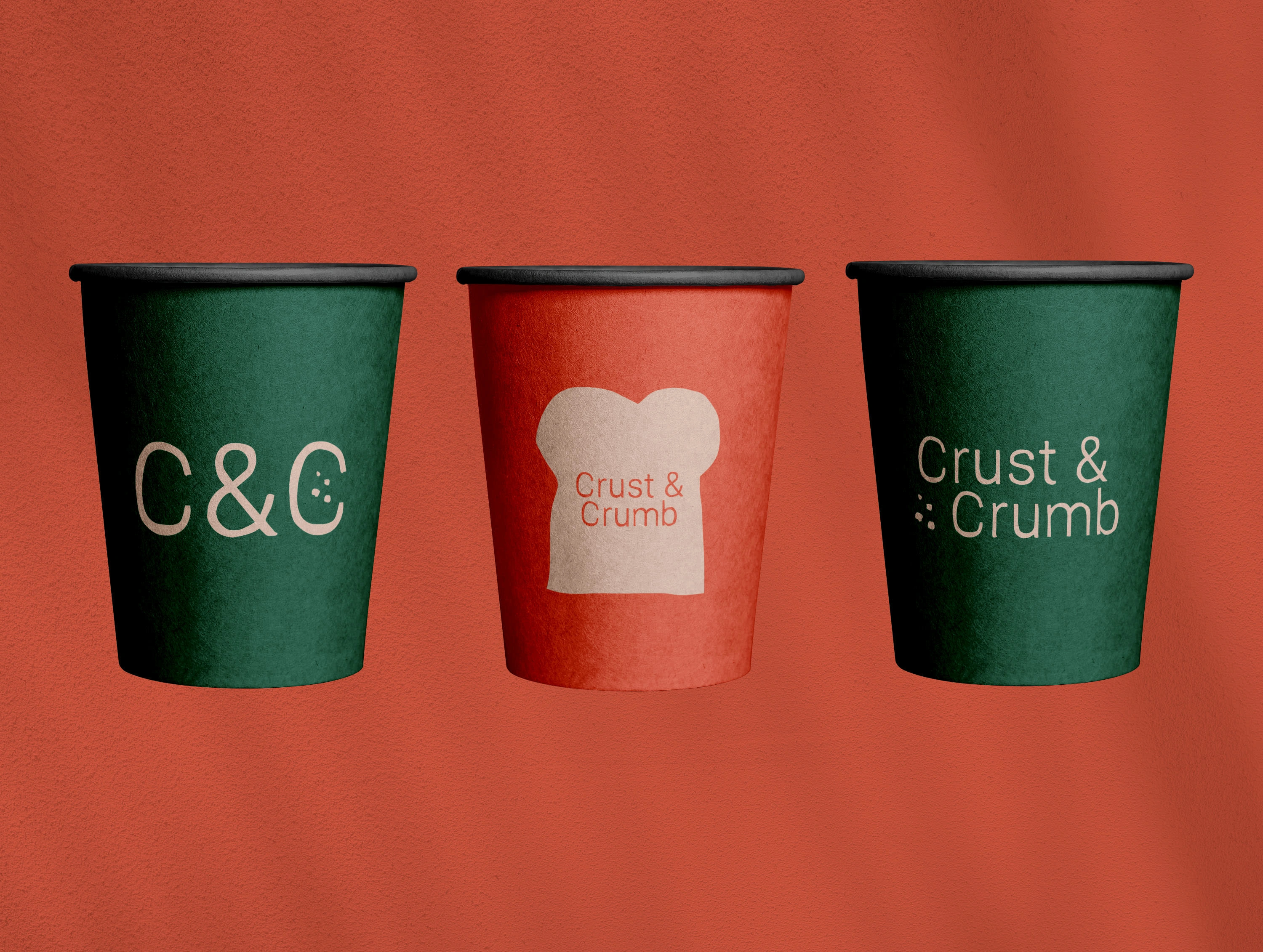
The typography design needed to be rustic and simple to build the foundation for this idea to take shape. I chose a font that had both these qualities and looked charming, standing alone without too much editing. The name and ampersand structure of the word forms lends itself to a lot of traditional, household brands that we all know and love and this played right into our hands, providing comfort and familiarity with the simple symmetrical quality and balance of the title. From here a rustic slice of bread icon seemed an intuitive next step and gave the primary logo design a bit more weight for applications needing a bolder presence. The toast illustration is rough around the edges and rugged like the font itself, playing on this idea of the rusticity of bread and the activities related to the simple enjoyment of it.
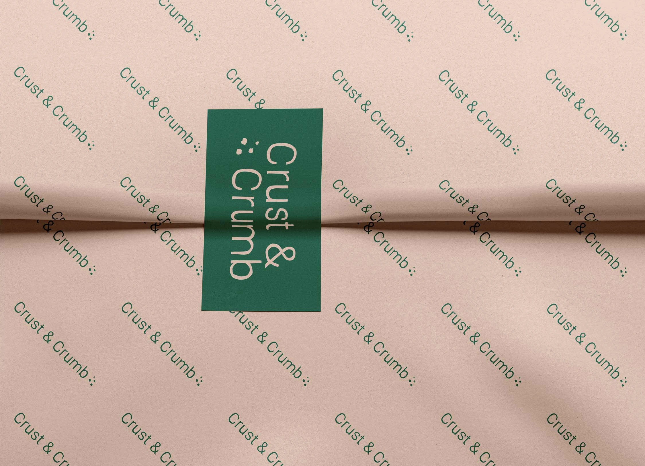
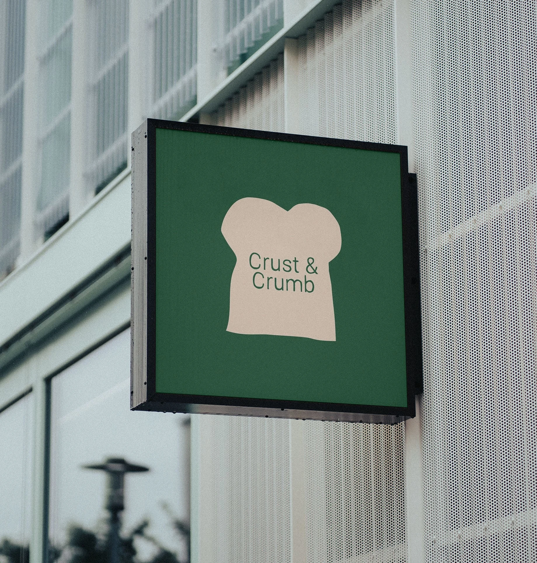
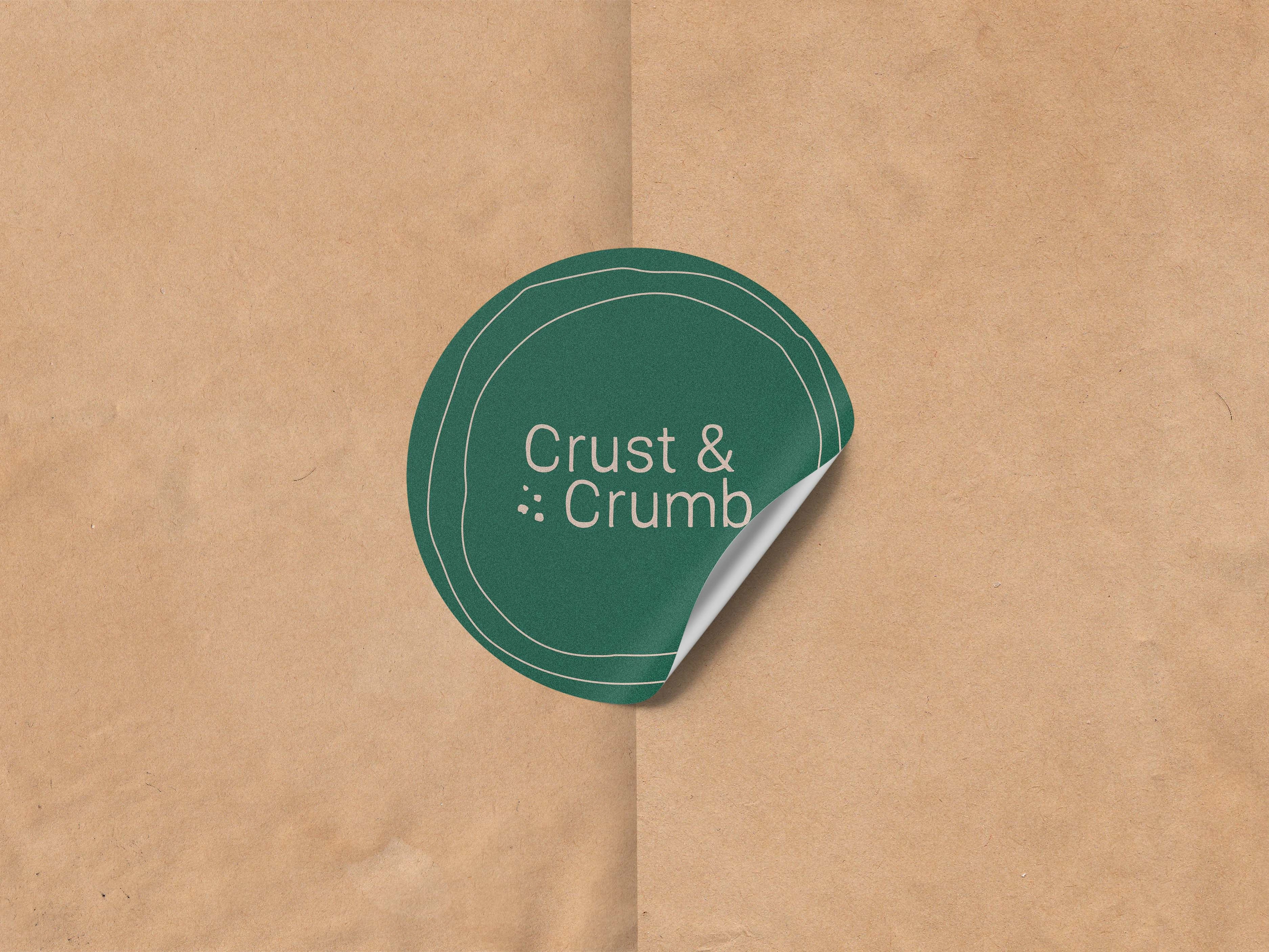
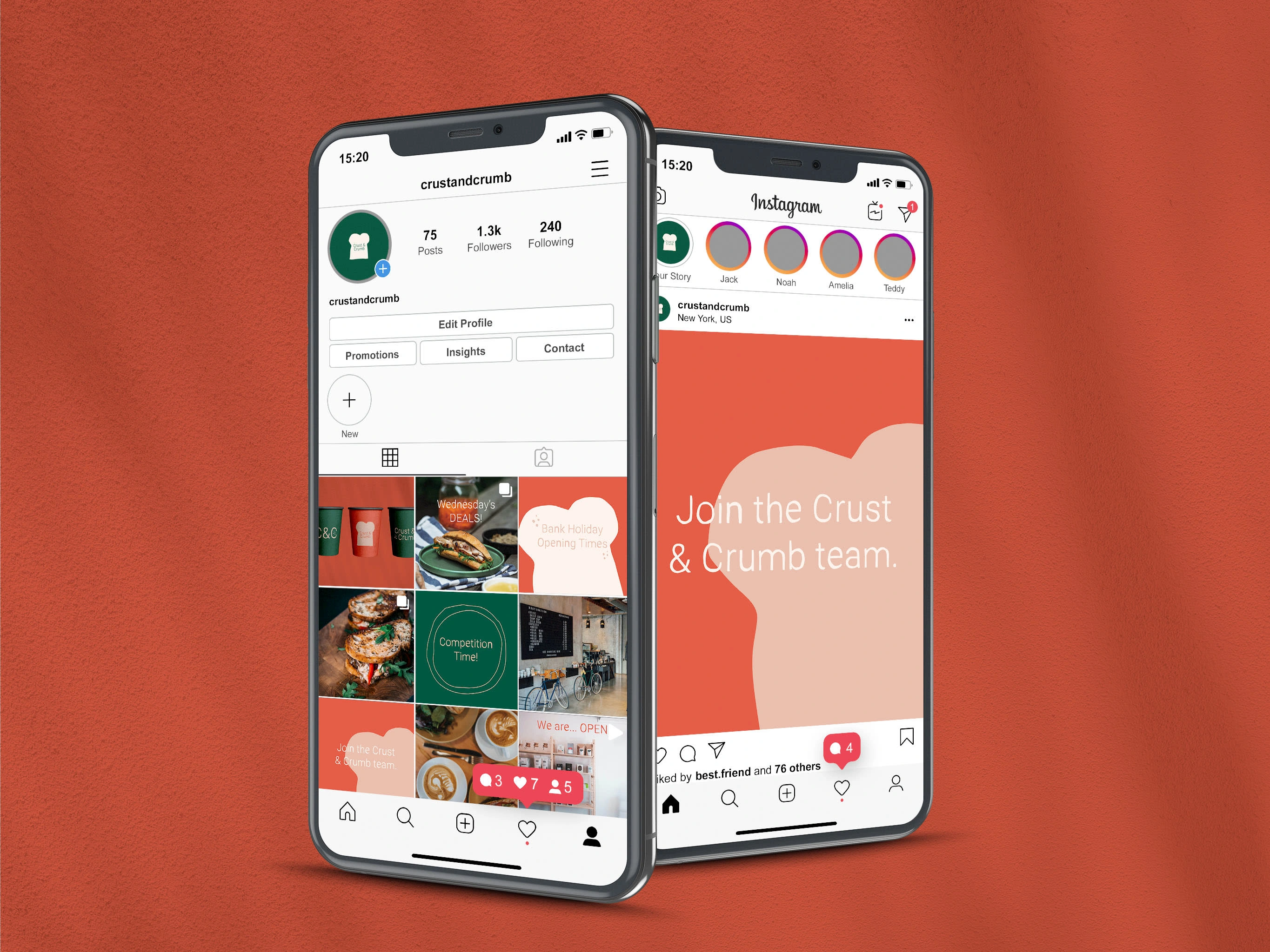
With this simple and humble type design in place, I added a few little crumb illustrations to add a little interest and a subtle idea that really brings the logos to life, cutely connoting the aftermath of enjoying toast or a sandwich and reaffirming the name. The simple, minimal form of the bread slice illustration lends itself to modern trends of using abstract shapes to create texture and interest on otherwise plain backgrounds. This therefore could be used as a trope for the brand and something that can provide audience recognition within the touchpoint of the business. The project’s aim was to communicate the cosiness, approachability and homeliness of the humble cafe in order to make it a go-to for locals wanting a no-frills, friendly and charming spot for their daily morning coffee and snack. This was achieved through an exploration of the most homely and comforting foodstuff there is, using its familiarity and long-standing reliability to embody the spirit of this business.
Like this project
Posted Aug 21, 2023
A brand design inspired by the essence of bread. Deliverables include logo designs, signage, food packaging and social media content designs.

