Level Fifty - Cocktail Bar Brand Identity Design
A new bar situated above the competition
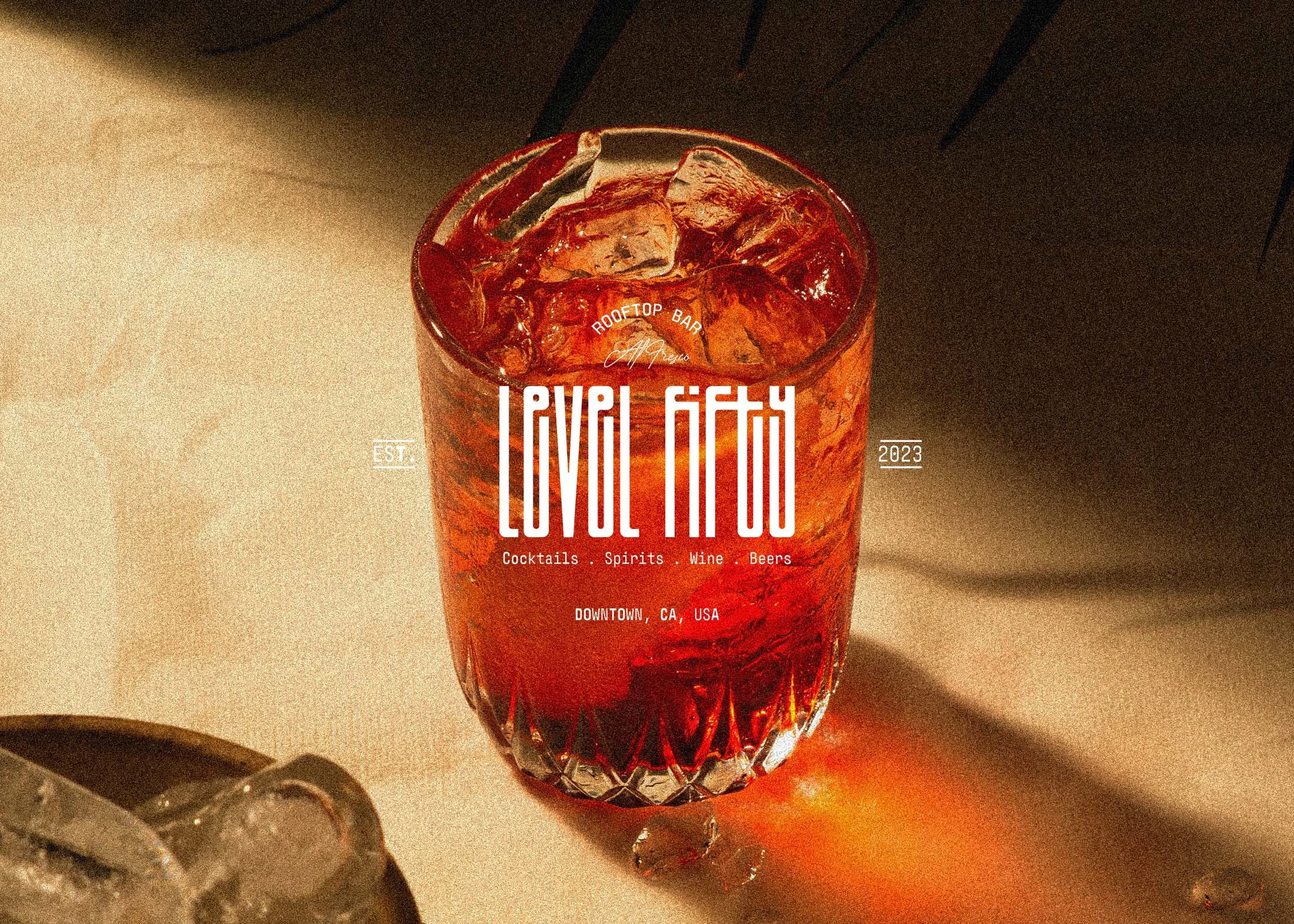
Primary Logo Design
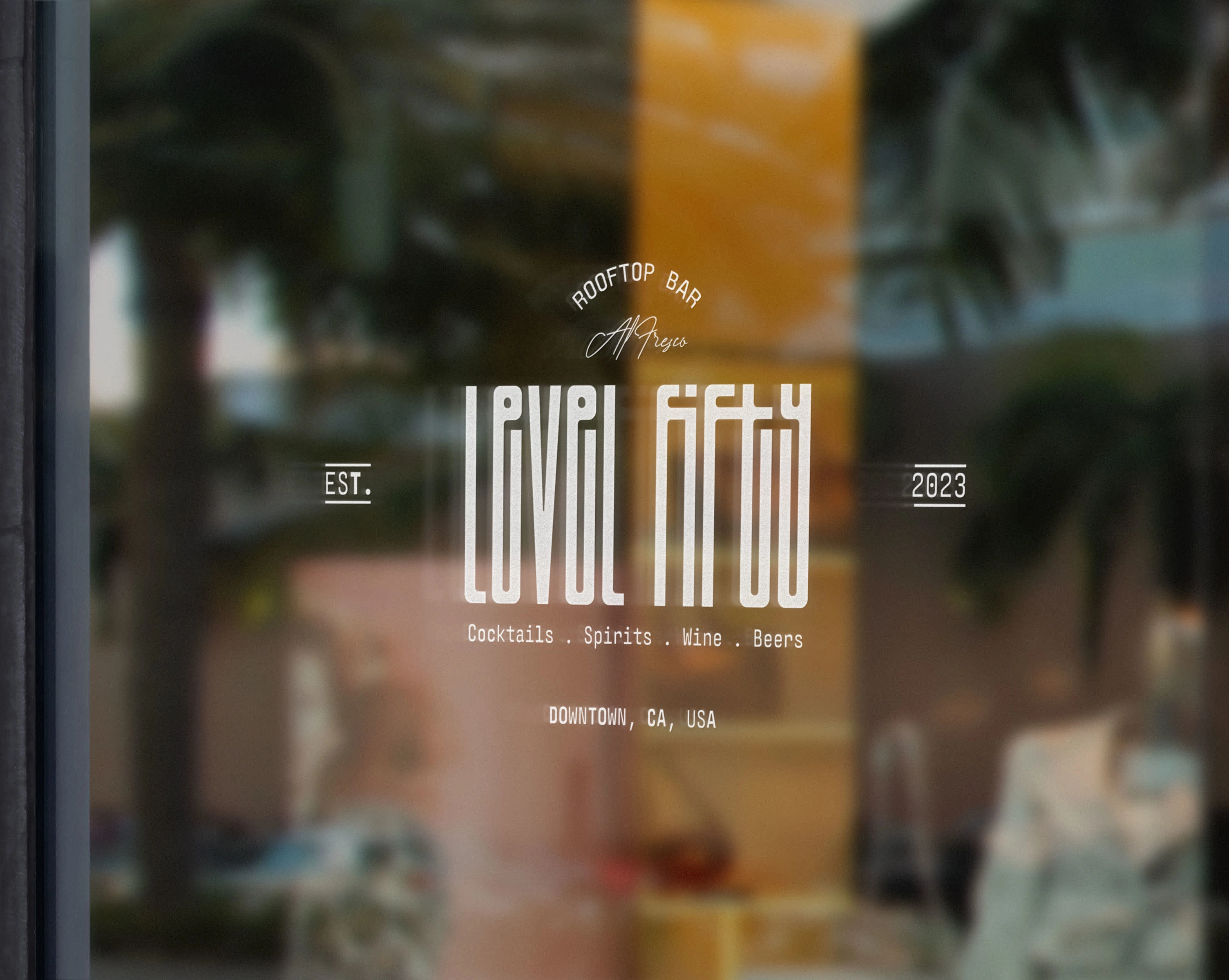
Bar Window Logo Display
Level Fifty is a cocktail bar with a unique, rooftop bar to soak up the summer sun whilst indulging in some luxurious refreshments. With this perfect selling point for all adult audiences, the business wanted to push the idea of drinking above the competition in its branding.
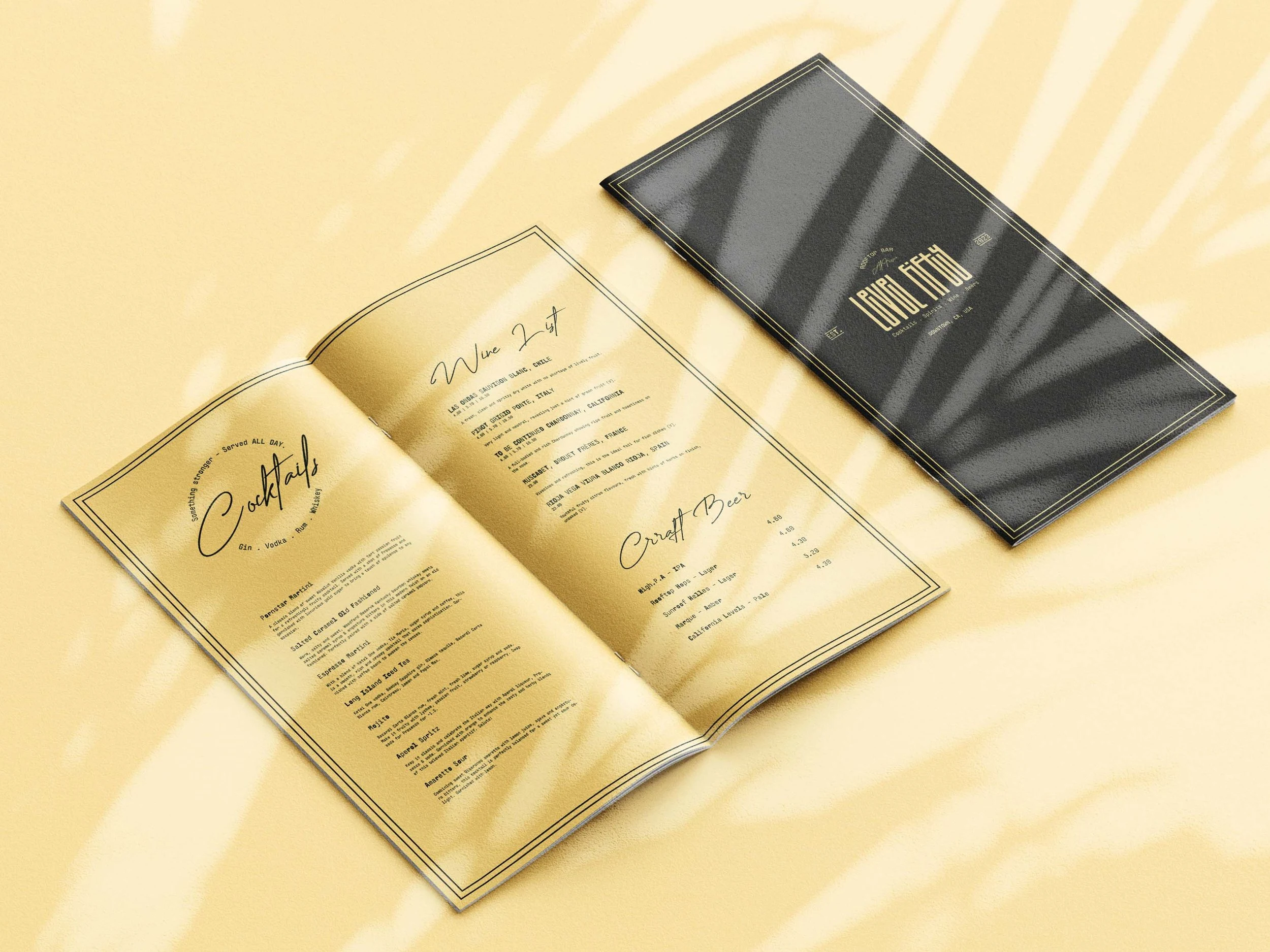
Cocktail and Drinks Menu Design
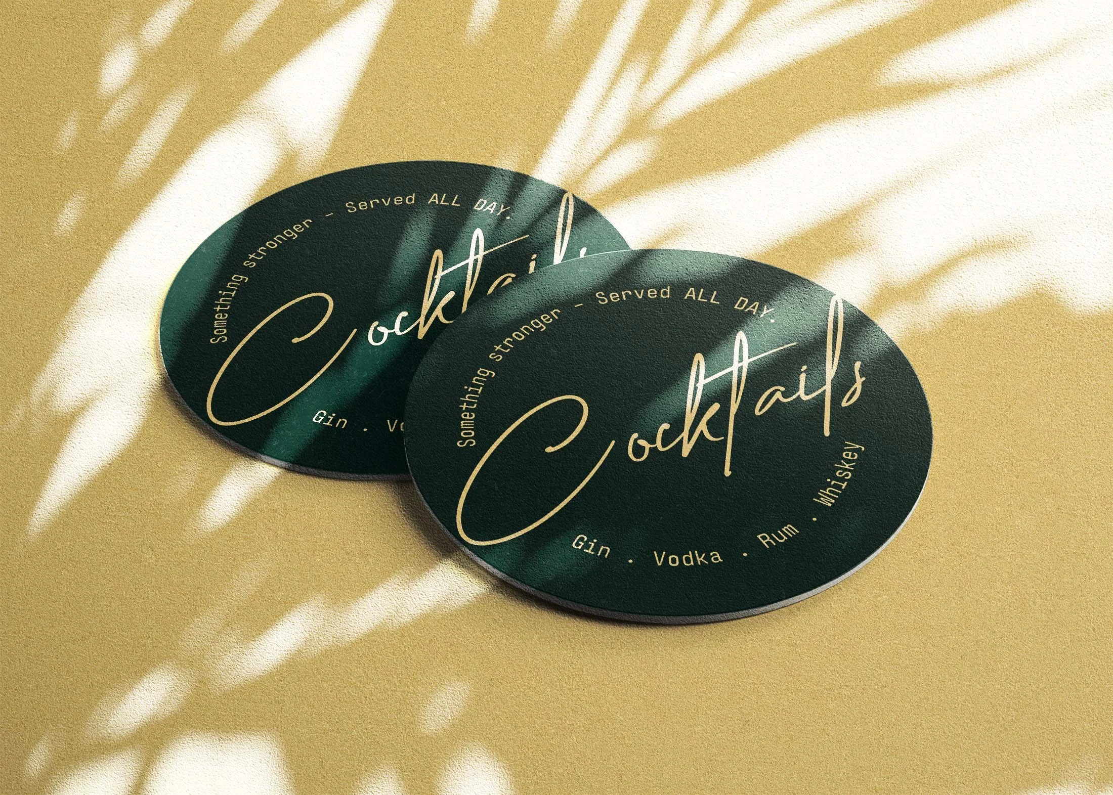
Coaster Designs
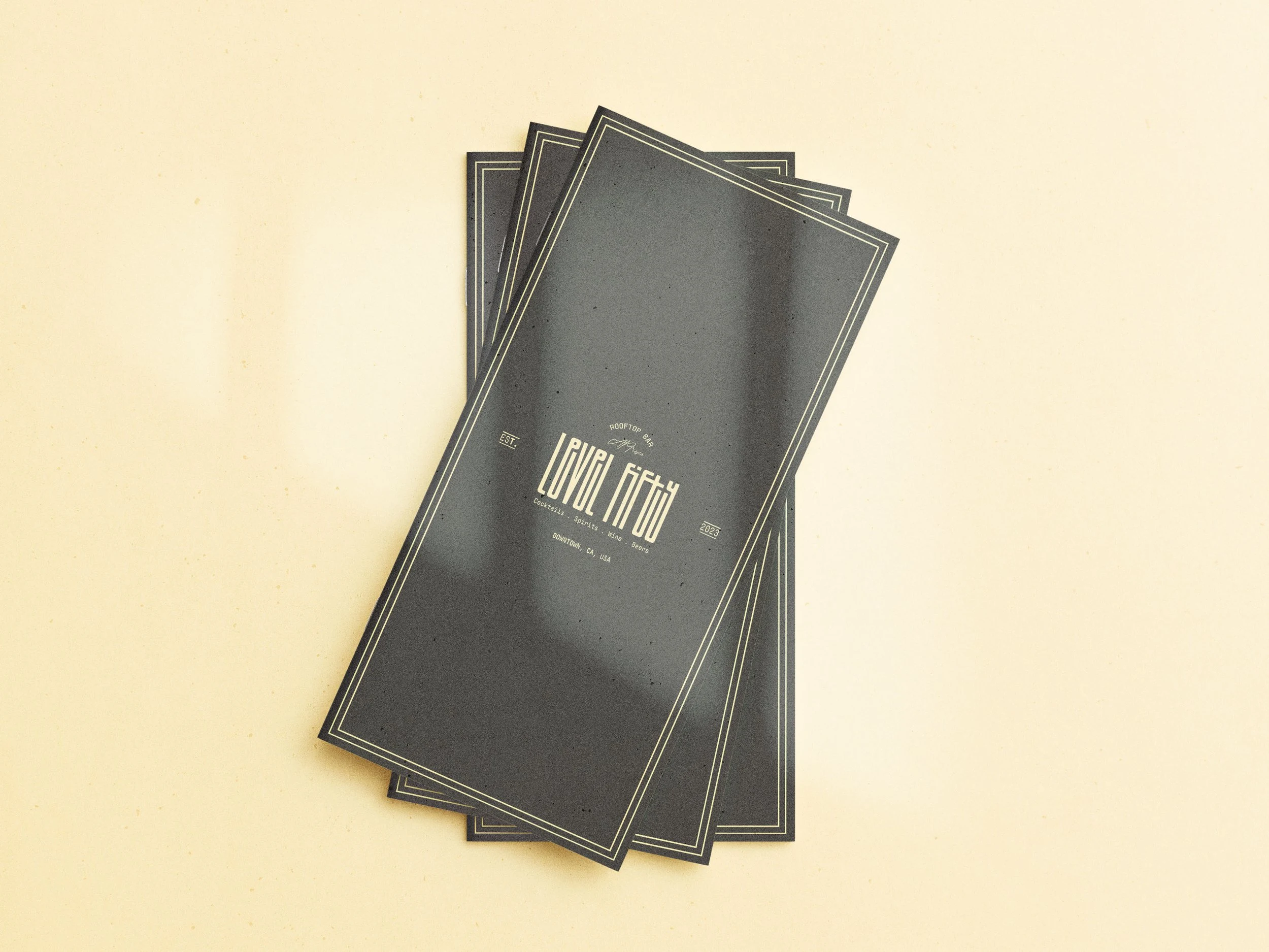
Menu Cover Design
With these themes and ideas at the heart of my design, I chose a typeface with a high counter to communicate the elevation of the bar and accentuated this further by delicately stretching the letterforms of the word mark logo. Adorned with typographic detailing reminiscent of traditional Mediterranean bars and restaurants the logo communicates ideas of rustic authenticity and summer. The marketing materials and print assets use lo-fi film photography of the bar and cocktails to push home the aspirations of the brand to be an idyllic summer, al fresco venue for drinks and good times in the sun.
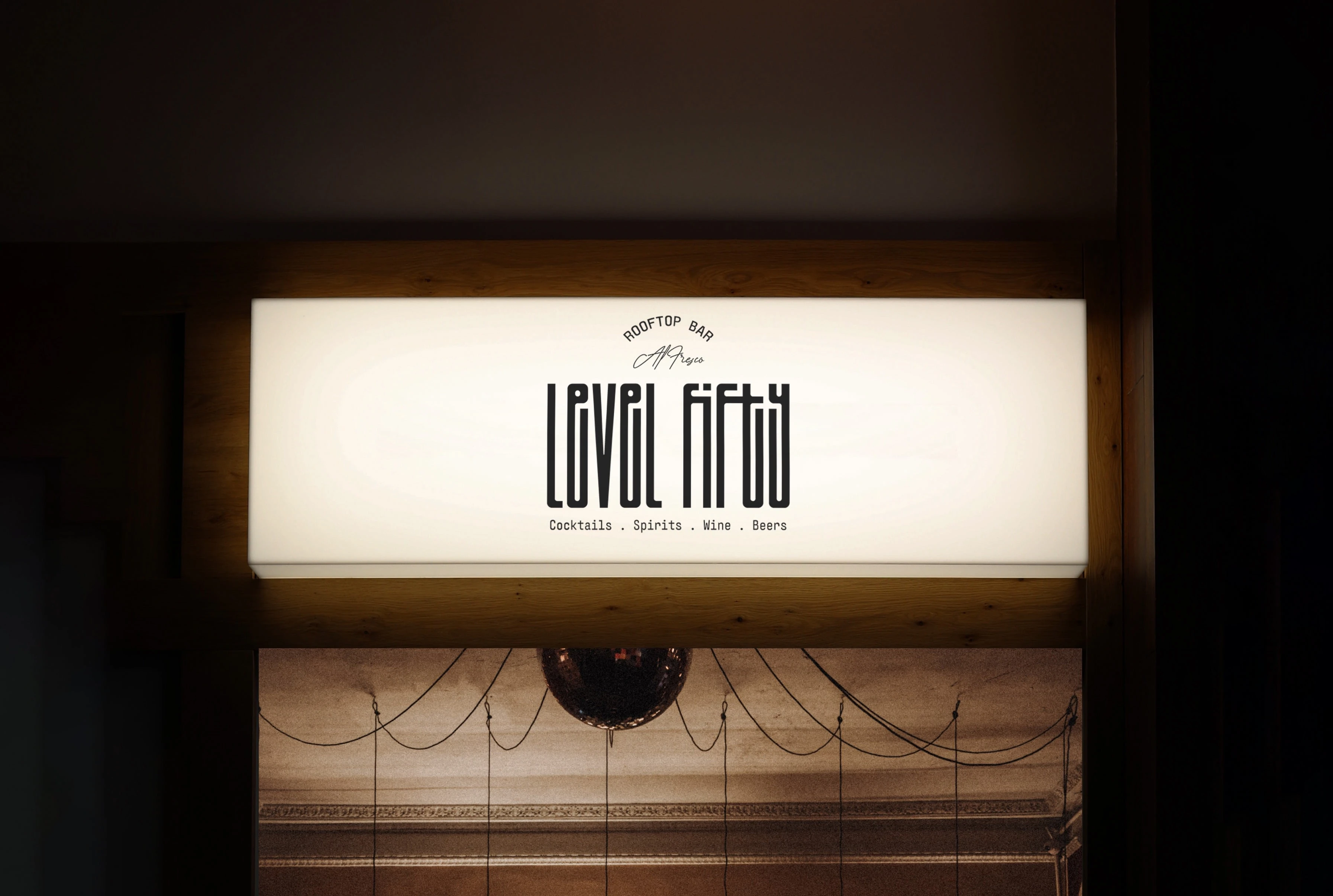
Storefront Logo Display
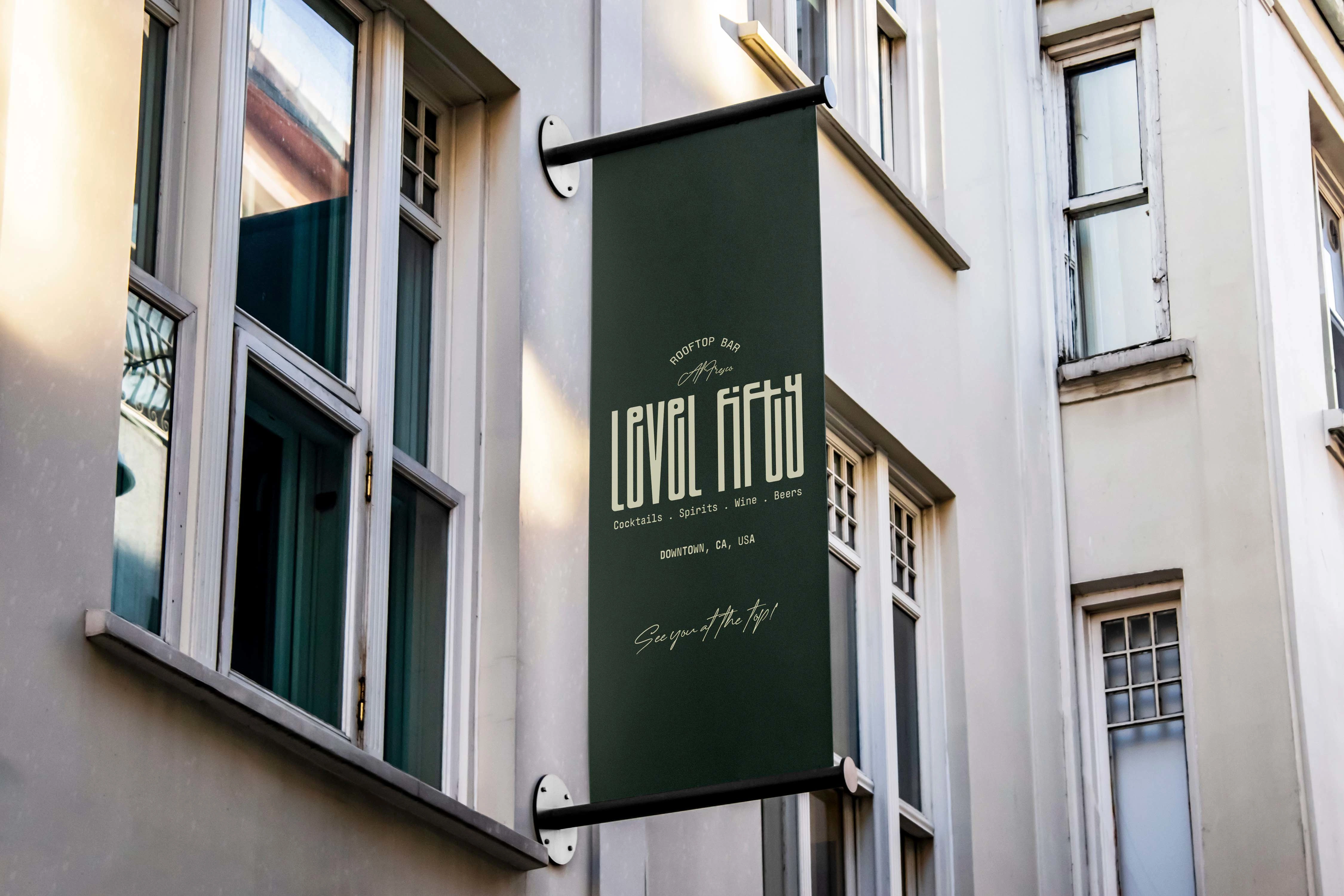
Outdoor Signage
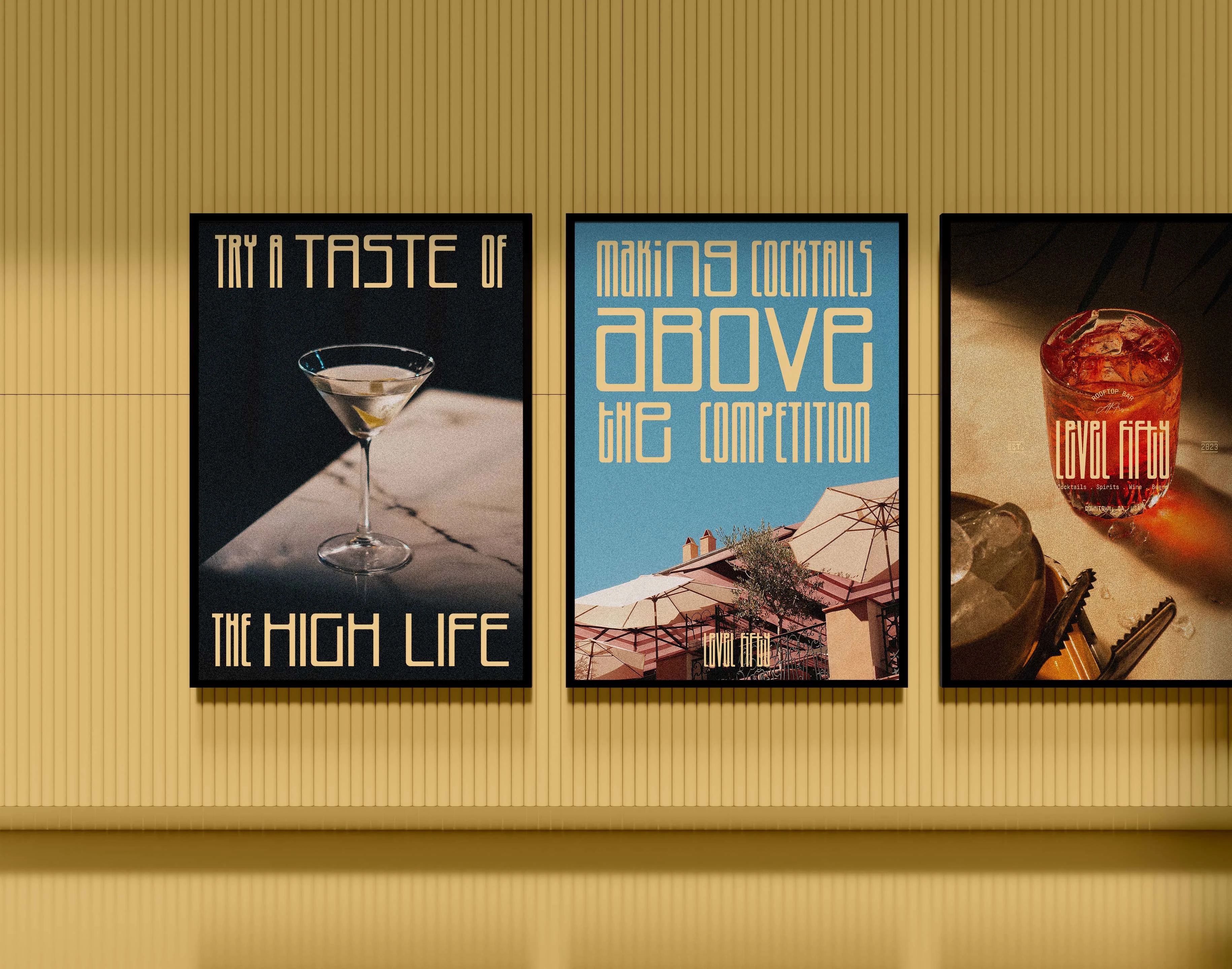
Poster Campaign Designs
The brand design and its implementation across its print and digital assets communicate the delicate alchemy of cocktail-making and the vintage aesthetic of traditional bars with a sprinkling of nostalgic summer vibes. The bar can position itself in its vicinity as cool and sophisticated without taking itself too seriously. Playing to the business’s unique selling point of a roof terrace bar to build an identity that resonates with its audience and evokes emotional responses to summer and open-air dining that we can all relate to as well as aspire to.
Got a business idea that needs bringing to life?
Get in touch today.
Like this project
Posted Jul 18, 2023
Full brand identity design for a new rooftop cocktail bar. Including the logo design, posters, coasters, menus and signage designs.

