Finex - International Money Transfer Landing Page

Rizki Arsyad

The Problem
International money transfer is a trust-heavy purchase. Users are sending hundreds or thousands of dollars across borders, often for the first time. They land on your page skeptical, comparing you against Wise, Remitly, and Revolut in adjacent tabs.
Finex needed a landing page that does three things fast: explain what the product does, prove it's trustworthy, and get visitors to try it. The window is about 8 seconds before they bounce.
My Role
Designed the full landing page (desktop and mobile) in Figma
Developed the content hierarchy and conversion strategy
Created the component system and responsive layouts
Produced device mockups for marketing use
The Core Insight
I studied landing pages from 6 competing money transfer services. Most of them lead with abstract promises: "Send money globally," "Fast and secure transfers." The copy is interchangeable.
What actually builds trust in fintech is transparency. Users want to see the exchange rate before they sign up. They want to know the fee structure. They want to see what the product looks like.
That insight drove the design: show the product working, not just describe what it does.
Page Structure & Design Decisions
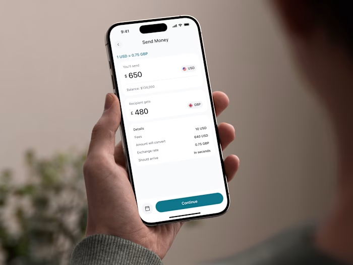
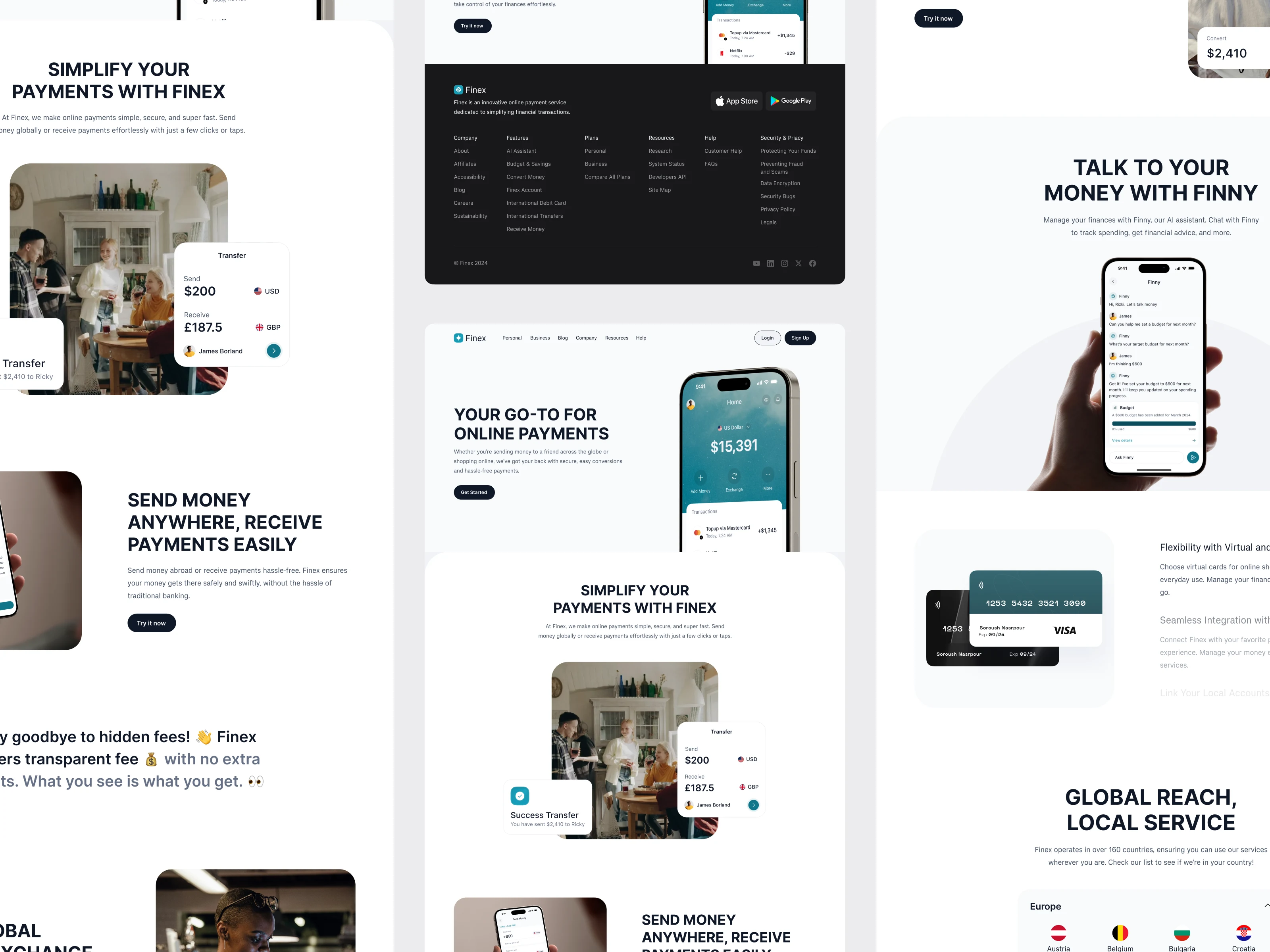
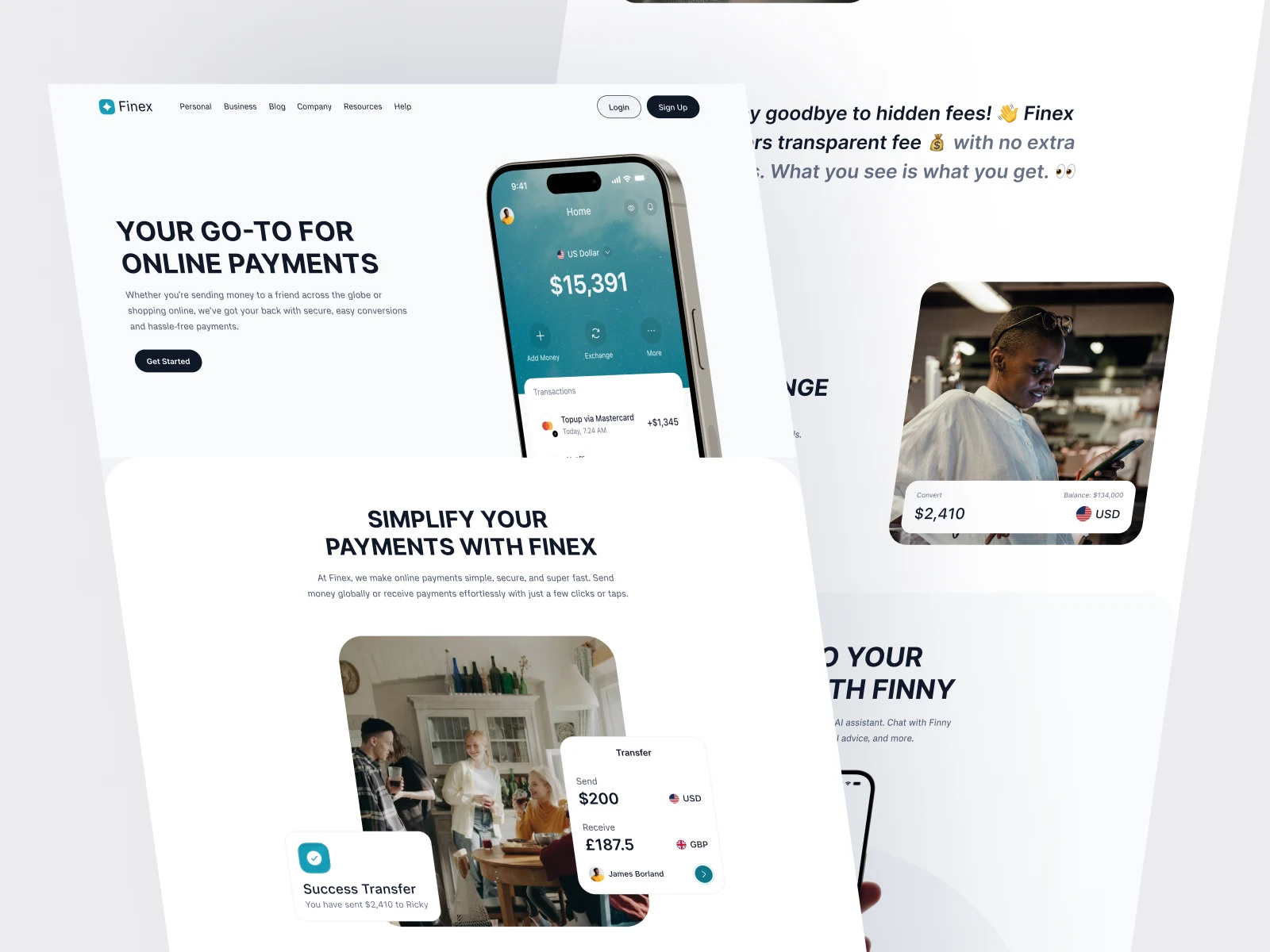
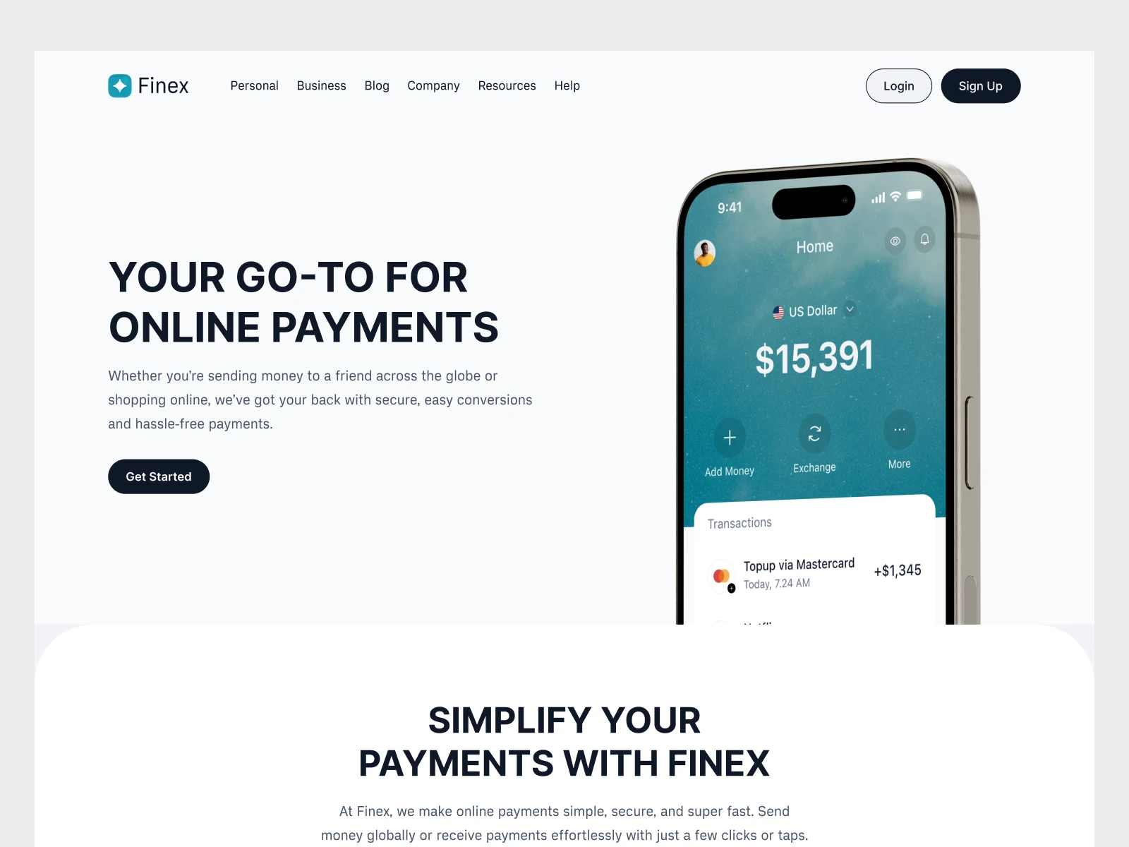
Hero section: Instead of a generic headline with a stock illustration, I placed an interactive currency converter preview directly in the hero. Visitors immediately see a real exchange rate and fee breakdown. This answers their first question ("How much will it cost me?") before they scroll.
Trust signals early: Social proof, security badges, and regulatory compliance information sit in the first scroll. In fintech, burying trust signals below the fold is a conversion killer. Users who don't feel safe won't scroll far enough to see your features.
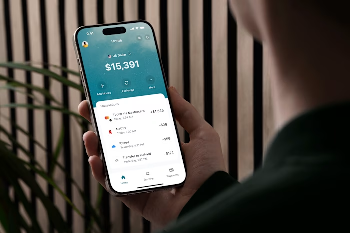
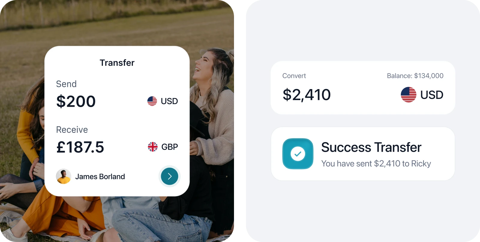
Feature sections: Three core benefits (speed, low fees, security) each get a dedicated section. I used a card-based layout with product screenshots rather than icons. Each card shows the actual UI for that feature, so visitors build a mental model of the product before signing up.
Visual language: Clean, modern aesthetic with Finex's green color palette. Green was a deliberate brand choice: it signals financial growth and stability. The typography is large and confident, with generous whitespace to keep the page from feeling cluttered despite the amount of information.
Component System
The landing page is built on a modular component system in Figma with auto layout. This includes:
Navigation bar with sticky scroll behavior
Hero block with embedded product preview
Feature cards (3 variants: image-left, image-right, centered)
Testimonial carousel
Pricing/fee transparency section
Footer with regulatory information
Every component is designed for reuse, so the marketing team can assemble new page variants (campaign landing pages, A/B test variations) without starting from scratch.
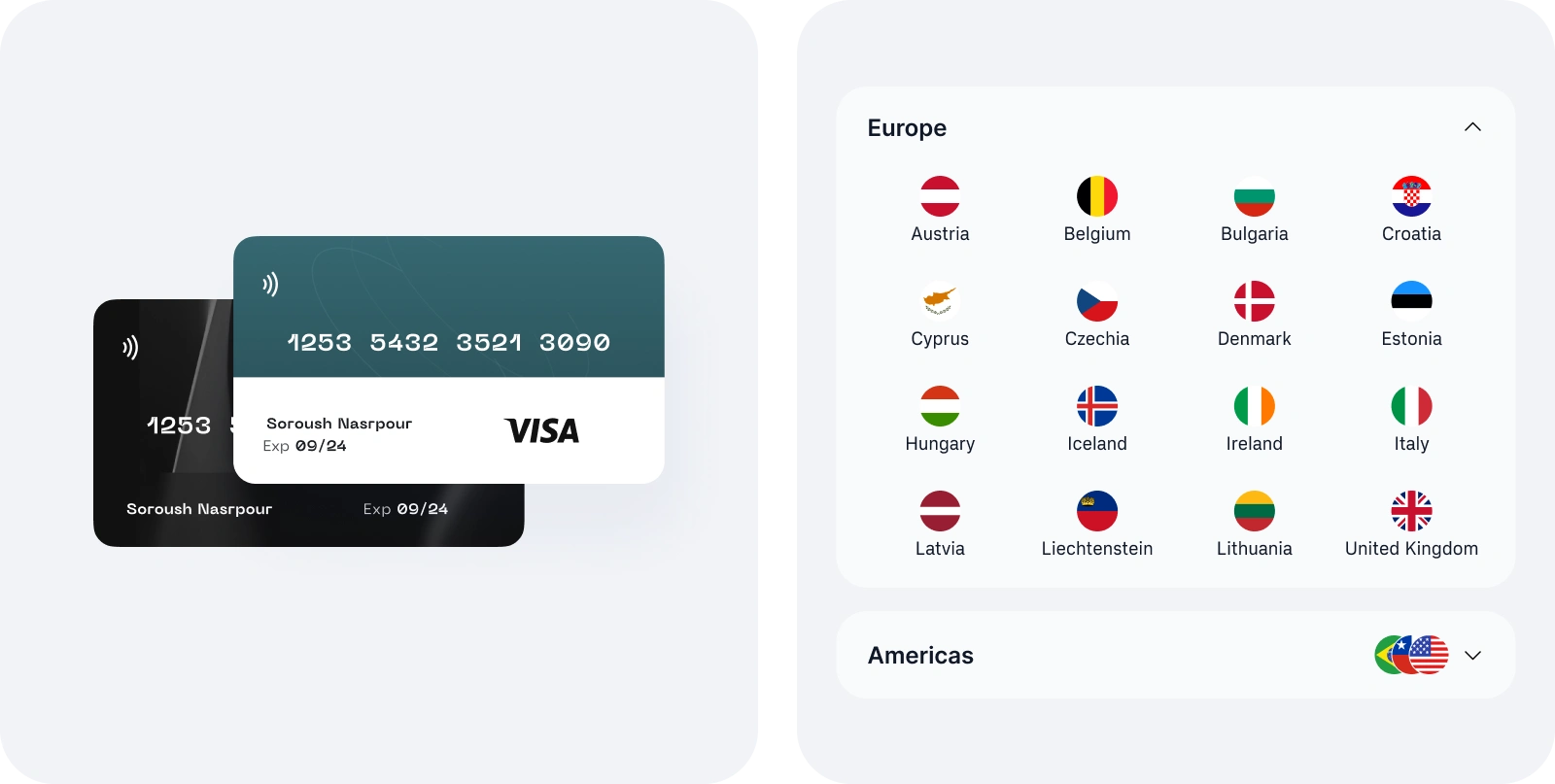
Mockups & Full Preview
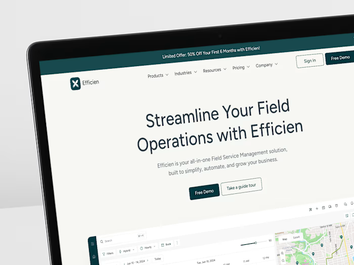
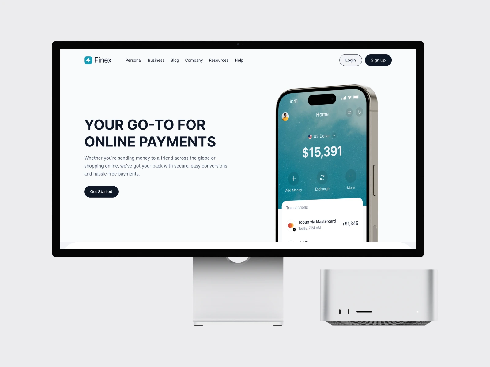
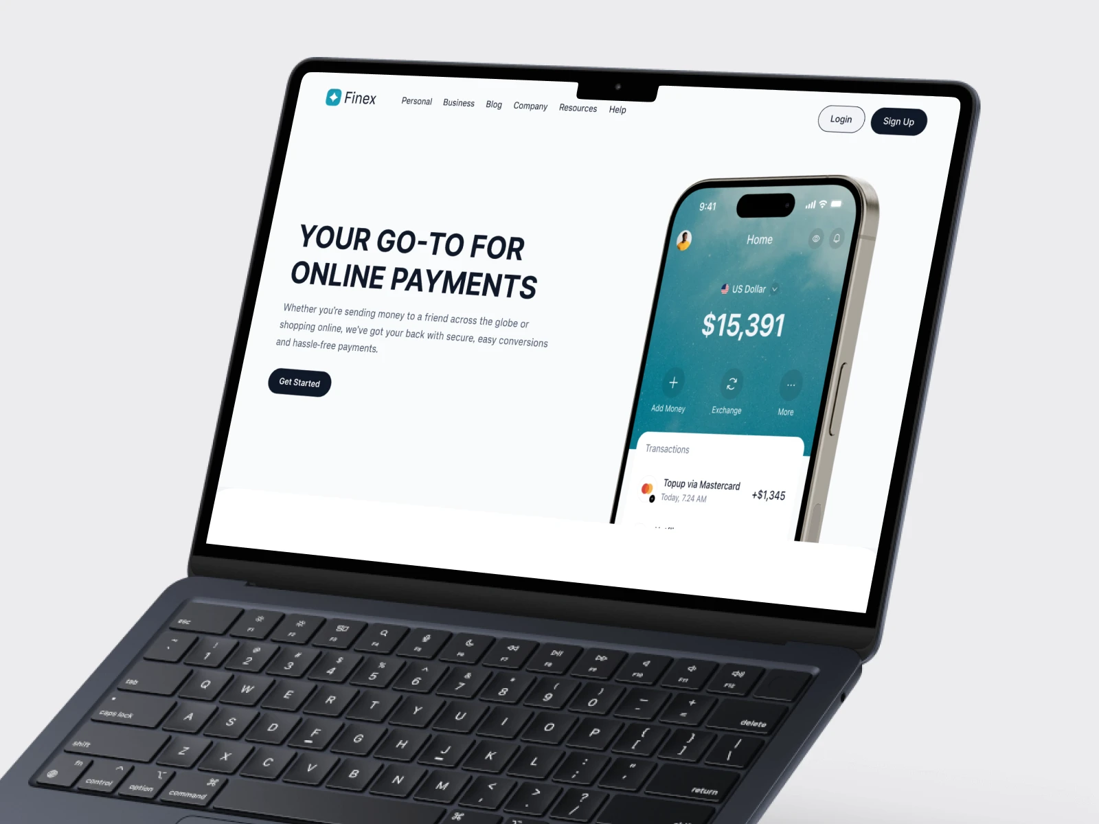
Device mockups show the landing page in real-world context. The responsive design adapts cleanly from desktop to mobile, with the hero section stacking vertically and the feature cards collapsing to single-column on smaller screens.
The full-length page preview below shows the complete scroll experience from hero to footer.
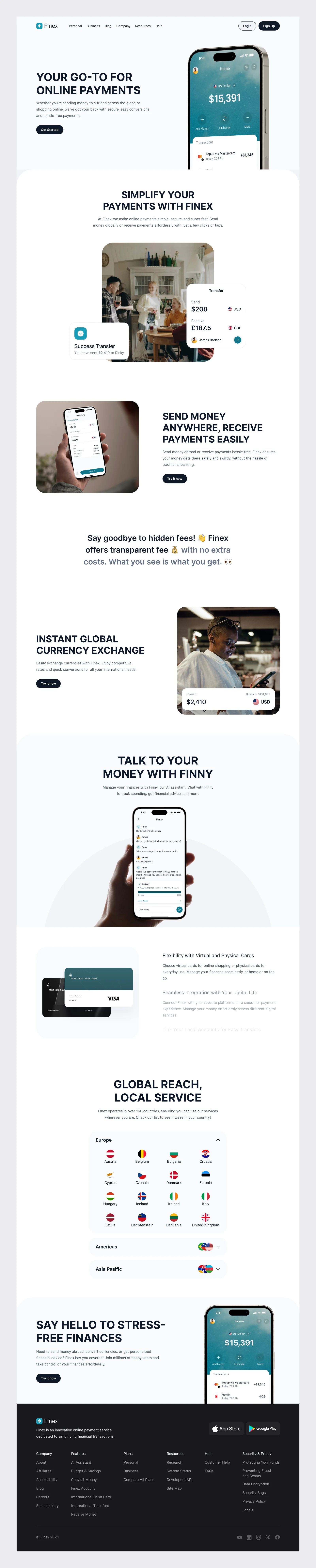
What I Delivered
Full landing page design (desktop + mobile) in Figma
Content hierarchy and conversion strategy
Modular component system with auto layout
Responsive layouts for all breakpoints
Device mockups for marketing use
Structured Figma files with developer annotations
The design positions Finex as a transparent, product-forward fintech brand in a market where most competitors rely on generic messaging.
Like this project
Posted Apr 28, 2025
Designed a conversion-focused landing page for Finex, a fintech platform for international money transfers.
Likes
1
Views
11