Finex - International Money Transfer App

Rizki Arsyad


The Problem
Sending money internationally on mobile should feel as simple as sending a text. In practice, most fintech apps make it feel like filing a tax return. Users navigate through 5-7 screens, encounter hidden fees at the last step, and second-guess whether the exchange rate they're getting is fair.
Finex needed a mobile app that makes cross-border transfers feel effortless while handling the real complexity (compliance, exchange rates, recipient verification) behind the scenes.
My Role
Designed the complete mobile app UI/UX (iOS and Android) in Figma
Created user flow maps for all core journeys
Built the component library and visual design system
Produced production-ready files for developer handoff
Understanding the Users
Two user types drive the design:
Frequent senders (migrant workers, freelancers with international clients) who transfer money weekly or monthly. They want speed above everything. They already know how the process works; they just want fewer taps.
First-time senders (travelers, people paying overseas vendors) who need reassurance at every step. They want to see the exchange rate, understand the fees, and know exactly when the money will arrive.
The design had to serve both without making the experience feel dumbed-down for power users or overwhelming for newcomers.
The 3-Tap Transfer Flow
The biggest design decision: compressing the transfer flow from the industry-standard 5-7 steps down to 3.
Select recipient (saved contacts surface first, with smart suggestions based on transfer history)
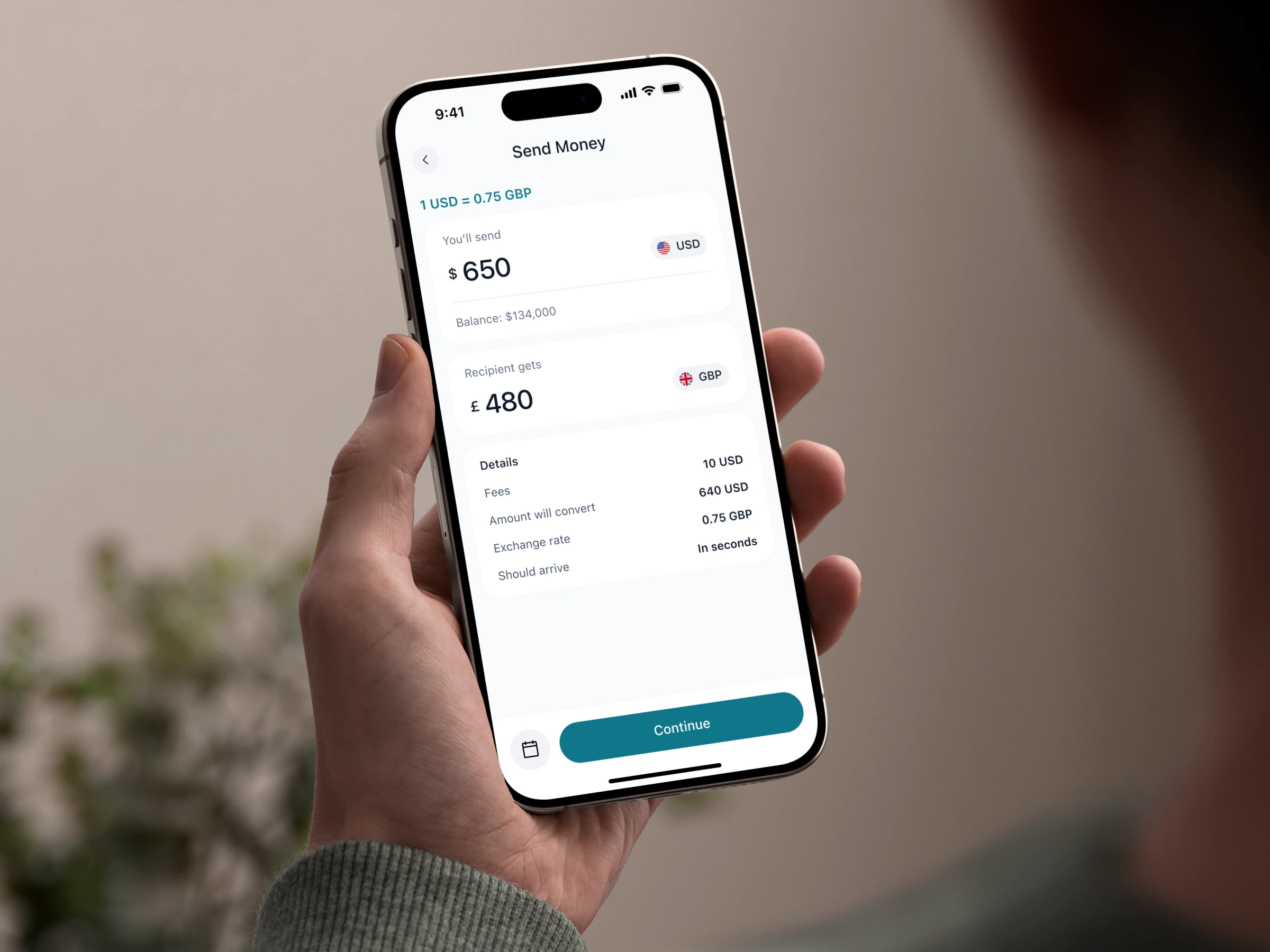
Enter amount (real-time exchange rate and fee breakdown update as you type; no surprises at checkout)
Confirm and send (single summary screen with all details visible; one tap to execute)
The key to making this work: inline fee transparency. Instead of revealing fees on a separate confirmation page (which feels like a bait-and-switch), the exchange rate and total cost update live as the user types the amount. By the time they reach the confirm screen, they've already absorbed the pricing.
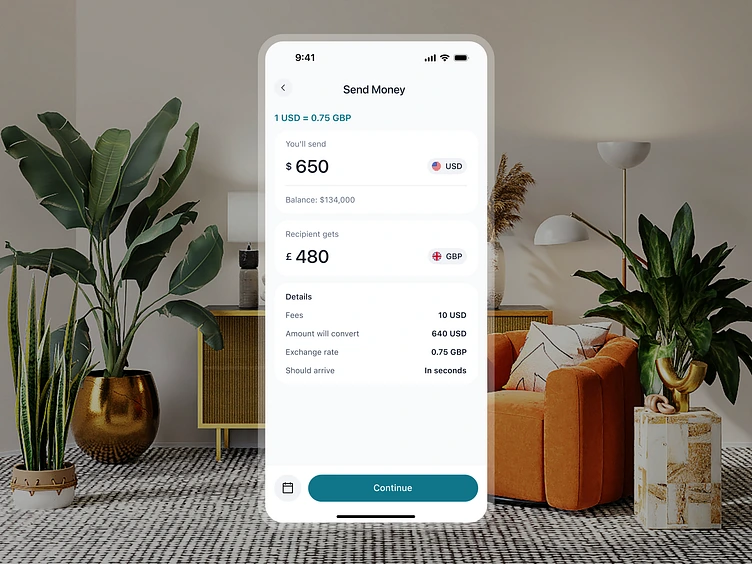
Currency Exchange Interface
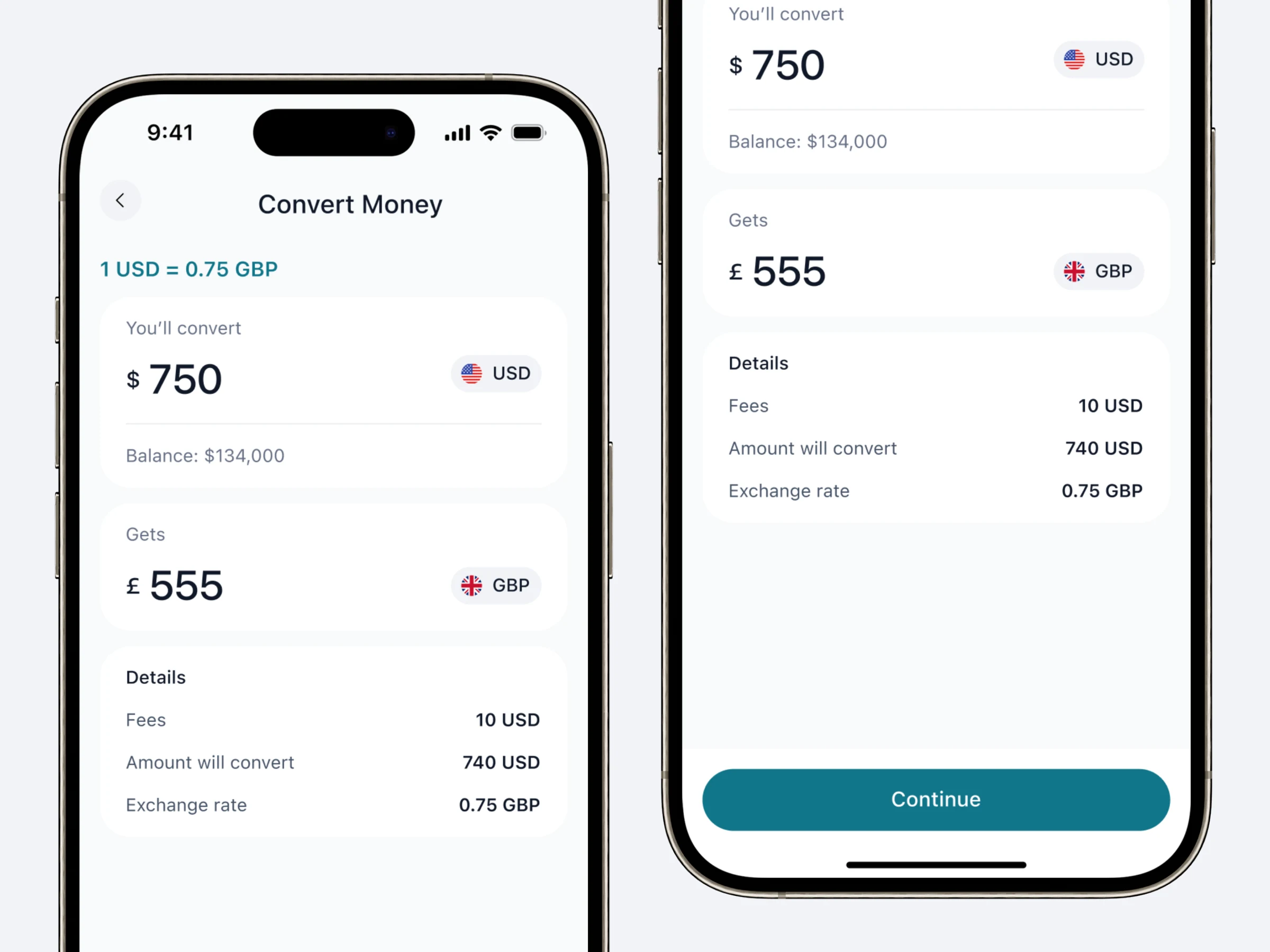
The exchange screen needed to handle a specific interaction: comparing rates across multiple currency pairs and executing conversions quickly.
I designed a clean converter UI with large, readable numbers (critical on mobile where users are often glancing at their phone). The currency pair selector uses flag icons for instant recognition. A mini chart shows the rate trend over the past 7 days, so users can decide whether to convert now or wait.
One-tap conversion keeps the interaction fast for users who already know what they want.
Visual Design System
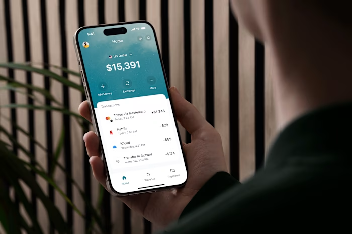
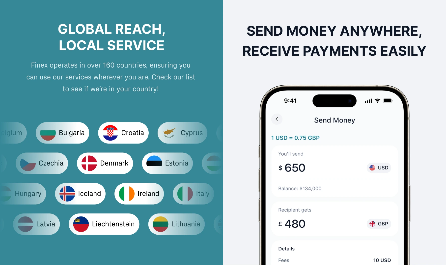
The app uses a card-based layout with Finex's green-accented color system. Specific choices:
Large touch targets: Every interactive element meets the 44pt minimum, with extra padding on primary actions. Financial apps can't afford mis-taps.
Status colors with meaning: Green for successful transactions, amber for pending, red for failed. These colors are consistent across every screen, so users build an instinctive understanding of transaction states.
Typography optimized for numbers: The typeface was chosen for its clear distinction between similar characters (0 vs O, 1 vs l). In a financial app, misreading a number is a real risk.
What I Delivered
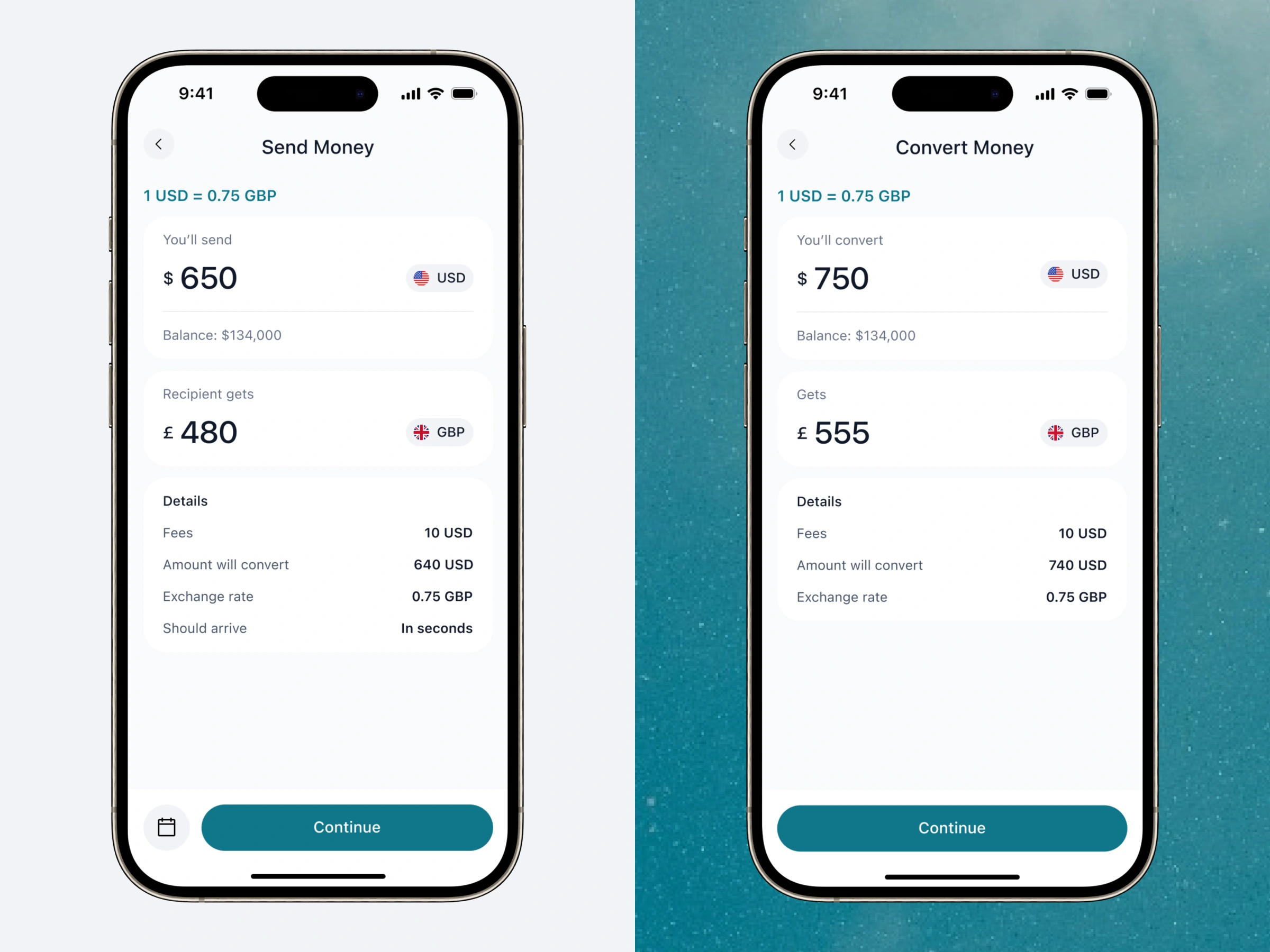
Complete mobile app UI covering onboarding, home dashboard, transfer flow, currency exchange, transaction history, and account settings
User flow maps for all core journeys
Reusable component library (navigation bars, transaction cards, input fields, status badges, modal sheets)
Interactive Figma prototype for user testing and stakeholder demos
Production-ready Figma files with auto layout and developer annotations
The design reduces the core transfer experience to 3 taps while keeping fee transparency front and center, addressing the two biggest pain points in mobile money transfer.
Like this project
Posted Apr 28, 2025
Designed the mobile app UI/UX for Finex, a fintech platform for cross-border money transfers and currency exchange. Reduced the transfer flow to 3 taps with inline fee transparency.