Built with Framer
Original Framer Sites
Welcome to my collection of Framer websites!
Here, you'll find a showcase of my latest website projects, crafted for clients, friends, and personal ventures. Each site reflects a unique vision, customized to meet the goals and aesthetics of the individuals and brands involved. Whether developed to elevate a business, celebrate a passion project, or simply explore new design possibilities, these sites highlight my commitment to creating engaging, user-friendly experiences.
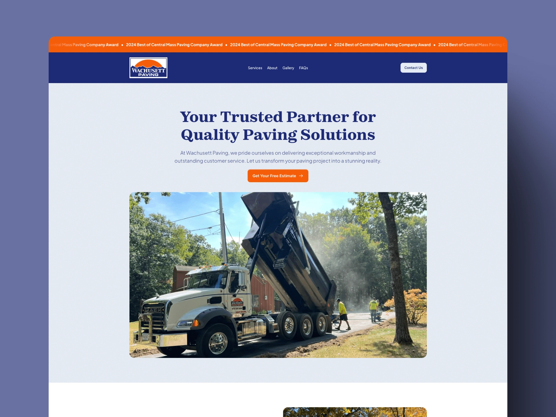
Wachusett Paving
Wachusett Paving
The Client 📝
Wachusett Paving is a local paving company that prides themselves on delivering exceptional workmanship and outstanding customer service.
Project Overview 🔍
Their current site (as seen here) is dated and doesn't represent their brand very well. It does not utilize brand colors or fonts and the page structure could be better organized.
Project Goal ✅
For this site I wanted to focus on a clean easy to navigate layout. And because they are in the service industry I opted to avoid unnecessary site animations. I wanted clear calls-to-action to drive the user to their contact form. I wanted the colors and fonts to be on brand.
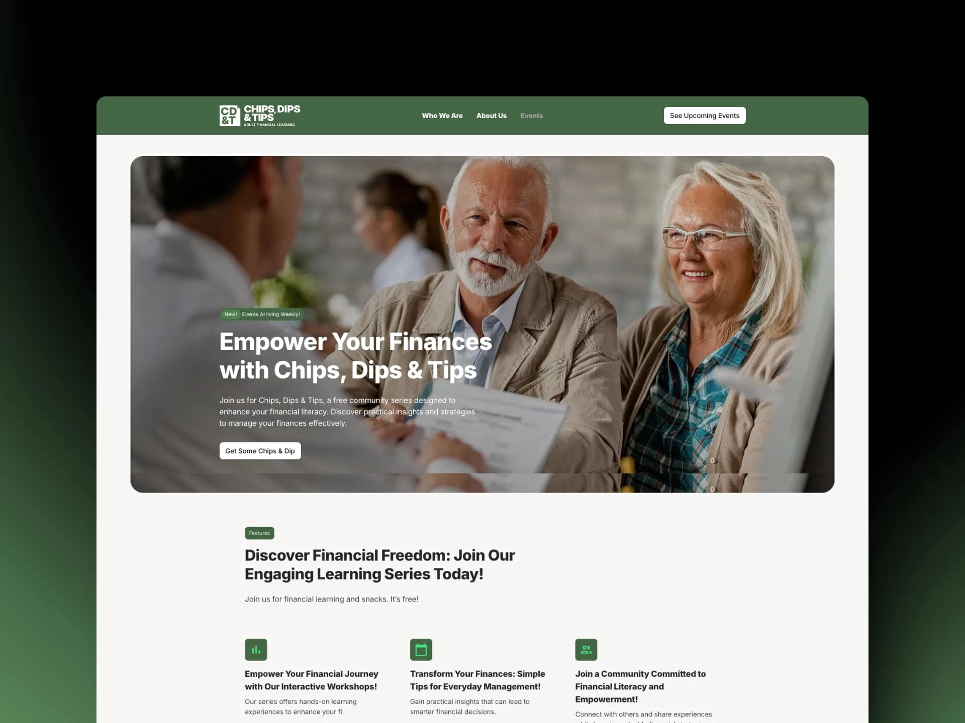
Chips, Dips & Tips
Chips, Dips, & Tips
The Client 📝
Chips, Dips & Tips, is a free community series designed to enhance financial literacy for adults.
Project Overview 🔍
I was contacted by the client for a logo and site refresh. After going cold I challenged myself to design a new logo and site in a weekend.
Project Goal ✅
I wanted to use what was available to me at the time, so I reused the images the client had previously used and cleaned up the color scheme while giving them an overall more polished look.
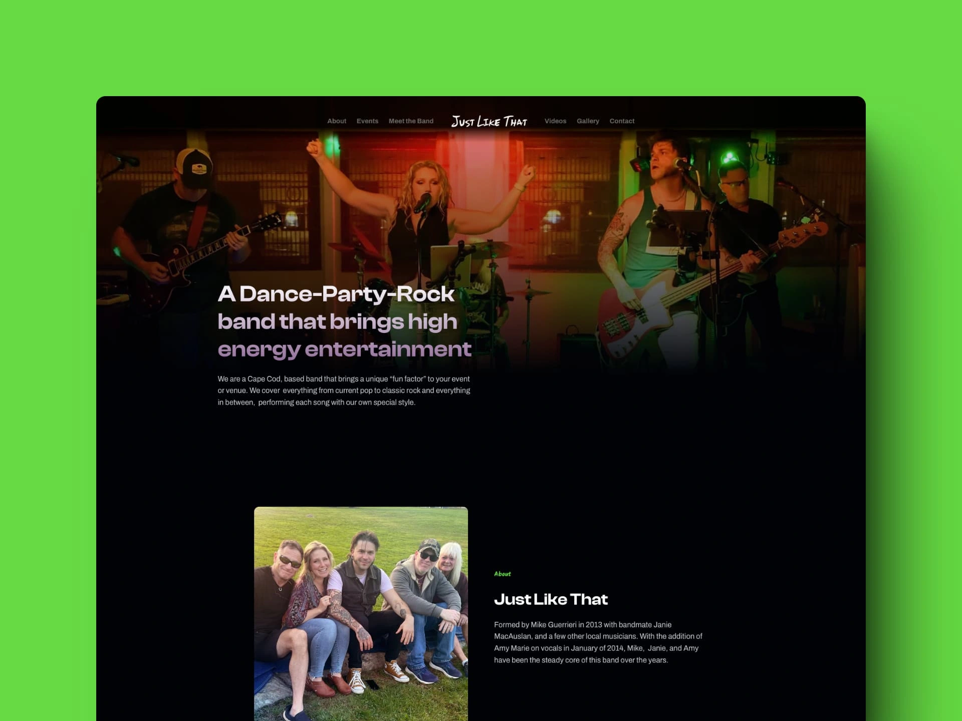
Just Like That
Just Like That
The Client 📝
Just Like That is a Cape Cod, based band that brings a unique “fun factor” to your event or venue. They cover everything from current pop to classic rock and everything in between, performing each song with our own special style.
Project Overview 🔍
After watching the band perform this summer while on vacation I thought it would be fun to reimagine what their site should look like.
Project Goal ✅
For this site I wanted to use some fun colors and header font while incorporating patterns where I could that was reminiscent of 80's hair bands.
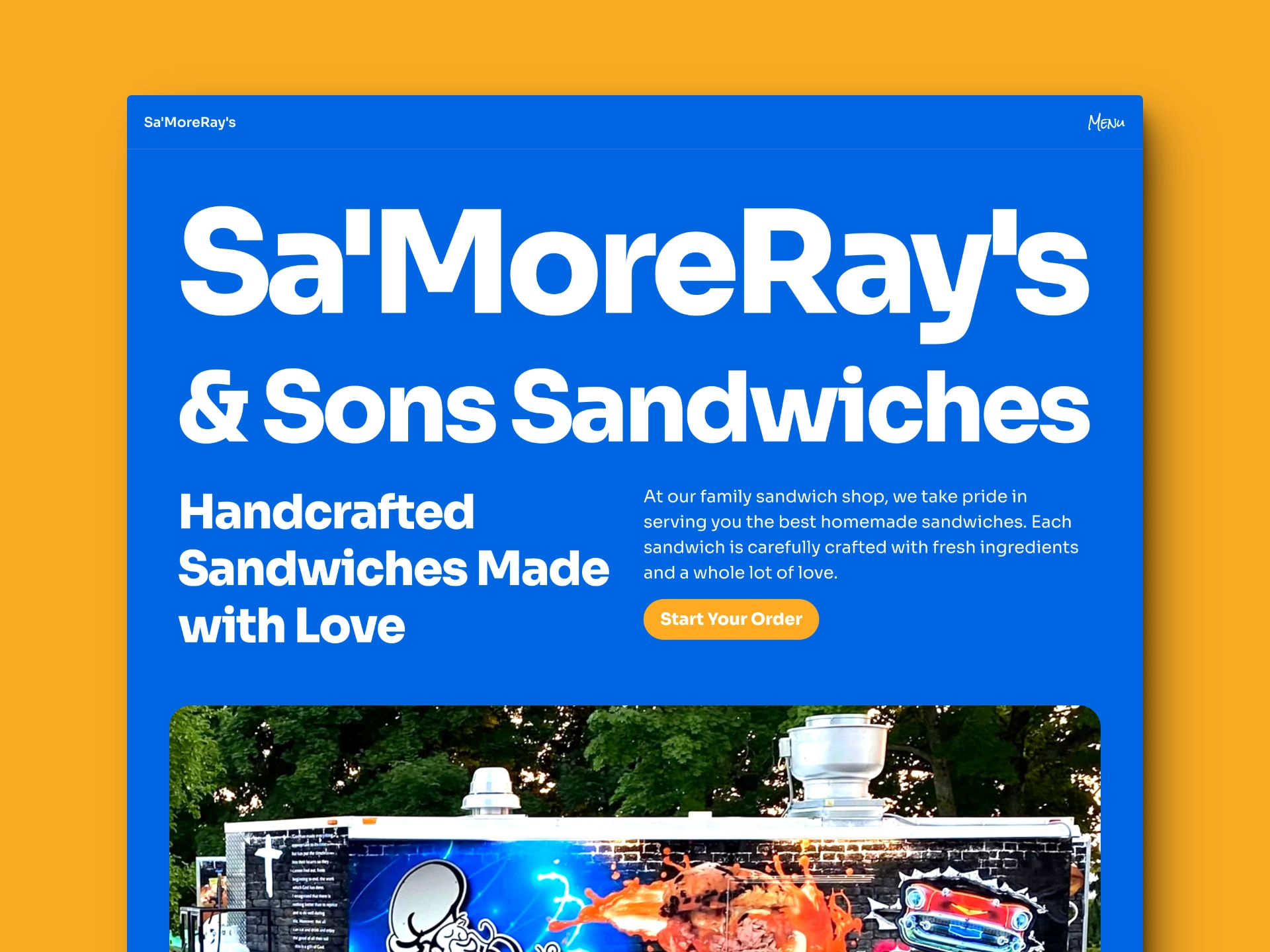
Sa'MoreRay's & Sons Sandwiches
Sa'MoreRay's
The Client 📝
Sa'MoreRay's is a well-known local restaurant and food truck within my area. They recently opened their location in my hometown and have ordered there far too many times already.
Project Overview 🔍
My role on this project was designer, developer and Project Manager. I took it upon myself to reimagine their site and build something that I felt better represented their restaurant.
Project Goal ✅
Their current website is lackluster to say the least and the biggest problem it lacks is using images of their menu on their site. It severely hurts the user experience. My main goal was to give them a menu page that rendered well on desktop and mobile. From there I knew I wanted to give them a site that better represented their food and flavor so I used their main blue color for the background and chose the Sora font as it provided enough font weights and a strong bold font. I think this combination gives them a new site they can be proud of.
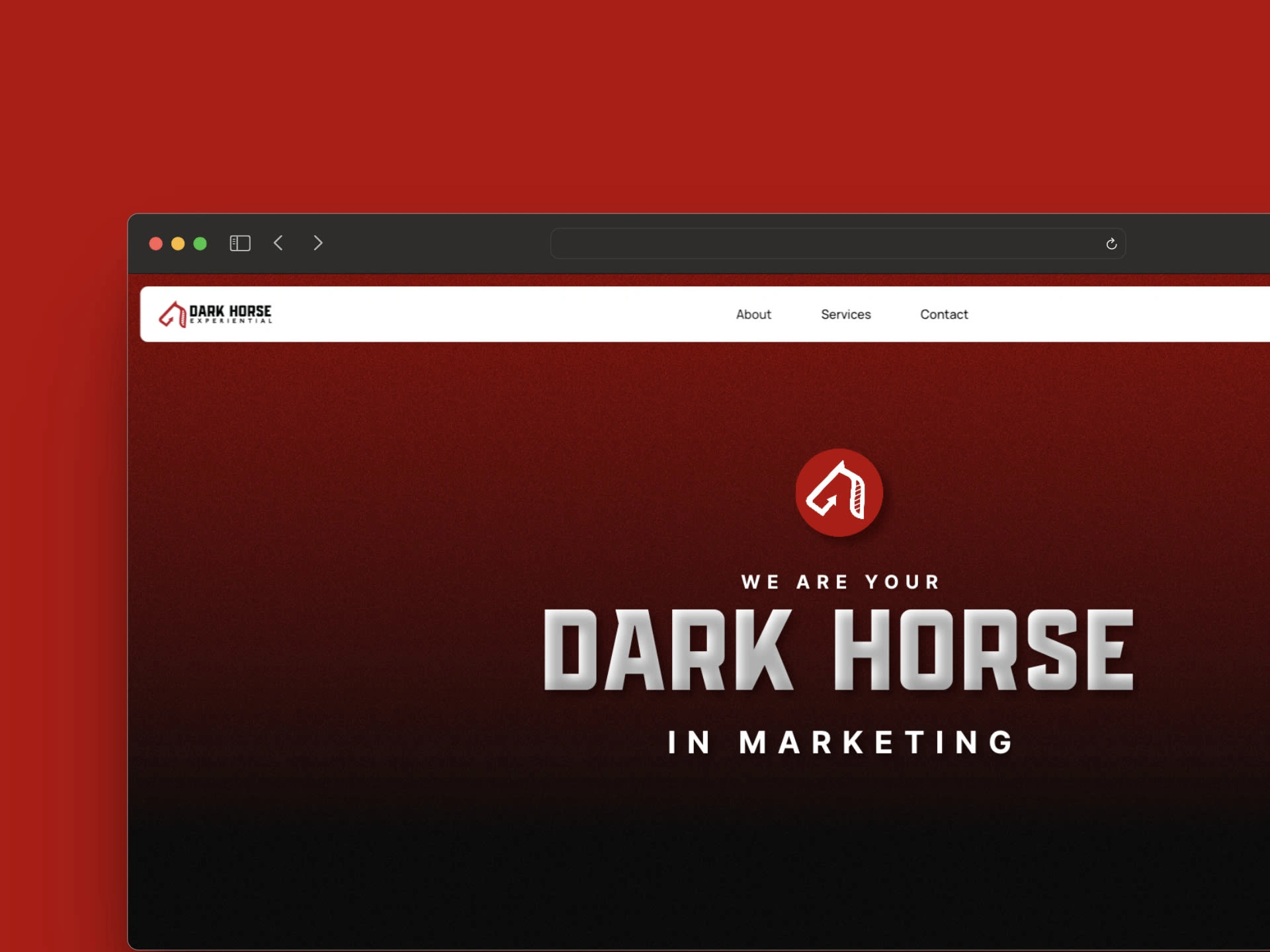
Dark Horse Experiential
Dark Horse Experiential
The Client 📝
This is a company of experiential designers and fabricators specializing in mobile tours, pop-up installations and brand activations.
Project Overview 🔍
I am the designer and developer of this site. I took it upon myself to reimagine their site and build something that I felt was better suited to their industry and felt more inline with their branding.
Project Goal ✅
The problem with their current site is it is too cookie-cutter and does not accurately represent who they are as a company. To give the site a new look I leaned heavily on the dark color for the background with the red as an accent sprinkled throughout. I wanted the intro to the site to have a revealing property to metaphorically represent the company revealing itself to the industry.
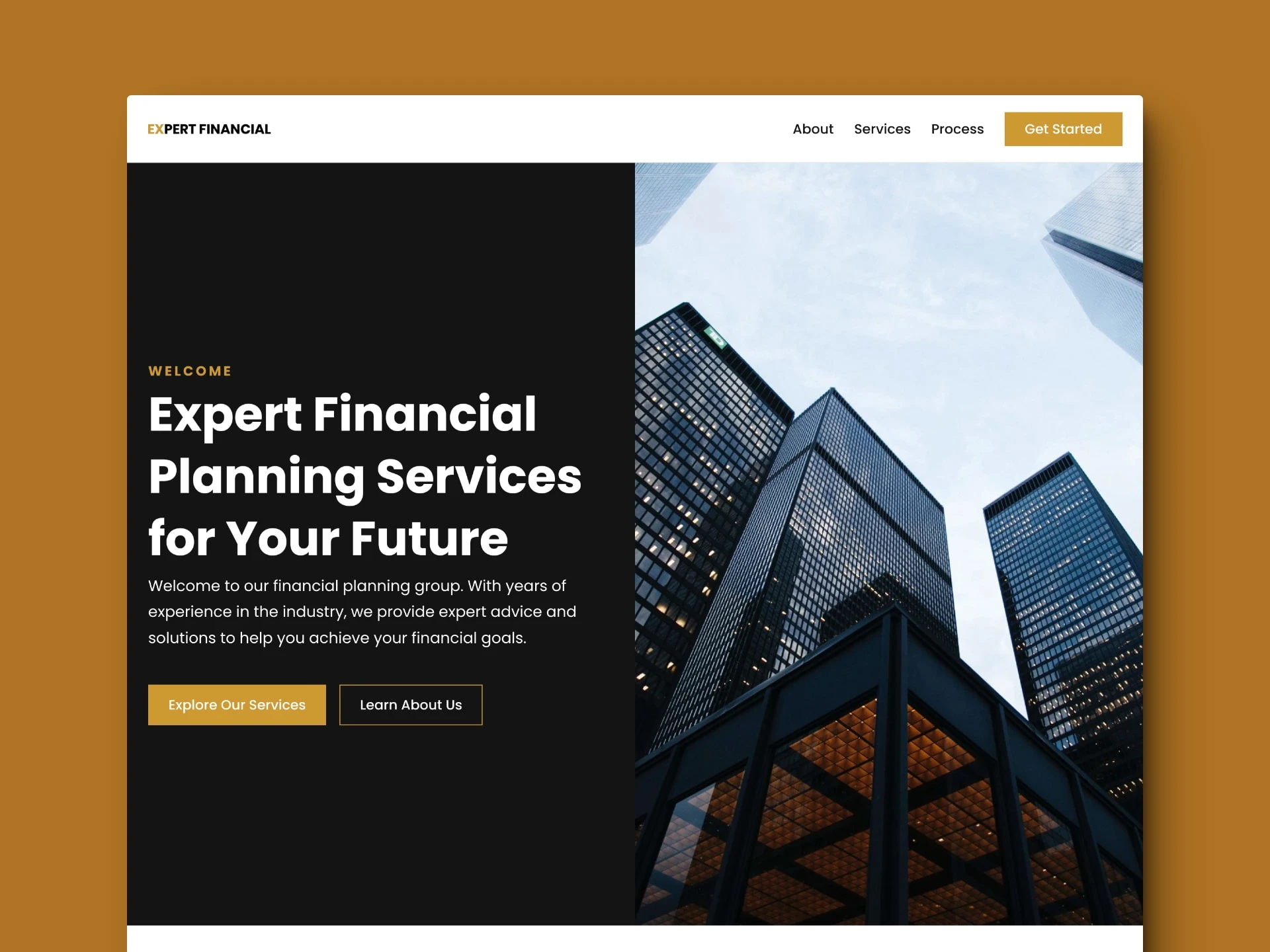
Expert Financial
Expert Financial
The Client 📝
Expert Financial was a personal project for me. I was inspired by all the great Framer templates out there and I wanted to challenge myself to build one.
Project Overview 🔍
My role in this project was designer and developer. I started this project with the homepage and used Relume to help give inspiration for an initial layout.
Project Goal ✅
The major problem I ran into designing this template was finding and implementing information and content. I spent most of my time finding and curating the content and deciding the best way to design it. The final product is is a clean Financial Planning business template that uses strong contrasting colors and Poppins as its main font. It is professional and ready for any start-up. It contains testimonials, contact form, newsletter sign up, and more that can be downloaded for free on the Framer marketplace.
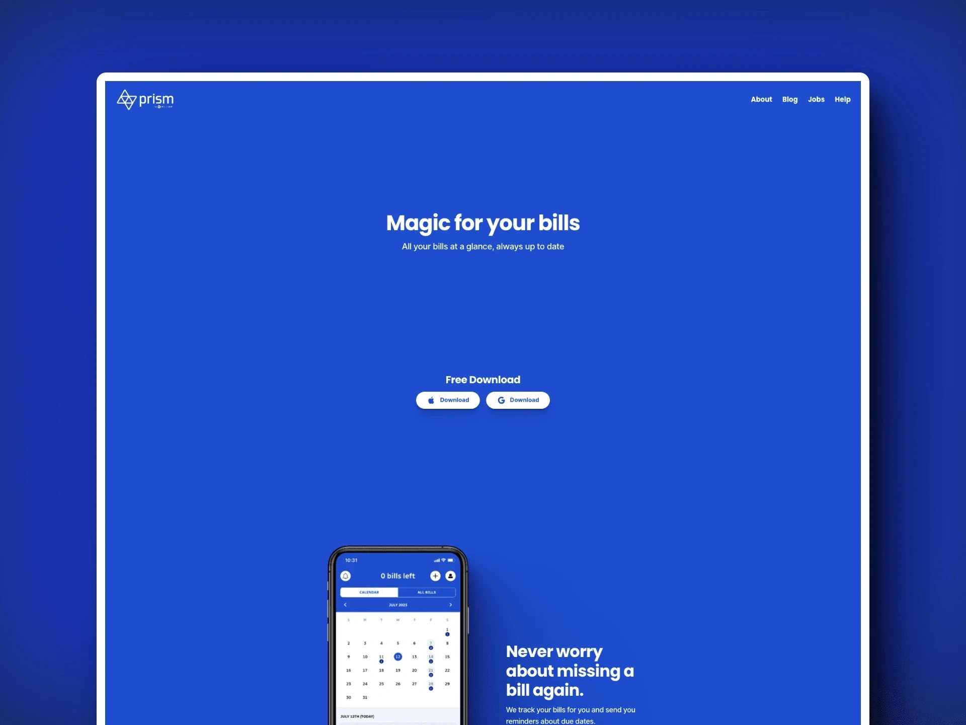
Prism Money
Prism Money
The Client 📝
Prism is a free app for Apple and Google that helps you get control of your money.
Project Overview 🔍
My role in this project was designer and developer. As a fan and avid user of the app I took it upon myself to update the look of their site to match their current brand. I used Prism’s primary blue color and approached the design with a minimal approach. Letting the information breathe and not be overwhelming to the user.
Project Goal ✅
The biggest problem is their site (https://www.prismmoney.com/) does not reflect the current branding of Prism Money. My solution was to strip away the multi-colored images and icons and use blue and white as the driving force behind the site.
Like this project
Posted Jan 3, 2024
Explore my curated collection of Framer Creations. Each website blending design, animation, and interactivity to elevate the user experience.
