Real Estate Property Listing App

Al Razi Siam


🧭 Overview
Project Type: Mobile App Design (iOS and Android)
Project Duration: 4 Weeks
Role: UI/UX Designer, Product Manager, UX Researcher
Tools Used: Figma (Design + Design System + Prototyping)
Deliverables: User Flow, Full Design System, End-to-End App Screens, Onboarding, Messaging, Profile & Listing Management
Check out the design in Figma: Click here
💡 Project Overview
Client came to me with a clear goal:
Design a real estate app that simplifies and streamlines the process of selling property for American homeowners.
Platforms like Zillow are popular, but many people find them cold, overwhelming, or too focused on funneling users to agents. On top of that, using a real estate agent often means giving up 5% to 6% of your home’s sale price in commissions. For someone selling a $400,000 home, that’s $20,000 or more in fees gone.
He believed there was a better way. He wanted Highlite to help homeowners sell directly, on their terms, and keep more of their money.
This wasn’t just another listing app. It was about giving people clarity, control, and confidence, especially first-time sellers who often feel lost in the process.
We set out to build something warm, personal, and honest, the kind of app you’d recommend to your parents, not just savvy investors.
🔍 My Roles
Throughout the project, I was deeply involved in every step:
Researched how homeowners feel about selling their properties
Mapped out the full user experience and interface
Managed the feature planning and communication with the client
Designed the entire system, from branding to every single screen
Built a design system to make everything consistent and scalable
👤 Who We Designed For
We focused on two core user groups:
Sellers: Regular homeowners (like “Hannah”) looking to list their house without stress
Buyers: People casually browsing or actively looking for properties, mostly on mobile
Our primary goal was to empower sellers while providing buyers with a seamless browsing experience.
🔍 Research Highlights
To understand what people needed, I conducted a competitor analysis and spoke with real users.
Insights from real homeowners:
Many were confused by the selling process
They didn’t trust apps that push them to agents immediately
They needed more guidance, not just empty forms
These insights shaped almost every design decision that followed.
🧠 Key Goals for MVP 1
We began the project with four main priorities:
Make it simple - every task should feel easy and intuitive
Make it trustworthy - users should feel safe messaging and making deals
Make it mobile-first - designed fully for smartphones, not desktops
Make it visually clear - clean design, clear actions, zero clutter
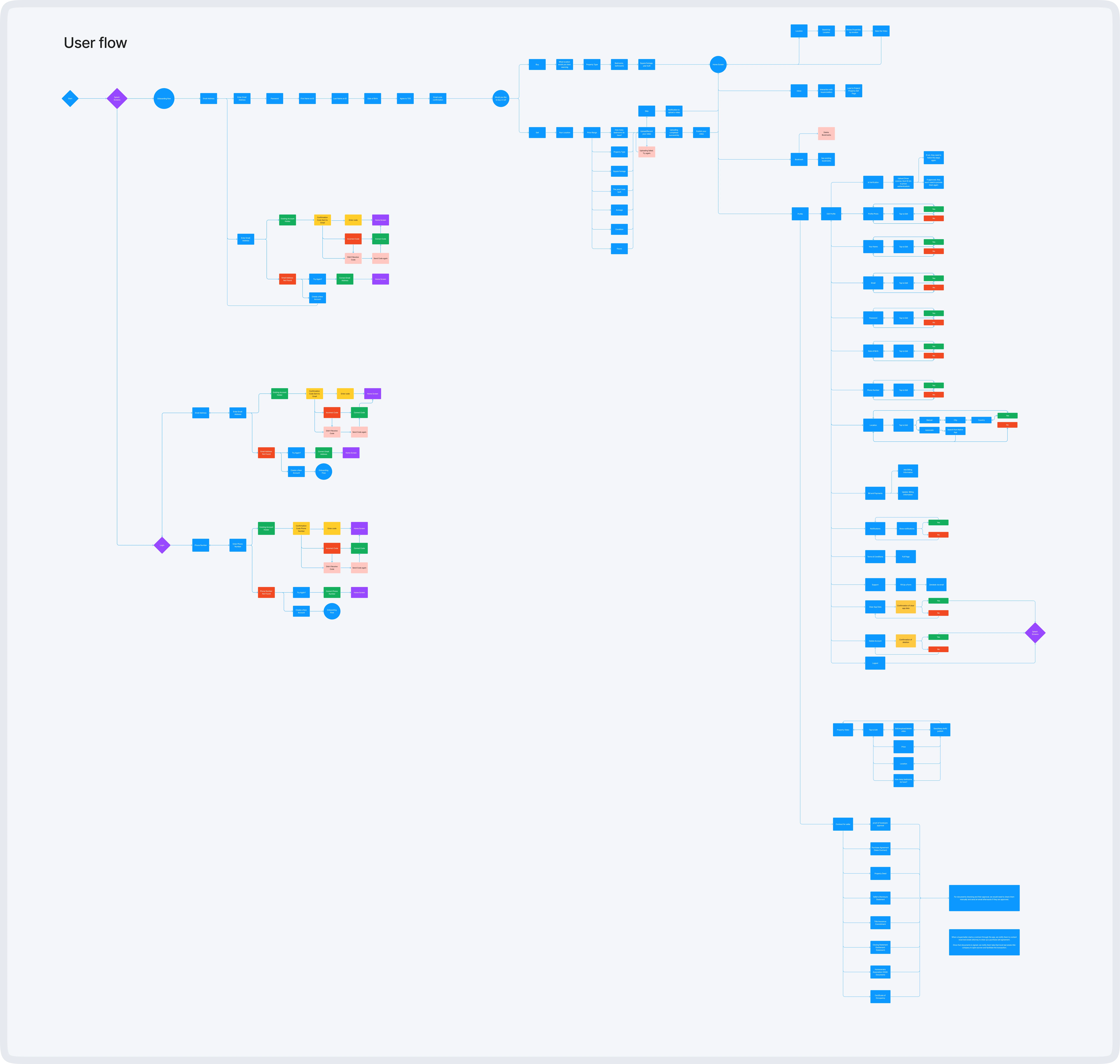
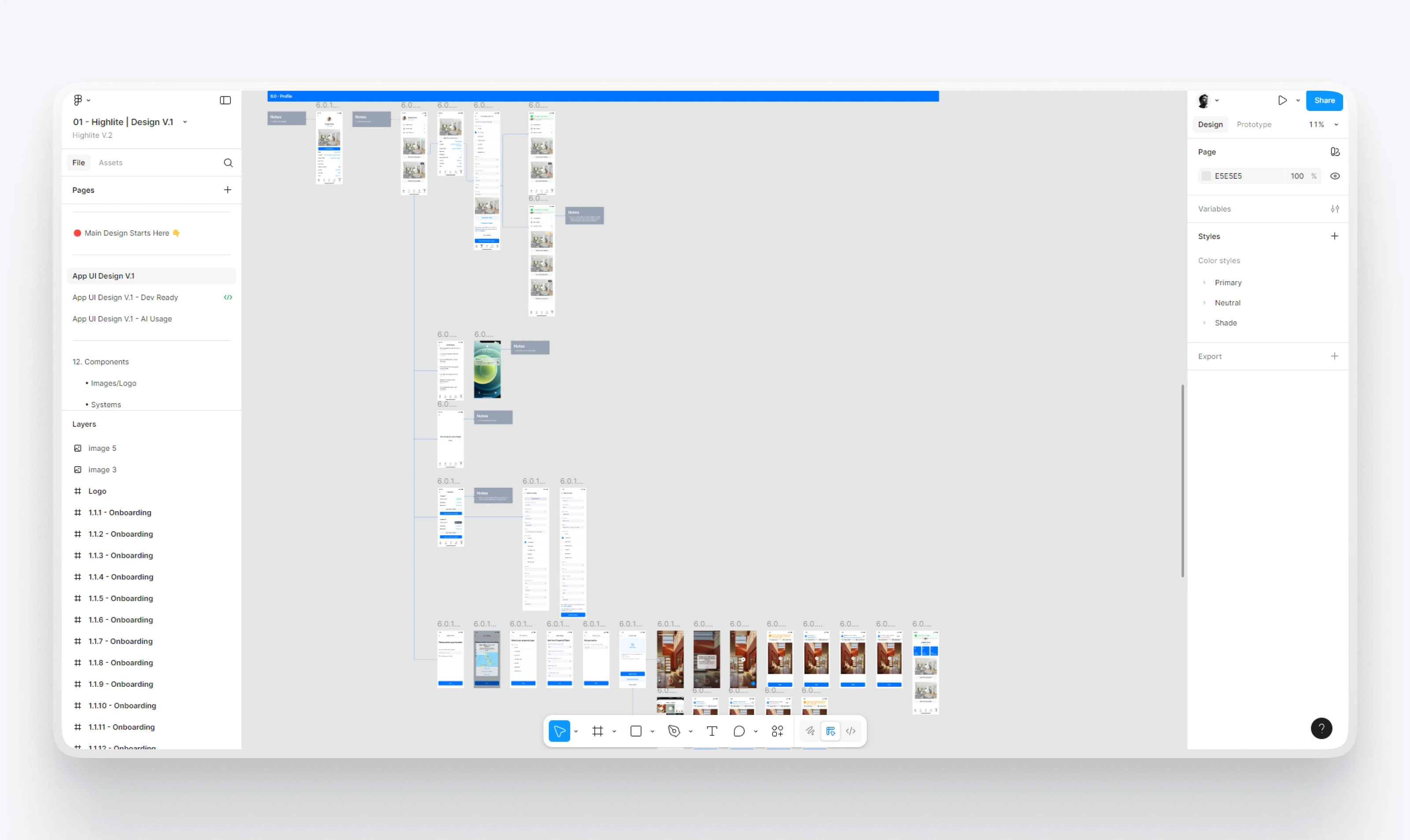
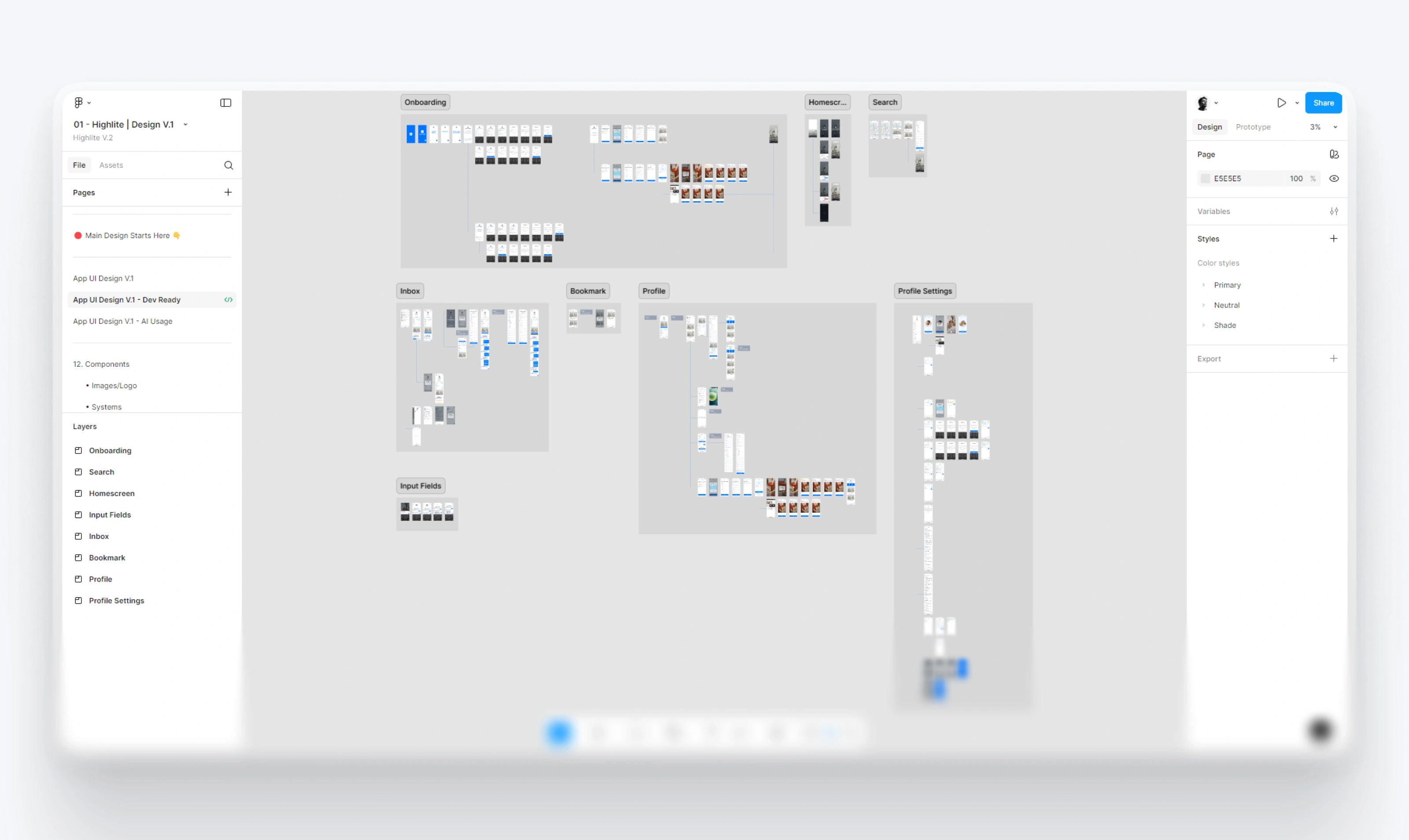
📲 User Flow Planning
I mapped out the full journey a user would take, from opening the app to closing a deal.
Key Flows Designed:
Onboarding
Search & Filter
Listing a property
Messaging between users
Making and reviewing offers
Profile setup and editing
Each flow was designed with minimal steps and clear actions. I avoided unnecessary friction wherever possible.
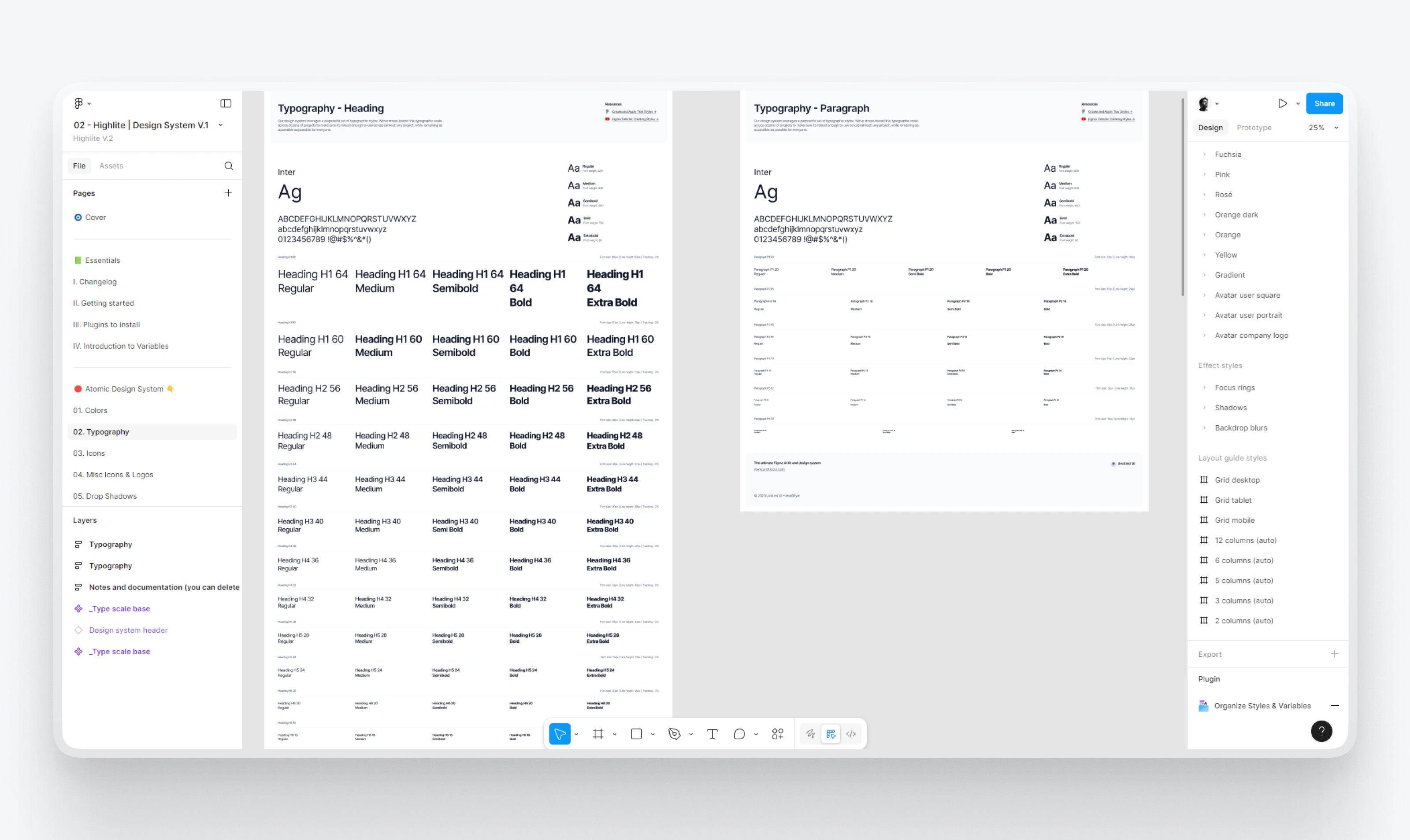
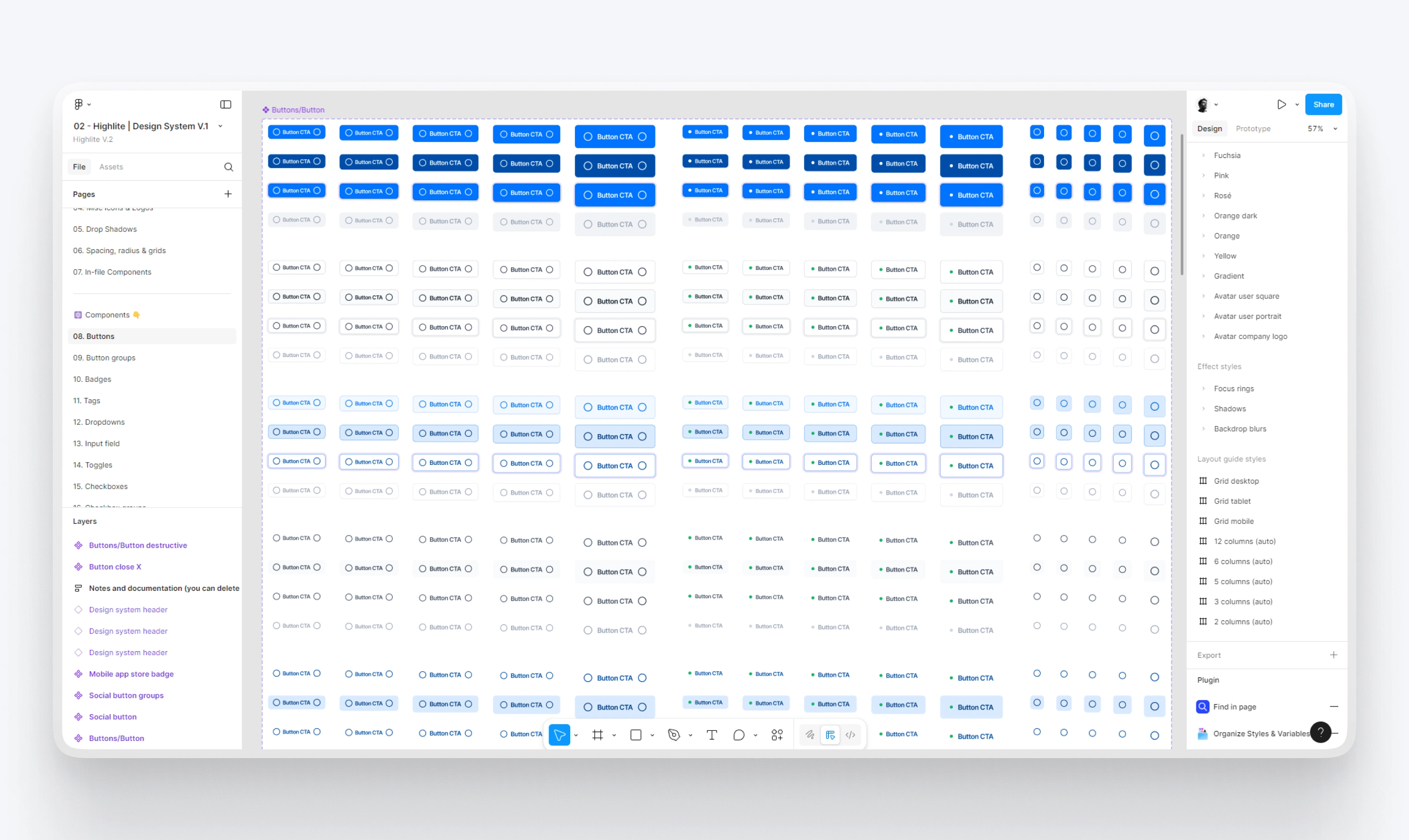
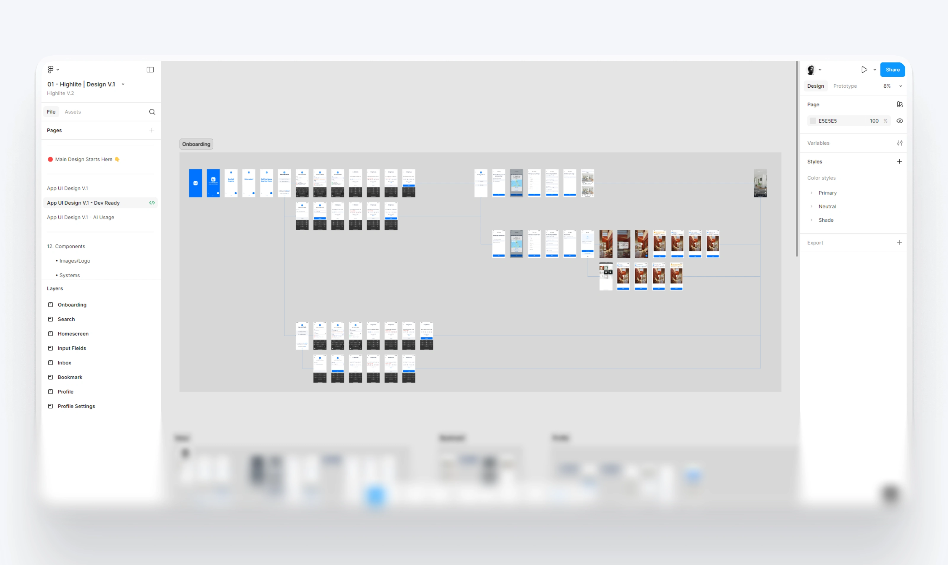
🧱 The Design System
To maintain consistency, I created a comprehensive design system in Figma.
Included:
Color palette: calming blues, clean neutrals, occasional greens
Typography: simple, readable sans-serif
Button and form components with all states
Icons, spacing rules, and visual branding assets
Reusable blocks for cards, filters, and listings
This allowed for quick iteration and made handoffs easier if developers got involved later.
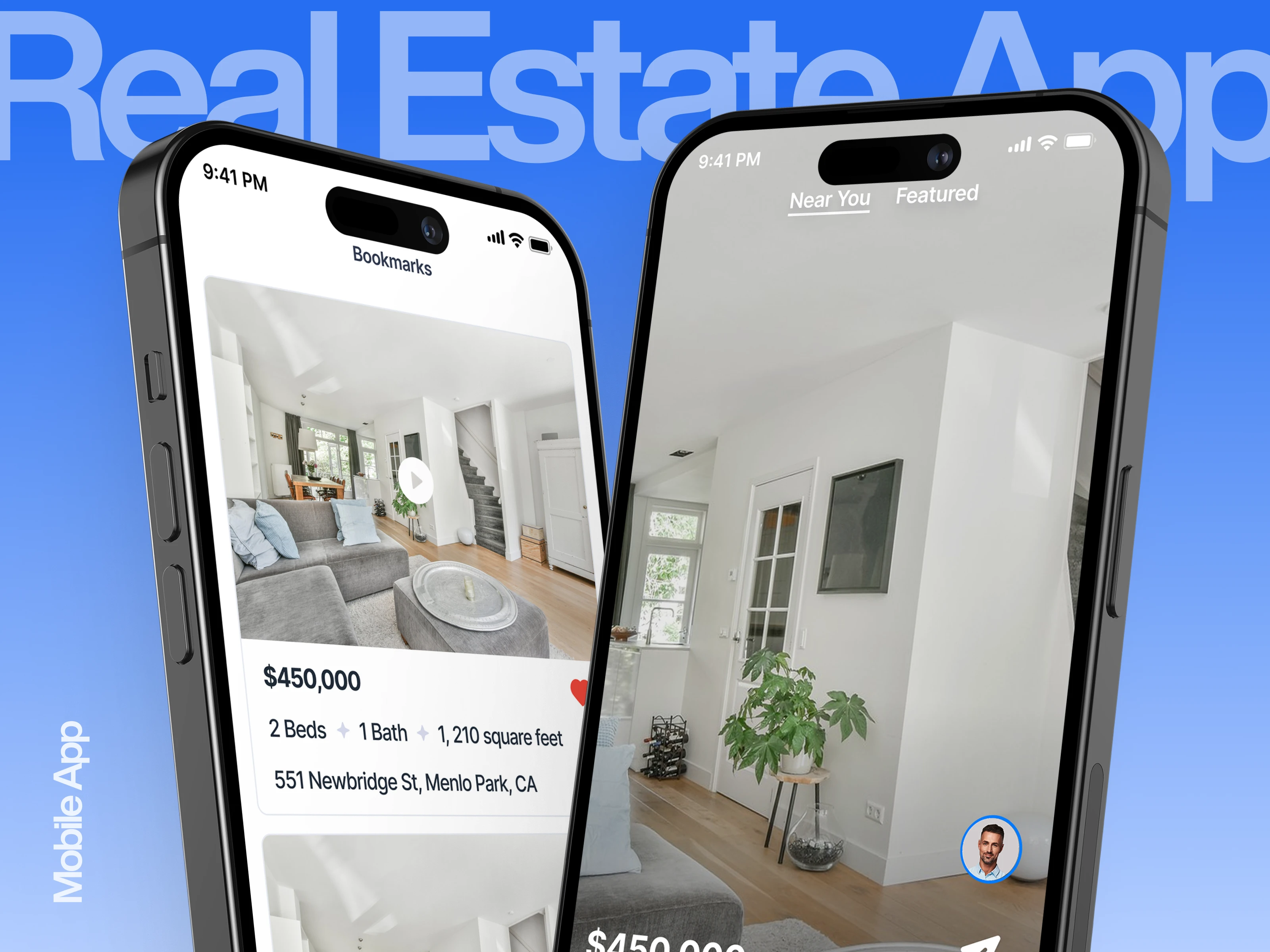
📸 App Screens & Features
Using the design system, I designed every core screen of the app. Here are some highlights from the actual files you provided:
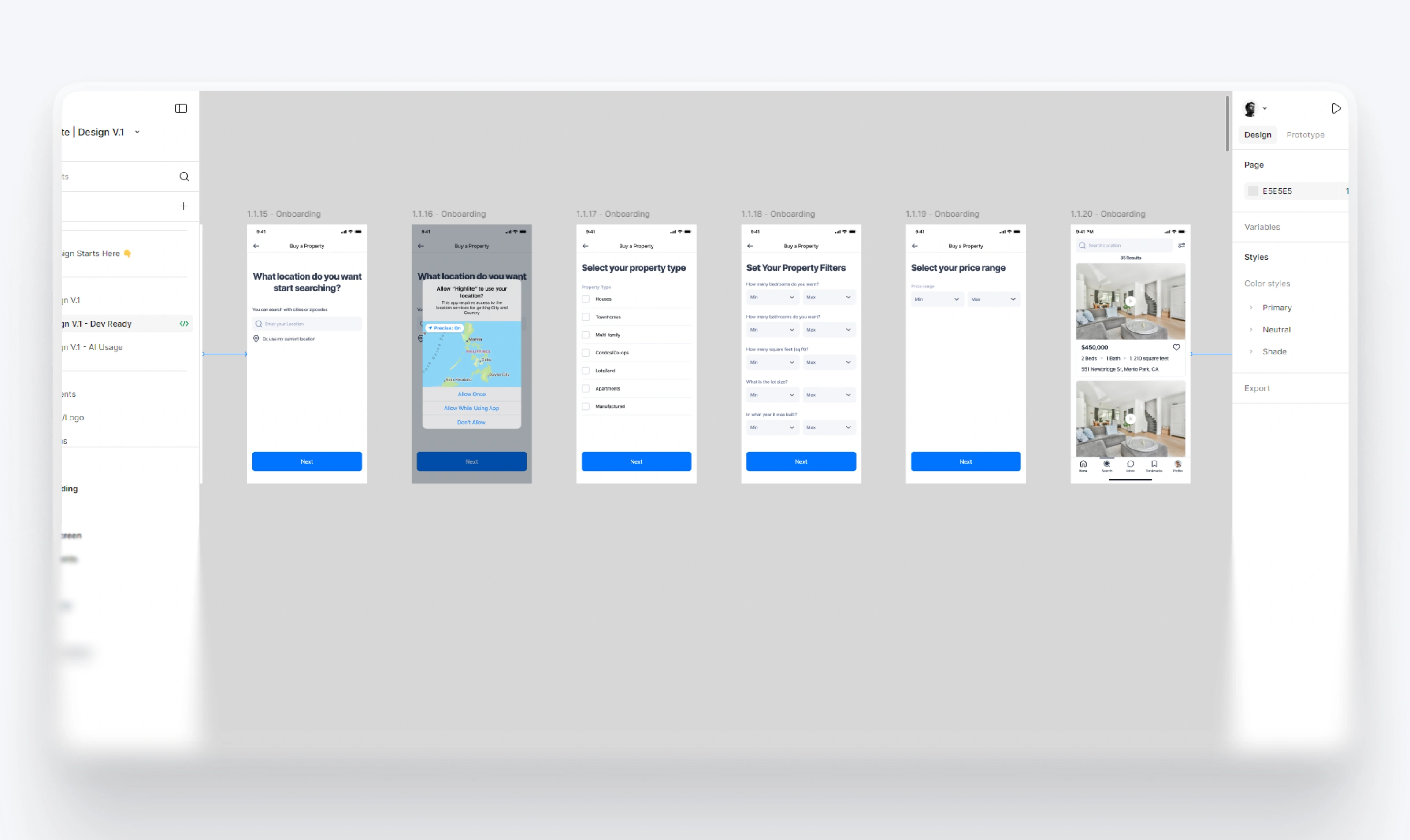
✅ Onboarding Flow
Welcoming, short intro screens
Clear CTA to “Buy” or “Sell” right from the start
Designed to reduce overwhelm from the first tap
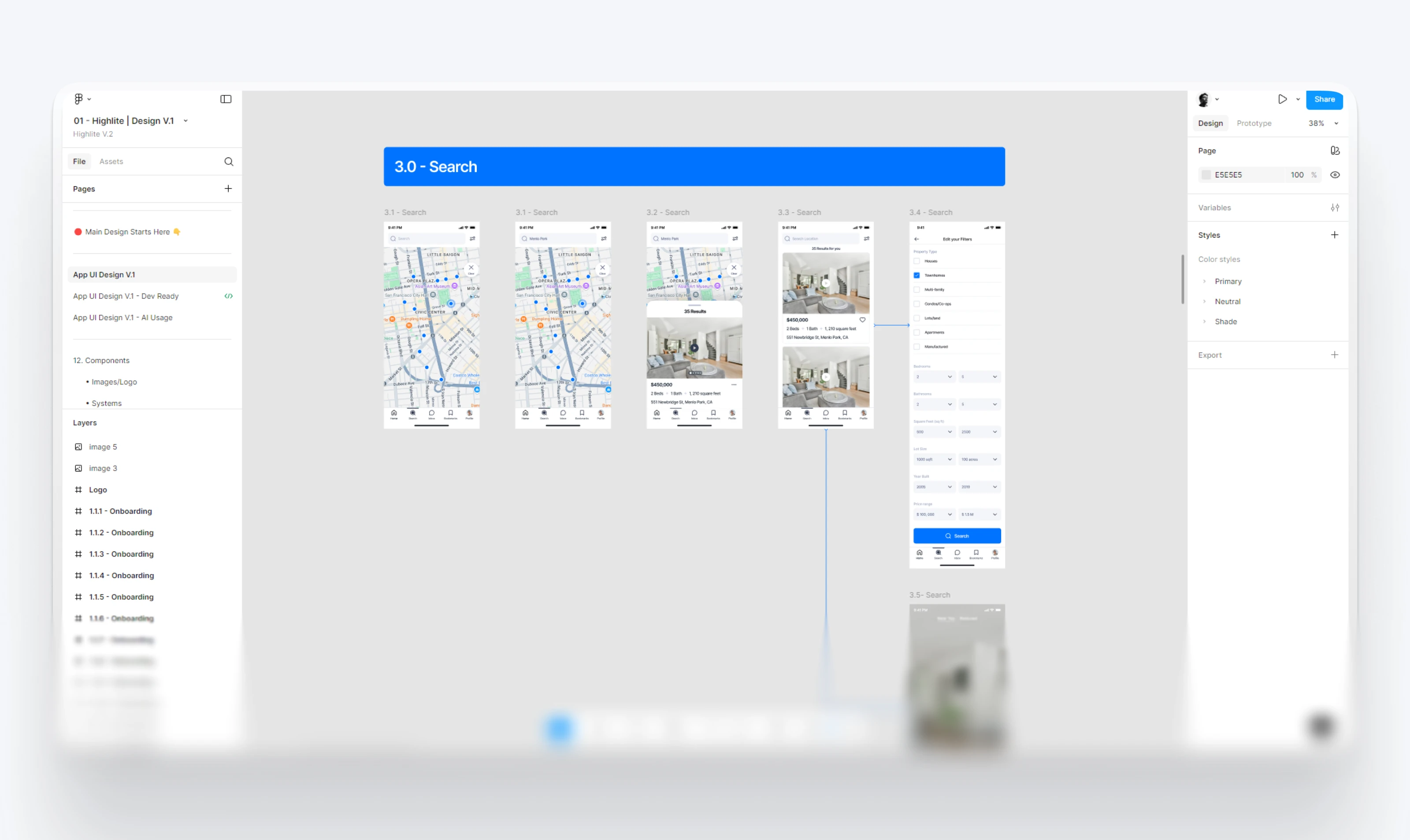
🔎 Search Experience
Users can browse listings using map or list views
Filters like price, type, beds/baths, and location
Save favorites to bookmarks with one tap
Clean layout showing price, location, and a big image
🏡 Listing a Property
Step-by-step guidance for sellers
Friendly tips (like how many photos to upload)
Simple forms with hints (no confusing real estate terms)
Instant preview before posting
📬 Inbox & Messaging
Direct chat between buyers and sellers
Each message thread linked to a specific property
Typing indicators and read receipts included
Buyer and seller profiles visible inside chat
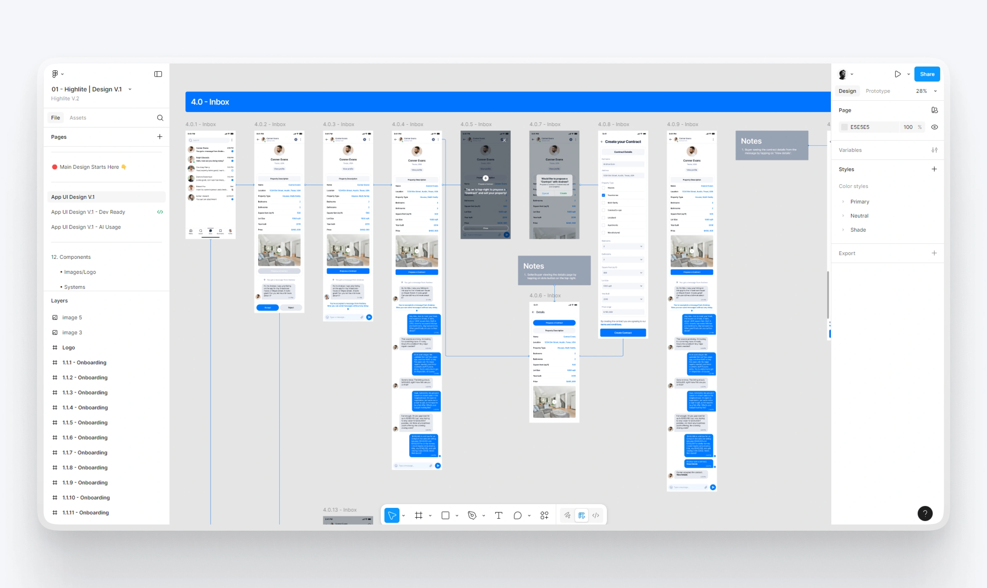
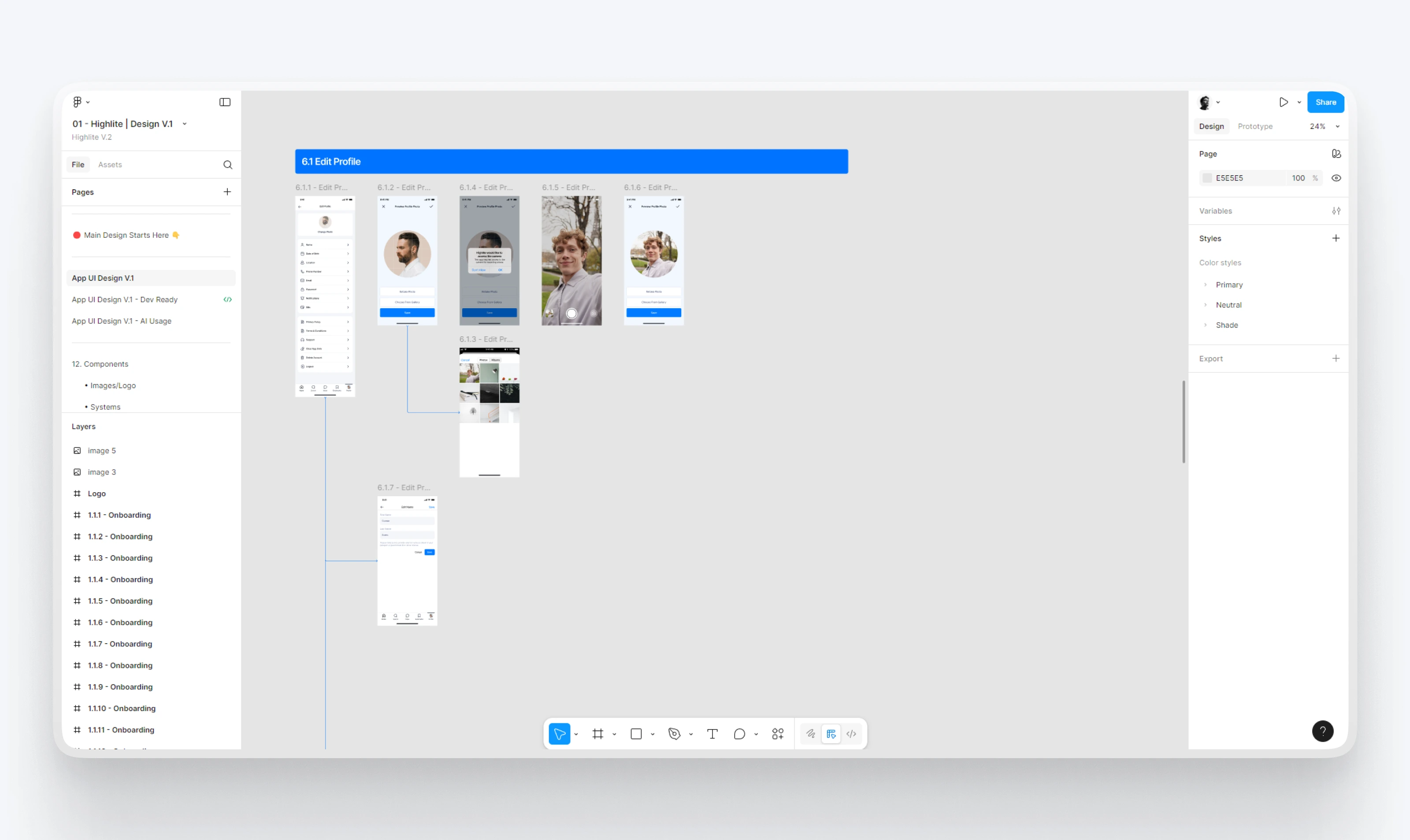
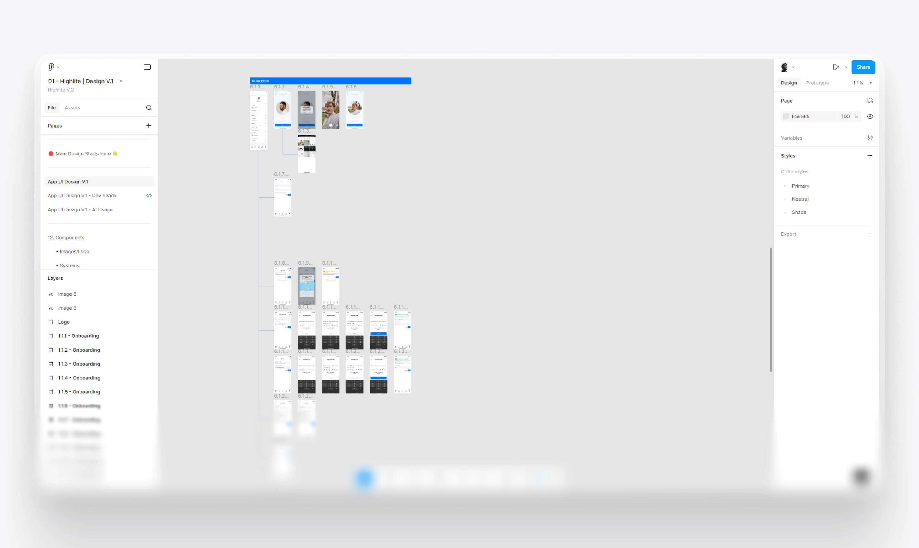
📝 Profile and Offers
Sellers can see how many views and offers they have
Can edit or unpublish listings any time
Buyers can make offers and negotiate directly
📂 Screens from the App
Here’s a small overview of what was designed:
40+ onboarding and login screens
20+ search, filter, and property list screens
30+ inbox and chat interactions
20+ listing creation steps
Full set of profile and edit profile flows
Brand assets, including logo, icons, and user flow diagrams
I made sure every part was mobile-responsive and user-friendly.
🙌 Client Reaction
Client was genuinely happy with the result. I was going out of my way to provide results and ensure we get the best MVP for our users.
He appreciated how smooth and familiar the app felt. Even though Highlite had advanced features like offer tracking and messaging, nothing ever felt overwhelming.
✅ Outcome
Delivered a full mobile-first property selling app
Designed a complete design system for scaling
Built with real users in mind from start to finish
Ready for development and further testing
Like this project
Posted Jul 23, 2025
Designed a mobile-first real estate app for selling properties, focusing on user experience and design consistency.