Framer Design Optimization for Themison
Al Razi Siam
🧭 Overview
Client: Juan Miguel Lopez
Company: Themision
Project Duration: 6 Hours
Service: Framer Design Optimization for Responsive Layouts
Role: Framer Designer, Framer Developer
Tools Used: Framer
Deliverables: Framer Layout Audit, Responsive Optimization for Desktop, Tablet, and Mobile, Layout Consistency Fixes, UI Refinements
Live Website: www.themison.com
🪛 Problem Statement
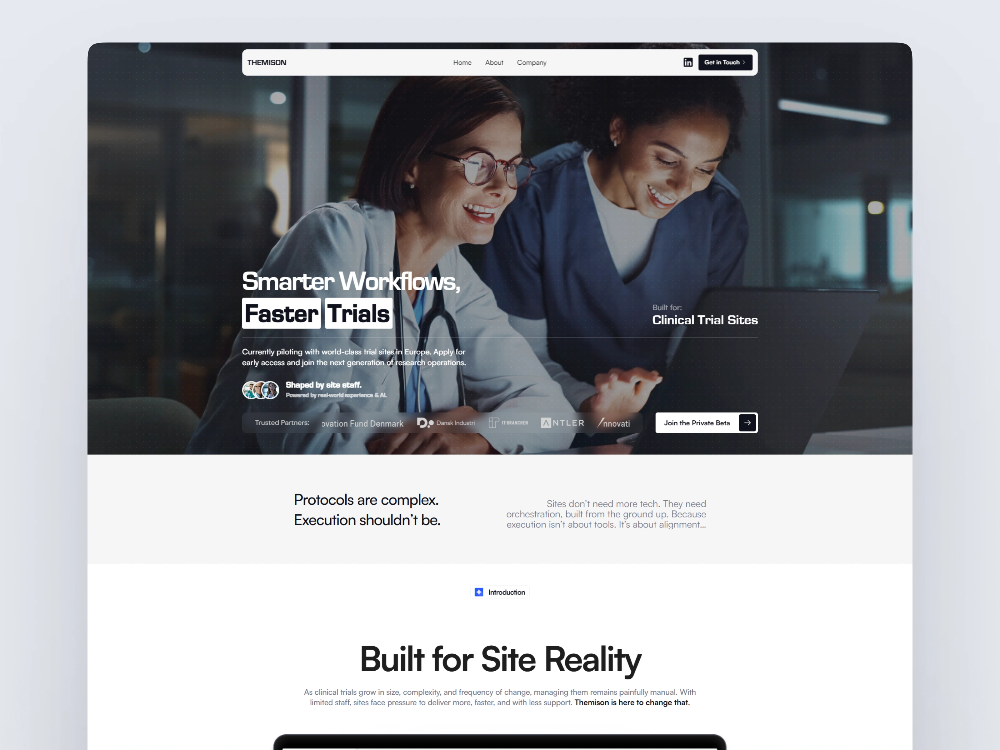
Themison is a next-gen AI platform designed for clinical trial sites, focused on simplifying workflows and improving clarity in protocol execution.
While the core design was already built in Framer, the layouts weren’t behaving consistently across breakpoints. That’s where I stepped in.
The client brought me in to audit and optimize the entire responsive experience of the site, from large desktops to tablets and mobile devices.
💡 The Challenge
While the desktop design looked polished, the tablet and mobile versions suffered from:
Inconsistent padding and margin behavior
Text overlapping or overflowing on small devices
Misaligned components and broken image ratios
Unpredictable layout shifts between breakpoints
A disjointed visual experience across screens
In short, the layouts looked great on desktop but didn’t scale gracefully for real-world device usage, especially for busy clinicians on the move.
🔧 My Role & Process
I approached the project with a clean and systematic workflow, tailored to Framer’s layout engine:
1. Responsive Audit
Went through every section to identify spacing issues, layout collapses, and breakpoint misbehaviors
Created a shared bug list to communicate clearly with the client
2. Framer Optimization
Restructured container logic using Framer’s auto-layout and constraint tools
Introduced stack-based responsive logic to maintain consistent spacing and alignment
Refactored elements like cards, images, grids, and buttons for better mobile performance
3. Testing Across Devices
Manually tested across major screen sizes and resolutions:
1440px (desktop), 1024px (tablet), 768px (small tablet), 375px (mobile)
Verified pixel-perfect results and ensured no overlaps, gaps, or content cutoffs
4. Client Feedback + Handoff
Walked the client through the final responsive system
Delivered clean, scalable breakpoints ready for future growth
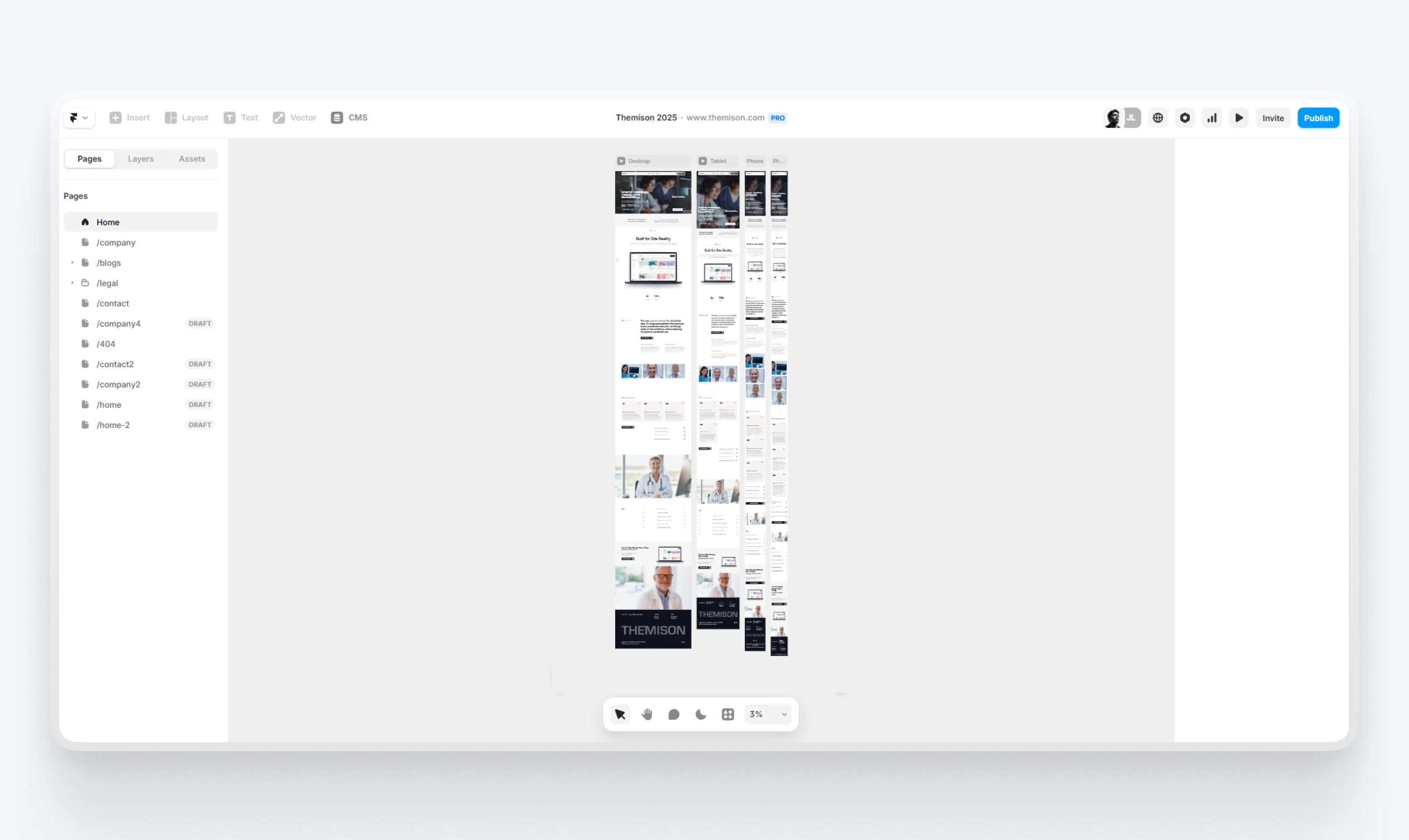
Framer Development Preview
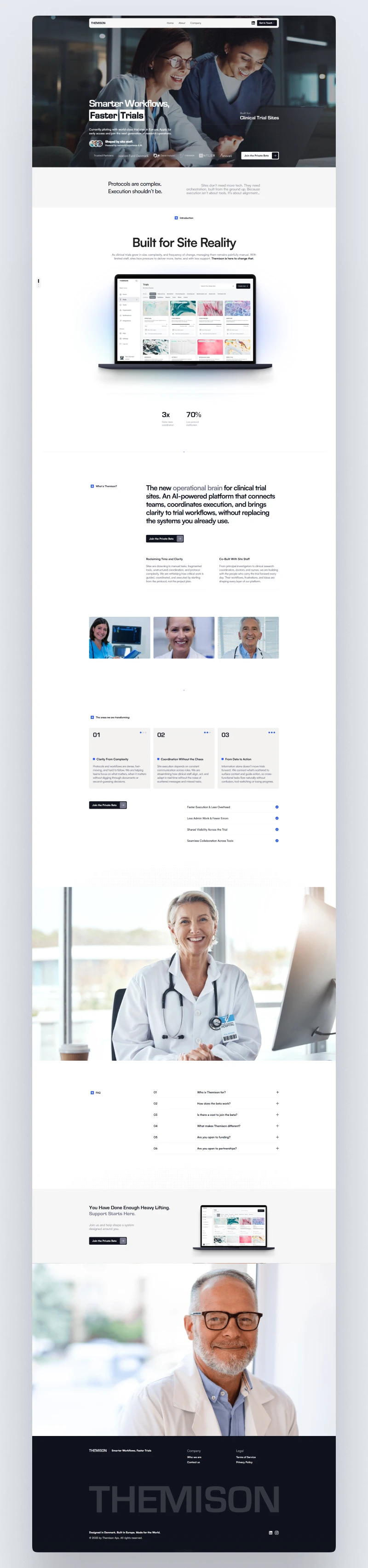
🌟 Key Results
✅ Seamless layout experience across desktop, tablet, and mobile
✅ 100% coverage for visual consistency on all breakpoints
✅ Improved content legibility and CTA visibility on mobile
✅ Zero broken components or overflow issues
✅ Faster load perception due to refined layout structure
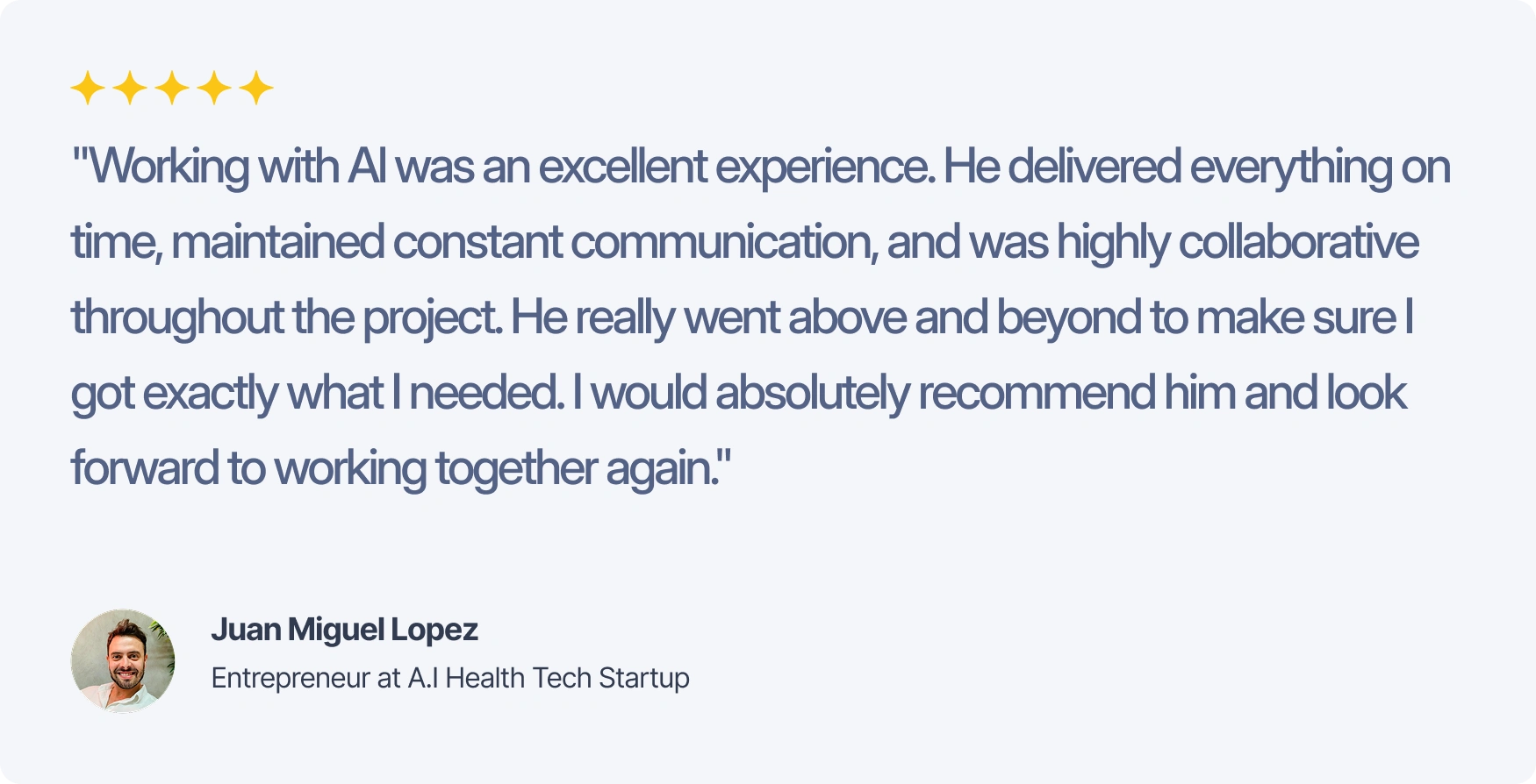
💬 Client Feedback
🎯 Impact
This responsive optimization not only improved UX but also boosted trust and usability for a platform used by healthcare professionals, where clarity and efficiency are paramount.
Themison’s design is now built to scale across devices, ensuring that users get the same powerful experience, whether they’re at a desk or on the go.
Live Website: www.themison.com
Full View
Like this project
Posted Jul 5, 2025
Helped Juan (client) to make final tweaks and optimize Framer designs for responsive layouts for desktop, tablet, and mobile.