Om On Wellness App Landing Page
Kiesha Allen
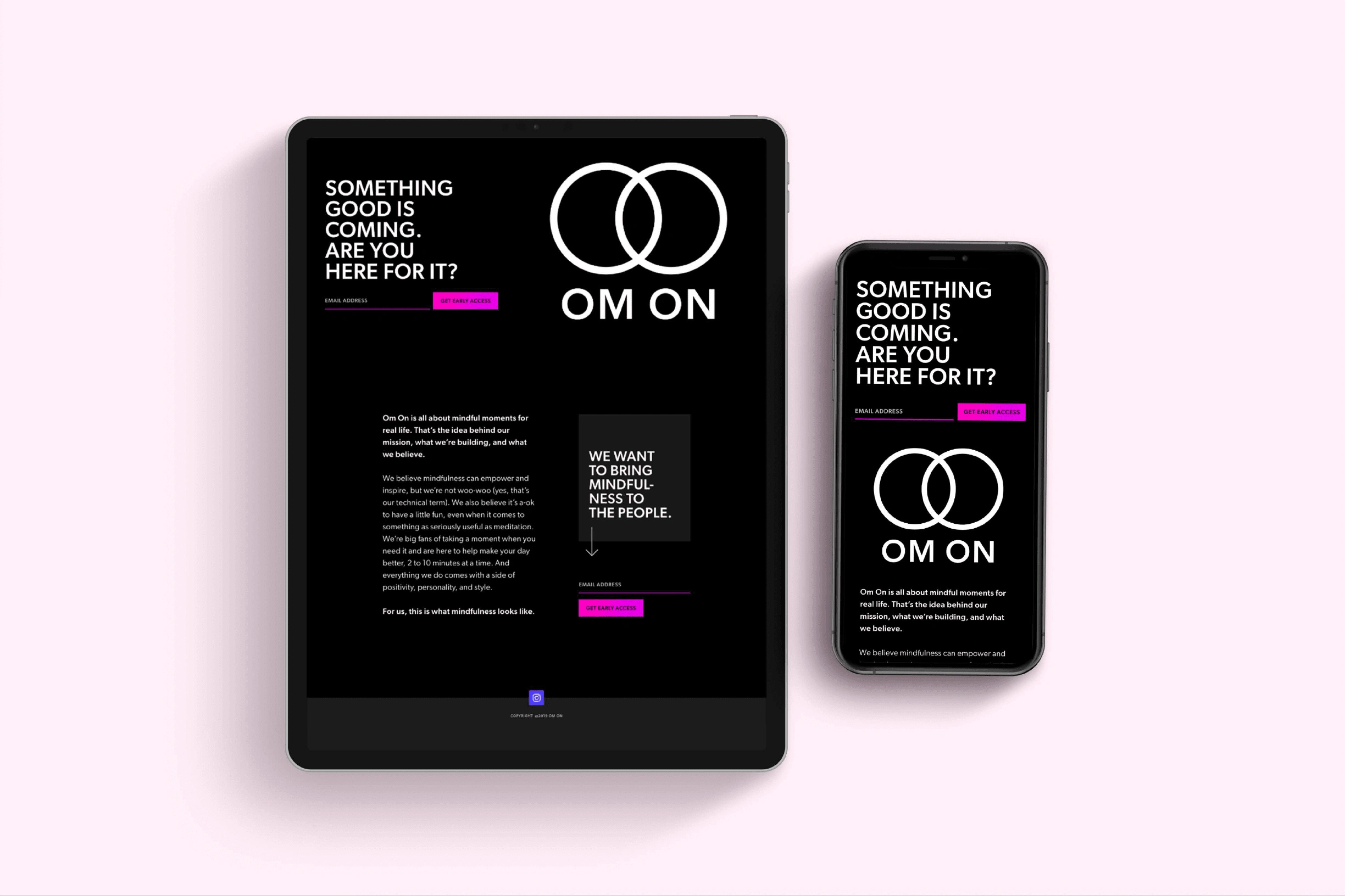
This project was about creating anticipation and capturing leads for a mindfulness app launch. The brief called for elevating their existing design to something more modern and minimal, and I saw this as an opportunity to create something bold yet peaceful. I stripped away unnecessary elements to focus on what matters: the message and the call to action.
I chose a stark black background with crisp white typography to create immediate visual impact, while the interlocking circles logo suggests harmony and connection - central themes for a mindfulness app. The subtle addition of pink accents adds a touch of warmth without compromising the minimal aesthetic. The responsive design ensures the impact of the message remains strong whether viewed on desktop or mobile, while the email capture form is prominently positioned but doesn't feel intrusive.
Like this project
Posted Nov 6, 2024
Crafted a minimal, high-impact lead capture page for a mindfulness app launch. Bold typography and clean design create anticipation and engagement.
Likes
0
Views
7