Mobile UX/UI Design for Lead Generation

🎯 Mobile UX/UI Design for Lead Generation
📱 Mobile-First Conversion Strategy
The hero section was intentionally designed with a mobile-first mindset, knowing that many local business owners browse on their phones between jobs, on-site, or during short breaks.
The goal was simple:
Deliver clarity in under 5 seconds and drive one primary action.
🧠 Clear Value Proposition Above the Fold
The headline structure follows a layered clarity model:
1. Brand Positioning Line:
“Small Bird. Big Impact.”
→ Creates memorability and brand identity.
2. Primary Value Headline:
“Professional Websites for Local Service Businesses”
→ Immediately defines audience and offer.
3. Supporting Statement:
“Turn visitors into calls with fast, conversion-focused websites. See your website before you pay.”
→ Communicates outcome + risk reversal.
This ensures the user understands:
Who it’s for
What it does
Why it’s different
Why it’s low risk
All before scrolling.
🟡 Strong Primary CTA Placement
The hero includes a single, high-contrast CTA:
“Get Your Free Preview”
Why this works:
It’s action-oriented
It removes financial hesitation
It emphasizes value before payment
It aligns with the productized service model
There are no competing CTAs in the hero, this increases clarity and improves conversion potential.
🔄 Visual Process Storytelling
Instead of static imagery, the hero uses a visual flow illustration showing:
Share business info
We build preview
You decide
This reduces cognitive load by visually answering:
“How does this work?”
The curved flow element guides the eye downward, encouraging natural scroll behavior.
📐 Visual Hierarchy & Spacing
Key design decisions:
Large, bold headline for immediate scanning
Adequate whitespace to prevent clutter
Strong contrast between text and background
Simplified icon elements to support, not distract
The mobile layout keeps everything vertically stacked, clean, and readable without zooming.
📞 CRO Principles Applied
The hero integrates core Conversion Rate Optimization principles:
Single conversion goal
Clear benefit-driven messaging
Risk reversal messaging (“See your website before you pay”)
No friction above the fold
Immediate clarity of target audience
This increases the likelihood of engagement from qualified prospects.
⚡ Psychological Triggers Used
The hero subtly incorporates:
Authority (Professional Websites)
Specificity (Local Service Businesses)
Outcome-driven language (Turn visitors into calls)
Risk reduction (Free preview)
Simplicity (3-step process visualization)
These psychological cues are especially important when selling to skeptical local contractors.
📱 Mobile UX Optimization
The mobile hero was optimized for:
Thumb-friendly CTA placement
Large readable typography
Minimal scroll depth before value is understood
Clear visual segmentation
Fast comprehension under 10 seconds
No unnecessary decorative elements that would slow down load time or distract.
💼 Strategic Intent Behind the Hero
This hero section does not try to impress with flashy visuals.
It is intentionally structured to:
Build trust quickly
Remove risk
Create curiosity
Encourage immediate action
It acts as a mini landing page within the first screen.
🏆 Final Impact of the Hero Section
The mobile hero successfully:
Positions Robin Web Studio clearly
Targets a specific niche (local service businesses)
Communicates outcome and differentiation
Encourages one focused action
Reduces hesitation through visual process explanation
This transforms the hero from a branding banner into a conversion-driving entry point.
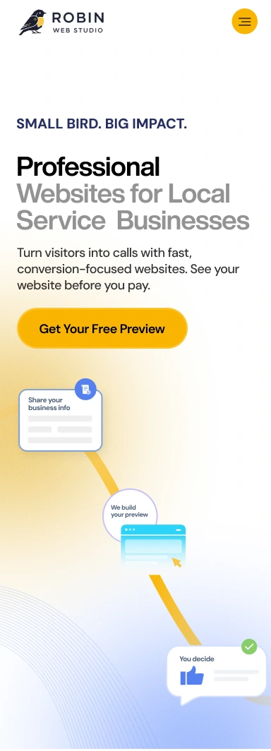
⚡ Immediate Clarity Without Friction
Instead of overwhelming the visitor with multiple value statements, the mobile hero compresses the offer into a sharp, layered message:
A confident brand identity
A clear niche focus (local service businesses)
A tangible outcome (more calls)
A powerful differentiator (preview before payment)
The messaging is structured so that even a 3-second glance communicates the full value.
🟡 Visual Confidence Through Simplicity
On mobile, visual noise kills conversions.
This layout intentionally:
Uses strong typographic contrast instead of decorative elements
Keeps visual direction vertical and natural
Avoids clutter around the primary CTA
Allows the yellow accent to guide attention with precision
The design doesn’t try to impress, it tries to convert calmly and confidently.
🔁 Scroll as a Persuasion Mechanism
The curved visual path below the CTA is not decorative, it’s psychological.
It subtly:
Encourages downward movement
Pre-answers “How does this work?”
Reduces uncertainty about the process
Makes the offer feel structured and predictable
In mobile UX, smooth scroll flow replaces heavy explanation.
🎯 Micro-Decision Engineering
This hero reduces the user’s decision to one micro-step:
“Do I want to see my free preview?”
There is no pricing anxiety.
No long comparison.
No feature overload.
Just one low-risk action.
That’s intentional funnel control.
📐 Controlled Attention Design
On mobile, attention is fragile.
This hero uses:
Large headline weight for authority
Strategic line breaks for readability
Generous spacing to avoid crowding
A single dominant button
Nothing competes with the primary action.
🧠 Designed for a Specific Buyer Mindset
This isn’t generic mobile design.
It is built specifically for:
Electricians
Plumbers
HVAC contractors
Trade business owners
People who care about:
Results
Speed
Practicality
ROI
The tone, layout, and structure reflect that mindset.
🚀 The Strategic Intent
This mobile hero doesn’t exist to look modern.
It exists to:
Filter the right audience
Communicate confidence
Remove risk
Push one action
Start a conversion sequence
It turns a cold visitor into a curious prospect, within one screen.
📱 Mobile Hero Architecture – Built for Speed, Trust & Action
This mobile hero wasn’t designed as a scaled-down desktop version.
It was architected as a conversion-first micro landing page.
The design assumes:
The user is on mobile.
The user is busy.
The user is skeptical.
The user is scanning, not reading.
Every design decision supports that reality.
🧠 Strategic Positioning Within One Screen
The hero accomplishes five things before the user scrolls:
Establishes brand identity
Defines the target audience
Communicates the outcome
Removes risk
Presents one clear action
That is not accidental.
Most mobile heroes fail because they try to:
Be clever
Be stylish
Be aesthetic
This one is built to be clear.
Clarity converts.
🎯 Headline Engineering (Not Just Typography)
The headline stack is intentional:
SMALL BIRD. BIG IMPACT.
→ Brand personality + memorability
Professional Websites for Local Service Businesses
→ Clear niche focus (no ambiguity)
Turn visitors into calls… See your website before you pay.
→ Outcome + risk reversal in one line
The hierarchy is designed so that even if a user reads only:
The bold headline
The first supporting sentence
They still understand the offer.
That’s micro-communication optimization.
🟡 CTA Dominance & Psychological Framing
The CTA isn’t just visually strong — it’s psychologically framed.
“Get Your Free Preview” works because:
It promises something tangible
It lowers commitment pressure
It avoids sales-heavy language
It implies value before payment
Notice what’s missing:
No “Book a Call”
No “Learn More”
No “View Pricing”
Those introduce friction.
This CTA introduces momentum.
📐 Spatial Breathing & Cognitive Ease
On mobile, clutter equals abandonment.
This hero uses:
Generous vertical spacing
Clear content grouping
Strong line breaks
Controlled white space
This reduces mental effort.
When cognitive effort drops, conversion probability rises.
🔄 Visual Flow as Subconscious Guidance
The curved pathway illustration is not decorative — it’s directional psychology.
It does three things:
Guides the eye downward
Explains the process visually
Suggests progress and motion
Humans trust processes they can see.
The visual journey:
Share info → We build → You decide
That alone eliminates confusion.
🧩 Friction Removal Through Pre-Answered Questions
Before the user even thinks:
“How much does this cost?”
“How complicated is this?”
“Is this risky?”
“What’s the catch?”
The hero answers indirectly:
You see it first. You decide after.
This is strategic objection handling inside design.
📱 Mobile Ergonomics & Thumb Reach
The button placement supports:
Natural thumb reach zones
Easy tap access without stretching
Clear separation from other interactive elements
Nothing is cramped.
Nothing requires zooming.
Nothing feels tight.
That improves tap confidence.
🎨 Controlled Color Psychology
The yellow accent is deliberate.
Yellow communicates:
Energy
Optimism
Momentum
Attention
Against a calm gradient background, it becomes:
The only visual command.
Color here isn’t decoration.
It’s behavioral influence.
⚡ Speed of Comprehension Over Visual Noise
Many mobile heroes use:
Background videos
Overlays
Multiple icons
Busy gradients
Animated distractions
This hero avoids all that.
Because the target audience (contractors) values:
Practicality
Directness
Results
The UI mirrors their mindset.
🔎 Funnel Discipline
This hero does not try to educate fully.
It does not try to prove fully.
It does not try to sell fully.
It does one thing:
Move the user to the next step.
That’s disciplined funnel design.
💼 Audience-Specific Design Language
This design speaks to:
Electricians
Plumbers
HVAC contractors
Trade professionals
It avoids:
Agency jargon
Startup fluff
Marketing buzzwords
The tone is grounded.
The message is practical.
That builds resonance.
🧱 Structural Simplicity for Scalability
From a systems perspective, this hero:
Can be reused across landing pages
Can support A/B testing easily
Can swap headline variations
Can test CTA copy
Can adapt to different trade niches
It’s modular.
That’s long-term thinking.
🏁 Strategic Intent of This Hero
This mobile hero exists to:
Filter the right audience
Establish trust quickly
Lower resistance
Create curiosity
Trigger action
It is not decorative branding.
It is a conversion gateway.
🚀 Why This Matters
A weak hero costs money.
A strong hero:
Increases CTA clicks
Reduces bounce rate
Speeds decision-making
Improves lead quality
This hero was built as a performance asset.
Not just a design asset.
Like this project
Posted Feb 16, 2026
Designed a mobile-first, conversion-optimized hero section for Robin Web Studio, improving user engagement, brand clarity, and lead generation performance.
Likes
1
Views
12
Clients
Robin Web Studio

