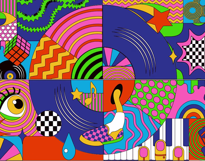
Pickle Me Crazy - Brand Identity
Invisual Studio

Posted Jun 2, 2026
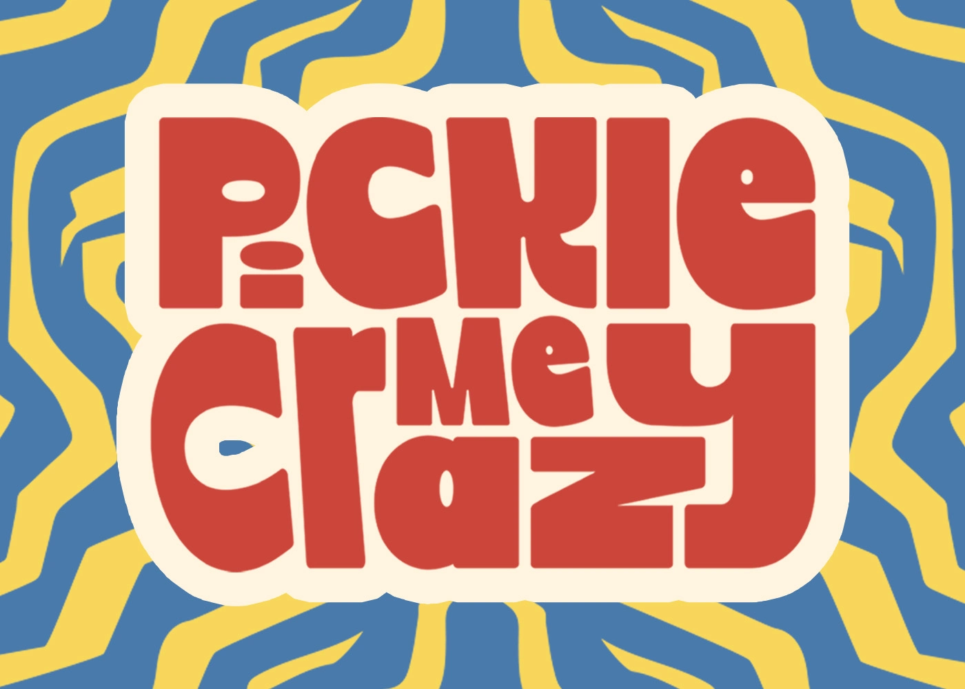
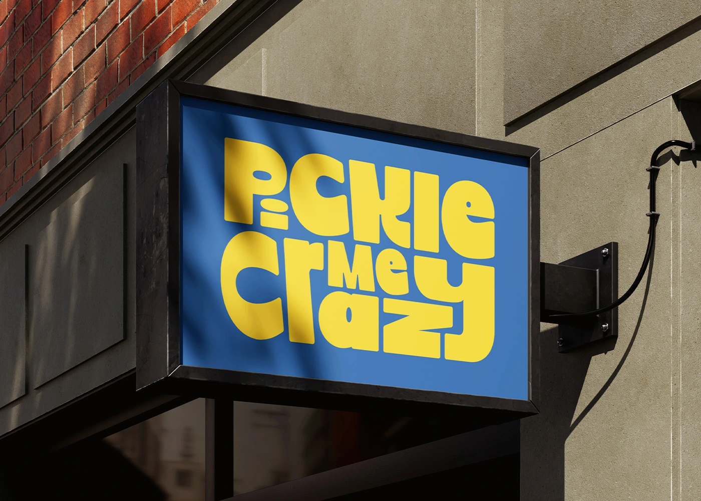
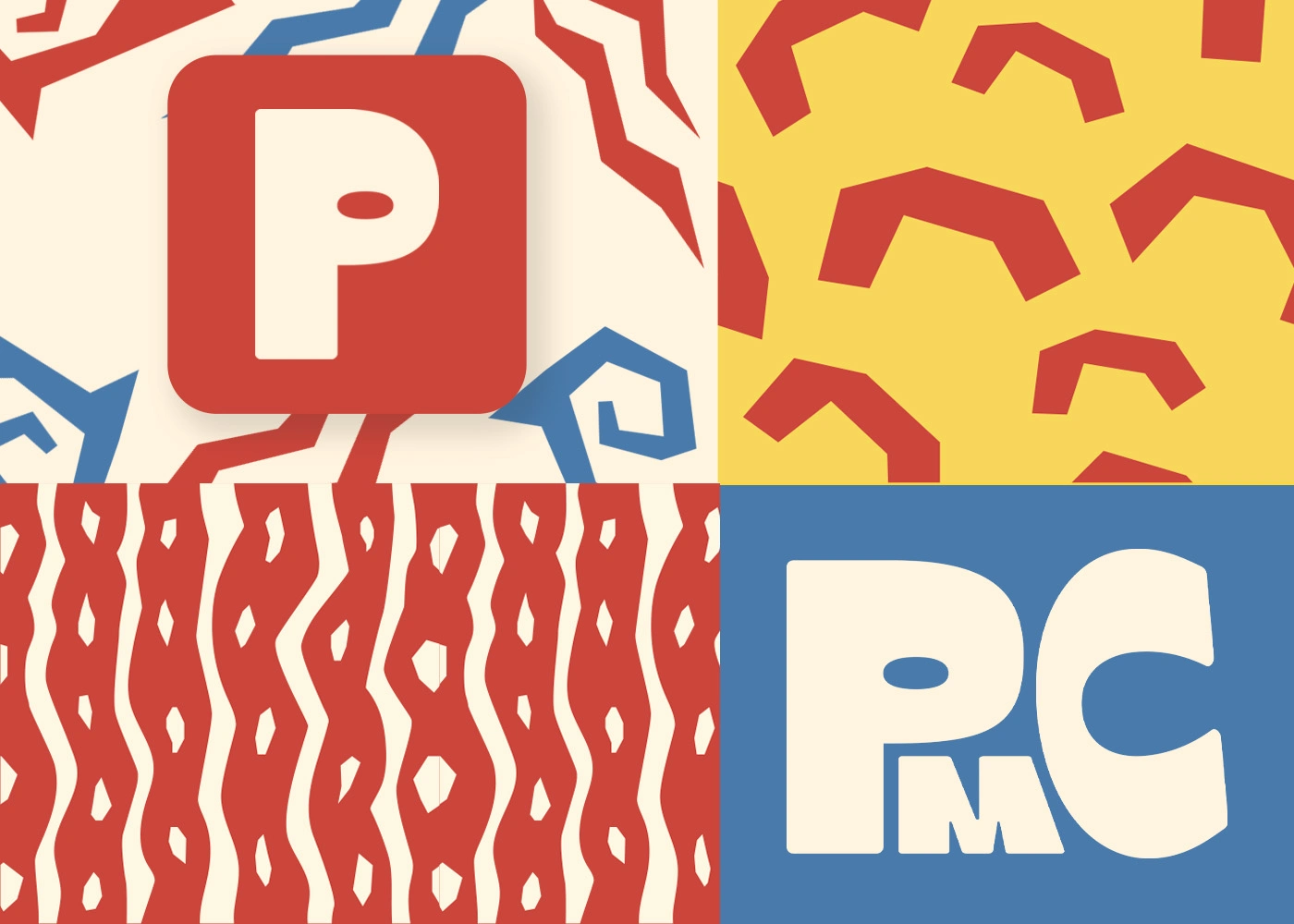
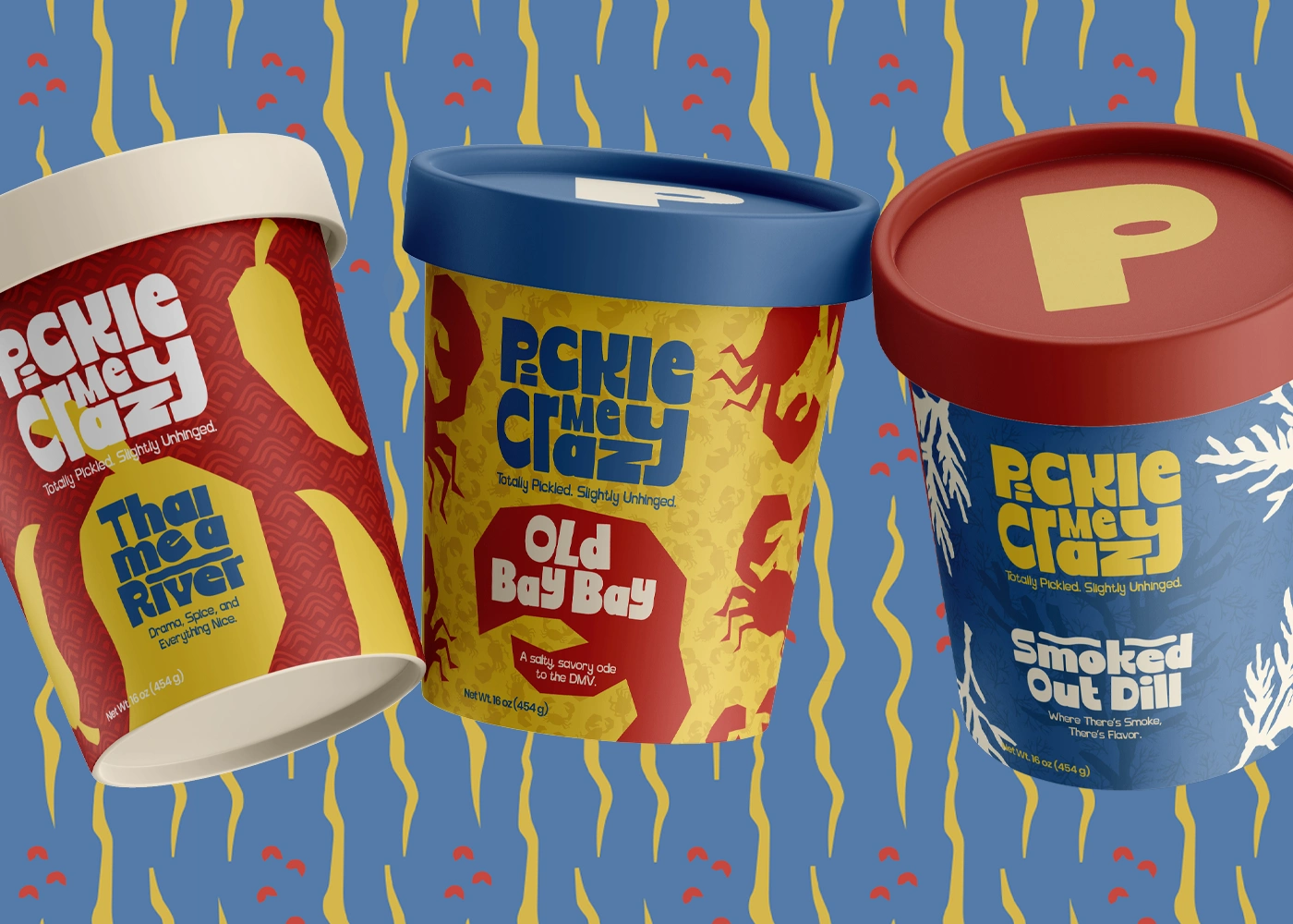
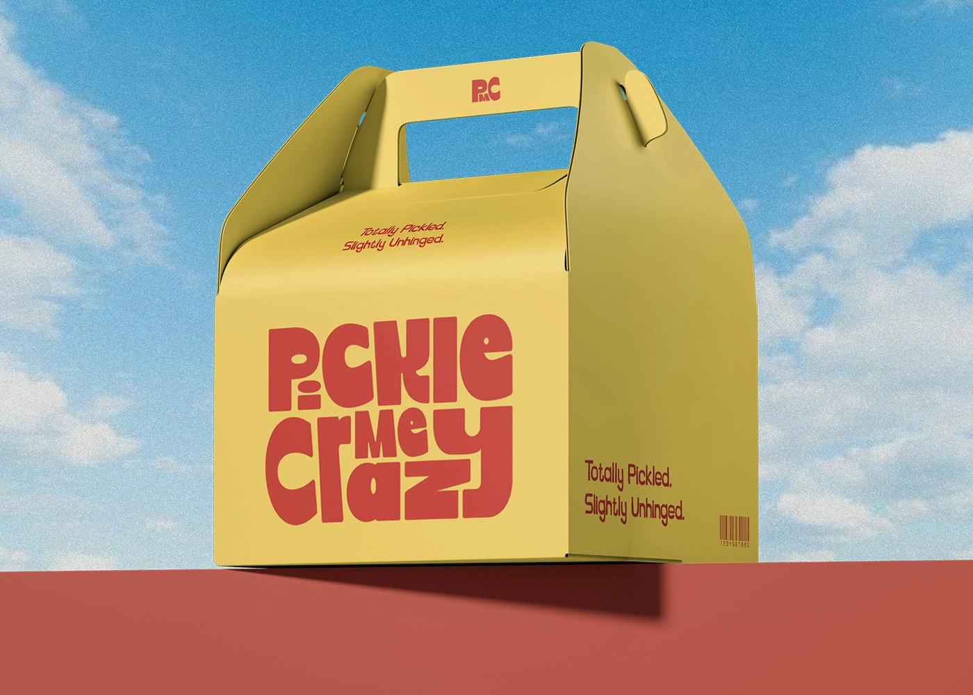
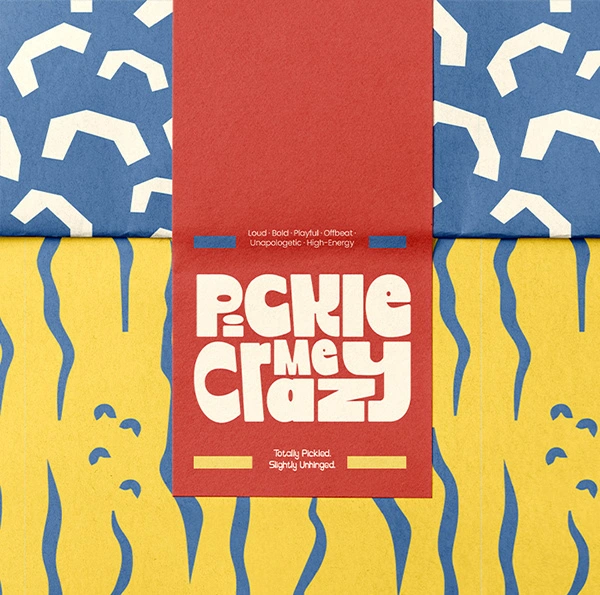
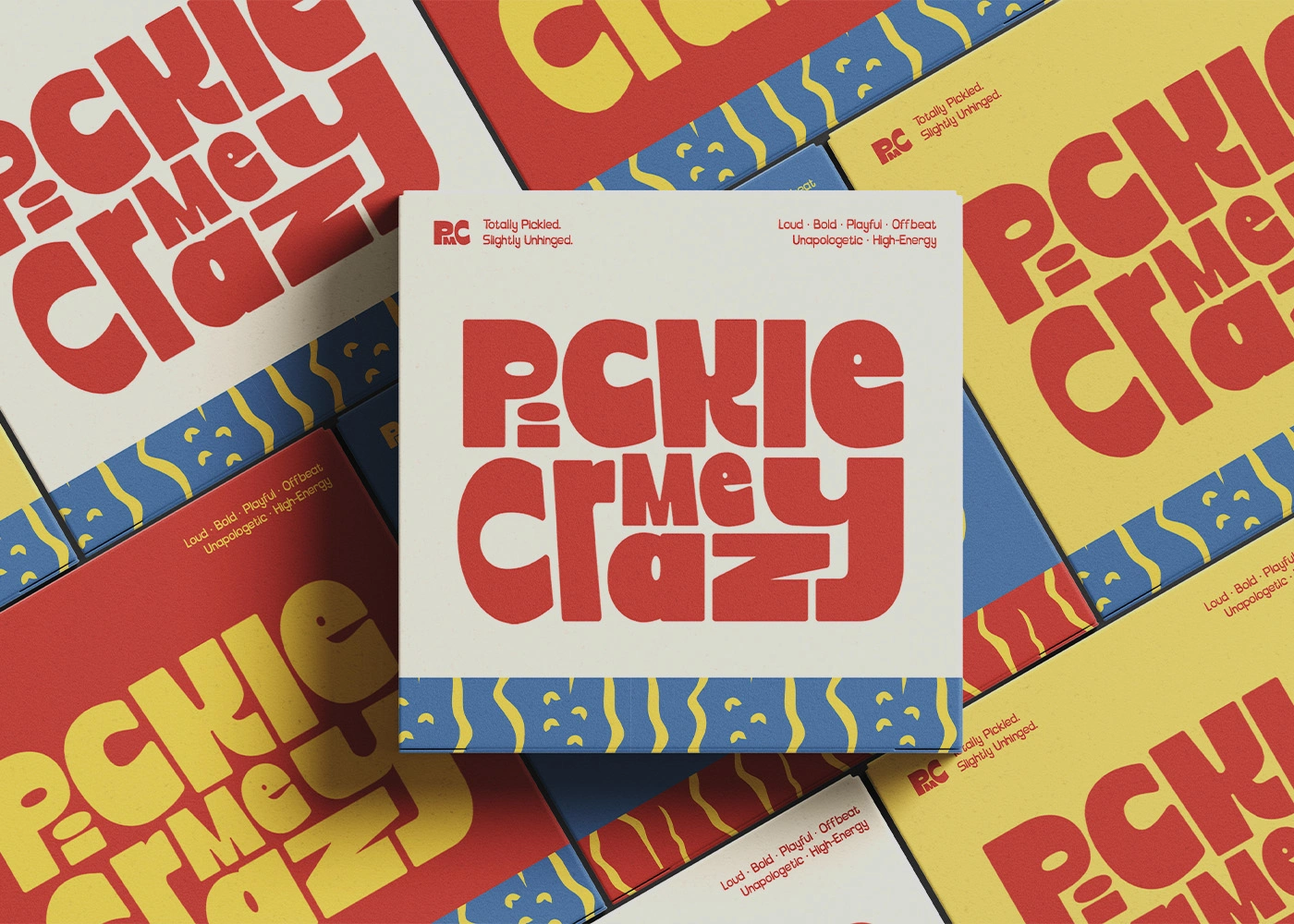
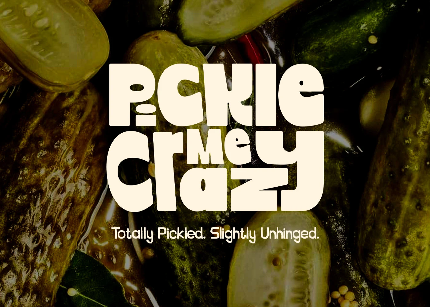
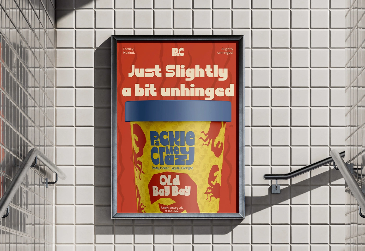
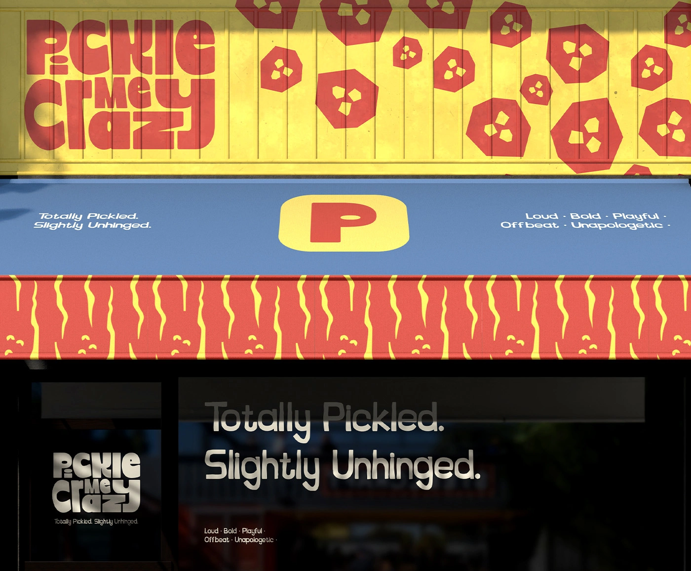
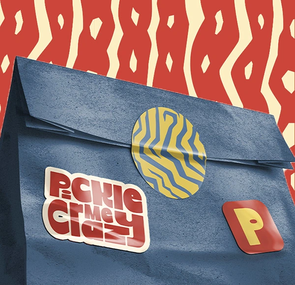
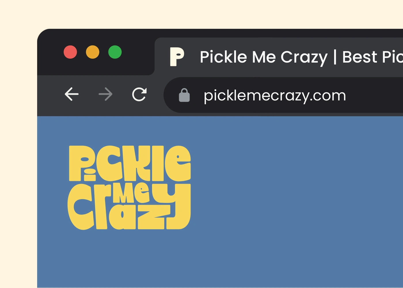
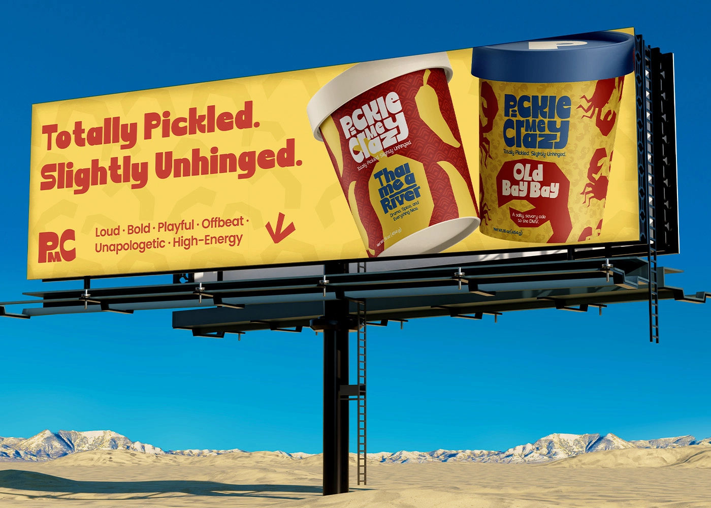
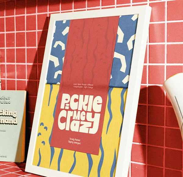
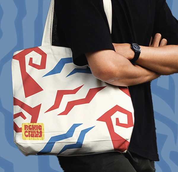
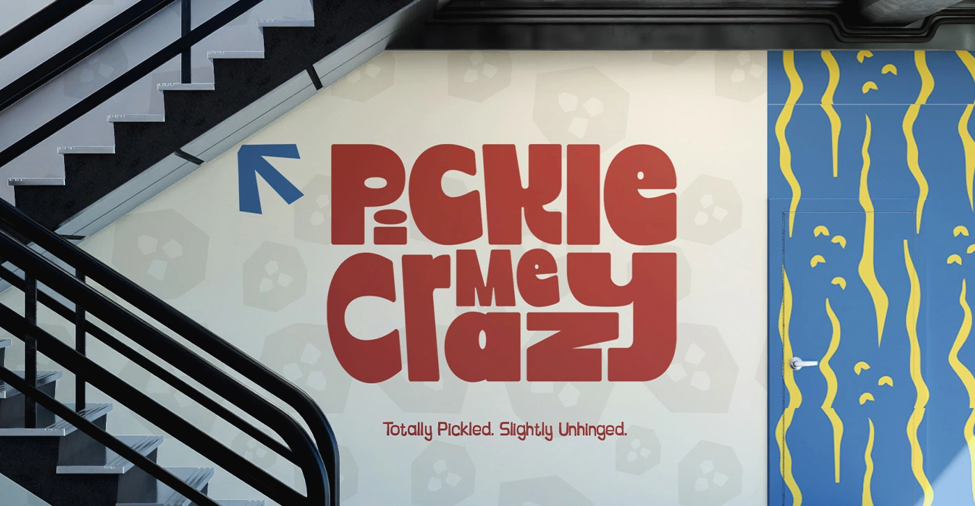
Pickle Me Crazy (PMC) is a pickle food brand that fully embraces being bold, playful, and just a little bit unhinged—in the best way possible. From the chunky logotype to the high-energy color palette and offbeat patterns, the brand is designed to feel loud, fun, and instantly recognizable. Nothing here is meant to be subtle. PMC celebrates strong flavors and strong visuals, creating a brand world that feels confident, chaotic, and memorable at first glance. This project focused on translating that playful personality into a cohesive visual system across packaging, patterns, and brand applications. Every element was built to feel dynamic and flexible, while still staying consistent as a brand. The result is a visual identity that doesn’t try to please everyone—just the ones who love pickles, bold ideas, and brands that don’t take themselves too seriously. Totally pickled. Slightly unhinged.