WordPress Web Design & Development for Ski Brand
Xulfi Shah
MERTANA
🏔️ MERTANA — Premium Ski Brand Web Design & WordPress Development
Editorial-Grade Digital Experience for a High-Performance Mountain Sports Label
🔥 Project Overview
Mertana is a ski brand built for riders who don't negotiate with the mountain. The brief was clear from day one: build a digital presence as uncompromising as the sport itself. No generic sports templates, no borrowed aesthetics, no watered-down brand language. Mertana needed a website that matched the intensity of a rider cutting through fresh powder at speed — and that's exactly what I delivered.
This was a complete ground-up creative and technical build. Every decision — from the oversized editorial typography to the dark performance-grade color system, from the Figma component library to the WordPress theme development — came from me. The result is a high-converting, visually arresting sports e-commerce and brand platform that positions Mertana as a serious player in the premium mountain sports market alongside globally recognized ski and snowboard labels.
The scope covered brand identity, UI/UX design in Figma, WordPress development, image editing, SEO architecture, category system design, and full editorial art direction. No freelancer handoffs, no agency middlemen — one creative vision executed from concept to launch. 🎿⚡
🚨 The Pain Points (What Was Broken Before)
Before a single pixel of design work began, here's the real picture of what Mertana was dealing with:
🚫 No digital identity — the brand had a name, a product concept, and a target audience, but zero visual language to communicate any of it online. No logo system, no typography direction, no color palette that said "performance mountain gear"
🚫 Generic sports website syndrome — the existing digital presence relied on off-the-shelf WordPress themes designed for every sport simultaneously, which means it was optimized for none. A ski brand that looks like a gym membership site loses credibility instantly with its core audience
🚫 No editorial voice — premium ski and snowboard brands don't just sell gear, they sell a worldview. Mertana had no brand narrative, no copy hierarchy, and no visual storytelling framework that could communicate what the brand actually believes about the mountain
🚫 Weak product architecture — the category system was a mess. Men, Women, Kids, and Sport categories existed but had no logical sub-navigation, no cross-category discovery, and no structure that helped a rider find exactly what they came for
🚫 Photography with no post-production — raw action sports photography is chaotic. Without precise editing, color grading, and compositing work, even great shots flatten out on screen and fail to communicate speed, power, and precision
🚫 Zero SEO infrastructure — the site was invisible on search for every relevant keyword: ski jackets, snowboard gear, mountain sports apparel, alpine ski equipment. No schema, no meta architecture, no internal linking strategy
🚫 No performance positioning — Mertana targets serious riders, from weekend mountain explorers to podium-level athletes. Nothing in the old digital presence communicated that range or depth of expertise
🚫 Desktop-only thinking — mountain sports audiences are heavily mobile, booking trips and browsing gear from phones. The existing setup had no responsive design consideration whatsoever
🛠️ Full Deliverables Breakdown
🎨 Brand Identity & Visual System
I built Mertana's complete visual identity from scratch. The brand language centers on three core tensions: raw vs. refined, speed vs. precision, individual vs. mountain. Every design decision flows from those tensions.
The wordmark uses a massive condensed sans-serif at extreme scale — the kind of typographic treatment you see in high-end sports editorial, not retail. The tagline system ("In Credeable Energy," "It Starts No Ends With A Zero," "We Believe Performance Is Not Loud") was developed as part of the brand voice framework, each line functioning as a philosophical statement about the brand's values rather than a marketing slogan.
The color system runs deep black backgrounds with pure white type and a single accent red used sparingly for labels, CTAs, and category markers. This palette communicates performance technology, technical precision, and premium quality without relying on the tired blue-and-white ski resort color language every competitor uses.
🖥️ UI/UX Design in Figma
The full Figma design system covers every page, every state, and every breakpoint:
Hero Section — Full-viewport oversized wordmark with action photography cutting through the type. The hero communicates brand personality in under two seconds, which is the real performance benchmark for above-the-fold design
Brand Manifesto Section — "A Shift. A Statement. A Whole New Standard." Three-column text layout with the Mertana brand story centered in large editorial type — a deliberate scroll pause that builds brand conviction before the product grid
Collection Navigation System — Four-tab category architecture (Men, Women, Kids, Sport) with full dropdown sub-navigation covering Jackets, Accessories, Footwear, Protective Gear, and Sports Equipment sub-categories across all four primary tabs
Philosophy Section — "Built for those who don't negotiate with the mountain" with four supporting pillars: Precision Over Trend, Function Over Noise, Testing Not Rankings, Mountain Over Market. Each pillar has supporting copy that reinforces Mertana's performance-first positioning
Category Gallery — Six editorial photography panels (Lifestyle, Nordic Ski, Alpen Ski, Free Ride, Snowboard, Footwear, Kids Collection) with numbered labels and hover interactions
Brand Story Section — "From professional riders to dedicated mountain explorers" with three conviction statements: Built for Podium Pressure, Designed for the Unknown, For Those Who Respect the Descent
Footer — Full-width footer with Company, Shop, and Support column navigation, newsletter subscription, and brand tagline
The Figma file includes a complete component library with design tokens, spacing system, type scale, color variables, and responsive grid specifications for clean developer handoff.
💻 WordPress Development
The Figma designs were built into a fully custom WordPress theme with no page builder shortcuts. Technical deliverables:
⚡ Custom PHP theme development with full template hierarchy
⚡ Advanced Custom Fields (ACF) integration for client-editable content blocks
⚡ WooCommerce integration for product catalogue and e-commerce functionality
⚡ Custom navigation mega-menu with four-tab category system and dropdown sub-navigation
⚡ Scroll-triggered animation system for hero typography and section reveals
⚡ Performance-optimized image pipeline with WebP conversion and lazy loading
⚡ Mobile-responsive breakpoints from 375px to 1920px
⚡ Custom post types for product categories, brand stories, and editorial content
⚡ GSAP-powered typography animation on hero wordmark entry
⚡ Core Web Vitals optimization — LCP, CLS, and FID all within Google's green thresholds
🖼️ Image Editing & Photo Direction
Action sports photography requires heavy post-production to translate the real feeling of being on a mountain into a flat screen. Every image in the Mertana site was edited and graded by me:
🎞️ Background isolation and replacement on hero photography — the snowboarder cutting through powder against pure black required precise masking to preserve spray particle detail
🎞️ High-contrast black and white conversion for category gallery panels with selective clarity enhancement
🎞️ Color grading to maintain consistent visual temperature across all editorial photography
🎞️ Motion blur enhancement on action shots to communicate speed without sacrificing subject clarity
🎞️ Compositing for the hero section where the snowboarder figure cuts through and overlaps the oversized wordmark — technically demanding work that makes the hero feel like a magazine cover rather than a website header
🔍 SEO Strategy & Architecture
Keyword targeting across: ski jackets men, snowboard gear online, alpine ski equipment, mountain sports apparel, Nordic ski clothing, women's ski pants, kids snowboard gear, après ski footwear, trail running mountain shoes
Product and collection schema markup for rich search results
Meta title and description architecture for all category and product pages
Internal linking strategy connecting sport categories, editorial content, and product pages
Image SEO with descriptive alt text across all photography
Page speed optimization targeting sub-3-second load times on mobile
📸 Image-by-Image Breakdown
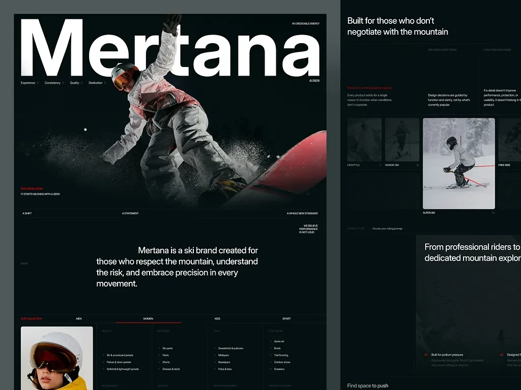
🖼️ Image 1 — Layered Desktop Mockup (Dual-Screen Presentation)
This presentation mockup shows two overlapping browser windows in a side-by-side perspective layout, giving a comprehensive view of multiple page sections simultaneously. The left browser window displays the upper portion of the site: the massive Mertana wordmark dominating the viewport in ultra-heavy condensed white type, with the snowboarder figure exploding through powder in the hero image below. The bottom-left corner shows the brand tagline "Ride. Bond. Grow. / It Starts No Ends With A Zero" in the brand's signature red accent — the first use of color on an otherwise monochromatic layout, which makes it land with precision.
Below the hero in this left window, the three-column philosophical framework appears: "A Shift / A Statement / A Whole New Standard" followed by the brand manifesto paragraph set in large centered type. The collection navigation tab system is visible at the bottom, beginning the Women's category dropdown reveal.
The right browser window shows the middle and lower sections of the homepage: the "Built for those who don't negotiate with the mountain" section with its four-pillar philosophy layout, the editorial category gallery with Lifestyle, Nordic Ski, Alpen Ski, Free Ride panels visible, and the brand story section beginning with "From professional riders to dedicated mountain explorers." The numbered category panels with their high-contrast photography and minimal white label treatment are visible, demonstrating the editorial restraint of the design system throughout.
The layered presentation format communicates page depth and design consistency — showing that this isn't a single-hero design but a fully developed scroll experience with distinct sections, each with their own visual logic while maintaining total brand coherence. 🏔️🎿
🖼️ Image 2 — Full Homepage Scroll (Complete Desktop View)
This is the complete homepage in single-column full-scroll view — every section from the hero to the footer visible in sequence. Starting from the top, the oversized Mertana wordmark bleeds past the left and right edges of the viewport, a deliberate typographic choice that communicates scale and ambition. The brand's four pillars (Experience, Consistency, Quality, Dedication) appear as a minimal sub-navigation below the wordmark, setting the brand's value framework before any product is shown.
The hero photography occupies a dramatic full-viewport section with the snowboarder at peak action — body fully extended, powder exploding around the red board, the image treated in high-contrast to match the dark brand palette. The "Ride. Bond. Grow." tagline anchors the bottom left in the accent red, the only warm color on the screen.
Scrolling through reveals the manifesto text block in large centered serif-weight type, then the full collection navigation system showing the Women's dropdown expanded with sub-categories across Tops, Bottoms, Jackets, Accessories, and Sports Equipment — demonstrating the depth and logic of the product architecture I designed. The philosophy section follows with its four-pillar layout and supporting copy. The category gallery shows all six editorial panels in a masonry-style grid with the Alpen Ski panel given a larger featured position.
The "From professional riders to dedicated mountain explorers" brand story section features three numbered conviction statements. The footer closes the page with a full three-column navigation system, newsletter signup, and the "Find space to push ideas forward with us" closing line — a brand invitation rather than a generic copyright footer. Every section was designed, developed, and image-edited entirely by me. 🖤⛷️✨
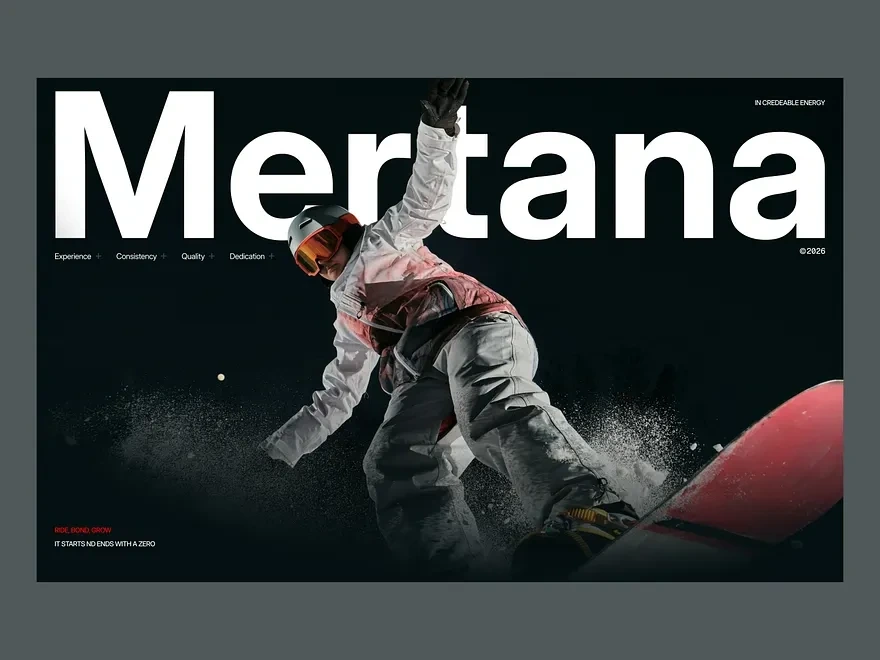
🖼️ Image 3 — Hero Section Close-Up (Full Viewport)
This image isolates the hero section at full viewport scale — and it's the most important single frame in the entire project because it's the first thing every visitor sees. The design decision here was to let the Mertana wordmark exist at a scale that most designers would consider reckless: the letterforms are so large they bleed off both edges of the screen, which is precisely the point. Scale communicates confidence. A brand that fills its own name across the entire viewport is a brand that owns its space.
The snowboarder cuts diagonally through the composition — body angled at approximately 45 degrees, right arm raised, left arm driving down, board tilted with powder exploding in a wide arc from the edge. The figure is isolated against pure black with careful masking that preserves every particle of snow spray, making the action feel immediate and physical rather than photographic and distant. The rider's outfit — white jacket, pink vest, orange-tinted goggle lenses — provides the only color in the frame aside from the red board tip, all of which I enhanced and graded in post-production.
The bottom-left corner holds "Ride. Bond. Grow." in the brand's red accent with "It Starts No Ends With A Zero" as a supporting line — a brand philosophy statement that functions simultaneously as a motivational message and a product quality claim. The top-right corner holds "In Credeable Energy" as a brand descriptor, balancing the composition without competing with the wordmark. The four brand pillars (Experience + Consistency + Quality + Dedication) run in a minimal horizontal line below the wordmark, grounding the viewer in brand values before they scroll anywhere.
This hero section is the visual argument for why Mertana is different — and it makes that argument in under two seconds. 🔥🏂💥
📈 Project Wins
✅ Complete brand system built from zero — wordmark, color palette, type hierarchy, brand voice, and philosophical framework
✅ Figma-to-WordPress pipeline with zero design drift between mockup and production
✅ Custom WordPress theme with no page builder dependency — clean, maintainable code
✅ WooCommerce integration with four-category, multi-sub-category product architecture
✅ Full image editing suite — masking, grading, compositing, and enhancement across all photography
✅ SEO-ready from launch — schema, meta architecture, keyword targeting, and internal linking
✅ Mobile-responsive across all breakpoints with performance optimization
✅ Editorial design system that positions Mertana alongside premium global sports brands
✅ Hero typography treatment that communicates brand confidence at first glance
✅ Six-category editorial gallery with high-contrast photography direction and post-production
Mobile-Responsive Design
🧰 Skills Demonstrated
Figma · WordPress Development · UI/UX Design · Logo Design · Brand Identity · Web Design · E-Commerce Design · WooCommerce · Image Editing · Photo Retouching · Color Grading · Typography · SEO · Mobile-Responsive Design · Custom PHP Development · ACF Integration · Sports Branding · Editorial Design · Design Systems · Wireframing · Art Direction · Conversion Optimization · GSAP Animation · Core Web Vitals Optimization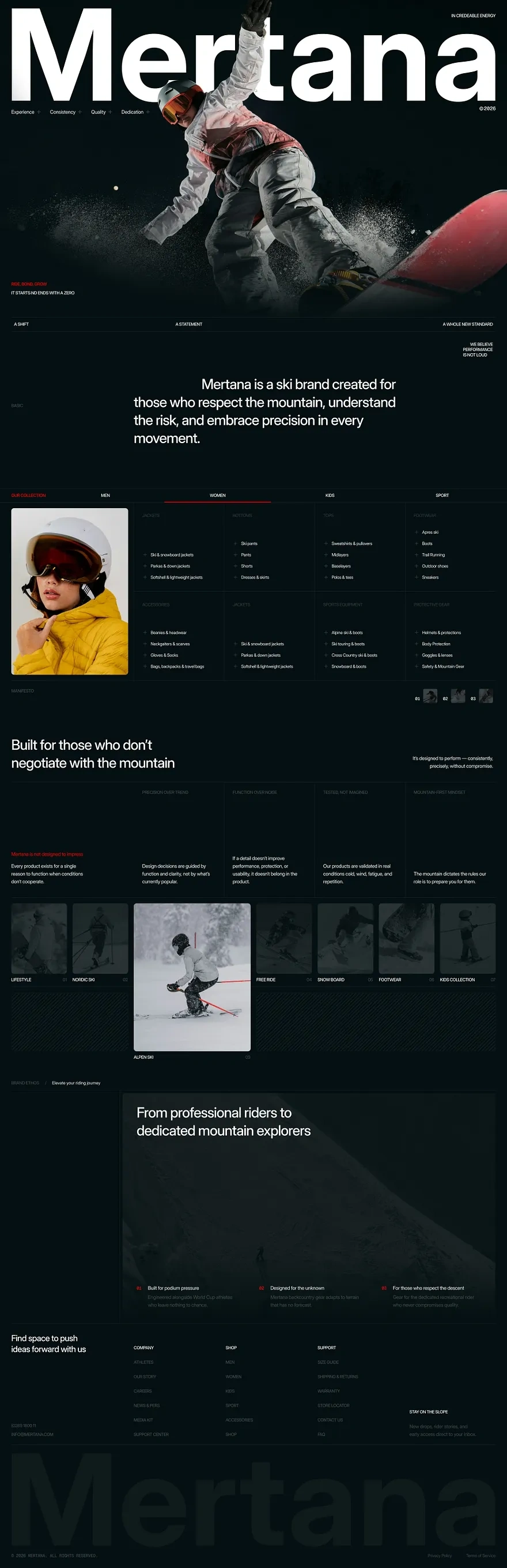
UI/UX Design
💬 Final Word
Mertana is the kind of project that shows what's possible when brand identity, design, development, and image production are handled by one person with a single creative vision. No handoff gaps, no miscommunication between designer and developer, no brand inconsistency between mockup and live site. The mountain doesn't negotiate — and neither did this build. 🏔️🚀
Like this project
Posted May 13, 2026
Figma UI/UX, and custom WordPress development for a premium ski label. Dark editorial aesthetic, six product categories, full build, done entirely by me.