Restorae Presentation & Pitch Deck Design

Xulfi Shah


RESTORAE — Presentation & Pitch Deck Design
🌊 RESTORAE — Presentation & Pitch Deck Design
A Nature-Inspired Slide System for Marine Restoration & Environmental Impact
🔥 Project Overview
Restorae is a brand centered on marine restoration — kelp forest regeneration, ocean health monitoring, and the scientists and entrepreneurs doing the actual work underwater. The brief was to design a presentation template that this kind of organization could use again and again: investor pitches, donor briefings, scientific partner updates, conference talks, all of it, without rebuilding a deck from scratch every time or breaking the brand's credibility along the way.
NGO and environmental decks tend to fail in one of two directions. Either they lean so hard into "cause marketing" that they stop reading as credible to scientists, donors, and institutional partners — stock ocean photos, generic icons, no rigor. Or they swing the other way into dense, data-heavy slides that feel like a lab report and lose the emotional urgency that got people to care about ocean restoration in the first place. Restorae needed a deck that could hold both: the scientific seriousness of a research brief and the emotional pull of a brand people want to fund.
I designed Restorae's complete presentation system in that middle register — calming ocean tones, organic shapes borrowed directly from marine life, and clean editorial layouts that let photography of actual divers, kelp, and coastline do the emotional work while the typography and structure carry the credibility. The result is a deck that works equally well in a boardroom pitching investors and in a coastal NGO office briefing volunteer scientists. 🌊🪸📊
🚨 The Pain Points (What Was Broken Before)
Here's the honest diagnosis of what Restorae needed solved:
🚫 No reusable system — every previous presentation was a one-off, built from a blank slide and whatever stock template was closest at hand. No template meant no consistency from one pitch to the next, and no way to update one deck without redesigning the whole thing
🚫 Generic NGO aesthetic — calming ocean photography and an earnest mission statement are table stakes for environmental organizations; on their own they don't differentiate Restorae from any other conservation group with a Canva subscription. There was no distinct visual signature that said "this is Restorae" the moment a slide appeared on screen
🚫 Credibility gap with scientific and donor audiences — marine restoration work depends on convincing two very different audiences at once: emotionally driven donors and rigorous institutional funders or scientific partners. A deck that leaned too soft lost the second group; a deck too clinical lost the first
🚫 No structure for showcasing people — the actual differentiator for Restorae is the team: the entrepreneurs and scientists doing fieldwork. There was no slide system built specifically to introduce a person, their credentials, and their role in a way that felt human rather than like a corporate org chart
🚫 No visual language for data and milestones — restoration work happens over years, in stages, with measurable outcomes (kelp regrowth rates, site locations, monitoring checkpoints). There was no timeline or data-visualization treatment that could communicate progress without resorting to generic bar charts
🚫 Inconsistent tone across slide types — quote slides, break slides, title slides, and content slides all need to feel like the same deck while doing different jobs. Without an underlying grid and type system, decks tend to drift in tone slide to slide, which reads as unpolished the moment a partner flips past slide six
🚫 No flexibility for repeated use — a one-time deck doesn't survive contact with reality. Restorae needed a true template: section types, placeholder content, and a layout grid that any team member could drop new copy and photography into without breaking the design
🛠️ Full Deliverables Breakdown
🎨 Visual Identity Applied to the Deck System
The Restorae presentation runs on a tightly controlled palette: deep teal-black for title and section-break slides, clean white for content-heavy informational slides, and natural ocean photography — kelp forests, divers, tide pools, coastline — as the emotional anchor wherever it appears. Color is never decorative; dark slides are reserved for openings, transitions, and emotionally weighted moments (the "Title Here" deep-dive slides, the "Find Us" closing slide), while white slides carry the structured, scannable content donors and partners need to act on.
The Restorae wordmark is paired with a custom wave-line icon — a simple set of concentric, organic horizontal strokes that reads instantly as water without leaning on a literal wave clipart or stock ocean icon. This mark appears consistently in the corner of every slide as a quiet anchor, and is enlarged into a full graphic treatment on the title and closing slides, where it becomes the dominant visual element layered over deep teal.
Typography pairs a clean, slightly condensed sans-serif for headlines with a humanist body font for supporting copy — legible at presentation distance, neutral enough to support both a scientific tone and a warmer donor-facing tone depending on the speaker's framing. 🌊🎨🪼
🖥️ Slide System & Layout Architecture
The template is built as a true modular system, with every slide type designed to solve a specific communication job rather than as one-off art:
Title & Section Slides — full-bleed underwater and coastal photography (kelp forests, diving footage) paired with minimal white wordmark treatment and the wave-mark graphic, used to open the deck and to mark major section transitions. These slides do the emotional work, establishing the stakes before any data appears
Break Slides — a dedicated "Break Slide" format using full-bleed landscape and aerial coastal photography with a simple two-word label treatment ("Break / Slide"), giving presenters a clean visual pause between dense content sections without resorting to a blank black slide
Team & Bio Slides — two distinct people-focused layouts depending on group size and context. A grid layout for small groups ("Entrepreneurs") presents four headshots with names and short bios in clean cards. A radial layout for larger groups ("Scientists") arranges headshots in a circular orbit around a central dark circle labeling the group, which solves the problem of presenting many team members without the slide collapsing into a dense, unreadable grid
Quote & Testimonial Slides — a half-photography, half-white-space layout puts a circular portrait, a quotation mark icon, and a short pull-quote against either a content-page background or a full underwater photography backdrop, letting Restorae feature a diver, scientist, or partner voice directly without the slide feeling like a generic testimonial template
Standard Content Slides — the workhorse layout: a clear "Title Here" headline, numbered or icon-labeled body content split into two or three columns, with consistent left-margin branding mark and footer treatment, used for the bulk of explanatory and data-driven content
Video / Call Slides — embedded video-call style frames (two speaker panels with name and title bars) for slides introducing remote team members or partner organizations, giving the deck a way to represent people who couldn't be photographed on location
Timeline / Milestone Slides — a connected-dot timeline running across the slide, each node holding a circular photograph and a short label, used to map the stages of a restoration project or the chronological story of the organization's impact to date
Closing / Contact Slide — a dark "Find Us" slide using the wave-mark graphic at full scale as a textured background, with contact details laid out cleanly against it, closing the deck on the same visual signature it opened with 📐🐚📈
💻 Template Build & Usability
⚡ Built as a true reusable template — every text frame, image placeholder, and icon position structured for fast content swaps without breaking alignment or spacing
⚡ Consistent footer and branding-mark system anchoring every slide regardless of slide type, so the deck reads as one coherent document even when flipped to at random
⚡ Photography placeholder system pre-cropped to the correct aspect ratios for each slide type (full-bleed title backgrounds, circular bio photos, rectangular content images), reducing the chance of stretched or misaligned imagery when new photos are dropped in
⚡ A restrained icon set (quote marks, small line icons for content slides, the wave mark) designed to scale cleanly at both presentation-screen size and printed handout size
⚡ Page numbering and slide-count indicators built into the footer for easy navigation during live presentations
⚡ Designed and tested across both an on-screen 16:9 presentation format and a printable handout layout, since restoration-focused nonprofits frequently need both a live pitch version and a leave-behind document version of the same content 🛠️📑✨
Mixed Slide Layout Overview
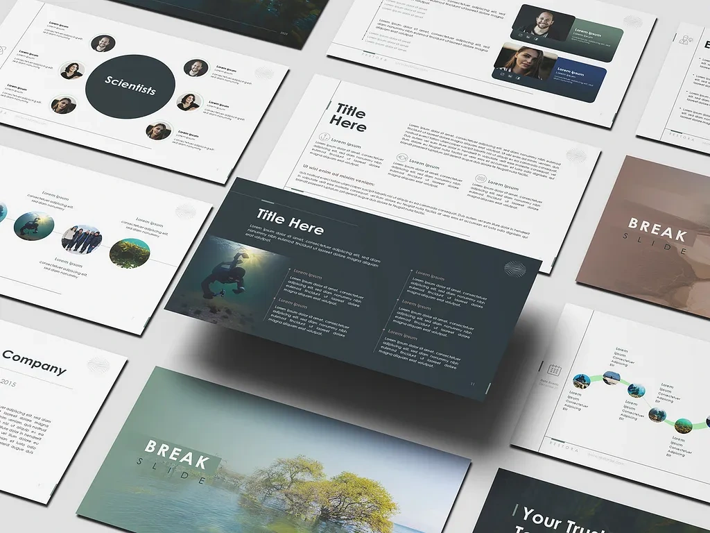
This mockup lays out the deck's range in a single composed grid: the "Scientists" radial bio slide and a two-column "Title Here" content slide sit alongside a dark underwater "Title Here" deep-dive slide front and center, with a "Break Slide" aerial coastline image and a connected-dot timeline slide visible at the edges, plus a glimpse of a video-call style slide top right. Seeing these together demonstrates the deck's core design discipline: wildly different content types — people, data, narrative, transition — all sharing the same margin system, footer treatment, and typographic scale, so the eye never has to readjust to a "new" design language slide to slide. 🌊📊🪼
Full Deck Range with Quote & Closing Slides
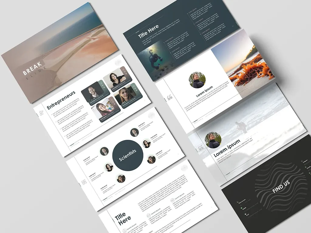
This mockup shows the deck's emotional bookends alongside its content core: a coastal "Break Slide" opens the set, a dark underwater "Title Here" slide sits beside it, and below them, the "Entrepreneurs" grid bio slide, the radial "Scientists" slide, and a standard two-column content slide demonstrate the people-and-information backbone of the deck. To the right, two quote slides — one set against a dark underwater photo, one against a warm coastal sunset image — show how the testimonial layout adapts its background treatment while keeping the same circular-portrait-plus-quote-mark structure. The set closes with the dark "Find Us" slide, its wave-mark graphic rendered at full scale, proving the closing slide carries the same visual signature established at the very start of the deck. 🐠💬📍
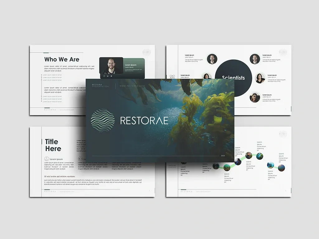
Cover Slide & Core Template Pages
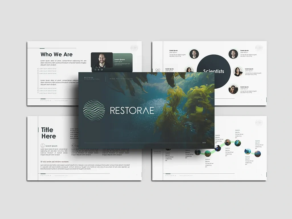
This mockup centers the deck's title slide: the Restorae wordmark set against full-bleed kelp-forest underwater photography, the wave-mark icon rendered large and pale against the deep teal-toned water, with the presentation URL and year in the corner — establishing the brand's signature visual moment before a single line of content is presented. Surrounding it, the "Who We Are" slide (paired with a video-call-style speaker panel), a "Scientists" bio slide, a standard "Title Here" content slide, and the connected-dot milestone timeline round out the view of the deck's core informational architecture. Together, this image makes the strongest case for the template's range: one cover slide moody and cinematic enough to open an investor pitch, surrounded by content slides clean and structured enough to carry the actual substance of the meeting. 🌿🔬🗺️
🧰 Skills Demonstrated
Presentation Design · Pitch Deck Design · Template Design · Brand Identity Application · Layout Design · Typography · Information Design · Data Visualization · Icon Design · Photo Direction · Grid Systems · NGO & Nonprofit Branding · Environmental & Sustainability Design · Slide Systems · Print & Digital Format Design
💬 Final Word
Restorae needed a presentation that could carry both the emotional weight of ocean restoration and the rigor that donors, scientists, and institutional partners expect before they commit support. The ocean palette does that. The radial bio layouts and connected timelines do that. The reusable template structure does that. One coherent design system, built to make every future Restorae pitch feel as considered as the work it's representing. 🌊🪸💚
Like this project
Posted Jun 30, 2026
A nature-inspired slide template for marine restoration, blending ocean tones, organic shapes, and clean layouts for donors, scientists, and partners.