Round Zero Logo Design
Lulu Imanda
Round Zero – Bold & Sporty Brand Identity
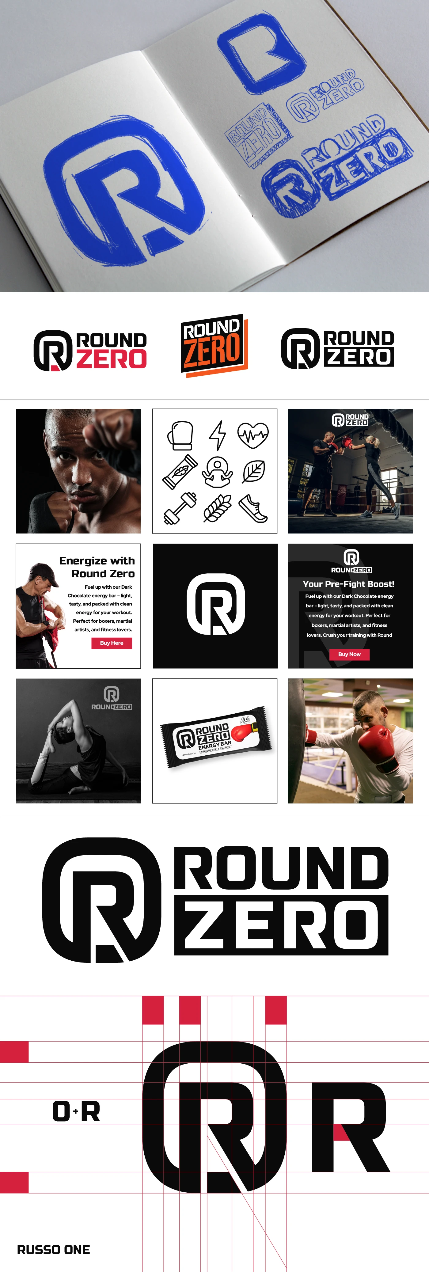
This project is done when I work for UL-UX Studio at 2024. Round Zero is a modern, health-conscious energy bar brand designed for fighters, martial artists, and active individuals who need a light, easily digestible snack before intense workouts. Unlike heavy protein bars or sugary energy drinks, Round Zero provides clean energy through essential carbs, calories, and electrolytes—fueling performance without the crash. The name represents the crucial moment before "Round One," preparing athletes with the right nutrition.
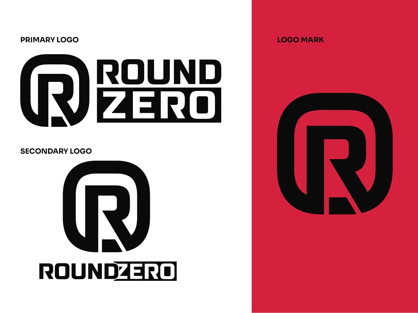
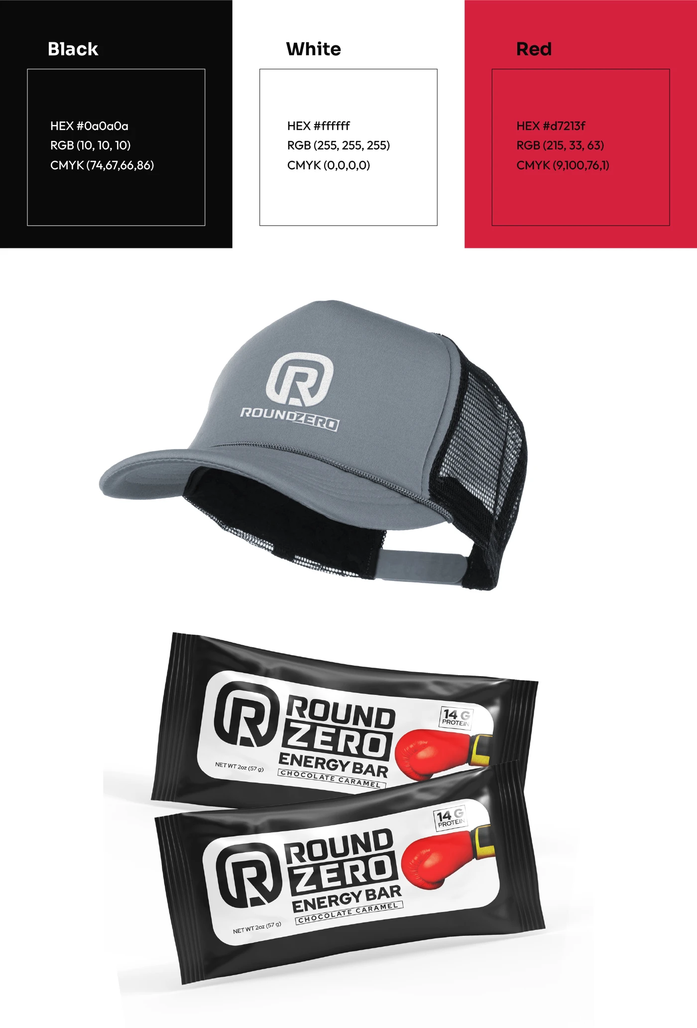
The logo mark features the letters "R" and "0", symbolizing both "Round" and "Zero" as rounded rectangle while evoking the look of boxing signage. A simple cut at the bottom creates a dynamic two-tone color effect, reinforcing the brand's active and competitive spirit.
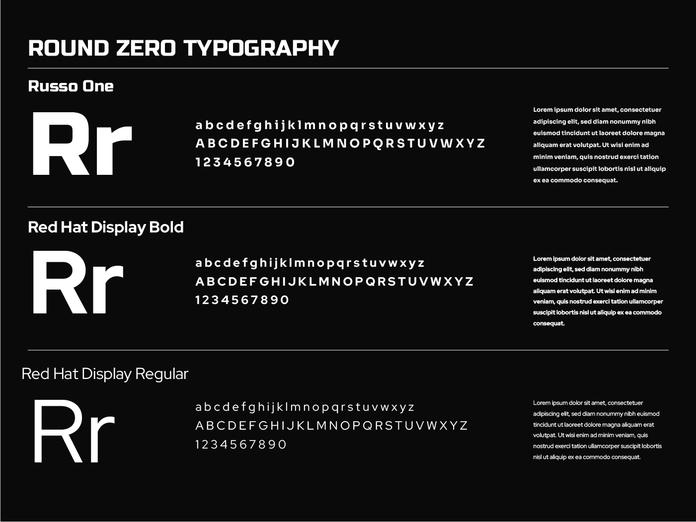
For typography, the bold and sporty Russo One is used for headlines, creating an impactful visual identity, while the modern and readable Red Hat Display is used for body text, ensuring clarity and balance.
The color palette consists of vibrant red and deep black, representing energy and strength, with white and gray tones to provide contrast and highlight key elements.
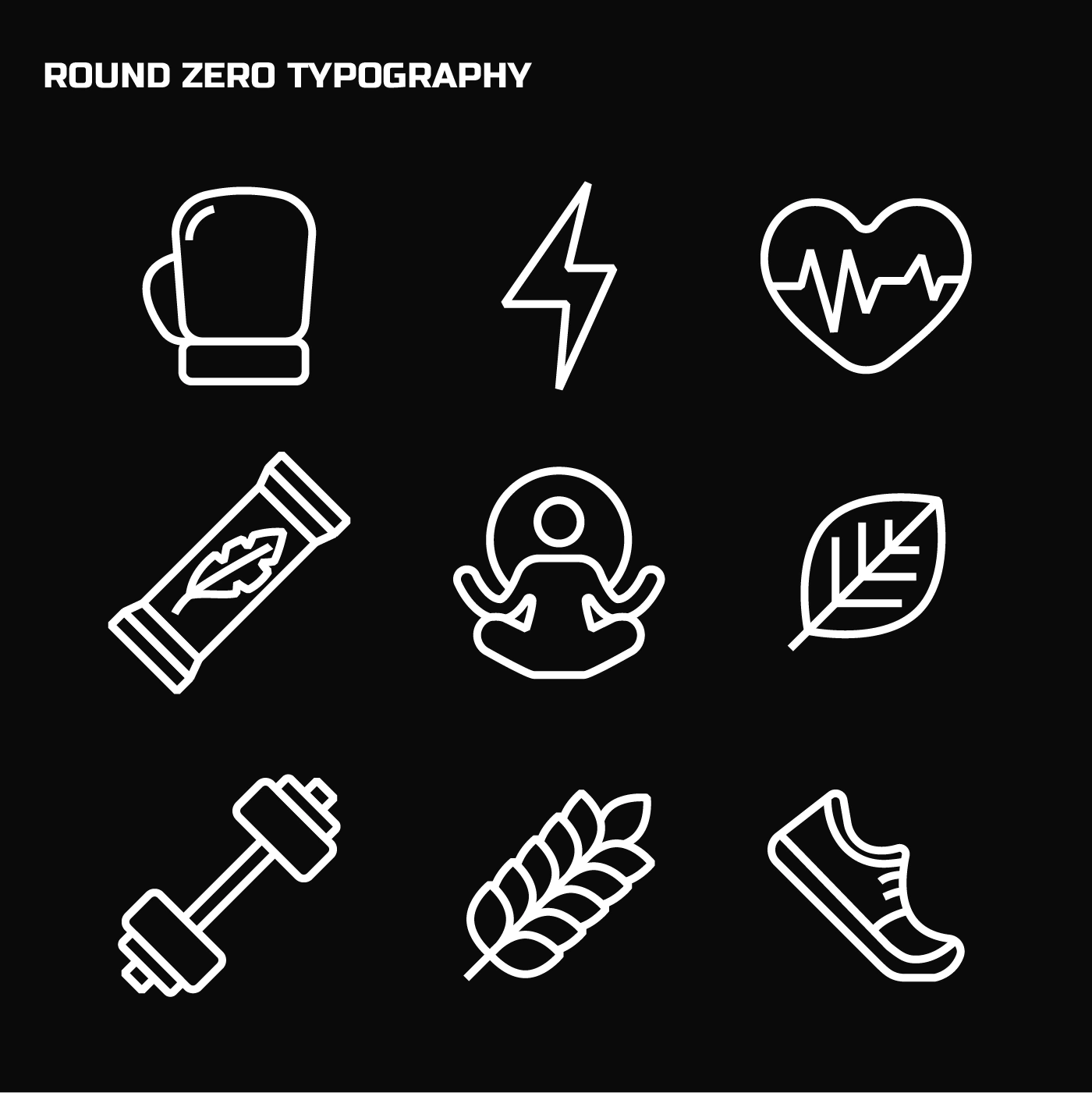
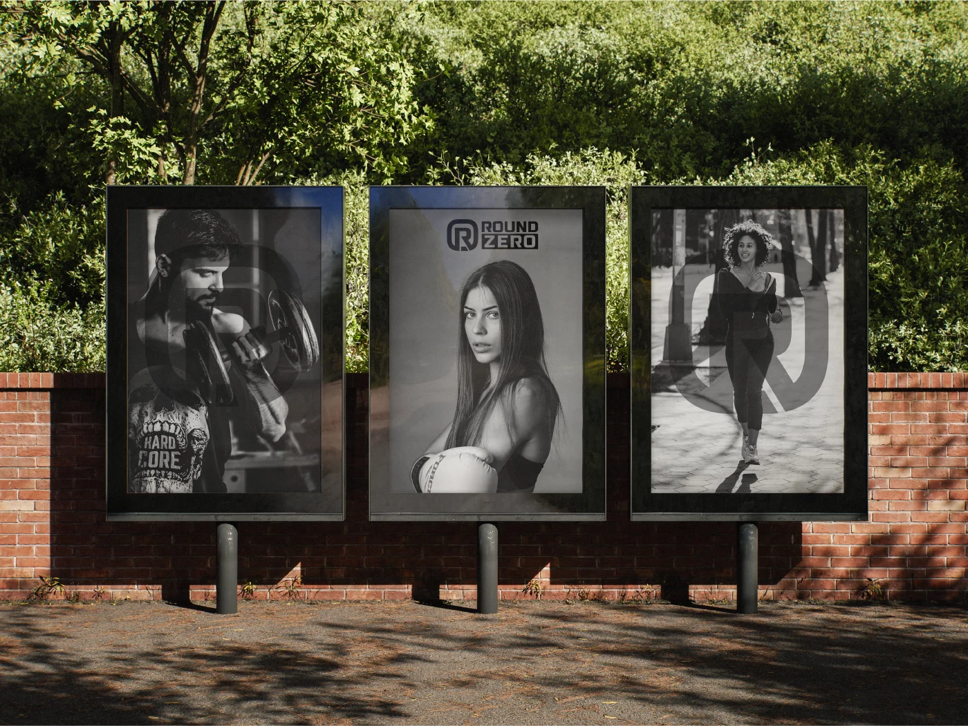
Imagery focuses on intense training moments and the raw energy of boxing, Muay Thai, and high-intensity fitness, reflecting Round Zero’s core values of clean energy, performance, and athletic dedication.
Like this project
Posted Jun 21, 2025
Designed bold brand identity for Round Zero at UL-UX Studio (2024)—a sporty energy bar for fighters, with logo, colors, and type evoking strength and motion.