HomeCare - Live-In Care Landing Page Exploration 🌿 by Pulok Paul✦HomeCare - Live-In Care Landing Page Exploration 🌿 by Pulok Paul✦

HomeCare - Live-In Care Landing Page Exploration 🌿

Pulok Paul✦

Pulok Paul✦

Hello Dribbble! 🏀
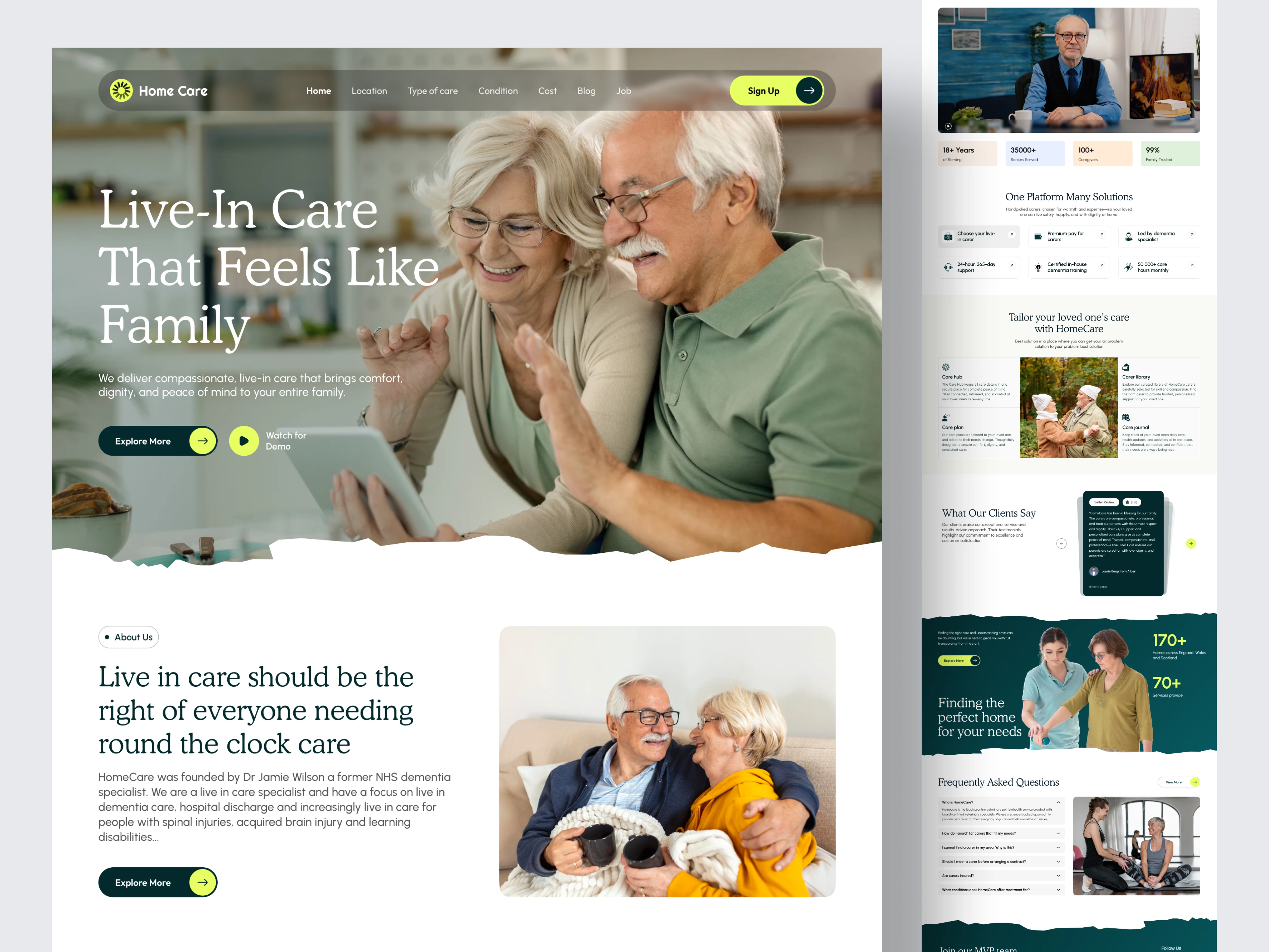
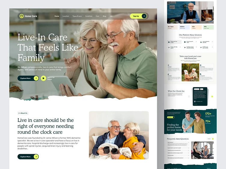
Sharing my latest design exploration for HomeCare, a platform dedicated to providing compassionate, professional live-in care for seniors.
The Vision: In the healthcare space, the interface needs to act as a bridge of trust. My goal was to move away from cold, clinical layouts and create a digital environment that feels warm, premium, and deeply human.
Design Highlights:
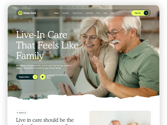
Organic Textures: I used custom "torn paper" edge dividers to break the standard grid and create a softer, more approachable feel.
High-Contrast Palette: The deep forest green conveys stability and growth, while the lime-yellow accents ensure that Call-to-Actions (CTAs) are impossible to miss.
Trust-Centered UI: Dedicated sections for founder videos, 25k+ family social proof, and clear "Step-by-Step" care guides to reduce user anxiety.
Typography: A sophisticated Serif for headings to establish authority, paired with a highly readable Sans-Serif for body copy.
The Workflow: Designed entirely in Figma, focusing on Auto Layout 5.0 for a fully responsive structure and a clean design system for easy developer handoff.

Mockup

Full View

Follow us on
I am Available for New Projects & Remote Positions.
I'm currently available for new projects and remote positions. Let's chat!

Have a project in mind?

Like this project

Posted Oct 12, 2026

Hello Dribbble! 🏀 Sharing my latest design exploration for HomeCare , a platform dedicated to providing compassionate, professional live-in care for seniors. The Vision: In the healthcare space, the interface needs to act as a bridge of trust. My goal was to move away from cold, clinical layouts and create a digital environment that feels warm, premium, and deeply human. Design Highlights: Organic Textures: I used custom "torn paper" edge dividers to break the standard grid and create a softer, more approachable feel. High-Contrast Palette: The deep forest green conveys stability and growth, while the lime-yellow accents ensure that Call-to-Actions (CTAs) are impossible to miss. Trust-Centered UI: Dedicated sections for founder videos, 25k+ family social proof, and clear "Step-by-Step" care guides to reduce user anxiety. Typography: A sophisticated Serif for headings to establish authority, paired with a highly readable Sans-Serif for body copy. The Workflow: Designed entirely in Figma , focusing on Auto Layout 5.0 for a fully responsive structure and a clean design system for easy developer handoff.