Connecting needs
Fiorella Falconi
The project:
As a freelancer, I conducted research, designed a responsive experience, and developed an MVP to match clients with lawyers.
Problem
In Peru, the process of finding and hiring a lawyer is outdated and time-consuming, as legal services are mainly advertised through word of mouth. This results in a lack of transparency and accessibility for those who urgently need legal help. Furthermore, Peruvian lawyers lack a trusted online platform to promote their legal services and connect with potential clients.
Hypothesis
By creating a digital platform that connects lawyers and clients, we can streamline the process of finding and hiring legal services in Peru. This platform will provide a trusted and efficient marketing channel for Peruvian lawyers. As a result, we expect to see an increase in the number of clients receiving legal help and a boost in business for lawyers on the platform.
To kick off the project, I conducted a comprehensive briefing session with the client to gain a deep understanding of their requirements and objectives. Based on the insights gathered from the briefing, I strategically selected the appropriate tools and technologies to ensure that the project was executed seamlessly.
With a clear understanding of the client's goals, I developed a comprehensive roadmap that aligned with their specific needs. It was agreed that the landing page would cater to two distinct user groups: individuals in search of legal assistance and lawyers seeking to connect with potential clients.
This case study will take you through the entire design and development process, highlighting key decisions, challenges, and achievements along the way. You will see how we approached each step of the project to create a user-friendly, intuitive, and aesthetically pleasing landing page that exceeded the client's expectations.
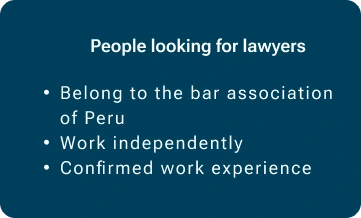
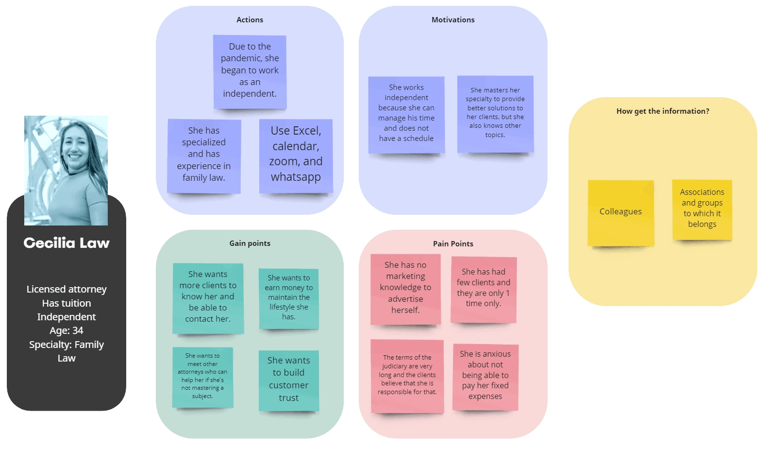
Profile 1
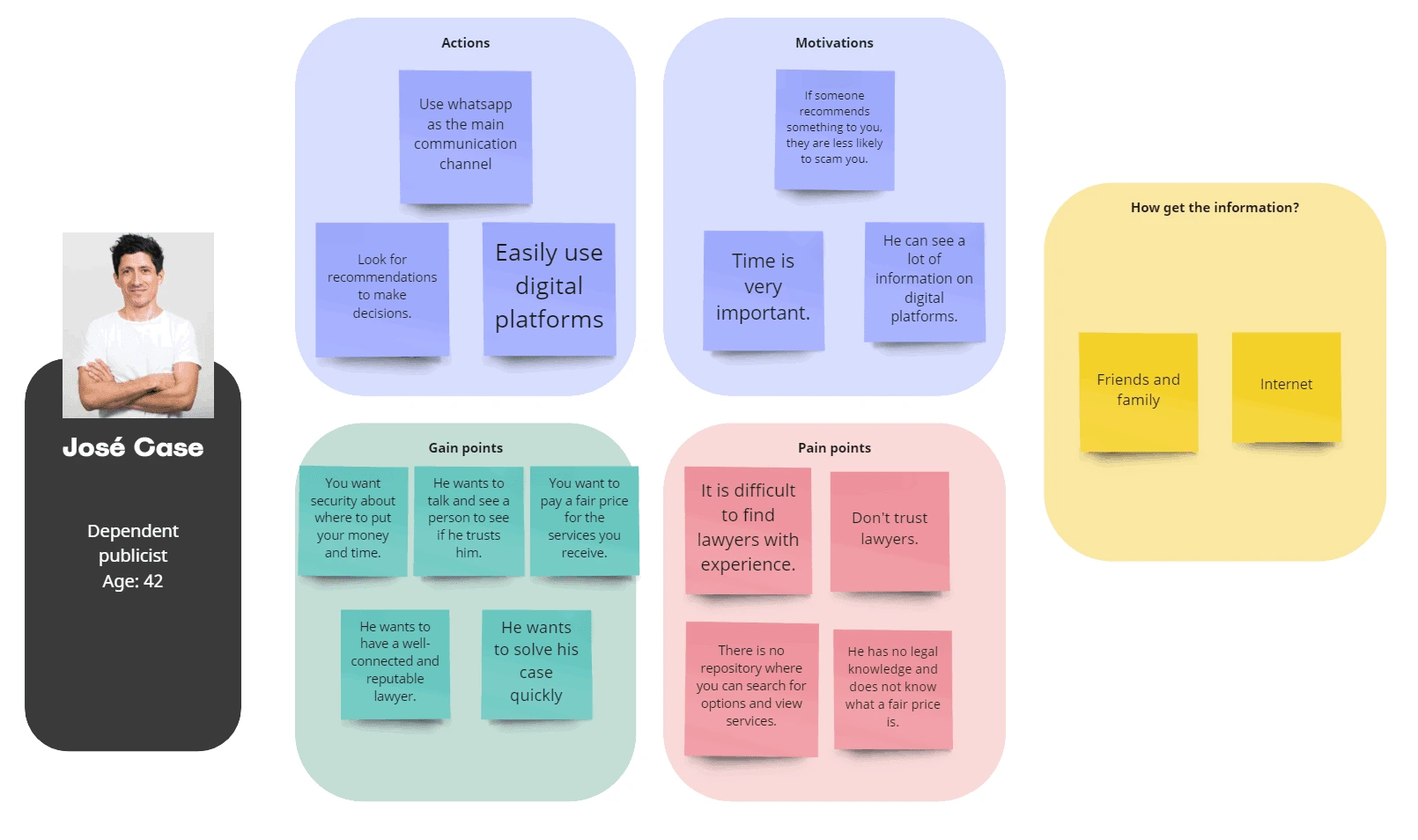
Profile 2
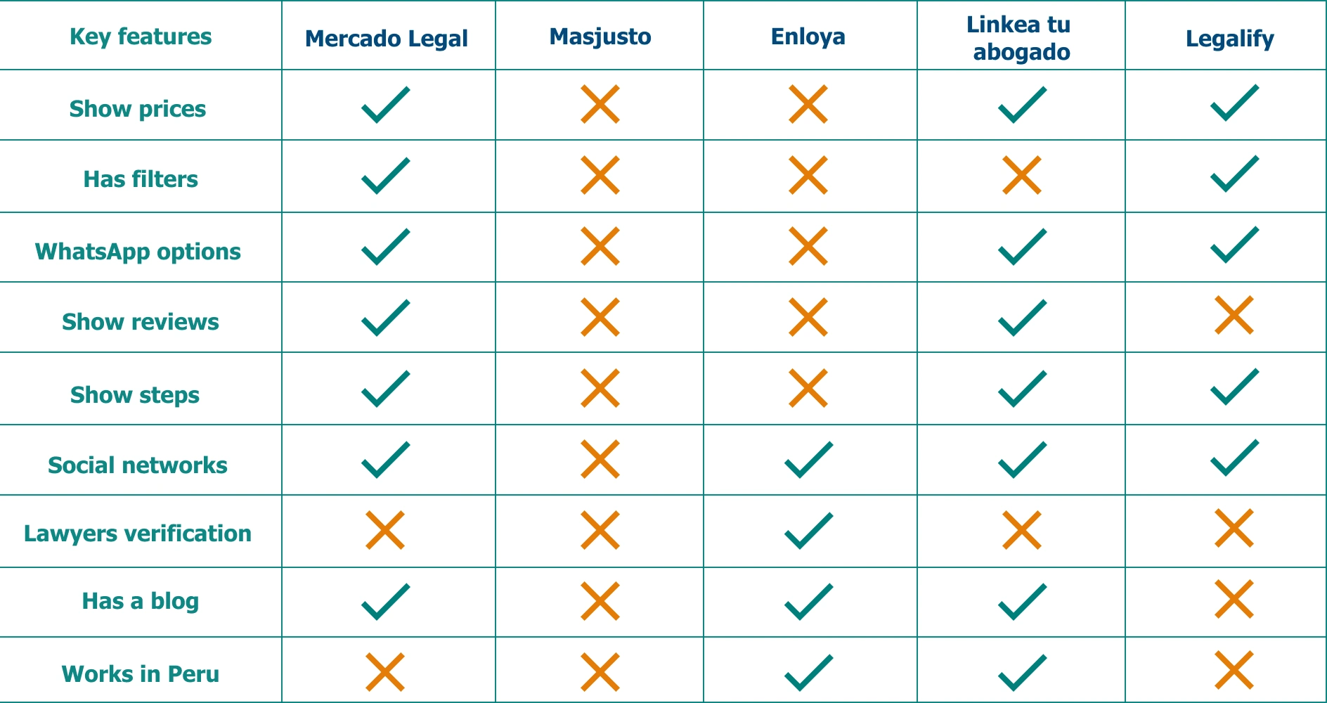
To ensure that our landing page would stand out from the competition, I began by conducting a thorough competitor analysis. This involved researching similar services and analyzing their strengths and weaknesses to gain valuable insights that could inform our design decisions.
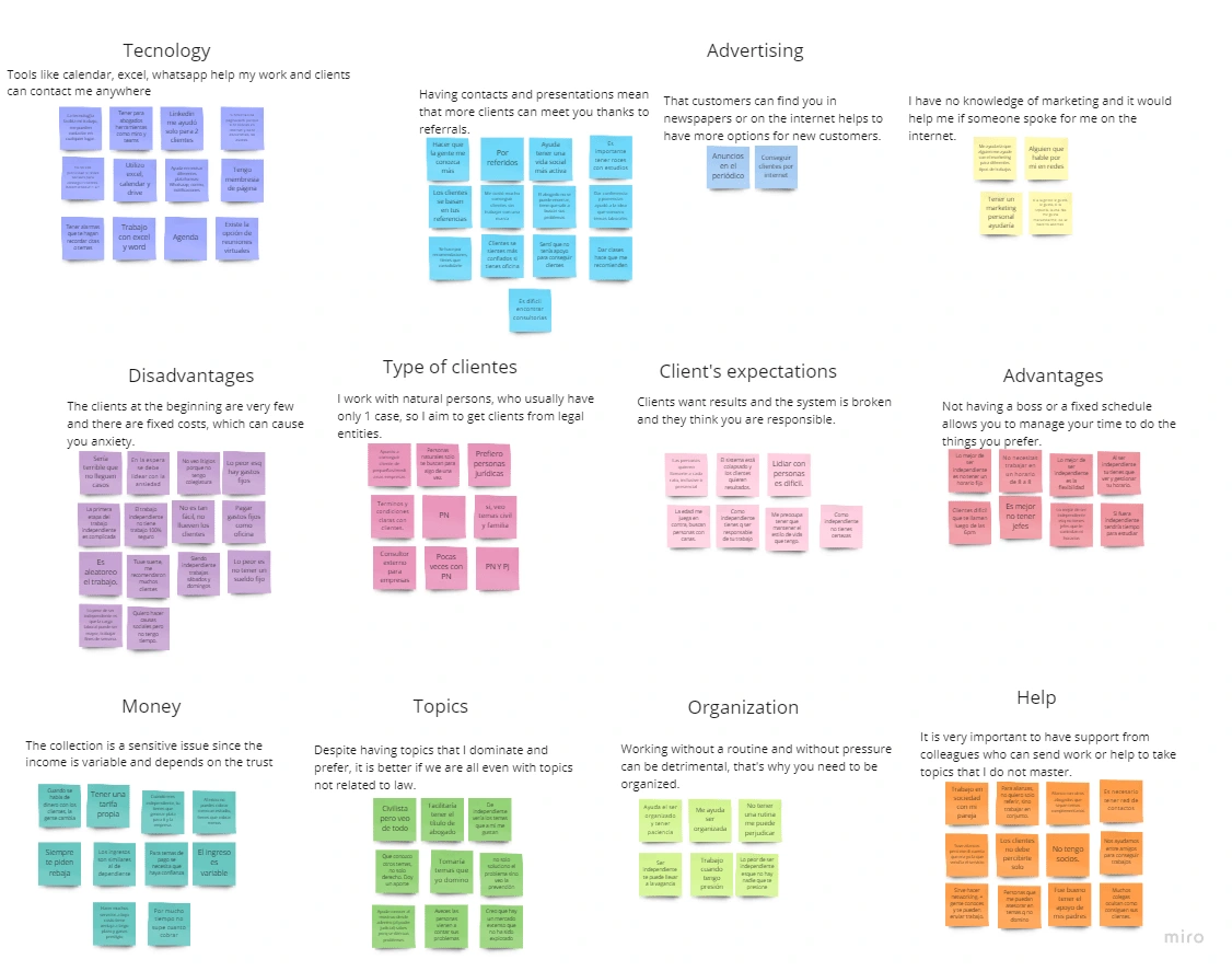
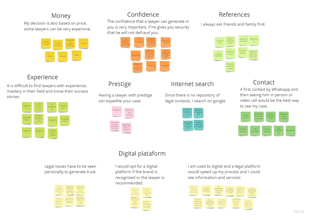
After interviewing a group of people from each type of user and analyzing all the data, I utilized an affinity diagramming technique to organize the information into meaningful clusters. This involved identifying common themes and categorizing them into distinct groups that represented pain points, needs, and opportunities.
Overall, the affinity diagramming process allowed us to distill the data into actionable insights and provided a foundation for creating a user-centric design that would effectively address the needs and pain points of our target audience.
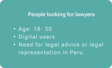
Using the insights gathered from our research, I created two distinct user personas that represent the two primary user groups for our landing page. These personas were developed to help us better understand the needs, goals, and pain points of each user type and to guide our design decisions accordingly.
By developing these personas, we were able to gain a deeper understanding of the specific challenges and opportunities that each user group faces when seeking legal services. This enabled us to create a design that was tailored to the unique needs of each user, ultimately resulting in a more effective and engaging user experience.
After conducting thorough research and analysis, I formulated the problem that I wanted to solve with the design:
Many services can be contracted on the Internet, but in Peru, legal services continue to be a service that is sought after and offered by word of mouth. With this method, a person who urgently needs a lawyer can take several days and weeks to get legal help. On the other hand, Peruvian lawyers don't have a trusted digital place to offer their legal services.
The design started
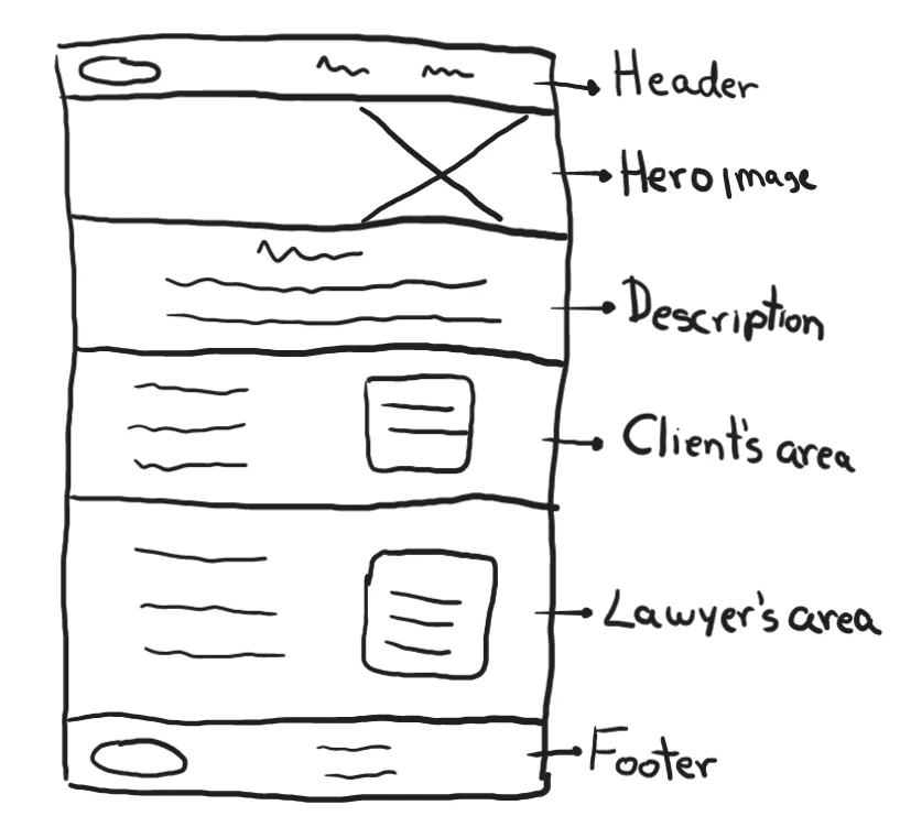
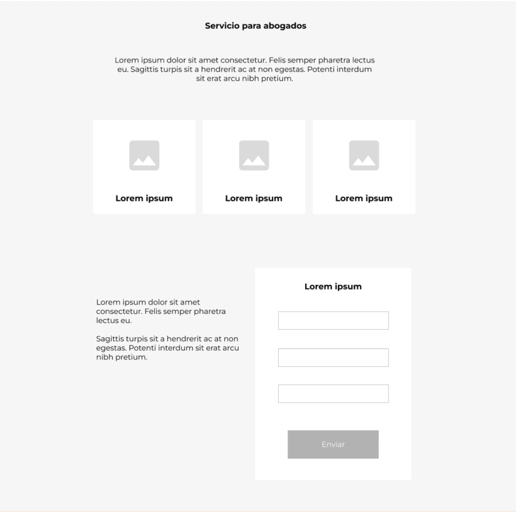
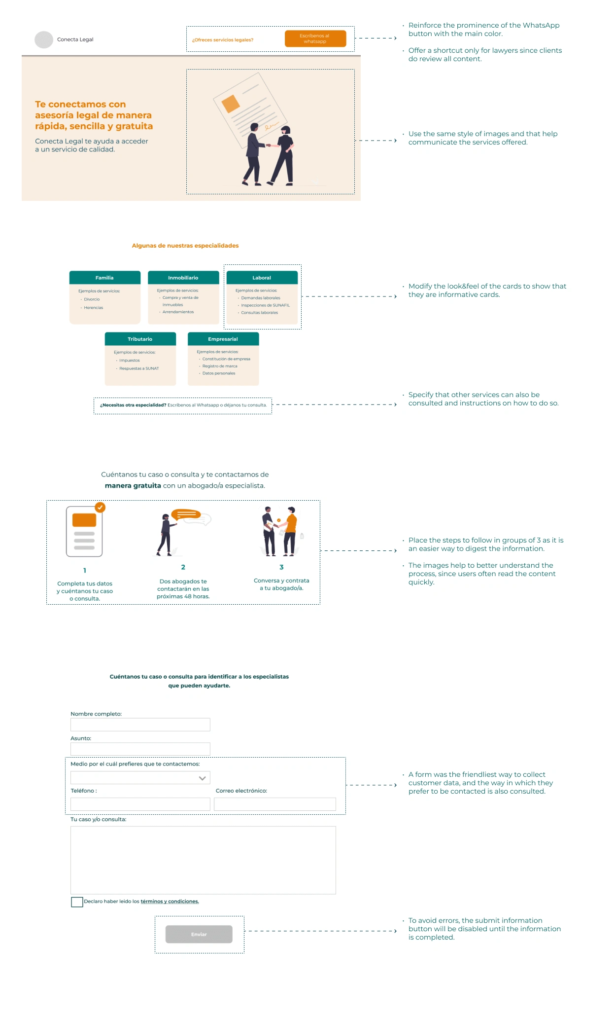
I created a wireframe to plan the structure and content of the landing page, and validated it with the client.The hero image was a critical component to convey the service's benefits. Two well-differentiated areas were necessary to cater to the two distinct user groups. By emphasizing the key elements in bold, the reader can easily identify the most critical aspects of the design process.
After validation with the client, I created the low-fidelity prototype and made the following specifications:
1) Place a communication button for WhatsApp, the preferred contact mode for both users.
2) Include specialties in the description since the world of law can be vast, and users look for exact matches.

3) I placed steps to request service, grouped in threes to increase clarity in the process to contact the service.
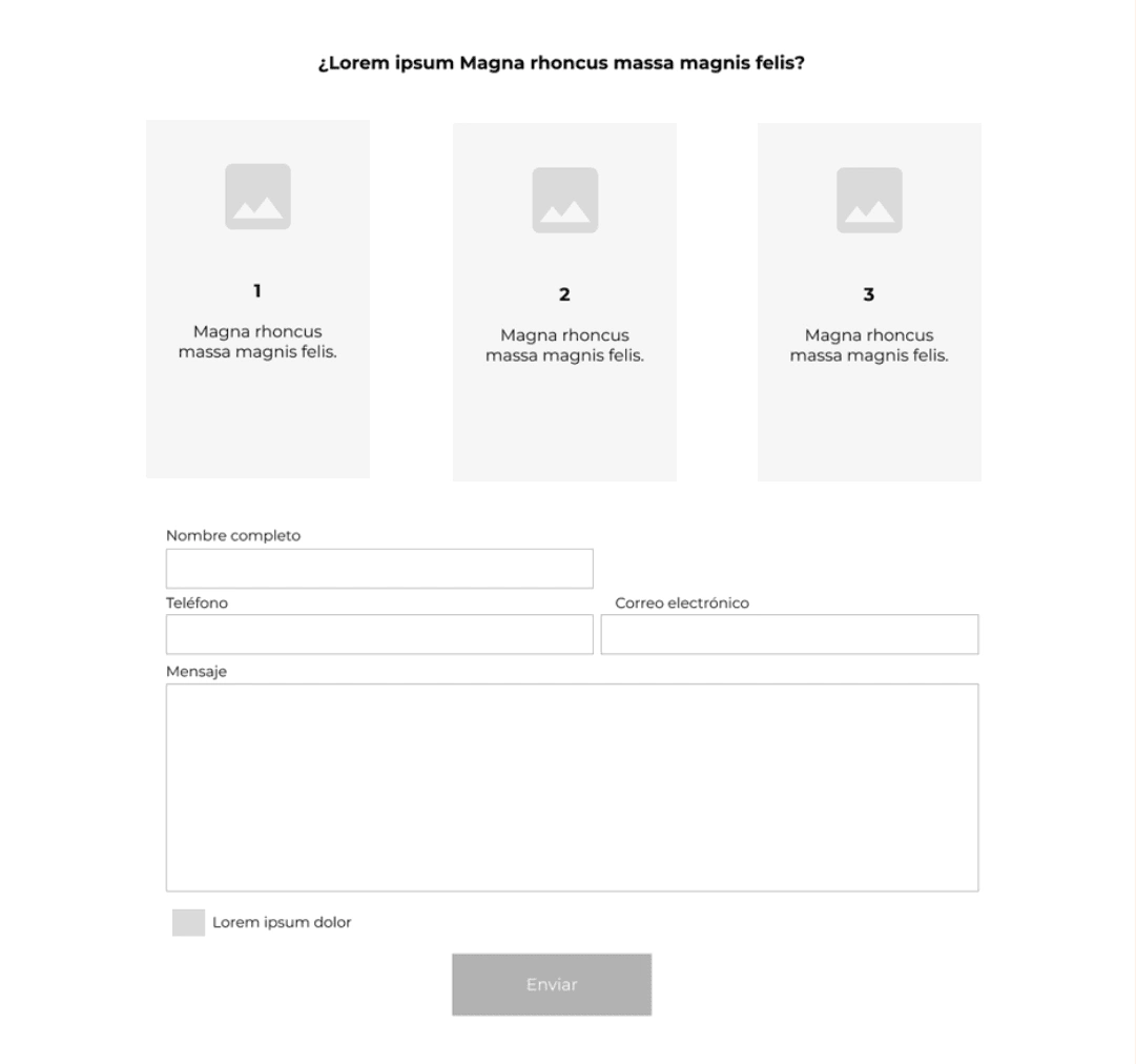
4) Since this is the MVP of the product, a service request form was included, and future features will show lawyers' information.
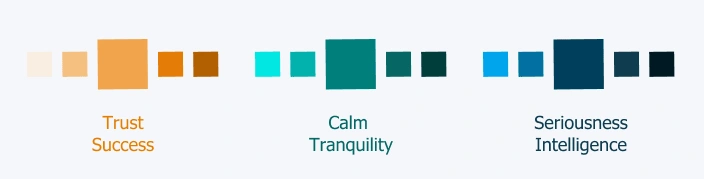
While recruiting participants for usability tests, we selected a color palette to project emotions to highlight on the website.
The tests
After conducting a "5-second test" with 3 users and reviewing the low-fidelity prototype with the client, I iterated based on the working prototype and planned usability test tasks. The primary goal was to verify that both types of users could perform main tasks.
Tests for personas like Cecilia Law:
- 3 usability tests
- Tasks: Download form and identify contact details.
Tests for personas like José Case:
- 3 usability tests
- Tasks: Complete and send the form and contact the company by WhatsApp.
The tests were conducted via Google Meets and used the Thinking Aloud technique. After each test, participants answered 2 feedback questions:
- How simple was it to complete the tasks?
- How clear was the content you were able to see on the web?
and the results were...
Clients
Simplicity: 5
Clearness:4.66
All users mentioned that they would contact by WhatsApp.
No user opened terms and conditions.
The effect of the specialties cards suggested that it led to more information.
Confusion about in which cases to use the form.
Lawyers
Simplicity: 5
Clearness: 5
All users used header to search for the information.
Use of WhatsApp button to communicate with the company.
Doubts about the content of the form.
The iteration
Moving from prototypes to development
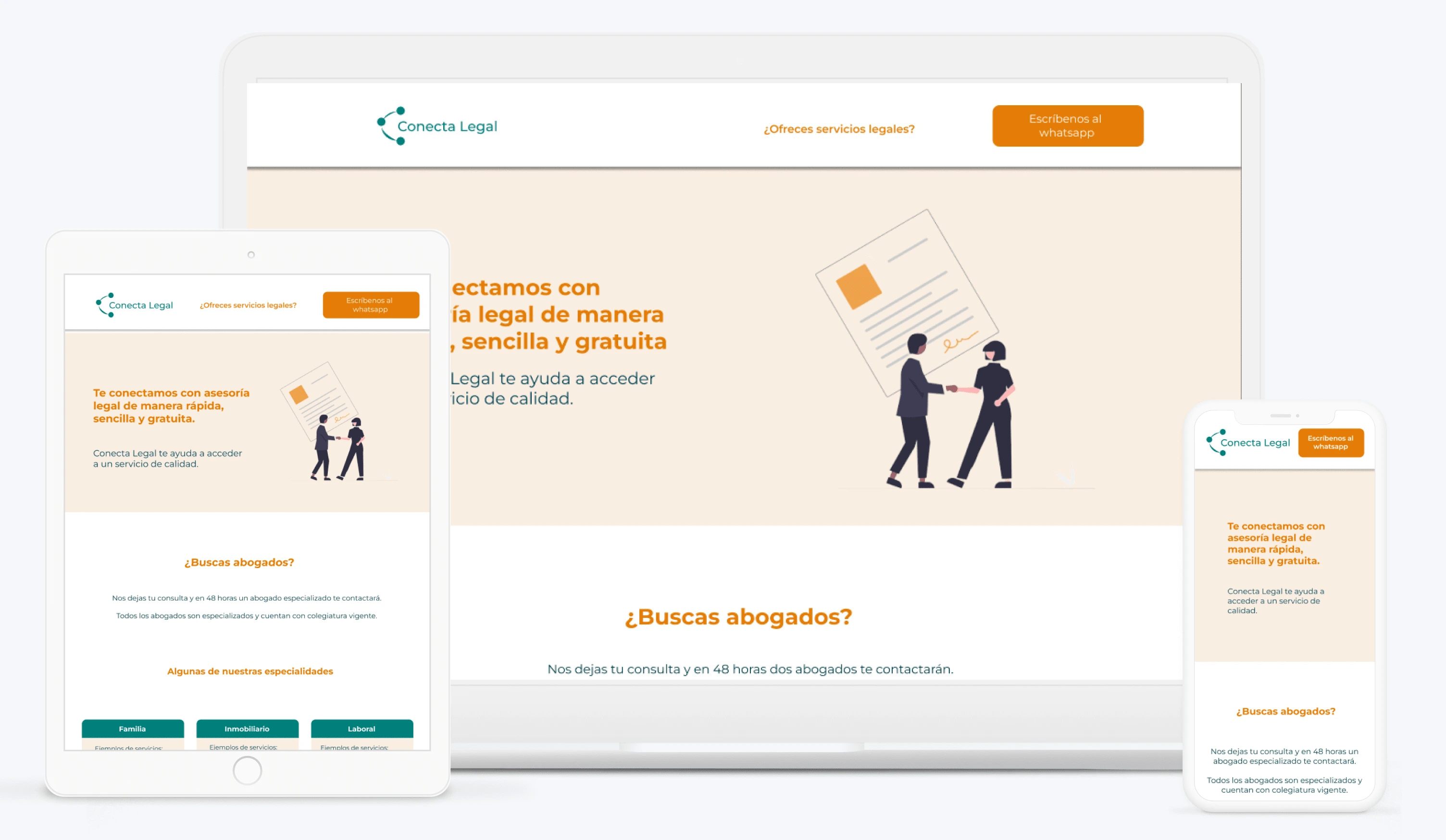
it was essential to consider responsive design. Therefore, I updated and reviewed all the prototypes for different devices. Then, I began the creation process in Webflow, where I faced the following challenges:
- Creating forms
- Integrating WhatsApp
- Linking documents to download
After the development was complete, I assisted the client in configuring the domain and host since they already had a host in Cpanel. Once the website was published, I worked closely with the client to resolve any doubts and verify all the functionalities.
The final result is available at www.conectalegal.com.pe.
Extra help
Despite not having a specialty in logo design, I put my knowledge and creativity to help my client with an additional request. To start the creation of the logo, I helped with the brainstorming of the name. After the election, I proposed the logo and integrated it inside the wireframes.
Key learnings
Empathizing with different users who can interact with the web is crucial, and it requires avoiding assumptions. When dealing with contracting legal services, it is important to consider the feelings of both clients and lawyers, such as uncertainty, distrust, and price ignorance.
Localization is crucial when designing for a specific market. In this case, understanding the cultural nuances and language used in Peru was important to create a landing page that resonated with the local audience.
Interviews played a fundamental role in building the landing page and defining the MVPs of the product, such as displaying client comments, relevant information about lawyers, and important benefits for lawyers.
Providing multiple ways to contact each other is appreciated by users, allowing them to request information in the way they feel most comfortable.
Collaborating closely with the client throughout the design process helps ensure that the final product meets their needs and expectations. In this case study, regular communication with the client was important to get feedback, make revisions, and ensure that the design aligned with their goals.
Making our landing page with Fiorella was a great decision. She fully understood our needs and conducted interviews with potential users to validate our premises and obtain their comments on the Landing page proposal. In addition, she was always willing to make the changes we requested, she met the deadlines, and at each meeting we have all the details of the progress. We definitely recommend it!
Luciana G.
Business Partner at Conectalegal
Like this project
Posted Jul 13, 2023
Web responsive design. Design the experience for a legal landing page.
Likes
0
Views
19