Calling Registration
Fiorella Falconi
The project:
In less than 2 days, I design and implement a landing page about the call for a workshop on heuristic evaluations.
Problem
Despite the schedule workshop, doesn't exist a public platform where prospective attendees can easily access comprehensive event information and complete the registration process, this could bring few subscribers and not reach the target audience.
Hypothesis
Developing a comprehensive landing page, rich in event details, will foster public interest, consequently leading to an increased number of well-informed and motivated registrants, thereby enhancing the overall success of the event.
As the initial step in crafting the landing page, I conducted a thorough assessment of the event organizers' requirements and expectations.
Workshop purpose: Explain what they are and how to apply heuristic evaluations.
Landing Page Goals:
Informative Hub: The landing page would serve as an informative hub, offering a comprehensive overview of the event, including its purpose, and agenda.
Registration Facilitation: It would seamlessly guide prospective participants through the registration process, simplifying their journey.
Credibility Enhancement: The page would also function as a credibility-enhancing platform, instilling trust and confidence in potential attendees.
Event Accessibility: A user-friendly feature involving QR codes would grant easy access to the page for individuals who encounter the event's call.
User Persona: Lastly, I swiftly identified the target audience for the workshop. This critical demographic insight was pivotal in tailoring the landing page to the precise needs and preferences of the intended users.
With these insights in hand, the foundation was laid for the creation of a landing page that not only met the organizers' expectations but also resonated with and catered to the specific interests of the workshop's prospective participants.
Prototype
Not having much time at my disposal, I quickly created the mid-fi design to validate with the client that the content was what was necessary.
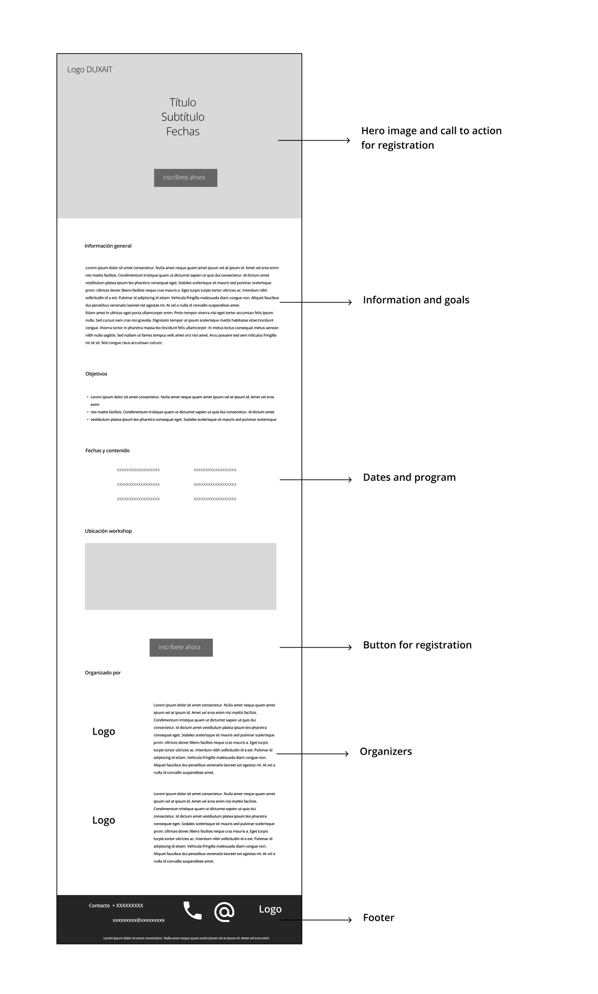
Mid-fi prototype
I used two colors of the academic group logo to showing professionalism, capturing the audience's attention and reinforcing the visual identity of the event.
I chose as a font for the website: "League Spartan" because it is legible on different device sizes and because of its modern and professional style.
Make the website alive
Using Webflow, a non-code tool, I transfer the design and complete it with the real information to be published in the url.
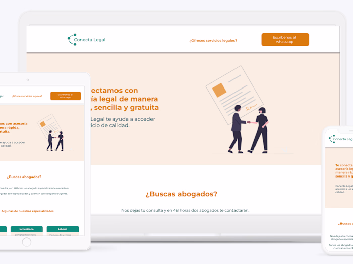
Responsive design
Those potentially interested in entering this landing page can do so in two ways: through the link or by reading a QR. For this reason, it was necessary to have a responsive design so that those interested in getting information from their phone do not have any problems doing it.
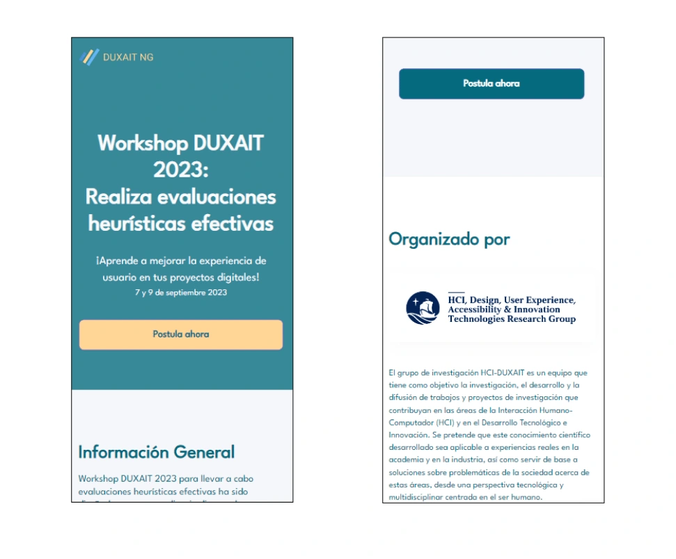
You can see the results at https://duxait-events-site.webflow.io/
Learnings
If you have little time at your disposal or few resources, you cannot carry out all the research you would like to do. In those cases, it helps to do an exhaustive interview with the client to identify what they want to communicate with their landing page.
It is important to identify the context at 360º to be able to know how the digital product you are working on will be consumed, considering hardware, communication modes and marketing strategies.
If the texts will be delivered by the client, it is better to establish deadlines to avoid problems with the deadlines.
Results
The workshop initially planned for 20 people had 25 registered, all through the landing page.
Like this project
Posted Sep 7, 2023
Responsive design to inform a event details and increase registrations.
Likes
0
Views
9